Hierarchical clustering is connectivity-based clustering. It assumes that the clusters are connected, or in another word, linked. For example, we can classify animals and plants based on this assumption. We have all developed from something common. This makes it possible for us to assume that every observation is its own cluster on one hand and, on the other, all observations are in one and the same group. This also forms the basis for two approaches to hierarchical clustering algorithms, agglomerative and divisive:
- Agglomerative clustering starts out with each point in its own cluster and then merges the two clusters with the lowest dissimilarity, that is, the bottom-up approach
- Divisive clustering is, as the name suggests, a top-down approach where we start out with one single cluster that is divided into smaller and smaller clusters
In contrast to k-means, it gives us a way to identify the clusters without initial guesses of the number of clusters or cluster positions. For this example, we will run an agglomerative cluster algorithm in SciPy.
Galaxies in the Universe are not randomly distributed, they form clusters and filaments. These structures hint at the complex movement and history of the Universe. There are many different catalogs of galaxy clusters, although the techniques to classify clusters vary and there are several views on this. We will use the Updated Zwicky Catalog, which contains 19,367 galaxies (Falco et al. 1999, PASP 111, 438). The file can be downloaded from http://tdc-www.harvard.edu/uzc/index.html . The first Zwicky Catalog of Galaxies and Clusters of Galaxies was released in 1961 (Zwicky et al. 1961-1968. Catalog of Galaxies and Clusters of Galaxies, Vols. 1-6. CalTech).
To start, we import some required packages, read in the file to a DataFrame, and investigate what we have:
import astropy.coordinates as coord
import astropy.units as u
import astropy.constants as c
Astropy is a community-developed astronomy package to help Astronomers analyze and create powerful software to handle their data ( http://www.astropy.org/ ). We import the coordinates package that can handle astronomical coordinates (World Coordinate System-WCS) and transforms. The units and constants packages are packages to handle physical units (conversions and so on) and constants (with units); both are extremely handy to do calculations where the units matter:
uzcat = pd.read_table('data/uzcJ2000.tab/uzcJ2000.tab',
                      sep='	', header=16, dtype='str',
                      names=['ra', 'dec', 'Zmag', 'cz', 'cze', 'T', 'U',
                             'Ne', 'Zname', 'C', 'Ref', 'Oname', 'M', 'N'],
                      skiprows=[17])
Let's look at the data with the head method:
uzcat.head()
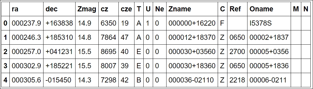
The first two columns, ra and dec, are coordinates in the equatorial coordinate system. Basically, if you imagine Earth's latitude and longitude system expanded, we are on the inside. RA, or Right Ascension, is the longitude and Dec, or declination, is the latitude. A consequence of this is that, as we are on the inside of it, East is West and West is East. The third column is the Z magnitude, which is a measure of how bright the galaxy is (in logarithmic units) measured at a certain wavelength of light. The fourth column is the redshift distance in units of km/s (fifth is the uncertainty) with respect to our Sun (that is, Heliocentric distance). This odd unit is the redshift multiplied by the speed of light (v = cz, z: redshift). Due to the simplicity of this, the v parameter can have speeds that go above the speed of light, that is, non-physical speeds. It assumes that the radial speed of every galaxy in the universe is dominated by the expansion of the universe. Recollecting that in
Chapter 3
, Learning About Models, we looked at Hubble's Law, the expansion of the universe increases linearly with distance. While the Hubble constant is constant for short distances, today we know that the expansion speed of the universe (that is, Hubble constant, H0) changes at large distances, the change depending on what cosmology is assumed. We will convert this distance to something more graspable later on.
The rest of the columns are described either in the accompanying README file or online at http://tdc-www.harvard.edu/uzc/uzcjformat.html .
First, we want to translate the coordinates into something more readable than a string (that is, ra and dec columns). Equatorial coordinates are given for RA in hours, minutes, and seconds and Dec in degrees, minutes, and seconds. To get degrees from hours, you simply multiply hours by 15 (that is, 360 degrees divided by 24 hours). One of the first reasons to choose this dataset as an example is that because of the coordinate system, the distance is not the Euclidean distance. To be able to use it, we have to translate the coordinates into Cartesian coordinates, which we will do soon. As explained, we now fix the first thing with the coordinates; we convert them into understandable strings:
df['ra'] = df['ra'].apply(lambda x: '{0}h{1}m{2}s'.format(
                          x[:2],x[2:4],x[4:]))
df['dec'] = df['dec'].apply(lambda x: '{0}d{1}m{2}s'.format(
                            x[:3],x[3:5],x[5:]))
df.head()
Next, we need to put np.nan where the entry is empty (we are checking whether it is an empty string with spaces). With apply, you can apply a function to a certain column/row, and applymap applies a function to every table entry:
uzcat = uzcat.applymap(lambda x: np.nan if
                       isinstance(x, str) and
                       x.isspace() else x)
uzcat['cz'] = uzcat['cz'].astype('float')
We also convert the magnitude column to floats by running mycat.Zmag = mycat.Zmag.astype('float'). To do an initial visualization of the data, we need to convert the coordinates to radians or degrees, something that matplotlib understands. To do this, we use the convenient Astropy Coordinates package:
coords_uzc = coord.SkyCoord(uzcat['ra'], uzcat['dec'], frame='fk5',
                            equinox='J2000')
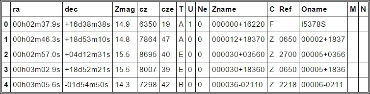
We can now access the coordinates in one object and convert them to various units. For example, coords_uzc.ra.deg.min() will return the minimum RA coordinate in units of degrees; replacing deg with rad will return it in radians. Visualizing it at this level has several reasons; one reason for this is that we want to check what the coordinates cover; what part of the sky we are looking at. To do this, we use a projection method; otherwise, the coordinates do not make sense as they are not common x,y,z coordinates (in this case, the Mollweide projection), so we are looking at the whole sky flattened out:
color_czs = (uzcat['cz']+abs(uzcat['cz'].min())) /
            (uzcat['cz'].max()+abs(uzcat['cz'].min()))
from matplotlib.patheffects import withStroke
whitebg = withStroke(foreground="w", linewidth=2.5)
fig = plt.figure(figsize=(8,3.5))
ax = fig.add_subplot(111, projection="mollweide")
ax.scatter(coords_uzc.ra.radian-np.pi, coords_uzc.dec.radian,
           color=plt.cm.Blues_r(color_czs), alpha=0.6,
           s=4, marker='.', zorder=-1)
plt.grid()
for tick in ax.get_xticklabels():
    tick.set_path_effects([whitebg])
As the scatter points are dark, I have also modified the tick labels with path effects, which was introduced in matplotlib 1.4. This makes it much easier to distinguish the coordinate labels:
We can see that we have data for the upper part of the sky only. We also see the extent of the Milky Way, its gas and dust is blocking our view beyond it and no galaxies are found there in the dataset. To minimize the data that we look at, we will cut it along the Dec between 15 and 30 degrees. Let's check the distribution of distances that are covered:
uzcat['cz'].hist(bins=50)
plt.yscale('log')
plt.xlabel('CZ-distance')
plt.ylabel('Counts')
plt.xticks(rotation=45, ha='right'),
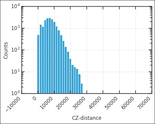
The peak is around 10,000 km/s, and we cut it off at 12,500 km/s. Let's visualize this cut from top-down. Instead of looking at both RA and Dec, we will look at RA and cz. First, we create the selection:
uzc_czs = uzcat['cz'].as_matrix()
uzcat['Zmag'] = uzcat['Zmag'].astype('float')
decmin = 15
decmax = 30
ramin = 90
ramax = 295
czmin = 0
czmax = 12500
selection_dec = (coords_uzc.dec.deg>decmin) *
                (coords_uzc.dec.deg<decmax)
selection_ra = (coords_uzc.ra.deg>ramin) *
               (coords_uzc.ra.deg<ramax)
selection_czs = (uzc_czs>czmin) * (uzc_czs<czmax)
selection= selection_dec * selection_ra * selection_czs
We export the cz column from the DataFrame just for convenience; we create a separate Boolean array for each selection. This way, we can filter whatever we want. For example, calling coords_uzc.ra.radian[selection_dec*selection_ra] will only filter out the RA and Dec that we are after. Next, we plot it all with only the Dec filter, and then visualize where we are about to cut in cz and RA. I have not explained the cut in RA and cz chosen here, but it was done after looking at the following image:
fig = plt.figure( figsize=(6,6))
ax = fig.add_subplot(111, polar=True)
sct = ax.scatter(coords_uzc.ra.radian[selection_dec],
                 uzc_czs[selection_dec],
                 color='SteelBlue',
                 s=uzcat['Zmag'][selection_dec*selection_czs],
                 edgecolors="none",
                 alpha=0.7,
                 zorder=0)
ax.set_rlim(0,20000)
ax.set_theta_offset(np.pi/-2)
ax.set_rlabel_position(65)
ax.set_rticks(range(2500,20001,5000));
ax.plot([(ramin*u.deg).to(u.radian).value,
         (ramin*u.deg).to(u.radian).value], [0,12500],
         color='IndianRed', alpha=0.8, dashes=(10,4))
ax.plot([ramax*np.pi/180., ramax*np.pi/180.], [0,12500],
        color='IndianRed', alpha=0.8, dashes=(10,4))
        theta = np.arange(ramin, ramax, 1)
ax.plot(theta*np.pi/180., np.ones_like(theta)*12500,
        color='IndianRed', alpha=0.8, dashes=(10,4))
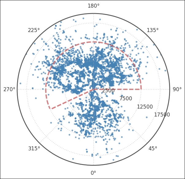
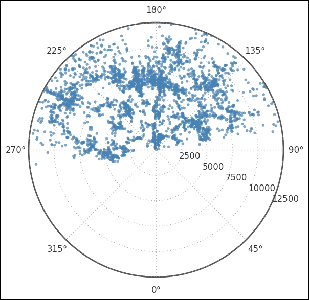
Here, we use a polar plot by passing polar=True when we instantiate the subplot and applying the selection_dec filters to all Dec values above 30 and below 15 degrees. The coordinates need to be given in radians, hence we go over to radians by simply asking for the coordinates in radians as previously described. Next, we customize the plot, rotating the plot 90 degrees clockwise, which is pi/2 in radians. To make it easier to read the radial distance axis labels, we set them to be drawn at 65 degrees and set the distance at which they should be drawn. The last two function calls draw the dashed region, the region which I set as selection_ra and selection_czs. Next, we plot only the selection points and zoom in a bit:
fig = plt.figure( figsize=(6,6))
ax = fig.add_subplot(111, polar=True)
sct = ax.scatter(coords_uzc.ra.radian[selection],
                 uzc_czs[selection],
                 color='SteelBlue',
                 s=uzcat['Zmag'][selection],
                 edgecolors="none",
                 alpha=0.7,
                 zorder=0)
ax.set_rlim(0,12500)
ax.set_theta_offset(np.pi/-2)
ax.set_rlabel_position(65)
ax.set_rticks(range(2500,12501,2500));
It is important to notice that most coordinates are above the line that 90 to 270 degrees forms. This will later have an effect on the Cartesian coordinates. With a subsection of the total catalog, it is a good idea to create a separate DataFrame to store everything in it, including the coordinates in degrees:
mycat = uzcat.copy(deep=True).loc[selection]
mycat['ra_deg'] = coords_uzc.ra.deg[selection]
mycat['dec_deg'] = coords_uzc.dec.deg[selection]
Although RA, Dec, and cz is a perfectly understandable coordinate format for astronomers, it is not for most people (it is even hard to digest for astronomers). So we shall now convert these spherical coordinates (Celestial Equatorial Coordinate System) to X, Y, Z. To do this, we use some very convenient functions in the Astropy Coordinates package, which we have already worked with. First, we calculate the actual distance to the galaxies. To do this, we use the Distance function, which can be done with different geometries of the universe/cosmologies, but the default (current) is fine for us:
zs = (((mycat['cz'].as_matrix()*u.km/u.s) / c.c).decompose())
dist = coord.Distance(z=zs)
print(dist)
mycat['dist'] = dist
We now have everything to calculate the Cartesian coordinates of the galaxies:
coords_xyz = coord.SkyCoord(ra=mycat['ra_deg']*u.deg,
                            dec=mycat['dec_deg']*u.deg,
                            distance=dist*u.Mpc,
                            frame='fk5',
                            equinox='J2000')
Now is a good time to save these Cartesian coordinates to our catalog:
mycat['X'] = coords_xyz.cartesian.x.value
mycat['Y'] = coords_xyz.cartesian.y.value
mycat['Z'] = coords_xyz.cartesian.z.value
I suggest running head() and describe() on the current DataFrame catalog that we have created (that is, mycat). Notice then that most X coordinates are negative. Why is this? Remember what RA coordinates most of our selection had? Go back and check the polar plots that we made. The RA is between 90 and 270 degrees; basically the opposite direction of 0 degrees, causing them to have negative X coordinates now. Now I want to plot this; as it is actually three-dimensional data, I will use two plots to visualize the three dimensions:
fig, axs = plt.subplots(1,2, figsize=(14,6))
plt.subplot(121)
plt.scatter(mycat['Y'], -1*mycat['X'], s=8,
            color=plt.cm.OrRd_r(10**(mycat.Zmag
                                     -mycat.Zmag.max())),
            edgecolor='None')
plt.xlabel('Y (Mpc)'), plt.ylabel('X (Mpc)')
plt.axis('equal'),
plt.subplot(122)
plt.scatter(-1*mycat['X'],mycat['Z'], s=8,
            color=plt.cm.OrRd_r(10**(mycat.Zmag
                                     -mycat.Zmag.max())),
            edgecolor='None')
lstyle = dict(lw=1.5, color='k', dashes=(6,4))
plt.plot([0,150], [0,80], **lstyle)
plt.plot([0,150], [0,45], **lstyle)
plt.plot([0,-25], [0,80], **lstyle)
plt.plot([0,-25], [0,45], **lstyle)
plt.xlabel('X (Mpc)'), plt.ylabel('Z (Mpc)')
plt.axis('equal')
plt.subplots_adjust(wspace=0.25);
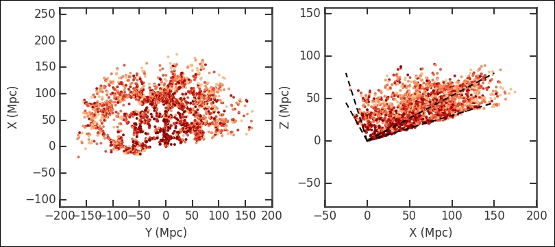
Visualizing it like this gives you a good overview, even if the data is three-dimensional. We could have made the selection after converting to X, Y, and Z coordinates and cut out a cube. Try this out and see how the results of this exercise differ. Furthermore, I recommend that you try to make a three-dimensional plot at this stage; refer to the previous chapter (
Chapter 4
, Regression) for the code. We have now reduced the catalog to cover the region that we are interested in and mapped some of the columns to values easily readable by functions. This is the time to save it in order to make it easier to start where we left off. Just like in the previous chapter, we use the HDF file format:
TABLE_FILE = 'data/data_ch5_clustering.h5'
mycat.to_hdf(TABLE_FILE, 'ch5data', mode='w', table=True)
As an alternative, if you have problems with the HDF libraries or just want an alternative, you can also save it with the pickle module, which is a standard module in Python:
mycat.to_pickle('data/data_ch5_clustering.pick')
We will read this data in Chapter 7 , Supervised and Unsupervised Learning. Now we have reduced the data so that we can run our clustering analysis on it.
The hierarchical agglomerative clustering algorithm is run in SciPy through the linkage function with this array as input. There are two main parameters to set in the linkage function, method and metric:
- Method defines the linkage algorithm to use, that is, how we estimate the dissimilarities between two clusters and thus define how clusters are formed
- Metric defines the distance metric; in this case, we are working with non-categorical variables, where distance makes sense
In our case, we have converted the data to Cartesian coordinates so that we can use the common Euclidean distance. It is possible to define your own distance function. Possible methods and metrics in the linkage function are listed in the SciPy documentation at http://docs.scipy.org/ .
The linkage function takes an N by 2 array (N data points), so here we use only the X and Y coordinates:
galpos = np.array([mycat.X,mycat.Y]).T
z_centroid = hac.linkage(galpos, metric = 'euclidean',
                         method = 'centroid')
The output here is the linkage matrix. This is the result for the whole run; it contains four columns. To quickly illustrate what it contains, we run a controlled and much smaller example. To visualize the various group levels, we also plot a dendrogram, which is done with the hac.dendrogram function that takes the linkage output as input. It visualizes the clustering sequence in a handy way. The root level is the level where the whole dataset is in one cluster. At the other end is a lower level of clustering; however, they are connected to the root level. Each node represents a group of clusters and each node connects to two subnodes. If all levels are plotted, the end node (node at the lowest level) is called a leaf node and contains only one data point (observation). How these are connected is determined by the linkage definition (dissimilarity measuring algorithm):
x = np.array([1,2,2,1,6,7,8,5])
y = np.array([8,6,8,7,1,2,2,3])
a = np.array([x,y]).T
z = hac.linkage(a, metric = 'euclidean', method = 'centroid')
fig, axs = plt.subplots(1,2,figsize=(7,3))
axs[0].scatter(x,y, marker='o', s=40, c='IndianRed')
axs[0].set_xlabel('X'), axs[0].set_ylabel('Y'),
for i in range(len(x)):
    axs[0].annotate(s=str(i), xy=(x[i]+0.1,y[i]+0.1))
ellipse1 = Ellipse(xy=(1.6,8.2),
                   width=2., height=1.2,
                   zorder=32, fc='None', ec='k', lw=1.5)
axs[0].add_artist(ellipse1)
d_temp = hac.dendrogram(z, ax=axs[1])
axs[1].annotate(s='8',
                xy=(np.mean(d_temp['icoord'][0][1:-1]),
                d_temp['dcoord'][0][1]),
                xytext=(3,3), textcoords='offset points')
axs[1].annotate(s='9',
                xy=(np.mean(d_temp['icoord'][3][1:-1]),
                d_temp['dcoord'][3][1]),
                xytext=(3,3), textcoords='offset points')
axs[1].annotate(s='10',
                xy=(np.mean(d_temp['icoord'][1][1:-1])-2,
                d_temp['dcoord'][1][1]),
                xytext=(3,3), textcoords='offset points',
                ha='right')
axs[1].annotate(s='Root',
                xy=(np.mean(d_temp['icoord'][-1][1:-1]),
                d_temp['dcoord'][-1][1]-0.3),
                xytext=(5,5), textcoords='offset points',
                va='top', ha='center')
axs[1].set_xlabel('Leafs')
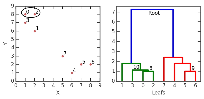
In the linkage output z, the first row is [0., 2., 1., 2.], which says the following: cluster index 0 and 2 form a group, their distance is 1, and the number of leafs (data points) in the group is 2. This group is encircled in the image. The group number is the number of original points plus the iteration number (n+i); in this case, we form cluster 8 (8+0). The third row (NB, not the second!) has the numbers [3., 8., 1.11803399, 3.] in it. It combines cluster index 3, which in this case is just the point because every cluster number less than 8 is a point/leaf with cluster 8, just what we created in the first iteration. The distance between them (with the given metric and method) is 1.111803399 and it contains three leafs. It forms the 10th cluster, that is, 8 + 2 iterations. I have illustrated these nodes in the example dendrogram and also marked cluster group number 10. Think about how it fits into the linkage output described here.
With this knowledge, we can now plot the dendrogram for the main data analysis:
fig, ax = plt.subplots(1, figsize=(8,6))
d0 = hac.dendrogram(z_centroid, p=6, truncate_mode='level',
                    orientation='right', ax=ax)
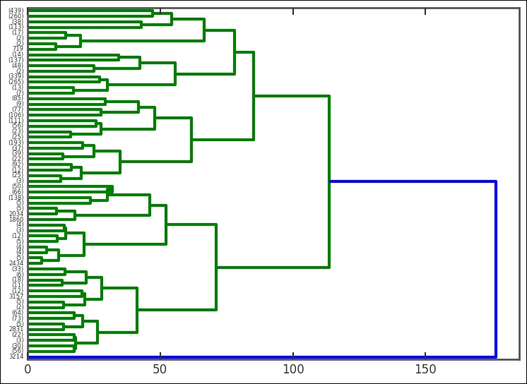
This time, I have added some parameters to the plotting function-we have tipped the whole dendrogram 90 degrees. The height between two nodes is proportional to the dissimilarity between the nodes (the distance method). Cutting this dendrogram across will give a certain amount of clusters. It's interesting to see that the root node divides only once into two clusters, where only one of them continues to divide. To get the clusters at a certain level, we use the fcluster function, also part of SciPy's clustering module. I suggest that you try different amount of clusters and plot them. In the following example, I have used 20 clusters:
nclust = 20
part_centroid = hac.fcluster(z_centroid, 20, criterion='maxclust')
Here, criterion sets the constraints on forming the clusters. Just to check the division of points in each cluster/group, we plot a histogram:
plt.figure(figsize=(7,6))
otpt = plt.hist(part_centroid, color='SteelBlue', bins=nclust);
plt.xlabel('Cluster no.'), plt.ylabel('Counts'),
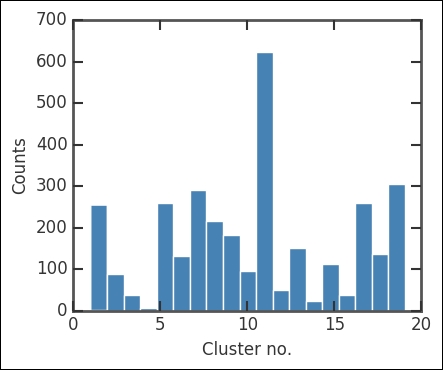
There are a lot of points in the 11th cluster. Of course, this does not tell us much, so now we plot all the clusters. As the position of each cluster, I just calculate the centroid with the mean method of the array object. This is just to mark the location of clusters more clearly:
plt.figure(figsize=(6,5))
plt.subplot(111)
part = part_centroid
levels = np.arange(nclust)
colors = plt.cm.rainbow(np.random.rand(len(levels)))
for n, color in zip(levels, colors):
    plt.scatter(mycat['Y'][part==n], -1*mycat['X'][part==n], s=12,
                color=color, edgecolor='None')
    plt.plot(mycat['Y'][part==n].mean(),
             -1*mycat['X'][part==n].mean(),
             'o', c='0.7', mec='k', ms=6,
             ls='None', mew=1.5, alpha=0.7)
plt.xlabel('Y (Mpc)'), plt.ylabel('X (Mpc)')
plt.scatter(mycat['Y'], -1*mycat['X'], s=10,
            color='0.7', edgecolor='None',zorder=-1)
plt.title('A slice of the Universe - Clusters identified')
plt.axis('equal'),
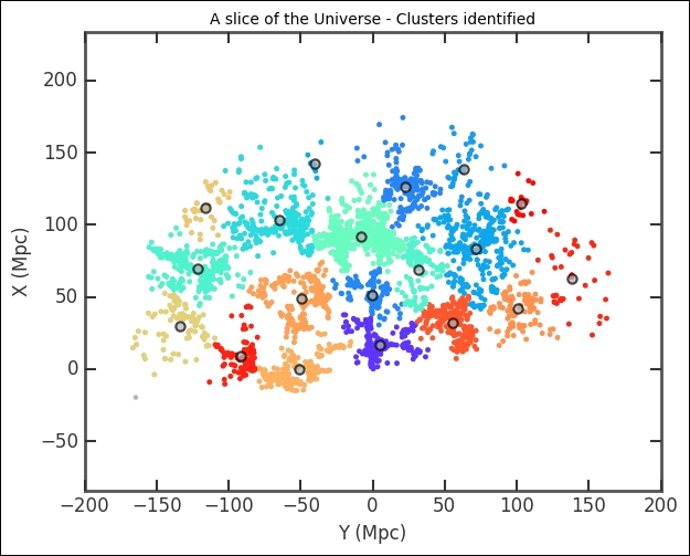
The cluster division looks solid. However, we determined the number of clusters by visually inspecting the effect of changing the number of clusters. This might not be the true or ideal number of clusters. In the previous example, we had a hypothesis of two clusters that we wanted to test, but even in that case the data might be better represented by, for example, three clusters or perhaps none (or one cluster with outliers). We want to have a reproducible way of determining the number of clusters. There are several approaches to this; there is even a dedicated Wikipedia article on how to find the number of clusters ( https://en.wikipedia.org/wiki/Determining_the_number_of_clusters_in_a_data_set ). The main problem with determining the optimum number of clusters is that we have to assume something about the cluster shapes. Hierarchical clustering circumvents this problem slightly by checking all the levels of a cluster with the assumption that each cluster is divided up into smaller clusters.
One approach measures the cluster compactness by calculating the normalized sum of the squared distances (that is, variance) for each cluster and then using this to estimate what percentage of the data that can be described by this variance in cluster size. Incrementally increasing the number of clusters, you get a graph of the increase in the coverage of the cluster by calculating the variance. When the true number of clusters has been reached, this variance (or coverage) will stop increasing and flatten out. However, this does not fit all clump shapes; imagine, for example, very elongated ellipses close to each other. In our case, the clusters at medium distances are more filamentary than clumpy (or Gaussian-like).