CHAPTER 14
mental ray Materials
THE Arch & Design MATERIAL TYPE HAS BEEN around since mental ray v3.5 and has been a factor in the ease of mental ray’s usability. In 3ds Max 2009, this material begat ProMaterials, which were Arch & Design based materials that featured a stripped-down UI. In 3ds Max 2011 and later, the ProMaterials were renamed and redesigned to become Autodesk materials. In 3ds Max 2012 there is now a huge library of Autodesk materials that are specifically designed to be even more accurate and easy to use. The Autodesk materials are an attempt to create one set of materials for multiple applications, and are standard for both Revit and 3ds Max. This chapter will focus on the Arch & Design material as it covers concepts that are applicable to any of the new materials. This chapter is not intended to be an in depth guide to all mental ray materials because providing coverage of every material type would require a dedicated book, yet would not be necessary because so many of the thousands of material settings are duplicates and the same concepts explained in this chapter will apply to all material types. This chapter will instead focus on the process of creating and troubleshooting architectural materials, and in doing so, we will learn how to use the new Arch & Design material effectively within architectural scenes.
The first material we will look at is glazing, or glass, and we’re going to cover this particular material type thoroughly because this is the perfect material type that allows us to demonstrate two of the most important characteristics of a material; reflection and refraction. In the course of discussing the creation of glass materials, we’ll look at how the same concepts discussed can be applied to other materials, such as water. After this, we will briefly look at bump maps, normal maps, displacement, and material exposure control. Each of these will be discussed through the use of the Arch & Design material.
The Arch & Design material
The Arch & Design material comes with a variety of preset templates, all of which are found within the Templates drop-down list in the Material Editor. These are great to use as starting points to see how the parameters differ from template to template. Upon completion of this chapter, I recommend examining each template to see what settings are used, and feel free to examine the new Autodesk Materials and how these concepts apply to them. We’ll start the discussion with an examination of the apparently benign material, Architectural Glazing.
Let’s discuss four key points about architectural glazing. These are Transparency, Translucency, Glossy Refraction and Sub Surface Scattering. Each of these is quite different from the other and can be used individually or in combination. The reflections will be discussed later in this chapter since they can apply to any material, not just glass.
Transparency
Obviously when you think of a window, you think of transparency. A partially transparent object will partially occlude objects behind it depending on how transparent it is, and it’s a misconception to think that window glazing is 100% transparent. Before going further, it is important to note that the Arch & Design material is energy-conserving. This means that if an object is 100% transparent the diffuse properties will have no visible effect, since in theory there will be no absorption of the refracted ray. This is physically accurate in the real world; unfortunately, no material is 100% transparent and the closest thing we have to anything fully transparent is a vacuum. To see any diffuse coloration you would need to have something less than 100% for refraction. The following example shows a glass pane with varying degrees of transparency and a pure blue diffuse color.
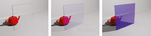
1. Open the file ch14-01.max. This scene contains a teapot and a thin box on which an Arch & Design material is applied.
2. Render the Camera view. Notice that the glass shows 100% transparency, no diffuse coloration and no shadows, as shown in the left image of the following illustration.
3. Open the Material Editor and examine the Refraction section of the Main material parameters rollout of the assigned material. Notice that the Transparency is set to 1.0, which prevents the possibility of diffuse coloration and shadows.
4. Change the Transparency to 0.9 and render again. With this change, we see some of the blue diffuse coloration and a shadow vaguely present, as shown in the middle image.
5. Change the Transparency to 0.5 and render again. Now we see 50% transparency, a much more pronounced blue diffuse coloration and a darker shadow as well. Notice, however, that the shadow remains gray, as shown in the right image.
The previous example illustrates the correlation between transparency and diffuse coloration. Now, let’s examine the correlation between transparency and refractive color. Unlike what we saw in the previous example, the rays that refract through the material will be influenced by the refractive color and will therefore allow for the raytraced shadows to take on the color of the medium. Also, note that the refraction color will also influence the transparency of the material.
6. Change the Transparency to 1.0 and set the Diffuse Color to pure black. This causes the glass to be completely transparent and not cast shadows again. You can also achieve the same result by setting the Diffuse Level to 1.0 while leaving the Diffuse Color as is.
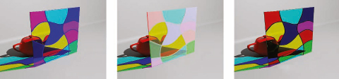
7. Click on the color swatch to the right of Transparency, set the colors to Red=0.9, Green=0.95, Blue=1.0, and render again. This slight adjustment has significant impact on the material and we now see a small amount of blue in the glass and in its shadow, as shown in the center image of the following illustration.
8. Change the colors to Red=0.3, Green=0.6, Blue=1.0, and render once again. The glass now shows a more vibrant blue hue than the right image of the previous illustration when the transparency was used to make the glass see-through.

There is typically more color intensity when using refractive coloration, which can be useful with things like stained-glass windows. It’s important to note that any refractive color other than pure white has a direct impact on the amount of transparency the material has. This means that the color of the diffuse component will start to influence the material. So if your diffuse color was red and the refractive color is blue, the glass would start to look purple.
The following examples show the influence of using a map in the refractive color component of the Arch & Design material and the corresponding diffuse contribution.
1. Open the file ch14-02.max and render the Camera view. The result is shown in the left image of the following illustration.
2. Open the Material Editor and notice that a map is loaded in the Refraction Color channel of the assigned material.
3. Click on the Diffuse Color swatch and notice that the colors are set to R=0, G=0, B=0.5. The center image shows the influence of a white diffuse color while the right image shows the influence of a black diffuse color. Notice that since the refraction color doesn’t change, neither does the strength or color of the shadow.
In all three examples there is a nice coloration of the shadows as we would expect from such a panel of colored glass, but this is not a true physical phenomenon although it is a good representation. The true physical phenomenon is the use of caustics and it is important to understand that we’re using transparent shadows to fake a caustic effect. Now let’s create a real caustic effect.
4. Select the glass pane, open the Object Properties dialog box for the pane, click on the mental ray tab and select Generate Caustics.
5. Within the Indirect Illumination tab of the Render Setup dialog box, open the Caustics and Global Illumination (GI) rollout and enable Caustics.
6. Render the Camera view. The result should look like the left image of the following illustration. Caustics are a specific type of photon that interacts more intimately with a material than regular photons. In this example, the photons will permeate through the glass pane and take on color in the process to create a realistic effect. Because the pane is flat we will not get any refocusing of light as you would expect through a magnifying glass. The last thing to do is to tell the Arch & Design material to refract light to generate caustic effects.
7. Within the Advanced Rendering Options rollout of the Material Editor, enable Refract light and generate Caustic effects and render again. The next illustration shows the comparison of the true caustic phenomenon (left) and use of transparent shadows (right).
There is another method to color the color of transparent mediums and it is found under the Advanced Rendering Options rollout of the Material Editor and shown in Figure 14-1. Here we can set the maximum distance a ray will travel into the medium before reaching the color defined by the Color at Max Distance swatch. This technique is based on the concept of persistence distance, which has been prevalent in the mental ray Glass material for years.
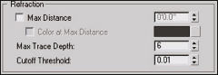
Figure 14-1. Settings to control the color of refraction according to depth of a material.
The concept is seen best in colored transparent objects that have varying thickness, such the teapot shown in Figure 14-2. You would expect a colored transparent object to have more, or less, color depending on the object’s thickness. In Figure 14-2, you can see the teapot on the left uses only the refractive color, which doesn’t give us accurate results. The teapot on the right uses persistence distance to correctly depict the colored glass. Notice that the handles and spout are lighter in color and less saturated than the body as we would expect in real life. When you create a new Arch & Design material, this option needs to be set manually, otherwise the material will render a solid color as illustrated in the left image. In a moment, we’ll experiment with the Max Distance, but first let’s look a little closer at what this is all about.
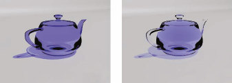
Figure 14-2. No max distance defined (left) and a max distance defined (right).
The radius of the teapot is 4” (approximately 8” at its widest). In theory, a sampling ray that enters the body of the teapot will have to travel about 8” before exiting the other side. The handle is only a fraction of this distance at its thickest (approximately 1/2” in thickness). This means that a sampling ray will only need to travel 1/2” before exiting the other side. So if we were to enter a value of 1/2” for the max distance, a sampling ray will reach the other side of the handle, yet a ray passing through the body will not. So the ray passing through the handle will reach its max distance and return the color specified at max distance, while the ray traveling through the body will not, and it will subsequently be forced to the color at maximum distance at only 1/2” depth. As the ray continues through the object, the color continues to darken since the effect is compounded. Likewise, any point on the geometry that is less than 1/2” in dimension will return a fraction of the color at max distance and will appear more transparent. Figure 14-3 shows the same teapot with differing max distance values. Note that as you increase the depth, less saturation occurs. So for highly colored glass, you would want to set the value lower, and for a more subtle effect you would want higher values.
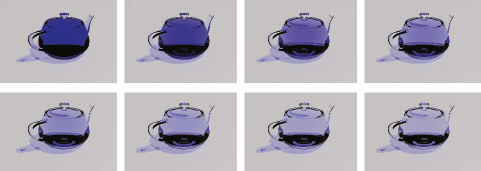
Figure 14-3. Various values of Max Distance for refraction.
1. Open the file ch14-03.max and experiment with different persistence distances to see the results as found in Figure 14-3. Notice that reflections have been disabled to see the effect better.
One great architectural use for this feature is water. Using the persistence distance enables nice depth coloration for things like pools. The depth of the pool in Figure 14-4 is approximately 4’ so the Max Distance would be set to 4’ and the color a nice rich lapis lazuli blue. This phenomenon is found in many tropical island settings where you see the aerial color of the ocean increase in richness the deeper the water gets.
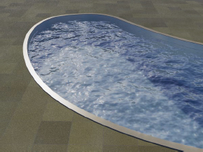
Figure 14-4. Lapis Lazuli blue for maximum depth used to depict the rich coloration of the pool.
Translucency
The next material characteristic we’ll look at is translucency, which is different from transparency and sub-surface scattering. It’s different from transparency in that it allows for rear illumination and shadow casting, and it is different from sub surface scattering in that it doesn’t scatter light rays through the medium. Below is a simple progression illustrating the difference between transparency and translucency.
1. Open the file ch14-04.max and render the Camera view. The result is shown in the top-left image of the following illustration.
2. Open the Material Editor and within the Main material parameters rollout, change the Transparency to 0.5 and render the scene again to obtain the image found in the top right of the following image. Although the material has become more opaque, we don’t see an expected shadow of the teapot on the plane. To correct this, we need to use translucency.
3. Set the Transparency back to 1.0 and enable the Translucency option found directly under the transparency settings.
4. Change the color to Pure White and render the scene again. The result should look like the bottom-left image in the following illustration.
5. Change the Weight from 0.5 to 1 and render the scene. Notice that this will totally occlude any objects behind the pane. Weight essentially sets the bias between full transparency (a weight of 0) and full translucency (a weight of 1).
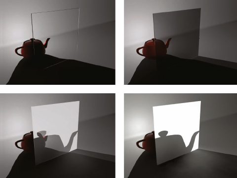
There are some key things to note with the above comparisons. First, a reduction in transparency brings an increase in GI on adjacent geometry. Notice in the top-right image of the previous illustration, that the teapot receives indirect illumination from the glass panel when the transparency is less than 1.0 but it doesn’t when transparency equals 1.0 or when translucency is used. Second, even though translucency gives the appearance of a semi-opaque material, we don’t get a scattered refraction as what we would expect from something like frosted glass. To get a true frosted glass, we will have to employ translucency and transparency, and glossy refraction as well.
Glossy Refraction
In 3ds Max, you can make the generalization that any blurry effect adds additional rendering time to a visualization. Blurry effects include a wide variety of things such as depth of field, motion blur, image sampling, GI, soft shadows, and in the case of this chapter, blurry reflections and refractions. Blurry effects are essentially the opposite of glossy effects, and the two different terms are often used to refer to the same thing.
A perfectly glossy reflection is what you see with a perfect mirror. The surface is so smooth that it creates an infinitely small specular reflection. As the surface of an object becomes rougher, the object (or material) becomes less glossy and the reflection begins to disperse due to small imperfections on the surface that are difficult or impossible to see with the naked eye. As a surface becomes more blurry, only those portions of the reflected image that have enough light intensity are immediately perceived. Thus we really only end up seeing light sources reflected in surfaces that have a low glossiness since the rest of the reflection lacks the intensity to be easily seen. This effect is simulated through the use of shaders, which are algorithms designed to recreate the look of this blurry dispersed reflection.
Historically these shaders were created and named after the mathematicians who created them. Those who are familiar with standard shaders such as Phong, Blinn, Strauss, Lambert, and the like, have been using these synthetic methods of creating a specular highlight. The truth of the matter is that in order to get a true specular highlight, you’ll need to have a true reflection and blur it based on how many reflected rays are redirected at a microscopic level. This is achieved by sampling many times at a point on the reflected surface. The more samples, the better quality the blurred reflection will be. We’ll also see that reflected areas, like light source reflections, will appear to grow in size and create broader highlights the less glossy a surface becomes.
In this chapter, we will look closely at blurry refractions and then move on to blurry reflections. It is important to note, however, that for the purpose of this chapter, the word blurry will usually be substituted with the term glossy, because in mental ray, settings are usually labeled with the word glossy or glossiness. In reality, the two words blurry and glossy are antonyms, although they are used interchangeably to refer to same concept.
1. Open the file ch14-05.max and render the Camera02 view. Notice that the glass casts a shadow because the glass isn’t totally transparent.
2. Open the Material Editor and within the Refraction section of the Main material parameters rollout, change the Refraction Glossiness to 0.5. Notice that the Glossy Samples spinner becomes active.
3. Render the Camera view again. Notice that there is no difference in the render even though we have a glossiness of 0.5. This is because the quality of the glossiness will be driven by the number of glossy samples, and no glossy samples effectively turns this feature off.
4. Increase the Glossy Samples to 1. The result should look like the following illustration.
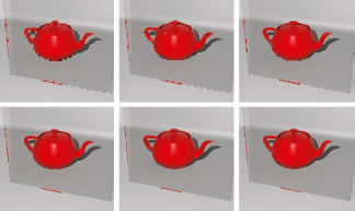
Notice how grainy the result is. If we increase the number of glossy samples, we increase the quality but at a cost of longer render times. The next illustration shows the result of increasing glossy samples to 8, 32, and 64 samples, from left to right. As we can see, there is no real improvement in quality, yet if you use higher values like these you could see much longer render times. The Fast Interpolation feature allows us to get similar results in a fraction of the time.
5. Enable the Fast Interpolation option, set the Glossy Samples back to 0 and render the scene again. Notice that there is now a blurring of the teapot and that this blurring becomes more apparent with lower glossiness settings. We can control the blurring through the Fast Glossy Interpolation rollout of the Arch & Design material.
6. Open the Fast Glossy Interpolation rollout. This interpolation works through an algorithm that blurs a lower resolution of the refracted image. By default, it is set to 1/2 the resolution of the final image and is made to blur over 2 pixels because of the Neighboring points to look up value, as shown in the following illustration.
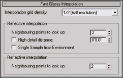
7. In the Refractive Interpolation section (not reflective) of this rollout, set the Neighboring points to look up to 0 and render again. The result is an image with a slightly smaller degree of blurring. A value of 0 provides the smallest amount of blurring and if you want less you will simply have to disable interpolation.
8. Try rendering with several different Interpolation grid density settings. Reducing the resolution of the grid results in an image with the same blurring but a more pixilated appearance. The benefit of this reduction is faster renderings and less RAM consumption; however, values lower than resolution are often unacceptable for production renderings. The following image progression clockwise from the top-left shows a grid density of 1/5, 1/4, 1/3, 1/2, 1 and 2 (double). Notice that the reflection interpolation uses the same resolution as the refraction interpolation, but its own look up value. The concepts mentioned here for refraction interpolation work the same way for reflection interpolation.
All of the previous examples show no interpolation values, meaning the Neighboring points to look up are set to 0. Fast interpolation will blur the refracted image by blending neighboring points. The lower the resolution of the refracted image, the more pronounced the blur effect will be. This means that the level of blur will decrease as we use higher resolution interpolation grids.
9. Set the Interpolation grid density to 1/5, and set the Neighboring points to look up to 1. Notice how the refracted image starts to blur and smooth out.
10. Increase the Neighboring points to look up to 2 (the default) and render again. The image continues to blur and become smoother. The following image series shows an interpolation grid density of 1/5 and increasing values 0, 1, 2, 3, and 4 Neighboring points to look up.

We can further define the look of the fast glossy interpolation by using it in conjunction with the Glossiness and Glossy Samples values in the Main material parameters rollout.
11. With the interpolation grid still set to 1/5 and the Neighboring points to look up still at 2, set the Glossiness to 0.5, and the Glossy Samples to 0 and render again. The result should look like the left image of the following illustration. Remember that without any glossy samples the result will be an image that is not blurred – at least not because of the Glossiness value; however, there is blurriness here because of interpolation. But you could set the Glossiness to 1.0 and Glossy Samples to 0 and you will still always have blurriness if interpolation is enabled.
12. Increase the Glossy Samples to 1 and render again. Notice that there is a very noticeable amount of noise in the glossy refraction.
13. Increase the Glossy Samples to 8 and render again. Notice that there is almost no noise now, as shown in the right image of the following illustration. Even though we’re using more Glossy Samples, we don’t increase our render time but definitely increase quality.
14. Disable Fast (interpolate) and render again. There is a noticeable difference in appearance to materials with and without interpolation. With interpolation you can achieve much faster glossiness; however, you cannot achieve the fine grainy noise that is typical with frosted glass. Whether you should use interpolation is just as much about the look you want as it is about the increase in speed.
Self Illumination
Next we’ll need to look at self illumination since this is a perceivable trait found in a variety of materials that exhibit internal light scattering like frosted glass. Self illumination is a way to effectively fake this effect and save on rendering times.
1. Open the file Ch14-06.max and render the Camera01 view. The glass pane contains a slightly transparent material with interpolated glossiness.
2. Within the Self Illumination (Glow) rollout enable the Self Illumination (Glow) option. The result should look like the following illustration, where the glass pane now uses a small amount of self illumination because it would essentially act as a light source in the real world when lit from behind as it is. We can easily use the same settings to create things like drapes or shear fabrics. It’s also important to note that the material doesn’t have any reflection yet as we will be talking about this next.

One last thing to examine is the difference between what we’ve created and a Sub Surface Scatter material. Sub surface scattering is a true physical phenomenon that scatters light rays within the medium, and while some get absorbed, others bounce back out giving the appearance of illumination from within. To accomplish this using photons and participating media can get complex. Luckily there are shaders that allow us to get similar results but with an easier workflow. That being said, the SSS materials are not without technical problems and shortcomings
Sub Surface Scattering
We will briefly introduce the SSS Fast material here as the complexity can be cumbersome to tackle within a brief architectural overview of mental ray.
1. Open the file Ch14-07.max.
2. Open the Material Editor and notice that a SSS Fast Material has been applied to the pane.
3. Render Camera01 view. The result should look like the following illustration. If you were to create a SSS Fast Material, you would notice that the material is set by default to emulate skin. To see this, create a new SSS Fast Material and notice that the color of the swatches resembles that of computer generated skin. For our purpose, we set both scatter colors to a Jade green for our pane material. Most importantly, look for the Scale Conversion Factor located in the materials’ Advanced options. Set the Scale Conversion Factor to 1 and render. Then set it to 0.5, and 0.05 rendering each to see the results. The Scale Conversion Factor is what sets the overall influence of the effect. You can play with this value to create the look you want.
For most architectural purposes you would change both the Front Surface Scatter color and the Back Surface Scatter color to the color of the media we’re trying to mimic. These front and back surface scatter colors can be set independently of each other if you want to create a more complex material.
One very important note with regard to SSS and global illumination is that there is one option that needs to be checked for the effect to be seen in scenes that use global illumination. In the Advanced Options rollout is a switch for ‘Screen’ (soft) compositing of layers, which will need to be enabled or disabled depending on your scene.
Figure 14-5. The ‘Screen’ (soft) compositing of layers option.
Reflection
Reflections are critical for any material to achieve photorealism. Everything casts a reflection and it all depends on the characteristics of the surface, material, and the angle at which we view the surface as to how much reflection we see. You may be surprised to learn that elements like concrete, stone, stucco, wood, and even fabric all reflect light and benefit from glossy reflections. The trick is to know how glossy they should each be and how to control the reflections based on things like viewing angle.
Recall that there were templates that acted as presets for some architectural materials? Take a look and see what templates use reflections by default. Materials like masonry have a reflectivity of 0.3 and glossiness of 0.1. Even rough concrete has a reflectivity of 0.3 and glossiness of 0.5.
With technology advancing so quickly and computers becoming more powerful, we can use computationally expensive glossy refractions and reflections to accurately define materials within our scenes. But before we create things like stainless steel, wood, leather, fabric, etc…, we need to understand how reflections work within mental ray’s Arch & Design material.
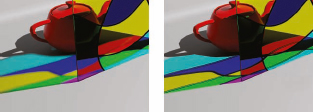
As mentioned previously, the Arch & Design material is energy conserving. So by definition, if a material is 100% reflective we shouldn’t be allowed to see the diffuse component, yet we do. This is due to the BRDF or Bi-Directional Reflection Distribution Function. Simply put, this is falloff. The amount of reflection you see depends on the angle from which you view the surface of a 3D object.
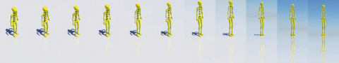
Figure 14-6. BRDF in action as seen in the reflection intensity at various viewing angles.
Notice how faint the reflection in Figure 14-6 is at the start of the sequence (left), and how it progressively gets stronger the more our view becomes perpendicular to the surface normal. To better understand what is happening, let’s examine the graphical representation within the BRDF rollout shown in Figure 14-7.

Figure 14-7. The BRDF rollout.
There are essentially two options available here. The first option is true Fresnel reflections, and the second is a custom option that allows you to define the reflection function manually using the function curve. True Fresnel reflections occur on every material in the real world and simply put, they are reflections that become more prominent and defined as the angle of a surface normal becomes more perpendicular to one’s view. Unfortunately, what is real and what we want to see are usually two different things. For that reason, we can fine-tune the reflection function by manually adjusting the BRDF function curve.
The first two settings are for the amount of reflection the material will have at 0 and 90 degrees to the line of sight, and the third setting dictates how we transition between them (the overall shape of the graph). By default, the 0 deg. refl. is set to 0.2, or 20%, and the 90 deg. refl. is set to 1.0, or 100%. The curve shape determines the reflection distribution. By default we maintain 20% reflection until the surface normal reaches 45 degrees to our line of sight (depicted halfway between 0 and 90 on the graph). Reflection then exponentially increases to 100% reflection as the surface normal is between 45 and 90 degrees to our line of sight. To get an object to be 100% reflective, like a mirror, we need to increase both the 0 deg. refl. and the 90 deg. refl. to 100% so that no matter which way the surface normal is oriented, we’ll see 100% reflection.
Glossy Reflections
Glossy reflections are a critical component of any material but often come at a huge cost in rendering time. We’ve already spent a lot of time examining glossy refraction and a lot of what we’ve learned thus far is applicable to reflections. The following section covers a few peculiarities of glossy reflections.
We’ve seen that higher quality glossy settings come at a cost of longer render times and need to be set appropriately for the scene to render efficiently. For example, if we had a material with solid color, we would more likely have to adjust our glossy settings quite high since a solid material is less forgiving than that of a texture in revealing artifacts. With a texture we could get away setting a lesser quality since the texture would essentially hide the artifacts from a lower sampling rate.
When we deal with materials that have a very low glossy value we can get away with a couple of optimizations. These are found in the Reflection group of the Arch & Design material. Materials, such as stone or fabric, that do not require the use of high sample values will benefit from these optimizations. I’ll present a couple of options for you to use on materials of these types:
• Use the Fast (Interpolate) option to create broad glossy effects, especially on flat surfaces like the floor shown in Figure 14-8. Notice that when using this option the reflection is blurred throughout the entire reflection as shown in the right image of Figure 14-8. We saw previously that lower Interpolation Grid Densities will result in more exaggerated blurriness and that the Neighboring Points to Look Up will improve the quality but also increase the blurriness.
• Use the Highlights+FG Only option to essentially turn your material into a standard shader. This means that it will only reflect light sources and/or use final gather points to produce specular highlights. This method is quick but does not create acceptable glossy reflections. This would be better suited to materials that have very subtle glossy reflections.
• Use the Metal Material to recreate metal materials where the specular reflection (or highlight) is influenced by the diffuse color. This is seen on the gold torus knot in each image. Notice that the specular highlights are yellow, not pure white. This is true for all metal surfaces.

Figure 14-8. True glossy reflection (left) and Fast Interpolated reflection (right).
Notice the shallow reflections closest to the torus knot in true glossy reflections are crisper than those in the fast interpolate option.
1. Open ch14-08.max and render the Camera01 view. This is the scene used to render the images in Figure 14-8.
2. Examine the difference in render times and appearance with and without the use of the options just mentioned; Fast (interpolate), Highlights+FG only, and Metal material. Note that you can use Fast (interpolate) and Metal material together, but if you use Highlights+FG only with Fast (interpolate), the Fast (interpolate) option will be ignored.
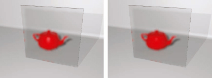
Since the Fast (interpolate) glossy effect blurs the entire reflection, it may be less than believable in some circumstances. This is remedied by using the High detail distance option in the Fast Glossy Interpolation rollout. When enabled this will allow you to have the illusion of true glossy reflections by casting more rays to sample the shallow reflections and give them more detail. This works well for textures but still blurs the reflection of the geometry.
In the left image of Figure 14-9, you can see the entire reflection is blurred because of interpolation but this is remedied in the right image where the High detail distance option is used to show the appearance of true glossy reflection falloff. Note the edges of the cylinder have the same amount of blur for both images.
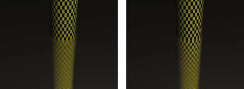
Figure 14-9. Blurry reflections with the High Detail Distance option disabled (left) and enabled (right).
Special Application of Reflections
One could argue that reflections are a product of their environment, meaning that a reflection is only as good as the environment it reflects. The more reflective a material is, the more that material requires a decent environment to define its appearance. Materials such as water, steel, and glass are all just a few examples of reflective materials that require an environment to be displayed properly. Without the environment, the materials will lack depth and subtle details can be lost.
As mentioned in Chapter 9, you should always create a 3D background rig rather than relying on the Environment channel within the Environment and Effects dialog box. However, the Arch & Design material (as well as many others) has an environment channel of its own that acts to enhance whatever is used as the true background in the scene; either the 3D background rig or the one loaded in the Environment and Effects dialog box. This environment channel within the material is a handy way to create a quick background reflection in a specific material or to improve on the reflection of the real background. In the case of reflections, where you load a background is not as important as whether or not you do.
The following exercise illustrates how we can add more realism by simply adding a spherical environment map in the Environment channel of the Arch & Design material.
1. Open Ch14-09.max and render the Camera view. This scene has a simple building facade with Alucabond and glazing and is illuminated by a mr Daylight system. The materials look sterile and lack depth because no environment map was used.
2. Open the Material Editor, select the White Alucabond material and open the Special Purpose Maps rollout. Notice that a bitmap is loaded in the Environment channel of this material but the map is disabled.
3. Enable the Environment channel map and render the scene again. The result should look like the right image of the following illustration. The materials look very dark due to the exposure control. To compensate for this we need to boost the RGB Level of the bitmap.
4. Within the Output rollout of the bitmap you just enabled for the environment channel, increase the RGB Level to its maximum of 9,999 and render the scene. The result should look like the left image of the following illustration.

Bump Maps and Normal Maps
Bump maps are fairly self-explanatory and work well for adding an apparent distortion in the reflective surface. Any map type can be used to generate a bump in the Arch & Design material. You simply need to add a map and adjust the bump intensity with the associated amount value, as seen in Figure 14-10, where a standard Cellular map was used. However, there is a particular flavor of bump found within the Special Purpose Maps rollout. Do not apply bumps to the diffuse shading is the new flavor and warrants some discussion.
Figure 14-10. The option to prevent an applied bump map from affecting diffuse shading.
As you can see in Figure 14-11, the bump is much more subtle and looks detached from the diffuse component. This allows for a more subtle bump effect that can be beneficial for wet surfaces or shellac/clear coat finishes.
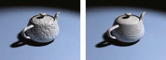
Figure 14-11. A standard bump (left) and Do not apply bumps to the diffuse shading (right).
The map type that bridges the gap between bump and displacement is the normal map. This uses a RGB color-coded map to generate bump map effects that are more convincing than traditional bump maps. There are several ways to generate a normal map but the easiest way is to simply use an existing texture and generate a normal map using software like Crazy Bump (www.crazybump.com). The only difference between using a bump map and a normal map is the shader you use. In the Arch & Design material, we can simply apply a Normal Bump map shader in the Bump slot found in the Special Purpose Maps of the Arch & Design material and choose the Normal Bump map as our bump map (as the left image of Figure 14-12 depicts).
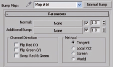
Figure 14-12. The Normal Bump Parameters
The result of using this bump type is subtle in stills and best illustrated through animated lighting. I only mention it here as an alternative to regular bump mapping and leave the experimentation up to you.
Displacement
Displacement is a little more complicated than bump or normal mapping. We’ll only discuss displacement as it is found in the Arch & Design material since there are other displacement shaders available that are outside the scope of this book. It’s very straight-forward to apply a texture for displacement, but the trick is to properly prepare the geometry and adjust the displacement global settings to achieve the look you need. Displacement tessellates geometry to produce a mesh with enough resolution to effectively add the geometric detail needed. We need to control this tessellation by first having enough detail in the geometry.
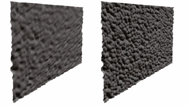
1. Open the file ch14-10.max and render the scene. This scene contains just a simple plane with 1 length and width segment. All you see rendered is this ordinary plane.
2. Open the Special Purpose Maps rollout of the applied Arch & Design material within the Material Editor and enable a basic Cellular map loaded in the Displacement channel. Adjust the displacement spinner to 3 to emphasize the effect.
3. Render the scene again and you should see the displacement in the object as shown in the left image of the following illustration. Notice the lack of displacement detail compared to the image on the right.
4. Increase the length and width segments of the plane object from 1 to 20 and render again. The result is the right image.
5. Open the Render Setup dialog box and within the Renderer tab open the Shadows and Displacement rollout. The Displacement section of this rollout, shown in the following illustration, controls global settings for displacement within mental ray.
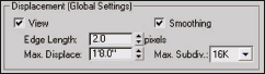
By default, displacement is set to View, which will adaptively subdivide the mesh for displacement. Polygons that are further away from the camera will not be subdivided as much as those that are closer. This is good but may cause some artifacts in highly detailed displacements, especially if you have a large surface that extends deep into your scene. You can turn off View to have the geometry tessellated globally. You’ll notice that when you do this, Edge Length is no longer defined in pixels but in real world units.
We can also define a maximum global displacement value. This essentially clips the displacement so it can never exceed the global height. One of the most important parameters here is the Max. Subdiv. fly-out. This value specifies the maximum number of triangles any polygon will be divided into. By default it is set to 16,000 triangles. This can be as low as 4 or as high as 64,000. If your geometry is of high enough resolution, you can get away with lower values, which can ultimately save your render times since not as many tessellations are required at render time. Typically when using displacement, it is good practice to have a dense mesh to do displacement on. Otherwise, if your mesh has a low face count, you won’t get very detailed displacement even with the Max. Subdiv. set high. So you may need to add a tessellation modifier if your geometry is too low a resolution.
Lastly, you can force mental ray to produce better displacement detail by lowering the Edge Length parameter. Lower values force more detail but with longer render times. Higher values relax the tessellation process and result in quicker render times but at a cost of lower detail.
Material and Exposure Control
There have been countless arguments about gamma correction and exposure controls. Typically using one or the other, or even both in combination, have been adopted by numerous users and studios. I prefer using exposure controls without any gamma correction. So because of this I wish to convey a couple of tips with regard to getting materials to render accurately when using exposure control. Typically, exposure control can lighten the material considerably and give it the appearance of being washed out. While this seems problematic, there is a simple way to bring them back. The first method applies to textures. Simply apply a curve correction within the texture itself. The following image shows a proper compensational curve adjustment. Note you will have to change the control point to a Bezier type by right clicking on it and selecting Bezier from the list.
Figure 14-13. Adjustment needed for bitmap textures to render properly with exposure control.
The second method of color correction with exposure control deals with solid colors. For example, if you were given a specific color to reproduce in your rendering and you use exposure control, you would need to adjust the color by using the square value of each of the R, G, B color components. If the tan color shown in the left image of Figure 14-14 is what you want depicted in a rendering, then when exposure control is used you will need to use the altered color shown on the right, which is achieved by taking the square of each R, G, B value. The color will be darker in the color swatch but will yield the desired color when exposure control is used. Notice that 0.859 x 0.859 =0.738, 0.761 x 0.761 = 0.579, and 0.529 x 0.529 = 0.28. Here is a rendered comparison between these two colors.
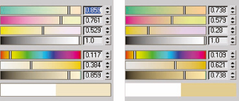
Figure 14-14. An intended color (left) and the adjusted color by the intended color, Right; The adjusted color by squaring the values.
Figure 14-15 shows an example of this technique in action using the colors shown in Figure 14-14.
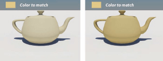
Figure 14-15. Color correcting by squaring the RGB values when using exposure controls.
A quick tip to find the square value is to use the Numerical Expression Evaluator by selecting the numerical field and pressing Ctrl+N on the keyboard. Then you can enter the value and square it. For example if the value for Red is 0.5, we can click on the value spinner and press Ctrl+N and enter 0.5^2, which will yield 0.25.
Autodesk Material Libraries
The most recent evolution of the Arch & Design material is now called the Autodesk Material. In the 2012 release of 3ds Max, Autodesk ships hundreds of mental ray based materials-shared materials used by AutoCAD, Inventor, Revit, and 3ds Max. These materials represent industry standard paints, finishes, and surfaces so CAD designers can apply materials without having to worry about understanding the material parameters.
These materials allow you to design in Revit or Inventor, and then export those files complete with materials into 3ds Max for rendering via fbx. These materials are actually Arch & Design based materials, with a simplified UI, so that the casual user will not be intimidated by the overwhelming complexity found in the Arch & Design material type. By making 22 individual material types out of the various Arch & Design Templates, the developers have been able to simplify the choices they give you to manipulate any particular material. Be forewarned, the downside of this idea is that if you tinker with the material in 3ds Max you’ve destroyed the connection with the original library. Autodesk recommends you use the materials as they are to preserve the concept of a universal material library that can be shared by users everywhere.
If you want to customize the materials you can change any material into an Autodesk Generic Material, in fact a new Copy to Generic feature is now part of 3ds Max 2012. Simply right-click on the Material Type button in the material editor and select Copy to Generic.
One other new feature in 2012 Generic Material is the Color by Object option. In the Generic rollout you can easily force the diffuse color to match the object color using this new option.
![]()
If you examine the Autodesk Generic material you will find that it has a comprehensive set of parameters, nearly comparable to the Arch & Design material. Years ago Autodesk took the Standard material and repackaged it as the Architectural material, it appears the same thing has happened here with the Autodesk Generic material type.
If you take the time to go through all these rollouts you will find most of the features and functions of the Arch & Design material, with only a few omissions such as the ability for Self Illumination materials to actual generate light in a scene. The promise of seamlessly interaction with CAD programs like Revit and Inventor should excuse those shortcomings. Autodesk seems very serious about trying to make its various products work together, and this appears to be a strong start in that direction.
iray renderer
New to 3ds Max 2012 is the iray renderer, which is a time-based mental ray renderer. Perhaps because people complained about long render times, this type of rendering lets you set how much time you want to spend, and then you know the rendering will only take that long. If the quality is not sufficient, you render for a longer period of time to achieve the desired result.
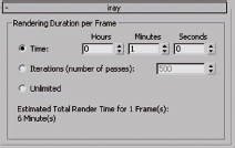
Once you have assigned the iray renderer using the Assign Renderer rollout of the Render Setup Dialog, you can access the iray rollout. Enter the amount of time you want to spend on the render and then press Render and that is how much time will be used. If you select Unlimited the rendering will go on for as long as you let it. To stop the render press Cancel on the Render dialog when the rendering is of satisfactory quality.
Instead of the bucket rendering you’ve seen with mental ray, iray slowly refines the entire image at once, sort of gradually bringing the entire image into focus as time progresses.
1. If you want to give iray rendering a try, open ch14-11.max.
2. On the Render setup dialog, choose the iray tab and set the time to 3 minutes, then render the camera view.
3. When the rendering is complete, change to Unlimited and render again. Press Cancel to stop the rendering when you have seen enough.
In the illustration that follows the image on the left represents the iray rendering after 10 seconds, the image on the right is the rendering after 5 minutes.
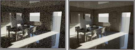
Figure 14-16. 5 seconds into iray on left, 5 minutes into iray on right.
The iray renderer takes advantage of nVidia trademarked CUDA technology, which allows offloading computational work to the graphics device, accelerating the rendering. If you have access to this hardware, your render times will be cut significantly.
The iray renderer doesn’t supportable programmable mental ray shaders, it has limitations only understanding a subset of the mental ray features. Review the iray renderer topic in the help system for a complete list of what is and isn’t iray compatible. If an object lacks the correct material, iray will render the object in a neutral gray.
It takes a while to get used to the fact that you can’t use all the mental ray tricks you’ve developed when rendering using iray. There is no final gather, no photons. Similar to the thinking with the Autodesk Materials, the iray renderer should be rendering made simple.
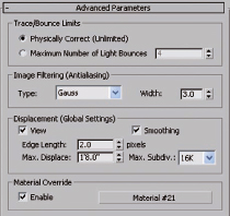
The iray Advanced Parameters rollout gives you only a few of the choices compared to what you are used to using in mental ray, such as Maximum number of Light Bounces, Image Filtering, Displacement and Material Override. The lack of Render Region is probably the most common complaint regarding missing functionality. Anticipate more tools in the next release.
While I have not used iray extensively in production, I have gathered comments from Jennifer O’Conner, mental ray guru, who is using iray for her visualization work now. Here are her suggestions:
• If you are rendering animation, you should probably stick with mental ray for now; you can’t reuse final gather or other cached computations, so every frame will recalculate these in iray.
• iray seems to be especially useful for heavy duty scenes with lots of reflections and tricky lighting. If you have the requisite hardware it will be faster than mental ray. On small scenes, mental ray will be much faster.
• iray doesn’t support standard materials, so convert your architectural and standard materials to Arch&Design materials unless you like gray. MasterZap has a script for this, search on Zap’s “mr Arch Design Tools”.
• iray lets you render without lights, by using self-illuminated objects as light sources. People seem to like this, kind of resembles studio lighting workflow. Use photometric lights AND self-illuminated objects for best results. Watch out Revit users, when you export your lights, you’ll be getting lights AND self-illuminated objects upon import, this will give you double illumination.
• Unlike mental ray, iray doesn’t care how many lights you throw at it, it doesn’t start to crawl when you put in too many lights. Every surface is considered a light source in iray.
• Depth of Field comes free with iray and doesn’t slow down your rendering, which is great.
• People ask which CUDA devices – nVIDIA GPUs (Fermi class hardware) are best. You probably want the 3 GB GTX 580 if you work on medium-size projects, if you’re visualizing bigger max files, get nVIDIA Quadro. iray expects you have lots of memory. Every object is held in memory as geometry.
• Plugins competing with iray include finalRender 4GPU from cebas, and Bunkspeed.
Summary
This chapter is meant as a springboard to initiate ideas and inspiration to create your own architectural materials and give you the tools needed to create them. The information presented here is just the tip of what can be done, but explains tried and true architectural techniques that are used in production. I’ve tried to limit the discussion to the Arch & Design material, which is a one-stop shop for almost anything you’d require. The new pro materials can be used to simplify this process but in doing so avoid the details needed to better understand materials. Once you become more comfortable with mental ray, I would suggest seeking out more information on the wide availability of shaders which can open up worlds of possibilities. A separate book can be written on this topic alone. Always remember to have fun, and take it further than where you found it.