 Combining box plots and kernel density plots with violin plots
by Luiz Felipe Martins, Magnus Vilhelm Persson, Ivan Idris, Martin Czygan, Phuong V
Python: End-to-end Data Analysis
Combining box plots and kernel density plots with violin plots
by Luiz Felipe Martins, Magnus Vilhelm Persson, Ivan Idris, Martin Czygan, Phuong V
Python: End-to-end Data Analysis
- Python: End-to-end Data Analysis
- Table of Contents
- Python: End-to-end Data Analysis
- Python: End-to-end Data Analysis
- Credits
- Preface
- 1. Module 1
- 1. Introducing Data Analysis and Libraries
- 2. NumPy Arrays and Vectorized Computation
- 3. Data Analysis with Pandas
- 4. Data Visualization
- 5. Time Series
- 6. Interacting with Databases
- 7. Data Analysis Application Examples
- 8. Machine Learning Models with scikit-learn
- 2. Module 2
- 1. Laying the Foundation for Reproducible Data Analysis
- Introduction
- Setting up Anaconda
- Installing the Data Science Toolbox
- Creating a virtual environment with virtualenv and virtualenvwrapper
- Sandboxing Python applications with Docker images
- Keeping track of package versions and history in IPython Notebook
- Configuring IPython
- Learning to log for robust error checking
- Unit testing your code
- Configuring pandas
- Configuring matplotlib
- Seeding random number generators and NumPy print options
- Standardizing reports, code style, and data access
- 2. Creating Attractive Data Visualizations
- Introduction
- Graphing Anscombe's quartet
- Choosing seaborn color palettes
- Choosing matplotlib color maps
- Interacting with IPython Notebook widgets
- Viewing a matrix of scatterplots
- Visualizing with d3.js via mpld3
- Creating heatmaps
- Combining box plots and kernel density plots with violin plots
- Visualizing network graphs with hive plots
- Displaying geographical maps
- Using ggplot2-like plots
- Highlighting data points with influence plots
- 3. Statistical Data Analysis and Probability
- Introduction
- Fitting data to the exponential distribution
- Fitting aggregated data to the gamma distribution
- Fitting aggregated counts to the Poisson distribution
- Determining bias
- Estimating kernel density
- Determining confidence intervals for mean, variance, and standard deviation
- Sampling with probability weights
- Exploring extreme values
- Correlating variables with Pearson's correlation
- Correlating variables with the Spearman rank correlation
- Correlating a binary and a continuous variable with the point biserial correlation
- Evaluating relations between variables with ANOVA
- 4. Dealing with Data and Numerical Issues
- Introduction
- Clipping and filtering outliers
- Winsorizing data
- Measuring central tendency of noisy data
- Normalizing with the Box-Cox transformation
- Transforming data with the power ladder
- Transforming data with logarithms
- Rebinning data
- Applying logit() to transform proportions
- Fitting a robust linear model
- Taking variance into account with weighted least squares
- Using arbitrary precision for optimization
- Using arbitrary precision for linear algebra
- 5. Web Mining, Databases, and Big Data
- Introduction
- Simulating web browsing
- Scraping the Web
- Dealing with non-ASCII text and HTML entities
- Implementing association tables
- Setting up database migration scripts
- Adding a table column to an existing table
- Adding indices after table creation
- Setting up a test web server
- Implementing a star schema with fact and dimension tables
- Using HDFS
- Setting up Spark
- Clustering data with Spark
- 6. Signal Processing and Timeseries
- Introduction
- Spectral analysis with periodograms
- Estimating power spectral density with the Welch method
- Analyzing peaks
- Measuring phase synchronization
- Exponential smoothing
- Evaluating smoothing
- Using the Lomb-Scargle periodogram
- Analyzing the frequency spectrum of audio
- Analyzing signals with the discrete cosine transform
- Block bootstrapping time series data
- Moving block bootstrapping time series data
- Applying the discrete wavelet transform
- 7. Selecting Stocks with Financial Data Analysis
- Introduction
- Computing simple and log returns
- Ranking stocks with the Sharpe ratio and liquidity
- Ranking stocks with the Calmar and Sortino ratios
- Analyzing returns statistics
- Correlating individual stocks with the broader market
- Exploring risk and return
- Examining the market with the non-parametric runs test
- Testing for random walks
- Determining market efficiency with autoregressive models
- Creating tables for a stock prices database
- Populating the stock prices database
- Optimizing an equal weights two-asset portfolio
- 8. Text Mining and Social Network Analysis
- Introduction
- Creating a categorized corpus
- Tokenizing news articles in sentences and words
- Stemming, lemmatizing, filtering, and TF-IDF scores
- Recognizing named entities
- Extracting topics with non-negative matrix factorization
- Implementing a basic terms database
- Computing social network density
- Calculating social network closeness centrality
- Determining the betweenness centrality
- Estimating the average clustering coefficient
- Calculating the assortativity coefficient of a graph
- Getting the clique number of a graph
- Creating a document graph with cosine similarity
- 9. Ensemble Learning and Dimensionality Reduction
- Introduction
- Recursively eliminating features
- Applying principal component analysis for dimension reduction
- Applying linear discriminant analysis for dimension reduction
- Stacking and majority voting for multiple models
- Learning with random forests
- Fitting noisy data with the RANSAC algorithm
- Bagging to improve results
- Boosting for better learning
- Nesting cross-validation
- Reusing models with joblib
- Hierarchically clustering data
- Taking a Theano tour
- 10. Evaluating Classifiers, Regressors, and Clusters
- Introduction
- Getting classification straight with the confusion matrix
- Computing precision, recall, and F1-score
- Examining a receiver operating characteristic and the area under a curve
- Visualizing the goodness of fit
- Computing MSE and median absolute error
- Evaluating clusters with the mean silhouette coefficient
- Comparing results with a dummy classifier
- Determining MAPE and MPE
- Comparing with a dummy regressor
- Calculating the mean absolute error and the residual sum of squares
- Examining the kappa of classification
- Taking a look at the Matthews correlation coefficient
- 11. Analyzing Images
- Introduction
- Setting up OpenCV
- Applying Scale-Invariant Feature Transform (SIFT)
- Detecting features with SURF
- Quantizing colors
- Denoising images
- Extracting patches from an image
- Detecting faces with Haar cascades
- Searching for bright stars
- Extracting metadata from images
- Extracting texture features from images
- Applying hierarchical clustering on images
- Segmenting images with spectral clustering
- 12. Parallelism and Performance
- Introduction
- Just-in-time compiling with Numba
- Speeding up numerical expressions with Numexpr
- Running multiple threads with the threading module
- Launching multiple tasks with the concurrent.futures module
- Accessing resources asynchronously with the asyncio module
- Distributed processing with execnet
- Profiling memory usage
- Calculating the mean, variance, skewness, and kurtosis on the fly
- Caching with a least recently used cache
- Caching HTTP requests
- Streaming counting with the Count-min sketch
- Harnessing the power of the GPU with OpenCL
- A. Glossary
- B. Function Reference
- C. Online Resources
- D. Tips and Tricks for Command-Line and Miscellaneous Tools
- 1. Laying the Foundation for Reproducible Data Analysis
- 3. Module 3
- 1. Tools of the Trade
- 2. Exploring Data
- 3. Learning About Models
- 4. Regression
- 5. Clustering
- 6. Bayesian Methods
- 7. Supervised and Unsupervised Learning
- 8. Time Series Analysis
- E. More on Jupyter Notebook and matplotlib Styles
- A. Bibliography
- Index
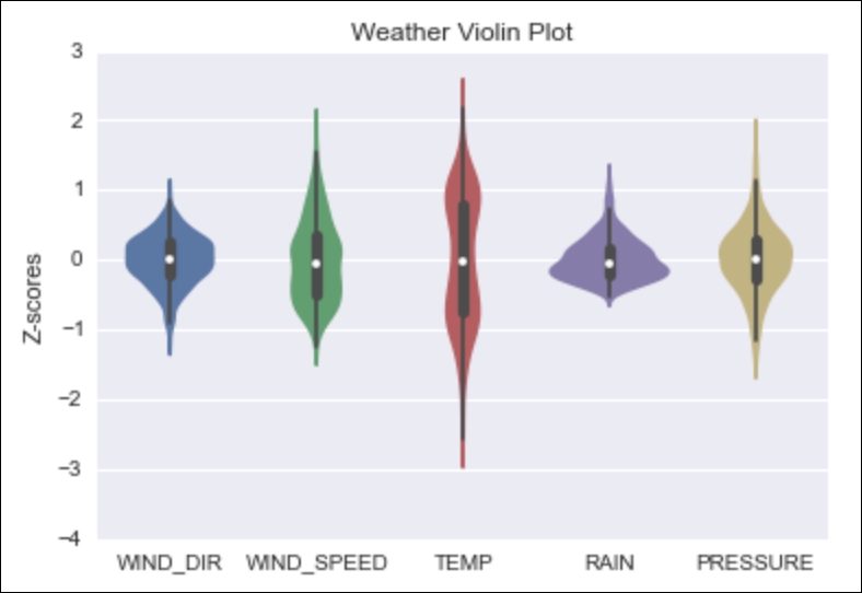
Violin plots combine box plots and kernel density plots or histograms in one type of plot. Seaborn and matplotlib both offer violin plots. We will use Seaborn in this recipe on z-scores of weather data. The z-scoring is not essential, but without it, the violins will be more spread out.
- Import the required libraries as follows:
import seaborn as sns
from dautil import data
import matplotlib.pyplot as plt
- Load the weather data and calculate z-scores:
df = data.Weather.load()
zscores = (df - df.mean())/df.std()
- Plot a violin plot of the z-scores:
%matplotlib inline
plt.figure()
plt.title('Weather Violin Plot')
sns.violinplot(zscores.resample('M'))
plt.ylabel('Z-scores')
Refer to the following plot for the first violin plot:
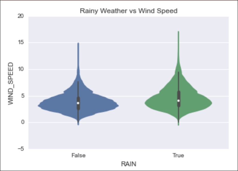
- Plot a violin plot of rainy and dry (the opposite of rainy) days against wind speed:
plt.figure()
plt.title('Rainy Weather vs Wind Speed')
categorical = df
categorical['RAIN'] = categorical['RAIN'] > 0
ax = sns.violinplot(x="RAIN", y="WIND_SPEED",
                         data=categorical)
Refer to the following plot for the second violin plot:
The source code is available in the violins.ipynb file in this book's code bundle.
- The Seaborn documentation about violin plots at https://web.stanford.edu/~mwaskom/software/seaborn/generated/seaborn.violinplot.html (retrieved July 2015)
-
No Comment
..................Content has been hidden....................
You can't read the all page of ebook, please click here login for view all page.