
Gero Gerber, Electronic Arts (EA Phenomic)
The more people you want to address with your game, the more divergent system environments you have to support and take into account. The differences are not only different CPUs and/or GPUs, but also displays. So what you want and need to develop is software that scales with its environment and makes efficient use of it in all aspects.
In this gem, we highlight an approach to efficient resource usage, especially the available screen size, from the perspective of the user interface (UI) layout. We show how you can keep the UI layout system sufficiently flexible so that, once in place, you can achieve optimal layout results without the need to handle special cases in the source code.
The more UI elements (widgets) you have in your game, and the smaller the screen size of your minimum supported system requirements, the more important it is to have efficient and flexible UI layouts. In addition to the fact that there’s a wide range of screen resolutions out there, you also have to take into account the fact that there are different aspect ratios. For example, many current laptops make use of previously unusual aspect ratios. So when designing the UI layout, you may need to consider more than the widget’s size, position, and font size. In most cases, where the difference between minimum supported system requirements and high end is large, you also have to make use of different assets—for example, textures, which you put on the widgets in order to have a crisply rendered widget. Finding an algorithmic solution for making optimal use of screen space and giving a useful layout is difficult and may, if done in code, not always result in solutions UI designers or artists want.
There are some solutions that solve this problem in a cheap and sometimes acceptable way.
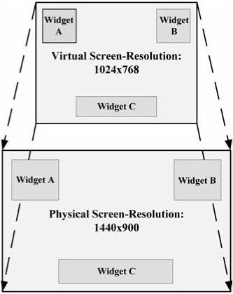
The first solution makes use of virtual screen coordinates (see Figure 4.10.1). Here the space the UI works with is always the same (for example, 1024×768). All widgets are positioned in this virtual space. When the physical screen resolution differs from the virtual space, all widgets are then scaled automatically. This effectively projects the virtual screen coordinates onto the physical screen resolution. As long as the two spaces do not differ that much in size or aspect ratio, everything can look acceptable. But if the difference in size or aspect ratio becomes too large, you get non-uniform-scaled widgets with blurred textures.
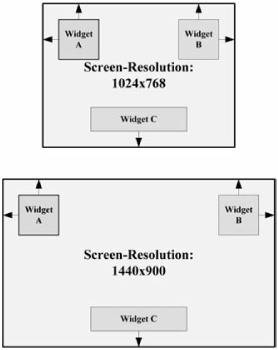
The second solution works for designs with only a few widgets. Here, all widgets are bound to a combination of screen borders or are centered. So when, for example, you define a widget that is bound to the lower and right screen borders, the widget will stick to the lower-right part of the screen when the screen resolution increases in width or height. You can see border linking as a form of alignment (see Figure 4.10.2). (.Net users may know border linking under the name of anchoring.) The difference is that with border linking, in contrast to simple alignment, you can define multiple borders to link to, and you can define a specific number of pixels the widget has to stay away from the borders. This way, you can make use of a large number of screen resolutions without non-uniform-scaled widgets or blurred textures. The drawback here is that with increasing screen resolutions, the widgets make use of a smaller part of the screen and so become harder to read. At the other end, below a given screen resolution the widgets may start overlapping each other, which may not be the desired behavior. But for some designs, this may be the way to go.
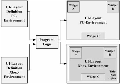
However, both solutions may not work optimally when additional constraints exist. For example, when you develop for consoles such as Xbox 360, you have to take into account the fact that on some TVs, only 80 to 90 percent of the picture may be visible. This area is called the title-safe region. Parts of the display outside this region may not be visible and should not be occupied by any widget or other important game elements. This case has to be considered in the UI layout when running in this special environment.
Another solution would be to do multiple UI layouts and check inside the source code for which layout to use (see Figure 4.10.3). This results in significant extra work for the UI artist, and you have many duplicate layout definitions that need to be kept in sync. Adding, removing, or editing existing widgets in multiple layouts can become complicated and error prone.
Things become worse for the software engineer in a multi-layout scenario when, at run time, widgets have to be created (for example, adding new widgets to a list box), widget textures have to be exchanged, or UI effects have to be started (for example, you want to use different scaled UI effects for different screen resolutions). In these cases there would have to be a check in the source code that decides which asset to load in order to fit into the current UI layout. When, later during development, new layouts are added or removed, all these code sections have to be adjusted in order to make use of this new layout.
Widgets are defined by a set of properties (position, size, texture, font style, and so on) that can be seen as key-value pairs. Many applications make use of XML to define widgets. Using a binary format would result in faster loading times, but for the sake of readability, we will stick to plain text XML in the examples. The following is a sample XML definition for a widget that defines the widget’s name, position, and size.
<Widget
   name = "player_name"
   x = "10"
   y = "15"
   width = "20"
   height = "30"
/>
This example is static and may not suit all environments. It could be better to have a larger widget in larger screen resolutions. A more flexible solution we have already used in a simpler form in our last project is the use of conditional modifiers (CM). A conditional modifier is a node in a widget’s XML definition that contains an additional set of widget properties. You can attach a CM to any widget. A CM always contains a set of conditions connected with condition operators, which, when evaluated to true, enable the properties defined inside the CM. An example of a CM inside a widget’s XML definition is presented here:
<Widget
   name = "player_name"
   x = "15"
   y = "15"
   width = "20"
   height = "30"
>
   <CM
      cm_name = "xbox360"
      x = "30"
      y = "30"
      width = "40"
      height = "50"
   >
      <Conditions>
         <Condition_Platform
            value = "xbox360"
         />
      </Conditions>
   </CM>
</Widget>
In this example the widget is created with the properties defined in the Widget node. As a child node of the widget, we added a CM node. As a child node of the CM, there is a condition that evaluates to true when the current platform is equal to xbox360. The CM is loaded into memory when the corresponding condition is fulfilled. After the widget is fully created, we iterate over all loaded CMs attached to the widget (in the order defined in the XML). For each CM whose conditions evaluate to true, we apply the specified properties to the outer widget. The property cm_name inside the CM node is just cosmetic and shall help to give the CM construct a meaning. So in the example above on a PC, the widget would be placed at position (15, 15) with a size of (20, 30), and on the Xbox 360 its position would be (30, 30) with a width of (40, 50). Of course, you do not have to re-specify all widget properties inside a CM, but only those will be applied when the CM evaluates to true. So in this example, you could, for example, only change the size of the widget if needed.
It is also possible to combine the previously discussed border-linking solution with the CM system.
Using only a single CM or a single condition inside a CM is not that useful. So to further improve the flexibility of CMs, you can chain together multiple conditions and CMs to form a more complex set of conditions. In the following example you can see how this works:
<Widget
   name = "player_name"
   x = "15"
   y = "15"
   width = "20"
   height = "30"
   texture = "high_res_texture.tga"
>
   <CM
      cm_name = "above_minspec_screen_size_pc"
      x = "30"
      y = "30"
   >
      <Conditions>
         <Condition_ScreenWidth
            operator = "greater_than"
            value = "1024"
         />
         <Condition_Operator_And/>
         <Condition_ScreenHeight
            operator = "greater_than"
            value = "768"
         />
         <Condition_Operator_And/>
         <Condition_ Platform
            negate = "true"
            value = "xbox360"
         />
      </Conditions>
   </CM>
   <CM
      cm_name = "low_res_gfx"
      texture = "low_res_texture.tga"
   >
      <Condition_MinSpec/>
   </CM>
</Widget>
Here we apply the properties inside the CM only in the case that screen width is greater than 1024, screen height is greater than 768, and if the current platform is not Xbox 360. In this case we change the widget’s position. As you can see in this example, there’s a second CM that changes the widget’s texture to a low-resolution variant when Condition_MinSpec evaluates to true. Both CMs are independent from each other and change different properties of the widget in a different environment. It is also possible for two different CMs to change the same widget property in different cases. The number of different conditions only depends on the needs you have to obtain the desired UI layout for a specific environment.
Implementing the CM system is straightforward. In order to keep the creation of CMs and their corresponding conditions in one place in the code, you can use the well-known Factory Method Pattern [Gamma94] for creating conditions. Figure 4.10.4 shows the class diagram for the CM system.

What you can see from the UML diagram is that a widget can contain an arbitrary number of CMs and that each CM contains at least one condition. Two conditions with a condition operator in between form a condition pair that can be evaluated. Of course, you have to consider operator precedence in these cases. For the sake of simplicity, we show only two custom conditions in the diagram (ConditionScreenWidth and ConditionScreenHeight). Additional condition types can be added, depending on your needs. You can also add custom condition operators derived from Condition-OperatorBase.
As you may have noticed, a non-trivial CM definition adds a good deal of potentially redundant data to each widget definition. This redundancy can be resolved by adding a CM-specific property (cm_conditions_reference) to the CM definition that references an XML file containing all the relevant conditions and condition operators. The advantage of this is that when you have to modify this set of conditions, you only need to touch one single file, and all referring CMs will work with the new definition. Here’s an example:
<Widget
   name = "player_name"
   x = "15"
   y = "15"
   width = "20"
   height = "30"
>
  <CM
      cm_name = "xbox360"
      x = "30"
      y = "30"
       width = "40"
       height = "50"
       cm_conditions_reference = "conditions_xbox360.xml"
   />
</Widget>
Following are the corresponding definitions from conditions_xbox360.xml.
<Conditions>
   <Condition_ScreenWidth
      operator = "greater_than"
      value = "1024"
   />
   <Condition_Operator_And/>
   <Condition_ScreenHeight
      operator = "greater_than"
      value = "768"
   />
   <Condition_Operator_And/>
   <Condition_ Platform
      value = "xbox360"
   />
</Conditions>
We can further improve the way we define widgets, especially if we make use of many similar widget definitions. A good example for this is the definition for a default button style in a game. Default buttons may share many properties that are equal in all instances. For example, the default button’s size, texture states, sounds, and so on would be the same for each instance of a default button. It would not make much sense if at each place where you define some sort of default button, you have to specify all the properties by which a default button is defined. For these cases you can make use of widget templates (see Figure 4.10.6).
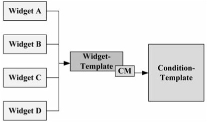
A widget template defines a widget with a default set of properties. A widget template is an additional XML widget definition file. A concrete widget definition can refer to widget templates via the additional property template_filename. The widget template can contain CMs and conditions. From the implementation point of view, you create a widget instance from the specified template XML definition, apply all properties found in the widget template, then apply all CMs defined in the template, and at the end you set the instance-specific properties for the concrete widget instance. If we stay with the default button example instance, specific properties would be the text shown on the button or the event that gets fired when clicking the button. This way you can save a lot of data inside the widget definitions, and you can make changes quickly because you only have to change the widget template itself. This feature is particularly useful for global styles. The following example shows how you can make use of widget templates.
<Widget
   name = "player_name"
   x = "15"
   y = "15"
   template_filename="default_widget.xml"
/>
The property template_filename refers to the widget template and contains all default properties and CMs including conditions. So in this example, the only custom properties for this widget instance are its position and its name.
Many situations require assets such as textures or UI effects to be loaded at run time. One example would be that you want to exchange a texture or show some UI effects to highlight some widget. This requires the specific UI effects that fit the current widget shape and size to be loaded. At this point, when using CMs, you don’t know which asset to load, because on different widget sizes you may want to apply textures with different resolutions, and on different widget shapes and widget sizes you have to use different UI effects. In order to decouple these problems from the source code, you can make use of proxy assets. A proxy asset is an XML file that contains the asset information itself (for example, the path to some texture or some UI effects file) and some CMs that control which asset to use in which environment. This is similar to the use of CMs in conjunction with widgets. Here is an example of a proxy asset for a texture:
<Texture
   filename = "high_res_texture.tga"
>
   <CM
      cm_name = "minspec"
      filename = "low_res_texture.tga"
   >
      <Conditions>
         <Condition_MinSpec/>
      </Conditions>
   </CM>
</Texture>
This example by default uses the texture high_res_texture.tga. Only when Condition_MinSpec evaluates to true do we actually load low_res_texture.tga. So in the source code you would reference the proxy asset’s XML definition instead of a concrete texture filename. This way, we have decoupled the asset from the source code. Because we use the same CM system here as described in conjunction with widgets, we can make use of the same factory as well. So when adding new conditions, you can use them automatically for proxy assets, too. See Figure 4.10.7.

Of course, all this parsing of CMs takes time. The conditions need only be evaluated once, so it would make sense to keep the conditions in memory and query the result when needed. This is, of course, only valid in cases where you do not create conditions that can change during run time. The same is true for widget templates. If your engine supports the cloning of widgets, you can keep a copy of the widget template in memory and clone it when you create a new widget instance of it. Proxy assets can be optimized by loading and evaluating them only once and reusing the results from memory.
When using CMs, the definition of widgets becomes a more complex task, and additional work is required to configure all CMs and their corresponding conditions. We recommend tool support for adding, removing, and modifying CMs. In our last project, we had effectively three different UI layouts we used for all different screen resolutions. We defined a minimum screen resolution of 1024×768 (4:3), a medium one of 1280×1024 (5:4), and a large one defined by 1680×1050 (16:10). Screen resolutions greater in width and height than the ones defined use the large screen resolution layout. Screen resolutions in between use the next smaller layout. UI elements positioned relative to a screen border keep the correct position via their border linking property. Because of this, it is possible to scale the UI layout to higher screen resolutions. This way, we covered the most common screen resolutions used by our customers. We also disabled some laptop screen resolutions in order to save time. Of course, when running the game with extremely large screen resolutions, you run into the problem described earlier (widgets become small in relation to screen size). Fortunately, screen sizes do not grow at such a pace that this should become a problem. The UI Editor we used in house was capable of generating CMs recursively regarding the position and size of the widgets. Therefore, we created our base UI layout for the smallest supported screen resolution of 1024×768 and let the UI Editor create CMs with a corresponding scale factor for the higher resolutions.
Another aspect you have to consider is the additional amount of testing you need when you have different UI layouts. Therefore, you should plan early which UI layouts you need and by which conditions these layouts are being controlled. This way, your QA can check out the different UI layouts with a defined checklist.
The CM system described in this gem gives you a good deal of flexibility in defining your UI layout. It offers UI designers and UI artists many options to define the UI layout without requiring corresponding source code changes. On the other hand, you have to invest some work to integrate this system into your engine, and testing the UI layouts is more work compared to just testing a single simple UI layout. But from experience with this system, the advantages outweigh the additional amount of work.