
i
i
i
i
i
i
i
i
680 27. Visualization
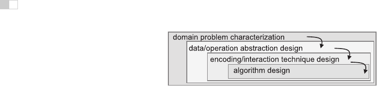
Figure 27.3. Four nested layers of validation for visualization.
27.3 Human-Centered Design Process
The visualization design process can be split into a cascading set of layers, as
shown in Figure 27.3. These layers all depend on each other; the output of the
level above is input into the level below.
27.3.1 Task Characterization
A given dataset has many possible visual encodings. Choosing which visual en-
coding to use can be guided by the specific needs of some intended user. Different
questions, or tasks, require very different visual encodings. For example, consider
the domain of software engineering. The task of understanding the coverage of a
test suite is well supportedby the Tarantula interface shown in Figure27.11. How-
ever, the task of understanding the modular decomposition of the software while
refactoring the code might be better served by showing its hierarchical structure
more directly as a node-link graph.
Understanding the requirements of some target audience is a tricky problem.
In a human-centered design approach, the visualization designer works with a
group of target users over time (C. Lewis & Rieman, 1993). In most cases, users
know they need to somehow view their data but cannot directly articulate their
needs as clear-cut tasks in terms of operations on data types. The iterative design
process includes gathering information from the target users about their problems
through interviews and observation of them at work, creating prototypes, and
observing how users interact with those prototypes to see how well the proposed
solution actually works. The software engineering methodology of requirements
analysis can also be useful (Kovitz, 1999).
27.3.2 Abstraction
After the specific domain problem has been identified in the first layer, the next
layer requires abstracting it into a more generic representation as operations on
i
i
i
i
i
i
i
i
27.3. Human-Centered Design Process 681
the data types discussed in the previous section. Problems from very different
domains can map to the same visualization abstraction. These generic operations
include sorting, filtering, characterizing trends and distributions, finding anoma-
lies and outliers, and finding correlation (Amar et al., 2005). They also include
operations that are specific to a particular data type, for example following a path
for relational data in the form of graphs or trees.
This abstraction step often involves data transformations from the original raw
data into derived dimensions. These derived dimensions are often of a different
type than the original data: a graph may be converted into a tree, tabular data may
be converted into a graph by using a threshold to decide whether a link should
exist based on the field values, and so on.
27.3.3 Technique and Algorithm Design
Once an abstraction has been chosen, the next layer is to design appropriate visual
encoding and interaction techniques. Section 27.4 covers the principles of visual
encoding, and we discuss interaction principles in Sections 27.5. We present
techniques that take these principles into account in Sections 27.6 and 27.7.
A detailed discussion of visualization algorithms is unfortunately beyond the
scope of this chapter.
27.3.4 Validation
Each of the four layers has different validation requirements.
The first layer is designed to determine whether the problem is correctly char-
acterized: is there really a target audience performing particular tasks that would
benefit from the proposed tool? An immediate way to test assumptions and con-
jectures is to observe or interview members of the target audience, to ensure that
the visualization designer fully understands their tasks. A measurement that can-
not be done until a tool has been built and deployed is to monitor its adoption
rate within that community, although of course many other factors in addition to
utility affect adoption.
The next layer is used to determine whether the abstraction from the domain
problem into operations on specific data types actually solves the desired problem.
After a prototype or finished tool has been deployed, a field study can be carried
out to observe whether and how it is used by its intended audience. Also, images
produced by the system can be analyzed both qualitatively and quantitatively.
The purpose of the third layer is to verify that the visual encoding and in-
teraction techniques chosen by the designer effectively communicate the chosen
abstraction to the users. An immediate test is to justify that individual design
i
i
i
i
i
i
i
i
682 27. Visualization
choices do not violate known perceptual and cognitive principles. Such a justi-
fication is necessary but not sufficient, since visualization design involves many
tradeoffs between interacting choices. After a system is built, it can be tested
through formal laboratory studies where many people are asked to do assigned
tasks so that measurements of the time required for them to complete the tasks
and their error rates can be statistically analyzed.
A fourth layer is employed to verify that the algorithm designed to carry out
the encoding and interaction choices is faster or takes less memory than previous
algorithms. An immediate test is to analyze the computational complexity of
the proposed algorithm. After implementation, the actual time performance and
memory usage of the system can be directly measured.
27.4 Visual Encoding Principles
We can describe visual encodings as graphical elements, called marks, that con-
vey information through visual channels. A zero-dimensional mark is a point, a
one-dimensional mark is a line, a two-dimensional mark is an area, and a three-
dimensional mark is a volume. Many visual channels can encode information,
including spatial position, color, size, shape, orientation, and direction of mo-
tion. Multiple visual channels can be used to simultaneously encode different
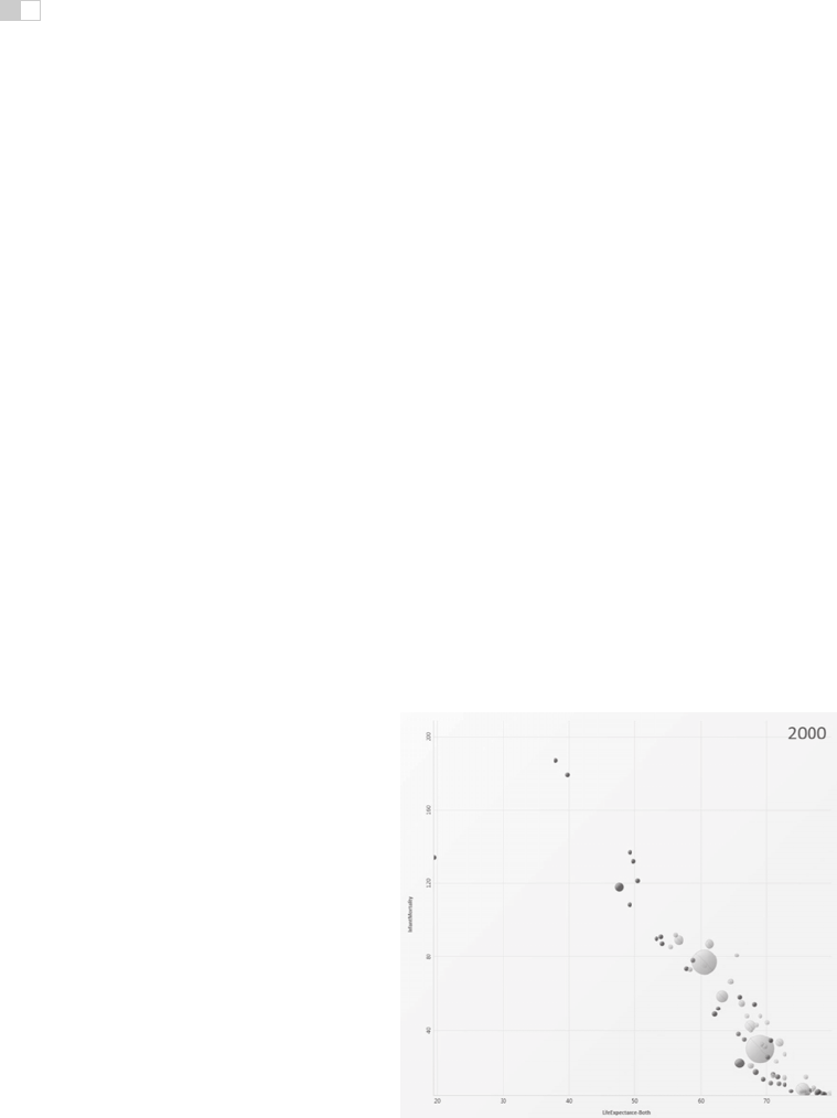
Figure 27.4. The four visual channels of horizontal and vertical spatial position, color,
and size are used to encode information in this scatterplot chart
Image courtesy George
Robertson
(Robertson et al., 2008),
c
IEEE 2008.

i
i
i
i
i
i
i
i
27.4. Visual Encoding Principles 683
data dimensions; for example, Figure 27.4 shows the use of horizontal and ver-
tical spatial position, color, and size to display four data dimensions. More than
one channel can be used to redundantly code the same dimension, for a design
that displays less information but shows it more clearly.
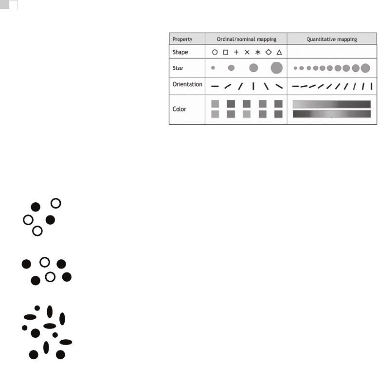
27.4.1 Visual Channel Characteristics
Important characteristics of visual channels are distinguishability, separability,
and popout.
Channels are not all equally distinguishable. Many psychophysical experi-
ments have been carried out to measure the ability of people to make precise
distinctions about information encoded by the different visual channels. Our
abilities depend on whether the data type is quantitative, ordered, or categorical.
Figure 27.5 shows the rankings of visual channels for the three data types. Fig-
ure 27.6 shows some of the default mappings for visual channels in the
Tableau/Polaris system, which take into account the data type.
Spatial position is the most accurate visual channel for all three types of data,
and it dominates our perception of a visual encoding. Thus, the two most impor-
tant data dimensions are often mapped to horizontal and vertical spatial positions.
However, the other channels differ strongly between types. The channels of
length and angle are highly discriminable for quantitative data but poor for or-
dered and categorical, while in contrast hue is very accurate for categorical data
but mediocre for quantitative data.
We must always consider whether there is a good match between the dynamic
Position
Texture
Connection
Containment
Lightness
Shape
Length
Angle
Slope
Area
Volume
Position
Length
Angle
Slope
Area
Volume
Lightness
Texture
Containment
Shape
Connection
Saturation
Position
Lightness
Texture
Connection
Containment
Length
Angle
Slope
Area
Volume
Shape
Saturation
Saturation
Hue
Hue
Hue
Quantitative Ordered Categorical
Figure 27.5. Our ability to perceive information encoded by a visual channel depends on
the type of data used, from most accurate at the top to least at the bottom.
Redrawn and
adapted from (Mackinlay, 1986)
.
i
i
i
i
i
i
i
i
684 27. Visualization
Figure 27.6. The Tableau/Polaris system default mappings for four visual channels accord-
ingtodatatype.
Image courtesy Chris Stolte
(Stolte et al., 2008),
c
2008 IEEE. (See also
Plate XLII.)
range necessary to show the data dimension and the dynamic range available in the
channel. For example, encoding with line width uses a one-dimensional mark and
the size channel. There are a limited number of width steps that we can reliably
use to visually encode information: a minimum thinness of one pixel is enforced
by the screen resolution (ignoring antialiasing to simplify this discussion), and
there is a maximum thickness beyond which the object will be perceived as a
polygon rather than a line. Line width can work very well to show three or four
different values in a data dimension, but it would be a poor choice for dozens or
hundreds of values.
Figure 27.7. Color and lo-
cation are separable chan-
nels well suited to encode
different data dimensions,
but the horizontal size and
and vertical size channels
are automatically fused into
an integrated perception of
area.
Redrawn after (Ware,
2000).
Some visual channels are integral, fused together at a pre-conscious level, so
they are not good choices for visually encoding different data dimensions. Others
are separable, without interactions between them during visual processing, and
are safe to use for encoding multiple dimensions. Figure 27.7 shows two channel
pairs. Color and position are highly separable. We can see that horizontal size and
vertical size are not so easy to separate, because our visual system automatically
integrates these together into a unified perception of area. Size interacts with
many channels: as the size of an object grows smaller, it becomes more difficult
to distinguish its shape or color.
We can selectively attend to a channel so that items of a particular type “pop
out” visually, as discussed in Section 22.4.3. An example of visual popout is
when we immediately spot the red item amidst a sea of blue ones, or distinguish
the circle from the squares. Visual popout is powerful and scalable because it
occurs in parallel, without the need for conscious processing of the items one
by one. Many visual channels have this popout property, including not only the
list above but also curvature, flicker, stereoscopic depth, and even the direction
of lighting. However, in general we can only take advantage of popout for one
channel at a time. For example, a white circle does not pop out from a group of
circles and squares that can be white or black, as shown in Figure 22.43. When we
..................Content has been hidden....................
You can't read the all page of ebook, please click here login for view all page.