

i
i
i
i
i
i
i
i
558 22. Visual Perception
(a) (b)
Figure 22.5. The Munker-White illusion shows the complexity of simultaneous contrast. In
Figure 22.4, the central region looked lighter when the surrounding area was darker. In (a),
the gray strips on the left look
lighter
than the gray strips on the right, even though they are
nearly surrounded by regions of white; (b) shows the gray strips without the black lines.
one region based on contrasting brightness in the surrounding region, it is actually
much more complicated than that (Figures 22.5 and 22.6). For more on lightness
perception, see (Gilchrist et al., 1999) and (Adelson, 1999).
a
b
Figure 22.6. The percep-
tion of lightness is affected
by the perception of 3D
structure. The two surfaces
marked (a) have the same
brightness, as do the two
surfaces marked (b) (after
Adelson (1999)).
While the visual system largely ignores slowly varying intensity patterns, it
is extremely sensitive to edges consisting of lines of discontinuity in brightness.
Edges in imaged light intensity often correspond to surface boundaries or other
important features in the environment (Figure 22.7). The vision system can also
detect localized differences in motion, stereo disparity, texture, and several other
(a) (b)
Figure 22.7. (a) Original gray scale image, (b) image
edges
, which are lines of high spatial
variability in some direction.

i
i
i
i
i
i
i
i
22.2. Visual Sensitivity 559
Figure 22.8. The visual system sometimes sees “edges” even when there are no sharp
discontinuities in brightness, as is the case at the right side of the central pattern in this
image.
image properties. The vision system has very little ability, however, to detect
spatial discontinuities in color when not accompanied by differences in one of
these other properties.
Perception of edges seems to interact with perception of form. While edges
give the visual system the informationit needs to recognizeshapes, slowly varying
brightness can appear as a sharp edge if the resulting edge creates a more complete
form (Figure 22.8). Figure 22.9 shows a subjective contour, an extreme form of
this effect in which a closed contour is seen even though no such contour exists
in the actual image. Finally, the vision system’s sensitivity to edges also appears
to be part of the mechanism involved in lightness perception. Note that the region
enclosed by the subjective contour in Figure 22.9 appears a bit brighter than the
surrounding area of the page. Figure 22.10 shows a different interaction between
edges and lightness. In this case, a particular brightness profile at the edge has
a dramatic effect on the apparent brightness of the surfaces to either side of the
edge.
Figure 22.9. Sometimes, the visual system will “see”
subjective contours
without any
associated change in brightness.

i
i
i
i
i
i
i
i
560 22. Visual Perception
Figure 22.10. Perceived lightness depends more on local contrast at edges than on bright-
ness across surfaces. Try covering the vertical edge in the middle of the figure with a pencil.
This figure is an instance of the
Craik-O’Brien-Cornsweet illusion
.
As indicated above, people can detect differences in the brightness between
two adjacent regions if the difference is at least 1% of the average brightness.
This is an example of Weber’s law, which states that there is a constant ratio
between the just noticeable differences (jnd) in a stimulus and the magnitude of
the stimulus:
ΔI
I
= k
1
, (22.2)
where I is the magnitude of the stimulus, ΔI is the magnitude of the just notice-
able difference, and k
1
is a constant particular to the stimulus. Weber’s law was
postulated in 1846 and still remains a useful characterization of many perceptual
effects. Fechner’s law, proposed in 1860, generalized Weber’s law in a way that
allowed for the description of the strength of any sensory experience, not just
jnd’s:
S = k
2
log(I), (22.3)
where S is the perceptual strength of the sensory experience, I is the physical
magnitude of the corresponding stimulus, and k
2
is a scaling constant specificto
the stimulus. Current practice is to model the association between perceived and
actual strength of a stimulus using a power function (Stevens’s law):
S = k
3
I
b
, (22.4)
where S and I are as before, k
3
is another scaling constant, and b is an exponent
specific to the stimulus. For a large number of perceptual quantities involving
vision, b<1. The CIE L*a*b* color space, described elsewhere, uses a mod-
ified Stevens’s law representation to characterize perceptual differences between
brightness values. Note that in the first two characterizations of the perceptual
strength of a stimulus and in Steven’s Law when b<1, changes in the stimulus
i
i
i
i
i
i
i
i
22.2. Visual Sensitivity 561
when it has a small average magnitude create larger perceptual effects than do the
same physical change in the stimulus when it has a larger magnitude.
The “laws” describe above are not physical constraints on how perception
operates. Rather, they are generalizations about how the perceptual system re-
sponds to particular physical stimuli. In the field of perceptual psychology, the
quantitative study of the relationships between physical stimuli and their percep-
tual effects is called psychophysics. While psychophysical laws are empirically
derived observations rather than mechanistic accounts, the fact that so many per-
ceptual effects are well modeled by simple power functions is striking and may
provide insights into the mechanisms involved.
22.2.2 Color
In 1666, Isaac Newton used prisms to show that apparently white sunlight could
be decomposed into a spectrum of colors and that these colors could be recom-
bined to produce light that appeared white. We now know that light energy is
made up of a collection of photons, each with a particular wavelength. The spec-
tral distribution of light is a measure of the average energy of the light at each
wavelength. For natural illumination, the spectral distribution of light reflected
off of surfaces varies significantly depending on the surface material. Character-
izations of this spectral distribution can therefore provide visual information for
the nature of surfaces in the environment.
Most people have a pervasive sense of color when they view the world. Color
perception depends on the frequency distribution of light, with the visible spec-
trum for humans ranging from a wavelength of about 370 nm to a wavelength of
about 730 nm (see Plate X). The manner in which the visual systems derives a
sense of color from this spectral distribution was first systematically examined in
1801 and remained extremely controversial for 150 years. The problem is that the
visual system responds to patterns of spectral distribution very differently than
patterns of luminance distribution.
“The history of the investi-
gation of colour vision is re-
markable for its acrimony.”
—Richard Gregory (1997)
Even accounting for phenomena such as lightness constancy, distinctly differ-
ent spatial distributions almost always look distinctly different. More importantly
given that the purpose of the visual system is to produce descriptions of the distal
stimulus given the proximal stimulus, perceived patterns of lightness correspond
at least approximately to patterns of brightness over surfaces in the environment.
The same is not true of color perception. Many quite different spectral distri-
butions of light can produce a sense of any specific color. Correspondingly, the
sense that a surface is a specific color provides little direct information about the
spectral distribution of light coming from the surface. For example, a spectral
i
i
i
i
i
i
i
i
562 22. Visual Perception
distribution consisting of a combination of light at wavelengths of 700 nm and
540 nm, with appropriately chosen relative strengths, will look indistinguishable
from light at the single wavelength of 580 nm. (Perceptually indistinguishable
colors with different spectral compositions are referred to as metamers.) If we see
the color “yellow,” we have no way of knowing if it was generated by one or the
other of these distributions or an infinite family of other spectral distributions. For
this reason, in the context of vision the term color refers to a purely perceptual
quality, not a physical property.
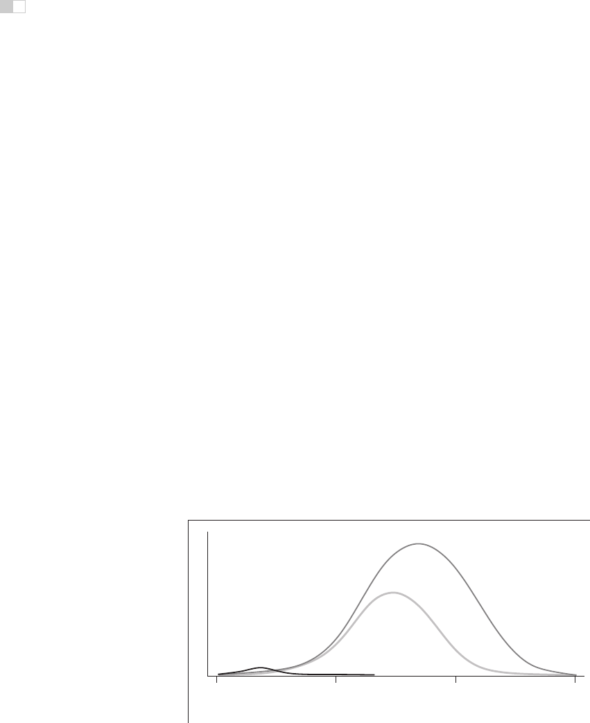
There are two classes of photoreceptors in the human retina. Cones are in-
volved in color perception, while rods are sensitive to light energy across the
visible range and do not provide information about color. There are three types of
cones, each with a different spectral sensitivity (Figure 22.11). S-cones respond
to short wavelengths in the blue range of the visible spectrum. M-cones respond
to wavelengths in the middle (greenish) region of the visible spectrum. L-cones
respond to somewhat longer wavelengths covering the green and red portions of
the visible spectrum.
While it is common to describe the three types of cones as red, green,and
blue, this is neither correct terminology nor does it accurately reflect the cone
sensitivities shown in Figure 22.11. The L-cones and M-cones are broadly tuned,
meaning that they respondto a wide range of frequencies. There is also substantial
overlap between the sensitivity curves of the three cone types. Taken together,
these two properties mean that it is not possible to reconstruct an approximation
to the original spectral distribution given the responses of the three cone types.
This is in contrast to spatial sampling in the retina (and in digital cameras), where
400 500 600 700
wavelength (nanometers)
sensitivity
S-cones
M-cones
L-cones
Figure 22.11. Spectral sensitivity of the
short
,
medium
, and
long
cones in the human retina.
..................Content has been hidden....................
You can't read the all page of ebook, please click here login for view all page.