
Chapter 3. Layout
WPF provides a powerful and flexible array of tools for controlling the layout of the user interface. These tools enable applications to present information to users in a clear and logical way.
There is a fine line between giving developers or designers enough control over the user interface’s layout, and leaving them to do all the work. A good layout system should be able to automate common scenarios such as resizing, scaling, and adaptation to localization, but should allow manual intervention where necessary. In this chapter, we will look at how WPF’s layout system helps fulfill these goals.
Layout Basics
WPF provides a set of panels—special-purpose user interface elements whose job is to arrange the elements they contain. Each individual panel type offers a straightforward and easily understood layout mechanism. As with all WPF elements, layout objects can be composed in any number of different ways, so although each individual panel type is fairly simple, the flexible way in which they can be combined makes for a very powerful layout system. And you can even create your own layout element types should the built-in ones not meet your needs.
Table 3-1 describes the main panel types built into WPF[14]. Whichever panel you use, the same basic rule always applies: an element’s position is always determined by the containing panel. Most panels also manage the size of their children.
Usage | |
Lays children out in a vertical or horizontal stack; extremely simple, useful for managing small-scale aspects of layout. | |
Lays children out from left to right, moving onto a new line each time it fills the available width. | |
Allocates an entire edge of the panel area to each child; useful for defining the rough layout of simple applications at a coarse scale. | |
Arranges children within a grid; useful for aligning items without resorting to fixed sizes and positions. The most powerful of the built-in panels. | |
Performs no layout logic—puts children where you tell it to; allows you to take complete control of the layout process. | |
Arranges children in a grid where every cell is the same size. |
Tip
By default, panels have no appearance of their own, the only
visible effect of their presence being how they size and position
their children. However, they can be made visible by setting their
Background property.
We’ll start with one of the most basic panels, StackPanel.
StackPanel
StackPanel is a very simple
panel that arranges its children in a row or a column. You will not
normally use StackPanel to lay out
your whole user interface. It is most useful for arranging small
subsections. Example 3-1 shows how to
build a simple search user interface.
<StackPanel Background="#ECE9D8"><TextBlock Margin="3">Look for:</TextBlock> <ComboBox Margin="3"/> <TextBlock Margin="3">Filtered by:</TextBlock> <ComboBox Margin="3"/> <Button Margin="3,5">Search</Button> <CheckBox Margin="3">Search in titles only</CheckBox> <CheckBox Margin="3">Match related words</CheckBox> <CheckBox Margin="3">Search in previous results</CheckBox> <CheckBox Margin="3">Highlight search hits (in topics)</CheckBox></StackPanel>
Figure 3-1 shows the
results. As you can see, the UI elements have simply been stacked
vertically one after another. This example used the Margin property to space the elements out a
little. Most elements use a single number, indicating a uniform margin
all around. The Button uses a pair of
numbers to specify different vertical and horizontal margins. This is
one of several standard layout properties available on all WPF elements,
which are all described in the "Common Layout Properties" section, later in this
chapter.
Tip
Many of the examples in this book represent typical snippets of
XAML, rather than complete self-contained programs. You can download
runnable versions of the examples from the book’s web site at http://sellsbrothers.com/writing/wpfbook. If you would
prefer to type in the examples, you can do that using the XamlPad tool
that ships with the Windows SDK, but because the examples are only
snippets, you will need to host them in a suitable root element such
as a Page.
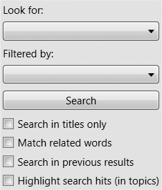
There is one problem with this layout: the Search button is much
wider than you would normally expect a button to look. The default
behavior of a vertical StackPanel is
to make all of the controls the same width as the panel. Likewise, a
horizontal StackPanel will make all
of the controls the same height. For the ComboBox controls, this is exactly what we
want. For the TextBlock and CheckBox controls, it doesn’t show that the
controls have been stretched to be as wide as the panel, because they
look only as wide as their text makes them look. However, a Button’s visuals always fill its entire
logical width, which is why the button in Figure 3-1 is unusually wide. (See the
upcoming "Fixed Size Versus Size to Content" sidebar
for more details on how this process works.)
When an element has been given a fixed amount of space that is
greater than required by its content, the way in which the extra space
gets used is determined by the HorizontalAlignment and VerticalAlignment properties.
We can prevent the button from being stretched across the panel’s
whole width by setting its HorizontalAlignment property to Left:
<Button Margin="3,5" HorizontalAlignment="Left">Search</Button>HorizontalAlignment determines
an element’s horizontal position and width in situations where the
containing panel gives it more space than it needs. The default is
Stretch, meaning that if more space
is available than the child requires, it will be stretched to fill that
space. The alternatives—Left,
Right, and Center—do not attempt to stretch the element;
these determine where the element will be placed within the excess
space, allowing the element to use its natural width. Here we are using
Left, meaning that the control will
have its preferred width, and will be aligned to the left of the
available space (see Figure 3-2).

The preceding example used the default vertical orientation.
StackPanel also supports horizontal
layout. Example 3-2 shows a StackPanel with its Orientation property set to Horizontal.
<StackPanel Orientation="Horizontal">
  <TextBlock>This is some text</TextBlock>
  <Button>Button</Button>
  <Button>Button (different one)</Button>
  <CheckBox>Check it out</CheckBox>
  <TextBlock>More text</TextBlock>
</StackPanel>
These elements will be arranged in a horizontal line, as shown in Figure 3-3.
StackPanel is not very smart
when it runs out of space. If you give it more elements than will fit,
it will just truncate the content. However, its close relative, the
WrapPanel, copes rather
better.
WrapPanel
WrapPanel works just like a
StackPanel until it runs out of
space. If you provide a horizontal WrapPanel with more children than will fit in
the available width, it will arrange its content in a way similar to how
a word processor lays out words on a line. It puts the children in a row
from left to right until it runs out of space, at which point it starts
on the next line.
WrapPanel is very simple to
use. Just as with a StackPanel, you
add a sequence of children, as Example 3-3
shows.
<WrapPanel Background="Beige"><Button>One</Button> <Button>Two</Button> <Button>Three</Button> <Button>Four</Button> <Button>Five</Button> <Button>Six</Button> <Button>Seven</Button> <Button>Eight</Button></WrapPanel>
As Figure 3-4 shows, the items are arranged from left to right. As you can see from the panel’s filled-in background, it is not wide enough to accommodate all the items, so the last three have been wrapped onto the next line.

WrapPanel also offers an
Orientation property. Setting this to
Vertical will arrange the children in
a sequence of vertical stacks, a layout style very similar to Windows
Explorer’s “List” view.
WrapPanel and StackPanel really are useful only for
small-scale layout. You will need to use a more powerful panel to define
the overall layout of your application, such as DockPanel.
DockPanel
DockPanel is useful for
describing the overall layout of a simple user interface. You can carve
up the basic structure of your window using a DockPanel, and then use the other panels to
manage the details.
A DockPanel arranges each child
element so that it fills a particular edge of the panel. If multiple
children are docked to the same edge, they simply stack up against that
edge in order. By default, the final child fills any remaining space not
occupied by controls docked to the panel’s edges.
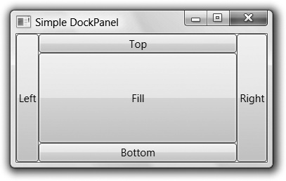
Example 3-4 shows a simple DockPanel-based layout. Five buttons have been
added to illustrate each option. Notice that four of them have a
DockPanel.Dock attribute applied.
This property is defined by DockPanel
to allow elements inside a DockPanel
to specify their position. DockPanel.Dock is an attached property (as described in the
upcoming sidebar, "Attached Properties and Layout“).
<DockPanel><ButtonDockPanel.Dock="Top">Top</Button> <ButtonDockPanel.Dock="Bottom">Bottom</Button> <ButtonDockPanel.Dock="Left">Left</Button> <ButtonDockPanel.Dock="Right">Right</Button> <Button>Fill</Button></DockPanel>
Figure 3-5 shows how the UI built in Figure 3-5 looks on-screen. Notice how the Top and Bottom buttons have filled the entire top and bottom edges of the window, and yet the Left and Right buttons do not fill their edges—the Top and Bottom buttons have taken control of the corners. This is because Top and Bottom were added to the panel first.

If you swapped these over so that the Left and Right buttons came first in the markup, as shown in Example 3-5, they would fill their whole edges, including the corners, leaving the Top and Bottom buttons with just the remaining space. Figure 3-6 shows the results.
<DockPanel>
  <Button DockPanel.Dock="Left">Left</Button>
  <Button DockPanel.Dock="Right">Right</Button>
  <Button DockPanel.Dock="Top">Top</Button>
  <Button DockPanel.Dock="Bottom">Bottom</Button>
  <Button>Fill</Button>
</DockPanel>
Elements never overlap in a DockPanel, so each successive child only gets
to use space not already used by the previous children. By default, the
final child takes all of the remaining space, but if you would prefer to
leave a blank space in the middle, you can set the LastChildFill attribute of the DockPanel to False. (It defaults to True.) The final child will dock to the left
by default, leaving the center empty.
For items docked to the top or bottom, DockPanel sets the width to fill the space
available, but for the height, it sizes to content—as described in the
earlier sidebar. Likewise, items docked to the left or right have their
heights fixed to fill the available space, but size to content
horizontally. In Figure 3-5 and
Figure 3-6, the buttons
at the top and bottom are just tall enough to contain their text.
Likewise, the buttons docked to the left and right are just wide enough
to hold their text. If we put a lot more text into one of the buttons,
it will try to expand in order to make the text fit. We can see in Figure 3-7 that the DockPanel is letting the button be exactly as
wide as it wants to be.

The DockPanel is good for
creating the top-level structure of a basic user interface. For example,
you could use it to position a menu and a toolbar at the top of the
window, with other content filling the remaining space. However, if you
have lots of controls to arrange, it can be helpful to have table-like
layout functionality. For this, we turn to the powerful Grid panel.
Grid
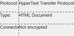
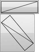
Consider the document Properties dialog from Internet Explorer shown in Figure 3-8. Notice how the main area of the form is arranged as two columns. The column on the left contains labels, and the column in the middle contains information.

Achieving this kind of layout with any of the panels we’ve looked
at so far is difficult, because they are not designed with
two-dimensional alignment in mind. We could try to use nesting—Example 3-6 shows a vertical StackPanel with three rows, each with a
horizontal StackPanel.
<StackPanel Orientation="Vertical" Background="Beige">
  <StackPanel Orientation="Horizontal">
    <TextBlock>Protocol:</TextBlock>
    <TextBlock>HyperText Transfer Protocol</TextBlock>
  </StackPanel>
  <StackPanel Orientation="Horizontal">
        <TextBlock>Type:</TextBlock>
    <TextBlock>HTML Document</TextBlock>
  </StackPanel>
  <StackPanel Orientation="Horizontal">
    <TextBlock>Connection:</TextBlock>
   <TextBlock>Not Encrypted</TextBlock>
  </StackPanel>
</StackPanel>
The result, shown in Figure 3-9, is not what we want at all. Each row has been arranged independently, so we don’t get the two columns we were hoping for.

The Grid panel solves this
problem. Rather than working a single row or a single column at a time,
it aligns all elements into a grid that covers the whole area of the
panel. This allows consistent positioning from one row to the next.
Grid Layout shows the same elements as Example 3-6, but arranged with a Grid rather than nested StackPanel elements.
<Grid Background="Beige"ShowGridLines="True"> <!-- ShowGridLines for testing only --><Grid.ColumnDefinitions><ColumnDefinition /><ColumnDefinition /></Grid.ColumnDefinitions><Grid.RowDefinitions><RowDefinition /><RowDefinition /><RowDefinition /></Grid.RowDefinitions><TextBlockGrid.Column="0" Grid.Row="0">Protocol:</TextBlock> <TextBlockGrid.Column="1" Grid.Row="0">HyperText Transfer Protocol</TextBlock> <TextBlockGrid.Column="0" Grid.Row="1">Type:</TextBlock> <TextBlockGrid.Column="1" Grid.Row="1">HTML Document</TextBlock> <TextBlockGrid.Column="0" Grid.Row="2">Connection:</TextBlock> <TextBlockGrid.Column="1" Grid.Row="2">Not encrypted</TextBlock></Grid>
The Grid needs to know how many
columns and rows we require, and we indicate this by specifying a series
of ColumnDefinition and RowDefinition elements at the start. This may
seem rather verbose—a simple pair of properties on the Grid itself might seem like a simpler
solution. However, you will often need to control the characteristics of
each column and row independently, so in practice, it makes sense to
have elements representing them.
Notice that each element in the grid has its column and row
specified explicitly using attached properties. This is
mandatory—without these, everything ends up in column 0, row 0.
(Grid uses a zero-based numbering
scheme, so 0,0 corresponds to the top-left corner.)
Grid Layout shows the result of Example 3-7. This figure has lines showing the grid
outline, because we enabled the ShowGridLines property. You would not normally
do this on a finalized design—this feature is intended to make it easy
to see how the Grid has divided up
the available space. With grid lines displayed, it is clear that the
Grid has made all the columns the
same width, and all the rows the same height.

Tip
What may not be obvious from Figure 3-10
is that each element has been given the full available cell space. It
doesn’t show here because a TextBlock looks only as large as the text it
shows. But the behavior is somewhat similar to a StackPanel—each element’s width is as wide
as its containing column, and its height is that of its containing
row. As always, you can use HorizontalAlignment and VerticalAlignment to determine what elements
do with excess space.
This default “one size fits all” behavior is useful when you want
all the items in the grid to be the same size, but it’s not what we want
here. It would make more sense for the column on the left to be wide
enough to contain the labels, and for the column on the right to be
allocated the remaining space. Fortunately, the Grid provides a variety of options for
managing column width and row height.
Column Widths and Row Heights
You configure the column widths and row heights in a Grid using the ColumnDefinition and RowDefinition elements. There are three
sizing options: fixed, automatic, and proportional.
Fixed sizing is the simplest to understand, but often requires
the most effort to use, as you end up having to do all of the work
yourself. You can specify the Width
of a column or the Height of a row
in device-independent pixels.
(These are 1/96th of an inch. WPF’s coordinate system is described in
Chapter 13.) Example 3-8
shows a modified version of the column definitions in Grid Layout, specifying a fixed width for the first
column.
...
<Grid.ColumnDefinitions>
  <ColumnDefinition Width="50" />
  <ColumnDefinition />
</Grid.ColumnDefinitions>
...
Figure 3-11 illustrates the main problem with using fixed column widths. If you make the column too narrow, the contents will simply be cropped. Fixed widths and heights may seem to be an attractive idea because they give you complete control, but in practice they tend to be inconvenient. If you change the text or the font, you will need to modify the sizes to match. You will need to be flexible on layout if you want your application to fit in with the system look and feel, because the default font is not the same on all versions of Windows. Localization of strings will also require the sizes to be changed. (See Chapter 12 for more information about localization.) So in practice, fixed widths and heights are not what you will normally want to use. This is true not only with grids and text blocks. In general, you should try to avoid fixed sizes in WPF—the more you let the layout system do for you, the easier it is to adapt to localization, different screen sizes, and display orientations.
The most appropriate sizing strategy for our label column will
be automatic sizing. This tells the Grid to make the column wide enough to
contain the widest element (i.e., to size to content). Example 3-9 shows a modified version of
the column and row definitions from Grid Layout,
specifying automatic width for the first column, and automatic heights
for all of the rows.
... <Grid.ColumnDefinitions> <ColumnDefinitionWidth="Auto"/> <ColumnDefinition /> </Grid.ColumnDefinitions> <Grid.RowDefinitions> <RowDefinitionHeight="Auto"/> <RowDefinitionHeight="Auto"/> <RowDefinitionHeight="Auto"/> </Grid.RowDefinitions> ...
This is not quite right yet—as you can see from Figure 3-12, the Grid has not left any space around the text,
so the results seem rather cramped. The solution is exactly the same
as it was for the StackPanel—we
simply use the Margin property on
the TextBlock elements in the
Grid to indicate that we want some
breathing room around the text. The Grid will honor this, giving us the layout
we require.

If the idea of adding a Margin attribute to every single element
sounds tedious, don’t worry. We can give all of the TextBlock elements the same margin by
defining a style. Styles are
discussed in Chapter 8. Example 3-10 does this to set
a horizontal margin of five device-independent pixels, and a vertical
margin of three.
<Grid Background="Beige"
      ShowGridLines="True">
<Grid.Resources>
    <Style TargetType="TextBlock">
      <Setter Property="Margin" Value="5,3" />
    </Style>
  </Grid.Resources>
  <Grid.ColumnDefinitions>
    <ColumnDefinition Width="Auto" />
... as before
As Figure 3-13 shows, this provides the better-spaced layout we require.

The final mechanism for specifying width and height in a
Grid is the proportional method.
This is sometimes called “star” sizing because of the corresponding
XAML syntax. If you set the width or height of a column or row to be
*, this tells the Grid that it should fill all the space left
over after any fixed and automatic items have taken their share. If
you have multiple items set to *,
the space is shared evenly among them.
The default value for column width and row height is *, so you have already seen the effect of
this. As Figure 3-10 shows, when we don’t
specify column widths or row heights, each cell ends up with exactly
the same amount of space.
The star syntax is a little more flexible than this. Rather than dividing up space evenly among all the rows or columns marked with a star, we can choose a proportional distribution. Consider the set of row definitions in Example 3-11.
<Grid.RowDefinitions> <RowDefinitionHeight="Auto"/> <RowDefinitionHeight="2*"/> <RowDefinitionHeight="1*"/> </Grid.RowDefinitions>
Here, the first row has been set to size automatically, and the
other two rows both use proportional sizing. However, the middle row
has been marked as 2*. This
indicates that it wants to be given twice as much of the available
space as the row marked with 1*.
For example, if the grid’s total height was 350, and the first row’s
automatic height came out as 50, this would leave 300 for the other
rows. The second row’s height would be 200, and the third row’s height
would be 100. Figure 3-14 shows how
this grid looks for a couple of different heights; the filled-in
background shows the size of the grid in each case. As you can see,
the row with Auto height is the
same in both cases. The two star-sized rows share out the remaining
space, with the 2* row getting
twice the height of the 1* row.

The numbers before the *
specify relative sizes, not absolute sizes. If you modified the
preceding example to use 6* and
3* instead of 2* and 1*, the result would be exactly the same.
It’s equivalent to saying that you want the rows to use six-ninths and
three-ninths of the available space, instead of saying that you want
them to use two-thirds and one-third—it’s just two ways of expressing
the same ratio.
These numbers are floating point, so you can specify noninteger
sizes such as 2.5*. And if you
specify just * without a number,
this is equivalent to 1*.
Tip
If you are familiar with HTML, you may have been wondering whether you can use percentage sizes. You can’t, but the star mechanism lets you achieve similar effects.
You may have noticed that for all three grid-sizing strategies,
we used the Width and Height properties each time, although the
property values looked quite different in each case. Width and Height are both of type GridLength. The GridLength type holds a number and a unit
type. The number is stored as a Double and the unit type is represented by
the GridUnitType
enumeration.
For a fixed size, the unit type is Pixel. (As mentioned previously, in WPF
pixel is really a device-independent unit,
meaning 1/96th of an inch.) In XAML, this is indicated by providing
just a number.[15] For automatic sizing, the unit type is Auto and no number is required. In XAML,
this is indicated by the string "Auto". For proportional sizing, the unit
type is *. In XAML, this is
indicated either by just * or a
number and a star (e.g., 3.5*).
Example 3-12 shows the C# equivalent
of the row settings shown in XAML in Example 3-11.
Grid g = new Grid( ); RowDefinition r = new RowDefinition( );r.Height = new GridLength(0, GridUnitType.Auto);g.RowDefinitions.Add(r); r = new RowDefinition( );r.Height = new GridLength(2, GridUnitType.Star);g.RowDefinitions.Add(r); r = new RowDefinition( );r.Height = new GridLength(1, GridUnitType.Star);g.RowDefinitions.Add(r);
Spanning Multiple Rows and Columns
Looking at the Properties dialog shown earlier in Figure 3-8, there is a feature we have left out. The dialog has two horizontal lines dividing the UI into three sections. However, the aligned columns span the whole window, straddling these dividing lines.
It would be inconvenient to try to achieve a layout like this with multiple grids. If you used one for each section of the window, you could keep the columns aligned in all the grids by using fixed column widths. As discussed earlier, use of fixed widths is inconvenient because it tends to require manual adjustment of the widths whenever anything changes. With this layout, it becomes triply inconvenient—you would have to change all three grids every time anything changed.
Fortunately, it is possible to add these dividing lines without
splitting the UI into separate grids. The way to do this is to put the
dividing lines into cells that span across all of the columns in the
grid. An element indicates to its parent Grid that it would like to span multiple
columns by using the attached Grid.ColumnSpan property.
Example 3-13 uses a single Grid to show three sets of properties. These
sets are separated by thin Rectangle elements, using Grid.ColumnSpan to fill the whole width of
the Grid. Because a single Grid is used for all three sections, the
columns remain aligned across all three sections, as you can see in
Figure 3-15. If we had
used three separate grids with the leftmost column set to use
automatic width, each would have chosen its own width, causing the
righthand columns to be misaligned.
<Grid Background="Beige">
  <Grid.Resources>
    <Style TargetType="TextBlock">
      <Setter Property="Margin" Value="5,3" />
    </Style>
  </Grid.Resources>

  <Grid.ColumnDefinitions>
    <ColumnDefinition Width="Auto" />
    <ColumnDefinition />
  </Grid.ColumnDefinitions>
  <Grid.RowDefinitions>
    <RowDefinition Height="Auto" />
    <RowDefinition Height="Auto" />
    <RowDefinition Height="Auto" />
    <RowDefinition Height="Auto" />
    <RowDefinition Height="Auto" />
    <RowDefinition Height="Auto" />
    <RowDefinition Height="Auto" />
    <RowDefinition Height="Auto" />
  </Grid.RowDefinitions>


  <TextBlock Grid.Column="0" Grid.Row="0">Title:</TextBlock>
  <TextBlock Grid.Column="1" Grid.Row="0">Information Overload</TextBlock>

<Rectangle Grid.Row="1" Grid.ColumnSpan="2" Margin="5"
               Height="1" Fill="Black" />

  <TextBlock Grid.Column="0" Grid.Row="2">Protocol:</TextBlock>
  <TextBlock Grid.Column="1" Grid.Row="2">Unknown Protocol</TextBlock>
  <TextBlock Grid.Column="0" Grid.Row="3">Type:</TextBlock>
  <TextBlock Grid.Column="1" Grid.Row="3">Not available</TextBlock>
  <TextBlock Grid.Column="0" Grid.Row="4">Connection:</TextBlock>
  <TextBlock Grid.Column="1" Grid.Row="4">Not encrypted</TextBlock>
<Rectangle Grid.Row="5" Grid.ColumnSpan="2" Margin="5"
               Height="1" Fill="Black" />

  <TextBlock Grid.Column="0" Grid.Row="6">Created:</TextBlock>
  <TextBlock Grid.Column="1" Grid.Row="6">Not available</TextBlock>
  <TextBlock Grid.Column="0" Grid.Row="7">Modified:</TextBlock>
  <TextBlock Grid.Column="1" Grid.Row="7">Not available</TextBlock>

</Grid>
The Grid class also defines a
Grid.RowSpan attached property.
This works in exactly the same way as Grid.ColumnSpan, but vertically.
You are free to use both Grid.RowSpan and Grid.ColumnSpan on the same element—any
element may occupy as many grid cells as it likes. Also, note that you
are free to put multiple overlapping items into each cell.
Example 3-14 illustrates
both of these techniques. It adds two Rectangle elements to color in areas of the
grid. The first spans multiple rows, and the second spans both
multiple rows and columns. Both Rectangle elements occupy cells in the
Grid that are also occupied by
text.
<Rectangle Grid.Column="1" Grid.Row="2"Grid.RowSpan="3"Margin="5,3" Fill="White" /> <Rectangle Grid.Column="0" Grid.Row="6"Grid.ColumnSpan="2" Grid.RowSpan="2"Margin="5,3" Fill="White" /> <TextBlock Grid.Column="0" Grid.Row="0">Title:</TextBlock> ...as before
Figure 3-16 shows the results.
Note that, in the absence of a Panel.ZIndex property, the order in which
the elements appear in the markup is crucial, as it determines the Z
order for overlapping elements. In Example 3-14 the Rectangle elements were added before the
TextBlock items whose cells they
share. This means that the colored rectangles appear behind the text,
rather than obscuring them. If the rectangles had been added at the
end of the Grid, after the text,
they would have been drawn over the text.

This example illustrates why the Grid requires the row and column of each
item to be specified explicitly, rather than being implied by the
order of the elements. Cells can be shared by multiple elements.
Elements can span multiple cells. This makes it impossible for the
Grid to guess which element goes in
which cell.
Consistency Across Multiple Grids
Although the row and column spanning features described in the
preceding section often make it possible to arrange your UI as you
need, it will not always be possible to put all of the information you
wish to present into a single Grid
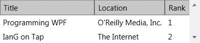
element. For example, consider a scrollable Grid with headings. [16] You could just put headings and contents into a single
Grid and then place that Grid in a ScrollViewer to make it scrollable, but this
suffers from a problem, which Example 3-15
illustrates.
<ScrollViewer>
  <Grid>
    <Grid.Resources>
      <Style TargetType="TextBlock">
        <Setter Property="Margin" Value="5,3" />
      </Style>
    </Grid.Resources>

    <Grid.ColumnDefinitions>
      <ColumnDefinition Width="*" />
      <ColumnDefinition Width="Auto" />
      <ColumnDefinition Width="Auto" />
    </Grid.ColumnDefinitions>
    <Grid.RowDefinitions>
      <RowDefinition Height="Auto" />
      <RowDefinition Height="Auto" />
      <RowDefinition Height="Auto" />
    </Grid.RowDefinitions>
    <Border Grid.Column="0" Grid.Row="0"
            Background="LightGray" BorderBrush="Gray"
            BorderThickness="1">
      <TextBlock>Title</TextBlock>
    </Border>
    <Border Grid.Column="1" Grid.Row="0"
            Background="LightGray" BorderBrush="Gray"
            BorderThickness="1">
        <TextBlock>Location</TextBlock>
    </Border>
    <Border Grid.Column="2" Grid.Row="0" Background="LightGray"
            BorderBrush="Gray" BorderThickness="1">
      <TextBlock>Rank</TextBlock>
    </Border>

    <TextBlock Grid.Column="0" Grid.Row="1" Text="Programming WPF" />
    <TextBlock Grid.Column="1" Grid.Row="1" Text="O'Reilly Media, Inc." />
    <TextBlock Grid.Column="2" Grid.Row="1" Text="1" />

    <TextBlock Grid.Column="0" Grid.Row="2" Text="IanG on Tap" />
    <TextBlock Grid.Column="1" Grid.Row="2" Text="The Internet" />
    <TextBlock Grid.Column="2" Grid.Row="2" Text="2" />
  </Grid>
</ScrollViewer>
Figure 3-17 shows the results.
If you look at the righthand side, you can see that the scroll bar
runs the entire height of the Grid,
including the header line with the titles. This means that as soon as
you scroll down, the headings will disappear. This is not particularly
helpful.
We could solve this by using two grids, one for the header and
one for the main results area. Only the second grid would be placed
inside a ScrollViewer. Figure 3-18 shows the results.

The scroll bar is now applied just to the part that needs to be
scrollable, but the alignment is all wrong. Each Grid has arranged its columns independently,
so the headings no longer line up with the main contents.
The Grid supports shared size groups to solve this problem. A
shared size group is simply a named group of columns, all of which
will have the same width, even if they are in different grids.
Tip
You can use shared size groups either across multiple grids or within a single grid.
We can use a shared size group to keep the headings Grid consistent with the scrollable contents
Grid. Example 3-16 illustrates the use of shared size
groups.
<DockPanelGrid.IsSharedSizeScope="True"> <DockPanel.Resources> <Style TargetType="TextBlock"> <Setter Property="Margin" Value="5,3" /> </Style> </DockPanel.Resources> <Grid DockPanel.Dock="Top"> <Grid.ColumnDefinitions> <ColumnDefinition Width="*" /> <ColumnDefinition Width="Auto"SharedSizeGroup="Location"/> <ColumnDefinition Width="Auto"SharedSizeGroup="Rank"/> <ColumnDefinition Width="Auto" /> </Grid.ColumnDefinitions> <Grid.RowDefinitions> <RowDefinition Height="Auto" /> </Grid.RowDefinitions> <Border Grid.Column="0" Grid.Row="0" BorderThickness="1" Background="LightGray" BorderBrush="Gray"> <TextBlock>Title</TextBlock> </Border> <Border Grid.Column="1" Grid.Row="0" BorderThickness="1" Background="LightGray" BorderBrush="Gray"> <TextBlock>Location</TextBlock> </Border> <Border Grid.Column="2" Grid.Row="0" BorderThickness="1" Grid.ColumnSpan="2" Background="LightGray" BorderBrush="Gray"> </Border> <TextBlock Grid.Column="2" Grid.Row="0">Rank</TextBlock><FrameworkElement Grid.Column="3"Width="{DynamicResource{x:Static SystemParameters.VerticalScrollBarWidthKey}}" /></Grid><ScrollViewer><Grid> <Grid.ColumnDefinitions> <ColumnDefinition Width="*" /> <ColumnDefinition Width="Auto"SharedSizeGroup="Location"/> <ColumnDefinition Width="Auto"SharedSizeGroup="Rank"/> </Grid.ColumnDefinitions> <Grid.RowDefinitions> <RowDefinition Height="Auto" /> <RowDefinition Height="Auto" /> </Grid.RowDefinitions> <TextBlock Grid.Column="0" Grid.Row="0" Text="Programming WPF" /> <TextBlock Grid.Column="1" Grid.Row="0" Text="O'Reilly Media, Inc." /> <TextBlock Grid.Column="2" Grid.Row="0">1</TextBlock> <TextBlock Grid.Column="0" Grid.Row="1">IanG on Tap</TextBlock> <TextBlock Grid.Column="1" Grid.Row="1">The Internet</TextBlock> <TextBlock Grid.Column="2" Grid.Row="1">2</TextBlock> </Grid></ScrollViewer></DockPanel>
In this example, the overall layout is defined by a DockPanel, using the attached Dock.Top property to position the header
Grid at the top, and allowing the
ScrollViewer to fill the remaining
space.
Shared size groups are identified by strings. Strings are prone
to name collisions—it’s quite possible that two developers
independently working on different parts of the user interface might
end up choosing the same name for their shared size groups,
inadvertently causing unrelated columns to have the same size. To
avoid this problem, Example 3-16 sets the
Grid.IsSharedSizeScope attached
property on the DockPanel. This
indicates that the DockPanel is the
common ancestor, and prevents the groups defined inside the DockPanel from being associated with any
groups of the same name defined elsewhere in the UI.
Tip
Grid.IsSharedSizeScope is
not optional. If you do not specify a shared size scope, WPF will
ignore your shared size groups.
Having defined the scope of the names, using shared size groups
is very straightforward. We just apply the SharedSizeGroup attribute to the “Location”
and “Rank” ColumnDefinition, and
this ensures that the columns are sized consistently across the two
grids. Figure 3-19 shows the
results.

The ScrollViewer adds a
scroll bar to the display, and this means that a small hack is
required to get this layout to work correctly. This scroll bar takes
away some space from the main Grid,
making it slightly narrower than the header Grid. Remember that the “Title” column’s
size is set to *, meaning that it
should fill all available space. The ScrollViewer’s scroll bar eats into this
space, making the “Title” column in the main Grid slightly narrower than the one in the
header Grid, destroying the
alignment.
You might think that we could fix this by adding a shared size
group for the “Title” column. Unfortunately, specifying a shared size
group disables the * behavior—the
column reverts to automatic sizing.
The fix for this is to add an extra column to the header row.
This row needs to be exactly the same width as the scroll bar added by
the ScrollViewer. So we have added
a fourth column, containing a FrameworkElement, with its Width set to the system scroll width metric
in order to make sure that it is exactly the same width as a scroll
bar. (We are using a DynamicResource reference to retrieve this
system parameter. This technique is described in Chapter 12.) It’s unusual to use a FrameworkElement directly, but because we
just need something that takes up space but has no appearance, it
makes a good lightweight filler object. Its presence keeps all of the
columns perfectly aligned across the two grids.
Tip
The Grid is the most
powerful of the built-in panels. You can get the Grid to do anything that DockPanel and StackPanel can do—those simpler elements
are provided for convenience. For nontrivial user interfaces, the
Grid is likely to be the best
choice for your top-level GUI layout, as well as being useful for
detailed internal layout.
UniformGrid
Powerful though the Grid is,
it’s occasionally a little cumbersome to use. There’s a simplified
version worth knowing about, called UniformGrid. All its cells are the same
size, so you don’t need to provide collections of row and column
descriptions—just set the Rows and
Columns properties to indicate the
size. In fact, you don’t even need to set these—by default, it creates
rows and columns automatically. It always keeps the number of rows and
columns equal to each other, adding as many as are required to make
space for the children. Each cell contains just one child, so you do
not need to add attached properties indicating which child belongs in
which cell—you just add children. This means you can use something as
simple as Example 3-17.
<UniformGrid TextBlock.TextAlignment="Center"><TextBlock Text="X" /> <TextBlock Text="O"/> <TextBlock Text="X"/> <TextBlock Text="X"/> <TextBlock Text="X"/> <TextBlock Text="O"/> <TextBlock Text="O"/> <TextBlock Text="O"/> <TextBlock Text="X"/></UniformGrid>
This contains nine elements, so the UniformGrid will create three rows and three
columns. Figure 3-20 shows the result.
Canvas
Occasionally, it can be necessary to take complete control of the
precise positioning of every element. For example, when you want to
build an image out of graphical elements, the positioning of the
elements is dictated by the picture you are creating, not by any set of
automated layout rules. For these scenarios, you can use a Canvas.
Canvas is the simplest of the
panels. It allows the location of child elements to be specified
precisely relative to the edges of the canvas. The Canvas doesn’t really do any layout at all; it
simply puts things where you tell it to. Also, Canvas will not size elements to fill the
available space—all its children are sized to content.
Warning
If you are accustomed to working with fixed layout systems such
as those offered by Visual Basic 6, MFC, and the most basic way of
using Windows Forms, the Canvas
will seem familiar and natural. However, it is strongly recommended
that you avoid it unless you really need this absolute control. The
automatic layout provided by the other panels will make your life much
easier because they can adapt to changes in text and font. They also
make it far simpler to produce resizable user interfaces. Moreover,
localization tends to be much easier with resizable user interfaces,
because different languages tend to produce strings with substantially
different lengths. Don’t opt for the Canvas simply because it seems
familiar.
When using a Canvas, you must
specify the location of each child element. If you don’t, all of your
elements will end up at the top-left corner. Canvas defines four attached properties for
setting the position of child elements. Vertical position is set with
either the Top or Bottom property, and horizontal position is
determined by either the Left or
Right property.
Example 3-18 shows a Canvas containing two TextBlock elements. The first has been
positioned relative to the top-left corner of the Canvas: the text will always appear 10 pixels
in from the left and 20 pixels down from the top. (As always, these are
device-independent pixels.) Figure 3-21
shows the result.
<Canvas Background="Yellow" Width="150" Height="100">
  <TextBlock Canvas.Left="10" Canvas.Top="20">Hello</TextBlock>
  <TextBlock Canvas.Right="10" Canvas.Bottom="20">world!</TextBlock>
</Canvas>

The second text element is more interesting. It has been
positioned relative to the bottom right of the form, which means that if
the canvas gets resized, the element will move with that corner of the
canvas. For example, if the Canvas
were the main element of a window, the second TextBlock element would move with the
bottom-right corner of the window if the user resized it.
Tip
If you have used Windows Forms, you may be wondering whether
setting both the Top and Bottom properties (or both Left and Right properties) will cause the element to
resize automatically when the containing canvas is resized. But unlike
with anchoring in Windows Forms, this technique does not work. If you
specify both Left and Right, or both Top and Bottom, one of the properties will simply be
ignored. (Top takes precedence over
Bottom, and Left takes precedence over Right.)
Fortunately, it is easy to get this kind of behavior with a
single-cell Grid and the Margin property. If you put an element into
a grid with a margin of, say, “10,10, 30,40”, its top-left corner will
be at (10,10) relative to the top left of the grid, its righthand side
will always be 30 pixels from the right edge of the grid, and its
bottom edge will always be 40 pixels from the bottom of the grid. This
is another reason to prefer Grid
over Canvas.
The main use for Canvas is to
arrange drawings. If you employ graphical elements such as Ellipse and Path, which are discussed in Chapter 13, you will typically need precise control over
their location, in which case the Canvas is ideal.
When child elements are larger than their parent panel, most
panels crop them, but the Canvas does
not by default, allowing elements to be partially or entirely outside of
its bounds. You can even use negative coordinates. The noncropping
behavior is sometimes useful because it means you do not need to specify
the size of the canvas—a zero-size canvas works perfectly well. However,
if you want to clip the content, set ClipToBounds to True.
The price you pay for the precise control offered by the Canvas is that it is inflexible. However,
there is one common scenario in which you can mitigate this rigidity. If
you’ve used a Canvas to arrange a
drawing and you would like that drawing to be automatically resizable,
you can use a Viewbox in conjunction
with the Canvas.
Viewbox
The Viewbox element
automatically scales its content to fill the space available. Strictly
speaking, Viewbox is not a panel—it
derives from Decorator. This means
that unlike most panels, it can have only one child. However, its
capability to adjust the size of its content in order to adapt to its
surroundings makes it a useful layout tool.
Figure 3-22 shows a window that
doesn’t use a Viewbox but probably
should. The window’s content is a Canvas containing a rather small drawing.
Example 3-19 shows the markup.

<Window xmlns="http://schemas.microsoft.com/winfx/2006/xaml/presentation">
  <Canvas Width="18" Height="18" VerticalAlignment="Center">
    <Ellipse Canvas.Left="1" Canvas.Top="1" Width="16" Height="16"
             Fill="Yellow" Stroke="Black" />
    <Ellipse Canvas.Left="4.5" Canvas.Top="5" Width="2.5" Height="3"
                         Fill="Black" />
    <Ellipse Canvas.Left="11" Canvas.Top="5" Width="2.5" Height="3"
                         Fill="Black" />
    <Path Data="M 5,10 A 3,3 90 0 0 13,10" Stroke="Black" />
  </Canvas>

</Window>
We can use a Viewbox to resize
the content automatically. It will expand it to be large enough to fill
the space, as shown in Figure 3-23. (If
you’re wondering why the drawing doesn’t touch the edges of the window,
it’s because the Canvas is slightly
larger than the drawing it contains.)

All we had to do to get this automatic resizing was wrap the
Canvas element in a Viewbox element, as shown in Example 3-20.
<Window xmlns="http://schemas.microsoft.com/winfx/2006/xaml/presentation"><Viewbox><Canvas Width="18" Height="18" VerticalAlignment="Center"> ...as before... </Canvas></Viewbox></Window>
Notice how in Figure 3-23 the Canvas has been made tall enough to fill the
window, but not wide enough. This is because by default, the Viewbox preserves the aspect ratio of its
child. If you want, you can disable this so that it fills all the space,
as Figure 3-24 shows.

To enable this behavior we set the Stretch property. Its default value is
Uniform. We can make the Viewbox stretch the Canvas to fill the whole space by setting the
property to Fill, as Example 3-21 shows.
You can also set the Stretch
property to None to disable
stretching. That might seem pointless, because the effect is exactly the
same as not using a Viewbox at all.
However, you might do this from code to flip between scaled and
normal-size views of a drawing. There is also a UniformToFill setting, which preserves the
aspect ratio but fills the space, clipping the source in one dimension,
if necessary (see Figure 3-25).

Tip
The Viewbox can scale any
child element—it’s not just for Canvas. However, you would rarely use it to
size anything other than a drawing. If you were to use a Viewbox to resize some nongraphical part of
your UI, it would resize any text in there as well, making it look
inconsistent with the rest of your UI. For a resizable user interface,
you are best off relying on the resizable panels shown in this
chapter.
Common Layout Properties
All user interface elements have a standard set of layout
properties, mostly inherited from the FrameworkElement base class. These properties
are shown in Table 3-2. We saw a
few of these in passing in the preceding section, but we will now look
at them all in a little more detail.
Property | Usage |
| Specifies a fixed width |
| Specifies a fixed height |
| The minimum permissible width |
| The maximum permissible width |
| The minimum permissible height |
| The maximum permissible height |
| Horizontal position if element is smaller than available space |
| Vertical position if element is smaller than available space |
| Space around outside of element |
| Space between element border and content |
| Allows the element to be made invisible to the layout system where necessary |
| Text direction |
| Controls which elements are on top or underneath |
| Applies a transform without modifying the layout |
| Applies a transform that affects layout |
A couple of these properties are not from FrameworkElement. Padding is defined in several places: Control, Border, and TextBlock each define this property. It has
the same meaning in all cases. It is not quite ubiquitous because
padding is meaningful only on elements that have content. Panel.ZIndex may be applied to any element,
but it’s not strictly inherited from FrameworkElement—it is an attached
property.
Width and Height
You can set these properties to specify an exact width and height for your element. You should try to avoid using these—in general it is preferable to let elements determine their own size where possible. It will take less effort to change your user interface if you allow elements to “size to content.” It can also simplify localization. However, you will occasionally need to provide a specific size.
If you specify a Width or
Height, the layout system will
always attempt to honor your choices. Of course, if you make an
element wider than the screen, WPF can’t make the screen any wider,
but as long as what you request is possible, it will be done.
MinWidth, MaxWidth, MinHeight, and MaxHeight
These properties allow you to specify upper and lower limits on
the size of an element. If you need to constrain your user interface’s
layout, it is usually better to use these than Width and Height where possible. By specifying upper
and lower limits, you can still allow WPF some latitude to automate
the layout.
It is possible to mandate limits that simply cannot be
fulfilled. For example, if you request a MinWidth of "10000", WPF won’t be able to honor that
request unless you have some very exotic display hardware. In these
cases, your element will be truncated to fit the space
available.
HorizontalAlignment and VerticalAlignment
These properties control how an element is placed inside a
parent when more room is available than is necessary. For example, a
vertical StackPanel will normally
be as wide as the widest element, meaning that any narrower elements
are given excess space. Alignment is for these sorts of scenarios,
enabling you to determine what the child element does with the extra
space.
The default setting for both of these properties is Stretch—when excess space is available, the
element will be enlarged to fill that space. The alternatives are
Left, Center, and Right for HorizontalAlignment, and Top, Center, and Bottom for VerticalAlignment. If you choose any of
these, the element will not be stretched—it will use its natural
height or width, and will then be positioned to one side or in the
center.
Margin
This property determines the amount of space that should be left around the element during layout.
You can specify Margin as a
single number, a pair of numbers, or a list of four numbers. When one
number is used, this indicates that the same amount of space should be
left on all sides. With two numbers, the first indicates the space to
the left and right and the second indicates the space above and below.
When four numbers are specified, they indicate the amount of space on
the left, top, right, and bottom sides, respectively.
You can use the Margin
property to control an element’s position. For example, although
Grid does not define attached
properties to control the exact positioning of an element, it will
honor the Margin property relative
to the element’s cell. Example 3-22 shows a simple
single-cell grid that uses this technique.
<Border BorderBrush="Black" BorderThickness="1">
  <Grid>
    <Rectangle Margin="20, 10, 0, 0" Fill="Green"
         Width="80" Height="30"
         HorizontalAlignment="Left" VerticalAlignment="Top" />
  </Grid>
</Border>
The rectangle it contains will be 20 device-independent pixels
in from the left and 10 down from the top, as Figure 3-26 shows. Note that we’ve left the last two
values of the Margin property—the
right and bottom margins—at zero. That’s because we only want to use
the margin to specify the position of the top left of the rectangle.
The position of the bottom right is determined by the rectangle’s size
in this case.

Padding
Whereas Margin indicates how
much space should be left around the outside of an element, Padding specifies how much should be left
between a control’s outside and its internal content.
Padding is not present on all
WPF elements, because not all elements have internal content. It is
defined by the Control base class,
and the Border and TextBlock classes, as well as some of the
text elements described in Chapter 14.
Example 3-23 shows three buttons, one with just a margin, one with both a margin and padding, and one with just padding. It also fills the area behind the buttons with color so that the effects of the margin can be seen.
<Grid ShowGridLines="True" Background="Cyan">
  <Grid.ColumnDefinitions>
    <ColumnDefinition Width="Auto" />
    <ColumnDefinition Width="Auto" />
    <ColumnDefinition Width="Auto" />
  </Grid.ColumnDefinitions>
  <Grid.RowDefinitions>
    <RowDefinition Height="Auto" />
  </Grid.RowDefinitions>

  <Button Grid.Column="0" Margin="20" Padding="0">Click me!</Button>
  <Button Grid.Column="1" Margin="10" Padding="10">Click me!</Button>
  <Button Grid.Column="2" Margin="0"  Padding="20">Click me!</Button>

</Grid>
Figure 3-27 shows the results. The button with a margin but no padding has appeared at its normal size, but has space around it. The middle button is larger, because the padding causes space to be added around its content. The third button is larger still because it has more padding, but it has no space around it because it has no margin.

Visibility
The Visibility property
determines whether an element is visible. It has an impact on layout,
because if you set it to Collapsed,
the preferred size of the element will become zero. This is different
from Hidden—this indicates that
although the element is not visible, the layout system should treat it
in the same way as it would if it were Visible.
FlowDirection
The FlowDirection property
controls how text flows; the default is based on the system locale.
For example, in English-speaking locales, it will be left to right,
but many cultures use the alternative right-to-left style. Setting the
FlowDirection property to RightToLeft affects the flow direction of
all text, and of any WrapPanel
elements contained within that element. This is an inherited property, meaning that it applies
to all its descendants—setting this on a window implicitly sets it for
all elements in the window. Example 3-24 shows
this property applied to a WrapPanel.
<StackPanel>
  <WrapPanel Orientation="Horizontal">
    <Button>One</Button>
    <Button>Two</Button>
    <Button>Three</Button>
  </WrapPanel>
  <WrapPanel Orientation="Horizontal" FlowDirection="RightToLeft">
    <Button>One</Button>
    <Button>Two</Button>
    <Button>Three</Button>
  </WrapPanel>
</StackPanel>
Figure 3-28 shows the results.

Although the WrapPanel offers
the most straightforward way of illustrating FlowDirection, the property’s main purpose
is to control how text is arranged—its impact on WrapPanel is of secondary importance. On the
face of it, a property for controlling text flow direction may seem to
be unnecessary, because Unicode defines the directionality of each
codepoint. If a string contains, say, Hebrew letters, these have an
intrinsic right-to-left direction, and will be rendered in that
direction regardless of the FlowDirection setting. Example 3-25 shows three Hebrew
letters:Alef ( ), Bet (
 ), and Gimel (
 ).
).
This will appear as shown in Figure 3-29. Notice that the first character
has appeared on the right, with the second and third appearing to the
left. This illustrates that WPF doesn’t need to be told the flow
direction for text with intrinsic directionality. And even if we
explicitly set the text block’s flow direction to LeftToRight, the directionality of these
characters would override this setting.
However, problems emerge when using characters that do not have a strong directionality. Example 3-26 makes a subtle change.
This adds a colon to the end of the second line, after the
Hebrew characters, and the results will appear as shown in Figure 3-30. Although the three Hebrew characters
have been displayed from right to left as before, the colon has been
shown to the right. This is because the colon is not a right-to-left
character. (Strictly speaking, Unicode considers its directionality to
be “weak.”) But because the TextBlock doesn’t have an explicit FlowDirection, the default flow direction
applies—left to right, on the authors’ machines. So the colon has
appeared where it normally would with left-to-right text, which is
inconsistent with the right-to-left text it appears next to
here.
To make the colon appear in a location consistent with the directionality of the remaining text, we need to tell WPF that we would like right-to-left text flow here. This won’t affect any text with an intrinsic directionality, but it will determine where the colon appears. Example 3-27 contains a mixture of Hebrew and Latin characters to illustrate this.
<TextBlock FlowDirection="RightToLeft"> אבג: Foo </TextBlock>
The sequence of characters here is three Hebrew letters, a
colon, a space, and then three Latin letters. As Figure 3-31 illustrates, the
Hebrew letters have been shown from right to left as they were before.
But this time, the colon has been shown to the left of these letters
rather than to the right, because of the FlowDirection setting. The three Latin
letters appear to the left of the other letters in accordance with the
RightToLeft flow direction, but
because these letters all have an intrinsic left-to-right
directionality, this block of Latin letters has been displayed from
left to right.
The full details of the algorithm used for bidirectional layout of Unicode text is given in Annex 9 of the Unicode specification. It is too complex to describe in full detail here, but you can find it at http://www.unicode.org/reports/tr9(http://tinysells.com/99).
Panel.ZIndex
Panel defines an attached
property, ZIndex, that determines
which element appears on top when two of them overlap. By default, the
Z order of elements is determined by the order in which they are
defined. Of the elements inside a particular panel, they will
typically be rendered in the order in which they appear, causing the
last one to appear to be “on top.” Panel.ZIndex lets you control the rendering
order independently of the document order.
Elements with a higher Panel.ZIndex appear on top of those with a
lower Panel.ZIndex. The default
value is 0, so elements with a
positive Panel.ZIndex will appear
on top of those that do not specify one. Example 3-28 does not use Panel.ZIndex, so the element overlapping
order is determined by the order in which the elements appear.
<Grid>
  <Button Width="75" Height="23" Margin="0,0"
        HorizontalAlignment="Left" VerticalAlignment="Top">

    One
  </Button>
  <Button Width="75" Height="23" Margin="15,15"
        HorizontalAlignment="Left" VerticalAlignment="Top">
    Two
  </Button>
  <Button Width="75" Height="23" Margin="30,30"
        HorizontalAlignment="Left" VerticalAlignment="Top">
    Three
  </Button>
</Grid>
This is shown on the left of Figure 3-32. The version on the right comes from Example 3-29.

Example 3-29 uses Panel.ZIndex to reverse the overlap.
<Grid> <Button Width="75" Height="23" Margin="0,0"Panel.ZIndex="3"HorizontalAlignment="Left" VerticalAlignment="Top"> One </Button> <Button Width="75" Height="23" Margin="15,15"Panel.ZIndex="2"HorizontalAlignment="Left" VerticalAlignment="Top"> Two </Button> <Button Width="75" Height="23" Margin="30,30"Panel.ZIndex="1"HorizontalAlignment="Left" VerticalAlignment="Top"> Three </Button> </Grid>
RenderTransform and LayoutTransform
You can use both the RenderTransform and LayoutTransform properties to apply a
transform, such as scaling or rotation, to an element and all of its
children. Transforms are described in Chapter 13, but
it is useful to understand their impact on layout.
If you apply a transform that doubles the size of an element,
the element will appear to be twice as large on-screen. You would
normally want the layout system to take this into account—if a
Rectangle with a Width of 100 is scaled up to twice its size,
it will normally make sense for the layout system to treat it as
having an effective width of 200. However, you might sometimes want
the transformation to be ignored for layout purposes. For example, if
you are using a transform in a short animation designed to draw
attention to a particular part of the UI, you probably don’t want the
entire UI’s layout to be changed as a result of that animation.
You can apply a transform to an object using either LayoutTransform or RenderTransform. The former causes the
transform to be taken into account by the layout system, and the
latter causes it to be ignored. Example 3-30 shows three
buttons, one containing untransformed content, and the other two
containing content transformed with these two properties.
<StackPanel>
  <Button>
    <TextBlock>
      Foo bar
    </TextBlock>
  </Button>
  <Button>
    <TextBlock>
<TextBlock.RenderTransform>
        <ScaleTransform ScaleX="3" ScaleY="3" />
      </TextBlock.RenderTransform>
      Foo bar
    </TextBlock>
  </Button>
  <Button>
    <TextBlock>
<TextBlock.LayoutTransform>
        <ScaleTransform ScaleX="3" ScaleY="3" />
      </TextBlock.LayoutTransform>
      Foo bar
    </TextBlock>
  </Button>
</StackPanel>
Figure 3-33 shows
the results. As you can see, the button with content scaled by
RenderTransform has the same size
border as the unscaled one. The presence of the transform has had no
effect on layout, and the content no longer fits inside the space
allocated for it. However, the LayoutTransform has been taken into account
by the layout system—the third button has been enlarged in order for
the scaled content to fit.

The layout system deals with LayoutTransform in a straightforward manner
for simple scaling transforms. The size allocated for the content is
scaled up accordingly. But what about rotations? Figure 3-34 shows a button whose content
has a LayoutTransform that rotates
the content by 30 degrees. This is not a scaling transform, but notice
that the button has grown to accommodate the content—it is taller than
a normal button.

When it encounters a LayoutTransform, the layout system simply
applies that transform to the bounding box, and makes sure that it
provides enough space to hold the transformed bounding box. This can
occasionally lead to surprising results. Consider the two buttons in
Example 3-31.
<StackPanel> <Button HorizontalAlignment="Left"><Line Stroke="Blue" Y1="30" X2="100" /></Button> <Button HorizontalAlignment="Left"><Line Stroke="Blue" Y1="30" X2="100"><Line.LayoutTransform><RotateTransform Angle="50" /></Line.LayoutTransform></Line></Button> </StackPanel>
These are shown in Figure 3-35. The top button looks as you would expect—the button is large enough to contain the graphical content. But the bottom one is rather surprising—the button appears to be taller than necessary.

This result makes sense only when you consider the bounding
box—remember that the layout system decides how much space to allocate
by applying the LayoutTransform to
the bounding box. So let’s look at it again, this time with the
bounding boxes shown. Example 3-32
is a modified version of Example 3-31, with
Border elements added to show the
bounding box of the lines.
<StackPanel> <Button HorizontalAlignment="Left"><Border BorderBrush="Black" BorderThickness="1"><Line Stroke="Blue" Y1="30" X2="100" /></Border></Button> <Button HorizontalAlignment="Left"><Border BorderBrush="Black" BorderThickness="1"><Border.LayoutTransform><RotateTransform Angle="50" /></Border.LayoutTransform><Line Stroke="Blue" Y1="30" X2="100" /></Border></Button> </StackPanel>
In Figure 3-36, we can now see the bounding box of the content. The button on the bottom shows this bounding box with the same 50 degree rotation as has been applied to the line. This makes it clear that the button is exactly large enough to hold this rotated bounding box.
You might be wondering why WPF doesn’t simply calculate a new
bounding box for the transformed content instead of transforming the
existing one. The reason is that calculating a new bounding box may
not be possible. Some elements, such as Canvas, can declare a width and height that
do not directly reflect their apparent size. The only sensible way in
which the layout system can deal with such elements is to treat their
logical shape as being rectangular. Using this approach of
transforming the bounding box everywhere ensures consistent
behavior.
When Content Doesn’t Fit
Sometimes WPF will not be able to honor your requests because you
have asked the impossible. Example 3-33
creates a StackPanel with a Height of 100, which contains a Button with a Height of 195.
<StackPanelHeight="100"Background="Yellow" Orientation="Horizontal"> <Button>Foo</Button> <Button Height="30">Bar</Button> <ButtonHeight="195">Quux</Button> </StackPanel>
Clearly that last button is too big to fit—it is taller than its containing panel. Figure 3-37 shows how WPF deals with this.

The StackPanel has dealt with
the anomaly by truncating the element that was too large. When
confronted with contradictory hardcoded sizes like these, most panels
take a similar approach, and will crop content where it simply cannot
fit.
There is some variation in the way that panels handle overflow in
situations where sizes are not hardcoded, but there is still too much
content to fit. Example 3-34 puts two copies of
a TextBlock and its content into a
StackPanel and a Grid cell.
<Grid Background="Yellow" ShowGridLines="True">
  <Grid.RowDefinitions>
    <RowDefinition />
    <RowDefinition />
  </Grid.RowDefinitions>

  <StackPanel Height="100" Orientation="Horizontal">
    <TextBlock TextWrapping="Wrap" FontSize="20">
      This is some text that is too long to fit.
    </TextBlock>
  </StackPanel>

  <TextBlock Grid.Row="1" TextWrapping="Wrap" FontSize="20">
    This is some text that is too long to fit.
  </TextBlock>
</Grid>
Figure 3-38 shows what happens when the
available space is too narrow to hold the TextBlock at its natural length.

The StackPanel has simply
truncated the TextBlock. The Grid has been slightly more intelligent. It
has exploited the fact that the TextBlock had wrapping enabled, and was able
to flow the text into the narrow space available.[17] WrapPanel and DockPanel both show the same behavior. Even
this technique has its limits, of course—sometimes you really will have
more content than fits in the space available. In that case, it may be
appropriate to use a ScrollViewer,
discussed presently.
The reason StackPanel doesn’t
result in wrapped text is that it does not attempt to constrain its
children in the stacking direction: a horizontal StackPanel lets each child choose its
preferred width, whether or not it fits. In effect, it pretends there is
an infinite amount of space, which is why the child TextBlock didn’t attempt to wrap. StackPanel will constrain children in the
other direction, though, so a vertical StackPanel would pass on the horizontal
constraint, causing the TextBlock in
this example to wrap. Canvas allows
its children to determine both their width and their height regardless
of available space, so a Canvas would
fail to wrap, just like the StackPanel in this example.
ScrollViewer
The ScrollViewer control allows
oversized content to be displayed by putting it into a scrollable area.
A ScrollViewer element has a single
child. Example 3-35 uses an Ellipse element, but it could be anything. If
you want to put multiple elements into a scrollable view, you would nest
them inside a panel.
<ScrollViewer HorizontalScrollBarVisibility="Auto"><Ellipse Fill="Green" Height="1000" Width="2000" /></ScrollViewer>
If the content of a ScrollViewer is larger than the space
available, the ScrollViewer can
provide scroll bars to allow the user to scroll around the content, as
ScrollViewer shows. By default, a ScrollViewer provides a vertical scroll bar,
but not a horizontal one. In Figure 3-39, the
HorizontalScrollBarVisibility
property has been set to Auto,
indicating that a horizontal scroll bar should be added if
required.

This Auto visibility we’ve
chosen for the horizontal scroll bar is different from the default
vertical behavior. The VerticalScrollBarVisibility defaults to
Visible, meaning that the scroll bar
is present whether it is required or not.
There are two ways to make sure a scroll bar does not appear. You
can set its visibility either to Disabled (the default for horizontal scroll
bars) or to Hidden. The distinction
is that Disabled constrains the
logical size of the ScrollViewer’s
contents to be the same as the available space. Hidden allows the logical size to be
unconstrained, even though the user has no way of scrolling into the
excess space. This can change the behavior of certain layout
styles.
To examine how these settings affect the behavior of a ScrollViewer, we’ll start with the code shown
in Example 3-36, and then show what happens as
we change the ScrollViewer
properties.
<ScrollViewer ...>
  <Grid>
    <Grid.ColumnDefinitions>
      <ColumnDefinition />
      <ColumnDefinition />
      <ColumnDefinition />
    </Grid.ColumnDefinitions>
    <Grid.RowDefinitions>
      <RowDefinition Height="Auto" />
    </Grid.RowDefinitions>

    <Button Grid.Column="0">Stretched</Button>
    <Button Grid.Column="1">Stretched</Button>
    <Button Grid.Column="2">Stretched</Button>
  </Grid>
</ScrollViewer>
This example shows a Grid
containing three Button elements in a
row. If the Grid is given more space
than it requires, it will stretch the buttons to be wider than
necessary. If it is given insufficient space, it will crop the buttons.
If it is placed inside a ScrollViewer, it will be possible for the
ScrollViewer to provide enough
virtual, scrollable space for it, even if the space on-screen is
insufficient.
Figure 3-40 shows
how the Grid in Example 3-36 appears in a ScrollViewer when there is more than enough
space. All four options for HorizontalScrollBarVisibility are shown, and
in all four cases, the buttons have been stretched to fill the
space.

Figure 3-41 shows
the same four arrangements, but with insufficient horizontal space. The
top two ScrollViewer elements have
horizontal scrolling enabled, with Visible and Auto, respectively. As you would expect, the
ScrollViewer has provided enough
space to hold all of the content, and allows the user to scroll the
hidden part into view. At the bottom left, where the horizontal scroll
bar is set to Hidden, the layout
behavior is the same—it has arranged the elements as though there were
enough space to hold all of them. The only difference is that it has not
shown a scroll bar. (Scrolling will still occur if the user uses
keyboard navigation to move the focus into the hidden area.) At the
bottom right, we can see that the behavior resulting from Disabled is different. Here, not only is a
scroll bar not shown, but also horizontal scrolling is disabled
completely. The Grid has therefore
been forced to crop the buttons to fit into the available space.

Scrollable Region and IScrollInfo
If you place a panel or any other ordinary element inside a
ScrollViewer, the ScrollViewer will measure its size in the
normal way: the scrollable area essentially sizes to content (unless
the available area is surplus to requirements, in which case the
ScrollViewer gives the child all of
the available space). It keeps track of the currently visible region,
and moves the child content around as required. Most of the time, this
is exactly the behavior you require. However, occasionally you might
need to take a bit more control.
For example, if you have a large scrollable area containing lots of items, it might not be very efficient to create all of the items upfront. You might be able to improve performance significantly by creating items on demand only as they scroll into view. Such tricks require you to get more deeply involved in the scrolling process.
If you want to take control of how scrolling functions, you must
write a user interface element that implements IScrollInfo. ScrollViewer looks for this interface on its
child element. If the child implements the interface, the ScrollViewer will no longer pretend that the
child has all the space it requires—instead, it will tell the child
exactly how much space is available on-screen for the viewport, and
will defer to the child for all scrolling operations. In this case,
the ScrollViewer’s role is reduced
to showing scroll bars and notifying the child when the user attempts
to scroll.
This is not a step to be taken lightly. IScrollInfo has 24 members, and requires you
to do most of the work that ScrollViewer would otherwise have done for
you.[18] Fortunately, for the very common scenario of scrolling
through a list, we can use the built-in IScrollInfo implementation provided by
VirtualizingStackPanel. The
VirtualizingStackPanel implements
IScrollInfo so that it can show
scroll feedback for all of the data, even though it only generates UI
elements to represent those items currently visible, “virtualizing”
the view of the data. You don’t need to take any special steps to
enable virtualization—a data-bound ListBox automatically displays its items
using a VirtualizingStackPanel. You
would need to implement IScrollInfo
only if you are not using data binding, or if you need something other
than a simple linear stack of items.
Warning
If you customize the appearance of an ItemsControl using the template techniques
described in Chapter 8 and Chapter 9, you might end up disabling
virtualization. To avoid this, you should ensure that if you change
the Template or ItemsPanelTemplate property of an ItemsControl, your replacement template
contains a VirtualizingStackPanel.
We have now looked at all of the built-in mechanisms for helping you manage your application’s layout. But what if you have unusual requirements that are not met by the built-in panels? Sometimes it is necessary to customize the layout process by writing your own panel.
Custom Layout
Although WPF supplies a flexible set of layout elements, you might decide that none of them suits your requirements. Fortunately, the layout system is extensible, and it is fairly straightforward to implement your own custom panel. To write a panel, you need to understand how the layout system works.
Layout occurs in two phases: measure and arrange. Your custom panel will first be asked how much space it would like to have—that’s the measure phase. The panel should measure each of its children to find out how much space they require, and use this information to calculate how much space the panel needs in total.
Of course, you can’t always get what you want. If your panel’s
measure phase decides it needs an area twice the size of the screen, it
won’t get that unless its parent happens to be a ScrollViewer. Moreover, even when there is
enough space on-screen, your panel’s parent could still choose not to
give it to you. For example, if your custom panel is nested inside a
Grid, the Grid may have been set up with a hardcoded
width for the column your panel occupies, in which case that’s the width
you’ll get regardless of what you asked for during the measure
phase.
It is only in the “arrange” phase that we find out how much space we have. During this phase, we must decide where to put all of our children as best we can in the space available.
Tip
You might be wondering why the layout system bothers with the measure phase when the amount of space we get during the arrange phase may be different. The reason for having both is that most panels try to take the measured size of their children into account during the arrange phase. You can think of the measure phase as asking every element in the tree what it would like, and the arrange phase as honoring those measurements where possible, compromising only where physical or configured constraints come into play.
Let’s create a new panel type to see how the measure and arrange
phases work in practice. We’ll call this new panel DiagonalPanel, and it will arrange elements
diagonally from the top left of the panel down to the bottom right, as
Figure 3-42 shows. Each element’s
top-left corner will be placed where the preceding element’s
bottom-right corner went.
Tip
You don’t really need to write a new panel type to achieve this
layout—you could get the same effect with a Grid, setting every row and column’s size to
Auto. However, you could make the
same argument for StackPanel and
DockPanel—neither of those does
anything that you couldn’t do with the Grid. It’s just convenient to have a simple
single-purpose panel, as the Grid
equivalent is a little more verbose.

To implement this custom layout, we must write a class that
derives from Panel, and that
implements the measure and arrange phases. As Example 3-37 shows, we do this by overriding the
MeasureOverride and ArrangeOverride methods.
using System;
using System.Windows.Controls;
using System.Windows;

namespace CustomPanel {
    public class DiagonalPanel : Panel {

        protected override Size MeasureOverride( Size availableSize ) {
            double totalWidth = 0;
            double totalHeight = 0;

            foreach( UIElement child in Children ) {
                child.Measure( new Size( double.PositiveInfinity,
                                         double.PositiveInfinity ) );
                Size childSize = child.DesiredSize;
                totalWidth += childSize.Width;
                totalHeight += childSize.Height;
            }

            return new Size( totalWidth, totalHeight );
        }

        protected override Size ArrangeOverride( Size finalSize ) {
            Point currentPosition = new Point( );

            foreach( UIElement child in Children ) {
                Rect childRect = new Rect( currentPosition, child.DesiredSize );
                child.Arrange( childRect );
                currentPosition.Offset( childRect.Width, childRect.Height );
            }
            return new Size( currentPosition.X, currentPosition.Y );
        }
    }
}
Notice that the MeasureOverride
method is passed a Size parameter. If
the parent is aware of size constraints that will need to be applied
during the arrange phase, it passes them here during the measure phase.
For example, if this panel’s parent was a Window with a specified size, the Window would pass in the size of its client
area during the measure phase. However, not all panels will do this. You
may find the available size is specified as being Double.PositiveInfinity in both dimensions,
indicating that the parent is not informing us of any fixed constraints
at this stage. An infinite available size indicates that we should
simply pick whatever size is appropriate for our content. You must pick
a finite size—returning an infinite size from your MeasureOverride will cause an exception to be
thrown.
Some elements ignore the available size, because their size is
always determined by their contents. For example, our panel’s simple
layout is driven entirely by the natural size of its children, so it
ignores the available size. Our MeasureOverride simply loops through all of
the children, adding their widths and heights. We pass in an infinite
size when calling Measure on each
child in order to use its preferred size.
Warning
You must call Measure on all
of your panel’s children. If your MeasureOverride fails to measure all of its
children, the layout process may not function correctly. All elements
expect to be measured before they are arranged. Their arrange logic
might rely on the results of calculations performed during the measure
phase. When you write a custom panel, it is your responsibility to
ensure that child elements are measured and arranged at the
appropriate times.
In our ArrangeOverride, we loop
through all of the child elements, setting them to their preferred size,
basing the position on the bottom-righthand corner of the preceding
element. Because this very simple layout scheme cannot adapt, it ignores
the amount of space it has been given. Any child elements that do not
fit will be cropped, as happens with StackPanel.
This measure and arrange sequence traverses the entire user
interface tree—all elements use this mechanism, not just panels. A
custom panel is the most appropriate place to write custom layout logic
for managing the arrangement of controls. However, there is one other
situation in which you might want to override the MeasureOverride and ArrangeOverride methods. If you are writing a
graphical element that uses the low-level visual APIs described in Chapter 13, you may want to override these methods in order
for the layout system to work with your element. The code will typically
be simpler than for a panel, because you will not have child elements to
arrange. Your MeasureOverride will
simply need to report how much space it needs, and ArrangeOverride tells you how much space you
have been given.
Where Are We?
WPF provides a wide range of options for layout. Many panel types
are available, each offering its own layout style. You can then compose
these into a single application in any number of ways, supporting many
different user interface styles. The top-level layout will usually be
set with either a Grid or a DockPanel. The other panels are typically used
to manage the details. You can use the common layout properties on child
elements to control how they are arranged—these properties work
consistently across all panel types. And if none of the built-in layout
mechanisms meets your requirements, you can write your own custom
panel.
[14] * A frequently asked question is “why do some of these type names end in ‘Panel’ when some do not? The naming seems to be inconsistent.” The pattern appears to be that the names should be, unambiguously, nouns. Stack, Wrap, and Dock can all be used as verbs, which is why “Panel” is appended. Grid and Canvas are both nouns, so they don’t get “Panel” tacked on the end.
[15] * In XAML, you can also use the
suffix in, cm, or
pt to specify inches, centimeters, or points.
These will all be converted to device-independent pixels, and the
unit type will be Pixel.
Sometimes these units don’t map neatly into pixels (e.g., a value
of 1pt will be converted into
1.3333 pixels).
[16] * The ListView control provides just such a
thing, so you don’t necessarily have to build your own. However,
it also entails certain interactive behaviors that you may not
want in your application. For example, ListView requires you to use data
binding, whereas the alternative presented here does not.
[17] * The reason for the difference in
behavior is that StackPanel uses
a very simple layout mechanism. A horizontal StackPanel always sizes its children to
content horizontally, regardless of whether there is sufficient
space.
[18] * For a full example of how to
implement IScrollInfo, see a
series of three articles on this subject, written by a Microsoft
developer, at http://blogs.msdn.com/bencon/archive/2006/01.aspx(http://tinysells.com/64).