
Chapter 4. Input
A user interface wouldn’t be much use if it couldn’t respond to user
input. In this chapter, we will examine the input handling mechanisms
available in WPF. There are three main kinds of user input for a Windows
application: mouse, keyboard, and ink.[19] Any user interface element can receive input—not just
controls. This is not surprising, because controls rely entirely on the
services of lower-level elements like Rectangle and TextBlock in order to provide visuals. All of
the input mechanisms described in the following sections are, therefore,
available on all user interface element types.
Raw user input is delivered to your code through WPF’s routed event mechanism. There is also a higher-level concept of a command—a particular action that might be accessible through several different inputs such as keyboard shortcuts, toolbar buttons, and menu items.
Routed Events
The .NET Framework defines a standard mechanism for managing events. A class may expose several events, and each event may have any number of subscribers. WPF augments this standard mechanism to overcome a limitation: if a normal .NET event has no registered handlers, it is effectively ignored.
Consider what this would mean for a typical WPF control. Most
controls are made up of multiple visual components. For example, suppose
you give a button a very plain appearance consisting of a single
Rectangle, and provide a simple piece
of text as the content. (Chapter 9 describes
how to customize a control’s appearance.) Even with such basic visuals,
there are still two elements present: the text and the rectangle. The
button should respond to a mouse click whether the mouse is over the
text or the rectangle. In the standard .NET event handling model, this
would mean registering a MouseLeftButtonUp event handler for both
elements.
This problem would get much worse when taking advantage of WPF’s
content model. A Button is not
restricted to having plain text as a caption—it can contain any object
as content. The example in Figure 4-1 is not especially ambitious,
but even this has six visible elements: the yellow outlined circle, the
two dots for the eyes, the curve for the mouth, the text, and the button
background itself. Attaching event handlers for every single element
would be tedious and inefficient. Fortunately, it’s not
necessary.
WPF uses routed events, which are rather more thorough than normal events. Instead of just calling handlers attached to the element that raised the event, WPF walks the tree of user interface elements, calling all handlers for the routed event attached to any node from the originating element right up to the root of the user interface tree. This behavior is the defining feature of routed events, and is at the heart of event handling in WPF.
Example 4-1 shows
markup for the button in Figure 4-1. If one of the Ellipse elements inside the Canvas were to receive input, event routing
would enable the Button, Grid, Canvas, and Ellipse to receive the event, as Figure 4-2 shows.
<ButtonPreviewMouseDown="PreviewMouseDownButton"MouseDown="MouseDownButton"> <GridPreviewMouseDown="PreviewMouseDownGrid"MouseDown="MouseDownGrid"<Grid.ColumnDefinitions> <ColumnDefinition /> <ColumnDefinition /> </Grid.ColumnDefinitions> <CanvasPreviewMouseDown="PreviewMouseDownCanvas"MouseDown="MouseDownCanvas" Width="20" Height="18" VerticalAlignment="Center"> <EllipsePreviewMouseDown="PreviewMouseDownEllipse"MouseDown="MouseDownEllipse" x:Name="myEllipse" Canvas.Left="1" Canvas.Top="1" Width="16" Height="16" Fill="Yellow" Stroke="Black" /> <Ellipse Canvas.Left="4.5" Canvas.Top="5" Width="2.5" Height="3" Fill="Black" /> <Ellipse Canvas.Left="11" Canvas.Top="5" Width="2.5" Height="3" Fill="Black" /> <Path Data="M 5,10 A 3,3 0 0 0 13,10" Stroke="Black" /> </Canvas> <TextBlock Grid.Column="1">Click!</TextBlock> </Grid> </Button>

A routed event can either be bubbling, tunneling, or direct. A bubbling event starts by looking for event handlers attached to the target element that raised the event, and then looks at its parent and then its parent’s parent, and so on until it reaches the root of the tree; this order is indicated by the numbers in Figure 4-2. A tunneling event works in reverse—it looks for handlers at the root of the tree first and works its way down, finishing with the originating element.
Direct events work like normal .NET events: only handlers attached directly to the originating element are notified—no real routing occurs. This is typically used for events that make sense only in the context of their target element. For example, it would be unhelpful if mouse enter and leave events were bubbled or tunneled—the parent element is unlikely to care about when the mouse moves from one child element to another. At the parent element, you would expect “mouse leave” to mean “the mouse has left the parent element,” and because direct event routing is used, that’s exactly what it does mean. If bubbling were used, the event would effectively mean “the mouse has left an element that is inside the parent, and is now inside another element that may or may not be inside the parent,” which would be less useful.
Tip
You may be wondering whether there is a meaningful difference between a direct routed event and an ordinary CLR event—after all, a direct event isn’t really routed anywhere. The main difference is that with a direct routed event, WPF provides the underlying implementation, whereas if you were to use the normal C# event syntax to declare an event, the C# compiler would provide the implementation. The C# compiler would generate a hidden private field to hold the event handler, meaning that you pay a per-object overhead for each event whether or not any handlers are attached. With WPF’s event implementation, event handlers are managed in such a way that you pay an overhead only for events to which handlers are attached. In a UI with thousands of elements each offering tens of events, most of which don’t have handlers attached, this starts to add up. Also, WPF’s event implementation offers something not available with ordinary C# events: attached events, which are described later.
With the exception of direct events, WPF defines most routed
events in pairs—one bubbling and one tunneling. The tunneling event name
always begins with Preview and is
raised first. This gives parents of the target element the chance to see
the event before it reaches the child (hence the Preview prefix). The tunneling preview event
is followed directly by a bubbling event. In most cases, you will handle
only the bubbling event—the preview would usually be used only if you
wanted to be able to block the event, or if you needed a parent to do
something in advance of normal handling of the event.
In Example 4-1,
most of the elements have event handlers specified for the PreviewMouseDown and MouseDown events—the bubbling and tunneling
events, respectively. Example 4-2 shows the
corresponding code-behind file.
using System;
using System.Windows;
using System.Diagnostics;


namespace EventRouting {
    public partial class Window1 : Window {
        public Window1(  ) {
            InitializeComponent(  );
        }

        void PreviewMouseDownButton(object sender, RoutedEventArgs e)
        { Debug.WriteLine("PreviewMouseDownButton"); }

        void MouseDownButton(object sender, RoutedEventArgs e)
        { Debug.WriteLine("MouseDownButton"); }

        void PreviewMouseDownGrid(
          object sender, RoutedEventArgs e)
        { Debug.WriteLine("PreviewMouseDownGrid"); }

        void MouseDownGrid(object sender, RoutedEventArgs e)
        { Debug.WriteLine("MouseDownGrid"); }


        void PreviewMouseDownCanvas(object sender, RoutedEventArgs e)
        { Debug.WriteLine("PreviewMouseDownCanvas"); }


        void MouseDownCanvas(object sender, RoutedEventArgs e)
        { Debug.WriteLine("MouseDownCanvas"); }


        void PreviewMouseDownEllipse(object sender, RoutedEventArgs e)
        { Debug.WriteLine("PreviewMouseDownEllipse"); }

        void MouseDownEllipse(object sender, RoutedEventArgs e)
        { Debug.WriteLine("MouseDownEllipse"); }

    }
}
Each handler prints out a debug message. Here is the debug output
we get when clicking on the Ellipse
inside the Canvas:
PreviewMouseDownButton
PreviewMouseDownGrid
PreviewMouseDownCanvas
PreviewMouseDownEllipse
MouseDownEllipse
MouseDownCanvas
MouseDownGrid
This confirms that the preview event is raised first. It also
shows that it starts from the Button
element and works down, as we would expect with a tunneling event. The
bubbling event that follows starts from the Ellipse element and works up. (Interestingly,
it doesn’t appear to get as far as the Button. We’ll look at why this is
shortly.)
This bubbling routing offered for most events means that you can register a single event handler on a control, and it will receive events for any of the elements nested inside the control. You do not need any special handling to deal with nested content, or controls whose appearance has been customized with templates—events simply bubble up to the control and can all be handled there.
Halting Event Routing
There are some situations in which you might not want events to
bubble up. For example, you may wish to convert the event into
something else—the Button element
effectively converts a MouseDown
event followed by a MouseUp event
into a single Click event. It
suppresses the more primitive mouse button events so that only the
Click event bubbles up out of the
control. (This is why the event bubbling stopped at the button in the
previous example.)
Any handler can prevent further processing of a routed event by
setting the Handled property of the
RoutedEventArgs, as shown in Example 4-3.
void ButtonDownCanvas(object sender, RoutedEventArgs e) {
    Debug.WriteLine("ButtonDownCanvas");
    e.Handled = true;
}
If you set the Handled flag
in a Preview handler, not only will
the tunneling of the Preview event
stop, but also the corresponding bubbling event that would normally
follow will not be raised at all. This provides a way of stopping the
normal handling of an event.
Determining the Target
Although it is convenient to be able to handle events from a
group of elements in a single place, your handler might need to know
which element caused the event to be raised. You might think that this
is the purpose of the sender
parameter of your handler. In fact, the sender always refers to the object to which
you attached the event handler. In the case of bubbled and tunneled
events, this often isn’t the element that caused the event to be
raised. In Example 4-1,
the MouseDownGrid handler’s
sender will always be the Grid itself, regardless of which element in
the grid was clicked.
Fortunately, it’s easy to find out which element was the
underlying cause of the event. The handler has a RoutedEventArgs parameter, which offers a
Source property for this purpose.
This is particularly useful if you need to handle events from several
different sources in the same way. For example, suppose you create a
window that contains a number of graphical elements, and you’d like
each to change shape when clicked. Instead of attaching a MouseDown event handler to each individual
shape, you could attach a single handler to the window. All the events
would bubble up from any shape to this single handler, and you could
use the Source property to work out
which shape you need to change. (Shapes are discussed in Example 13-5. Example 4-5 uses exactly this
trick.)
Routed Events and Normal Events
Normal .NET events (or, as they are often called, CLR events) offer one advantage over routed events: many .NET languages have built-in support for handling CLR events. Because of this, WPF provides wrappers for routed events, making them look just like normal CLR events.[20] This provides the best of both worlds: you can use your favorite language’s event handling syntax while taking advantage of the extra functionality offered by routed events.
Tip
This is possible thanks to the flexible design of the CLR event mechanism. Though a standard simple behavior is associated with CLR events, CLR designers had the foresight to realize that some applications would require more sophisticated behavior. Classes are therefore free to implement events however they like. WPF reaps the benefits of this design by defining CLR events that are implemented internally as routed events.
Example 4-1 and
Example 4-2 arranged for the event handlers to
be connected by using attributes in the markup. But we could have used
the normal C# event handling syntax to attach handlers in the
constructor instead. For example, you could remove the MouseDown and PreviewMouseDown attributes from the
Ellipse in Example 4-1, and then modify
the constructor from Example 4-2, as shown here
in Example 4-4.
...
public Window1(  ) {
    InitializeComponent(  );

    myEllipse.MouseDown += MouseDownEllipse;
    myEllipse.PreviewMouseDown += PreviewMouseDownEllipse;
}
...
When you use these CLR event wrappers, WPF uses the routed event system on your behalf. The code in Example 4-5 is equivalent to that in Example 4-4.
...
public Window1(  ) {
    InitializeComponent(  );

    myEllipse.AddHandler(Ellipse.MouseDownEvent,
        new MouseButtonEventHandler(MouseDownEllipse));
    myEllipse.AddHandler(Ellipse.PreviewMouseDownEvent,
        new MouseButtonEventHandler(PreviewMouseDownEllipse));
}
...
Example 4-5 is more verbose and offers no benefit—we show it here only so that you can see what’s going on under the covers. The style shown in Example 4-4 is preferred.
The code behind is usually the best place to attach event handlers. If your user interface has unusual and creative visuals, there’s a good chance that the XAML file will effectively be owned by a graphic designer. A designer shouldn’t have to know what events a developer needs to handle, or what the handler functions are called. Ideally, the designer will give elements names in the XAML and the developer will attach handlers in the code behind.
Attached Events
It is possible to define an attached event. This is the routed-event equivalent of an attached property: an event defined by a different class than the one from which the event will be raised. This keeps the input system open to extension. If a new kind of input device is invented, it could define new events as attached events, enabling them to be raised from any UI element.
In fact, the WPF input system already works this way. The mouse,
stylus, and keyboard events examined in this chapter are just wrappers
for underlying attached events defined by the Mouse, Keyboard, and Stylus classes in the System.Windows.Input namespace. This means
we could change the Grid element in
Example 4-1 to use the
attached events defined by the Mouse class, as shown in Example 4-6.
<GridMouse.PreviewMouseDown="PreviewMouseDownGrid"Mouse.MouseDown="MouseDownGrid">
This would have no effect on the behavior, because the names Example 4-1 used for these events are aliases for the attached events used in this example.
Handling attached events from code looks a little different.
Normal CLR events don’t support this notion of attached events, so we
can’t use the ordinary C# event syntax like we did in Example 4-4. Instead, we have to
call the AddHandler method, passing
in the RoutedEvent object
representing the attached event (see Example 4-7).
myEllipse.AddHandler(Mouse.PreviewMouseDownEvent,
    new MouseButtonEventHandler(PreviewMouseDownEllipse));
myEllipse.AddHandler(Mouse.MouseDownEvent,
    new MouseButtonEventHandler(MouseDownEllipse));
Alternatively, we can use the helper functions provided by the
Mouse class. Example 4-8 uses this to
perform exactly the same job as the preceding two examples.
Mouse.AddPreviewMouseDownHandler(myEllipse, PreviewMouseDownEllipse);
Mouse.AddMouseDownHandler(myEllipse, MouseDownEllipse);
Example 4-8 is
more compact than Example 4-7
because we were able to omit the explicit construction of the
delegate, relying instead on C# delegate type inference. Example 4-7 cannot do this because
AddHandler can attach a handler for
any kind of event, so in its function signature the second parameter
is of the base Delegate type. By
convention, classes that define attached events usually provide
corresponding helper methods like these to let you use this slightly
neater style of code.
Mouse Input
Mouse input is directed to whichever element is directly under the
mouse cursor. All user interface elements derive from the UIElement base class, which defines a number
of mouse input events. These are listed in Table 4-1.
Event | Routing | Meaning |
| Bubble | Element captured the mouse. |
| Bubble | Element lost mouse capture. |
| Direct | Mouse pointer moved into element. |
| Direct | Mouse pointer moved out of element. |
PreviewMouseLeftButtonDown, MouseLeftButtonDown | Tunnel, Bubble | Left mouse button pressed while pointer inside element. |
PreviewMouseLeftButtonUp,
| Tunnel, Bubble | Left mouse button released while pointer inside element. |
PreviewMouseRightButtonDown, MouseRightButtonDown | Tunnel, Bubble | Right mouse button pressed while pointer inside element. |
PreviewMouseRightButtonUp, MouseRightButtonUp | Tunnel, Bubble | Right mouse button released while pointer inside element. |
PreviewMouseDown, MouseDown | Tunnel, Bubble | Mouse button pressed while pointer inside element (raised for any mouse button). |
PreviewMouseUp,
| Tunnel, Bubble | Mouse button released while pointer inside element (raised for any mouse button). |
PreviewMouseMove,
| Tunnel, Bubble | Mouse pointer moved while pointer inside element. |
PreviewMouseWheel, MouseWheel | Tunnel, Bubble | Mouse wheel moved while pointer inside element. |
| Bubble | Mouse cursor shape to be determined while pointer inside element. |
In addition to the mouse-related events, UIElement also defines a pair of properties
that indicate whether the mouse pointer is currently over the element:
IsMouseOver and IsMouseDirectlyOver. The distinction between
these two properties is that the former will be true if the cursor is
over the element in question or over any of its child elements, but the
latter will be true only if the cursor is over the element in question
but not one of its children.
Note that the basic set of mouse events shown in Table 4-1 does not include a Click event. This is because clicks are a
higher-level concept than basic mouse input—a button can be “clicked”
with the mouse, the stylus, the keyboard, or through the Windows
accessibility API. Moreover, clicking doesn’t necessarily correspond
directly to a single mouse event—usually, the user has to press and
release the mouse button while the mouse is over the control to register
as a click. Accordingly, these higher-level events are provided by more
specialized element types. The Control class adds a PreviewMouseDoubleClick and MouseDoubleClick event pair. Likewise,
ButtonBase—the base class of Button, CheckBox, and RadioButton—goes on to add a Click event.
Mouse Input and Hit Testing
WPF always takes the shapes of your elements into account when handling mouse input. Many graphical systems just use the rectangular bounding box of elements to perform hit testing (i.e., testing to see which element the mouse input “hit”). WPF does not employ this shortcut, no matter what shapes your elements may be. For example, if you create a donut-shaped control and click on the hole in the middle, the click will be delivered to whatever was visible behind your control through the hole.
Occasionally it is useful to subvert the standard hit testing behavior. You might wish to create a donut-shaped control with a visible hole, but which doesn’t let clicks pass through it. Alternatively, you might want to create an element that is visible to the user, but transparent to the mouse. WPF lets you do both of these things.
To achieve the first trick—transparent to the eye but opaque to
the mouse—you can paint an object with a transparent brush. For
example, an Ellipse with its
Fill set to Transparent will be invisible to the eye,
but not to the mouse. Alternatively, you can use a nontransparent
brush, but make the whole element transparent by setting its Opacity property to 0. If a donut-shaped control paints such an
ellipse over the hole, this enables it to receive any clicks on the
hole. As far as the mouse is concerned, an element is a valid mouse
target as long as it is painted with some kind of brush. The mouse
doesn’t even look at the level of transparency on the brush, so it
treats a completely transparent brush in exactly the same way as a
completely opaque brush.
Tip
If you want a shape with a transparent fill that does not
receive mouse input, simply supply no Fill at all. For example, you might want
the shape to have an outline but no fill. If the Fill is null, as opposed to being a
completely transparent brush, the shape will not act as an input
target.
WPF supports the second trick—creating a visible object that is
transparent to the mouse—with the IsHitTestVisible property, which can be
applied to any element. Setting this to false ensures that the element
will not receive mouse input; instead, input will be delivered to
whatever is under the element. For example, suppose you had written
code to make some sort of graphical embellishment follow the mouse
around, such as a semi-transparent ellipse to act as a halo for the
pointer. Setting IsHitTestVisible
to false would ensure that this visual effect had no impact on the
interactive behavior.
Tip
If you are using 3D (as described in Chapter 17), hit testing can be an expensive process. If you don’t require hit testing for your 3D content, making it invisible to hit testing can offer a useful performance boost.
Mouse State
As well as defining events, the Mouse class defines some static properties
and methods that you can use to discover information about the mouse
or modify its state.
The GetPosition method lets
you discover the position of the mouse. As Example 4-9 shows, you must pass in a
user interface element. It will return the mouse position relative to
the specified element, taking into account any transformations that
may be in effect.
Point positionRelativeToEllipse = Mouse.GetPosition(myEllipse);
The Capture method allows an
element to capture the mouse. Mouse capture means that all mouse input
events are sent to the capturing element, even if the mouse is
currently outside of that element.[21] Example 4-10 captures the mouse to
an ellipse when a mouse button is pressed, enabling it to track the
movement of the mouse even if it moves outside of the ellipse. In
fact, it will continue to receive MouseMove events even if the mouse moves
outside of the window. This is useful for drag operations, as the user
will expect an item being dragged to follow the mouse for as long as
the mouse button is pressed. The capture is released by passing null
to the Capture method.
public Window1(  ) {
    InitializeComponent(  );

    myEllipse.MouseDown += myEllipse_MouseDown;
    myEllipse.MouseMove += myEllipse_MouseMove;
    myEllipse.MouseUp += myEllipse_MouseUp;
}

void myEllipse_MouseDown(object sender, MouseButtonEventArgs e) {
    Mouse.Capture(myEllipse);
}

void myEllipse_MouseUp(object sender, MouseButtonEventArgs e) {
    Mouse.Capture(null);
}

void myEllipse_MouseMove(object sender, MouseEventArgs e) {
    Debug.WriteLine(Mouse.GetPosition(myEllipse));
}
The Mouse class provides a
Captured property that returns the
element that has currently captured the mouse; it returns null if the
mouse is not captured. You can also discover which element in your
application, if any, the mouse is currently over, by using the static
Mouse.DirectlyOver property.
Mouse provides five
properties that reflect the current button state. Each returns a
MouseButtonState enumeration value,
which can be either Pressed or
Released. Three of these
properties—LeftButton, MiddleButton, and RightButton—are self-explanatory. The other
two—XButton1 and XButton2—are perhaps less obvious. These are
for the extra buttons provided on some mice, typically found on the
side. The locations of these so-called extended buttons are not wholly
consistent—one of the authors’ mice has these two buttons on the
lefthand side, and another has one on each side. This explains the
somewhat abstract property names.
Mouse also provides an
OverrideCursor property that lets
you set a mouse cursor to be shown throughout your whole application,
as shown in Example 4-11. This
overrides any element-specific mouse cursor settings. You could use
this to temporarily show an hourglass cursor when performing some slow
work.
Keyboard Input
The target for mouse input is always the element currently under the mouse, or the element that has currently captured the mouse. This doesn’t work so well for keyboard input—the user cannot move the keyboard, and it would be inconvenient to need to keep the mouse directly over a text field while typing. Windows therefore uses a different mechanism for directing keyboard input. At any given moment, a particular element is designated as having the focus, meaning that it acts as the target for keyboard input. The user sets the focus by clicking the control in question with the mouse or stylus, or by using navigation keys such as the Tab and arrow keys.
Tip
The UIElement base class
defines an IsFocused property, so
in principle, any user interface element can receive the focus.
However, the Focusable property
determines whether this feature is enabled on any particular element.
By default, this is true for controls, and false for other
elements.
Table 4-2 shows the keyboard input events offered by user interface elements. Most of these items use tunnel and bubble routing for the preview and main events, respectively.
Event | Routing | Meaning |
| Tunnel, Bubble | Element received the keyboard focus. |
| Tunnel, Bubble | Element lost the keyboard focus. |
| Bubble | |
| Bubble | Element lost the logical focus. |
| Tunnel, Bubble | Key pressed. |
| Tunnel, Bubble | Key released. |
| Tunnel, Bubble | Element received text input. |
Strictly speaking, the TextInput event is not caused exclusively by
keyboard input. It represents textual input in a device-independent way,
so this event can also be raised as a result of ink input from a
stylus.
As Table 4-2 shows, WPF makes a distinction between logical focus and keyboard focus. Only one element can have the keyboard focus at any given instant. Often, the focus will not even be in your application—the user may switch to another application. However, applications typically remember where the focus was so that if the user switches back, the focus returns to the same place as before. WPF defines the logical focus concept to keep track of this: when an application loses the keyboard focus, the last element that had the keyboard focus retains the logical focus. When the application regains the keyboard focus, WPF ensures that the focus is put back into the element with the logical focus.
Keyboard State
The Keyboard class provides a
static property called Modifiers.
You can read this at any time to find out which modifier keys, such as
the Alt, Shift, and Ctrl keys, are pressed. Example 4-12 shows how you might use this
in code that needs to decide whether to copy or move an item according
to whether the Ctrl key is pressed.
if (Keyboard.Modifiers & ModifierKeys.Control) != 0) {
    isCopy = true;
}
Keyboard also provides the
IsKeyDown and IsKeyUp methods, which let you query the
state of any individual key, as shown in Example 4-13.
You can also discover which element has the keyboard focus,
using the static FocusedElement
property, or set the focus into a particular element by calling the
Focus method.
Tip
The state information returned by Keyboard does not represent the current
state. It represents a snapshot of the state for the event currently
being processed. This means that if for some reason, your
application gets bogged down and gets slightly behind in processing
messages, the keyboard state will remain consistent.
As an example of why this is important, consider a drag
operation where the Ctrl key determines whether the operation is a
move or a copy. To behave correctly, your mouse up handler needs to
know the state the Ctrl key had when the mouse button was released,
rather than the state that it’s in now. If the user releases the
Ctrl key after letting go of the mouse button, but before your
application has processed the mouse up event, the user will expect a
copy operation to be performed, and he will be unhappy if the
application performs a move simply because your code couldn’t keep
up. By returning a snapshot of the keyboard state rather than its
immediate state, the Keyboard
class saves you from this problem.
Ink Input
The stylus used on Tablet PCs and other ink-enabled systems has its own set of events. Table 4-3 shows the ink input events offered by user interface elements.
Event | Routing | Meaning |
| Bubble | Element captured stylus. |
| Bubble | Element lost stylus capture. |
| Tunnel, Bubble | Stylus button pressed while over element. |
| Tunnel, Bubble | Stylus button released while over element. |
| Tunnel, Bubble | Stylus touched screen while over element. |
| Tunnel, Bubble | Stylus left screen while over element. |
| Direct | Stylus moved into element. |
| Direct | Stylus left element. |
| Tunnel, Bubble | Stylus moved close enough to screen to be detected. |
| Tunnel, Bubble | Stylus moved out of detection range. |
| Tunnel, Bubble | Stylus moved while over element. |
| Tunnel, Bubble | Stylus moved while over element but not in contact with screen. |
| Tunnel, Bubble | Stylus performed a gesture. |
| Tunnel, Bubble | Element received text input. |
The Stylus class provides a
static Capture method that works
exactly the same as the Mouse.Capture
method described earlier. It also offers Captured and DirectlyOver properties that do the same for
the stylus as the matching properties of the Mouse class do for the mouse.
There is an alternative way of dealing with stylus input. Instead
of handling all of these low-level events yourself, you can use WPF’s
high-level ink handling element, InkCanvas. Example 4-14 shows
how little is required to add an ink input area to a WPF
application.
The InkCanvas accepts free-form
ink input. Figure 4-3 shows the InkCanvas in action. (It also demonstrates
that I should probably stick to using the keyboard.) InkCanvas makes all of the ink input available
to your program through its Strokes
property. It is possible to connect this data to the handwriting
recognition APIs in Windows, but that is beyond the scope of this
book.

Commands
The input events we’ve examined give us a detailed view of user input directed at individual elements. However, it is often helpful to focus on what the user wants our application to do, rather than how she asked us to do it. WPF supports this through the command abstraction—a command is an action the application performs at the user’s request.
The way in which a command is invoked isn’t usually important. Whether the user presses Ctrl-C, selects the Edit → Copy menu item, or clicks the Copy button on the toolbar, the application’s response should be the same in each case: it should copy the current selection to the clipboard. The event system we examined earlier in this chapter regards these three types of input as being unrelated, but WPF’s command system lets you treat them as different expressions of the same command.
The command system lets a UI element provide a single handler for
a command, reducing clutter and improving the clarity of your code. It
enables a more declarative style for UI elements; by associating a
MenuItem or Button with a particular command, you are
making a clearer statement of the intended behavior than you would by
wiring up Click event handlers. Example 4-15 illustrates how commands
can simplify things.
<DockPanel>
  <Menu DockPanel.Dock="Top">
    <MenuItem Header="_Edit">
      <MenuItem Header="Cu_t"   Command="ApplicationCommands.Cut" />
      <MenuItem Header="_Copy"  Command="ApplicationCommands.Copy" />
      <MenuItem Header="_Paste" Command="ApplicationCommands.Paste" />
    </MenuItem>
  </Menu>
  <ToolBarTray DockPanel.Dock="Top">
    <ToolBar>
      <Button Command="Cut" Content="Cut" />
      <Button Command="Copy" Content="Copy" />
      <Button Command="Paste" Content="Paste" />
    </ToolBar>
  </ToolBarTray>

  <TextBox />
</DockPanel>
Each menu item is associated with a command. This is all that’s
required to invoke these clipboard operations on the text box; we don’t
need any code or event handlers because the TextBox class has built-in handling for these
commands. More subtly, keyboard shortcuts also work in this example: the
built-in cut, copy, and paste commands are automatically associated with
their standard keyboard shortcuts, so these work wherever you use a text
box. WPF’s command system ensures that when commands are invoked, they
are delivered to the appropriate target, which in this case is the text
box.
Tip
You are not obliged to use commands. You may already have classes to represent this idea in your own frameworks, and if WPF’s command abstraction does not suit your needs, you can just handle the routed events offered by menu items, buttons, and toolbars instead. But for most applications, commands simplify the way your application deals with user input.
There are five concepts at the heart of the command system:
- Command object
An object identifying a particular command, such as copy or paste
- Input binding
An association between a particular input (e.g., Ctrl-C) and a command (e.g., Copy)
- Command source
The object that invoked the command, such as a
Button, or an input binding- Command target
The UI element that will be asked to execute the command—typically the control that had the keyboard focus when the command was invoked
- Command binding
A declaration that a particular UI element knows how to handle a particular command
Not all of these features are explicitly visible in Example 4-15—the command bindings are buried inside the text box’s implementation, and although input bindings are in use (Ctrl-C will work just fine, for example), they’ve been set up implicitly by WPF. To make it a bit easier to see all of the pieces, let’s look at a slightly more complex example that uses all five concepts explicitly (see Example 4-16).
<!— XAML —>
<Window ...>
  <Grid>
    <Button Command="ApplicationCommands.Properties"
               Content="_Properties"/>
  </Grid>
</Window>

// Codebehind
public partial class Window1 : Window {

    public Window1(  ) {
        InitializeComponent(  );

        InputBinding ib = new InputBinding(
            ApplicationCommands.Properties,
            new KeyGesture(Key.Enter, ModifierKeys.Alt));
        this.InputBindings.Add(ib);


        CommandBinding cb = new CommandBinding(ApplicationCommands.Properties);
        cb.Executed += new ExecutedRoutedEventHandler(cb_Executed);
        this.CommandBindings.Add(cb);
    }

   void cb_Executed(object sender, ExecutedRoutedEventArgs e) {
        MessageBox.Show("Properties");
    }

}
This example uses the standard ApplicationCommands.Properties command object. Applications that support
this command would typically open a property panel or window for the
selected item. The XAML in this example associates a button with this
command object; clicking the button will invoke the command. The code
behind establishes an input binding
so that the Alt-Enter shortcut may also be used to invoke the command.
Our example, therefore, has two potential command sources: the button and the input
binding. The command target in this
particular example will be the button; this is true even if the command
is invoked with a keyboard shortcut, because the button is the only
element in the window capable of having the keyboard focus. However, the
button doesn’t know how to handle this command, so it will bubble up to
the window, much like an input event. The window does know how to handle
the command; it has declared this by creating a command binding with a handler attached to
the binding’s Executed event. This
handler will be called when the user invokes the command.
Now that we’ve seen all five features in use, we’ll examine each one in more detail.
Command Objects
A command object identifies a particular command. It does not
know how to handle a command—as we’ve seen, that’s the job of a
command binding. Command objects are typically made available through
static properties, such as ApplicationCommands.Properties.
There are several places from which you can get hold of a
command object. Some controls define commands. For example, the
ScrollBar control defines one for
each of its actions, and makes these available in static fields, such
as LineUpCommand and PageDownCommand. However, most commands are
not unique to a particular control. Some correspond to
application-level actions such as “new file” or “open.” Others
represent actions that could be implemented by several different
controls. For example, TextBox and
RichTextBox can both handle
clipboard operations.
WPF provides a set of classes that define standard commands. These classes are shown in Table 4-4. This means you don’t need to create your own command objects to represent the most common operations. Moreover, built-in controls understand many of these commands.
Class | Command types |
| Commands common to almost all applications. Includes clipboard commands, undo and redo, and document-level operations (open, close, print, etc.). |
| Operations for moving through information, such as scroll up and down, move to end, and text selection. |
| Text editing commands such as bold, italic, center, and justify. |
| Media-playing operations such as transport (play, pause, etc.), volume control, and track selection. |
| Browser-like navigation commands such as Back, Forward, and Refresh. |
Although the standard commands cover a lot of the common features found in many applications, applications usually have functionality of their own not addressed by the standard commands. You can use the command system for application-specific actions by defining custom commands.
Defining commands
Example 4-17 shows how to define a custom command. WPF uses object instances to establish the identity of commands—if you were to create a second command of the same name, it would not be treated as the same command. Because commands are identified by their command objects rather than their names, commands are usually put in public static fields or properties.
...
using System.Windows.Input;

namespace MyNamespace {

    public class MyAppCommands {
    public static RoutedUICommand AddToBasketCommand;

    static MyAppCommands(  ) {

        InputGestureCollection addToBasketInputs =
               new InputGestureCollection(  );
        addToBasketInputs.Add(new KeyGesture(
            Key.B, ModifierKeys.Control|ModifierKeys.Shift));
        AddToBasketCommand = new RoutedUICommand(
            "Add to Basket", "AddToBasket",
            typeof(MyAppCommands), addToBasketInputs);
        }
    }
}
The first RoutedUICommand
constructor parameter is the name as it should appear in the user
interface. In a localizable application, you would use a mechanism
such as the .NET class library’s ResourceManager to retrieve a localized
string rather than hardcoding it. The second constructor parameter
is the internal name of the command as used from code—this should
match the name of the field in which the command is stored, with the
command suffix removed.
As with the built-in commands, your application command doesn’t do anything on its own. It’s just an identifier. You will need to supply command bindings to implement the functionality. You will also typically want to associate the command with menu items or buttons.
Using commands in XAML
Example 4-18 shows a
Button associated with the
standard Copy command.
Because this example uses a standard command from the ApplicationCommands class, we can use this
short form syntax, specifying nothing but the command name. However,
for commands not defined by the classes in Table 4-4, a little more information is
required. The full syntax for a command attribute in XAML is:
[[xmlNamespacePrefix:]ClassName.]EventName
If only the event name is present, the event is presumed to be
one of the standard ones. For example, Undo is shorthand for ApplicationCommands.Undo. Otherwise, you
must also supply a class name and possibly a namespace prefix. The
namespace prefix is required if you are using either custom
commands, or commands defined by some third-party component. This is
used in conjunction with a suitable XML namespace declaration to
make external types available in a XAML file. (See Appendix A for more information on clr-namespace XML namespaces.)
Example 4-19 shows the
use of the command-name syntax with all the parts present. The value
of m:MyAppCommands.AddToBasketCommand means
that the command in question is defined in the MyNamespace.MyAppCommands class in the
MyLib component, and is stored in
a field called AddToBasketCommand.
<Windowxmlns:m="clr-namespace:MyNamespace;assembly=MyLib"...> ... <ButtonCommand="m:MyAppCommands.AddToBasketCommand">Add to Basket</Button> ...
Because commands represent the actions performed at the user’s request, it’s likely that some commands will be invoked very frequently. It is helpful to provide keyboard shortcuts for these commands in order to streamline your application for expert users. For this, we turn to input bindings.
Input Bindings
An input binding associates a particular form of input gesture, such as a keyboard shortcut,
with a command. Two input gesture types are currently supported: a
MouseGesture is a particular mouse
input such as a Shift-left-click, or a right-double-click; a KeyGesture, as used in Example 4-16, is a particular keyboard
shortcut. Many of the built-in commands are associated with standard
gestures. For example, ApplicationCommands.Copy is associated with
the standard keyboard shortcut for copying (Ctrl-C in most
locales).
Although a command can be associated with a set of gestures when
it is created, as Example 4-17 showed,
you may wish to assign additional shortcuts for the command in the
context of a particular window or element. To allow this, user
interface elements have an InputBindings property. This collection
contains InputBinding objects that
associate input gestures with commands. These augment the default
gestures associated with the command. Example 4-16 illustrated this technique—it
bound the Alt-Enter shortcut to the built-in Properties command.
Tip
Occasionally, it can be useful to disable the default input bindings. A common reason for doing this is that a particular application may have a history of using certain nonstandard keyboard shortcuts, and you wish to continue this to avoid disorienting users. For example, email software has traditionally used Ctrl-F to mean “Forward,” even though this is more commonly associated with “Find” in other applications.
In most cases, you can just add a new input binding to your
window, and that will override the existing binding. But what if you
simply want to disassociate a particular shortcut from any command?
You can do this by binding it to the special ApplicationCommands.NotACommand object.
Establishing an input binding to this pseudocommand effectively
disables the binding.
Command Source
The command source is the object that was used to invoke the
command. It might be a user interface element, such as a button,
hyperlink, or menu item. But it can also be an input gesture. Command
sources all implement the ICommandSource interface, as shown in Example 4-20.
public interface ICommandSource {
    ICommand Command { get; }
    object CommandParameter { get; }
    IInputElement CommandTarget { get; }
}
If you set the Command
property to a command object, the source will invoke this command when
clicked, or in the case of an input gesture, when the user performs
the relevant gesture.
The CommandParameter property
allows us to pass information to a command when it is invoked. For
example, we could tell our hypothetical AddToBasket command what we would like to
add to the basket, as shown in Example 4-21.
<MenuItem Command="m:MyAppCommands.AddToBasketCommand"
             CommandParameter="productId4823"
             Header="Add to basket" />
The command handler can retrieve the parameter from the Parameter property of the ExecutedRoutedEventArgs, as Example 4-22 shows. (This example is a
command handler for our hypothetical AddToBasketCommand. The handler would be
attached with a command binding as was shown in Example 4-16.)
void AddToBasketHandler(object sender, ExecutedRoutedEventArgs e) {
    string productId = (string) e.Parameter;
    ...
}
Command parameters are slightly less useful if you plan to
associate commands with keyboard shortcuts. Input bindings are command
sources, so they also offer a CommandParameter property, but Example 4-23 shows the problem
with this.
public Window1(  ) {
    InitializeComponent(  );

    KeyBinding kb = new KeyBinding(MyAppCommands.AddToBasketCommand, Key.B,
                            ModifierKeys.Shift|ModifierKeys.Control);
    kb.CommandParameter = "productId4299";
    this.InputBindings.Add(kb);
}
This adds an input binding, associating the Ctrl-Shift-B
shortcut with our AddToBasketCommand. The CommandParameter property of the binding
will be passed to the command handler just as it is when the input
source is a button or menu item. But of course, it will pass the same
parameter every time, which limits the utility—you might just as well
hardcode the value into the command handler. So in practice, you would
normally use command parameters only for commands without a keyboard
shortcut.
If you were building a real application with shopping-basket
functionality, it would probably make more sense to use data binding
rather than command parameters. If you arrange for the control that
invokes the command to have its data context set to the data you
require, the command handler can retrieve the DataContext of the command target, as Example 4-24 shows.
void AddToBasketHandler(object sender, ExecutedRoutedEventArgs e) {
    FrameworkElement source = (FrameworkElement) e.Source;
    ProductInfo product = (ProductInfo) source.DataContext;
    ...
}
This technique has the benefit of working even when a keyboard shortcut is used. Chapter 6 explains data contexts.
The ICommandSource interface
also offers a CommandTarget
property. Although the interface defines this as a read-only property,
all of the classes that implement this interface in WPF add a setter,
enabling you to set the target explicitly. If you don’t set this, the
command target will typically be the element with the input focus
(although, as we’ll see later, there are some subtle exceptions).
CommandTarget lets you ensure that
a particular command source directs the command to a specific target,
regardless of where the input focus may be. As an example of where you
might use this, consider an application that uses a RichTextBox as part of a data template
(introduced in Chapter 1)—you might use this
to allow the user to add annotations to data items in a list. If you
provided a set of buttons right next to the RichTextBox to invoke commands such as
ToggleBold or ToggleItalic, you would want these to be
applicable only to the RichTextBox
they are next to. It would be confusing to the user if she clicked on
one of these while the focus happened to be elsewhere in her
application. By specifying a command target, you ensure that the
command only ever goes where it is meant to go.
Command Bindings
For a command to be of any use, something must respond when it
is invoked. Some controls automatically handle certain commands—the
TextBox and RichTextBox handle the copy and paste
commands for us, for example. But what if we want to provide our own
logic to handle a particular command?
Command handling is slightly more involved than simply attaching
a CLR event handler to a UI element. The classes in Table 4-4 define 144 commands, so if
FrameworkElement defined CLR events
for each distinct command, that would require 288 events once you
include previews. Besides being unwieldy, this wouldn’t even be a
complete solution—many applications define their own custom commands
as well as using standard ones.
The obvious alternative would be for the command object itself
to raise events. However, each command is a singleton—there is only
one ApplicationCommands.Copy
object, for example. If you were able to add a handler to a command
object directly, that handler would run anytime the command was
invoked anywhere in your application. What if you want to handle the
command only if it is executed in a particular window or within a
particular element?
The CommandBinding class
solves these problems. A CommandBinding object associates a specific
command object with a handler function in the scope of a particular
user interface element. This CommandBinding class offers PreviewExecuted and Executed events, which are raised as the
command tunnels and bubbles through the UI.
Command bindings are held in the CommandBindings collection property defined
by UIElement. Example 4-25 shows how to handle the ApplicationCommands.New command in the code
behind for a window.
public partial class Window1 : Window {
    public Window1(  ) {
        InitializeComponent(  );

        CommandBinding cmdBindingNew = new CommandBinding(ApplicationCommands.New);
        cmdBindingNew.Executed += NewCommandHandler;
        CommandBindings.Add(cmdBindingNew);
    }

    void NewCommandHandler(object sender, ExecutedRoutedEventArgs e) {
        if (unsavedChanges) {
            MessageBoxResult result = MessageBox.Show(this,
                "Save changes to existing document?", "New",
                MessageBoxButton.YesNoCancel);

            if (result == MessageBoxResult.Cancel) {
                return;
            }
            if (result == MessageBoxResult.Yes) {
                SaveChanges(  );
            }
        }

        // Reset text box contents
        inputBox.Clear(  );
    }
    ...
}
Enabling and disabling commands
As well as supporting execution of commands, CommandBinding objects can be used to
determine whether a particular command is currently enabled. The
binding raises a PreviewCanExecute and CanExecute pair of events, which tunnel
and bubble in the same way as the PreviewExecuted and Executed events. Example 4-26 shows how to handle this event
for the system-defined Redo
command.
public Window1(  ) {
    InitializeComponent(  );

    CommandBinding redoCommandBinding =
        new CommandBinding(ApplicationCommands.Redo);
    redoCommandBinding.CanExecute += RedoCommandCanExecute;
    CommandBindings.Add(redoCommandBinding);
}

void RedoCommandCanExecute(object sender, CanExecuteRoutedEventArgs e) {
    e.CanExecute = myCustomUndoManager.CanRedo;
}
Command bindings rely on the bubbling nature of command
routing—the top-level Window
element is unlikely to be the target of the command, as the focus
will usually belong to some child element inside the window.
However, the command will bubble up to the top. This routing makes
it easy to put the handling for commands in just one place. For the
most part, command routing is pretty straightforward—it usually
targets the element with the keyboard focus, and uses tunneling and
bubbling much like normal events. However, there are certain
scenarios where the behavior is a little more complex, so we will
finish off with a more detailed look at how command routing works
under the covers.
Command routing
All of the built-in command objects use a class called
RoutedUICommand, and you will
normally use this if you define application-specific
commands.[22] RoutedUICommand
provides the mechanism for finding the right command binding when
the command is invoked. This often needs to be determined by
context. Consider Example 4-27.
<Grid>
  <Grid.RowDefinitions>
    <RowDefinition Height="Auto" />
    <RowDefinition />
    <RowDefinition />
  </Grid.RowDefinitions>

  <Menu Grid.Row="0">
    <MenuItem Header="_Edit">
      <MenuItem Header="Cu_t"   Command="ApplicationCommands.Cut" />
      <MenuItem Header="_Copy"  Command="ApplicationCommands.Copy" />
      <MenuItem Header="_Paste" Command="ApplicationCommands.Paste" />
    </MenuItem>
  </Menu>

  <TextBox Grid.Row="1" AcceptsReturn="True" />
  <ListBox Grid.Row="2">
    <TextBlock Text="One" />
    <TextBlock Text="Two" />
  </ListBox>
</Grid>
If the focus is in the text box when the Copy command is invoked, the text box
handles the command itself as you would expect, copying the
currently selected text to the clipboard. But not all controls have
an obvious default Copy behavior.
If the command were invoked while the focus was in the listbox, you
would need to supply application-specific code in order for the
command to do anything. RoutedUICommand supports this by providing
a mechanism for identifying the command’s target and locating the
correct handler.
The target of the RoutedUICommand is determined by the way
in which the command was invoked. Typically, the target will be
whichever element currently has the focus, unless the command
source’s CommandTarget has been
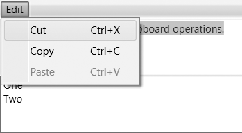
set. Figure 4-4 shows the controls
and menu from Example 4-27. As you
can see from the selection highlight, the TextBox at the top had the focus when the
menu was opened, so you would expect it to be the target of the
commands. This is indeed what happens, but it’s not quite as
straightforward as you might expect.
RoutedUICommand tries to
locate a handler using a tunneling and bubbling system similar to
the one used by the event system. However, command routing has an
additional feature not present in normal event routing: if bubbling
fails to find a handler, RoutedUICommand may try to retarget the
command. This is designed for the scenario where commands are
invoked by user interface elements such as menu or toolbar items
because these present an interesting challenge.
Example 4-27 is an example of
this very scenario. It has a subtle potential problem. While the
menu is open, it steals the input focus away from the TextBox. It’s unlikely that the menu item
itself is the intended target for a command—it’s merely the means of
invoking the command. Users will expect the Copy menu item to copy whatever was
selected in the TextBox, rather
than copying the contents of the menu item. The menu deals with this
by relinquishing the focus when the command is executed. This causes
the focus to return to the TextBox, and so the command target is the
one we expect. However, there’s a problem regarding disabled
commands.
A command target can choose whether the commands it supports
are enabled. A TextBox enables
copying only if there is some selected text. It enables pasting only
if the item on the clipboard is text, or can be converted to text.
Menus gray out disabled commands, as Figure 4-4 shows. To do this, a menu
item must locate the command target. The problem is that the menu is
in possession of the keyboard focus at the point at which it needs
to discover whether the command is enabled; the appropriate command
target is therefore not the focused item in this case.
The RoutedUICommand class
relies on focus scopes to
handle this situation. If a RoutedUICommand fails to find a command
binding, it checks to see whether the initial target was in a nested
focus scope. If it was, WPF finds the parent focus scope, which will
typically be the window. It then retargets the command, choosing the
element in the parent scope that has the
logical focus (i.e., the last element to have
the focus before the menu grabbed it). This causes a second
tunneling and bubbling phase to occur. The upshot is that the
command’s target is whichever element had the focus before the menu
was opened, or the toolbar button clicked.
If you are using menus or toolbars, you don’t need to do
anything to make this work, because Menu and ToolBar elements both introduce nested
focus scopes automatically. However, if you want to invoke commands
from other elements, such as buttons, you’ll need to define the
focus scope explicitly. Consider Example 4-28.
<StackPanel>
  <Button Command="ApplicationCommands.Copy"  Content="_Copy" />
  <Button Command="ApplicationCommands.Paste" Content="_Paste" />
  <TextBox />
</StackPanel>
This associates two buttons with commands supported by a
TextBox. And yet, as Figure 4-5 shows, the
buttons remain disabled even when the TextBox should be able to process at least
one of the commands.
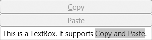
We can fix this by introducing a focus scope around the buttons, as Example 4-29 shows.
<StackPanel>
     <StackPanel FocusManager.IsFocusScope="True">
     <Button Command="ApplicationCommands.Copy"  Content="Copy" />
     <Button Command="ApplicationCommands.Paste" Content="Paste" />
     </StackPanel>
  <TextBox />
</StackPanel>
Now when the buttons attempt to locate a handler in order to
choose whether they are enabled, the presence of the focus scope
will cause the command routing to look for the element with the
focus. If the TextBox has the
logical focus, it will become the command target. As Figure 4-6 shows, this
causes the buttons to reflect the availability of the commands
correctly, and it means they invoke the command on the correct
target when clicked.

We don’t have to use focus scopes to solve the problem in this particular example. You can use the more explicit, though slightly cumbersome, approach shown in Example 4-30.
<StackPanel>
  <Button Command="Copy" Content="Copy"
             CommandTarget="{Binding ElementName=targetControl}" />
  <Button Command="Paste" Content="Paste"
             CommandTarget="{Binding ElementName=targetControl}" />
  <TextBox x:Name="targetControl" />
</StackPanel>
Here, each button specifies its command target explicitly. This makes it absolutely clear what the target will be. However, it is more verbose, so the automatic command routing is often more convenient. And even if the thought of manually specifying the command target for every item in a menu doesn’t strike you as unbearable, command routing has the added benefit of working well when there are multiple potential command targets (e.g., multiple text boxes on a form) and you want the command to go to whichever one last had the focus.
Code-Based Input Handling Versus Triggers
The input handling techniques shown in this chapter all involve writing code that runs in response to some user input. If your reason for handling input is simply to provide some visible feedback to the user, be aware that writing an event handler or a custom command is likely to be overkill. It is often possible to create the visual feedback you require entirely within the user interface markup by using triggers. Triggers offer a declarative approach, where WPF does more of the work for you.
Any discussion of input handling in WPF would be incomplete without some mention of triggers. However, trigger-based input handling is radically different from the more traditional approach shown in this chapter, and it depends on aspects of WPF not yet described. Accordingly, it is dealt with later, in Chapter 8 and Chapter 9. So, for now just be aware of the two techniques and their intended usage: triggers are best suited for superficial responses, such as making a button change color when the mouse moves over it; event handling is appropriate for more substantive behavior, such as performing an action when the user clicks a button.
Where Are We?
Input is handled through events and commands, which use a routing system to allow simple uniform event handling regardless of how complex the structure of the user interface visuals might be. Input events are the lower level of these two mechanisms, reporting the exact nature of the user’s input in detail. Commands allow us to work at a higher level, focusing on the actions the user would like our applications to perform, rather than the specific input mechanism used to invoke the action.
[19] * Ink is input written with a stylus, whether on a Tablet PC or a hand-held device, although the mouse can be used in a pinch.
[20] * If you write custom elements, you should do the same. Chapter 18 describes how to do this.
[21] * Capturing the mouse does not constrain its movement. It merely controls where mouse events are delivered.
[22] * It is technically possible to
provide a different class if you have special requirements.
Command sources are happy to use any implementation of the
ICommand interface, so you
are not obliged to use the normal command routing mechanism. But
most applications will use RoutedUICommand.