
Appendix E. Silverlight
WPF provides a rich model for creating user interfaces. At the core of WPF is the XAML markup language. The use of XAML to describe user interfaces as well as some interaction is a model that works well for developing desktop applications. Formerly known as WPF/E, Silverlight leverages XAML markup to create user interfaces for use as part of web application development. As you will see in this appendix, you will be able to take the skills learned here and apply them to create web content.
Why Silverlight?
The World Wide Web is growing up before our eyes. No, that is not quite correct. The users of the Web are growing up. They are no longer content to fly from one static page to another hoping to read some new tidbit of information. Today’s users want a better Web.
When I received my first copy of WordPerfect many years ago, it came with a huge user manual. Before I could really work with it, I needed to be instructed in how it worked. Learning all the arcane key combinations to perform simple tasks like bolding words, printing, and saving files was unavoidable.
As operating systems have evolved into the graphical powerhouses that we use today, the need for user manuals has diminished but has not disappeared. Many applications (e.g., Microsoft Office, iTunes, and Acrobat Reader) supply user interfaces that are intuitive enough that users can dive right in to do most of what they want to do. This is possible because the mouse/keyboard combination, along with the near-standard elements of the graphical user interfaces that are part of current operating systems, make it clearer how to accomplish everyday tasks.
When the Web was formed, HTML was just fine. It presented a common markup that you could use to define content that a variety of browsers could consume. HTML was critical to the success of the Web. That was a long time ago. The difficulty with HTML today is that it uses markup that supports text and images well, but falls down on creating content such as video, animations, and complex user interaction.
Various alternatives are available for augmenting content in HTML. One of these alternatives is client-side script, but although scripting can get the job done, doing everything with scripts on the client is difficult, error-prone, and labor-intensive.
Another alternative to using raw HTML is to use custom programming, like Java applets or ActiveX controls. These technologies require the developer to write special code just to enable the applet or control to be embedded in the web browser. The appearance is determined entirely by the code. And, in the case of ActiveX controls, security is up to you. Further, because custom development relies on developers, there is no way for designers to take control of the user interface’s appearance.
A popular solution for creating content has been plug-in-based solutions such as Adobe’s Flash products. Web developers use these products to create everything from simple interactive content to animations and video. Flash allows you to create complex user interfaces, but creating Flash-based content requires skills that are specific to Flash and do not have much adaptability to other programming contexts.
Silverlight attempts to redress these limitations to empower developers and designers to build great content without the limitations of the other approaches. In Silverlight, the markup is XAML, which means you can describe complex and compelling content without the limitations inherent to HTML. The XAML markup is separate from the code, which makes it easier to build secure, dynamic content that is emitted either on the client or by servers. Lastly, Silverlight uses the same skills and tools that WPF uses, so when you work with Silverlight you can apply what you know from WPF to the new problem of web content.
What Is Silverlight?
Silverlight is a browser plug-in that allows rendering of elements described with XAML in a web browser. Currently, this browser plug-in supports several browsers and operating systems (Internet Explorer and Firefox on Windows; Firefox and Safari on Mac OS X). For example, Figure E-1 and Figure E-2 show the same HTML and Silverlight code running in Internet Explorer and Firefox, respectively. Figure E-3 shows it in Safari on Mac OS X. Silverlight supports both JavaScript and managed code (e.g., C# and Visual Basic) to interact with the XAML. At this writing, JavaScript Silverlight support is in beta (referred to as Silverlight 1.0) and the managed support is in alpha (referred to as Silverlight 1.1). Because Silverlight 1.1 is only in alpha, our examples use the more mature Silverlight 1.0 (JavaScript model).


Hello, Silverlight
Showing XAML-based content in a browser is not revolutionary (WPF supports this out of the box, as discussed in Chapter 11). What is revolutionary is that Silverlight does not require a Windows operating system (or even Windows Media Player for media functionality). One of the main capabilities of Silverlight is to make user interfaces for web sites. Silverlight’s scope is not to replace HTML-based web sites, but instead to augment HTML. You should think of Silverlight as something that enables you to create content inside a web page, not something you would use to create replacement content for your existing web pages.
For instance, Example E-1 shows a simple XAML document that displays a smiley face, some text, and some shading.
<!-- scene.xaml -->
<Canvas xmlns="http://schemas.microsoft.com/client/2007"
        xmlns:x="http://schemas.microsoft.com/winfx/2006/xaml">

  <!-- Background Rectangle -->
  <Rectangle Width="400" Height="400" Stroke="Black">
    <Rectangle.Fill>
      <LinearGradientBrush>
        <GradientStop Color="LightGray" Offset="0" />
        <GradientStop Color="Snow" Offset=".75" />
        <GradientStop Color="LightGray" Offset="1" />
      </LinearGradientBrush>
    </Rectangle.Fill>
  </Rectangle>

  <!-- Smiley Face -->
  <Ellipse Canvas.Top="50" Canvas.Left="50"
           Width="300" Height="300"
           Fill="Yellow" Stroke="Black" />
  <Ellipse Canvas.Top="150" Canvas.Left="100"
           Width="50" Height="50"
           Fill="Black" />
  <Ellipse Canvas.Top="150" Canvas.Left="250"
           Width="50" Height="50"
           Fill="Black" />
  <Path Stroke="Black" StrokeThickness="5"
        Data="M 100,275 S 200,325 300,275" />

  <!-- Text Message (with Drop Shadow) -->
  <TextBlock Canvas.Top="352" Canvas.Left="152"
             FontFamily="Comic Sans MS"
             FontSize="36" Foreground="Gray"
             Text="Smile!" />
  <TextBlock Canvas.Top="350" Canvas.Left="150"
             FontFamily="Comic Sans MS"
             FontSize="36" Foreground="Black"
             Text="Smile!" />
</Canvas>
To show this XAML in an HTML page, we use a script file called
Silverlight.js. This script file,
the entry point into the Silverlight API, contains a JavaScript class
called Sys.Silverlight that is used
to create the Silverlight plug-in object in the browser. You can use
the createObject function on the
Sys.Silverlight object to load the
Silverlight object into the HTML document. Example E-2 shows an HTML page that
hosts our scene.xaml
document.
<html xmlns="http://www.w3.org/1999/xhtml">
<head>
  <title>Hello Silverlight</title>
  <!-- Load the Script that is used to
       show XAML in the browser -->
  <script type="text/JavaScript" src="silverlight.js"></script>
</head>
<body>
  <form>
    <div>
      <h3>Hello Silverlight</h3>
      <p>This is just plain HTML Code.</p>
      <p>Below you'll find XAML Hosted in the Browser:</p>
    </div>

    <div id="theHost">
      <script type="text/JavaScript">
        Sys.Silverlight.createObject(
        "Scene.xaml",                       // Url to the Xaml File
        document.getElementById("theHost"), // The Host element
        "SilverlightControl",               // Silverlight Object Name
        {                                   // Properties object
          width: "400",                     // Width of the Host
          height: "400",                    // Height of the Host
          version: "0.9"                    // Silverlight Plug-in
                                            // Version
        },
        {}                                  // Event to wire
                                            // (onLoad and onError)
                                    );
      </script>
    </div>
  </form>
</body>
</html>
The createObject method of
the Sys.Silverlight object is the
key to showing XAML in the browser.[132] When you browse to the HTML page detailed in Example E-2, you will see our smiley
face XAML on a web page (as shown in Figure E-4).

Silverlight XAML
Even though the XAML defined for use in Silverlight is not tied to WPF XAML, the Silverlight team has made an effort to use WPF XAML as a starting place for its XAML design. In this first release of Silverlight, all the XAML tags used in Silverlight are also compatible with WPF.
Tip
Compatibility will be a priority in future releases. However, because WPF and Silverlight are evolving in parallel, you can expect that some innovations in the markup introduced on one platform may or may not appear on the other.
For the WPF developer, the most glaring omission is that it does
not offer any built-in controls. Silverlight aims to provide the maximum
functionality for the smallest download cost. Because of this design
goal, no WPF controls are supported initially. This means no text boxes,
no buttons, no combo boxes, and, in fact, nothing from WPF that derives
from the Control base class at
all.
As developers (and designers), it may seem that the exclusion of controls from the XAML is a show-stopper. Silverlight’s goals are to have a small runtime and to be cross-platform-compatible. In this first release, Silverlight is attempting to fulfill some very specific web-related use cases:
Video (e.g., sites like YouTube.com and Soapbox.msn.com)
Animation (e.g., sites like Jibjab.com and Funnyflash.com)
User interaction (e.g., sites like Gamespot.com)
These use cases mean that in addition to no control support, there is no 3D support or templates, and there is limited resource use, event support, layout modes, and text handling (e.g., no XPS support directly, although one can translate an XPS document’s XAML to "Appendix E" XAML with some effort).
Layout Model
Silverlight applications normally contain a number of visual elements to display to a user. Being able to lay out these visual elements in a precise way is one benefit of using Silverlight (as opposed to HTML). That’s where the Silverlight layout model fits in.
Unlike WPF, Silverlight supports only a single layout model: all
elements have fixed positions. You specify positions by using Canvas elements as the only layout model
supported. This means that the first tag in every Silverlight XAML
document has to be a Canvas. For
example:
<Canvasxmlns="http://schemas.microsoft.com/client/2007" xmlns:x="http://schemas.microsoft.com/winfx/2006/xaml"> ... </Canvas>
Within a Canvas, you can
specify the position of any tag by using the Left and Top attached properties:
<Canvas ...> <RectangleCanvas.Left="10"Canvas.Top="10"Width="100" Height="100" Fill="Blue" /> </Canvas>
You can also use the Canvas
element to create groups of elements within the root Canvas. Because the Left and Top attached properties point to the parent
Canvas, you can use the Canvas element to create sets of objects
that are moved together. For instance, Example E-3 shows a simplified version of our
smileyface.xaml from
earlier.
<!-- scene.xaml --> <Canvas ... > <!-- Smiley Face --> <EllipseCanvas.Top="50" Canvas.Left="50"Width="300" Height="300" Fill="Yellow" Stroke="Black" /> <EllipseCanvas.Top="150" Canvas.Left="100"Width="50" Height="50" Fill="Black" /> <EllipseCanvas.Top="150" Canvas.Left="250"Width="50" Height="50" Fill="Black" /> <Path Stroke="Black" StrokeThickness="5"Data="M 100,275 S 200,325 300,275"/> <!-- Some Text --> <TextBlock Canvas.Top="400" Canvas.Left="50">Smile!</TextBlock> </Canvas>
We place each piece of the smiley face on our main canvas by
specifying the Top and Left attached properties (or specific
coordinates for drawing elements such as Path). This works well, except that when we
want to move our smiley face, we need to change each of the Top and/or Left properties as well as the coordinates
in the Path element individually,
as shown in the following code:
<!-- scene.xaml --> <Canvas ...> <!-- Smiley Face --> <Ellipse Canvas.Top="75" Canvas.Left="75" Width="300" Height="300" Fill="Yellow" Stroke="Black" /> <Ellipse Canvas.Top="175" Canvas.Left="125" Width="50" Height="50" Fill="Black" /> <Ellipse Canvas.Top="175" Canvas.Left="275" Width="50" Height="50" Fill="Black" /> <Path Stroke="Black" StrokeThickness="5" Data="M125,300S225,350 325,300" /> <!-- Some Text --> <TextBlock Canvas.Top="400" Canvas.Left="50">Smile!</TextBlock> </Canvas>
Instead of changing all the coordinate positions, we can use a
Canvas to “group” the entire smiley
face into one logical object, as shown in the following code:
<!-- scene.xaml --> <Canvas ...> <!-- Smiley Face: coordinates relative to parent --><Canvas Canvas.Top="50" Canvas.Left="50"><!-- nested elements positioned relative to parent --><Ellipse Canvas.Top="0" Canvas.Left="0" Width="300" Height="300" Fill="Yellow" Stroke="Black" /> <Ellipse Canvas.Top="100" Canvas.Left="50" Width="50" Height="50" Fill="Black" /> <Ellipse Canvas.Top="100" Canvas.Left="200" Width="50" Height="50" Fill="Black" /> <Path Stroke="Black" StrokeThickness="5" Data="M 50,225 S 150,275 250,225" /></Canvas><!-- Some Text --> <TextBlock Canvas.Top="400" Canvas.Left="50">Smile!</TextBlock> </Canvas>
Moving the smiley face becomes as simple as changing the
Top and Left attached properties of the Canvas that holds the smiley face:
<!-- scene.xaml -->
<Canvas ... >

  <!-- Smiley Face -->
  <Canvas Canvas.Top="75" Canvas.Left="75">
    <!-- same as before, but now moved 25 right and 25 down -->
    ...
  </Canvas>

  <!-- Some Text -->
  <TextBlock Canvas.Top="400" Canvas.Left="50">Smile!</TextBlock>

</Canvas>
This grouping of objects into logical units becomes crucial as
you start to work with objects as atomic units. In Silverlight, you
will be creating objects that users will need to interact with
logically as a single object. For example, you could create a play
button for a video player, and even if that button comprises multiple
objects (e.g., an Ellipse and a
Polygon), you will want to handle
mouse events as though the button were a single object (you’ll see how
to handle mouse events later).
Namespaces
You may have noticed that in all the examples so far, we are using a new namespace for Silverlight content:
<Canvas xmlns="http://schemas.microsoft.com/client/2007"
        xmlns:x="http://schemas.microsoft.com/winfx/2006/xaml">
</Canvas>
This new namespace is the official namespace, but the WPF namespace is supported as well:
<Canvas xmlns="http://schemas.microsoft.com/winfx/2006/xaml/presentation"
        xmlns:x="http://schemas.microsoft.com/winfx/2006/xaml">
</Canvas>
The reason for continuing to support the WPF namespace is less about technology and more about tool support. Tools are available for creating or converting XAML. By supporting the WPF namespace (at least in these early releases of Silverlight), you should be able to use a variety of XAML-powered tools to create Silverlight-compliant assets. We will list tools for Silverlight XAML creation later in this appendix.
Graphics
In Silverlight, drawing with XAML’s graphics tags is important
for creating visual elements that are not included by default.
Although the breadth of the 2D graphics stack in Silverlight is on par
with WPF, you will need to rely on it more often than you would in
WPF. For example, the Button
element does not exist in Silverlight XAML, so to create a button you
will need to draw it manually. As an example, let’s consider a simple
button that looks like Figure E-5.
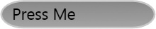
First, we create a Canvas for
our button:
  <Canvas Canvas.Left="25" Canvas.Top="25">

  </Canvas>
Next, we can add a Rectangle
for our button:
  <Canvas Canvas.Left="25" Canvas.Top="25">
    <Rectangle Height="32" Width="100"
               Stroke="LightGray" StrokeThickness="2">
    </Rectangle>
  </Canvas>
To make the button a little more polished, we could round the
corners subtly by setting the RadiusX and RadiusY attributes:
  <Canvas Canvas.Left="25" Canvas.Top="25">
    <Rectangle Height="32" Width="100"
               Stroke="LightGray" StrokeThickness="2"
               RadiusX="25" RadiusY="25">
    </Rectangle>
  </Canvas>
Now we can add a gradient fill to the background of our rectangle:
  <Canvas Canvas.Left="25" Canvas.Top="25">
    <Rectangle Height="32" Width="100"
               Stroke="LightGray" StrokeThickness="2"
               RadiusX="25" RadiusY="25" >
      <Rectangle.Fill>
        <LinearGradientBrush StartPoint="0,0" EndPoint="1,1">
          <GradientStop Color="#EEEEEE" Offset="0"/>
          <GradientStop Color="#444444" Offset="1"/>
        </LinearGradientBrush>
      </Rectangle.Fill>
    </Rectangle>
  </Canvas>
Lastly, we can add a TextBlock to provide the text in our button.
Example E-4 shows our complete
button.
  <Canvas Canvas.Left="25" Canvas.Top="25">
    <Rectangle Height="32" Width="100"
               Stroke="LightGray" StrokeThickness="2"
               RadiusX="25" RadiusY="25" >
      <Rectangle.Fill>
        <LinearGradientBrush StartPoint="0,0" EndPoint="1,1">
          <GradientStop Color="#EEEEEE" Offset="0"/>
          <GradientStop Color="#444444" Offset="1"/>
        </LinearGradientBrush>
      </Rectangle.Fill>
    </Rectangle>
    <TextBlock Canvas.Top="3" Canvas.Left="13"
               FontSize="18" Foreground="Black"
               Text="Press Me"/>
  </Canvas>
Because of the limited palette of XAML tags in Silverlight, you will need to use the graphics tags to create the look and feel of objects that are not natively part of Silverlight XAML. Using the graphics tags usually requires that you implement behavior that is normally implicit in controls. For example, drawing the button in this example really requires that you handle not only when the button is clicked, but also when a mouse hovers over it and what the button looks like when you click on it. Later we will see how to add these features.
Mouse Cursors
Because Silverlight does not support common controls, it would
be nice if we could indicate to the user that certain elements acting
as controls are clickable. We can do this by using mouse cursors. The
Canvas, MediaElement, TextBlock, Rectangle, Ellipse, Polygon, and PolyLine elements support a Cursor property that specifies which cursor
to show while the mouse is over a particular element. The supported
cursors are Arrow, Hand, Wait, IBeam, None, and Default. For example:
<Canvas xmlns="http://schemas.microsoft.com/client/2007"
        xmlns:x="http://schemas.microsoft.com/winfx/2006/xaml">
  <Canvas Width="100" Height="25"
          Cursor="Arrow"
          Canvas.Top="0" Canvas.Left="0"
          Background="Gray">
    <TextBlock Text="Arrow" />
  </Canvas>
</Canvas>
Measuring Text
Silverlight offers only coordinate-based layout (using the
Canvas to lay out elements).
Because of this, all text in our XAML documents is left-justified. To
get around the limitation of not supporting the full text handling
subsystem that is available in WPF, Silverlight enables you to measure
the text so that you can do your own calculations to center or
right-justify text. You measure text by using the actualWidth and actualHeight properties on the TextBlock element. For example, to center a
piece of text within the Silverlight host, you could do
this:
function root_Loaded(sender, args) {

  // Center Header
  var text = sender.findName("headerText");
  var host = sender.getHost(  );

  // Center it by measuring the text (with actualWidth)
  // and comparing to the host size
  text.setValue("Canvas.Left", (host.actualWidth - text.actualWidth)/2);
}
Transformations
Transformations allow users to manipulate the way parts of the
visual tree are rendered. Like WPF, Silverlight XAML supports a number
of transformations that you can use to manipulate the look of XAML
elements. The RenderTransform
property of every visual XAML element supports using transformations
to change the way a tag (or a group of tags) is rendered. (There are
no layout transforms because there is no real layout in Silverlight.)
For instance, Example 13-58 uses a ScaleTransform to stretch the button that we
created in Example E-4.
<Canvas xmlns="http://schemas.microsoft.com/winfx/2006/xaml/presentation"
        xmlns:x="http://schemas.microsoft.com/winfx/2006/xaml" >
  <Canvas.RenderTransform>
    <ScaleTransform ScaleX="1" ScaleY="2" />
  </Canvas.RenderTransform>
  <Canvas
Canvas.Left="25" Canvas.Top="25">
    <Rectangle Height="32" Width="175"
               Stroke="LightGray" StrokeThickness="2"
               RadiusX="25" RadiusY="25" >
      <Rectangle.Fill>
        <LinearGradientBrush StartPoint="0.5,2.109" EndPoint="0.5,−1.109">
          <GradientStop
Color="#EEEEEE" Offset="0"/>
          <GradientStop
Color="#444444" Offset="1"/>
        </LinearGradientBrush>
      </Rectangle.Fill>
    </Rectangle>
    <TextBlock Canvas.Top="3" Canvas.Left="13"
               FontSize="18" Foreground="Black"
               Text="Press Me"/>
  </Canvas>
</Canvas>
By using a ScaleTransform to
stretch our button to twice its size vertically (i.e., ScaleY), our button now looks like Figure E-6.

Silverlight XAML supports the same transformations that WPF does, as shown in Table E-1.
Transform class | Usage |
| An affine transformation (See Chapter 13 for more information) |
| Rotates or spins an element |
| Resizes or stretches an element |
| Tilts or slants an element |
| Any mix of transformations |
| Moves an element |
Animations
Animation support is a key component of Silverlight. Like WPF, Silverlight supports two styles of animations: simple and keyframe animations.
Simple animations include DoubleAnimation, ColorAnimation, and PointAnimation. These three animations
support animating different types of properties on XAML elements.
Unlike WPF XAML, the only number-based animation is the DoubleAnimation, as all numeric properties
in Silverlight XAML are double values. The keyframe animations follow
the pattern of the simple animations by supporting DoubleAnimationUsingKeyFrames, ColorAnimationUsingKeyFrames, and PointAnimationUsingKeyFrames. These keyframe
animations are structured just like WPF keyframe animations.
For example, imagine that we want to fade an Ellipse into view when the Canvas loads. To do this, we add a new
EventTrigger to our Canvas element’s Triggers property. EventTrigger is the only trigger supported
in Silverlight. The EventTrigger
allows you to specify a RoutedEvent
to use as the triggering mechanism, but in this release of
Silverlight, the only RoutedEvent
supported for triggering is Canvas.Loaded. Here is a Canvas element with an EventTrigger added:
<Canvas xmlns="http://schemas.microsoft.com/winfx/2006/xaml/presentation"
        xmlns:x="http://schemas.microsoft.com/winfx/2006/xaml" >
  <Canvas.Triggers>
    <EventTrigger RoutedEvent="Canvas.Loaded">
      ...
    </EventTrigger>
</Canvas.Triggers>
  <Ellipse x:Name="theCircle" Width="200" Height="200" Fill="Blue" />
</Canvas>
Inside an EventTrigger, you
need an action that the event trigger fires. In Silverlight, the only
action supported is a BeginStoryboard action. Inside the BeginStoryboard tag, we also need a Storyboard. The Storyboard is the container for any
animations we want to show:
<Canvas xmlns="http://schemas.microsoft.com/winfx/2006/xaml/presentation"
        xmlns:x="http://schemas.microsoft.com/winfx/2006/xaml" >
  <Canvas.Triggers>
    <EventTrigger RoutedEvent="Canvas.Loaded">
      <BeginStoryboard>
        <Storyboard>
          ...
        </Storyboard>
      </BeginStoryboard>
    </EventTrigger>
  </Canvas.Triggers>
  <Ellipse x:Name="theCircle" Width="200" Height="200" Fill="Blue" />
</Canvas>
Last, we will need an animation to fade the opacity of the ellipse from zero to one (i.e., from invisible to visible):
<Canvas xmlns="http://schemas.microsoft.com/winfx/2006/xaml/presentation"
        xmlns:x="http://schemas.microsoft.com/winfx/2006/xaml" >
  <Canvas.Triggers>
    <EventTrigger RoutedEvent="Canvas.Loaded">
      <BeginStoryboard>
        <Storyboard>
          <DoubleAnimation
            Storyboard.TargetName="theCircle"
            Storyboard.TargetProperty="Opacity"
            From="0" To="1" Duration="0:0:2" />
        </Storyboard>
      </BeginStoryboard>
    </EventTrigger>
  </Canvas.Triggers>
  <Ellipse x:Name="theCircle" Width="200" Height="200" Fill="Blue" />
</Canvas>
Additionally, Storyboards can
contain more than one animation:
<Canvas xmlns="http://schemas.microsoft.com/winfx/2006/xaml/presentation"
        xmlns:x="http://schemas.microsoft.com/winfx/2006/xaml" >
  <Canvas.Triggers>
    <EventTrigger RoutedEvent="Canvas.Loaded">
      <BeginStoryboard>
        <Storyboard>
          <DoubleAnimation
            Storyboard.TargetName="theCircle"
            Storyboard.TargetProperty="Opacity"
            From="0" To="1" Duration="0:0:2" />
          <DoubleAnimation
            Storyboard.TargetName="theCircle"
            Storyboard.TargetProperty="Width"
            From="100" To="200" Duration="0:0:5" />
        </Storyboard>
      </BeginStoryboard>
    </EventTrigger>
  </Canvas.Triggers>
  <Ellipse x:Name="theCircle" Width="200" Height="200" Fill="Blue" />
</Canvas>
Like WPF, Storyboards in
Silverlight can exist in resources. As we will see later, we can delay
an animation by placing it in the resources of one of our XAML
elements. See the "Delaying storyboards" section,
later in this appendix, for more information about how this
works.
Silverlight and WPF
In .NET 3.0, XAML is used as an object graph serialization technology. For WPF, this allows XAML to be used as a user interface markup language that is then serialized into CLR objects. But it is important to note that WPF does not require XAML at all. You can create user interface objects by writing CLR code like so:
Canvas myCanvas = new Canvas( ); // You can't do this in Silverlight 1.0
Silverlight 1.0 is different in this respect, as it requires XAML. There is no way to create XAML objects from code without using XAML. Silverlight is about showing elements described with XAML on a web page. There are other differences between the two technologies, as detailed in Table E-2.
Silverlight | Windows Presentation Foundation |
Web-based | Desktop applications, click-once deployment, or XBAP applications |
Works across different operating systems (Windows and Mac OS X in the first release) | Requires Windows XP SP2, Windows Server 2003 SP1, or Windows Vista |
Supports multiple web browsers (Internet Explorer and Firefox on Windows; Firefox and Safari on Mac OS X) | Internet Explorer 6+ for XBAP applications |
No .NET Framework requirements | Requires .NET 3.0 Framework |
No Windows Media Player required for media support | Requires Windows Media Player 10 for media support |
Uses XAML for design markup, but the library of tags is smaller | Uses XAML for design markup, but supports a large library of tags |
Supports JavaScript or managed languages (C#, Visual Basic, etc.) for Silverlight applications | Supports managed languages (C#, Visual Basic, etc.) |
Plug-in download size approximately 4 MB (though on Mac OS X, size is slightly larger to accommodate Intel and PPC processors) | .NET 3.0 Framework size is fairly large (approximately 50 MB for x86, and 90 MB for x64) |
Release of Silverlight 1.0 is scheduled for mid-2007, with Silverlight 1.1 slated for later than that (no dates had been announced as of this writing) | Released in November 2006 |
Development Model
Now that you have a sense of what Silverlight XAML is, we can look at how to use that XAML in a browser. Unlike WPF, with Silverlight 1.0 applications, you will add programmatic logic to your XAML in the JavaScript browser language.
Hosting in HTML
To show and interact with XAML in the browser, Silverlight loads
a plug-in into the HTML document. An OBJECT tag is used in Internet Explorer and
an EMBED tag in Firefox (on both
Windows and Mac OS X). You can specify this tag manually, as shown in
this code example:
<!-- Only works in IE6+ --><objectid="WpfeControl" width="400" height="100" classid="CLSID:32C73088-76AE-40F7-AC40-81F62CB2C1DA" <param name="BackgroundColor" value="#ffebcd" /> <param name="SourceElement" value=null /> <param name="Source" value="HelloWorld.xaml" /> <param name="WindowlessMode" value="true" /> <param name="MaxFrameRate" value="30" /> <param name="OnError" value="myErrorHandler" /></object>
Although this works perfectly well for Internet Explorer, you
want your XAML to work in every supported browser equally well. To
address this, the Silverlight team has supplied a script called
Silverlight.js that is used to
host the XAML across all supported browsers, eliminating the need for
you to use an OBJECT tag, an
EMBED tag, or something dynamically
generated according to server-side browser detection.[133] To take advantage of this script, you import it and use
the Sys.Silverlight class to load
your XAML:
<!-- Loading the script locally --><script type="text/JavaScript" src="silverlight.js"></script>... <div id="agContainer" > <script type="text/JavaScript"> Sys.Silverlight.createObject( "Scene.xaml", // Url to the Xaml File document.getElementById("theHost"), // The Host element "SilverlightControl", // Silverlight Object Name { // Properties object width: "400", // Width of the Host height: "400", // Height of the Host version: "0.9" // Silverlight Plug-in // Version }, {} // Event to wire // (onLoad and onError) ); </script> </div>
The newly created object hosts the XAML and attempts to display
it. Note that either you can specify the XAML as a separate file (as
shown in the previous example), or you can specify a source element
name from which to get the XAML. When you specify the name of a source
element, you would create an XML island inside the HTML page by adding
a new script tag with a type of text/xaml:
<script type="text/xaml" id="myInlineXaml">
  <Canvas xmlns="http://schemas.microsoft.com/client/2007"
          xmlns:x="http://schemas.microsoft.com/winfx/2006/xaml">
    ...
  </Canvas>
</script>
When using inline XAML, you would change your call to createObject,[134] to specify passing XAML by using the hash symbol (#) and
the name of the script tag, like so:
<div id="agContainer" >
  <script type="text/JavaScript">

      Sys.Silverlight.createObject(
        "#myInlineXaml",                    // The Inline XAML
        document.getElementById("theHost"), // The Host element
        "SilverlightControl",               // Silverlight Object Name
        {                                   // Properties object

         width: "400",                     // Width of the Host
          height: "400",                    // Height of the Host
          version: "0.9"                    // Silverlight Plug-in
                                            // Version
        },
        {}                                  // Event to wire
                                            // (onLoad and onError)
                                    );
  </script>
</div>
The Silverlight.js file
contains the JavaScript Sys.Silverlight class that generates the
right HTML tags for the different browsers. For example, on Internet
Explorer 6 and above, the Sys.Silverlight class generates an OBJECT tag. On Firefox and Safari browsers,
it uses an EMBED tag.
End-User Installation
At this point in Silverlight development, when users go to a web
page that contains an embedded Sys.Silverlight class, the browser will
attempt to download the runtime like other ActiveX solutions (e.g.,
Flash), including support for upgrading the runtime as
necessary.
Handling XAML Errors
As you work with XAML, errors are likely to occur from time to
time. Many of these will be XAML parsing errors. By default, the
Silverlight.js script file will
show the error in an alert window. If you want more control over how
to tell your users about this problem, you can specify the name of a
function in the creation of the Sys.Silverlight class in your HTML
markup:
Sys.Silverlight.createObject(
        "#myInlineXaml",                    // The Inline XAML
        document.getElementById("theHost"), // The Host element
        "SilverlightControl",               // Silverlight Object Name
        properties: {                       // Properties object
          width: "400",                     // Width of the Host
          height: "400",                    // Height of the Host
          version: "0.9"                    // Silverlight Plug-in
                                            // Version
        },
        events: {onError:"myErrorHandler"}  // Events to wire
                                            // (onLoad and onError)
By specifying in the events object the name of a function to use
as the onError handler, you are
telling Silverlight to call that function on any Silverlight error.
The Silverlight host control passed several arguments to the error
handler, including the line number, the column number, the error
number, and a text message that explains the nature of the
error.
The error handler is used only for Silverlight errors. Any script errors are handled by normal scripting error handling. Example E-6 shows a sample error handler.
Event Model
In Silverlight, all code interaction with the XAML elements revolves around using the events in the XAML object model. You wire events to JavaScript by specifying the name of the event, and the name of the handler function:
<Canvas xmlns="http://schemas.microsoft.com/client/2007"
        xmlns:x="http://schemas.microsoft.com/winfx/2006/xaml"
        Loaded="root_Loaded">
  <Ellipse x:Name="theCircle" Width="200" Height="200" Fill="Blue" />
</Canvas>
In this example, we are specifying that a JavaScript function
called root_Loaded should be called
when the Canvas has completed
loading. For example, the root_Loaded function would look like Example E-7.
function root_Loaded(sender, args) {
  alert("Canvas has been loaded");
}
By convention, all event handling functions specify two
parameters for the function signature: sender and args. The first parameter is the sender of
the event and the second parameter is an optional object that contains
data specific to the event.
Most UI elements (e.g., Canvas, Rectangle, Ellipse, etc.) support six common events,
listed in Table E-3.
Event | Usage |
| Fired after the element has completed loading, but before it is rendered |
| Fired when the mouse moves from the outside to the inside of an element |
| Fired when the mouse moves from the inside to the outside of an element |
| Fired as the mouse is moved within an element |
| Fired when the left mouse button is pressed while over an element |
| Fired when the left mouse button is released while over an element |
In addition to these six common events, the root Canvas of any Silverlight document also
supports keyboard handling events, listed in Table E-4.
Event | Usage |
| Fired when a keyboard key is pressed |
| Fired when a keyboard key is released |
| Fired when the
Silverlight |
| Fired when the
Silverlight |
These events represent the primary methods for user interactivity with the XAML loaded in the browser.
Working with XAML Properties
Once you have a reference to an individual XAML element in JavaScript, you can use simple property assignment to specify properties on the individual elements:
function root_Loaded(sender, args) {
  // Getting and setting Canvas properties
  if (sender.width == 200) {
    sender.width = 250;
  }
  sender.height = 300;
  sender.background = "#888888";
}
For attached properties, you use the getValue and setValue methods to get and set the values
on the object:
sender.setValue("Canvas.Top", 5);
var top = sender.getValue("Canvas.Top");
You can register for events using the property syntax as well,
by calling the addEventListener
method of a XAML element. You call the method using the name of the
event and the name of the function to call when the event is
fired:
  sender.addEventListener("mouseEnter", "canvas_MouseEnter");
  sender.addEventListener("mouseLeave", "canvas_MouseLeave");
Once you register for events, you must have functions to handle events, such as the methods in Example E-8.
The Plug-in
Working with individual XAML elements is useful, but sometimes
you will need to work directly with the Silverlight plug-in. Every
XAML object has a getHost method
that will return the Silverlight plug-in object, as Example E-9
illustrates.
function root_Loaded(sender, args) {
  var theHost = sender.getHost(  );
}
In addition, you can obtain the plug-in by calling the HTML
document’s getElementById method.
When doing so, use the name you specified in the createObject function call that was used to
instantiate the Silverlight object in the HTML, as shown in Example E-10.
function root_Loaded(sender, args) {
  var theHost = document.getElementById("SilverlightControl");
}
The Silverlight host has a number of properties that describe the plug-in object, listed in Table E-5.
Property | Meaning |
| The color of the background of the Silverlight host |
| A URL to a XAML document to load into the Silverlight host |
| A Boolean value that indicates whether the Silverlight host should be windowless; windowless controls support alpha-channel colored backgrounds to enable HTML to display through the Silverlight control |
| Displays a number that reports the current frame rate |
| Allows the Silverlight object to interact with the HTML DOM |
| Displays colored regions on the plug-in that are currently being redrawn (for debugging of XAML performance) |
| A structure that
contains the initialization properties, like |
| Returns a Boolean value that reports whether the plug-in is completely loaded |
| The maximum frame rate to display content |
In addition, the Silverlight host has properties that are available once the plug-in has loaded, listed in Table E-6.
Property | Meaning |
| The actual computed width of the host |
| The actual computed height of the host |
| A Boolean that specifies whether the Silverlight host should be shown over the entire screen instead of embedded in the HTML object |
The difference between the width and height values used in the
initialization and their actual counterparts is how they are set
initially. For example, if the width and height are set to static
values (e.g., 400 × 400) the actual values will be identical.
Alternatively, if you set the width and/or height to a percentage
value (e.g., 50 percent), the actual height and/or width will be the
actualWidth and actualHeight properties.
Silverlight allows you to display an asset over the entire
screen. The fullscreen property is
available only after the Silverlight host has loaded the XAML. For
example, a mouse click on a canvas could cause the host to show itself
full-screen, as shown in Example E-11.
function makeFullScreen_MouseLeftButtonUp(sender, args) {
  var theHost = sender.getHost( );
  theHost.fullScreen = true;
}
In addition to the loaded
event, the host also supports the events listed in Table E-7.
Event | Usage |
| Fired when the actual
size ( |
| Fired when the Silverlight host changes the state of the fullScreen property |
When looking for objects in the HTML DOM, you normally use the
document’s getElementById method.
Silverlight’s findName method
provides the same functionality, allowing you to find objects anywhere
in the XAML document by name. The findName method exists on all Silverlight
XAML elements as well as on the plug-in object. If you use it from a
XAML element, you can call it directly. For example, we could use it
in our root_Loaded function to find
the ellipse and set its stroke (outline) to white, as shown in Example E-12.
function root_Loaded(sender, args) {
  var theCircle = sender.findName("theCircle"); // from XAML DOM
  theCircle.stroke = "#000000";
}
If you want to use the findName method on the plug-in object, you
will need to prefix the content
property of the plug-in object:
 // Check the entire XAML document
var theHost = sender.getHost(  );
var theCircle = theHost.content.findName("theCircle");
The findName method searches
the entire document for the named element. An element’s findName does not limit the search to just
part of the document tree. In fact, the findName on a XAML element is a shortcut to
the host’s findName method. So,
these two calls to findName are
functionally identical:
// Check the entire XAML document
var theHost = sender.getHost(  );
var theCircle = theHost.content.findName("theCircle");

// Also check the entire XAML document
var theCircle = sender.findName("theCircle");
Working with the XAML Object Model
The XAML object model is a hierarchy built from the XAML loaded
into the host. You can traverse this hierarchy using collections of
contained objects. For the Canvas
element, use its children property.
To iterate through the collection, use the count property in conjunction with the
getItem method of the children property, like so:
for (var x = 0; x < sender.children.count; ++x) {
  var child = sender.children.getItem(x);
  ...
}
XAML elements support a variety of collections. Table E-8 shows the parent elements and the collections they support.
Parent element | Collection name |
| Children |
| Figures |
| GradientStops |
| GradientStops |
| KeyFrames |
| KeyFrames |
| KeyFrames |
| Segments |
| Triggers |
| Actions |
Each collection provides the methods listed in Table E-9.
Method | Usage |
| Retrieves a specific element in the collection by index |
| Adds an item to the end of the collection |
| Adds an item to the collection at a specific position by index |
| Removes a specific element from the collection |
| Removes the element in the collection at a specific position by index |
You can also use the getParent method of any XAML object to
retrieve its container:
var parent = sender.getParent( );
An Example: Creating a Button
Earlier in this appendix, we saw how we could create the beginnings of a button using XAML. With a little additional XAML, we can make it act like a real button:
<Canvas xmlns="..."
        xmlns:x="..."
        Loaded="root_Loaded">

  <!-- The button -->
  <Canvas x:Name="button1"
          Canvas.Left="25" Canvas.Top="25"
          Cursor="Hand">
    <Rectangle Height="32" Width="100"
               Stroke="LightGray" StrokeThickness="2"
               RadiusX="2" RadiusY="2" >
      <Rectangle.Fill>
        <LinearGradientBrush>
          <GradientStop x:Name="button1_gradientStop1"
                        Color="#EEEEEE" Offset="0"/>
          <GradientStop x:Name="button1_gradientStop2"
                        Color="#444444" Offset="1"/>
        </LinearGradientBrush>
      </Rectangle.Fill>
    </Rectangle>
    <TextBlock Canvas.Top="4" Canvas.Left="14"
               FontSize="18" Foreground="#BBBBBB"
               Text="Press Me"/>
    <TextBlock Canvas.Top="3" Canvas.Left="13"
               FontSize="18" Foreground="#444444"
               Text="Press Me"/>
  </Canvas>

</Canvas>
Notice the root_Loaded event
handler for the main Canvas, where
we will set up our button’s events. We have also given the button
Canvas a name so that we can
reference it with the findName
method. Lastly, we have named the GradientStops so that we can manipulate
them. The GradientStop names begin
with the button name for a reason that will become apparent
shortly.
The following setupButton
function registers four event handlers for a button, and it is invoked
by the root_Loaded function:
function setupButton(button) {
  button.addEventListener("mouseEnter", "handleMouseEnter");
  button.addEventListener("mouseLeave", "handleMouseLeave");
  button.addEventListener("mouseLeftButtonUp", "handleMouseUp");
  button.addEventListener("mouseLeftButtonDown", "handleMouseDown");
}

function root_Loaded(sender, args) {
  setupButton(sender.findName("button1"));
}
In each mouse event handler, we can change the offset for the
gradient stop to make the button act like a real button (i.e., change
the look when you move the mouse over the button as well as when the
button is clicked and released). Notice that we are using the name of
the sender of this event (the button’s Canvas) to prefix our name to find the
correct gradient stop for our button. In our MouseUp event handler, we will display an
alert to show that the button was clicked:
function handleMouseEnter(sender, eventArgs) {
  var gradientStop1 = sender.findName(sender.Name +
                                      "_gradientStop1");
  var gradientStop2 = sender.findName(sender.Name +
                                      "_gradientStop2");
  gradientStop1.offset = 1;
  gradientStop2.offset = .203;
}
function handleMouseLeave(sender, eventArgs) {
  var gradientStop1 = sender.findName(sender.Name +
                                      "_gradientStop1");
  var gradientStop2 = sender.findName(sender.Name +
                                      "_gradientStop2");
  gradientStop1.offset = 0;
  gradientStop2.offset = 1;
}

function handleMouseUp(sender, eventArgs) {
  var gradientStop1 = sender.findName(sender.Name +
                                      "_gradientStop1");
  var gradientStop2 = sender.findName(sender.Name +
                                      "_gradientStop2");
  gradientStop1.offset = 1;
  gradientStop2.offset = .203;

  alert("clicked: " + sender.Name);
}

function handleMouseDown(sender, eventArgs) {
  var gradientStop1 = sender.findName(sender.Name +
                                      "_gradientStop1");
  var gradientStop2 = sender.findName(sender.Name +
                                      "_gradientStop2");
  gradientStop1.offset = 1;
  gradientStop2.offset = 1;
}
The mouse handlers retrieve the name of the button from the
sender argument and use it to construct the names of that button’s
GradientStops. By using the same
naming pattern for each button, the same event handlers can work for
all of them. Because the mouse event handlers are generic enough to
work for more than one button, we can add a new button to our XAML
document, like so:
...
  <!-- The second button -->
  <Canvas x:Name="button2"
          Canvas.Left="25" Canvas.Top="75"
          Cursor="Hand">
    <Rectangle Height="32" Width="100"
               Stroke="LightGray" StrokeThickness="2"
               RadiusX="2" RadiusY="2" >
      <Rectangle.Fill>
        <LinearGradientBrush>
          <GradientStop x:Name="button2_gradientStop1"
                        Color="#EEEEEE" Offset="0"/>
          <GradientStop x:Name="button2_gradientStop2"
                        Color="#444444" Offset="1"/>
        </LinearGradientBrush>
      </Rectangle.Fill>
    </Rectangle>
    <TextBlock Canvas.Top="4" Canvas.Left="14"
               FontSize="18" Foreground="#BBBBBB"
               Text="Press Me"/>
    <TextBlock Canvas.Top="3" Canvas.Left="13"
               FontSize="18" Foreground="#444444"
               Text="Press Me"/>
  </Canvas>
...
Finally, we can add code to the root_Loaded function to set up a new
button:
function root_Loaded(sender, args) {
  setupButton(sender.findName("button1"));
  setupButton(sender.findName("button2"));
}
We can see the button’s various states in Figure E-7, Figure E-8, and Figure E-9.
Creating Dynamic XAML
So far, we have been working with largely static XAML, but
Silverlight supports dynamic XAML as well. You can use the host object
to create elements from XAML fragments. For example, we can create a
new rectangle by using a string representation of the XAML fragment to
call the createFromXaml method (on
the host’s content property), as
shown in the following code snippet:
function root_Loaded(sender, args) {
  // Get a reference to the Host
  var host = sender.getHost(  );

  // The XAML
  var xaml = '<Rectangle Fill="Blue" Width="100" Height="100" />';

  // Create a new object from the fragment
  var newRect = host.content.createFromXaml(xaml);

  // Add it to the children of our root Canvas
  sender.children.add(newRect);
}
Calling createFromXaml
creates the element but does not add it to the document. Once the
element is created, you can use the Children collection to add it to any
children collection in the XAML
object model. If you want to name an element, you must use the
Name attribute prefix, as shown in
the following fragment:
// The XAML
var xaml =
'<Rectangle
Name="aRect" Fill="Blue" Width="100" Height="100" />';
Silverlight does not include control templates or data
templates; instead, we can use createFromXaml to create templates in
JavaScript code. For example, if we were to create an HTML button that
creates new rectangles every time it was clicked:
<input id="addButton" type="button"
       onclick="return addButton_click(  )"
       value="Add Rectangle" />
the code to create the rectangles dynamically would look like Example E-13.
var currentTop = 0;
var currentLeft = 0;
var template = '<Rectangle Width="50" Height="50" ' +
               '           Canvas.Top="%1" Canvas.Left="%2" ' +
               '           Fill="Gray" Stroke="Black" />';
function addButton_click(  ) {

  // Get the host and the root canvas
  var theHost = document.getElementById("theHost");
  var root = theHost.content.findName("theRoot");

  // Get a copy of the template and replace the
  // placeholders with the top and left values
  var newTemplate = template.replace("%1", currentTop);
  newTemplate = newTemplate.replace("%2", currentLeft);

  // Create the new rectangle from the template
  var newRect = theHost.content.createFromXaml(newTemplate);

  // Add it to the root canvas
  root.children.add(newRect);

  // Increment the top and left for the next rectangle
  currentTop += 10;
  currentLeft += 10;
}
By using a template, we can create any number of the objects we
need at runtime using the host’s createFromXaml method. When we run the page,
we start with just our button and no rectangles. Clicking the button a
few times gives us multiple rectangles, as shown in Figure E-10.

Controlling Media
Now that you are comfortable building your Silverlight XAML, you
should learn how to use some of the more interesting tags. The first
of these is the MediaElement tag.
Using media (e.g., video and audio) is a key use case for Silverlight.
To that end, Silverlight has rich support for media playback. The core
of this support is the MediaElement
tag. The MediaElement tag provides
the following types of media:
Windows Media Video (WMV)
Windows Media Audio (WMA)
MPEG-1 Audio Layer-3 (MP3)
To specify the media to be played you specify the URL from which to download the media, like so:
<MediaElement x:Name="theVideo"
              Width="450.222" Height="280"
              Source="xbox.wmv"/>
To control the flow of the media, the MediaElement provides three methods, listed
in Table E-10.
Method | Usage |
| Starts or restarts the media (if paused) |
| Stops the media at the current position, allowing play to continue where it was paused |
| Ends playing the video and resets its current position to the beginning of the media |
MediaElement provides a
number of events that are specific to playing media, listed in Table E-11.
Event | Usage |
| Fired when the media
has been opened and is about to play (which is normally after
the |
| Fired when the media has completed playing |
| Fired if the media did not load correctly or could not be found |
MediaElement can download and
play prerecorded video and audio files from a web server, and it
supports streaming media sources such as live webcasts. For downloads,
MediaElement supports a DownloadProgress property and a DownloadProgressChanged event. You can use
these to track a download’s progress. MediaElement also provides a BufferingProgress property and a BufferingProgressChanged event to allow you
to show the buffering progress of streamed media.
MediaElement allows access to
media time through the position
property. This allows you to get and set the current playing position
(in seconds), as follows:
function root_Loaded(sender, args) {
  // Get a reference to the video
  var video = host.content.findName("theVideo");

  // Get the current Position
  var seconds = video.position.seconds;
  alert("Current Location: " + seconds);

  // Change the position to 2 minutes in
  video.position.seconds = 120;
}
MediaElement also provides
the actual duration of the media by using the naturalDuration property. Similar to the
position property, naturalDuration exposes the number of
seconds, but the value is read-only. naturalDuration is useful for determining
the difference between position and duration to see how much of the
video has played. naturalDuration
is valid only after the MediaOpened
event has fired.
In addition to controlling the duration, MediaElement also provides volume control
through the properties listed in Table E-12.
Property | Meaning |
| The current level of volume for the media. |
| The position in stereo space for the two audio channels (where −1 is left, 1 is right, and 0, the default, is the middle position). |
| A Boolean value that
controls whether audio can be heard. Setting this property has
no effect on the |
Controlling Animations
In addition to controlling media, Silverlight allows you to control animations. For example, here is a simple piece of XAML that displays a circle and then animates the opacity from visible to invisible, then back to visible:
<Canvas xmlns="http://schemas.microsoft.com/client/2007"
        xmlns:x="http://schemas.microsoft.com/winfx/2006/xaml"
        Width="480" Height="320"
        Loaded="root_Loaded">
  <Canvas.Triggers>
    <EventTrigger RoutedEvent="Canvas.Loaded">
      <EventTrigger.Actions>
        <BeginStoryboard>
          <Storyboard Completed="circleAnimation_Complete">
            <DoubleAnimation Storyboard.TargetName="theCircle"
                             Storyboard.TargetProperty="Opacity"
                             From="1" To="0"
                             Duration="0:0:2"
                             AutoReverse="True" />
          </Storyboard>
        </BeginStoryboard>
      </EventTrigger.Actions>
    </EventTrigger>
  </Canvas.Triggers>
  <Ellipse x:Name="theCircle"
           Canvas.Left="50" Canvas.Top="50"
           Width="100" Height="100"
           Fill="Blue" />
</Canvas>
The Storyboard element
provides a Completed event that
fires when the storyboard has finished. This allows us to alert the
user when the circle animation has completed:
function circleAnimation_Complete(sender, args) {
  alert("Circle Animation done");
}
Tip
A storyboard is not complete until all animations in a storyboard have finished.
Controlling animation execution
Storyboards provide a
number of methods to allow you to control their playback. These
methods are listed in Table E-13.
Method | Usage |
| Starts an animation |
| Stops an animation |
| Temporarily stops an
animation at any point; allows |
| Continues an
animation after calling |
| Moves an animation to a particular position in time |
For example, we can add an event handler for the mouse’s left
button on the Ellipse from our
earlier example (allowing us to respond to a mouse click on the
circle):
...
<Ellipse x:Name="theCircle"
           Canvas.Left="50" Canvas.Top="50"
           Width="100" Height="100"
           Fill="Blue"
           MouseLeftButtonUp="theCirle_MouseLeftButtonUp"/>
...
To be able to stop the animation, we need to name the storyboard that contains the animation:
...
  <Storyboard x:Name="circleStoryboard">
    <DoubleAnimation Storyboard.TargetName="theCircle"
                     Storyboard.TargetProperty="Opacity"
                     From="1" To="0"
                     Duration="0:0:2"
                     AutoReverse="True" />
  </Storyboard>
...
Having named the storyboard, we can stop the animation in the mouse event:
function theCircle_MouseLeftButtonUp(sender, args) {
  var circleStoryboard = sender.findName("circleStoryboard");

  // Stop our Storyboard
  circleStoryboard.stop(  );
}
Delaying storyboards
In our earlier examples, we showed only storyboards starting
within a Canvas (when the
Canvas is loaded, in fact). More
often, we will want to delay the start of a storyboard until some
user interaction (e.g., a mouse click). To accomplish this,
Silverlight supports placing Storyboards inside a Canvas.Resources section. This prevents
the storyboard from starting immediately:
...
  <Canvas.Resources>
    <Storyboard x:Name="circleStoryboard"
                Completed="cirlceAnimation_Complete">
      <DoubleAnimation Storyboard.TargetName="theCircle"
                       Storyboard.TargetProperty="Opacity"
                       From="1" To="0"
                       Duration="0:0:2"
                       AutoReverse="True" />
    </Storyboard>
  </Storyboard>
...
Like our earlier example, we can get the storyboard (by name), but this time we can tell it to start in reaction to our mouse event:
function theCircle_MouseLeftButtonUp(sender, args) {
  var circleStoryboard = sender.findName("circleStoryboard");

  // Start our Storyboard
  circleStoryboard.begin(  );
}
Mixing Silverlight and HTML
Although it is possible to create entire XAML-based user interfaces using Silverlight in your own projects, more likely you will want to use XAML and HTML together. For example, you might have an HTML button that starts a storyboard, as shown in Example E-14.
<html xmlns="http://www.w3.org/1999/xhtml">
<head>
  <script type="text/JavaScript" src="js/silverlight.js"></script>
  <script type="text/JavaScript">

    function startButton_Clicked(  ) {
      var host = document.getElementById("theHost");
      var theStoryboard = host.content.findName("theStoryboard");
      theStoryboard.stop(  );
      theStoryboard.begin(  );
    }

  </script>
</head>
<body>
  <form>
    <input id="theButton" type="button" value="Click to Start"
           onclick="startButton_Clicked(  );"></input>
    <div id="theContainer">
      <script type="text/JavaScript">
        Sys.Silverlight.createObject(
          "plugin.xaml",
          document.getElementById("theContainer"),
          "theHost",
          { width: "400", height: "400", version: "0.9"},
          {});
      </script>
    </div>
  </form>
</body>
</html>
Mixing HTML and Silverlight elements in the same page is the most likely model for adding Silverlight content to your web pages. You can host more than one piece of Silverlight content in a single HTML page by simply creating more than one host on your page. The containing HTML element and the host object must have unique names, but otherwise you can just add multiple elements to a single HTML page, as shown in the following example:
...
<div id="firstContainer">
  <script type="text/JavaScript">
    Sys.Silverlight.createObject(
          "first.xaml",
          document.getElementById("firstContainer"),
          "firstHost",
          { width: "400", height: "400", version: "0.9"},
          {});
  </script>
</div>
<div id="secondContainer">
  <script type="text/JavaScript">
    Sys.Silverlight.createObject(
          "second.xaml",
          document.getElementById("secondContainer"),
          "secondHost",
          { width: "400", height: "400", version: "0.9"},
          {});
  </script>
</div>
...
Although you can mix Silverlight into HTML simply by adding it to the markup of the page, you cannot mix HTML into XAML. Each XAML document must contain only XAML. For instance, the following does not work:
<Canvas xmlns="http://schemas.microsoft.com/client/2007"
        xmlns:x="http://schemas.microsoft.com/winfx/2006/xaml">
  <Rectangle Width="100" Height="100" Fill="Black" />
  <!-- THIS DOES NOT WORK -->
  <input type="button" value="Click to Start"></input>
</Canvas>
The Silverlight host contains the XAML object model. The Silverlight host is just another object within the HTML DOM. This allows us to use JavaScript to change both XAML and HTML objects from within the same script. For example, if we want to disable the HTML button in the page once we have used it to start our storyboard, we can use the HTML DOM:
...
function startButton_Clicked(  ) {
  var host = document.getElementById("theHost");
  var theStoryboard = host.content.findName("theStoryboard");
  theStoryboard.stop(  );
  theStoryboard.begin(  );

  var button = document.getElementById("theButton");
  button.disabled = true;}
...
In the real world, it is best to allow each technology to do what it does best. Attempting to create text layouts and flows using Silverlight XAML is just not feasible with the current state of Silverlight. Likewise, using HTML to create complex drawings is possible, but it is not the best tool for that job.
The Silverlight Downloader
A typical Silverlight application may comprise a number of different parts, including images, media, XAML, and code. Although Silverlight will typically download these pieces of the application for you, in some cases it is helpful to be able to control the download process (i.e., to give the user feedback regarding how long the download will take).
Silverlight provides a special type of object that gives you
control over the downloading of content. This object is the
Silverlight Downloader[135] (it works similarly to the XmlHttpRequest object). Before you can use
the Downloader to make a request,
you must create it with the Silverlight host object, like so:
function root_Loaded(sender, args) {
  var host = sender.getHost(  );
  var downloader = host.createObject("downloader");
  ... // do something with the downloader
}
The Downloader works by
specifying a file to download. The Downloader then fires events both during the
file’s retrieval and at completion. For example:
// Setup some event handling
downloader.addEventListener("downloadProgressChanged",
                            "onDownloadProgressChanged");
downloader.addEventListener("completed", "onCompleted");
To specify the file to retrieve, call the open method:
// Initialize the Downloader request.
downloader.open("GET", "addme.xaml");
To start the download, call the send method:
// Execute the Downloader request.
downloader.send(  );
Once downloading has started, the downloadProgressChanged event will fire
periodically, allowing you to report progress to the user, as shown by
the downloadProgress
property:
function onDownloadProgressChanged(sender, args) {
  var progressText = sender.findName("progressText");
  progressText.Text = Math.floor(sender.downloadProgress * 100) + "%";
}
The completed event fires
when the download is finished. You then use the responseText property to get the text of the
downloaded file:
function onCompleted(sender, args) {
  // Get the result of our request
  var response = sender.responseText;

  // Use the host object to create our new XAML object
  var host = sender.getHost(  );
  var newObject = host.content.createFromXaml(response);

  // Find the root so we can add the new object
  var root = host.content.findName("root");
  root.children.add(newObject);
}
ASP.NET and Silverlight
Hosting Silverlight content in a plain HTML file is an interesting exercise, but most .NET web developers will want to be able to integrate Silverlight with their ASP.NET projects. Have no fear, Silverlight and ASP.NET work well together.
Commingling with ASP.NET
In the most basic case of integration between Silverlight and ASP.NET, you will want to add Silverlight content to existing .aspx pages. Because ASP.NET is a server-side technology and Silverlight is client-side, you can simply add the Silverlight to the markup of any .aspx page, as shown in Example E-15.
<%@ Page Language="C#"
         AutoEventWireup="true"
         CodeFile="Default.aspx.cs"
         Inherits="_Default" %>
<html xmlns="http://www.w3.org/1999/xhtml" >
<head runat="server">
  <title>ASP.NET and Silverlight - Together!</title>
  <script type="text/JavaScript" src="js/silverlight.js"></script>
</head>
<body>
  <form id="form1" runat="server">
    <div>
      <h3>ASP.NET and Silverlight</h3>
      <p><asp:Button ID="clickMe" runat="server" Text="Click me!" /></p>
    </div>
    <div id="agContainer">
      <script type="text/JavaScript">
        Sys.Silverlight.createObject(
          "xaml/plugin.xaml",
          document.getElementById("agContainer"),
          "theHost",
          { width: "200", height: "200", version: "0.9"},
          {});
      </script>
    </div>
  </form>
</body>
</html>
The example shows a simple XAML document on an ASP.NET web page
alongside HTML and server-side content. Much as you used the createFromXaml method of the Silverlight
host to create dynamic XAML, ASP.NET allows you to create dynamic XAML
on the server as well.
Dynamic XAML
HTML is markup. XAML is markup. If we can emit HTML dynamically with ASP.NET, we should be able to do the same with XAML. For example, we can create a new .aspx page that emits a new XAML document, as shown in Example E-16.
<!-- MyXAML.aspx -->
<%@ Page Language="C#"
         AutoEventWireup="true"
         CodeFile="MyXaml.aspx.cs"
         Inherits="MyXaml"
         ContentType="text/xaml" %>

<Canvas xmlns="http://schemas.microsoft.com/client/2007"
        xmlns:x="http://schemas.microsoft.com/winfx/2006/xaml"
        Width="400" Height="400">
  <%= GenerateCircles(10) %>
</Canvas>
Note that we change the content type to text/xaml to indicate the content we are
generating. Also, note that we are calling a code-behind method called
GenerateCircles, which creates a
number of Ellipse elements and
returns a string of all the circles. This method is shown in Example E-17.
// MyXAML.aspx.cs
...

public partial class MyXAML : System.Web.UI.Page {
  ...
  protected string GenerateCircles(int numCircles) {
    StringBuilder bldr = new StringBuilder(  );
    int left = 10;
    int top = 10;
    for (int x = 0;
 x < numCircles; ++x) {
      int size = top;
      bldr.AppendFormat("<Ellipse Width="{0}" Height="{0}" ", size);
      bldr.AppendFormat("Canvas.Top="{0}" ", top);
      bldr.AppendFormat("Canvas.Left="{0}" ", left);
      bldr.AppendFormat("Fill="#{0:X6}" ", top * 100);
      bldr.Append(" />");

      top += 10;
      left += 10;
    }

    return bldr.ToString(  );
  }
}
If you run this new page, it will display in the browser as an XML file, as shown in Figure E-11.

We now have an ASP.NET page that generates the XAML we want to show in the browser. We can use that as the source of XAML on the original page:
<!-- MyXAML.aspx -->
...
    <div id="agContainer">
      <script type="text/JavaScript">
        Sys.Silverlight.createObject(
          "MyXAML.xaml",
          document.getElementById("theContainer"),
          "theHost",
          { width: "400", height: "400", version: "0.9"},
          {});
      </script>
    </div>
...
The default.aspx page now uses dynamic XAML to show the multiple circles, as shown in Figure E-12.

XAML and User Controls
Just as we created an .aspx page that could create dynamic content, we can do the same for user controls. This allows us to create componentized XAML content, much as we do with HTML in ASP.NET today. To illustrate this, we can create a new ASP.NET user control to emit a XAML button (based on the earlier button examples). Example E-18 shows a simple user control that creates XAML representing our button.
<%-- XamlButton.ascx --%>
<%@ Control Language="C#"
            AutoEventWireup="true"
            CodeFile="XamlButton.ascx.cs"
            Inherits="XamlButton" %>
<Canvas x:Name="<%= Name %>"
        Canvas.Left="<%= Left %>"
        Canvas.Top="<%= Top %>"
        Loaded="root_Loaded"
        Cursor="Hand">
  <Rectangle Height="<%= Height %>" Width="<%= Width %>"
             Stroke="LightGray" StrokeThickness="2"
             RadiusX="25" RadiusY="25">
    <Rectangle.Fill>
      <LinearGradientBrush>
        <GradientStop x:Name="<%= Name %>_gradientStop1"
                      Color="#EEEEEE" Offset="0"/>
        <GradientStop x:Name="<%= Name %>_gradientStop2"
                      Color="#444444" Offset="1"/>
      </LinearGradientBrush>
    </Rectangle.Fill>
  </Rectangle>
  <TextBlock Canvas.Top="4" Canvas.Left="14"
             FontSize="<%= FontSize %>" Foreground="#BBBBBB"
             Text="<%= Text %>"/>
  <TextBlock Canvas.Top="3" Canvas.Left="13"
             FontSize="<%= FontSize %>" Foreground="#444444"
             Text="<%= Text %>"/>
</Canvas>
Notice that we’re using the ASP.NET <%= %> construct to replace certain
values in our control (e.g., Width,
Height, Name, etc.). In the code behind shown in
Example E-19, we can specify the
different attributes of our control so that users can use simple
attributes.
// XAMLButton.ascx.cs

...

public partial class XamlButton : System.Web.UI.UserControl {
  string _name;
  int _width = 100;
  int _height = 25;
  int _top = 0;
  int _left = 0;
  string _text = "";
  int _fontSize = 14;

  public string Name {
    get { return _name; }
    set { _name = value; }
  }
  public int Width {
    set { _width = value; }
    get { return _width; }
  }

  public int Height {
    set { _height = value; }
    get { return _height; }
  }

  public int Top {
    set { _top = value; }
    get { return _top; }
  }

  public int Left {
    set { _left = value; }
    get { return _left; }
  }

  public string Text {
    set { _text = value; }
    get { return _text; }
  }

  public int FontSize {
    set { _fontSize = value; }
    get { return _fontSize; }
  }
}
Now that we have a user control, we can register it in our XAML page, like so:
<%-- UsingAscx.aspx --%>
<%@ Page ... >
<%@ Register Src="˜/XamlButton.ascx"
             TagPrefix="myxaml"
             TagName="Button" %>
<html>
...
  <script type="text/xaml"id="theXaml"><?xml version="1.0"?>
    <Canvas xmlns="http://schemas.microsoft.com/client/2007"
            xmlns:x="http://schemas.microsoft.com/winfx/2006/xaml"
            Width="400" Height="400">
      <myxaml:Button Name="button1"
                     Text="Click Me"
                     runat="server" />
      <myxaml:Button Name="button2"
                     Text="Click me too"
                     Top="50" Left="50"
                     Width="175" Height="35"
                     FontSize="18"
                     runat="server" />
    </Canvas>
  </script>
...
</html>
In this example, new buttons are created within a XAML script block in a standard ASP.NET page. This allows us to create dynamic, componentized XAML content on the server. Our resulting page looks like Figure E-13.

Our new user control emits the right XAML to show our buttons, but we are not done. We will need to wire each button to mouse events to make them work as real buttons do. To do this, we need to add the following:
// XamlButton.js
function setupButton(button) {
  button.addEventListener("mouseEnter", "handleMouseEnter");
  button.addEventListener("mouseLeave", "handleMouseLeave");
  button.addEventListener("mouseLeftButtonUp", "handleMouseUp");
  button.addEventListener("mouseLeftButtonDown", "handleMouseDown");
}

function handleMouseEnter(sender, eventArgs) {
  var gradientStop1 = sender.findName(sender.Name +
                                      "_gradientStop1");
  var gradientStop2 = sender.findName(sender.Name +
                                      "_gradientStop2");
  gradientStop1.offset = 1;
  gradientStop2.offset = .203;
}

function handleMouseLeave(sender, eventArgs) {
  var gradientStop1 = sender.findName(sender.Name +
                                      "_gradientStop1");
  var gradientStop2 = sender.findName(sender.Name +
                                      "_gradientStop2");
  gradientStop1.offset = 0;
  gradientStop2.offset = 1;
}

function handleMouseUp(sender, eventArgs) {
  var gradientStop1 = sender.findName(sender.Name +
                                      "_gradientStop1");
  var gradientStop2 = sender.findName(sender.Name +
                                      "_gradientStop2");
  gradientStop1.offset = 1;
  gradientStop2.offset = .203;
}

function handleMouseDown(sender, eventArgs) {
  var gradientStop1 = sender.findName(sender.Name +
                                      "_gradientStop1");
  var gradientStop2 = sender.findName(sender.Name +
                                      "_gradientStop2");
  gradientStop1.offset = 1;
  gradientStop2.offset = 1;
}
To make sure this script is included on each page that needs it,
we can use the ASP.NET Page
object’s ClientScript property in
the Page_Load event handler:
// XamlButton.ascx.cs
public partial class XamlButton : System.Web.UI.UserControl {
  ...

  protected void Page_Load(object sender, EventArgs e) {
    // Set up the shared XAML Script
    Page.ClientScript.RegisterClientScriptInclude(this.GetType(  ),
                                                  "XAMLBUTTON.JS",
                                                  "js/XamlButton.js");
  }
}
This call to RegisterClientScriptInclude ensures that
every page that uses this control will have the js/XamlButton.js script included. If this
is called with the same type and key (the first and second
parameters), the script is not included more than once.
Now that the script is included, we also need a way to call the
setup function in the script. We do this in several steps. In the XAML
markup for the button’s canvas, we target the event handler in the
Loaded attribute:
<%--XamlButton.ascx--%>
<%@ Control ... %>
<Canvas x:Name="<%= Name %>"
        Canvas.Left="<%= Left %>"
        Canvas.Top="<%= Top %>"
        Loaded="<%= LoadedFunctionName %>"
        Cursor="Hand">
  ...
</Canvas>
Notice that we have replaced the name of the Loaded event handler with a control property
called LoadedFunctionName. We now
need to add this property to our user control:
// XamlButton.ascx.cs
public partial class XamlButton : System.Web.UI.UserControl {
  ...

  public string LoadedFunctionName {
    get { return string.Concat(Name, "_Loaded"); }
  }
}
This returns the button’s name with _Loaded appended to it, so the button
Canvas’s Loaded event will look for an event handler
with this tailor-made name.
For each button, we now need a handler with the name we have
created. The following code, added to the button class’s PageLoad method, will create (at runtime) a
tailored script function for the button. Because this code uses the
LoadedFunctionName property again,
the function will receive the required custom name. Its purpose is
simply to call the setupButton
function we defined earlier, passing it a reference to the button.
When setupButton is called, it
hooks up the four mouse event handlers that were also defined
earlier:
// XamlButton.ascx.cs
public partial class XamlButton : System.Web.UI.UserControl {
  ...

  protected void Page_Load(object sender, EventArgs e) {
    ...

    // Add Button Script
    string script =
      string.Format(@"
        function {0}(sender, args) {{
          setupButton(sender);
        }}",
        LoadedFunctionName);
    string key = string.Format("{0}_BUTTONSETUP", Name);
    Page.ClientScript.RegisterClientScriptBlock(
      this.GetType(  ), key, script, true);
  }
}
Now that we have all the mouse events wired up to each button,
we’re almost done. The only remaining task is to add support for a
named function to call when the button is clicked. We can’t simply add
a MouseLeftButtonUp event handler,
because one already exists in the button’s JavaScript (to return the
button’s look and feel to normal once the button has been clicked). To
get around this problem, we add a new function name that is optionally
called when the button’s MouseLeftButtonUp event is fired in the
button. One solution to this is to modify the setupButton function to add a click event
handler:[136]
// XamlButton.js
var clickEvents = new Array(  );

function setupButton(button, clickHandler) {
  button.addEventListener("mouseEnter", "handleMouseEnter");
  button.addEventListener("mouseLeave", "handleMouseLeave");
  button.addEventListener("mouseLeftButtonUp", "handleMouseUp");
  button.addEventListener("mouseLeftButtonDown", "handleMouseDown");

  // If handler is specified, store the name to look up later
  if (clickHandler != null) {
    clickEvents.push(new Array(button.Name, clickHandler));
  }
}

...

function handleMouseUp(sender, eventArgs) {
  var gradientStop1 = sender.findName(sender.Name +
                                      "_gradientStop1");
  var gradientStop2 = sender.findName(sender.Name +
                                      "_gradientStop2");
  gradientStop1.offset = 1;
  gradientStop2.offset = .403;

  // Look for click event and fire it if necessary
  for (var x = 0; x < clickEvents.length; ++x) {
    var clickEvent = clickEvents[x];
    var buttonName = clickEvent[0];
    if (buttonName == sender.Name) { // This is our button
      var handler = clickEvent[1];
      handler.call(sender, eventArgs);
    }
  }
}

...
Because each button will have its own click handling function,
we collect them all in an array (clickEvents). Then, in the shared handleMouseUp function, we search this
collection to find the right function for the button that was
clicked.
Now we need to pass the new parameter to setupButton. So, we add a ClickHandler property, which we will use to
hold the name of the function. We then adapt the script-generating
code in Page_Load to pass this to
setupButton:
// XamlButton.ascx.cs
public partial class XamlButton : System.Web.UI.UserControl {
  protected void Page_Load(object sender, EventArgs e) {
    ...

    // Add Button Script
    string script =
      string.Format(
        @"function {0}(sender, args) {{
            setupButton(sender, {1});
          }}",
          LoadedFunctionName,
          ClickHandler.Length > 0 ? ClickHandler : "null");
    string key = string.Format("{0}_BUTTONSETUP", Name);
    Page.ClientScript.RegisterClientScriptBlock(this.GetType(  ), key, script, true);
  }

  string _clickHandler = "";
  public string ClickHandler {
    set { _clickHandler = value; }
    get { return _clickHandler; }
  }
}
Lastly, we use the Page
markup to fill in the ClickHandler
property with the name of the function to be called:
<%-- UsingAscx.aspx --%>
<%@ Page ... %>
<%@ Register Src="˜/XamlButton.ascx"
             TagPrefix="xaml"
             TagName="Button" %>
<html>
...
  <script type="text/xaml"id="theXaml"><?xml version="1.0"?>
    <Canvas xmlns="http://schemas.microsoft.com/client/2007"
            xmlns:x="http://schemas.microsoft.com/winfx/2006/xaml"
            Width="400" Height="400">
      <xaml:Button Name="button1"
                   Text="Click Me"
                   runat="server" />
      <xaml:Button Name="button2"
                   Text="Click me too"
                   Top="50" Left="50"
                   Width="175" Height="35"
                   FontSize="18"
            ClickHandler="button2_Clicked"
                   runat="server" />
    </Canvas>
  </script>

  <script type="text/JavaScript">
  function button2_Clicked(sender, args) {
    alert("button2 was clicked");
  }
  </script>
...
</html>
The button2_Clicked function
will now be called when a user clicks on our button, and it will carry
out whatever actions are needed.
Tip
In most cases, when using ASP.NET controls to emit XAML, you will want to use inline XAML instead of external XAML resources. This is because when emitting XAML, you will likely want to emit JavaScript to the page as well. If you want to use ASP.NET controls that emit XAML on XAML-only pages (as shown in the dynamic XAML example earlier), you will not be able to emit the JavaScript to the page directly.
A Taste of Silverlight 1.1
Microsoft recently announced the availability of an alpha (think pre-CTP) version of Silverlight 1.1. This new version allows you to write your logic in .NET-compliant languages, including C#, Visual Basic, and IronPython. This new version supports a mini version of .NET. This means Silverlight 1.1 is still cross-platform and cross-browser and still uses a small runtime component.
Using Silverlight 1.1 is very similar to Silverlight 1.0. Hosting Silverlight in HTML still requires the Silverlight.js, but you specify the 0.95 version to specify Silverlight 1.1, as shown in Example E-20.
<html xmlns="http://www.w3.org/1999/xhtml">
<head>
  <title>Hello Silverlight 1.1</title>
  <script type="text/JavaScript" src="silverlight.js"></script>
</head>
<body>
  <form>
    <div id="theHost">
      <script type="text/JavaScript">
        Sys.Silverlight.createObject(
        "Scene.xaml",                       // Url to the Xaml File
        document.getElementById("theHost"), // The Host element
        "SilverlightControl",               // Silverlight Object Name
        {                                   // Properties object
          width: "400",                     // Width of the Host
          height: "400",                    // Height of the Host
          version: "0.95"                   // Silverlight Plug-in
                                            // Version
        },
        {}                                  // Event to wire
                                            // (onLoad and onError)
                                    );
      </script>
    </div>
  </form>
</body>
</html>
Creating your XAML is also similar to Silverlight 1.0, except that
you can specify the class that controls your particular XAML document.
You specify the class by using the x:Class attribute of the root Canvas. This attribute includes both the name
of the class (MyProject.Page) and the
location of the assembly that contains the class (ClientBin/MyProject.dll). This assembly is
downloaded to the client and run in a mini version of .NET:
<Canvas x:Name="parentCanvas"
        xmlns="http://schemas.microsoft.com/client/2007"
        xmlns:x="http://schemas.microsoft.com/winfx/2006/xaml"
        Loaded="Page_Loaded"
        x:Class="MyProject.Page;assembly=ClientBin/MyProject.dll"
        Width="640"
        Height="480"
        >
  <MediaElement x:Name="thePlayer" Width="400" Height="250" />
</Canvas>
If the x:Class attribute
exists, all the event handlers must exist in the class you specify
(instead of the name of the JavaScript functions as we saw earlier). As
you saw in the preceding example, the Loaded event uses Page_Loaded as the event handler. This means
our class must have a Page_Loaded
method:
namespace SilverlightProject2 {
  public partial class Page : Canvas {
    public void Page_Loaded(object o, EventArgs e) {
      // Required to initialize variables
      InitializeComponent(  );
    }
  }
}
In addition, Silverlight 1.1 also provides automatic access to
named elements in the managed code. For example, let’s add a MediaElement (named thePlayer):
<Canvas ...>
  <MediaElement x:Name="thePlayer" Width="400" Height="250" />
</Canvas>
Our Page_Loaded event handler
can now access the MediaElement by
the local field (called thePlayer):
namespace SilverlightProject2 {
  public partial class Page : Canvas {
    public void Page_Loaded(object o, EventArgs e) {
      // Required to initialize variables
      InitializeComponent(  );

      thePlayer.Source = "bear.wmv";
      thePlayer.MediaEnded += new EventHandler(thePlayer_MediaEnded);
    }

    void thePlayer_MediaEnded(object sender, EventArgs e) {
      // Do Something...
    }
  }
}
The .NET integration with Silverlight includes key features of both the CLR and the BCL to allow for a rich programming model. This includes key features in the BCL as well as support for writing custom controls to be hosted in your XAML. Much of the support is still in flux, and what Silverlight 1.1 ultimately delivers may be very different from this early alpha release. Understanding that a real .NET runtime is part of the Silverlight 1.1 story is the important piece of information. The specifics will change.
Tool Support
In most of the examples in this appendix, the XAML I have shown is fairly small and straightforward. The reality is that most interesting XAML is much more complex than what I can show you in a simple code example. Hand-coding complex XAML can be difficult, but that is where tools come in.
There are several tools to help you work with Silverlight XAML:
The Expression Toolset (including Design and Blend)
Visual Studio (including the Silverlight JavaScript Application Project)
Third-party tools (e.g., Photoshop and Illustrator)
Expression Toolset
New to the Microsoft family of products is the Expression set of tools:
- Expression Design
An Adobe Illustrator-like tool for creating vector-based designs
- Expression Blend
A design tool that works directly against XAML and interoperates with developer-level tools (e.g., Visual Studio)
- Expression Web
A professional web design tool
- Expression Media
A multimedia asset management tool as well as a video/audio editing and transcoding tool
For the Silverlight developer, the three parts of Expression that are of most interest are Expression Design, Expression Media, and Expression Blend. Currently, Design and Media are compatible with Silverlight. A new version of Blend (Version 2) is also compatible with Silverlight. At the time of this writing, prerelease versions of Expression Media and Expression Blend Version 2 are available.[137]
Expression Design
You use Design to mix vector and raster (i.e., bitmap) designs together. Expression Design allows you to create complex designs. The tool is geared primarily toward designers, rather than developers. Figure E-14 shows Expression Design (loaded with the Popcan sample).

Expression Design is a complex tool that we do not have the space to cover in depth. But for creating Silverlight XAML, it is necessary to be aware of one key Design capability.
Design can export files directly as Silverlight-compliant XAML. To take a Design file and export it for XAML, you would select File → Export → XAML from the main menu. When exporting from Design, open the Document Format drop down and select Silverlight, as shown in Figure E-15.

Expression Blend
Whereas Expression Design is the right tool for creating static designs, Expression Blend is a tool for working with native XAML. You use Blend for creating animations for Silverlight (as well as WPF). The Expression Blend window looks similar to the Expression Design window. Instead of working on an individual design file, Blend works with projects. Figure E-16 shows the Expression Blend user interface.

Expression Blend Version 2 fully supports the use of Silverlight for development. It creates new Silverlight projects and generates fully Silverlight-compatible XAML.
Expression Media
For applications that include video and audio streams, Expression Media is a tool for transcoding video and audio to the right format (cropping, trimming, adding metadata and alpha channels, and more). The preview version of Expression Media is also available now and supports encoding video packaged in several different Silverlight skins.
Visual Studio
The Silverlight 1.0 SDK includes an additional installer for adding a new project type in Visual Studio. You can find this installer in the Tools folder of the SDK (usually C:Program FilesMicrosoft SDKsSilverlight). Installing it will add a new project type to Visual Studio. Once you install the new project type, you can access it (it’s called a Silverlight JavaScript Application) inside Visual Studio. You can find this project type under Visual C# projects. Figure E-17 shows you the New Project dialog with this project template.

This new project type is a simple test bed for a XAML file hosted in HTML. Even though this project is hosted under the Visual C# project type, it creates a simple HTML page where you can specify and test your Silverlight assets before you integrate them into an ASP.NET project. When you run the project, it will run the HTML file hosting your XAML and allow you to set breakpoints to debug the JavaScript. Figure E-18 shows the Solution Explorer for a newly created project using the template.

Other Tools
Designers are used to working with tools such as Adobe’s Photoshop and Illustrator. To use the output from these tools, you need a way to create XAML files that are compatible with Silverlight. The key is to use Expression Design as the way to create XAML from these tools. Expression Design can import both Photoshop and Illustrator files. Once the files are imported into Design, it is simple to export them as Silverlight-compatible XAML (as we saw earlier in this appendix).
Examples in the World
Beyond the resources that are available from the Silverlight DevCenter[138] or the Silverlight web site,[139] there are several very good examples of Silverlight on the Web today. They include:
- Mike Harsh’s Lumines Hi-Score
http://blogs.msdn.com/mharsh/archive/2007/03/26/lumines-live-60-second-top-score-in-wpf-e.aspx (http://tinysells.com/82)
- ScreenEdit
http://www.screenedit.co.uk/sevideo/9992/9992.htm (http://tinysells.com/83)
- Airline Demo
http://blogs.msdn.com/delay/archive/2007/05/01/the-web-just-got-even-better-silverlight-announced-at-mix07.aspx (http://tinysells.com/84)
Where Are We?
Silverlight is a technology that allows use of XAML to design web content that works across different browsers and operating systems. By delivering XAML to the browser and using scripts to automate the XAML, we can create compelling content for a web audience.
Though named similarly, WPF and Silverlight are very different technologies. Silverlight’s entire programming model is based on writing client-side scripts for use in a web browser. Although WPF XAML and Silverlight XAML have a lot in common, we still need to learn how to automate Silverlight’s XAML assets in a completely different way.
One main question remains unanswered: when should I use WPF and when should I use Silverlight? You should use Silverlight when your intended audience is widely distributed across operating systems and web browsers. Because WPF requires Windows and the large .NET 3.0 runtime, it is perfect in scenarios where you have more control over your users’ environment. Silverlight, on the other hand, is useful for true Internet applications. Although it does require a runtime, that runtime is very small in comparison and will be delivered in a way with which web users are comfortable (in the style of Adobe Flash’s runtime).
—Shawn Wildermuth
Microsoft MVP (C#)
[132] * The version numbers used in the
createObject method are a bit
confusing. You would specify version 0.90 to use Silverlight 1.0
and Version 0.95 to use Silverlight 1.1. I hope that once the
release versions are available the versions will become 1.0 and
1.1, respectively.
[133] * Although the current version of the Silverlight SDK includes the Silverlight.js script, the ASP.NET Futures Preview includes several ASP.NET controls that can eliminate this necessity.
[134] † In all of the JavaScript
examples, we are styling the code to conform to the convention of
using camel casing for variables, functions, and method names. For
example, use of the FindHost
method of the plug-in object appears as findHost in the JavaScript example.
JavaScript is not case-sensitive, so using this convention does
not introduce any issues.
[135] * Although Silverlight contains a
Downloader, there is no
corresponding object to facilitate uploading to the server.
[136] * See the Silverlight SDK’s “VideoLibrary” sample for an example of how to do this using classes and prototypes.