
Chapter 14. Text and Flow Documents
Text in WPF applications need never be plain. Any place a user interface displays text, all of WPF’s text rendering features are available. Basic text formatting is offered, including word wrapping, text alignment, and any mixture of fonts and text styles. Nontextual UI elements such as controls or graphics may be intermingled with text. ClearType text rendering is used on flat-panel screens, significantly enhancing the clarity, shape, and readability of characters. The various typography features available in OpenType fonts can be exploited. And, as you would expect, there is full support for international applications.
As well as enabling fine control over textual details, WPF also defines types that represent documents. It offers two kinds: fixed documents and flow documents. Fixed documents have a fixed layout and size, and are often created in order to be printed. These are described in Chapter 15. Flow documents are more flexible—instead of prescribing a particular layout, they are formatted dynamically to fit the space available. This makes them ideal for presenting text on-screen, because most applications cannot know in advance the exact dimensions of the end user’s screen, or whether the user will resize her window.
In this chapter, we will explore the options for presenting text, and we will examine the object model used by flow documents.
Fonts and Text Styles
You can work with text at several levels in WPF, but regardless of which level you choose, there are some common types and properties that control features—such as typeface, font weight, underlines, and so on—that you should know about. Because these types and properties crop up throughout the API, we will look at them first.
Common Text Properties
WPF defines a class called TextElement. This is part of the text object
model used to define the structure and appearance of text, which we
describe later in this chapter, but TextElement also defines a set of attached
properties for formatting text. Many of these are inherited
properties, meaning that if you apply them to some containing element,
such as the Button in Example 14-1, the setting
applies to any text inside that element. For example, if you were to
apply these properties to a Window
element, they would affect all text inside the window.
<Button TextElement.FontFamily="Parchment" TextElement.FontSize="80">
  Cancel
</Button>
As Figure 14-1 shows, the font settings applied to the button have had an impact on the text element inside the button that provides the caption.[96]
Tip
Although an inherited property applies to all of the children of the element to which it is applied, it can be overruled. Obviously, giving the property a different value on a child element overrules the inherited value. More subtly, a property setter in a style will overrule an inherited property value, even if the style is picked up implicitly.
A few controls have default styles that set common TextElement properties, which results in
inconsistencies if you set these properties on a Window. One example is Menu, which ignores the inherited font
family and font size properties because its style sets the font to
the system’s configured font menu. It does this because users are
allowed to change this font with the Windows Control Panel. StatusBar and ToolTip also set the font in their styles
for the same reason. Consequently, these elements will ignore
window-level font settings.

Table 14-1 lists the
inherited attached properties defined by TextElement.
Usage | |
| Typeface family (e.g., Palatino Linotype, or Arial). |
| Font size in device-independent pixels. (XAML can specify alternative units with a suffix: in, cm, px, and pt indicate inches, centimeters, pixels, and points, respectively. These are all converted at compile-time to a numeric value in pixel units.) |
| A value from |
| A value from |
| A value from |
| Brush with which text is painted. |
Because the need to control text properties crops up so often, several elements provide aliases for these properties. For instance, we can rewrite Example 14-1 as shown in Example 14-2.
<Button FontFamily="Parchment" FontSize="80">
  Cancel
</Button>
The two examples are exactly equivalent—we are setting the
FontFamily and FontSize properties defined by TextElement in both cases. The Control.FontFamilyProperty field refers to
the very same DependencyProperty
object as the field of the same name in TextElement. The Control, AccessText, and TextBlock classes all provide aliases for
the properties in Table 14-1.
Page provides aliases for FontFamily, FontSize, and Foreground.
The following sections describe these properties and the associated types.
Fonts and Font Families
The common FontFamily
property’s type is FontFamily. This
is one of the three classes WPF offers for working with fonts, which
are listed in Table 14-2.
Usage | |
| Represents a named family of fonts such as Arial, Times New Roman, or Palatino Linotype. |
| Wraps a specific font file on disk, such as C:WindowsFonts imesbi.ttf. This will contain a particular weight and style of a font family, such as the bold, italic version of Times New Roman. |
| Encapsulates a |
FontFamily just identifies a
named family of fonts, rather than any particular weight or style.
Example 14-1 used this to
select the Parchment font family. In order to render text, WPF needs
more than this—most font families have variants such as bold and
italic. For elements using the common text properties in Table 14-1, these facets are
managed by separate properties. This is useful because it lets you
control features such as weight and italics independently—if you just
choose a font weight of bold without specifying a font family, the
element will inherit the family from its parent.
Property inheritance does not apply automatically to the
low-level text handling APIs. These offer very fine control, but they
require the font to be specified comprehensively and explicitly. This
is why WPF offers the other two types, Typeface and GlyphTypeface. We will illustrate their use
later when we look at the visual-level text APIs.
You should not count on all variants of a font being available
for any particular font family. For example, some fonts do not have
bold versions, or may be available only in bold. You can discover
which variants are available by retrieving the list of Typeface objects from a FontFamily object’s GetTypefaces method.
FontSize
The FontSize property is of
type Double. It specifies the
font’s size in pixels. If you’re working in XAML, you can specify
other units by adding a suffix, as Example 14-3
shows.
Stretch
The FontStretch property lets
you choose a condensed or expanded variant of the typeface. It accepts
any of the values provided by the FontStretches class. These are: UltraCondensed, ExtraCondensed, Condensed, SemiCondensed, Normal, Medium, SemiExpanded, Expanded, ExtraExpanded, and UltraExpanded.
Stretched variants of fonts are not created simply by scaling.
Doubling or halving the width of a character would distort it,
changing the width of horizontal features without changing vertical
aspects to match. Each stretch type requires a separate font file. A
font family will not normally offer all of the stretch types listed
previously. Most fonts offer either exactly one (usually Normal), or a handful. For example, the Gill
Sans MT font that ships with various versions of Microsoft Office
comes in Normal, Condensed, and ExtraCondensed, but the latter is available
only in bold.[97] If the font family does not offer the stretch you
request, WPF will choose the nearest matching stretch.
Style
The FontStyle property
indicates whether a font should be upright or slanted. This can be any
of the three values from the FontStyles class: Normal, Italic, or Oblique. The distinction between italic and
oblique is that an italic font is a distinct font, where the character
shapes are typically different from (but harmonious with) the normal
version, and are defined in a separate file. An oblique style is
formed by skewing a normal font—it does not require a separate font
file, as it just transforms the shapes of an existing font. Figure 14-2 shows the Palatino
Linotype font family in all three styles.

As you can see, the italic font has letters that are of a significantly different shape from the equivalent characters in the normal style. This is partly because italic fonts typically have a slightly more decorative style, but also because simply skewing the character shapes—which is what an oblique font does—produces rather low-quality results, distorting the letter shapes. You would normally use an oblique font only as a fallback when an italic font is missing for some reason.
Weight
The FontWeight property
determines how dark the text appears. You specify one of the values
from the FontWeights class. Where
two values are listed in the same table entry, it means they are
different names for the same weight—for historical reasonscertain
weights go by more than one name. The available FontWeights are Thin, ExtraLight/UltraLight, Light, Normal/Regular, Medium, DemiBold/SemiBold, Bold, ExtraBold/UltraBold, Black/Heavy, and ExtraBlack/UltraHeavy.
As with FontStretch, most
font families do not offer variants for every weight. WPF will choose
the nearest match. It has no facility for adjusting character shapes
to “lighten” or “embolden” text—each font weight requires a font file
defining the character shapes for that weight.
The properties discussed so far in this section are all defined
by the TextElement class. There are
a few properties that are widely used by WPF’s text facilities, but
which are defined by other more specialized types because they apply
only to certain types of textual element—text alignment makes sense
for paragraphs or blocks of text, but not for an individual word, for
example. The following sections examine these properties.
Decorations
A decoration is a line
drawn through a piece of text, such as an underline or strikethrough.
The Inline class, which is part of
the text object model described later in this chapter, defines an
attached TextDecorations property,
which is aliased by both AccessText
and TextBlock. This property
supports the four decoration styles shown in Example 14-4.
<TextBlock TextWrapping="Wrap" TextAlignment="Center">
  <Span TextDecorations="Underline">Underline</Span>,
  <Span TextDecorations="Baseline">Baseline</Span>,
  <Span TextDecorations="Strikethrough">Strikethrough</Span>,
  <Span TextDecorations="Overline">Overline</Span>,
  <Span TextDecorations="Underline,Overline,Baseline,Strikethrough">
    Full house
  </Span>
</TextBlock>
Figure 14-3 shows the results. As
you can see from the final item, it is possible to use multiple
decorations. This is because the TextDecorations property is of type TextDecorationCollection.

The syntax shown in Example 14-4 is easy
to use but slightly limited. If you create the TextDecoration elements explicitly, you can
control the pen used to paint the decoration, and its exact vertical
position. Example 14-5 sets two
decorations on an element: a blue underline and a thicker green
strikethrough.
<Span>
  <Span.TextDecorations>
    <TextDecoration Location="Underline" PenOffset="4">
      <TextDecoration.Pen>
        <Pen Brush="Blue" Thickness="1" />
      </TextDecoration.Pen>
    </TextDecoration>
    <TextDecoration Location="StrikeThrough">
      <TextDecoration.Pen>
        <Pen Brush="LightGreen" Thickness="2" />
      </TextDecoration.Pen>
    </TextDecoration>
  </Span.TextDecorations>
  Highly decorated
</Span>
Figure 14-4 shows the results.

The shorter syntax shown in Example 14-4
is available only in XAML—it’s provided by a type converter class.
However, WPF makes it just as easy to set simple decorations from
code. It provides the TextDecorations class, which offers static
properties containing text decoration collections holding exactly one
decoration, such as an underline or a strikethrough. Example 14-6 uses this to apply a simple
underline decoration.
As this example shows, the static properties offered by TextDecorations make it as simple to set a
single decoration from code as it is from XAML.
Text Trimming
If you try to display more text than fits in the space
available, something has to give. Some of the text viewing elements
described later in this chapter deal with this by scrolling or paging
through the text. However, the TextBlock and AccessText elements both simply crop the
text. They each offer a TextTrimming property, shown in Example 14-7, which takes a value from the TextTrimming enumeration, allowing the
cropping behavior to be modified.
The effect of the None
setting (which is the default) is shown in Figure 14-5—the text has been cut off
mid-character. A black border has been added to the edges of the
figures in this section to illustrate where cropping occurs relative
to the available space, and with this setting, the whole space is
used.

Figure 14-6 shows one of
the other two options: CharacterEllipsis. This crops to an exact
number of characters. It also adds an ellipsis to indicate that
cropping has occurred, which has the side effect of reducing the
number of visible characters. It also means that the space available
is not filled completely—with this setting, WPF cannot show a partial
character in order to fill the space, as it did in Figure 14-5.

The final option is WordEllipsis, which crops at a word
boundary. As Figure 14-7 shows, this
can reduce the amount of text that is shown further still,
particularly when only a handful of words will fit. WPF has had to cut
the text off after the first word because where wasn’t room to fit
both much and an ellipsis, resulting in a lot of
unused space. However, even though this is the least space-efficient
option, it can sometimes lead to less confusing results—cropping text
at a word boundary reduces the chances of changing the apparent
meaning of the text.

Text Wrapping and Hyphenation
Often, a UI layout will have insufficient horizontal width to
show some text, but spare vertical space. Not all text elements will
exploit this space by default. Figure 14-8 shows a traditional
English tongue twister displayed by a TextBlock, and as you can see, it has failed
to use the available vertical space.

To use the vertical space, we must enable text wrapping. Both
TextBlock and AccessText offer a TextWrapping property, which takes a value
from the TextWrapping enumeration.
This defaults to NoWrap, but Figure 14-9 shows the effect of setting it to Wrap.

The TextWrapping enumeration
offers a third value: WrapWithOverflow. The distinction between
the two wrapping styles is in the way they deal with individual words
that are longer than the available space. Figure 14-10 shows a piece of
text with this problem.

The left of Figure 14-10 shows how Wrap deals with this—it simply breaks the
word across multiple lines. On the right, we see the WrapWithOverflow behavior: over-long words
are cropped.
A more elegant solution to this problem is commonly used in
print: hyphenation. Splitting words with hyphens can enable word
wrapping to work better in confined spaces. The Block class, which is part of the text
object model described later in this chapter, defines an attached
IsHyphenationEnabled property, and
TextBlock provides an alias for
this, as Example 14-8 shows.
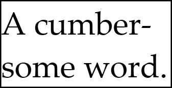
<TextBlock TextWrapping="Wrap" IsHyphenationEnabled="True">
  A cumbersome word.
</TextBlock>
As Figure 14-11 shows, hyphenation enables the text to fit on fewer lines than in Figure 14-10, and with less compromise. Because hyphenation seems to be better in every respect, it may seem strange that it is disabled by default. However, the hyphenation algorithm is complex, and there are nontrivial costs to enabling it. Because hyphenation is appropriate only for certain scenarios—presenting bodies of text in relatively narrow spaces—it makes sense for it to be off by default.
Tip
Hyphenation is a language-specific process. WPF takes the
element tree’s language into account for both hyphenation and
spellchecking. In XAML, you can set the language using the standard
xml:lang attribute—you can set
this to any culture string, such as en-GB or fr-CA, which represent British English and
French Canadian, respectively. From code, you can set the Language property of any FrameworkElement or FrameworkContentElement object. Text
editing controls with the SpellCheck.IsEnabled attached property set
to True also honor the language
setting.
Hyphenation and spelling dictionaries are shipped as part of the .NET 3.0 language packs provided by Microsoft. At the time of this writing, dictionaries are provided for English, German, French, and Spanish.
Text Alignment
TextAlignment is an attached
property defined by the Block
class. The property accepts any value from the TextAlignment enumeration type. This offers
four values, all of which will be familiar to you if you’ve ever used
a word processor: Left, Right, Center, and Justify.
Figure 14-12 shows the effect of the
Justify setting. As you can see,
the righthand edge is now flush with the available space, as opposed
to the ragged-right edge shown in Figure 14-9.

We’ve looked at the mechanisms available for describing how text should be formatted. However, a description of formatted text isn’t much use unless we can somehow display that text, so it is time to look at the elements available to us for presenting text in a user interface.
Text and the User Interface
As we saw in the Introduction and Chapter 13, a
WPF application’s appearance is defined by its visual tree—a tree of
objects derived from the Visual base
class. Text must fit into this model, but we have several different
options for adding text into the visual tree depending on the balance we
require between control and ease of use.
The lowest level at which we can work with text is to use the
visual layer drawing techniques introduced in Chapter 13. The next level up is to use the Glyphs class, which offers a similar level of
control as visual layer programming, but packaged into a framework
element. This enables it to be used from markup and to provide the usual
framework-level features, such as event support and participation in
layout. The GlyphRunDrawing class
offers similar features, but you can incorporate it into a drawing.
Finally, you can use the text object model in conjunction with one of
the elements that knows how to render this form of text, such as
TextBlock or FlowDocumentReader. TextBlock is the most widely used, as it
offers a good balance between simplicity and flexibility.
TextBlock
The TextBlock element is
usually the best choice for presenting simple text. It can handle both
plain text and formatted text, and can cope easily with anything from
a single character to a few paragraphs. Example 14-9 shows TextBlock at its simplest.
Because TextBlock derives
from FrameworkElement, its position
and size will be determined by WPF’s normal layout mechanisms (which
we described in Chapter 3).
A TextBlock can span multiple
lines. A straightforward though inflexible way to do this is to put
either a carriage return or a linefeed (character values 13 and 10) or
both[98] into the Text
property. Example 14-10 shows this
technique. Note that because all three of the popular representations
for a new line are treated equivalently, there’s no need to use .NET’s
Environment.NewLine property in
WPF.
Although this hardcoded line break works fine, a better solution
might be to switch on word wrapping, enabling the TextBlock to choose where to put line
breaks. This is controlled with the TextWrapping property, one of the common
text properties, described earlier in this chapter, in the "Fonts and Text Styles" section. TextBlock defines aliases for all of these
common properties.
As an alternative to setting the Text property of a TextBlock, you can supply content inside the
element. Example 14-11 uses this technique to
create the same result as Example 14-9.
Moving the text inside the element doesn’t add anything very useful for this particular example. However, by representing the text as content, we can go beyond plain strings, as Example 14-12 shows.
As Figure 14-13 shows, this renders the word “Some” in bold, and the word “text” with the normal font weight.
When you add content to a TextBlock in this way, you are adding items
to its Inlines property. This is a
collection of objects, all derived from Inline. This class and its derivatives (such
as Bold and Italic) are described in detail in the
"Text Object Model" section, later in this chapter.
For now, it is enough to think of an Inline as some formatted text contained
within a single paragraph. This means that a good way to think of
TextBlock is as a framework element
that renders a sequence of Inline
text elements.
Label and AccessText
WPF defines a Label
control, which is also able to display text. If you have used
Windows Forms, Label might look
like the obvious choice for displaying text, because Windows Forms
also defined a Label control,
which was used for displaying simple text. However, the purpose of
WPF’s Label control is
different.
As mentioned in Chapter 5, WPF’s Label control’s purpose is to place the
focus into another control such as a TextBox when an access key is pressed.
Using a Label control simply as a
plain-text label is wasteful—it creates a TextBlock internally to render plain text
for you, so you might as well just create the TextBlock yourself.
Label has one other trick:
you can use it to add underlines for access keys when the user
presses the Alt key. As Example 14-13 shows, you denote the
access key with an underscore.
When the user presses the Alt key (or if he has configured Windows to show access key underlines at all times), the relevant letter will be underlined, as shown in Figure 14-14.

However, if the only reason you’re using Label is to show an access key underline,
there’s a better alternative. When you provide Label (or any control that supports the
content model) with a string containing an underscore, it generates
an AccessText element to present
that string instead of a TextBlock. So, it would be more efficient
to use this directly, as Example 14-14 does.
The rule is simple: use the Label control if you need its focus
management. If all you need to do is present text, use a text
presentation element: AccessText
if you need the underline and TextBlock otherwise.
The TextBlock is designed
for fairly small volumes of text. It is possible to put multiple
paragraphs into a TextBlock
either by embedding suitable line break characters in its Text property, or by using the LineBreak inline element. However, WPF
provides other elements that are better suited to presenting large
quantities of text.
Flow Documents and Viewer Controls
The full text object model of WPF supports more than just the
inline elements supported by TextBlock. It contains types that represent
paragraphs, lists, and tables; collectively these are known as
block types, and we will describe
them in detail in the "Text Object Model" section.
These elements can only appear inside a FlowDocument. WPF provides three controls
for displaying flow documents.
FlowDocumentScrollViewer is
the simplest of the flow document controls. Its behavior is very
similar to the HTML control: it formats the document to fill the
available width, and provides a vertical scroll bar if the document is
taller than the available height. This is a very simple element to
use, as Example 14-15
shows.
<Window ...>
  <FlowDocumentScrollViewer x:Name="viewer" />
</Window>
All you need to do is set the viewer’s Document property to a FlowDocument. We will show how to write a
FlowDocument in the "Text Object Model" section, but for now assume that your
application contains a XAML file called MyFlowDocument.xaml[99] containing a FlowDocument in XAML form. You could load it
in the code-behind file for the file that contains the viewer in Example 14-15 with the code in Example 14-16.
partial class Window1 : Window {
    public Window1(  ) {
        InitializeComponent(  );
        viewer.Document = (FlowDocument) Application.LoadComponent(
            new Uri("MyFlowDocument.xaml", UriKind.Relative));
    }
}
Figure 14-15 shows how the
FlowDocumentScrollViewer presents a
document.

A problem with this control is that it doesn’t make very effective use of wide spaces. As the available width increases, it simply makes the lines of text wider to match. This can be unhelpful because wide lines are hard to read—when we reach the end of one line and our eyes track back to the start of the next line, the likelihood of missing a line gets higher with longer lines. Ideally you don’t want more than 15 words per line.
The traditional solution to this problem in the world of printed media is to split the text into multiple columns. This keeps the line length readable, while exploiting the available width. On paper, a column’s height is fixed, being dictated by the page size and layout. On screen, we need to be a little more flexible—columns need to be as tall as the available space, which can change as the user resizes the application. The worst thing we could do is create columns that are too tall, requiring the user to scroll up and down to read across the columns. If you’ve ever had to read a column-formatted PDF file on a computer, you’ll know what a horrible reading experience that is. Even with suitably sized columns, there may be too much text to fit, in which case we’ll need some mechanism for moving from page to page.
WPF provides the FlowDocumentPageViewer to solve these
problems. It splits text into columns of the appropriate height,
reformatting the text should the layout change for any reason (such as
the user resizing the window). And, it provides paging controls to
navigate through the document. In markup and code, it is used in
exactly the same way as the FlowDocumentScrollViewer, as you can see
from Example 14-17. Figure 14-16 shows how it looks.

Figure 14-16 shows two columns because that was how many happened to fit for that window size. As Figure 14-17 shows, the control will add more columns if space permits. Notice that the viewer also provides a set of controls at the bottom. In the center are the paging controls, indicating the current page, the total number of pages, and buttons for moving backward and forward. To the right is a zoom control, allowing the user to adjust the magnification.

If you want to let the user choose whether to have a scrolling
view or a column-based paginated view, you can use the FlowDocumentReader control. This provides
buttons that let the user choose between scrolling and pagination. As
Figure 14-18 shows, these appear to
the left of the zoom control.

FlowDocumentReader provides
three modes. The leftmost button selects paginated viewing, and the
rightmost selects scrolling. The middle button selects the double-page
view shown in Figure 14-19,
which is reminiscent of reading a double-sided printed and bound
material such as a book or a magazine.

Tip
WPF provides a fourth document viewer: the DocumentViewer control. This displays a
FixedDocument instead of a
FlowDocument. It is described in
Chapter 15.
Whether you are using simple formatted text in a TextBlock or a full flow document in one of
the viewer controls, you will be making use of WPF’s text object model
in order to manage the structure and formatting of the text. We
describe this in detail in the "Text Object Model"
section. However, before we look at that, there are some lower-level
options for rendering text. These offer finer control than the text
object model, but are considerably harder to use.
Visual Layer Text
The visual layer is the lowest level at which you can work with text. In practice, you will probably not use this approach very often—it is most useful when you are already writing visual layer graphics code and need to present some text. However, the visual layer underpins all forms of text rendering in WPF, so it is useful to understand how it works.
Even at the visual layer, two levels of abstraction are
available. At the very lowest level, we work with glyph runs, which are sequences of
characters sharing a single font and style. A glyph run offers very
precise control over how text is rendered, but it is a lot of work to
use. Alternatively, you can work with the higher-level FormattedText class, which provides simple
formatting for small blocks of text.
Glyph runs
Glyph runs are the lowest-level representation of text in WPF. They provide extremely precise control, but they are very inconvenient to use as a result, as Example 14-18 shows.
public class MyGlyphsElement : FrameworkElement {
    protected override void OnRender(DrawingContext drawingContext) {
        GlyphRun run = BuildGlyphRun("Hello, world!");
        if (run != null) {
            drawingContext.DrawGlyphRun(Brushes.Black, run);
        }
    }

    public static GlyphRun BuildGlyphRun(string text) {
        double fontSize = 50;
        GlyphRun glyphs = null;

        Typeface font = new Typeface("Calibri");
        GlyphTypeface glyphFace;
        if (font.TryGetGlyphTypeface(out glyphFace)) {
            glyphs = new GlyphRun(  );
            ISupportInitialize isi = glyphs;
            isi.BeginInit(  );
            glyphs.GlyphTypeface = glyphFace;
            glyphs.FontRenderingEmSize = fontSize;

            char[] textChars = text.ToCharArray(  );
            glyphs.Characters = textChars;
            ushort[] glyphIndices = new ushort[textChars.Length];
            double[] advanceWidths = new double[textChars.Length];

            for (int i = 0; i < textChars.Length; ++i) {
                int codepoint = textChars[i];
                ushort glyphIndex = glyphFace.CharacterToGlyphMap[codepoint];
                double glyphWidth = glyphFace.AdvanceWidths[glyphIndex];

                glyphIndices[i] = glyphIndex;
                advanceWidths[i] = glyphWidth * fontSize;
            }
            glyphs.GlyphIndices = glyphIndices;
            glyphs.AdvanceWidths = advanceWidths;

            glyphs.BaselineOrigin = new Point(0, glyphFace.Baseline * fontSize);
            isi.EndInit(  );
        }
        return glyphs;
    }
}
This example overrides OnRender in order to work with the visual
layer API. As we saw in Chapter 13, WPF passes this
method a DrawingContext, with
which we define the appearance of our element. Here, we call the
DrawGlyphRun method to render
text. Figure 14-20 shows the
result.

The bulk of the work is done in the BuildGlyphRun method, which creates the
GlyphRun object. A GlyphRun needs to know which font to use,
specified by a GlyphTypeface
object. As mentioned earlier, in the "Fonts and Font Families" section, WPF offers three
classes for working with fonts. GlyphTypeface is the lowest-level one,
representing a specific font file.
If you know the exact location of the font file on disk, you
can build a GlyphTypeface from
scratch. However, Example 14-18 does not
presume the location of the font. Instead, it creates a Typeface object that describes the font,
and then uses its TryGetGlyphFace
method to do the work of locating the relevant font file and
creating a GlyphTypeface
object.
We have to provide the GlyphRun with detailed information about
the characters we would like it to draw. Not only must we provide an
array containing the characters themselves, but we also need to tell
it where to find each character in the font file—this is the purpose
of the glyphIndices array in
Example 14-18. We
obtain the glyph index by looking it up in the GlyphTypeface object. Note that glyph
indices are not standardized—a particular character’s glyph index
will change from one font file to another.
GlyphRun also requires us
to be explicit about horizontal character positioning: the advanceWidths array contains the nominal
width of each character. The visible width of a character is always
determined by its shape, and the advance
widths do not change this—characters are not squashed or
stretched to fit. These so-called widths simply determine where each
character is positioned. If you imagine a typewriter, the advance
width for a character would indicate how far the paper should be
advanced horizontally after that character is typed. GlyphRun gives us control over this to
allow nonstandard spacing where necessary. We could use this to
perform tracking (i.e.,
reducing or increasing the spacing uniformly for every letter). We
might also use this to perform kerning, where the spacing between a
particular pair of characters is adjusted. We could also place
multiple characters on top of one another by using a zero advance
width. Example 14-18
does none of these things—it simply asks the GlyphTypeface for each character’s default
width.
Finally, we set the BaselineOrigin property to indicate where
we would like the text to be rendered. Because we just want to
render text in a straightforward fashion, we use the GlyphTypeface object to look up the
baseline offset, just as we did for the glyph indices and advance
widths.
Example 14-18
passes the GlyphRun object to the
DrawGlyphRun method of the
DrawingContext. You can also use
a GlyphRun with a GlyphRunDrawing, in order to incorporate
text into a drawing. Example 14-19 calls the
BuildGlyphRun method defined in
Example 14-18 and wraps
it as a drawing, which it then presents in a window. (We described
drawing objects in Chapter 13.) Because this uses
the same text as the previous example, the results will look much
the same as Figure 14-20.
public class FontDrawingWindow : Window {
    public FontDrawingWindow(  ) {

        GlyphRunDrawing drawing = new GlyphRunDrawing(
                Brushes.Blue, MyGlyphsElement.BuildGlyphRun("Hello, world!"));

        // Host drawing in an Image so we can see it.
        Image imageElement = new Image(  );
        imageElement.Stretch = Stretch.None;
        imageElement.Source = new DrawingImage(drawing);
        this.Content = imageElement;
    }
}
Although GlyphRun gives you
very fine control over text rendering, it involves a lot of work.
You will probably not want to write code like that in Example 14-18 every time you
want to put some text on the screen. So even down at the visual
layer, we have a higher-level alternative: FormattedText.
FormattedText
The most convenient way to work with text at the visual layer
is to use the FormattedText
class. As Example 14-20 shows, we
can build a FormattedText object
representing the text we would like to render, and then pass it to
the DrawingContext. This is
considerably simpler than building a GlyphRun.
public class MyTextElement : FrameworkElement {
    protected override void OnRender(DrawingContext drawingContext) {
        FormattedText text = new FormattedText(
            "Hello, world!",
            Thread.CurrentThread.CurrentUICulture,
            FlowDirection.LeftToRight,
            new Typeface("Candara"),
            60,    // Font size in pixels
            Brushes.Black);

        drawingContext.DrawText(text, new Point(0, 0));
    }
}
As you can see, the FormattedText object contains the text to
be displayed, but it also contains some other settings. We provide
culture and text direction information—WPF’s text rendering takes
the culture into account, as certain text features may need to be
handled differently in different cultures. (For example, a
particular Unicode character can have different shapes in different
regions.) The FormattedText
object also needs to know the font, font size, and brush to be used.
Figure 14-21 shows the results.

FormattedText is able to
perform word wrapping. This is off by default—text will simply be
cropped if it doesn’t fit. The result is the same as the default
TextBlock behavior shown earlier
in Figure 14-8. To use
wrapping, we must tell WPF how much space is available. All we need
to do is add one line of code, shown in Example 14-21, before passing the FormattedText object to DrawText.
Specifying a width has the effect of turning on word wrapping, so the results will look the same as those shown earlier in Figure 14-9.
This example may have you wondering whether FormattedText also has a MaxTextHeight property. Indeed it does.
Figure 14-22 shows the result of specifying a
maximum width and height, and then making the window slightly too
small to hold the text.

WPF will render only as much text as fits completely. The
cropping behavior is determined by setting the FormattedText object’s Trimming property to a value from the
TextTrimming enumeration. We
described the available enumeration values earlier, in the "Text Trimming" section of this chapter.
FormattedText also offers a
TextAlignment property that
supports the four alignment styles defined by the TextAlignment enumeration, as described
earlier in the "Text Alignment" section of the
chapter.
Example 14-20 specified only
the typeface name. The Typeface
object passed to the FormattedText constructor can contain more
information. Example 14-22 shows a more detailed
typeface description.
FontFamily preferredFont = new FontFamily("Candara");
FontFamily fallbackFont = new FontFamily("Verdana");

Typeface tf = new Typeface(
    preferredFont,
    FontStyles.Italic,
    FontWeights.Bold,
    FontStretches.Normal,
    fallbackFont);
This creates a Typeface
object that incorporates two font families: the first (Candara) will
be used if available, but the second one (Verdana) indicates the
family to use if the first is unavailable. The constructor used here
also takes FontStyle, FontWeight, and FontStretch values, all of which work in
the same way as the font style, weight, and stretch properties
described earlier in the chapter, in the "Fonts and Text Styles" section. In this case, we have
asked for an italic, bold, unstretched version of the font.
Tip
If you need a mixture of fonts or styles, you will need to
create a FormattedText object
for each distinct style, and make multiple calls to DrawText.
FormattedText also supports
lines, such as underlines and strikethroughs. As we saw earlier, in
the "Decorations" section of the chapter, UI
elements support this with the TextElement class’s attached TextDecorations property, which is of type
TextDecorationCollection.
FormattedText offers a SetTextDecoration method that uses this
same collection type. Example 14-23 uses this in
conjunction with one of the predefined simple text decoration
collections to apply an underline.
FormattedText text = ...; // As before

text.SetTextDecorations(TextDecorations.Underline);
The FormattedText class
offers a useful service that is not directly related to text
rendering, but which is well worth knowing about: it can convert
text into a Geometry. As we saw
in Chapter 13, geometries define shapes, and you
can use them at the visual layer or in conjunction with a Path object, as well as to specify clip
regions for any UI element. The FormattedText class’s BuildGeometry method does the work, as
Example 14-24 shows.
FormattedText text = new FormattedText(
    "CLIP!",
    Thread.CurrentThread.CurrentUICulture,
    FlowDirection.LeftToRight,
    new Typeface("Gill Sans Ultra Bold"),
    20,
    Brushes.Black);

Geometry textGeometry = text.BuildGeometry(new Point(0,0));
button1.Clip = textGeometry;
This example builds a geometry from some text and then applies
it as the Clip property of a
button element. Figure 14-23 shows the
results.

The visual layer API offers powerful text rendering
services—all of WPF’s text rendering builds on either GlyphRun or FormattedText. However, you will not want
to write code every time you need to get text to appear. In many
cases, TextBlock or the various
flow document viewers will be ideal, but sometimes it is useful to
exploit the full control offered by glyph runs from markup. This is
the purpose of the Glyphs
element.
Glyphs
The Glyphs class allows a
glyph run to be incorporated into an application’s UI tree. It is very
similar in nature to the Path class
we saw in Chapter 13. Both types derive from Shape (which in turn derives from FrameworkElement). Whereas Path lets you add any geometry object to the
visual tree, Glyphs lets you add
any glyph run.
You don’t build the GlyphRun
object yourself—Glyphs constructs
it for you. Glyphs can use exactly
the same information as we used when building a GlyphRun earlier in this chapter. However,
it is quite happy to generate default glyph indices, advance widths,
and cluster maps for us. This makes it simpler to use—as Example 14-25 shows, we need to provide only a font, the
font size, the text, the fill brush, and the position.
<Glyphs FontUri="C:WindowsFontsCalibri.ttf" FontRenderingEmSize="40"
        UnicodeString="Hello, world" Fill="Black" OriginY="30" />
Note that as with GlyphRuns,
Glyphs needs to know the location
of the font file. In Example 14-18, we were able to
get Typeface to find the file for
us by calling its TryGetGlyphTypeface method. In code, you
could do the same thing with a Glyphs object. But if you are using Glyphs from markup, there is no
straightforward way to look up the font location, which is why Example 14-25 hardcodes the path. In practice, you should
avoid doing this unless the path is a relative URI referring to a font
embedded in your application as a resource. (You can package a font
into your application just as you would any other binary
resource.[100] See Chapter 12 for information on
embedding binary resources.) If you need to use a system font in a
Glyphs element, you will
unfortunately need to write some code to look up the URI. Example 14-26 shows one general-purpose
solution to this problem.
using System;
using System.Windows.Markup;
using System.Windows.Media;

namespace GlyphsUriLookup {
    public class FontUriExtension : MarkupExtension {
        string fontFamilyName;

        public FontUriExtension(string fontFamilyName) {
            this.fontFamilyName = fontFamilyName;
        }

        public override object ProvideValue(IServiceProvider serviceProvider) {
            Typeface tf = new Typeface(this.fontFamilyName);
            GlyphTypeface gtf = null;
            if (!tf.TryGetGlyphTypeface(out gtf)) {
                throw new ArgumentException("Font family not found");
            }
            return gtf.FontUri;
        }
    }
}
This is a markup extension—a class that contains code used to
determine the value of a property. (See Appendix A for
more information about XAML and markup extensions.) It contains the
code necessary to map from a font name to a font URI. You can use this
to set the FontUri property of a
Glyphs element, as Example 14-27 shows.
<Canvas xmlns:loc="clr-namespace:GlyphsUriLookup">
  <Glyphs FontUri="{loc:FontUri Calibri}" FontRenderingEmSize="40"
          UnicodeString="Hello, world" Fill="Black" OriginY="30" />
</Canvas>
Although Glyphs will generate
sensible default values for glyph indices and advance widths, you can
specify nonstandard values manually if necessary, as you would for a
GlyphRun. However, the way you
specify these values looks a little different. GlyphRun takes separate arrays for indices
and widths, but with Glyphs, these
are encoded into a single text property, Indices, shown in Example 14-28.
<Glyphs FontUri="C:WindowsFontsCalibri.ttf"
        FontRenderingEmSize="40"
        Indices="44,60;286,60;367,60;367,60;381,60;853,60;3,60;
                 449,60;381,60;396,60;367,60;282,60;842,60"
        UnicodeString="Hello, world!"
        Fill="Black"
        OriginY="30" />
The Indices property consists
of semicolon-separated sets of numbers. Each set corresponds to one
character in the text. The first number is the glyph index.
Tip
Remember that glyph indices are specific to a particular font
file. If you change the FontUri
without updating the Indices, you
are likely to see complete garbage as a result.
The number after the glyph index is the advance width (i.e., the nominal width of the character). Example 14-28 sets this to 60 for every single character. Figure 14-24 shows the results. It looks pretty horrible because this particular font is designed for proportional spacing, and not the monospaced layout shown here.

You can optionally supply two more numbers for each entry in
Indices to control the position of
combining characters. Some characters, such as accents, are designed
to be added to other characters. Their default position is usually
appropriate, but occasionally it’s useful to adjust them. You would do
this by providing an x and y
offset after the advance width.
Now that we’ve seen all of the elements available for rendering text, it’s time to look at this text object model in more detail.
Text Object Model
Text has distinctive layout requirements. With most user interface elements, the goal of layout is typically to define the basic UI structure (e.g., menu and toolbars at the top, status bar at the bottom, tree view on the left, scrollable work area on the right) and have the layout system make simple adjustments to the size and position of each element in order to fit the available space. But with text, we typically have a continuous stream of content where sequencing is more important than exact position. For example, we often don’t care whether a particular figure appears at the top, bottom, or middle of a page as long as it is adjacent to the paragraph that refers to the figure.
There is some overlap between the requirements of text layout and
UI layout. For example, the WrapPanel
arranges elements in a similar manner to word-wrapped text layout.
Although it would have been technically possible to use a single layout
system for both textual content and user interface structure, this would
have involved compromises on both sides. WPF’s object model for
representing formatted text is therefore separate from the layout panels
and controls we’ve seen in previous chapters.
The element types that make up the text model all derive from a
common abstract base class: TextElement. As you saw in Table 14-1, this defines a set of
properties for controlling aspects of the text’s appearance, such as its
font and color. The TextElement type
does not derive from FrameworkElement. Instead, it derives from
FrameworkContentElement, meaning that
all text objects are not intrinsically visible—they rely on some hosting
element derived from Visual, such as
TextBlock or FlowDocumentPageViewer, in order to render
them. But although text elements do not form part of the visual tree,
they are still a part of the logical tree—if you walk the tree using the
LogicalTreeHelper class, it will
report all textual content. We described the distinction between the
logical and visual trees in Chapter 9.
Text elements fall into two main categories: inline elements and block elements. We’ll start by looking at inlines.
Inline
Inline text elements represent a stretch of text contained
within a paragraph. They derive from the Inline base class, which in turn derives
from TextElement. Some inlines
simply apply formatting to their content, and some do a little more
than that.
Because Inline derives from
TextElement, it supports all the
standard properties shown in Table 14-1. It also defines a few
more, listed in Table 14-3.
We covered the TextDecorations property earlier because
decorations are also used in the low-level text rendering APIs.
FlowDirection is straightforward
enough—in some languages text runs from left to right, whereas in
others it runs from right to left—but it may seem surprising for this
to be applied to an inline rather than, say, a paragraph. The reason
is that a paragraph might contain a mixture of languages, so each
inline can have a different flow direction if necessary. BaselineAlignment supports these values:
Baseline, Bottom, Center, Subscript, Superscript, TextBottom, TextTop, and Top.
Example 14-29 illustrates the use of
BaselineAlignment.
<TextBlock Background="LightGreen"> Alignment: <Span FontSize="20"BaselineAlignment="Baseline">Baseline</Span> <SpanBaselineAlignment="Center">Center</Span> <SpanBaselineAlignment="Top">Top</Span> <SpanBaselineAlignment="Superscript">Superscript</Span> <SpanBaselineAlignment="Bottom">Bottom</Span> <SpanBaselineAlignment="Subscript">Subscript</Span> </TextBlock>
We made one piece of text in this example larger than the rest
in order to highlight the difference between Center and Baseline. If every item in a line is the
same height, these two values have the same effect. Figure 14-25 shows the results.

Example 14-29 does not show the TextTop and TextBottom settings, because in this
particular example, they behave in the same way as Top and Bottom. The distinction matters only if you
take the fairly unusual step of forcing the effective line height to
be different from the natural height of the text. You can do this by
setting the LineStackingStrategy
property to BlockLineHeight, and
setting the BlockLineHeight
property, as shown in Example 14-30.
<TextBlock Background="LightGreen"
           LineStackingStrategy="BlockLineHeight" LineHeight="40">
  Alignment:
  <Span FontSize="20" BaselineAlignment="Baseline">Baseline</Span>
  <Span BaselineAlignment="TextTop">TextTop</Span>
  <Span BaselineAlignment="Top">Top</Span>
  <Span BaselineAlignment="TextBottom">TextBottom</Span>
  <Span BaselineAlignment="Bottom">Bottom</Span>
</TextBlock>
As Figure 14-26
shows, Top and Bottom appear at the top and bottom of the
TextBlock. TextTop and TextBottom appear at the top and bottom of
the text’s natural vertical extent.

The following sections describe each concrete type derived from
Inline.
Run
Run is the most widely used
text element type, because it’s the only one capable of containing
actual text. This can come as a surprise, as you rarely see the type
used explicitly in XAML. However, Run elements are generated automatically.
For example, this:
<TextBlock>
  Simple text
</TextBlock>
is equivalent to this:
<TextBlock>
  <Run Text="Simple text" />
</TextBlock>
The XAML compiler knows to generate the Run element automatically thanks to custom
attributes applied to the relevant classes. As Example 14-31 shows, the
TextBlock element is annotated
with a ContentProperty attribute
indicating that child content should be added to its Inlines property. That property is of type
InlineCollection, and as you can
see, that is annotated with two ContentWrapper attributes. We describe the
process by which XAML is converted into objects in Appendix A; the net result of these attributes is that plain
text inside any InlineCollection
will automatically be wrapped in Run elements, whereas user interface
elements will automatically be wrapped in InlineUIContainer elements.
[ContentProperty("Inlines"), ...]
public class TextBlock : FrameworkElement, ...

[ContentWrapper(typeof(Run)), ContentWrapper(typeof(InlineUIContainer)),
   WhitespaceSignificantCollection]
public class InlineCollection : TextElementCollection<Inline>, ...
Because Run elements are
generated automatically, you don’t often use them in XAML. However,
they offer one advantage over bare text: XML parsers often ignore
whitespace in element content, but will never ignore it inside an
attribute. Consider Example 14-32.
<TextBlock>
  A      B
  <Run Text="A      B" />
</TextBlock>
This TextBlock looks like
it should contain the same text twice. The plain-text content will
automatically be wrapped with a Run element, which is then followed by
another Run with the same text.
However, as Figure 14-27 shows, the text
has been handled differently. The spaces in the first block of text
have collapsed into a single space. Only in the second case, where
the text was wrapped explicitly in a Run, is the whitespace preserved.
This reduction of whitespace is often useful. It enables us to indent text and add new lines without affecting the final outcome. Indeed, although we can disable this behavior, doing so illustrates why we often don’t want to. Example 14-33 uses a standard XML attribute to force whitespace to be preserved.
<TextBlock xml:space="preserve" Background="LightBlue">
  A      B
  <Run Text="A      B" />
</TextBlock>
Figure 14-28 shows the results. A
background color has been specified to make it clear what is
happening. Although both blocks of text now correctly preserve the
amount of space between the two letters, the example also preserves
some things we may not have wanted. There is now some space to the
left of both As—this is because we indented the
contents of the TextBlock. If we
want the content to be flush to the left of the TextBlock, we would have to avoid
indenting it wherever xml:space="preserve" is used. This can be
inconvenient because a lot of XML editors will automatically indent
both elements and their content based on the depth of
nesting.

The example also now spans multiple lines. As you can see from
the empty areas painted with the background color, we have blank
lines at the top and the bottom. This is because the content is
defined on separate lines from the opening and closing TextBlock tags—there are line end
characters in our XAML after the opening TextBlock, before the Run, and before the closing TextBlock, and these have all been
faithfully preserved. If you use the xml:space="preserve" attribute, the only
way to get just one line of output is to make sure that the TextBlock is all on one line in your XAML
source. In practice, it’s often more convenient to use explicit
Run elements instead when you
need to control whitespace.
The XAML compiler automatically generates Run wrapper elements for text content. If
you are working with the text object model from code, you will need
to deal with Run elements
regardless of whether you need precise control over
whitespace.
Because Run derives from
TextElement, it can use all of
the TextElement formatting
properties shown in Table 14-1. Run elements are always the leaves of a
tree of text elements—they cannot have children. This can make them
a little cumbersome for mixing styles together. It may be easier to
use Span or one of its
derivatives.
Span
Span allows you to apply
text formatting properties to a range of text. Unlike Run, a Span can contain child elements. This
allows you to combine styles, as shown in Example 14-34.
<TextBlock>
  <Span FontFamily="Cambria">
    This uses <Span FontWeight="Bold">a
    <Span FontStyle="Italic">mixture</Span> of</Span> styles.
  </Span>
</TextBlock>
The Span class has an
Inlines property. Just as with
TextBlock, child content will be
added to this property, which is of type InlineCollection. This means that plain
text will automatically be wrapped with Run elements, just as it is inside a
TextBlock. So the XAML in Example 14-34 is equivalent to the code in Example 14-35.
TextBlock txt = new TextBlock(  );
Span rootSpan = new Span(  );
rootSpan.FontFamily = new FontFamily("Cambria");
rootSpan.Inlines.Add(new Run("This uses "));

Span boldSpan = new Span(  );
boldSpan.FontWeight = FontWeights.Bold;
boldSpan.Inlines.Add(new Run("a "));

Span italicSpan = new Span(  );
italicSpan.Inlines.Add(new Run("mixture"));

boldSpan.Inlines.Add(italicSpan);
boldSpan.Inlines.Add(new Run(" of"));

rootSpan.Inlines.Add(boldSpan);
rootSpan.Inlines.Add(new Run(" styles"));
Figure 14-29 shows the results.
For convenience, WPF defines four types derived from Span that apply common formatting to their
contents: Bold, Hyperlink, Italic, and Underline.
These allow the content in Example 14-34 to be expressed more compactly. Example 14-36 will produce the same result as that shown in Figure 14-29.
<TextBlock>
  <Span FontFamily="Cambria">
    This uses <Bold>a <Italic>mixture</Italic> of</Bold> styles.
  </Span>
</TextBlock>
Unlike Bold and Italic, the Hyperlink class does more than define a
standard look. It also offers a NavigateUri property. If you set this on a
Hyperlink in a navigation
application, the application will navigate to the specified URI if
the element is clicked. It also offers a Click event and a Command property, both of which behave in
exactly the same way as the equivalently named members of the
Button class, which we described
in Chapter 5.
LineBreak
The LineBreak element is a
bit of an oddball. It derives from Inline, meaning that it is for use within
a paragraph, but it appears to introduce a new paragraph. Strictly
speaking, from the point of view of the text object model, it
introduces a new line in the middle of a paragraph. Example 14-37 shows LineBreak in use.
<TextBlock TextWrapping="Wrap">
  This is the first sentence in a paragraph.
  <LineBreak />
  This is technically the second sentence of the same paragraph.
</TextBlock>
Figure 14-30 shows the results. As you can see, it certainly looks like two paragraphs. But as far as the text object model is concerned, it is treated as a single paragraph.
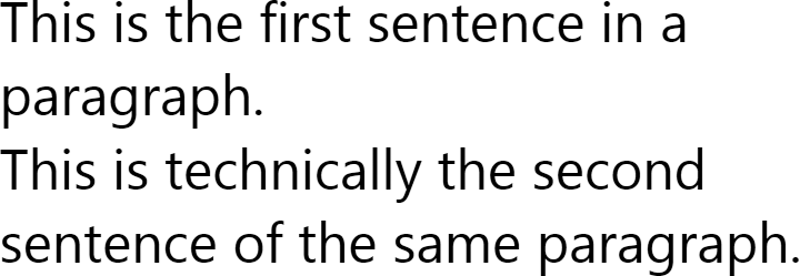
Although this may seem to be a rather pedantic distinction, it
is a useful one. A TextBlock is
not capable of dealing with WPF’s Paragraph element, but it can deal with
LineBreak because that’s an
Inline. By using LineBreak, you can show what appear to be
multiple paragraphs of text without having to use a full FlowDocument in a reader control. In
performance-sensitive scenarios, this can be important, because
TextBlock uses fewer resources
than any of the FlowDocument
viewers.
InlineUIContainer
Although types derived from TextElement use a different layout
strategy from those derived from FrameworkElement, it is possible to mix
both element types. Just as elements such as TextBlock or FlowDocumentReader can host text in a
visual tree, there are also text elements that can host UI elements
in a text tree. The InlineUIContainer type wraps any object
derived from UIElement. Because
InlineUIContainer derives from
Inline, you can place it in any
element that contains inlines, such as a TextBlock or a Span. Example 14-38 uses this to host a Button.
<TextBlock>
  Text with a
  <InlineUIContainer>
    <Button Content="Control" />
  </InlineUIContainer>
  in the middle.
</TextBlock>
Figure 14-31 shows the result.
Elements hosted by an InlineUIContainer will size to content
unless the containing element has its LineHeight property set. In that case, the
hosted element will size to content horizontally, but would be
vertically constrained to the line height.

As you can see in Figure 14-31,
the default alignment for a hosted element is that its bottom is
aligned with the baseline of the text. Because InlineUIContainer derives from Inline, you can modify this by setting the
BaselineAlignment property
described earlier, as Example 14-39 shows.
<TextBlock TextWrapping="Wrap">
  Text with a
  <InlineUIContainer BaselineAlignment="Center">
    <Button Content="Control" />
  </InlineUIContainer>
  in the middle.
</TextBlock>
Figure 14-32 shows the results.

InlineUIContainer offers
all the same properties as any other inline element. If you do not
need to set any of these, you can omit it from your XAML because, as
we saw in Example 14-31,
the InlineCollection class is
annotated with a ContentWrapper
attribute. This instructs the XAML compiler to wrap UI elements in
InlineUIContainer elements
automatically. So, instead of the markup in Example 14-38, we can use the shorter
equivalent in Example 14-40.
<TextBlock>
  Text with a
  <Button Content="Control" />
  in the middle.
</TextBlock>
InlineUIContainer is not
limited to controls. It enables you to integrate any content type
into your text—you can host video, bitmaps, and 2D and 3D graphics
in an InlineUIContainer.
We’ve now looked at all of the text element types that we can
use within a single paragraph. However, for any reasonable quantity
of text, you will want to break the text into multiple paragraphs,
and maybe add features such as lists and tables. This is where the
Block type comes in.
Block
Block is an abstract base
class that derives from TextElement. It represents blocks of text
such as paragraphs, tables, and lists. You can’t use a Block inside a TextBlock—that can contain only inline
elements. Blocks belong inside a FlowDocument, and must therefore be
presented by one of the flow document viewer controls described
earlier in this chapter.
The Block base class defines
a set of common properties. This includes all of those from TextElement, of course, which are listed in
Table 14-1. Block adds many more properties common to
all elements derived from Block.
Two of these, TextAlignment and
IsHyphenationEnabled, are aliased
by TextBlock and were described
earlier. Table 14-4 shows the complete
set.
Property | Usage |
| Brush with which to paint a border around the block; null if no border required. |
| Thickness of border. |
|
|
|
|
| Controls how floaters for this block are positioned—see the "Figures and Floaters" section, later in this chapter, for details on floaters. |
| Sets text flow
direction for block—either |
| If |
| Line height in
device-independent pixels. (XAML can specify other units with
a suffix: in, cm, and pt indicate inches, centimeters, and
points, respectively.) A value of |
| Determines whether the
actual line height is determined by |
| Space to be left between this block and its neighbors. |
| Space to be left between the block’s border and its content. |
| One of the |
We describe the block element types in the following sections.
Paragraph
The Paragraph element
groups a collection of Inline
elements into a paragraph. Example 14-41
shows a FlowDocument containing
two paragraphs.
<FlowDocument>
  <Paragraph>
    This is a paragraph.
  </Paragraph>
  <Paragraph>
    <Italic>This</Italic> is <Bold>another</Bold> paragraph. It
    contains more text than the first, and with more
    <Span FontFamily="Old English Text MT">styles</Span>.
  </Paragraph>
</FlowDocument>
Figure 14-33 shows the results. As you can see, each paragraph starts on a new line.

There is also space between the paragraphs—by default, a
paragraph has a vertical margin that is the same as the line height.
You can override this by setting an explicit Margin property value. Figure 14-34 shows the effect of
changing the Margin to 0 on both paragraphs.

The contents of a Paragraph
are contained in its Inlines
property. Just as with TextBlock
and Span, this is of type
InlineCollection, so again,
Run and InlineUIContainer elements will be
generated automatically for nested text and FrameworkElements when the XAML is
processed.
List
The List block defines a
numbered or bulleted list. The list’s contents are held in the
ListItems property—a collection
of ListItem elements. The
ListItemCollection type is not
annotated with a ContentWrapper
attribute, so you are required to define the ListItem elements explicitly, as Example 14-42 shows.
<List>
  <ListItem>
    <Paragraph>
      This is an item.
    </Paragraph>
  </ListItem>
  <ListItem>
    <Paragraph>
      This item contains two paragraphs. This is the first.
    </Paragraph>
    <Paragraph>
      This is the second.
    </Paragraph>
  </ListItem>
</List>
ListItem derives directly
from TextElement, because the
only place in which it occurs is inside a List—it is neither an Inline nor a Block. Its content is held in the Blocks property, which is a collection of
Block elements. In Example 14-42, the two items contain a paragraph
and a pair of paragraphs, respectively, but any block type will do.
You can even nest lists, as Example 14-43
shows.
<ListMarkerStyle="Square"> <ListItem> <Paragraph> This item contains a paragraph followed by a nested list. </Paragraph> <ListMarkerStyle="Decimal"> <ListItem> <Paragraph> This is a nested list item. </Paragraph> </ListItem> <ListItem> <Paragraph> This is a second nested list item. </Paragraph> </ListItem> </List> </ListItem> <ListItem> <Paragraph> Is the second item in the first list. </Paragraph> <ListMarkerStyle="Decimal" StartIndex="3"> <ListItem> <Paragraph> This nested list carries on from the previous list numbering. </Paragraph> </ListItem> <ListItem> <Paragraph> This is the second item in the second nested list. </Paragraph> </ListItem> </List> </ListItem> </List>
This example also illustrates the use of the MarkerStyle property, as Figure 14-35 shows. The top-level list
uses a hollow square, but more interestingly, the nested lists are
numbered. There is no way to get one list to automatically pick up
the numbering from where another left off, but this example gets the
required result by manually specifying the StartIndex for the second nested
list.

MarkerStyle supports a
variety of styles, which are shown in Figure 14-36.

There is no direct support for customizing the marker—MarkerStyle accepts values only from the
TextMarkerStyle enumeration, so
the set of values is closed, and there is no “custom” style.
However, you could easily create your own list by defining a
two-column Table, with the list
items in the second column and the custom markers in the
first.
Table
The Table element presents
information in tabular form. Its capabilities overlap somewhat with
the Grid. Think of it as the
TextElement equivalent of the
Grid—you would only use a
Table inside a FlowDocument, whereas a UI would use a
Grid. However, not only are these
elements designed for use in different contexts, but also the style
of use is slightly different. Whereas the position of an element
within a Grid is set by attached
Grid.Column and Grid.Row properties, table elements’
positions are based on the order in which they are added—Example 14-44 contains no explicit positioning
information.
<Table CellSpacing="6">
  <TableRowGroup FontWeight="Bold">
    <TableRow FontSize="24">
      <TableCell ColumnSpan="3" TextAlignment="Center" >
        <Paragraph>Ice Cream</Paragraph>
      </TableCell>
    </TableRow>
    <TableRow FontSize="18" Background="LightGray">
      <TableCell><Paragraph>Type</Paragraph></TableCell>
      <TableCell><Paragraph>Description</Paragraph></TableCell>
      <TableCell><Paragraph>Availability</Paragraph></TableCell>
    </TableRow>
  </TableRowGroup>
  <TableRowGroup>
    <TableRow>


      <TableCell><Paragraph>Chocolate</Paragraph></TableCell>


      <TableCell><Paragraph>Yummy</Paragraph></TableCell>


      <TableCell><Paragraph>Widespread</Paragraph></TableCell>


    </TableRow>


    <TableRow>


      <TableCell><Paragraph>Cookie Dough</Paragraph></TableCell>


      <TableCell><Paragraph>Extra yummy</Paragraph></TableCell>


      <TableCell><Paragraph>Scarce - Ian ate it all</Paragraph></TableCell>


    </TableRow>


    <TableRow>


      <TableCell><Paragraph>Artichoke</Paragraph></TableCell>


      <TableCell><Paragraph>Gruesome</Paragraph></TableCell>


      <TableCell><Paragraph>Rarely available</Paragraph></TableCell>


    </TableRow>


  </TableRowGroup>


</Table>
Figure 14-37 shows the results. Each item in
the table is defined in a TableCell element, which is contained by a
TableRow. The first cell in a row
will be in the first column, the second cell in the second column,
and so on. You can make a single item span multiple cells using the
ColumnSpan or RowSpan property—the title on the first
row has a ColumnSpan of 3 in order to fill the whole width. But
unlike the Grid, a single
Table cell cannot contain
multiple overlapping items.

The rows in a table are always contained by a TableRowGroup. This provides a single
place to apply formatting to multiple rows. Example 14-44 uses a TableRowGroup to set the FontWeight of the first two rows to
Bold. The remaining rows use the
default font weight because they are in a separate TableRowGroup that does not specify any
formatting.
Tip
A Table must always
contain at least one TableRowGroup even if you do not need to
apply formatting to groups of rows. The object model requires
this—the Table class’s content
is held in its RowGroups
property.
The number of columns in a table is determined automatically
unless you choose to specify columns explicitly. Example 14-45 defines the columns explicitly
in order to fix the first column’s width. The TableColumn.Width property is of type
GridLength, meaning it supports
the same sizing mechanisms as Grid: fixed size, star sizing, and
automatic sizing. We described these in Chapter 3.
<Table BorderThickness="1" BorderBrush="Black"> <Table.Columns> <TableColumn Width="25" /> <TableColumn /> </Table.Columns> <TableRowGroup> <TableRow> <TableCell><Paragraph>♥</Paragraph></TableCell> <TableCell><Paragraph>Raspberry</Paragraph></TableCell> </TableRow> <TableRow> <TableCell><Paragraph>♥</Paragraph></TableCell> <TableCell><Paragraph>Vanilla</Paragraph></TableCell> </TableRow> </TableRowGroup> </Table>
Figure 14-38 shows the results. Example 14-45 sets a border on the table so that you can see its bounds. This makes the effect of the fixed-width column clear; by default, the two columns would have been the same width.

The only other property offered by TableColumn is Background, enabling you to set a
background brush for the column.
In Example 14-44 and Example 14-45, each cell contains a Paragraph. A TableCell can contain any sequence of
block elements, so you can also nest lists, or even other tables,
inside a table cell.
Section
The Section block type
contains a sequence of other blocks. A Section has no default intrinsic behavior:
wrapping some blocks in a Section
will not change their appearance unless you set some formatting
properties on the Section. The
purpose of Section is to allow
you to apply a set of formatting properties to several blocks at
once. Example 14-46 uses a Section to apply an italic font style to
two paragraphs.
<Section FontStyle="Italic">
  <Paragraph>
    This paragraph is in italics because the containing section's
    FontStyle property is set to Italic.
  </Paragraph>
  <Paragraph FontWeight="Bold">
    This paragraph is in bold italics because its FontWeight is set
    to Bold, and it inherits the Italic FontStyle from its containing
    section.
  </Paragraph>
</Section>
As you can see from Figure 14-39, both paragraphs pick up the italic style from their parent section. The second paragraph combines this inherited italic style with a locally specified bold font weight.

BlockUIContainer
Earlier, we saw the InlineUIContainer, which allows any
UIElement to be hosted inside a
paragraph. This allowed controls, video, bitmap, 2D graphics, or 3D
graphics to be integrated into a document. BlockUIContainer is similar: it can host
any UIElement, but it wraps it as
a Block instead of an Inline. Example 14-47 uses this to put a Button between two paragraphs.
<Paragraph>
  This is a paragraph.
</Paragraph>
<BlockUIContainer>
  <Button Content="Button" />
</BlockUIContainer>
<Paragraph>
  This is another paragraph.
</Paragraph>
Figure 14-40 shows the result. As
you can see, the button has turned out rather wide. This is because
a BlockUIContainer will offer the
entire column width to the element it contains. The contained
element will size to content vertically, but not
horizontally.

If you don’t want the contained element to fill the whole
width, you must use FrameworkElement layout settings. For
example, setting the HorizontalAlignment property of the
Button to Left will cause the button to left-align
within the container, as Figure 14-41 shows. Setting the
TextAlignment property of the
BlockUIContainer to Left will not work—this block type always
fills the full width of the column, so the horizontal alignment
options mean nothing on the BlockUIContainer itself.

We have now looked at all of the block types. However, there
are two remaining text element types we’ve not yet looked at:
Figure and Floater. These are not blocks, but they
are normally used from within blocks.
Figures and Floaters
The Figure and Floater types are used to host blocks of
content around which other content flows. They are typically used for
hosting figures, sidebars, or tables. Both types derive from the
AnchoredBlock abstract base class.
This derives from Inline, so these
are technically inline elements. However, their content is a
collection of Block elements, so
you cannot use them in a TextBlock—figures and floaters must appear
inside a flow document. Example 14-48 shows a Floater.
<FlowDocument>
<Paragraph>
This paragraph contains a 'floater'. It is the table you can see to
the right.
<Floater HorizontalAlignment="Right" Width="150">
<Table BorderThickness="1" BorderBrush="Black">
<Table.Columns>
<TableColumn Width="25" />
<TableColumn />
</Table.Columns>
<TableRowGroup>
<TableRow>
<TableCell><Paragraph>♥</Paragraph></TableCell>
<TableCell><Paragraph>Raspberry</Paragraph></TableCell>
</TableRow>
<TableRow>
<TableCell><Paragraph>♥</Paragraph></TableCell>
<TableCell><Paragraph>Vanilla</Paragraph></TableCell>
</TableRow>
<TableRow>
<TableCell ColumnSpan="2">
<Paragraph TextAlignment="Center" FontStyle="Italic"
Margin="0,5,0,0">
Example ice cream flavors
</Paragraph>
</TableCell>
</TableRow>
</TableRowGroup>
</Table>
</Floater>
This table is anchored to this paragraph because the Floater element
appears inside of this paragraph.
</Paragraph>
<Paragraph>
This second paragraph also flows around the Floater because the table
is tall enough to span two paragraphs.
</Paragraph>
</FlowDocument>Notice that the Floater
element appears inside the first Paragraph. The position at which the
Floater or Figure appears determines the anchor point,
which will have an impact on where the hosted block appears—WPF will
try to position it as close to the anchor point as possible. In Figure 14-42, the table appears on the line immediately
after the one containing the anchor point.

Whereas a Floater is
positioned vertically as close as possible to its anchor point, its
horizontal position is determined by the HorizontalAlignment property. In Example 14-48, this is set to Right. Figure 14-43 shows the effect
of setting this to Center. The
other options are Left and Stretch. The latter causes the block to fill
the whole column width, preventing text from flowing around either
side.

Figure is very similar to
Floater, the main difference being
that it offers more flexibility in specifying the position relative to
the anchor point. The horizontal position is set with the HorizontalAnchor property. This can be any
of the values in the FigureHorizontalAnchor enumeration, which
are shown in Table 14-5.
Value | Figure position |
| The center of the current column |
| The left of the current column |
| The right of the current column |
| The center of the content-holding area of the page |
| The left of the content-holding area of the page |
| The right of the content-holding area of the page |
| The center of the page |
| The left of the page |
| The right of the page |
You can control the vertical position using the VerticalAnchor property. Table 14-6 shows the available
values.
Value | Figure position |
| The bottom of the content-holding area of the page |
| The center of the content-holding area of the page |
| The top of the content-holding area of the page |
| The bottom of the page |
| The center of the page |
| The top of the page |
| The top of the current paragraph |
Notice that almost all of the available anchor values are
concerned with columns or pages. This means that some of the higher
level of control offered by a Figure over a Floater is significant only if you are using
a column-based paginated view. If you are using the FlowDocumentScrollViewer, there is no
distinction between ColumnLeft and
ContentLeft, because there is just
one big scrolling column. Both of these do the same thing as a
Floater with a HorizontalAlignment of Left. Likewise, the FigureVerticalAnchor settings are meaningful
only in a paginated view. So, you would normally use Figure only on a document likely to be
viewed in pages (e.g., a document you intend to print or one that will
be viewed in a FlowDocumentPageViewer).
The horizontal column-based positions in Table 14-5 are self-explanatory.
The difference between the page-based position and the positions
relative to the “content” area is less obvious. This distinction
exists because a FlowDocument does
not necessarily fill the entire page. If you set its PagePadding property, WPF will leave space
between the edge of the page and the document. Choosing a
page-relative alignment such as PageLeft will position a figure relative to
the page, ignoring the space added due to PagePadding. Figure 14-44 shows a document with 50
pixels of page padding, and a figure horizontally aligned with
PageLeft. As you can see, this
causes the figure to appear outside of the horizontal bounds of the
column. Had we specified ContentLeft, the figure would have remained
within the column’s bounds.

Figure offers extra
flexibility for specifying the Width and Height of a figure. Whereas with a Floater these properties are of type
Double—representing the absolute
size in pixels—on a Figure they are
of type FigureLength. This value
type has a FigureUnitType property,
indicating the units in which the size is specified. You can set this
to Pixel in order to specify
absolute dimensions. But you can also set it to Column, Content, or Page to specify the size relative to the
column, content, or page size. For example, a width of 0.25 and unit
of Page mean the figure should be
one-quarter the width of the page. When using Page or Content, the size must be less than or equal
to one. But you can specify multiple columns. Example 14-49 shows the XAML
syntax for specifying a figure width in columns.
<Figure HorizontalAnchor="ContentLeft" VerticalAnchor="ContentTop"
     Width="2 columns">
    ...figure content...
</Figure>
This example would place a figure at the top left of the page content area, and it would span two columns. Figure 14-45 shows how this would look when the document is displayed in a paginated viewer wide enough to show three columns.

We’ve now seen all of the types in the text object model, and yet we’ve not yet seen how to add an image to a document. It turns out that we can embed images easily using features we’ve already seen.
Images
The text object model doesn’t have any direct support for
hosting images. Although this is hardly surprising for a
text object model, hosting images is a reasonably
common requirement. There is no explicit support for images because
you can use either of the UI container elements to add an Image element to the document.
By default, the images will try to fill the entire width available. If this is not what you require, you should specify the width or height as Example 14-50 does. Figure 14-46 shows the results.
<FlowDocument>
  <Paragraph>
    This paragraph is followed by an image in a block container:
  </Paragraph>

  <BlockUIContainer>
    <Image Source="Picture.jpg" Width="200" />
  </BlockUIContainer>

  <Paragraph>
    This paragraph uses an inline UI container to host an image:
    <InlineUIContainer BaselineAlignment="Center">
      <Image Source="Picture2.jpg" Height="40" />
    </InlineUIContainer>
  </Paragraph>
</FlowDocument>
All of the text object model examples we’ve seen so far have shown hardcoded content. Because text is represented with objects, you are of course free to generate content from code. As you saw in Chapter 6 and Chapter 7, data binding can offer a powerful way to generate content dynamically from data with a minimal amount of code. However, although data binding is supported in the text object model, it is somewhat limited.
Text and Data Binding
All types in the text object model derive from FrameworkContentElement. This provides data
binding support, including a DataContext property, just like its
counterpart, FrameworkElement. Data
binding relies on the dependency property system: a data binding
target must be a dependency property. Unfortunately, the Text property of the Run class, which is where all the text in
any tree of text objects is ultimately defined, is an ordinary CLR
property and not a dependency property. This means it cannot be the
target of a data binding expression. Indeed, the dependency properties
available in the text object model are mainly concerned with
formatting rather than textual content.
The only elements that offer dependency properties that you can
use to display text are not text elements at all—they derive from
FrameworkElement. You can use
TextBlock—its Text property can be the target for a
binding expression. Alternatively, you can use any type derived from
ContentControl—if you bind text to
its Content property, it will host
that text in a TextBlock for you.
Example 14-51 shows data binding with
TextBlock elements.
<TextBlock> Name: <TextBlockText="{Binding FirstName}"/> <TextBlockText="{Binding LastName}"/> </TextBlock>
This example contains two binding expressions, bound to a
hypothetical data source offering two properties, FirstName and LastName. In order to provide a binding
target for each property, we’ve used two TextBlock elements. These are nested inside
a third TextBlock, allowing us to
mix data-bound content with fixed content. As we saw earlier, the
content of a TextBlock is a
collection of inline elements, so this is really shorthand for the
markup in Example 14-52.
<TextBlock>
  <Run Text="Name: " />
  <InlineUIContainer>
    <TextBlock Text="{Binding FirstName}" />
  </InlineUIContainer>
  <Run Text=" " />
  <InlineUIContainer>
    <TextBlock Text="{Binding LastName}" />
  </InlineUIContainer>
</TextBlock>
You don’t need to specify the InlineUIContainer elements explicitly—as we
saw earlier, they are generated automatically for you thanks to the
ContentWrapper attributes on the
InlineCollection class. So, Example 14-51 and Example 14-52 are functionally
equivalent. There is one problem with this: each nested TextBlock element will be treated by the
top-level TextBlock as a single
indivisible element for word-wrapping purposes. To see why this is a
problem, consider the following two examples. Example 14-53 uses a nested TextBlock to display the title of a book.
(It’s not data-bound, but you could easily imagine wanting to retrieve
a book title with data binding.)
<TextBlock Margin="5" Background="PaleGreen" TextWrapping="Wrap">
  This book is called
  '<TextBlock FontWeight="Bold" Text="Programming WPF" />'
</TextBlock>
Example 14-54 displays the same text, but
without using a nested TextBlock.
Instead, it uses a Bold span to
make the book title bold.
<TextBlock Margin="5" Background="PaleGreen" TextWrapping="Wrap">
  This book is called
  '<Bold>Programming WPF</Bold>'
</TextBlock>
Figure 14-47 shows the results. The
nested TextBlock version is shown
on the left, and as you can see, some things have gone wrong. It has
wrapped the entire “Programming WPF” string into a new line, even
though there was space to fit the word “Programming” on the first
line. WPF was unable to break the line in between “Programming” and
“WPF” because the text was inside an InlineUIContainer. It has failed to keep the
opening apostrophe adjacent to the word “Programming” for exactly the
same reason. As far as the text layout engine is concerned, the
“Programming WPF” content is part of a completely different body of
text than the rest of the sentence. By contrast, the example on the
right has just the one text tree, so it has been able to break the
text in the right place. (And, if we were to force it to break the
line earlier by narrowing the space, it would keep each apostrophe on
the same line as the word to which it belongs.)

Unfortunately, there is no straightforward solution to this problem. None of the element types in the text object model provides a way to bind data into a text tree, so if you want to inject code into the middle of a body of text without disrupting the formatting, you will need to write some code to do it instead of relying on data binding.[101]
In the FrameworkElement
world, ItemsControl provides
powerful support for binding to list-like data sources, and generating
multiple UI items from those sources. Unfortunately, there is no
equivalent of this in the text object model world: you cannot generate
either a Table or a List from a list-like data source with data
binding. If you want to build data-driven textual lists, you will need
to write code.
Coding with the Text Object Model
Generating a flow document from code is straightforward. It is
slightly more long-winded than using XAML, because you need to create
the Run elements that hold the text
explicitly. Example 14-55 shows how to
build a FlowDocument containing a
List in code.
FlowDocument doc = new FlowDocument(  );
List myList = new List(  );
for (int item = 1; item <= 5; ++item) {
    string itemText = "Item " + item;
    Run itemRun = new Run(itemText);
    Paragraph itemBlock = new Paragraph(itemRun);
    ListItem listItem = new ListItem(itemBlock);
    myList.ListItems.Add(listItem);
}
doc.Blocks.Add(myList);
This creates a list of numbered items, as Figure 14-48 shows.

Creating text object models from scratch in code is very similar
to creating text in markup. However, manipulating existing text gets
special handling. You can just add and remove items from the
collections of blocks and inlines, but the text object model also
provides features for navigating and modifying trees of text, using
the TextPointer type.
TextPointer
A TextPointer object
represents a particular position within either a FlowDocument or a TextBlock. You can retrieve a TextPointer from any TextElement—the ContentStart and ContentEnd properties return pointers to
the start and end of the content represented by the element. Or, you
can ask a TextBlock to return a
pointer for a particular location (e.g., the current mouse pointer
position) using its GetPositionFromPoint method. TextPointer is also used anywhere an API
needs to indicate a position within a body of text, such as the
start and end of the current selection in a RichTextBox.[102]
TextPointer provides
methods for navigating through the text structure. Example 14-56 iterates through a range of
text represented by a start and end pair of text pointers by calling
GetNextContextPosition. It builds
a string by appending the text from all of the runs it finds, and it
uses GetPointerContext to
discover which of the elements it encounters are Run elements.
static string GetText(TextPointer textStart, TextPointer textEnd) {
    StringBuilder output = new StringBuilder(  );

    TextPointer tp = textStart;

    while (tp != null && tp.CompareTo(textEnd) < 0) {
        if (tp.GetPointerContext(LogicalDirection.Forward) ==
                   TextPointerContext.Text) {
            output.Append(tp.GetTextInRun(LogicalDirection.Forward));
        }
        tp = tp.GetNextContextPosition(LogicalDirection.Forward);
    }
    return output.ToString(  );
}
As well as being able to examine the text, a TextPointer allows you to insert text. Not
all points in a text tree can accept new content, so TextPointer offers a GetInsertionPosition method that returns
the nearest place where new text may be added. Example 14-57 uses this to insert
text at the beginning of the current selection in a RichTextBox. (If there is no selected
text, the Selection property
returns the location of the caret.)
TextPointer insertionPoint =
  richTextBox.Selection.Start.GetInsertionPosition(LogicalDirection.Forward);
insertionPoint.InsertTextInRun("Text added from code");
The RichTextBox type’s
Selection property is of type
TextRange. TextRange encapsulates a pair of TextPointer objects to denote a range of
text that is available through the Start and End properties. It also offers a helper
Text property that extracts all
of the text in the range as a string (so in practice, you wouldn’t
need to write the code in Example 14-56—you can use a TextRange to do the work for you).
Sometimes it is useful to get from a TextPointer to an element in the tree of
text objects. TextPointer
therefore offers a GetAdjacentElement method, enabling you to
retrieve the object containing the location to which the pointer
refers. Alternatively, you can use the TextPointer object’s Paragraph property. If the TextPointer points to a Paragraph, or an element contained by a
Paragraph, this property gives
you access to that Paragraph.
Whether you’re using the full text object model as supported
by flow documents, or just the inline subset available with a
TextBlock, you can take advantage
of WPF’s typography support.
Typography
WPF supports both TrueType and OpenType fonts. OpenType fonts
often contain many alternates to the basic set of character shapes in
order to support advanced typographical functionality. If you are using
a low-level text-handling feature such as GlyphRun, you can use these alternates
directly, referring to them by glyph index. But if you are using the
higher-level elements, such as TextBlock or the FlowDocument viewers, these can locate and use
the appropriate glyphs for you. You can control which character shapes
are used with the attached properties defined by the Typography class.
Because WPF supports all of OpenType’s typography features, we will not provide a complete list here.[103] We’ll show just one example: ligatures.
Most fonts offer ligatures: single shapes representing a group of letters. Historically, ligatures were invented out of necessity. In the past, typesetting involved an individual block of metal or wood for each letter. Certain combinations were problematic. For example, the top of a lowercase letter f extends to the right of the main stem of the letter. If you put two of them next to each other, with some typefaces this results in too much space between the stems—you couldn’t get the letters close enough together to look right. To solve this, printers used a single block of metal with two fs on it. This single block is called a ligature. Figure 14-49 shows an example from the Palatino Linotype typeface: the two lowercase fs are displayed as a single shape here because the font offers them as a standard ligature, and WPF will use a font’s standard ligatures by default.
Digital printing technology renders ligatures unnecessary. However, they are still widely used, mainly because we have become accustomed to seeing them. When reading at full speed, we recognize words as much by their overall shape as by the shapes of the individual letters in the words, and getting rid of ligatures can have a negative impact on reading speed. Moreover, most fonts are designed with the use of ligatures in mind, so they tend to look better with ligatures than without. Palatino Linotype is a case in point—as you can see from Figure 14-49, its lowercase f is relatively narrow at the top, so a ligature is not strictly necessary, but the font has still been designed to use a ligature for this case.
OpenType fonts can designate ligatures for various purposes. Some are standard, meaning they should be used by default. This set will typically include “ff,” “fi,” and “ffi.” Some are marked as discretionary, meaning their use is optional. Palatino Linotype defines a discretionary ligature for the “Th” pair. Figure 14-50 shows the default appearance for this pair, as well as the discretionary ligature.
The Typography class defines
various attached properties for controlling the use of ligatures, which
are listed in Table 14-7. Each is a Boolean
property. StandardLigatures defaults
to True, and you can enable the rest
in the way shown in Example 14-58.
Attached property | Usage |
| Ligatures to be used only in specific contexts (e.g., only after certain letters) |
| Decorative ligatures, not necessarily appropriate in ordinary text |
| Decorative ligatures using old-fashioned styles |
| Ligatures suitable for use in ordinary text |
<Span Typography.DiscretionaryLigatures="True">Th</Span>All of the typography features are controlled in a similar way:
the Typography class defines attached
properties that you can set on any TextElement. All of these are inherited
properties, so you can set them on the root FlowDocument or TextBlock element in order to apply a
consistent typography style to all of the text.
Where Are We?
WPF supports any mixture of typefaces and formatting styles
anywhere text is used. If you need fine control, you can work at a very
low level with glyphs, using either GlyphRun at the visual layer, or Glyphs at the FrameworkElement level. It is typically easier
to work at a higher level. TextBlock
provides a simple but powerful way to incorporate small volumes of
formatted text into an application, and it is the workhorse of basic
text presentation for most WPF applications. But if you need to
represent a multiparagraph document, FlowDocument is the way to go, as it supports
the full WPF text object model. The document viewer controls offer
either a simple single-column scrolling view, or a column-based
paginating viewer. Whichever representation you use, WPF provides access
to all the typographical features of your fonts.
[96] * Recall that the default
template for a Button includes
a ContentPresenter to host the
content. If the content is plain text, a ContentPresenter will generate a
TextBlock to display that text.
This TextBlock inherits the two
TextElement properties set on
the Button.
[97] * Just to confuse matters, Office
also provides a font called Gill Sans, which is a different
family—note the missing “MT.” This offers only Normal and Condensed, and only in
ultra-bold.
[98] * A carriage return followed directly by a line feed is treated as a single new line. This is the most common convention for representing line ends in Windows. It originates from the days when computer terminals had a keyboard and printer but no screen. The printer used separate control characters to feed a new line of paper (10), and to return the print head to the start of the line (13). This character sequence is completely redundant today, but it is still the norm in Windows thanks to backward compatibility and developer inertia.
[99] * This example flow document is provided in the examples for this book, which you can download from http://sellsbrothers.com/writing/wpfbook/.
[100] * You should of course check whether the license for your font permits you to do this.
[101] * You can find an example of how to do this at http://fortes.com/2007/03/20/bindablerun/ (http://tinysells.com/109).
[102] * RichTextBox uses a FlowDocument to represent the text
being edited.
[103] * The MSDN documentation already does a fine job of that. For details, see http://msdn2.microsoft.com/en-us/system.windows.documents.typography.aspx or http://tinysells.com/74.