
Chapter 1. Hello, WPF
WPF is a completely new presentation framework, integrating the capabilities of many frameworks that have come before it, including User, GDI, GDI+, and HTML, as well as being heavily influenced by toolkits targeted at the Web, such as Adobe Flash, and popular Windows applications like Microsoft Word. This chapter will give you the basics of WPF from scratch, and then a whirlwind tour of the things you’ll read about in detail in the chapters that follow.
WPF from Scratch
Example 1-1 is pretty much the smallest WPF “application” you can write in C#.
// MyApp.cs
using System;
using System.Windows; // the root WPF namespace
namespace MyFirstWpfApp {
  class MyApp {
    [STAThread]
    static void Main(  ) {
     // the WPF message box
     MessageBox.Show("Hello, WPF");
    }
  }
}
Tip
The STAThread attribute
signals .NET to make sure that when COM is initialized on the
application’s main thread, it’s initialized to be compatible with
single-threaded UI work, as required by WPF applications.
In fact, this is such a lame WPF application that it doesn’t even
use any of the services of WPF; the call to MessageBox.Show is just an interop call to
Win32. However, it does require the same infrastructure required of
other WPF applications, so it serves as a useful starting point for our
explorations.
Building Applications
Building this application (Example 1-2) is a matter of firing off the C# compiler from a command shell with the appropriate environment variables.[3] (The command line here has been spread across multiple lines for readability, but you need to put it all on one line.)
C:1st> csc /target:winexe /out:.1st.exe
  /r:System.dll
  /r:"C:Program FilesReference AssembliesMicrosoftFrameworkv3.0WindowsBase.dll"
  /r:"C:Program FilesReference AssembliesMicrosoftFrameworkv3.0
PresentationCore.dll"
  /r:"C:Program FilesReference AssembliesMicrosoftFrameworkv3.0
PresentationFramework.dll"
  MyApp.cs

Microsoft (R) Visual C# 2005 Compiler version 8.00.50727.312
for Microsoft (R) Windows (R) 2005 Framework version 2.0.50727
Copyright (C) Microsoft Corporation 2001-2005. All rights reserved.
Here, we’re telling the C# compiler that we’d like to create a
Windows application (instead of a Console application, which we get by
default), putting the result, 1st.exe, into the current folder,
referencing the three main WPF assemblies (WindowsBase, PresentationCore, and PresentationFramework), along with the core
.NET System assembly, and compiling
the MyApp.cs source
file.
Running the resulting 1st.exe produces the world’s lamest WPF application, as shown in Figure 1-1.

In anticipation of less lame WPF applications with more source files and more compilation options, let’s refactor the compilation command line into an msbuild project file (Example 1-3).
<!-- 1st.csproj -->
<Project
  DefaultTargets="Build"
  xmlns="http://schemas.microsoft.com/developer/msbuild/2003">
  <PropertyGroup>
    <OutputType>winexe</OutputType>
    <OutputPath>.</OutputPath>
    <Assembly>1st.exe</Assembly>
  </PropertyGroup>
  <ItemGroup>
    <Compile Include="MyApp.cs" >
    <Reference Include="System" />
    <Reference Include="WindowsBase" />
    <Reference Include="PresentationCore" />
    <Reference Include="PresentationFramework" />
  </ItemGroup>
  <Import Project="$(MsbuildBinPath)Microsoft.CSharp.targets" />
</Project>
The msbuild tool is a .NET 2.0 command-line application that
understands XML files in the form shown in Example 1-3. The file format is shared
between msbuild and Visual Studio 2005 so that you can use the same
project files for both command-line and integrated development
environment (IDE) builds. In this .csproj file (which stands for “C#
Project”), we’re saying the same things we said to the C# compiler—in
other words, we’d like a Windows application, we’d like the output to
be 1st.exe in the current folder,
and we’d like to reference the System assembly and the main WPF assemblies
while compiling the MyApp.cs
file. The actual smarts of how to turn these minimal settings into a
compiled .NET application are contained in the .NET 2.0 Microsoft.CSharp.targets file that’s
imported at the bottom of the file.
Executing msbuild.exe on the 1st.csproj file looks like Example 1-4.
C:1st>msbuild 1st.csproj
Microsoft (R) Build Engine Version 2.0.50727.312
[Microsoft .NET Framework, Version 2.0.50727.312]
Copyright (C) Microsoft Corporation 2005. All rights reserved.
Build started 2/4/2007 2:24:46 PM.
_________________________________________________
Project "C:1st1st.csproj" (default targets):
Target PrepareForBuild:
Creating directory "objDebug".
Target CoreCompile:
C:WindowsMicrosoft.NETFrameworkv2.0.50727Csc.exe /noconfig/nowarn:1701
,1702 /reference:"C:Program FilesReference AssembliesMicrosoftFrameworkv3.0
PresentationCore.dll" /reference:"C:Program FilesReference AssembliesMicroso
ftFrameworkv3.0PresentationFramework.dll" /reference:C:WindowsMicrosoft.NET
Frameworkv2.0.50727System.dll /reference:"C:Program FilesReference Assembli
esMicrosoftFrameworkv3.0WindowsBase.dll" /debug+ /out:objDebug1st.exe /tar
get:winexe MyApp.cs
Target _CopyFilesMarkedCopyLocal:
Copying file from "C:Program FilesReference AssembliesMicrosoftFramework
v3.0PresentationCore.dll" to ".PresentationCore.dll".
Copying file from "C:Program FilesReference AssembliesMicrosoftFramework
v3.0System.Printing.dll" to ".System.Printing.dll".
Copying file from "C:Program FilesReference AssembliesMicrosoftFramework
v3.0PresentationCore.xml" to ".PresentationCore.xml".
Copying file from "C:Program FilesReference AssembliesMicrosoftFramework
v3.0System.Printing.xml" to ".System.Printing.xml".
Target CopyFilesToOutputDirectory:
Copying file from "objDebug1st.exe" to ".1st.exe".
1st -> C:1st1st.exe
Copying file from "objDebug1st.pdb" to ".1st.pdb".
Build succeeded.
0 Warning(s)
0 Error(s)
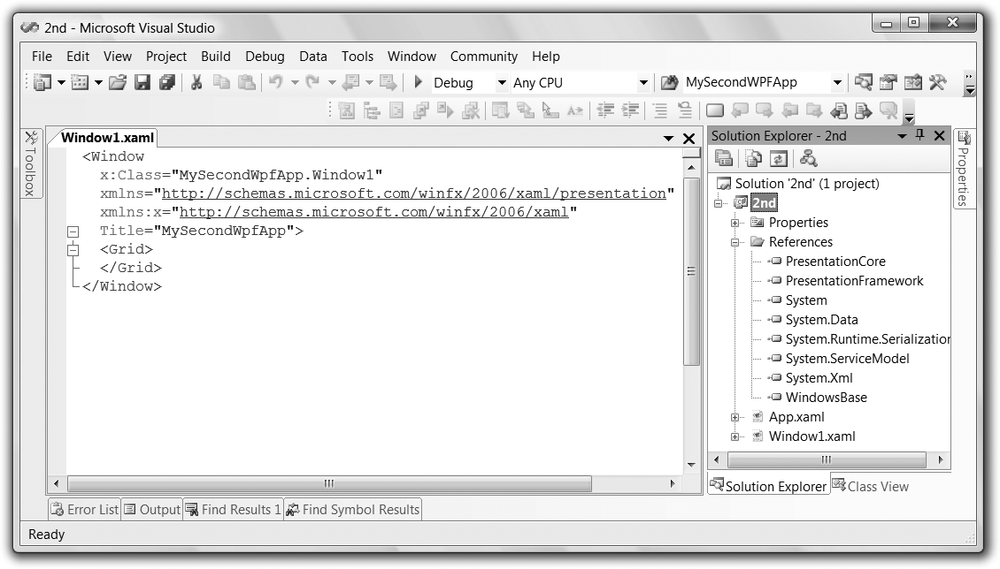
Time Elapsed 00:00:04.15As I mentioned, msbuild and Visual Studio 2005 share a project file format, so loading the project file into Visual Studio is as easy as double-clicking on 1st.csproj (as shown in Figure 1-2.

Unfortunately, as nice as the project file makes building our WPF application, the application itself is still lame.
WPF Applications
A real WPF application is going to need more than a message box.
WPF applications have an instance of the Application class from the System.Windows namespace. The Application class provides methods like
Run for starting the application,
events like Startup and SessionEnding for tracking lifetime, and
properties like Current, ShutdownMode, and MainWindow for finding the global
application object, choosing when it shuts down, and getting the
application’s main window. Typically, the Application class serves as a base for
custom application-wide data and behavior Example 1-5.
// MyApp.cs
using System;
using System.Windows;

namespace MyFirstWpfApp {
  class MyApp : Application {
    [STAThread]
    static void Main(  ) {
      MyApp app = new MyApp(  );
      app.Startup += app.AppStartup;
      app.Run(  );
    }
    void AppStartup(object sender, StartupEventArgs e) {
      // By default, when all top level windows
      // are closed, the app shuts down
      Window window = new Window(  );
      window.Title = "Hello, WPF";
      window.Show(  );
    }
  }
}
Here, our MyApp class derives
from the Application base class. In
Main, we create an instance of the
MyApp class, add a handler to the
Startup event, and kick things off
with a call to the Run method. Our
Startup handler creates our
sample’s top-level window, which is an instance of the built-in WPF
Window class, making our sample WPF
application more interesting from a developer point of view, although
visually less so, as shown in Figure 1-3.

Although we can create instances of the built-in classes of WPF,
such as Window, populating them and
wiring them up from the application, it’s much more encapsulating (not
to mention abstracting) to create custom classes for such things, like
the Window1 class Example 1-6.
// Window1.cs
using System;
using System.Windows;
using System.Windows.Controls; // Button et al

namespace MyFirstWpfApp {
    class Window1 : Window {
    public Window1(  ) {
      this.Title = "Hello, WPF";

      // Do something interesting (sorta...)
      Button button = new Button(  );
      button.Content = "Click me, baby, one more time!";
      button.Width = 200;
      button.Height = 25;
      button.Click += button_Click;

      this.Content = button;
    }

    void button_Click(object sender, RoutedEventArgs e) {
      MessageBox.Show(
        "You've done that before, haven't you...",
        "Nice!");
    }
  }
}
In addition to setting its caption text, an instance of our
Window1 class will include a button
with its Content, Width, and Height properties set, and its Click event handled. With this
initialization handled in the Window1 class itself, our app’s startup code
looks a bit simpler (even though the application behavior itself has
gotten “richer”; see Example 1-7).
// MyApp.cs
using System;
using System.Windows;

namespace MyFirstWpfApp {
  class MyApp : Application {
    [STAThread]
    static void Main(string[] args) {
      MyApp app = new MyApp(  );
      app.Startup += app.AppStartup;
      app.Run(  );
    }

    void AppStartup(object sender, StartupEventArgs e) {
      // Let the Window1 initialize itself
      Window window = new Window1(  );
      window.Show(  );
    }
  }
}
The results (after updating the .csproj file appropriately) are shown in Figure 1-4 and are unlikely to surprise you much.

As the Window1 class gets
more interesting, we’re mixing two very separate kinds of code: the
“look,” represented by the initialization code that sets the window
and child window properties, and the “behavior,” represented by the
event handling code. As the look is something that you’re likely to
want handled by someone with artistic sensibilities (a.k.a.
turtleneck-wearing designer types) whereas the behavior is something
you’ll want to leave to the coders (a.k.a. pocket-protector-wearing
engineer types), separating the former from the latter would be a good
idea. Ideally, we’d like to move the imperative “look” code into a
declarative format suitable for tools to create with some
drag-and-drop magic. For WPF, that format is XAML.
XAML
XAML is an XML-based language for creating and initializing .NET
objects. It’s used in WPF as a human-authorable way of describing the
UI, although you can use it for a much larger range of CLR types than
just those in WPF. Example 1-8 shows
how we declare the UI of our Window-derived class using XAML.
<!-- Window1.xaml -->
<Window
  x:Class="MyFirstWpfApp.Window1"
  xmlns="http://schemas.microsoft.com/winfx/2006/xaml/presentation"
  xmlns:x="http://schemas.microsoft.com/winfx/2006/xaml"
  Title="Hello, WPF">

  <Button
    x:Name="button"
    Width="200"
    Height="25"
    Click="button_Click">Click me, baby, one more time!</Button>

</Window>
The root element, Window, is
used to declare a portion of a class, the name of which is contained
in the Class attribute from the
XAML XML namespace (declared with a prefix of “x” using the “xmlns”
XML namespace syntax). The two XML namespace declarations pull in two
commonly used namespaces for XAML work, the one for XAML itself (the
one with the “x” prefix) and the one for WPF (which we’ve declared as
the default for this XML file). You can think of the XAML in Example 1-8 as creating the partial class
definition in Example 1-9.
namespace MyFirstWpfApp {
  partial class Window1 : Window {
    Button button;

    void InitializeComponent(  ) {
      // Initialize Window1
      this.Title = "Hello, WPF";

      // Initialize button
      button = new Button(  );
      button.Width = 200;
      button.Height = 25;
      button.Click += button_Click;

      this.AddChild(button);
    }
  }
}
XAML was built to be as direct a mapping from XML to .NET as possible. Generally, a XAML element is a .NET class name and a XAML attribute is the name of a property or an event on that class. This makes XAML useful for more than just WPF classes; pretty much any old .NET class that exposes a default constructor can be initialized in a XAML file.
Notice that we don’t have the definition of the click event handler in this generated class. For event handlers and other initializations and helpers, a XAML file is meant to be matched with a corresponding code-behind file, which is a .NET language code file that implements behavior in code “behind” the look defined in the XAML. Traditionally, this file is named with a .xaml.cs extension and contains only the things not defined in the XAML. With the XAML from Example 1-8 in place, we can reduce our single-buttoned main window code-behind file to the code in Example 1-10.
// Window1.xaml.csusing System; using System.Windows; using System.Windows.Controls; namespace MyFirstWpfApp { publicpartialclass Window1 : Window { public Window1( ) { InitializeComponent( ); } void button_Click(object sender, RoutedEventArgs e) { MessageBox.Show(...); } } }
Notice the partial keyword
modifying the Window1 class, which
signals to the compiler that the XAML-generated class is to be paired
with this human-generated class to form one complete class, each
depending on the other. The partial Window1 class defined in XAML depends on the
code-behind partial class to call the InitializeComponent method and to handle the
click event. The code-behind class depends on the partial Window1 class defined in XAML to implement
InitializeComponent, thereby
providing the look of the main window (and related child
controls).
Further, as mentioned, XAML is not just for visuals. For
example, nothing is stopping us from moving most of the definition of
our custom MyApp class into a XAML
file (Example 1-11).
<!-- MyApp.xaml -->
<Application
  x:Class="MyFirstWpfApp.MyApp"
  xmlns="http://schemas.microsoft.com/winfx/2006/xaml/presentation"
  xmlns:x="http://schemas.microsoft.com/winfx/2006/xaml"
  Startup="AppStartup">
</Application>
This reduces the MyApp
code-behind file to the event handler in Example 1-12.
// MyApp.xaml.cs
using System;
using System.Windows;

namespace MyFirstWpfApp {
  public partial class MyApp : Application {
    void AppStartup(object sender, StartupEventArgs e) {
      Window window = new Window1(  );
      window.Show(  );
    }
  }
}
You may have noticed that we no longer have a Main entry point to create the instance of
the application-derived class and call its Run method. That’s because WPF has a special
project setting to specify the XAML file that defines the application
class, which appears in the msbuild project file (Example 1-13).
<!-- MyFirstWpfApp.csproj -->
<Project ...>
  <PropertyGroup>
    <OutputType>winexe</OutputType>
    <OutputPath>.</OutputPath>
    <Assembly>1st.exe</Assembly>
  </PropertyGroup>
  <ItemGroup>
    <ApplicationDefinition Include="MyApp.xaml" />
    <Page Include="Window1.xaml" />
    <Compile Include="Window1.xaml.cs">
    <DependentUpon>Window1.xaml</DependentUpon>
    </Compile>
    <Compile Include="MyApp.xaml.cs" />
    <DependentUpon>MyApp.xaml</DependentUpon>
    </Compile>
    <Reference Include="System" />
    <Reference Include="WindowsBase" />
    <Reference Include="PresentationCore" />
    <Reference Include="PresentationFramework" />
  </ItemGroup>
  <Import Project="$(MsbuildBinPath)Microsoft.CSharp.targets" />
  <Import Project="$(MSBuildBinPath)Microsoft.WinFX.targets" />
</Project>
The combination of the ApplicationDefinition element and the .NET
3.0-specific Microsoft.WinFX.targets file produces an
application entry point that will create our application for us. Also
notice in Example 1-13
that we’ve replaced the MyApp.cs
file with the MyApp.xaml.cs file,
added the Window1.xaml.cs file,
and included the window’s corresponding XAML file as a Page element (we don’t do the same thing for
the application’s XAML file, as it’s already referenced in the
ApplicationDefinition element). The
XAML files will be compiled into partial class definitions using the
instructions in the Microsoft.WinFX.targets file. The DependentUpon element is there to associate
a code-behind file with its XAML file. This isn’t necessary for the
build process, but it’s useful for tools that want to show the
association. For example, Visual Studio uses DependentUpon to show the code-behind file
nested under the XAML file.
This basic arrangement of artifacts (i.e., application and main windows each split into a XAML and a code-behind file) is such a desirable starting point for a WPF application that creating a new project using the “Windows Application (WPF)” project template from within Visual Studio 2005 gives you the same initial configuration, as shown in Figure 1-5.
Editing XAML
Now that we’ve seen the wonder that is declarative UI description in XAML, you may wonder, “Do I get all the fun of editing the raw XML, or are there some tools that can join in the fun, too?” The answer is “sort of.” For example, if you’ve got the .NET Framework 3.0 extensions for Visual Studio 2005 (the same extensions that give you the WPF project templates in VS05), you will have a visual editor for XAML files that works very similarly to the built-in Windows Forms Designer. It will trigger by default when you double-click a file in the Solution Explorer, or you can right-click on a XAML file in the Solution Expression and choose Open With. One of the options offered will be “WPF Designer (Cider)” (where “Cider” is the codename for the WPF Designer still under development). The WPF Designer allows for drag-and-drop-style construction of XAML files with elements from the Toolbox and setting properties in the property browser. In addition, you can see the XAML as the designer makes changes, and in fact, you can make changes in the XAML view itself and see those reflected in the designer. Figure 1-6 shows the WPF Designer in action.

Tip
Unfortunately, as of the writing of this book, the WPF Designer is still very much under development and such basic features as visually adding event handlers, let alone more advanced features like data binding, styles, control templates, and animation, are not supported, which is why you’re unlikely to do much with it. If you’re following along with the Visual Studio “Orcas” beta, you’ll get more current (and more full-featured) versions of the WPF Designer, but if you can’t wait, you have other choices, including two XAML designer tools (Microsoft Expression Blend and Microsoft Expression Design), a third-party XAML 3D editor (ZAM 3D), and several conversion tools from other popular vector drawing formats (e.g., Adobe Illustrator and Flash), all of which are currently downloadable at the time of this writing.[4]
Another very useful tool for playing with XAML is the XamlPad tool that comes with the Windows SDK. It actually shows the visual representation of your XAML as you type it, as shown in Figure 1-7.

XamlPad has some limitations; the most important is that it
doesn’t allow code (e.g., x:Class
or event handler declarations), but as instant gratification, it can’t
be beat.
WPF provides a number of services for applications that we haven’t covered, including lifetime management and ClickOnce-based deployment. In addition, although WPF doesn’t provide any direct support for application instance management or settings, the .NET 2.0 support for both of these features integrates with WPF. Chapter 2 covers all of these topics.
XAML Browser Applications (XBAPs)
While we’re talking about Visual Studio tools for WPF, you may notice that a few icons away from the “Windows Application (WPF)” project template is another one called “XAML Browser Application (WPF),” as shown in Figure 1-8.

WPF itself was created as a unified presentation framework, meant to enable building Windows applications with the best features from existing Windows application practice and existing web application practice. One of the nice things that web applications provide is a single window showing the user one page of content/functionality at a time, allowing for navigation among the pages. For some applications, including Internet Explorer, the shell Explorer, Microsoft Money, and a bunch of Control Panel applets, this is thought to be preferable to the more common Windows application practice of showing more than one window at a time.
To enable more of these kinds of applications, WPF provides the
page, which is the unit of
navigation in an XML Browser Application (XBAP). Instead of setting an
application’s StartupUri to a XAML
file that defines a window, we point an XBAP’s StartupUri at a XAML file that defines a page
(Example 1-14).
<!-- App.xaml -->
<Application
  x:Class="MyFirstXbapApp.App"
  xmlns="http://schemas.microsoft.com/winfx/2006/xaml/presentation"
  xmlns:x="http://schemas.microsoft.com/winfx/2006/xaml"
  StartupUri="Page1.xaml" />
A WPF page is a class that derives from the Page class, as shown in Example 1-15.
<!-- Page1.xaml --> <Page x:Class="MyFirstXbapApp.Page1" xmlns="http://schemas.microsoft.com/winfx/2006/xaml/presentation" xmlns:x="http://schemas.microsoft.com/winfx/2006/xaml"WindowTitle="Page1"> <TextBlock FontSize="36"> Check out<Hyperlink NavigateUri="page2.xaml">page 2</Hyperlink>, too. </TextBlock> </Page> // Page1.xaml.cs ... namespace MyFirstXbapApp { public partial class Page1 :System.Windows.Controls.Page{ public Page1( ) { InitializeComponent( ); } } }
The primary way to allow the user to navigate in an XBAP is via
the Hyperlink element, setting the
NavigateUri to a relative URL of
another XAML page in the project. The first page of our sample XBAP
looks like Figure 1-9.

In Figure 1-9, the
hyperlinked text is underlined in blue, and if you were to move your
mouse cursor over the hyperlink, it would show up as red. Further, the
page’s WindowTitle property is set as
the window caption. Of course, the most obvious thing to notice is that
the XBAP is hosted inside the browser—Internet Explorer 7 to be exact.
The reason for this is simple: XBAPs are meant to be deployed via the
Web (which we’ll talk about later in this chapter) and to blend
seamlessly with web pages. As you navigate among the pages in an XBAP,
those pages are added to the navigation history just as web pages would
be, and you’re allowed to use the Internet Explorer toolbar to go
backward and forward, as you’re used to doing.
For example, let’s define page2.xaml as shown in Example 1-16.
<!-- Page2.xaml -->
<Page ... WindowTitle="Page2">
  <TextBlock FontSize="36">
    Hello and welcome to page 2.
  </TextBlock>
</Page>
Clicking on the hyperlink on page 1 navigates to page 2, as shown in Figure 1-10.

Notice in Figure 1-10 that the history for the back button is showing page 1, which is where we were just before getting to page 2.
As you might imagine, there are many more topics to discuss to make your XBAPs integrate with the browser and still provide the rich functionality we expect from WPF applications. In addition, you can have any number of navigation windows in your standalone WPF applications. We cover these topics and more in Chapter 11.
Content Models
Although the different kinds of WPF application types are useful,
the core of any presentation framework is in the presentation elements
themselves. In presentation systems of old, fundamentally we had “chunks
of look and behavior” (often called controls) and
“containers of chunks of look and behavior.” In WPF, this
characterization doesn’t really hold up very well. Many elements that
provide their own content and behavior can also be containers of
elements (and so on). As an example, let’s take a look at a Button.
The first thing that may surprise you about a WPF Button object is that you don’t need to use a
string as the content; it will take any .NET object. You’ve already seen
a string as a button’s content (see Example 1-17).
<Window ...>
  <Button Width="100" Height="100">Hi</Button>
</Window>
However, as Example 1-18 shows, you can also use an image (see Figure 1-11).
<Window ...>
  <Button Width="100" Height="100">
        <Image Source="tom.png" />
  </Button>
</Window>
You can even use an arbitrary control, like a TextBox, as shown in Example 1-19 and Figure 1-12.
<Window ...>
  <Button Width="100" Height="100">
        <TextBox Width="75">edit me</TextBox>
  </Button>
</Window>
Further, as you’ll see in Layout and Chapter 6, you can get fancy and show a
collection of nested elements in a Button or even nonvisual objects as the
content of a Button. The Button can take any object as content because
it’s derived ultimately from a class called ContentControl, as are many other WPF classes
(e.g., Label, ListBoxItem, ToolTip, CheckBox, RadioButton, and, in fact, Window itself).
A ContentControl knows how to
hold anything that’s able to be rendered, not just a string. A ContentControl gets its content from the
Content property, so you could
specify a Button’s content like so
(this is the longhand version of Example 1-17):
<Button Width="100" Height="100" Content="Hi" />ContentControls are especially
useful because you get all the behavior of the “thing” (e.g., Button, Window, ListBoxItem), but you can display whatever you
like in it without having to build yourself a special class (e.g.,
ImageButton, TextBoxListBoxItem, etc.).
The content model is not relegated to just the ContentControl. For example, the HeaderedContentControl is like a ContentControl, except it has two spots for
content, the header and the content. The GroupBox and TabItem controls both derive from the HeaderedContentControl and both provide a
header (i.e., the group title and the tab), as well as content (i.e.,
the group contents and the tab contents). By using the content model,
HeaderedContentControls allow any
kind of content in either content spot, allowing for much greater
flexibility still within a simple model.
XAML Property Element Syntax
Although setting the Content
property as an XML attribute works just fine for specifying a string
as a property, it doesn’t work at all well for specifying a
subelement, like the image example. For this reason, XAML defines the
property element syntax, which
uses nested Element.Property
elements for specifying objects as property values. For instance,
Example 1-20 shows the
property element syntax for the string setting of a button’s
content.
<Button Width="100" Height="100"><Button.Content>Hi</Button.Content></Button>
Example 1-21 shows the property element syntax using an image.
<Button Width="100" Height="100">
    <Button.Content>
        <Image Source="tom.png" />
    </Button.Content>
</Button>
Because XML attributes can contain only one thing, property element syntax is especially useful when you’ve got more than one thing to specify. For example, you might imagine a button with a string and an image defined, as in Example 1-22.
<Button Width="100" Height="100">
    <!-- WARNING: doesn't work! -->
    <Button.Content>
        <TextBlock>Tom: </TextBlock>
        <Image Source="tom.png" />
    </Button.Content>
</Button>
Although the property element syntax can be useful for this kind
of thing, in this particular case it doesn’t work at all. This brings
us to the second thing that may surprise you about content containment
in WPF: many content containers can take only a single piece of
content. For example, whereas a Button can take any old thing as content, it
can take only a single thing which, without additional instructions,
it will center and cause to fill up its entire client area. For more
than one content element or a richer layout policy, you’ll need a
panel.
Layout
Taking another look at Example 1-22 with the TextBlock and the Image as content for the Button, we don’t really have enough
information to place them inside the area of the button. Should they be
stacked left to right or top to bottom? Should one be docked on one edge
and one docked to the other? How will things be stretched or arranged if
the button resizes? These are questions best answered with a panel.
A panel is a control that knows how to arrange its content. WPF comes with the following general-purpose panel controls:
CanvasArranges content by position and size with no automatic rearrangement when the
Canvasis resizedDockPanelArranges content according to the edge that each piece of content “docks” to, except for the last, which fills the remaining area
GridArranges content in rows and columns as specified by the developer
StackPanelArranges content top to bottom or left to right according to the orientation of the panel
UniformGridArranges content in a grid with the same number of rows and columns generated as needed to display the content
WrapPanelArranges things in a horizontal row until the next item won’t fit, in which case it wraps to the next row
Grid Layout
The most flexible panel by far is the grid, which arranges content elements in rows and columns, including the ability to span multiple rows and/or multiple columns, as shown in Example 1-23.
<Window ...>
    <Grid>
     <Grid.RowDefinitions>
      <RowDefinition />
      <RowDefinition />
      <RowDefinition />
    </Grid.RowDefinitions>
    <Grid.ColumnDefinitions>
      <ColumnDefinition />
      <ColumnDefinition />
      <ColumnDefinition />
    </Grid.ColumnDefinitions>
    <Button Grid.Row="0" Grid.Column="0" Grid.ColumnSpan="2">A</Button>
    <Button Grid.Row="0" Grid.Column="2">C</Button>
    <Button Grid.Row="1" Grid.Column="0" Grid.RowSpan="2">D</Button>
    <Button Grid.Row="1" Grid.Column="1">E</Button>
    <Button Grid.Row="1" Grid.Column="2">F</Button>
    <Button Grid.Row="2" Grid.Column="1">H</Button>
    <Button Grid.Row="2" Grid.Column="2">I</Button>
   </Grid>
</Window>
Example 1-23 used the
XAML property element syntax to define a grid with three rows and
three columns inside the RowDefinition and ColumnDefinition elements. On each element,
we’ve specified the Grid.Row and
Grid.Column properties so that the
grid knows which elements go where (the grid can have multiple
elements in the same cell). One of the elements spans two rows and one
spans two columns, as shown in Figure 1-13.

Using the grid, we can be explicit about how we want to arrange an image with a text caption (Example 1-24).
<Button Width="100" Height="100">
  <Button.Content>
    <Grid>
      <Grid.RowDefinitions>
        <RowDefinition />
        <RowDefinition Height="Auto" />
      </Grid.RowDefinitions>
      <Image Grid.Row="0" Source="tom.png" />
      <TextBlock
        Grid.Row="1"
        HorizontalAlignment="Center">Tom</TextBlock>
    </Grid>
  </Button.Content>
</Button>
Figure 1-14 shows how the grid arranges the image and text for us.
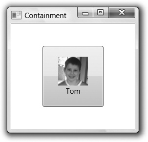
Because we’re just stacking one element on top of another, we could’ve used the stack panel, but the grid is so general-purpose that many WPF programmers find themselves using it for most layout configurations.
XAML Attached Property Syntax
You may have noticed that in setting up the Grid.Row and Grid.Panel attributes of the Button elements, we used another dotted
syntax, similar to the property element syntax, but this time on the
attribute instead of on the element. This is the attached property syntax, and it is used to
set a property as associated with the particular element (e.g., a
Button), but as defined by another
element (e.g., a Grid).
The attached property syntax is used in WPF as an extensibility
mechanism. We don’t want the Button
class to have to know that it’s being arranged in a Grid, but we do want to specify Grid-specific attributes on it. If the
Button was being hosted in a
Canvas, the Grid properties wouldn’t make any sense, so
building Row and Column properties into the Button class isn’t such a great idea.
Further, when we define our own custom panel that the WPF team never
considered (e.g., HandOfCards), we
want to be able to apply the HandOfCards-related attached properties to
arbitrary elements it contains.
This kind of extensibility is what the attached property syntax was designed for and it is common when arranging content on a panel.
For the nitty-gritty of layout, including the other panels that I didn’t show, you’ll want to read Chapter 3.
Controls
Although the layout panels provide the container, the controls are the important things you’ll be arranging. So far, you’ve seen how to create instances of controls, set properties, and handle events. You’ve also seen the basics of the content models that make controls in WPF special. However, for the details of event routing, command handling, mouse/keyboard input, and an enumeration of the controls in WPF, you’ll want to check out Chapter 4 and Chapter 5. Further, for information about packaging up custom UI and behavior, you’ll want to read Chapter 18.
Data Binding
Once we’ve got a set of controls and a way to lay them out, we still need to fill them with data and keep that data in sync with wherever the data actually lives. (Controls are a great way to show data but a poor place to keep it.) For example, imagine that we’d like to build a WPF application for keeping track of people’s nicknames. Something like Figure 1-15 would do the trick.

In Figure 1-15,
we’ve got two TextBox controls, one
for the name and one for the nickname. We’ve also got the actual
nickname entries in a ListBox in the
middle and a Button to add new
entries. We could easily build the core data of such an application with
a class, as shown in Example 1-25.
public class Nickname : INotifyPropertyChanged {
    // INotifyPropertyChanged Member
    public event PropertyChangedEventHandler PropertyChanged;
    void Notify(string propName) {
      if( PropertyChanged != null ) {
        PropertyChanged(this, new PropertyChangedEventArgs(propName));
    }
  }

  string name;
  public string Name {
    get { return name; }
    set {
      name = value;
      Notify("Name"); // notify consumers
    }
  }

  string nick;
  public string Nick {
    get { return nick; }
    set {
      nick = value;
      Notify("Nick"); // notify consumers
    }
  }

  public Nickname(  ) : this("name", "nick") { }
  public Nickname(string name, string nick) {
    this.name = name;
    this.nick = nick;
  }
}
This class knows nothing about data binding, but it does have two
public properties that expose the data, and it implements the standard
INotifyPropertyChanged interface to
let consumers of this data know when it has changed.
In the same way that we have a standard interface for notifying
consumers of objects when they change, we also have a standard way to
notify consumers of collections of changes, called INotifyCollectionChanged. WPF provides an
implementation of this interface, called ObservableCollection, which we’ll use so that
appropriate events are fired when Nickname objects are added or removed (Example 1-26).
  // Notify consumers
  public class Nicknames : ObservableCollection<Nickname> { }
Around these classes, we could build nickname management logic that looks like Example 1-27.
// Window1.xaml.cs
...
namespace DataBindingDemo {
  public class Nickname : INotifyPropertyChanged {...}
  public class Nicknames : ObservableCollection<Nickname> { }

  public partial class Window1 : Window {
    Nicknames names;

    public Window1(  ) {
      InitializeComponent(  );
      this.addButton.Click += addButton_Click;

      // create a nickname collection
      this.names = new Nicknames(  );

      // make data available for binding
      dockPanel.DataContext = this.names;
    }

    void addButton_Click(object sender, RoutedEventArgs e) {
      this.names.Add(new Nickname(  ));
    }
  }
}
Notice that the window’s class constructor adds a click event
handler to add a new nickname and creates the initial collection of
nicknames. However, the most useful thing that the Window1 constructor does is set its DataContext property so as to make the
nickname data available for data binding.
In WPF, data binding is about
keeping object properties and collections of objects synchronized with
one or more controls’ views of the data. The goal of data binding is to
save you the time required to write the code to update the controls when
the data in the objects changes, and to update the data when the user
edits the data in the controls. The synchronization of the data to the
controls depends on the INotifyPropertyChanged and INotifyCollectionChanged interfaces that we’ve
been careful to use in our data and data collection
implementations.
For example, because the collection of our example nickname data and the nickname data itself both notify consumers when there are changes, we can hook up controls using WPF data binding, as shown in Example 1-28.
<!-- Window1.xaml -->
<Window ...>
  <DockPanel x:Name="dockPanel">
    <TextBlock DockPanel.Dock="Top">
      <TextBlock VerticalAlignment="Center">Name: </TextBlock>
      <TextBox Text="{Binding Path=Name}" />
      <TextBlock VerticalAlignment="Center">Nick: </TextBlock>
      <TextBox Text="{Binding Path=Nick}" />
    </TextBlock>
    <Button DockPanel.Dock="Bottom" x:Name="addButton">Add</Button>
    <ListBox
        ItemsSource="{Binding}"
        IsSynchronizedWithCurrentItem="True" />
   </DockPanel>
</Window>
This XAML lays out the controls as shown in Figure 1-15 using a dock panel
to arrange things top to bottom and a text block to contain the editing
controls. The secret sauce that takes advantage of data binding is the
{Binding} values in the control
attributes instead of hardcoded values. By setting the Text property of the TextBox to {Binding
Path=Name}, we’re telling the TextBox to use data binding to peek at the
Name property out of the current
Nickname object. Further, if the data
changes in the Name TextBox, the
Path is used to poke the new value
back in.
The current Nickname object is
determined by the ListBox because of
the IsSynchronizedWithCurrentItem
property, which keeps the TextBox
controls showing the same Nickname
object as the one that’s currently selected in the ListBox. The ListBox is bound to its data by setting the
ItemsSource attribute to {Binding} without a Path statement. In the ListBox, we’re not interested in showing a
single property on a single object, but rather all of the objects at
once.
But how do we know that both the ListBox and the TextBox controls are sharing the same data?
That’s where setting the dock panel’s DataContext comes in (back in Example 1-27). In the absence of other
instructions, when a control’s property is set using data binding, it
looks at its own DataContext property
for data. If it doesn’t find any, it looks at its parent and then
its parent, and so on, all the way up the tree.
Because the ListBox and the TextBox controls have a common parent that has
a DataContext property set (the
DockPanel), all of the data bound
controls will share the same data.
XAML Markup Extensions
Before we take a look at the results of our data binding, let’s
take a moment to discuss XAML markup
extensions, which is what you’re using when you set an
attribute to something inside of curly braces (e.g., Text="{Binding Path=Name}"). Markup
extensions add special processing to XAML attribute values. For
example, this:
<TextBox Text="{Binding Path=Name}" />is just a shortcut for this (which you’ll recognize as the property element syntax):
<TextBox.Text>
  <Binding Path="Name" />
</TextBox.Text>
For a complete discussion of markup extensions, as well as the rest of the XAML syntax, read Appendix A.
Data Templates
With the data binding markup syntax explained, let’s turn back to our example data binding application, which so far doesn’t look quite like what we had in mind, as seen in Figure 1-16.

It’s clear that the data is making its way into the application,
because the currently selected name and nickname are shown for
editing. The problem is that, unlike the TextBox controls, which were each given a
specific field of the Nickname
object to show, the ListBox is
expected to show the whole thing. Lacking special instructions, it’s
calling the ToString method of each
object, which results in only the name of the type. To show the data,
we need to compose a data template, like the one in Example 1-29.
<ListBox
    ItemsSource="{Binding}"
    IsSynchronizedWithCurrentItem="True">

    <ListBox.ItemTemplate>
    <DataTemplate>
      <TextBlock>
        <TextBlock Text="{Binding Path=Name}" />:
        <TextBlock Text="{Binding Path=Nick}" />
      </TextBlock>
    </DataTemplate>
  </ListBox.ItemTemplate>

</ListBox>
A data template is a set of
elements that should be inserted somewhere. In our case, we are
specifying a data template to be inserted for each listbox item by
setting the ItemTemplate property.
In Example 1-29, we’ve composed a data
template from a text block that flows together two other text blocks,
each bound to a property on a Nickname object separated by a colon, as
shown back in Figure 1-15.
At this point, we’ve got a completely data-bound application. As data in the collection or the individual objects changes, the UI will be updated, and vice versa. However, there is a great deal more to say on this topic, including binding to XML and relational data, master-detail binding, and hierarchical binding, which you’ll see in Chapter 6 and Chapter 7.
Dependency Properties
Although our data source Nickname object made its data available via
standard .NET properties, we need something special to support data
binding on the target element. Even though the TextContent property of the TextBlock element is exposed with a standard
property wrapper, in order for it to integrate with WPF services like
data binding, styling, and animation, it also needs to be a dependency property. A dependency property
provides several features not present in .NET properties, including the
ability to inherit its value from a container element, provide for
object-independent storage (providing a potentially huge memory
savings), and change tracking.
Most of the time, you won’t have to worry about dependency properties versus .NET properties, but when you need the details, you can read about them in Chapter 18.
Resources
Resources are named chunks of data defined separately from code and bundled with your application or component. .NET provides a great deal of support for resources, a bit of which we already used when we referenced tom.png from our XAML button earlier in this chapter. WPF also provides special support for resources scoped to elements defined in the tree.
As an example, let’s declare some default instances of our custom
Nickname objects in XAML (see Example 1-30).
<!-- Window1.xaml --> <Window ...xmlns:local="clr-namespace:DataBindingDemo"/> <Window.Resources> <local:Nicknames x:Key="names"> <local:Nickname Name="Don" Nick="Naked" /> <local:Nickname Name="Martin" Nick="Gudge" /> <local:Nickname Name="Tim" Nick="Stinky" /> </local:Nicknames> </Window.Resources> <DockPanelDataContext="{StaticResource names}"> <TextBlock DockPanel.Dock="Top" Orientation="Horizontal"> <TextBlock VerticalAlignment="Center">Name: </TextBlock> <TextBox Text="{Binding Path=Name}" /> <TextBlock VerticalAlignment="Center">Nick: </TextBlock> <TextBox Text="{Binding Path=Nick}" /> </TextBlock> ... </DockPanel> </Window>
Notice the Window.Resources,
which is property element syntax to set the Resources property of the Window1 class. Here we can add as many named
objects as we like, with the name coming from the Key attribute and the object coming from the
XAML elements (remember that a XAML element is just a mapping to .NET
class names). In this example, we’re creating a Nicknames collection named names to hold three Nickname objects, each constructed with the
default constructor, and then setting each of the Name and Nick properties.
Also notice the use of the StaticResource markup extension to reference
the names resource as the collection
to use for data binding. With this XAML in place, our window
construction reduces to the code shown in Example 1-31.
public partial class Window1 : Window {
  Nicknames names;

  public Window1(  ) {
    InitializeComponent(  );
    this.addButton.Click += addButton_Click;

    // get names collection from resources
    this.names = (Nicknames)this.FindResource("names");

    // no need to make data available for binding here
    //dockPanel.DataContext = this.names;
  }
  void addButton_Click(object sender, RoutedEventArgs e) {
    this.names.Add(new Nickname(  ));
  }
}
Now instead of creating the collection of names, we can pull it
from the resources with the FindResource method. Just because this
collection was created in XAML doesn’t mean that we need to treat it any
differently than we treated it before, which is why the Add button event handler is the exact same
code. Also, there’s no need to set the data context on the dock panel
because that property was set in the XAML.
For the full scoop on resources, including resource scoping and lookup, static and dynamic binding to resources, and using resources for theming and skinning, read Chapter 12.
XAML Namespace Mapping Syntax
Before we go on with resource applications, we need to discuss a new XAML syntax that’s come up: the mapping syntax. This provides the ability to bring in types not already known by the XAML compiler (in fact, the XAML compiler knows about only a couple of types). Our use of the mapping syntax looks like Example 1-32.
<Window ...xmlns:local="clr-namespace:DataBindingDemo"/> <Window.Resources> <local:Nicknamesx:Key="names"> <local:NicknameName="Don" Nick="Naked" /> ... </local:Nicknames> </Window.Resources> ... </Window>
When bringing a new CLR namespace into XAML, we use the XML namespace prefix mapping syntax. If we’ve got control of the CLR assembly in question, we can add an attribute to tag it with any URI we like. Otherwise, we have to use a specific format:
xmlns:myPrefix="clr-namespace:MyNamespace[;assembly=MyAssembly]"
The XML prefix is how we access the CLR namespace when referring
to a CLR type in a XAML document (e.g., local:Nickname). I’ve chosen the XML
namespace local in this case
because the CLR namespace to which I’m referring must be part of the
assembly being compiled along with the XAML in question. You can
import CLR namespaces for another assembly by specifying the optional
assembly attribute as part of the mapping. For a more thorough
discussion of the namespace mapping syntax, including the attribute
you can use to tag your CLR assemblies with URIs for more seamless
mapping into XAML, read Appendix A.
Styles
One of the major uses for resources is to specify styles. A
style is a set of property/value pairs to be
applied to one or more elements. For example, recall the two TextBlock controls from our Nickname sample, each of which was set to the
same VerticalAlignment (Example 1-33).
<!-- Window1.xaml -->
<Window ...>
  <DockPanel ...>
    <TextBlock ...>
      <TextBlock VerticalAlignment="Center">Name: </TextBlock>
      <TextBox Text="{Binding Path=Name}" />
      <TextBlock VerticalAlignment="Center">Nick: </TextBlock>
      <TextBox Text="{Binding Path=Nick}" />
    </TextBlock>
    ...
  </DockPanel>
</Window>
If we wanted to bundle the VerticalAlignment setting into a style, we
could do this with a Style element in
a Resources block (Example 1-34).
<Window ...>
  <Window.Resources>
    ...
    <Style x:Key="myStyle" TargetType="{x:Type TextBlock}">
      <Setter Property="VerticalAlignment" Value="Center" />
      <Setter Property="Margin" Value="2" />
      <Setter Property="FontWeight" Value="Bold" />
      <Setter Property="FontStyle" Value="Italic" />
    </Style>
  </Window.Resources>
  <DockPanel ...>
    <TextBlock ...>
      <TextBlock Style="{StaticResource myStyle}">Name: </TextBlock>
      <TextBox Text="{Binding Path=Name}" />
      <TextBlock Style="{StaticResource myStyle}">Nick: </TextBlock>
      <TextBox Text="{Binding Path=Nick}" />
    </TextBlock>
    ...
  </DockPanel>
</Window>
The Style element is really
just a named collection of Setter
elements for a specific target type (and specified with the Type markup extension). The new TextBlock style centers the vertical alignment
property and, just for fun, sets the margin, font width, and font style.
With the style in place, you can use it to set the Style property of any TextBlock that references the style resource.
Figure 1-17 illustrates
the use to which we’ve put this style.

Styles provide one great way to set the look of a control without building a custom control, by merely setting properties. There’s much more on this topic in Chapter 8.
Animation
If you’d like to apply property changes to a control (or other visual element) over time, you can do so with styles that include animation information, which is discussed in Chapter 16 (although Figure 1-18 is a small taste of what WPF animations can produce).

Control Templates
In addition to changing a control’s look by manipulating
properties, you can replace it with something completely different by
setting a control’s Template
property.
In Example 1-35, we’ve decided that our Add button is a yellow ellipse, as shown in Figure 1-19.
<Button DockPanel.Dock="Bottom" x:Name="addButton" Content="Add">
  <Button.Template>
    <ControlTemplate TargetType="{x:Type Button}">
      <Grid>
        <Ellipse Width="128" Height="32" Fill="Yellow" Stroke="Black" />
        <ContentPresenter
          VerticalAlignment="Center" HorizontalAlignment="Center" />
      </Grid>
     </ControlTemplate>
  </Button.Template>
</Button>

The template of a control in
WPF is what defines the look, whereas the code defines the behavior. The
default template comes from the system-scope resources (as described in
Chapter 12), but if you don’t like that one, you can
replace it with whatever you like, using a content presenter to drop in
the content provided by the developer using your control. However, the
behavior remains the same (e.g., if you click on the ellipse-shaped
button in Figure 1-19, a Click event is still fired). We explore in
detail the power of replacing the look of a control in Chapter 9.
Graphics
When building up a control’s template, you’ll likely build it with a set of graphics primitives that WPF provides, including rectangles, polygons, lines, ellipses, and so on. WPF also lets you affect the way it renders graphics in any element, offering facilities that include bordering, rotating, or scaling another shape or control. WPF’s support for graphics is engineered to fit right into the content model we’re already familiar with, as shown in Example 1-36, from Chapter 13.
<Button>
  <Button.LayoutTransform>
    <ScaleTransform ScaleX="3" ScaleY="3" />
  </Button.LayoutTransform>
  <StackPanel Orientation="Horizontal">
    <Canvas Width="20" Height="18" VerticalAlignment="Center">
         <Ellipse Canvas.Left="1" Canvas.Top="1" Width="16" Height="16"
               Fill="Yellow" Stroke="Black" />
      <Ellipse Canvas.Left="4.5" Canvas.Top="5" Width="2.5" Height="3"
               Fill="Black" />
      <Ellipse Canvas.Left="11" Canvas.Top="5" Width="2.5" Height="3"
               Fill="Black" />
      <Path Data="M 5,10 A 3,3 0 0 0 13,10" Stroke="Black" />
    </Canvas>
    <TextBlock VerticalAlignment="Center">Click!</TextBlock>
  </StackPanel>
</Button>
Here we’ve got three ellipses and a path composed inside a canvas
that is hosted inside a stack panel with a text block that, when scaled
via the LayoutTransform property on
the button, produces Figure 1-20.

Notice that there’s nothing special about the graphics primitives in XAML; they’re declared and integrated as content just like any of the other WPF elements we’ve discussed. The graphics and the transformation are integrated into the same presentation stack as the rest of WPF, which is a bit of a difference for experienced User/GDI programmers.
For a complete discussion of how graphics primitives, retained drawings, color, lines, brushes, and transformations happen in WPF, both declaratively and in code, and for an introduction to 3D and video, read Chapter 13.
3D
Graphics in WPF are not limited to 2D; Figure 1-21 shows an example of a figure that was defined using WPF’s 3D capabilities.

For an introduction to 3D and how it integrates with your WPF applications, you’ll want to read Chapter 17.
Documents and Printing
The document support in WPF is about flowing all the different content types you’ve seen in the rest of this chapter, along with special text-specific content types, into a seamless whole, a small sample of which is shown in Figure 1-22.

The text-specific content support is provided with the flow document and related elements that provide advanced typography; adaptive, flow-based layout; spellchecking; hyphenation; and more, as described in Chapter 14.
In addition, the base of the flow document supports printing, as do the rest of the WPF visual elements, via the XML Paper Specification (XPS), as covered in Chapter 15.
Where Are We?
WPF applications have a great deal of power, at which this chapter can only hint. The base services of the application aren’t too surprising, but the support for page-based navigation and browser hosting certainly adds a new capability for Windows applications, further enhanced with .NET 2.0 ClickOnce support.
Building your application is a matter of grouping controls in containers—either single content containers, like windows or buttons, or multiple content containers that provide layout capabilities, like the canvas and the grid.
When bringing your controls together, you’ll want to populate them with data that’s synchronized with the in-memory home of the data, which is what data binding is for, and keep them pretty, which is what styles are for. If you want to declare data or styles in your XAML, you can do so using resources, which are just arbitrarily named objects that aren’t used to render the WPF UI directly.
If no amount of data or style property settings makes you satisfied with the look of your control, you can replace it completely with control templates, which can comprise other controls or graphics primitives. In addition, you can apply graphics operations, like rotating, scaling, or animation, to 2D or 3D graphics primitives or controls in WPF’s integrated way. These elements can further be gathered into documents for viewing or printing.
[3] * Start → All Programs → Microsoft Windows SDK → CMD Shell.
[4] * Michael Swanson, the general manager of the Microsoft Platform Evangelist team, maintains a wonderful list of WPF-related first- and third-party tools and controls for your development enjoyment at http://blogs.msdn.com/mswanson/articles/wpftoolsandcontrols.aspx (http://tinysells.com/88