
Chapter 8. Styles
In a word-processing document, a style is a set of properties to be applied to ranges of content (e.g., text, images, etc.). For example, the name of the style I’m using now is called Normal,Body,b and for this document in prepublication, that means a font family of Times, a size of 10, and full justification. Later in the document, I’ll be using a style called Code,x,s, which will use a font family of Courier New, a size of 9, and left justification. Styles are applied to content to produce a certain look when the content is rendered.
In WPF, a style is also a set
of properties applied to content used for visual rendering, like setting
the font weight of a Button control. In
addition to the features in word-processing styles, WPF styles have
specific features for building applications, including the ability to
apply different visual effects based on user events. All of these features
come without the need to build a custom control (although that’s still a
useful thing to be able to do, as discussed in Chapter 18).
Without Styles
As an example of how styles can make themselves useful in WPF, let’s look at a simple implementation of tic-tac-toe (see Example 8-1).
<!-- Window1.xaml -->
<Window
  x:Class="TicTacToe.Window1"
  xmlns="http://schemas.microsoft.com/winfx/2006/xaml/presentation"
  xmlns:x="http://schemas.microsoft.com/winfx/2006/xaml"
  Title="TicTacToe"
  Height="300"
  Width="300">
  <!-- the black background lets the tic-tac-toe -->
  <!-- crosshatch come through on the margins -->
  <Grid Background="Black">
    <Grid.RowDefinitions>
      <RowDefinition />
      <RowDefinition />
      <RowDefinition />
    </Grid.RowDefinitions>
    <Grid.ColumnDefinitions>
      <ColumnDefinition />
      <ColumnDefinition />
      <ColumnDefinition />
    </Grid.ColumnDefinitions>
    <Button Margin="0,0,2,2" Grid.Row="0" Grid.Column="0" Name="cell00" />
    <Button Margin="2,0,2,2" Grid.Row="0" Grid.Column="1" Name="cell01" />
    <Button Margin="2,0,0,2" Grid.Row="0" Grid.Column="2" Name="cell02" />
    <Button Margin="0,2,2,2" Grid.Row="1" Grid.Column="0" Name="cell10" />
    <Button Margin="2,2,2,2" Grid.Row="1" Grid.Column="1" Name="cell11" />
    <Button Margin="2,2,0,2" Grid.Row="1" Grid.Column="2" Name="cell12" />
    <Button Margin="0,2,2,0" Grid.Row="2" Grid.Column="0" Name="cell20" />
    <Button Margin="2,2,2,0" Grid.Row="2" Grid.Column="1" Name="cell21" />
    <Button Margin="2,2,0,0" Grid.Row="2" Grid.Column="2" Name="cell22" />
  </Grid>
</Window>
This grid layout arranges a set of nine buttons in a 3 × 3 grid of tic-tac-toe cells, using the margins on the button for the tic-tac-toe crosshatch. A simple implementation of the game logic in the XAML code-behind file looks like Example 8-2.
// Window1.xaml.cs
...
namespace TicTacToe {
  public partial class Window1 : Window {
    // Track the current player (X or O)
    string currentPlayer;

    // Track the list of cells for finding a winner, etc.
    Button[] cells;

    public Window1(  ) {
      InitializeComponent(  );

      // Cache the list of buttons and handle their clicks
      this.cells = new Button[] { this.cell00, this.cell01, ... };
      foreach( Button cell in this.cells ) {
        cell.Click += cell_Click;
      }

      // Initialize a new game
      NewGame(  );
    }
    // Wrapper around the current player for future expansion,
    // e.g., updating status text with the current player
    string CurrentPlayer {
      get { return this.currentPlayer; }
      set { this.currentPlayer = value; }
    }

    // Use the buttons to track game state
    void NewGame(  ) {
      foreach( Button cell in this.cells ) {
        cell.ClearValue(Button.ContentProperty);
      }
      CurrentPlayer = "X";
    }

    void cell_Click(object sender, RoutedEventArgs e) {
      Button button = (Button)sender;

      // Don't let multiple clicks change the player for a cell
      if( button.Content != null ) { return; }

      // Set button content
      button.Content = CurrentPlayer;

      // Check for winner or a tie
      if( HasWon(this.currentPlayer) ) {
        MessageBox.Show("Winner!", "Game Over");
        NewGame(  );
        return;
      }
      else if( TieGame(  ) ) {
        MessageBox.Show("No Winner!", "Game Over");
        NewGame(  );
        return;
      }

      // Switch player
      if( CurrentPlayer == "X" ) {
        CurrentPlayer = "O";
      }
      else {
        CurrentPlayer = "X";
      }
    }
    // Use this.cells to find a winner or a tie
    bool HasWon(string player) {...}
    bool TieGame(  ) {...}
  }
}
Our simple tic-tac-toe logic uses strings to represent the players and uses the buttons themselves to keep track of the game state. As each button is clicked, we set its content to the string indicating the current player and switch players. When the game is over, the content for each button is cleared.[49] The middle of a game looks like Figure 8-1.

Notice in Figure 8-1 how the grid background comes through from the margin. These spacers almost make the grid look like a drawn tic-tac-toe board (although we’ll do better later). However, if we’re really looking to simulate a hand-drawn game, we have to do something about the size of the font used on the buttons; it doesn’t match the thickness of the lines.
One way to fix this problem is by setting the font size and weight
for each Button object, as shown in
Example 8-3.
<ButtonFontSize="32pt" FontWeight="Bold"... Name="cell00" /> <ButtonFontSize="32pt" FontWeight="Bold"... Name="cell01" /> ... <ButtonFontSize="32pt" FontWeight="Bold"... Name="cell22" />
The results, shown in Figure 8-2, look nicer.

Setting the font size and weight properties makes the Xs and Os look better according to my visual sensibilities today. However, if I want to change it later, I’ve now committed myself to changing both properties in nine separate places, which is a duplication of effort that offends my coding sensibilities. I’d much prefer to refactor my decisions about the look of my tic-tac-toe cells into a common place for future maintenance. That’s where styles come in handy.
Inline Styles
A style in WPF is expressed as zero or more Setter objects inside a Style object. Every element in WPF that
derives from either FrameworkElement
or FrameworkContentElement has a
Style property, which you can set
inline using standard XAML property element syntax, as shown in Example 8-4.
<Button ... Name="cell00">
  <Button.Style>
    <Style>
      <Setter Property="Button.FontSize" Value="32pt" />
      <Setter Property="Button.FontWeight" Value="Bold" />
    </Style>
  </Button.Style>
</Button>
Because we want to bundle two property values into our style, we
have a Style element with two
Setter subelements, one for each
property we want to set (i.e., FontSize and FontWeight), both with the Button prefix to indicate the class that
contains the property. Properties suitable for styling must be
dependency properties.
Due to the extra style syntax and because inline styles can’t be shared across elements, inline styles actually involve more typing than just setting the properties. For this reason, inline styles aren’t used nearly as often as named styles.[50]
Named Styles
By hoisting the same inline style into a resource (as introduced in Chapter 1), we can award it a name and use it by name in our button instances, as shown in Example 8-5.
<!-- Window1.xaml -->
<Window ...>
  <Window.Resources>
    <Style x:Key="CellTextStyle">
      <Setter Property="Control.FontSize" Value="32pt" />
      <Setter Property="Control.FontWeight" Value="Bold" />
    </Style>
  </Window.Resources>
  ...
  <Button Style="{StaticResource CellTextStyle}" ... Name="cell00" />
  ...
</Window>
In Example 8-5, we’ve used the class
name as a prefix on our properties so that the style knows what
dependency property we’re talking about. We used Control as the prefix instead of Button to allow the style to be used more
broadly, as we’ll soon see.
The Target Type Attribute
As a convenience, if all of the properties can be set on a
shared base class, like Control in
our example, we can promote the class prefix into the TargetType attribute and remove it from the
name of the property (see Example 8-6).
<Style x:Key="CellTextStyle"TargetType="{x:Type Control}"> <SetterProperty="FontSize"Value="32pt" /> <SetterProperty="FontWeight"Value="Bold" /> </Style>
When providing a TargetType
attribute, you can only set properties available on that type. If
you’d like to expand to a greater set of properties down the
inheritance tree, you can do so by using a more derived type (see
Example 8-7).
<Style x:Key="CellTextStyle" TargetType="{x:Type Button}">
  <!-- IsCancel is a Button-specific property -->
  <Setter Property="IsCancel" Value="False" />
  <Setter Property="FontSize" Value="32pt" />
  <Setter Property="FontWeight" Value="Bold" />
</Style>
In this case, the IsCancel
property is available only on Button, so to set it, we need to switch the
target type attribute for the style.
Reusing Styles
In addition to saving you from typing out the name of the class
prefix for every property name, the TargetType attribute will also confirm that
all classes that have the style applied are an instance of that type
(or derived type). That means that if we leave TargetType set to Control, we can apply it to a Button element, but not to a TextBlock element, as the former derives
ultimately from Control but the
latter does not.
However, if we’d like to define a style that contains properties
not shared by every element to which we’d like to apply them, we can
do that by dropping the TargetType
and putting back the property prefix, as shown in Example 8-8.
<Style x:Key="CellTextStyle"> <Setter Property="TextElement.FontSize" Value="32pt" /> <Setter Property="Button.IsCancel" Value="False" /> </Style> ... <!-- has an IsCancel property --> <ButtonStyle="{StaticResource CellTextStyle}"... /> <!-- does *not* have an IsCancel property --> <TextBlockStyle="{StaticResource CellTextStyle}"... />
In Example 8-8,
we’ve added the Button.IsCancel
property to the CellTextStyle and
applied it to the Button element,
which has this property, and the TextBlock element, which doesn’t. This is
OK. At runtime, WPF will apply the dependency properties and the
elements themselves will ignore those values that don’t apply to
them.[51]
Tip
WPF’s ability to apply styles to objects that don’t have all of the properties defined in the style is analogous to applying the Word Normal style, which includes a font size property of its own, to both a range of text and an image. Even though Word knows that images don’t have a font size, it applies the portions of the Normal style that do make sense (like the justification property), ignoring the rest.
Getting back to our sample, we can use the CellTextStyle on the Buttons to show nice Xs and Os, and on a
TextBlock in a new row to show
whose turn it is (see Example 8-9).
<Window.Resources>
  <Style x:Key="CellTextStyle">
    <Setter Property="Control.FontSize" Value="32pt" />
    <Setter Property="Control.FontWeight" Value="Bold" />
  </Style>
</Window.Resources>
<Grid Background="Black">
  <Grid.RowDefinitions>
    <RowDefinition />
    <RowDefinition />
    <RowDefinition />
    <RowDefinition Height="Auto" />
  </Grid.RowDefinitions>
  <Grid.ColumnDefinitions>
    <ColumnDefinition />
    <ColumnDefinition />
    <ColumnDefinition />
  </Grid.ColumnDefinitions>
  <Button Style="{StaticResource CellTextStyle}" ... />
  ...
  <TextBlock
    Style="{StaticResource CellTextStyle}"
    Foreground="White"
    Grid.Row="3"
    Grid.ColumnSpan="3"
    Name="statusTextBlock" />
</Grid>
</Window>
With our new text block in place, we can inform the next player
of her turn by updating the CurrentPlayer property setter:
string CurrentPlayer {
  get { return this.currentPlayer; }
  set {
    this.currentPlayer = value;
    this.statusTextBlock.Text =
      "It's your turn, " + this.currentPlayer;
  }
}
This reuse of the style across controls of different types gives us a consistent look in the application, as shown in Figure 8-3.

One thing you’ll notice is that the status text in Figure 8-3 is white, whereas the text
in the buttons is black. Because black is the default text color, if
we want the status text to show up against a black background, we have
to change the color to something else, hence the need to set the
Foreground property to white on the
TextBlock. Setting per-instance
properties works just fine in combination with a style, and you can
combine the two techniques of setting property values as you see
fit.
Overriding Style Properties
Further, if we wanted to override a style property on a specific instance, we can do so by setting the property on the instance (see Example 8-10).
<Style x:Key="CellTextStyle">
  <Setter Property="TextElement.FontSize" Value="32pt" />
  <Setter Property="TextElement.FontWeight" Value="Bold" />
</Style>
...
<TextBlock
  Style="{StaticResource CellTextStyle}"
  FontWeight="Normal" ... />
In Example 8-10,
the TextBlock instance property
setting of FontWeight takes
precedence over the style property setting of FontWeight.
Extending Styles
In addition to the abilities to reuse and override existing styles, you can also extend a style, adding new properties or overriding existing ones (see Example 8-11).
<Style x:Key="CellTextStyle">
  <Setter Property="Control.FontSize" Value="32pt" />
  <Setter Property="Control.FontWeight" Value="Bold" />
</Style>
<Style x:Key="StatusTextStyle" BasedOn="{StaticResource CellTextStyle}">
  <Setter Property="TextBlock.FontWeight" Value="Normal" />
  <Setter Property="TextBlock.Foreground" Value="White" />
  <Setter Property="TextBlock.HorizontalAlignment" Value="Center" />
</Style>
The BasedOn style attribute
is used to designate the style being extended. In Example 8-11, the StatusTextStyle style gets all of the
CellTextStyle property setters,
overrides the FontWeight, and adds
setters for Foreground and HorizontalAlignment. Our current use of
styles causes our tic-tac-toe game to look like Figure 8-4.

Our application so far is looking pretty good, but we can do better.
Setting Styles Programmatically
Once a style has a name, it’s easily available from our code. For example, we might decide that we’d like each player to have his own style:
<Stylex:Key="XStyle"BasedOn="{StaticResource CellTextStyle}"> <SetterProperty="Control.Foreground" Value="Red"/> </Style> <Stylex:Key="OStyle"BasedOn="{StaticResource CellTextStyle}"> <SetterProperty="Control.Foreground" Value="Green"/> </Style>
In this case, applying named styles to each button in XAML at
compile time won’t do the trick, because we want to set the style
based on the content, and in this application, the content changes
when a button is clicked at runtime. However, nothing requires us to
set the Style property of a control
statically; we can set it programmatically as well, as we do in Example 8-12.
public partial class Window1 : Window {
  ...
  void cell_Click(object sender, RoutedEventArgs e) {
    Button button = (Button)sender;
    ...
  // Set button content
    button.Content = this.CurrentPlayer;
    ...
    if( this.CurrentPlayer == "X" ) {
      button.Style = (Style)FindResource("XStyle");
      this.CurrentPlayer == "O";
    }
    else {
      button.Style = (Style)FindResource("OStyle");
      this.CurrentPlayer == "X";
    }
    ...
  }
  ...
}
In Setting Styles Programmatically, whenever
the player clicks, in addition to setting the button’s content, we
pull a named style out of the window’s resources with the FindResource method and use that to set the
button’s style, as shown in Figure 8-5.

Notice that the Xs and Os are colored according to the named player styles. In this particular case (and in many other cases, too), data triggers should be preferred to setting styles programmatically, but we’ll get to that later.
Tip
As with all XAML constructs, you are free to create styles themselves programmatically. Appendix A is a good introduction on how to think about going back and forth between XAML and code.
Element-Typed Styles
Named styles are useful when you have a set of properties to be
applied to a specific element instance. However, if you’d like to apply
a style uniformly to all instances of a certain type of element, set the
TargetType without a Key (see Example 8-13).
... <!-- without a Key --> <StyleTargetType="{x:Type Button}"> <Setter Property="FontSize" Value="32pt" /> <Setter Property="FontWeight" Value="Bold" /> </Style> <!-- with a Key --> <Stylex:Key="StatusTextStyle" TargetType="{x:Type TextBlock}"> <Setter Property="FontSize" Value="32pt" /> <Setter Property="FontWeight" Value="Normal" /> <Setter Property="Foreground" Value="White" /> <Setter Property="HorizontalAlignment" Value="Center" /> </Style> ... <!-- no need to set the Style --> <Button Grid.Row="0" Grid.Column="0" x:ID="cell00" /> ... <!-- need to set the Style --> <TextBlockStyle="{StaticResource StatusTextStyle}"... /> ...
In Element-Typed Styles, we have two styles,
one with a TargetType of Button and no Key, and another with a TargetType of TextBlock and a Key. The TextBlock style works just as we’ve seen
(i.e., you have to assign a TextBlock
Style property explicitly to the style using the key for it to
take effect). On the other hand, when an instance of Button is created without an explicit Style attribute setting, it uses the style
that matches the target type of the style to the type of the control.
Our element-typed styles return our game to looking again like Figure 8-4.
Element-typed styles are handy whenever you’d like all instances
of a certain element to share a look, depending on the scope. For
example, we’ve scoped the button style in our sample thus far at the
top-level Window (see Example 8-14).
<!-- Window1.xaml -->
<Window ...>
  <!-- every Button in the Window is affected -->
  <Window.Resources>
    <Style TargetType="{x:Type Button}">...</Style>
  </Window.Resources>
  ...
</Window>
However, you may want to reduce the scope of an element-typed style. In our sample, it would work just as well to scope the button style inside the grid so that only buttons in the grid are affected (see Example 8-15).
<!-- Window1.xaml -->
<Window ...>
  <Grid ...>
    <!-- only Buttons in the Grid are affected -->
    <Grid.Resources>
      <Style TargetType="{x:Type Button}">...</Style>
    </Grid.Resources>
    ...
  </Grid>
  <!-- Buttons outside the Grid are unaffected -->
  ...
</Window>
Alternatively, if you want to make your style have greater reach in your project, you can put it into the application scope (see Example 8-16).
<!-- MyApp.xaml -->
<Application ...>
  <!-- every Button in the Application is affected -->
  <Application.Resources>
    <Style TargetType="{x:Type Button}">...</Style>
  </Application.Resources>
</Application>
In general, it’s useful to understand the scoping rules of element-typed styles so that you can judge their effect on the various pieces of your WPF object model. Chapter 12 discusses resource scoping of all kinds, including styles, in more detail.
Element-Typed Styles and Derived Types
When you define a style with only a TargetType, that style will be applied only
to elements of that exact type and not to derived types. For example,
if you’ve got a single style that you’d like to apply to both the
CheckBox and the RadioButton types, you might think to create
a style for their common base type (ToggleButton), as in Example 8-17.
<Window ...>
  <Window.Resources>
    <!-- this isn't going to be applied to RadioButton or CheckBox -->
    <Style TargetType="ToggleButton">
      <Setter Property="FontSize" Value="32" />
    </Style>
</Window.Resources>
  <StackPanel Margin="5">
    <TextBlock FontSize="32">two toggle buttons:</TextBlock>
    <CheckBox>my checkbox</CheckBox>
    <RadioButton>my radio button</RadioButton>
  </StackPanel>
</Window>
As Figure 8-6
shows, the style associated with the ToggleButton type will not be applied to
either the radio button or the checkbox.

This limitation keeps styles from leaking to unknown derived types. However, if you’d like to centralize the settings for a style on a base type and apply it to known derived types, you can do so with a little extra work (see Example 8-18).
<Window ...>
  <Window.Resources>
    <Style x:Key="toggleButtonStyle" TargetType="ToggleButton">
      <Setter Property="FontSize" Value="32" />
    </Style>
    <Style TargetType="RadioButton"
      BasedOn="{StaticResource toggleButtonStyle}" />
    <Style TargetType="CheckBox"
      BasedOn="{StaticResource toggleButtonStyle}" />
  </Window.Resources>
  ...
</Window>
In Example 8-18,
we gave our toggle button style a key and then used it with the
BasedOn property of our
element-typed styles for RadioButton and CheckBox, as shown in Figure 8-7.

Using this technique, we’re able to define element-typed styles and reuse settings across known derived types.
Data Templates and Styles
Let’s imagine that we want to implement a variant of tic-tac-toe
that’s more fun to play (an important feature in most games). For
example, one variant of tic-tac-toe only allows players to have three of
their pieces on at any one time, dropping the first move off when the
fourth move is played, dropping the second move when the fifth is
played, and so on. To implement this variant, we need to keep track of
the sequence of moves, with each move represented by a PlayerMove object, as shown in Example 8-19.
public class PlayerMove : INotifyPropertyChanged {
  string playerName;
  public string PlayerName {
    get { return playerName; }
    set {
      if( string.Compare(playerName, value) == 0 ) { return; }
      playerName = value;
      Notify("PlayerName");
    }
  }

  int moveNumber;
  public int MoveNumber {
    get { return moveNumber; }
    set {
      if( moveNumber == value ) { return; }
      moveNumber = value;
      Notify("MoveNumber");
    }
  }
  bool isPartOfWin = false;
  public bool IsPartOfWin {
    get { return isPartOfWin; }
    set {
      if( isPartOfWin == value ) { return; }
      isPartOfWin = value;
      Notify("IsPartOfWin");
    }
  }
  public PlayerMove(string playerName, int moveNumber) {
    this.playerName = playerName;
    this.moveNumber = moveNumber;
  }

  // INotifyPropertyChanged Members
  public event PropertyChangedEventHandler PropertyChanged;
  void Notify(string propName) {
    if( PropertyChanged != null ) {
      PropertyChanged(this, new PropertyChangedEventArgs(propName));
    }
  }
}
Now, instead of using a simple string for each button object’s
content, we’ll use an instance of PlayerMove, as shown in Example 8-20.
namespace TicTacToe {
  public partial class Window1 : Window {
    ...
    int moveNumber;

    void NewGame(  ) {
      ...
      this.moveNumber = 0;
    }

    void cell_Click(object sender, RoutedEventArgs e) {
      ...
      // Set button content
      //button.Content = this.CurrentPlayer;
      button.Content =
        new PlayerMove(this.CurrentPlayer, ++this.moveNumber);
      ...
    }
    ...
  }
}
Figure 8-8 shows the brilliance of such a change (after turning off the button style so that the text isn’t too large to read).

As you’ll recall from Chapter 6, in
Figure 8-8 the button
doesn’t have enough information to render a PlayerMove object, but we can fix that with a
data template.
Data Templates Redux
As you already know from Chapter 7, WPF allows you to define a data template, which is a tree of elements to expand in a particular context. We use data templates to provide an application with the capability to render nonvisual objects (see Example 8-21).
<Window ... xmlns:local="clr-namespace:TicTacToe">
  <Window.Resources>
    ...
    <Style TargetType="{x:Type Button}">
      <Setter Property="HorizontalContentAlignment" Value="Stretch" />
      <Setter Property="VerticalContentAlignment" Value="Stretch" />
      <Setter Property="Padding" Value="8" />
    </Style>
    <DataTemplate DataType="{x:Type local:PlayerMove}">
      <Grid>
        <TextBlock
          Text="{Binding Path=PlayerName}"
          FontSize ="32pt"
          FontWeight="Bold"
          VerticalAlignment="Center"
          HorizontalAlignment="Center" />
        <TextBlock
          Text="{Binding Path=MoveNumber}"
          FontSize="16pt"
          FontStyle="Italic"
          VerticalAlignment="Bottom"
          HorizontalAlignment="Right" />
      </Grid>
    </DataTemplate>
  </Window.Resources>
  ...
</Window>
Using the XAML mapping syntax described in Chapter 1, we’ve mapped the PlayerMove type into the XAML with the
xmlns attribute, which we’ve used
as the data type of the data template. Now, when a WPF element that
uses the content model sees a PlayerMove object, like the content of all
of our buttons, the data template will be expanded.[52] In our case, the template consists of a grid to arrange
two text blocks, one showing the player name in the middle of the
button and one showing the move number in the bottom right, along with
some other settings to make things pretty. In addition, we’ve changed
our button style to give the grid the entire space of the content
area, less some padding around the edge (otherwise, things get a
little cramped). Figure 8-9 shows the
result.

Data Templates with Style
Just as it’s a good idea to take “magic numbers” out of your code, pulling them out and giving them names for easy maintenance, it’s a good idea to move groups of settings into styles,[53] as shown in Example 8-22.
<Window.Resources>
  ...
  <Style x:Key="CellTextStyle" TargetType="{x:Type TextBlock}">
    <Setter Property="FontSize" Value="32pt" />
    <Setter Property="FontWeight" Value="Bold" />
    <Setter Property="VerticalAlignment" Value="Center" />
    <Setter Property="HorizontalAlignment" Value="Center" />
  </Style>
 <Style x:Key="MoveNumberStyle" TargetType="{x:Type TextBlock}">
    <Setter Property="FontSize" Value="16pt" />
    <Setter Property="FontStyle" Value="Italic" />
    <Setter Property="VerticalAlignment" Value="Bottom" />
    <Setter Property="HorizontalAlignment" Value="Right" />
  </Style>
  <DataTemplate DataType="{x:Type local:PlayerMove}">
    <Grid>
      <TextBlock
        Text="{Binding Path=PlayerName}"
        Style="{StaticResource CellTextStyle}" />
      <TextBlock
        Text="{Binding Path=MoveNumber}"
        Style="{StaticResource MoveNumberStyle}" />
    </Grid>
  </DataTemplate>
</Window.Resources>
As nice as Figure 8-9 is, the interaction is kind of boring given the capabilities of WPF. Let’s see what we can do with style properties as the application is used.
Triggers
So far, we’ve seen styles as a collection of Setter elements. When a style is applied, the
settings described in the Setter
elements are applied unconditionally (unless overridden by per-instance
settings). On the other hand, property triggers are a way to wrap one or
more Setter elements in a condition.
With a property trigger, if the
condition is true, the corresponding Setter elements are executed to set one or
more element properties. When the condition becomes false, the property
values revert to their pre-trigger values.
Property triggers are not the only kinds of triggers that WPF supports, however. With an event trigger, the trigger is activated when an event is fired, which fires off another event to start or stop an animation.
Property Triggers
The simplest form of a trigger is a property trigger, which
watches for a dependency property on the element to have a certain
value. For example, we might want to set the tool tip over a button if
neither player has yet chosen it for a move. We can do so by watching
for the Content property to have a
value of null,[54] as shown in Example 8-23.
<Style TargetType="{x:Type Button}">
  ...
  <Style.Triggers>
    <Trigger Property="Content" Value="{x:Null}" >
      <Setter Property="ToolTip" Value="click to move here" />
    </Trigger>
  </Style.Triggers>
</Style>
Triggers are grouped together under the Style.Triggers element. In this case, we’ve
added a Trigger element to the
button style. When the Content
property of our button is null, the ToolTip property of the button will be set
to “click to move here,” as shown in Figure 8-10.
There’s no need to worry about setting a property back when the
trigger is no longer true (e.g., watching for Content to be non-null). The WPF dependency
property system watches for the property trigger to become inactive
and reverts the property to the previous value.
You can set property triggers to watch any of the dependency properties on the control to which your style is targeted and to set any of the dependency properties on the control while the condition is true. In fact, you can use a single trigger to set multiple properties if you like.
Multiple Triggers
Although you can set as many properties as you like in a
property trigger, there can be more than one trigger in a style. When
grouped together under the Style.Triggers element, multiple triggers
act independently of one another.
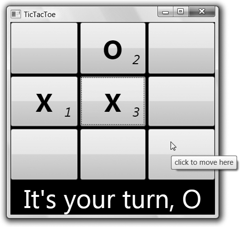
For example, we can update our example so that if the content is null on one of our buttons, it’ll have one tool tip, but if the button has focus (the Tab and arrow keys move focus around), it’ll have another tool tip, as shown in Example 8-24.
<Style TargetType="{x:Type Button}">
  ...
  <Style.Triggers>
    <Trigger Property="Content" Value="{x:Null}" >
      <Setter Property="ToolTip" Value="click to move here" />
    </Trigger>
    <Trigger Property="IsFocused" Value="True" >
      <Setter Property="ToolTip" Value="click or spacebar to move here" />
    </Trigger>
</Style>
Figure 8-11 shows the result of one cell having both focus and the mouse hovering.

If multiple triggers set the same property, the last one wins.
For example, in Figure 8-11, because the
button has no content and focus, the tool tip will be the one
associated with the keyboard focus because the trigger for the
IsFocused trigger is last in the
list.
Multicondition Property Triggers
One thing you may have noticed about Example 8-24 is that it checks only for keyboard focus. However, just checking for the focus isn’t enough; we also need to check whether the button already has content. If you’d like to check more than one property before a trigger condition is activated, you can combine multiple conditions with a multiple condition property trigger, as shown in Example 8-25.
<Style TargetType="{x:Type Button}">
  ...
  <Style.Triggers>
    <Trigger Property="Content" Value="{x:Null}" >
      <Setter Property="ToolTip" Value="click to move here" />
    </Trigger>
    <MultiTrigger>
      <MultiTrigger.Conditions>
        <Condition Property="IsFocused" Value="True" />
        <Condition Property="Content" Value="{x:Null}" />
      </MultiTrigger.Conditions>
      <Setter Property="ToolTip" Value="click or spacebar to move here" />
    </MultiTrigger>
  </Style.Triggers>
</Style>
Multicondition property triggers check all of the properties’ values to be set as specified, not just one of them. Here, we’re watching for both keyboard focus and the content to be null, reflecting the game logic that new moves can happen only in empty cells.
Property triggers are great for noticing when the user is interacting with an element displaying your program’s state. However, we’d also like to be able to notice when the program’s state itself changes—such as when a particular player makes a move—and update our style settings accordingly. For that, we have data triggers.
Data Triggers
Unlike property triggers, which check only WPF dependency
properties, data triggers can check any old thing to which you can
bind (e.g., a CLR object property, an XPath statement, etc.). Whereas property
triggers are generally used to check WPF visual element properties,
data triggers are normally used to check the properties of nonvisual
objects used as content, like our PlayerMove objects (see Example 8-26).
<Window.Resources>
  <Style TargetType="{x:Type Button}">
    ...
  </Style>
  <Style x:Key="CellTextStyle" TargetType="{x:Type TextBlock}">
    ...
    <Style.Triggers>
      <DataTrigger Binding="{Binding Path=PlayerName}" Value="X">
        <Setter Property="Foreground" Value="Red" />
      </DataTrigger>
      <DataTrigger Binding="{Binding Path=PlayerName}" Value="O">
        <Setter Property="Foreground" Value="Green" />
      </DataTrigger>
    </Style.Triggers>
  </Style>
  <Style x:Key="MoveNumberStyle" TargetType="{x:Type TextBlock}">
    ...
  </Style>
  ...
  <DataTemplate DataType="{x:Type l:PlayerMove}">
    <Grid>
      <TextBlock
        TextContent="{Binding Path=PlayerName}"
        Style="{StaticResource CellTextStyle}" />
      <TextBlock
        TextContent="{Binding Path=MoveNumber}"
        Style="{StaticResource MoveNumberStyle}" />
    </Grid>
  </DataTemplate>
</Window.Resources>
DataTrigger elements go under
the Style.Triggers element just
like property triggers, and also just like property triggers, more
than one of them can be active at any one time. Whereas a property
trigger operates on the properties of the visual elements displaying
the content, a data trigger operates on the content itself. In our
case, the content of each cell is a PlayerMove object. In both of the data
triggers, we’re binding to the PlayerName property. If the value is “X,”
we’re setting the foreground to red, and if it’s “O,” we’re setting it
to green.
We haven’t had per-player colors since moving to data templates after setting styles programmatically in Figure 8-5, but data triggers bring that feature right back, along with all of the other features we’ve been building up, as shown in Figure 8-12.

Unlike property triggers, which rely on the change notification
of dependency properties, data triggers can also use an implementation
of the standard property change notification patterns built into .NET
and discussed in Chapter 6 (e.g.,
INotifyPropertyChanged). Even our
simple class needs to raise such notifications as the IsPartOfWin property changes (it’s set when
a win is detected). If you’re using data triggers, chances are that
you’ll need to expose notifications from your data classes.
One other especially handy feature of data triggers is that
there’s no need for an explicit check for null content. If the content
is null, the trigger condition is automatically false, which is why
the application isn’t crashing trying to dereference a null PlayerMove to get to the PlayerName property.
Multicondition Data Triggers
Just as we can combine property triggers into “and” conditions
using the MultiTrigger element, we
can combine data triggers using the MultiDataTrigger element. For example, if we
wanted to watch for winning moves and match the move number to the
color of the player that won, we’d need two multicondition data
triggers, one for each player, as shown in Example 8-27.
<Style x:Key="MoveNumberStyle" TargetType="{x:Type TextBlock}">
  ...
  <Style.Triggers>
    <MultiDataTrigger>
      <MultiDataTrigger.Conditions>
        <Condition Binding="{Binding Path=PlayerName}" Value="X" />
        <Condition Binding="{Binding Path=IsPartOfWin}" Value="True" />
      </MultiDataTrigger.Conditions>
      <Setter Property="BitmapEffect">
        <Setter.Value>
          <OuterGlowBitmapEffect GlowColor="Red" GlowSize="10" />
        </Setter.Value>
      </Setter>
    </MultiDataTrigger>

    <MultiDataTrigger>
      <MultiDataTrigger.Conditions>
        <Condition Binding="{Binding Path=PlayerName}" Value="O" />
        <Condition Binding="{Binding Path=IsPartOfWin}" Value="True" />
      </MultiDataTrigger.Conditions>
      <Setter Property="BitmapEffect">
        <Setter.Value>
          <OuterGlowBitmapEffect GlowColor="Green" GlowSize="10" />
        </Setter.Value>
      </Setter>
    </MultiDataTrigger>
  </Style.Triggers>
</Style>
Here we’re setting a glow around the winning move numbers to make the crucial moves clear.[55]Figure 8-13 shows the results after a win.

The multicondition data trigger in Example 8-27 sets the move number to match the
color of the winner to connote a cause for celebration, but you can
use multicondition data triggers for celebrations of your own kinds.
Also, I didn’t show it in this example, but because data triggers
support CLR property change notifications as well as dependency
property change notifications, they are very handy inside the Triggers element of a data template.
Event Triggers
Whereas property triggers check for values on dependency
properties and data triggers check for values on CLR properties, event
triggers watch for events. When an event (like a Click event) happens, an event trigger
responds by raising an animation-related event. Although animation is
interesting enough to deserve its own chapter (Chapter 16), Example 8-28
shows a simple animation that will transition a button from
transparent to opaque over two seconds when it’s clicked.
<Style TargetType="{x:Type Button}">
  ...
  <Style.Triggers>
    ...
    <EventTrigger RoutedEvent="Click">
      <EventTrigger.Actions>
        <BeginStoryboard>
          <Storyboard>
            <DoubleAnimation Storyboard.TargetProperty="Opacity"
                             From="0" To="1" Duration="0:0:2" />
          </Storyboard>
        </BeginStoryboard>
      </EventTrigger.Actions>
    </EventTrigger>
  </Style.Triggers>
</Style>
To add an animation to a style requires two things. The first is
an event trigger with the name of the event that caused the trigger to
fire (the Click event, in our
case). The second is a storyboard, which is a grouping for
animations. When the Click event
happens, we begin the storyboard. Our storyboard happens to contain
one animation, which animates the Opacity property on the button from fully
transparent to fully opaque. Figure 8-14 shows the results
of clicking the button in the upper left about halfway through the
fade-in animation.

Event triggers let you trigger animations when events happen. Property and data triggers let you set properties when properties change, but they also let you start or stop animations (discussed in Chapter 16). Both types of triggers let you add a degree of interactivity to your applications in a wonderfully declarative way with little or no code.
Where Are We?
Styles enable you to define a policy for setting the dependency properties of visual elements. You can apply sets of properties manually by name, programmatically by name, or automatically using element-typed styles. In addition to providing constant dependency property values, styles can contain condition-based property values based on other dependency properties, data properties, or events.
But that’s not all there is to styles. For information about how animations work, you’ll want to read Chapter 16, and for information about styles as related to resources, themes, and skins, you’ll want to read Chapter 12. Finally, if setting style properties isn’t enough to give your control the look you want, the very next chapter shows you how to replace the look of a control completely.
[49] * We clear the content of each
button by using the ClearValue
method instead of setting the CLR property to null so that setting
the Content property in the
triggers works later on.
[50] * However, an inline style is useful if you want to add property and data triggers to an individual element. We discuss triggers later in this chapter.
[51] * The ability to set a value for a property that an element doesn’t have is useful for inheritable properties, because those values will flow on through to child elements. See Chapter 18 for a description of dependency property inheritance.
[52] * Controls that use the content
model in WPF are those with control templates that use a ContentPresenter, as discussed in Chapter 9.
[53] * Moving groups of settings into styles also allows for easier skinning and theming, as described in Chapter 12.
[54] * The null value is set via a XAML markup extension, which you can read more about in Appendix A.
[55] * For more information about bitmap effects, read Chapter 13