
Chapter 18. Custom Controls
One of the benefits of WPF is that you don’t need to write custom controls as often as you would have to in many user interface frameworks. If you need to customize the appearance of an existing control or adjust its superficial interactive behavior, WPF provides various tools that can let you do this. In earlier chapters, we saw features such as composability, content models, styling, templates, animation, and integrated graphics support. These let you customize existing controls extensively without having to write a new control type.
Custom controls still have a place, of course. As we saw in Chapter 5, the role of a control is to define essential behavior. For example, although you can customize and animate the visuals of a button to your heart’s content, it still retains its essence—it is just something clickable. If the behavior you require is not provided by any existing controls, and you cannot create it by bolting a few controls together, you will need to write a custom control.
If you want your control to be reusable, you will want it to have the same kind of flexibility that the built-in controls offer, such as support for rich content, styling, and templates. In this chapter, we will see how to make your custom controls take advantage of the same powerful flexibility as the built-in controls.
Custom Control Basics
Before you write a custom control, the first question you should ask is:
Do I really need a custom control?
One of the main reasons for writing custom controls in older user interface technologies is to modify the appearance of a control, but as we’ve seen in earlier chapters, content models and templates mean this is often unnecessary. WPF offers a progressive scale of customization techniques that you should bear in mind when considering writing a custom control:
Use properties to modify the appearance or behavior of an existing control.
Compose existing controls.
Nest content in an existing control.
Replace the template of an existing control.
Create a custom control or other custom element.
This sequence offers increasing levels of power in exchange for slightly more effort at each step. Only if 1–4 don’t meet your needs is writing some kind of custom element such as a custom control likely to be the answer.
An important indicator of whether you need to write a new control
(or some other custom visual element type) is whether you plan to add
new API features. Even in this case, you should consider carefully what
type of custom element to write—controls are not the only kind of
element. You might get more flexibility by writing a lower-level element
that you can integrate into the visuals of an existing control. For
example, a lot of the elements that make WPF so flexible, such as layout
classes and shapes, derive from FrameworkElement, but are not in fact controls
(i.e., they do not derive from the Control base class).
If you are certain that a custom element is the best way to
proceed, you will need to work through a number of design steps. First,
you must pick the base class—will it derive from FrameworkElement, Control, or one of the other base types
provided by WPF? Then you must define the API, deciding what properties,
events, and commands your class will provide. Finally, if your new
element is to provide the same flexibility that built-in classes offer,
you will need to pay careful attention to the interface between the
element and its template.
Choosing a Base Class
WPF provides many classes from which you can derive when creating custom elements. Figure 18-1 shows a set of classes that are most likely to be suitable base classes, and illustrates the inheritance relationship between them. Note that this is by no means a complete inheritance diagram—it simply shows the classes you should consider as possible base classes.

Whichever base class you choose, your element will derive directly
or indirectly from FrameworkElement.
This offers event routing, advanced property handling, animation, data
binding, layout support, styling, and logical tree integration.
Tip
It is not an absolute requirement to derive from FrameworkElement. Chapter 13 discussed the low-level visual layer graphics API, and although the
example in that chapter derived from FrameworkElement, you can derive directly
from UIElement when using the
low-level drawing API. However, you would lose all of the services
FrameworkElement offers. The main
reason UIElement exists is that
Microsoft wanted to make it possible to use WPF’s low-level rendering
services without being obliged to use the whole WPF framework. In
practice, you would not normally do this.
Deriving directly from FrameworkElement might be appropriate for an
element designed to be composed into other elements. For example,
consider an element that binds to a data source and renders the data as
a graph. You might be tempted to make this derive from Control. However, the raw graph drawing
element would usually be used in conjunction with other elements such as
TextBlock to provide labels for the
graph and its axes. It might therefore make more sense to separate the
graph drawing into a low-level element, which could then be incorporated
into the visuals of any number of different controls.
Tip
It is possible to use controls inside the template of other controls. But if you find yourself writing a custom control purely to be used in the template of another custom control, you probably need to review your choice of base class.
If you are writing an element that performs custom layout logic,
you should derive from Panel to be
consistent with the built-in layout elements.
If you are writing an element that wraps around another element,
augmenting it in some way, consider deriving from Decorator. Many built-in elements derive from
Decorator. For example, there is
Border, which adds a border around an
element. There is also ViewBox, which
automatically scales the element that it wraps to fill the available
space. If you wish to provide some kind of wrapper that adds
functionality around other content, consider deriving from Decorator.
The Adorner base class is
designed for elements such as selection outlines and drag handles. WPF
renders adorners so that they appear on top of all other elements. For
example, if a selected shape in a drawing program were mostly obscured
by other shapes on top of it, its selection outline would still be
visible if rendered as an adorner. The Adorners
section, later in this chapter, describes how to write an
adorner.
Shape is the base class of
elements such as Rectangle and
Path. If your application makes heavy
use of some shape that can be represented with a PathGeometry, you can derive your own shape
class instead of having to use the Path type every time. For example, if you
wanted lots of stars in your application, you could derive a Star class from Shape. When writing your own shape, you
generate the appearance by overriding the DefiningGeometry property. The base Shape class’s OnRender will render the Geometry you provide, and will automatically
handle the Stretch property for you
by applying a transform. If you want to handle how your object changes
shape when stretched—the default behavior might distort the shape in an
unacceptable way—you can take complete control by overriding the
OnRender method, as shown in Chapter 13.
If your element provides behavior, or supports user interactions
not available from built-in components, it is appropriate to derive from
Control, either directly or
indirectly. For example, if you want to make an interactive graphing
component, where the user can click on items in the graph to inspect
them, or zoom around, you would typically write this as a control (and
its template might use the lower-level graph rendering element you wrote
earlier).
Control offers several derived
classes, augmenting the basic control functionality. If you are writing
a control that provides a space in which the user can place some content
(e.g., a caption), you should derive from ContentControl—this provides your control with
support for the content model. If your control supports content in both
a header caption and the main area (like a tab page), consider deriving
from HeaderedContentControl.
If you need to present multiple child items, first consider
whether the combination of ListBox,
data binding, templates, and styles will meet your requirements. Data
binding and styling enable WPF’s list controls such as ListBox and TreeView to handle a wide range of scenarios
for which their Win32 and Windows Forms forebears are unsuited. If you
need extra functionality not provided by the built-in list controls, you
should consider deriving your custom element type from either Selector or its base class, ItemsControl. ItemsControl provides the basic support for
controls containing lists of items, including optional data binding
functionality. Selector augments this
with the ability to track a currently selected item or set of
items.
Custom Functionality
Once you have picked a base class, you will need to devise an API
for your control. WPF elements usually expose the majority of their
functionality through properties, events, and commands, because these
get extensive support from the framework and are easily used from XAML.
WPF can provide automatic support for routing of events and commands,
and its dependency property system
provides support for many framework features such as data binding,
styling, triggers, and animation. You can, of course, write methods as
well, and for certain kinds of functionality, methods are the best
approach. (For example, the ListBox
has a ScrollIntoView method that
ensures that a particular item is visible. This is a useful thing to be
able to do from code.) But, you should prefer properties, events, and
commands where they are a reasonable fit.
Properties
The .NET type system provides a standard way of defining properties for an object. It prescribes a convention for supplying get and set accessor methods, but the implementation of these, and the way in which the property value is stored, is left up to the developer.[117] In WPF, elements normally use the dependency property system. .NET-style property accessors are typically provided, but these are just wrappers around dependency properties (DPs), added for convenience.
The get and set accessors required to wrap the DP system are
trivial—just a single method call for each, as you’ll see shortly. In
exchange for this minimal amount of code, the DP system adds a number
of features that standard .NET properties do not normally offer. For
example, a DP can inherit its
value from a parent element. Confusingly, this is different from the
classic OO meaning of inheritance, where a derived class inherits
features from its base class (although DPs also support inheritance in
that sense). Property value inheritance is a more dynamic feature,
allowing a property to be set on a single element and automatically
propagate to all of its children. For example, all elements have a
Cursor property to control the
mouse cursor. This property uses value inheritance, meaning that if
you set the Cursor on an element,
all of the child elements will automatically get the same Cursor property value. (You will be familiar
with this idea if you’ve used Windows Forms, in which ambient properties offer the same
feature.)
Besides supporting inheritance, DPs can also pick up their values automatically from elsewhere, such as data binding expressions, triggers, or styles. The animation system also relies on DPs—it uses the DP infrastructure to adjust property values over time. They also provide a mechanism for defining a default value. That’s a lot of functionality in exchange for a tiny amount of code.
By implementing your element’s properties as DPs, not only do you get all of these features automatically, but also the DP system manages the storage of the value for you—you do not need to define any instance fields to hold property values.
Tip
Storage management may seem like a small thing—after all, how hard is it to add a field to a class? However, this feature can offer surprisingly significant memory savings.
Simply by inheriting from Control, your element will support more
than 80 properties (plus any attached properties) of varying
complexity, most of which are likely to be left at their default
values on most objects. If each element had its own set of fields to
hold these values, this would take hundreds of bytes per element. A
complex user interface may have hundreds or even thousands of
elements. (Even if the logical tree is not that complex, the visual
tree can multiply the number of elements greatly.)
If most of the properties on these many elements are either inheriting values from their parents or are set to their default values, using per-element fields to hold these values could waste hundreds of kilobytes of memory. DPs use a more sophisticated storage approach that exploits the fact that most properties are left unset. And although memory is cheap, moving data into and out of the CPU is expensive. The CPU can execute code far faster than it can fetch data from main memory. Only cache memory is fast enough to keep up with the processor, and most modern processors typically have only a few hundred kilobytes of cache. Even high-end systems have only a few megabytes of cache. Saving a few hundred kilobytes can therefore sometimes improve performance dramatically.
By deferring to the DP system, we can let it handle the information more efficiently by storing just the property values that have been set explicitly.
Finally, the DP system tracks changes to values. This means that if any interested party wants to know when a property value changes, it can register for notifications with the DP system. (Data binding relies on this.) We do not need to write any special code to make this happen—the DP system manages storage of our property values, so it knows whenever a property changes.
Any custom WPF element you create will automatically have
everything it requires to support DPs, because FrameworkElement derives indirectly from the
DependencyObject base class. To
define a new property on our custom element, we must create a new
DependencyProperty object in the
element’s static constructor. This object acts as an identifier for
the property—all the DPs of built-in controls have a corresponding
DependencyProperty object. By
convention, this property object is stored in a public static field of
our class, and the field’s name is formed by adding
Property to the end of the property’s name (see
Example 18-1).
public class MyCustomControl : ContentControl {

    public static readonly DependencyProperty StripeBrushProperty;

    static MyCustomControl(  ) {
        PropertyMetadata stripeBrushMetadata =
            new PropertyMetadata(Brushes.Green); // default value
        StripeBrushProperty = DependencyProperty.Register("StripeBrush",
            typeof(Brush), typeof(MyCustomControl), stripeBrushMetadata);
    }

    public Brush StripeBrush {
        get { return (Brush) GetValue(StripeBrushProperty); }
        set { SetValue(StripeBrushProperty, value); }
    }
}
This custom control defines a single DP called StripeBrush, of type Brush with a default color of green. The
control’s template could use this to determine the color of a stripe
drawn as part of its appearance, using a TemplateBinding as described in Chapter 9. It is common to define properties
whose only purpose is to provide TemplateBinding sources. Many common
properties of built-in controls, such as Foreground and Background, have no intrinsic behavior of
their own—they just provide a place for users of the control to set
information that will be relayed to the control’s template. For such
properties, it is common for the control class itself to do nothing
with the property other than defining it. So, although Example 18-1 is a pretty minimal
implementation, it is entirely sufficient for its purpose.
It is often useful to define a default value for a property. The
control in Example 18-1 specifies
a default value of Brushes.Green by
passing in a PropertyMetadata
object when registering the StripeBrush property.
Tip
You might wonder why WPF invents these new DependencyProperty and PropertyMetadata types to represent
properties and associated metadata when the Reflection API already
provides the PropertyInfo class,
and an extension mechanism in the form of custom attributes.
Unfortunately, the Reflection API was unable to provide the
combination of flexibility and performance WPF requires, which is
why there is some overlap between the DP metadata system and
reflection.
Example 18-1 also defines
normal .NET get and set property accessors. These are not strictly
necessary—you could access the properties using the public GetValue and SetValue methods inherited from DependencyObject like so:
myControl.SetValue(MyCustomControl.StripeBrushProperty, Brushes.Red);
However, in most .NET languages it is easier to use a normal CLR
property, and more important, the XAML compiler will complain if you
use a DP that has no corresponding CLR property, so you would normally
provide a property wrapper as Example 18-1 does. As you can see, the
accessors simply defer to the GetValue and SetValue methods inherited from the DependencyObject base class.
Tip
The Visual Studio Extensions for .NET 3.0 define a code
snippet to help write dependency properties. Put the caret inside
the class to which you would like to add a DP. Type propdp and then press the Tab key. (If
the IntelliSense pop up is open, you’ll need to press Tab twice—once
to get rid of the pop up and once to expand the snippet.) This will
insert code very similar to Example 18-1.
Example 18-2 shows how to use
this custom property from XAML. (This assumes that the namespace
containing this control has been associated with the XML namespace
prefix local. See Appendix A for more information on the relationship between
.NET namespaces and XML namespaces.)
Because our property’s type is Brush, we can use the same text format for
representing brushes as we saw in Chapter 13. Example 18-2 exploits this to create a
brush based on a named color, but you could also use one of the
numerical formats, such as #0000FF.
Attached properties
If you wish to define an attached
property—one that you can apply to elements other than
the defining element—you register it with a different call: RegisterAttached. As Example 18-3 shows, this is called
in much the same way as the normal Register method.
public class ElementWithAttachedProp : Panel {

    public static readonly DependencyProperty IsSkewedProperty;

    static ElementWithAttachedProp (  ) {
        PropertyMetadata isSkewedMetadata = new PropertyMetadata(false);
        IsSkewedProperty = DependencyProperty.RegisterAttached
("IsSkewed",
            typeof(bool), typeof(ElementWithAttachedProp), isSkewedMetadata);
    }
    public static bool GetIsSkewed(DependencyObject target) {
        return (bool) target.GetValue(IsSkewedProperty);
    }

    public static void SetIsSkewed(DependencyObject target, bool value) {
        target.SetValue(IsSkewedProperty, value);
    }
    ...
}
Note that the accessors look different. .NET does not specify
a standard way for properties defined by one type to be applied to
another. XAML and WPF recognize the idiom used in Example 18-3, where we define a pair
of static methods called GetPropName and
SetPropName.
Both of the set methods are passed the target object to which the
property is to be attached.
The class in Example 18-3 derives from Panel, indicating that it offers some kind
of custom layout service, as described in Chapter 3.
Although any custom element can define attached properties, it is
particularly common for custom panels to do so, to enable child
elements to tell the panel how they would like to be arranged. Example 18-3 is just a hypothetical
example, so the layout implementation is not shown, but the name
suggests that when the panel encounters a child with the IsSkewed attached property set to true, it
will arrange it askew. Example 18-4 shows how to apply
this custom attached property to a Button element in XAML.
<Button local:ElementWithAttachedProp.IsSkewed="True"/>XAML also offers the property element syntax, which is useful
for when the property value is too complex to express as an
attribute. This works in the same way for attached properties as it
does for ordinary properties: use an element name of the form
<ClassName.PropertyName> to set a property. Example 18-5 uses this syntax to set three
properties: the unattached Background property, the built-in Grid.Row attached property, and the custom
IsSkewed attached
property.
Value change notification
Your properties will not always be set using the accessor
methods. For example, data binding and animation use the DP system
to modify property values directly. If you need to know when a
property value is changed, you must not depend
on your accessors being called, because they often won’t be—this is
true for both instance properties and attached properties. Instead,
you should register for change notifications. You do this by passing
a callback to the PropertyMetadata during property
registration.
Tip
You can register a change handler for both normal and attached properties. The same technique is used in either case.
Example 18-6 shows the modifications you would make to Example 18-3 in order to be notified when the property value changes.
...
static ElementWithAttachedProp (  ) {
    PropertyChangedCallback isSkewedChanged =
        new PropertyChangedCallback(OnIsSkewedChanged);
    PropertyMetadata isSkewedMetadata =
        new PropertyMetadata(false, isSkewedChanged);
    IsSkewedProperty = DependencyProperty.RegisterAttached("IsSkewed",
        typeof(bool), typeof(ElementWithAttachedProp), isSkewedMetadata);
}
...
static void OnIsSkewedChanged(DependencyObject target,
                            DependencyPropertyChangedEventArgs e) {
    Debug.WriteLine("IsSkewed just changed: " + e.NewValue);
}
...
The change handler function will be called whenever the
property is changed, whether it is altered by a call to the static
SetIsSkewed method shown in Example 18-3, or by code that uses
the DP system to change the value directly, such as a trigger in a
style. Your change handler is passed two parameters. The first
indicates the target object to which the property has been attached.
If your property’s behavior requires you to do something to target
objects, you would do it in the property change handler. For
example, when you set the built-in SpellCheck.IsEnabled attached property to
a text editing control, this hooks up dynamic spellchecking
functionality. Because you are given a reference to the target, your
property change handler can do whatever it deems fit.
The second parameter is a simple struct containing self-explanatory
OldValue and NewValue properties. The NewValue property is just for
convenience—Example 18-6 could also
have retrieved the new value by calling the GetIsSkewed accessor.
Whether you need a property change handler depends on the
nature of the attached property. Some attached properties are
passive. For example, panel layout properties have no intrinsic
behavior of their own and have no direct effect on the elements to
which they are applied—instead, they tell the containing panel what
to do with the elements. Moreover, layout properties mean anything
only when they are applied to children of the panel that defined
them. For this kind of panel, you don’t need a property change
handler. However, for a more proactive property, such as SpellCheck.IsEnabled, you would need to
supply a change handler in order to discover to which elements your
property has been applied.
Change notifications for property consumers
The change handling technique shown in the preceding section
is perfect for custom properties. But what if you want to be
notified of changes to dependency properties you didn’t create? For
example, if you’ve written a custom control, you might want to know
when the Background property
changes. (There is no BackgroundChanged event, because most
controls rely on templates to render their background, and template
bindings handle property changes for you.) There are two options,
depending on whether you wish to receive notifications for
properties on an object of a custom type written by you, or
properties on an object of a type you do not control.
A custom type can have two types of properties not written by
you: attached properties, and properties defined by the base class.
You can handle changes for both kinds of properties by overriding
the OnPropertyChanged method.
This virtual method is defined by DependencyObject, and it will be called
anytime any of the object’s properties change. Example 18-7 uses this to
change the background color anytime the IsMouseOver property changes. (This is
just to illustrate the OnPropertyChanged method. In practice, you
would normally use a Style with a
Trigger if you want one
property’s value to be changed by another, as described in Chapter 8.)
partial class MyWindow : Window {
    ...
    protected override void OnPropertyChanged(
            DependencyPropertyChangedEventArgs e) {

        base.OnPropertyChanged(e);
        if (e.Property == UIElement.IsMouseOverProperty) {
            this.Background = this.IsMouseOver ? Brushes.Red : Brushes.Blue;
        }
    }
}
You can override the OnPropertyChanged method only if you are
writing a custom type. What if you want to be notified of property
changes on an object of a type you do not control, such as Button? In this case, we must rely on the
PropertyDescriptor class. You can
retrieve a property descriptor for any CLR property using the
TypeDescriptor class’s static
GetProperties method. You pass it
either a type or an object, and it returns a complete list of
descriptors, one for each property. By default, the .NET Framework
generates property descriptors automatically, using reflection to
discover the available properties. However, one of the most
important features of the property descriptor system is that objects
are allowed to provide their own descriptors if they want
to.[118] DependencyObject
offers custom property descriptors for all dependency properties.
This enables us to retrieve them in the same way we would for any
object.
Example 18-8
shows how we can provide the property descriptor with a change
handler. The OnButtonIsPressedChanged method in this
example will be called whenever the myButton object’s IsPressed property changes.
partial class Window1 : Window {

   public Window1(  ) {
        InitializeComponent(  );

        // myButton refers to a <Button> in the XAML (not shown)
        PropertyDescriptor buttonIsPressedProp =
            TypeDescriptor.GetProperties(myButton)["IsPressed"];

        buttonIsPressedProp.AddValueChanged(myButton, OnButtonIsPressedChanged);
    }

    void OnButtonIsPressedChanged(object sender, EventArgs e) {
        this.Background = myButton.IsPressed ? Brushes.Red : Brushes.Blue;
    }
}
Although the normal mechanism for retrieving a property descriptor used by Example 18-8 works fine, WPF provides a more direct mechanism, as Example 18-9 shows.
PropertyDescriptor buttonIsPressedProp =
    DependencyPropertyDescriptor.FromProperty(Button.IsPressedProperty,
                                              typeof(Button));
This is a little more verbose than Example 18-8, but it offers a
useful advantage. Instead of passing in a property name, we pass in
the DependencyProperty object for
the property we require. This removes the potential for a runtime
error. If we mistype the property name, we will get a compiler
error, whereas if we use the technique in Example 18-8, the mistake
will not be detected until runtime.
Tip
You would use the techniques shown in Example 18-8 and Example 18-9 only when you
are not deriving from the class that defines the DP. The previous
techniques are preferable when you are able to use them, for two
reasons. First, your handler will be notified if you use XAML to
set the property’s initial value—the PropertyDescriptor technique won’t do
that because you can attach the handler only after initialization
is complete. Second, using the earlier techniques you will be
passed both the old and the new values, whereas with the PropertyDescriptor, you will be able to
see only the new value.
Property metadata options
Certain common property behaviors crop up time and time again.
For example, if you are writing a custom element that overrides
OnRender in order to work at the
visual layer, it is likely to have properties that affect its
appearance. Suppose you had written a custom element called Star that renders a star shape, with a
Points property defining how many
points the star should have. The obvious thing to do would be to
register a change handler, and to call InvalidateVisual in this handler in order
to trigger another call to OnRender. In fact, you don’t have to do
this. Example 18-10 shows how to
get WPF to do this work for you.
public class Star : FrameworkElement {
    public static readonly DependencyProperty PointsProperty;

    public int Points {
        get { return (int) GetValue(PointsProperty); }
        set { SetValue(PointsProperty, value); }
    }

    static Star(  ) {
        FrameworkPropertyMetadata pointsMetadata =
            new FrameworkPropertyMetadata(5, // default value
                   FrameworkPropertyMetadataOptions.AffectsRender);

        PointsProperty = DependencyProperty.Register("Points",
            typeof(int), typeof(Star), pointsMetadata);
    }
    ...
}
Instead of using the basic PropertyMetadata class, we’ve used the
derived FrameworkPropertyMetadata
type. This is designed for properties defined by a FrameworkElement, and it adds various
features not available to dependency properties defined on types
that derive directly from lower-level base classes such as UIElement. You can pass in any of the
flags defined by the FrameworkPropertyMetadataOptions
enumeration, which are described in Table 18-1.
Meaning | |
| The arrange layout phase will be redone when the property changes. |
| The layout will be completely redone when the property changes. |
| The arrange layout phase of the parent will be redone when the property changes. |
| The parent’s layout will be completely redone when the property changes. |
| The element’s visuals
will be invalidated when the property changes, causing
|
| Data binding
expressions will use a |
| The property’s value will be inherited by child elements. |
| The property value will be stored in the navigation journal when navigating away, and restored when returning. |
| Data binding expressions will not be allowed to target this property. |
| The property is
inherited by descendants even when a child element disables
inheritance with the |
| Used in conjunction
with |
By enabling metadata options, you can often avoid the need to write a property change handler.
Tip
You should not use the AffectsRender flag unless your element
overrides OnRender. You do not
need to set this for all properties that have an impact on
appearance. If the property affects a control’s appearance via a
TemplateBinding in the
template—which is how the property defined in Example 18-1 is intended to be
used—the template binding will automatically detect property
changes without you needing to set AffectsRender.
FrameworkPropertyMetadata
also defines a couple of properties that can affect property
behavior. DefaultUpdateSourceTrigger lets you
specify when two-way data bindings to this property will normally
update the source. The usual default is LostFocus, but by setting this to PropertyChanged, you can force the source
to be updated every time the property changes. Alternatively, you
can set it to Explicit,
indicating that the source will be updated only if the code calls
the binding’s UpdateSource
method.
Finally, you can disable the use of animation with the
property by setting the IsAnimationProhibited property to true.
This might be appropriate if changing the property would be a
calamitously expensive thing to try to do tens of times per
second.
Events
We looked at the handling of routed events in Chapter 4. If you wish to define custom events for your control, it makes sense to implement them as routed events. Not only will this make your element consistent with other WPF elements, but also you can take advantage of the same bubbling and tunneling routing strategies where appropriate.
Creating custom routed events is similar to creating custom properties. You simply create them in your class’s static constructor. For convenience, you would normally also add a .NET style event to wrap the underlying routed event handling.
Example 18-11 shows the
definition of a pair of events: a tunneling PreviewAlarm event and a bubbling Alarm event. It provides .NET event
accessors for convenience—these just defer to the AddHandler and RemoveHandler methods built into the base
class.
This example also provides an OnAlarm method to raise the event. This
raises the preview event, and if that isn’t marked as handled, it goes
on to raise the main Alarm event.
The RaiseEvent method provided by
the base UIElement class does the
work of event routing and calling any registered handlers. Note that
just as with normal CLR events, routed events are raised
synchronously—RaiseEvent will call
the event handlers sequentially, and will not return until all of them
have run.
public class ClockControl : ContentControl {

    public static RoutedEvent AlarmEvent;
    public static RoutedEvent PreviewAlarmEvent;

    static ClockControl(  ) {
        AlarmEvent = EventManager.RegisterRoutedEvent(
            "Alarm", RoutingStrategy.Bubble,
            typeof(RoutedEventHandler), typeof(ClockControl));
        PreviewAlarmEvent = EventManager.RegisterRoutedEvent(
            "PreviewAlarm", RoutingStrategy.Tunnel,
            typeof(RoutedEventHandler), typeof(ClockControl));
    }

    public event RoutedEventHandler Alarm {
        add { AddHandler(AlarmEvent, value); }
        remove { RemoveHandler(AlarmEvent, value); }
    }
    public event RoutedEventHandler PreviewAlarm {
        add { AddHandler(PreviewAlarmEvent, value); }
        remove { RemoveHandler(PreviewAlarmEvent, value); }
    }

    protected virtual void OnAlarm(  ) {
        RoutedEventArgs args = new RoutedEventArgs(PreviewAlarmEvent);
        RaiseEvent(args);
        if (!args.Handled) {
            args = new RoutedEventArgs(AlarmEvent);
            RaiseEvent(args);
        }
    }
    ...
}
Tip
Example 18-11 used the
built-in RoutedEventArgs class.
If you want to pass extra information about the event, as with
normal .NET events you are free to define your own custom event
argument type. It should derive from RoutedEventArgs, because this incorporates
some routing functionality required by WPF to route events
correctly.
Attached events
Just as some properties can be attached to types other than
their defining types, so can events. Unlike dependency properties,
routed events do not need to be registered in a different way in
order to work as attached events. For example, you could attach a
handler for the ClockControl.Alarm event defined in Example 18-11 to a Button using the code shown in Example 18-12.
RoutedEventHandler handler = MyAlarmHandlerMethod;
myButton.AddHandler(ClockControl.AlarmEvent, handler);
The MyAlarmHandlerMethod
referred to in this example is the event handler method that will
get called when the Alarm event
is raised on this button. Of course, the button knows nothing about
the Alarm event, so we would need
to write the code to raise the event. This is shown in Example 18-13.
RoutedEventArgs re = new RoutedEventArgs(ClockControl.AlarmEvent);
myButton.RaiseEvent(re);
Attached events enable you to introduce your own events into the UI tree even though the source element may have no intrinsic understanding of the event.
Commands
We saw in Chapter 4 that WPF’s RoutedUICommand class represents a
particular user action, which may be invoked through any number of
different inputs. There are two ways in which a custom control might
want to interact with the command system. It might define new command
types. Or, it could handle commands defined elsewhere.
Example 18-14 shows how to
register a custom command. Note that we provide two strings to name
the command. The first is a display name. Because this may appear in
the UI (e.g., if the command is associated with a menu item), you
would not hardcode the string like this if the application were
localizable. Instead, you would typically read the value from a
ResourceManager, as with any
localizable string. The second name is not localized—this is the real
name of the command, and should always be the same regardless of
locale.
public class ClockControl : Control {
    public static RoutedUICommand SnoozeCommand;

    static ClockControl(  ) {
        InputGestureCollection boomInputs = new InputGestureCollection(  );
        boomInputs.Add(new KeyGesture(Key.F,
                                     ModifierKeys.Control|ModifierKeys.Shift));
        SnoozeCommand = new RoutedUICommand("Snooze", "Snooze",
                                     typeof(ClockControl), boomInputs);
    }
    ...
}
Example 18-15 shows XAML that
configures a Button to invoke this
custom command when it is clicked.
<Button Command="local:ClockControl.SnoozeCommand">Click me</Button>
You will often want to make your control handle any custom
commands it defines. You might also want it to handle other commands.
For example, you might wish to respond to some of the standard
commands provided by classes such as ApplicationCommands. In Chapter 4, we saw how to achieve this by adding a CommandBinding to our custom control’s
CommandBindings collection.
However, although this technique will work, it is usually not an
appropriate technique for a custom control. You will normally want all
instances of your control to respond to the command in the same way,
so instead of setting up command bindings for every instance, it would
be better to register a class
handler. This lets you set up a command handling
association just once in your static constructor, and it will work for
all instances of your custom element. Example 18-16 shows how.
public class MyCustomControl : ContentControl {

    static MyCustomControl(  ) {
        CommandBinding copyCommandBinding = new CommandBinding(
            ApplicationCommands.Copy,
            HandleCopyCommand);
        CommandManager.RegisterClassCommandBinding(typeof(MyCustomControl),
        copyCommandBinding);
    }

    static void HandleCopyCommand(object target,
                                        ExecutedRoutedEventArgs e) {
        MyCustomControl myControl = (MyCustomControl) target;
        ...
    }
}
Note that the handler must be a static method—when your static constructor runs, there will not yet be any instances of your custom element. Besides, this handler will be registered once on behalf of all instances, so it would not make sense for it to be an instance method. When the command is invoked, the handler will be passed a reference to the target element as its first parameter.
Supporting Templates in Custom Controls
The final design consideration for any custom element is how it
will connect with its visuals. If the element derives directly from
FrameworkElement, it might be
appropriate for it to generate its own visuals. (Chapter 13 described how to create a graphical appearance.)
In particular, if you are creating an element whose purpose is to
provide a particular form of visualization—such as an element that
renders a three-dimensional graph—the element should take complete
control of how this is managed. However, if you are writing a control,
you would not normally hard-wire the graphics into the
control.
Remember that a control’s job is to provide behavior. The visuals are provided by the control template. A control may provide a default set of visuals, but it should allow these to be replaced in order to offer the same flexibility as the built-in controls. (Chapter 9 described how to replace a control’s visuals with a template.) A control that conforms to this approach, where the visuals are separated from the control, is often described as lookless, because the control has no intrinsic appearance or “look.” All of the controls built into WPF are lookless.
Of course, it is not possible for the control to be entirely independent of its visuals. As we saw in Chapter 9, there is an implied contract between a control and its template. The control allows its appearance to be customized by replacing the template, but the template should in turn provide certain features on behalf of the control. Chapter 9 described the various styles of contract; some controls use a mixture of these styles. The following sections describe how to support these contract types in a custom control.
Property Binding
Property binding is where the control template projects
properties from the control onto properties of elements in the control
template. It does this with the TemplateBinding markup extension.
To support this model, all you need to do is implement
properties using the dependency property mechanism described earlier
in this chapter. Example 18-1
showed a custom control that defined a single dependency property
called StripeBrush, of type
Brush. This enables users of this
control to refer to it in a template, as Example 18-17 shows.
<ControlTemplate TargetType="{x:Type local:MyCustomControl}">
  <Grid>
    <Line Stroke="{TemplateBinding StripeBrush}" StrokeThickness="1"
                X1="0" Y1="0" X2="100" Y2="100" />
  </Grid>
</ControlTemplate>
All dependency properties automatically support property binding. The “contract” in this case is implied by the set of dependency properties your control offers.
Named Parts
The named parts style is where the control locates required template parts by name. Example 9-8 shows a very simple control template with two named parts.
<ControlTemplate TargetType="{x:Type loc:ControlWithNamedParts}">
  <Grid Width="80" Height="100">
    <Ellipse Fill="Black" Stroke="Gray" StrokeThickness="3" Margin="0,20,0,0" />
    <ContentControl x:Name="PART_Body"
                    Foreground="White" HorizontalAlignment="Center"
                    VerticalAlignment="Center" Margin="0,15,0,0" />
    <Line x:Name="PART_Fuse"
          Stroke="Blue" StrokeThickness="3" X1="55" Y1="40" X2="75" Y2="5" />
  </Grid>
</ControlTemplate>
Writing a control that uses this style of template is
straightforward. First, you should declare which parts your control
expects by annotating the class with the TemplatePartAttribute custom attribute,
which is defined in the System.Windows namespace. This indicates the
names and types of elements you expect to see. Design tools can use
this information to ensure that a template is correct. To hook your
control to these named parts, you should override the OnApplyTemplate method (see Example 18-19).
[TemplatePart(Name="PART_Body", Type=typeof(ContentControl))][TemplatePart(Name="PART_Fuse", Type=typeof(FrameworkElement))]public class ControlWithNamedParts : Control { ContentControl body; FrameworkElement fuse;public override void OnApplyTemplate( ) {base.OnApplyTemplate( );body = Template.FindName("PART_Body", this) as ContentControl;fuse = Template.FindName("PART_Fuse", this) as FrameworkElement;}... }
This retrieves the ControlTemplate from the Template property, and calls its FindName method to locate named elements
within the template. Notice that we have to pass in the this reference—this is because one ControlTemplate object is typically shared
by many controls, so it needs to know which particular instance of the
template we’d like to connect with. The method returns null if it
cannot find the element.
In general, you should try to make your control robust in the
face of missing elements. The built-in controls do not raise errors
when parts are missing; they simply stop providing the functionality
that depended on the part in question (even if that means becoming
completely nonfunctional). For example, the Button control requires its template to
contain a ContentPresenter in order
for the Content property to work.
If the template does not contain a ContentPresenter, the Content property stops doing anything, but
otherwise the control continues to function as normal. Users of your
control may not be interested in exploiting all the available
features, and so may give you an incomplete template. Even if they
intend to provide a full template, it is likely that at the start of
the design process, the template will be incomplete.
Your template may be replaced during the lifetime of your control. If you do things to the template parts, such as hooking up event handlers, you must be prepared to undo this work in the event that your template is replaced. Example 18-20 shows how to do this.
[TemplatePart(Name="PART_Target", Type=typeof(FrameworkElement))]
public class MyControl : Control {
    private FrameworkElement targetPart;

    public override void OnApplyTemplate(  ) {
        base.OnApplyTemplate(  );

        FrameworkElement oldTargetPart = targetPart;
        targetPart = Template.FindName("PART_Target", this) as FrameworkElement;
        if (!object.ReferenceEquals(oldTargetPart, targetPart)) {
            if (oldTargetPart != null) {
                oldTargetPart.MouseEnter -=
                    new MouseEventHandler(targetPart_MouseEnter);
                oldTargetPart.MouseLeave -=
                    new MouseEventHandler(targetPart_MouseLeave);
            }

            if (targetPart != null) {
                targetPart.MouseEnter +=
                    new MouseEventHandler(targetPart_MouseEnter);
                targetPart.MouseLeave +=
                    new MouseEventHandler(targetPart_MouseLeave);
            }
        }
    }

    void targetPart_MouseLeave(object sender, MouseEventArgs e) {
        ...
    }
    void targetPart_MouseEnter(object sender, MouseEventArgs e) {
        ...
    }
   ...
}
Content Placeholders
Some controls expect the template to provide a placeholder for
content, typically using a ContentPresenter element. You do not need to
do anything special to enable the use of a ContentPresenter—if you derive from ContentControl, it will just work. Users of
your control will be able to write templates such as that shown in
Example 18-21.
<ControlTemplate TargetType="{x:Type local:MyContentControl}">
  <Grid>
    <Rectangle Fill="White" />
    <ContentPresenter />
  </Grid>
</ControlTemplate>
Your control may require more than one placeholder. For example,
controls derived from HeaderedContentControl require two—one for
the body and one for the header. In this case, we can simply be
explicit about which property the ContentPresenter presents, as Example 9-9 shows.
<ControlTemplate TargetType="{x:Type local:MyHeaderedContentControl}">
  <Grid>
    <Grid.RowDefinitions>
      <RowDefinition />
      <RowDefinition />
    </Grid.RowDefinitions>

    <ContentPresenter Grid.Row="0" Content="{TemplateBinding Content}" />
    <ContentPresenter Grid.Row="1" Content="{TemplateBinding Header}" />
  </Grid>
</ControlTemplate>
ContentPresenter does not
require the template control to derive from ContentControl. You can use this technique
in the template of any custom control, although you get to omit the
Content property template binding
as in Example 18-21 only if your control
derives from ContentControl—all
other control types will require the template to contain explicit
bindings as in Example 9-9.
WPF defines two more placeholder types. You can use ItemsPresenter in an ItemsControl in order to show where
generated items should be added. And, ScrollContentPresenter is designed for use
in the scroll viewer control, indicating where the scrollable content
will go. If you were defining a new kind of control that hosts content
in some way (e.g., a paginating viewer), it might be appropriate to
define a custom placeholder type. However, you should do this only if
the built-in ones do not meet your needs.
Placeholders Indicated by Properties
There is an alternative to the named parts approach described
earlier: you can define attached properties whose job is to mark
certain elements as special. For example, Panel.IsItemsHost is an attached property
used in an ItemsControl template to
indicate the panel that will hold generated items. The advantage of
this property-based technique is that it is more amenable to
compile-time checking: if you misspell the name of a named part, the
failure is typically not detected until runtime. A misspelled property
name is detected at compile time. The TemplatePartAttribute provides a mechanism
by which a template could be verified for the correct named parts, but
the current WPF build tools do not make use of this. However, the
named part approach is far more common and simpler to implement. The
marker property approach is described here mainly for
completeness.
To implement a control that denotes a placeholder with a marker property, you will need to define a custom attached dependency property. This should be a Boolean property. Example 18-23 registers such an attached property and defines the usual accessor functions.
public class ControlWithPlaceholder : Control {
    public static readonly DependencyProperty IsMyPlaceholderProperty;

    static ControlWithPlaceholder(  ) {

        PropertyMetadata isMyPlaceholderMetadata = new PropertyMetadata(false,
            new PropertyChangedCallback(OnIsMyPlaceholderChanged));

        IsMyPlaceholderProperty = DependencyProperty.RegisterAttached(
            "IsMyPlaceholder", typeof(bool),
            typeof(ControlWithPlaceholder), isMyPlaceholderMetadata);
    }

    public static bool GetIsMyPlaceholder(DependencyObject target) {
        return (bool) target.GetValue(IsMyPlaceholderProperty);
    }
    public static void SetIsMyPlaceholder(DependencyObject target, bool value) {
        target.SetValue(IsMyPlaceholderProperty, value);
    }
...
Notice that in Example 18-23, a PropertyChangedCallback is supplied to the
PropertyMetadata. This denotes a
method that is to be called anytime this attached property is set or
modified on any element. It is in this method that our control will
discover which element was set as the placeholder. Example 18-24 shows the
method.
    ...
    static void OnIsMyPlaceholderChanged(DependencyObject target,
                                    DependencyPropertyChangedEventArgs e) {

        FrameworkElement targetElement = target as FrameworkElement;
        if (targetElement != null && GetIsMyPlaceholder(targetElement)) {
            ControlWithPlaceholder containingControl =
                targetElement.TemplatedParent as ControlWithPlaceholder;
            if (containingControl != null) {
                containingControl.placeholder = targetElement;
            }
        }
    }

    FrameworkElement placeholder;

    ...
}
This example starts by checking that the property was applied to
an object derived from FrameworkElement. Remember that we’re
expecting this to be applied to a particular element inside the
control template, so if it is applied to something other than a
FrameworkElement, there’s nothing
useful we can do with it.
Next, we check the value of the property by calling the GetIsMyPlaceholder accessor method we
defined for the attached property in Example 18-23. It would be
slightly odd if someone explicitly set this property to false, but if
he does, we definitely shouldn’t treat the element as the
placeholder.
If the property was set to true, we go on to retrieve the target
element’s TemplatedParent property.
For elements that are part of a control’s template, this returns the
control that owns the template. (It returns null if the element is not
a member of a control. Because our property only has any meaning for
elements inside a template, we just do nothing when there is no
templated parent.) We also check that the parent is an instance of our
control type, and ignore the property if it is applied to an element
in the template of some other kind of control.
If the target element was a member of a template for an instance of this custom control type, we know we’ve found the placeholder. This example stores a reference to the placeholder in a private field of the control so that the control can then go on to do whatever it needs to do with the placeholder, such as add child elements or set its size.
Example 18-25 shows how you would use this property in a control template to indicate which element is the placeholder.
Default Styles
Although the ability to provide a custom look for a control is useful, developers should be able to use a control without having to supply custom visuals. The control should just work when used in its most straightforward way, which means that it should supply a default set of visuals. This is normally done by providing a style that sets default property values, including a default control template.
Logically speaking, these default styles live in the system resource scope. As we saw in Chapter 12, this scope contains system-defined resources such as system colors, and default styles for built-in controls. If you write a custom control, you can add your own resources to this scope by adding a themesgeneric.xaml file to your project. See Chapter 12 for more information on custom system-scope resources.
For each custom control, you should define a system-scope style
with a TargetType specifying your
control. This style must set the Template property with a ControlTemplate defining the default visuals
for your control, such as the one shown in Example 18-26. See Chapter 8 and Chapter 9 for more information on how to define a
style that supplies a template.
<!-- themes/generic.xaml -->
<ResourceDictionary
    xmlns="http://schemas.microsoft.com/winfx/2006/xaml/presentation"
    xmlns:x="http://schemas.microsoft.com/winfx/2006/xaml"
    xmlns:local="clr-namespace:CustomControlLib">
  <Style TargetType="{x:Type local:MyCustomControl}"
>
    <Setter Property="Template">
      <Setter.Value>
        <ControlTemplate TargetType="{x:Type local:MyCustomControl}">
          <Border Background="{TemplateBinding Background}"
                  BorderBrush="{TemplateBinding BorderBrush}"
                  BorderThickness="{TemplateBinding BorderThickness}">
            <ContentPresenter />
          </Border>
        </ControlTemplate>
      </Setter.Value>
    </Setter>
  </Style>
</ResourceDictionary>
To make sure your control picks up this default theme, you need to let the dependency property system know that the style is there. If you don’t, the control will just pick up the default style for its base class. Example 18-27 shows how to ensure that the correct style is used.
public class MyCustomControl : ContentControl {
    static MyCustomControl(  ) {
        ...
        DefaultStyleKeyProperty.OverrideMetadata(typeof(MyCustomControl),
            new FrameworkPropertyMetadata(typeof(MyCustomControl)));
    }
    ...
}
Note that the Visual Studio extensions for .NET 3.0 generate this code for you when you add a new custom control to a WPF project.
UserControl
User controls offer a way of building custom controls that works rather differently than everything we’ve looked at so far. These are intended to offer a similar model to user controls in other UI frameworks such as Windows Forms and ASP.NET. In those technologies, user controls are built with the visual designer in the same way as a window or page would be created, using the same event handling and code-behind mechanisms.
UserControl is a very simple
class that derives from ContentControl and adds very little. It
defines no new public members, and merely makes minor changes to some
default behaviors: it prevents the control from acting as a target for
focus and tab navigation (we typically want the elements inside the user
control to act as focus targets, not the containing user control
itself). The main purpose of UserControl is to signal intent: by deriving
from UserControl, you are indicating
to the development environment how you would like to build and edit the
control. It also offers a clue to developers using your control that it
is unlikely to be lookless—user controls use the same tightly coupled
relationship between markup and code behind as a window or page, so they
do not usually support customization through templates.
Tip
Strictly speaking, user controls have templates—all controls do.
However, the default template contains just a single ContentPresenter, which hosts the UI defined
in your markup. So in practice, a user control supplies its own
visuals.
Example 18-28 shows the XAML and code behind for a very simple user control.
<!-- CustomElement.xaml --><UserControl x:Class="CustomElement"xmlns="http://schemas.microsoft.com/winfx/2006/xaml/presentation" xmlns:x="http://schemas.microsoft.com/winfx/2006/xaml"> <Grid> <Button Click="OnButtonClick" Content="_Click me" /> </Grid></UserControl>// CustomElement.xaml.cs public partial class CustomElement :UserControl{ public CustomElement( ){ InitializeComponent( ); } void OnButtonClick(object sender, RoutedEventArgs e) { MessageBox.Show("Clicked"); } }
Having written a user control, you use it in the same way as any other custom element. Example 18-29 shows how you might use the control defined in Example 18-28.
<Window ...
    xmlns:local="clr-namespace:MyNamespace">
  <Grid>
    <local:CustomElement />
  </Grid>
</Window>
One of the reasons UserControl
is so simple is that we don’t technically need it—features intrinsic to
user controls in other UI frameworks are supported throughout all of
WPF, so you can build custom elements using markup with code behind
without deriving from UserControl.
XAML is quite happy to use any root element type, so you can derive from
any base class you like. Example 18-30 shows a pair of
markup and code-behind files for a custom element that derives directly
from Grid. This behaves in much the
same way as the user control defined in Example 18-28.
<!-- CustomElement.xaml --> <Gridx:Class="CustomElement" xmlns="http://schemas.microsoft.com/winfx/2006/xaml/presentation" xmlns:x="http://schemas.microsoft.com/winfx/2006/xaml"> <Button Click="OnButtonClick" Content="_Click me" /></Grid>// CustomElement.xaml.cs public partial class CustomElement :Grid{ public CustomElement( ){ InitializeComponent( ); } void OnButtonClick(object sender, RoutedEventArgs e) { MessageBox.Show("Clicked"); } }
As you can see, we add elements and attach event handlers to this code in the same way as with a user control. The current preview .NET 3.0 extensions for Visual Studio 2005 will even let you edit the design of such an element interactively—it doesn’t care that it’s not a user control.
Today, there is very little difference between these two ways of
creating custom elements. This illustrates that the UserControl class doesn’t offer any unique
functionality. It exists mainly to signal explicitly that you are using
the markup and code-behind idiom. And this is A Good Thing—the minimal
functionality doesn’t mean that class is useless. If another developer
is using your element, she might be misled if it derives directly from
Grid—she could reasonably think that
it is intended as a custom layout element. But if it derives from
UserControl, that provides a clear
indication of its nature.
Adorners
An adorner is a special-purpose custom element whose purpose is to add visual features to a UI element. An adorner appears at the same position as the element it adorns, but it will be at top of the Z order—it appears above all nonadorner elements in the window. Adorners are typically used in interactive editing scenarios to display selection outlines or handles. Figure 18-2 shows a typical example from Microsoft Expression Blend.
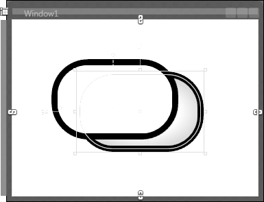
Figure 18-2 shows two rounded rectangles. The one with the white fill is on top of the gray one, partially obscuring it. The gray one underneath has been selected, causing various handles, shapes, and labels to light up. For example, there’s a rectangle showing the bounding box, with small, square resize handles at each corner, and there’s an outline version of the shape itself. Notice that the white rectangle has obscured none of these features. Even though the gray rectangle is beneath the white rectangle, all of the handles appear on top, making it easy to edit the shape even though it is mostly obscured. These handles and other features appear on top because they use WPF’s adorner system.
Adorners are able to appear on top because WPF creates a special
AdornerLayer element at the top of
the Z order. There is nothing magic about this—you could achieve the
same effect without using the adorner infrastructure simply by creating
a suitably placed panel to host your adorners. However, it would require
a considerable amount of work to ensure that the elements on this panel
appeared in the correct position. This is what makes the adorner system
attractive—it ensures that the objects in the adorner layer are always
in the same position as the elements they adorn, despite being in
completely different parts of the UI tree.
The AdornerLayer can contain
multiple elements, so you might expect it to be a panel. However, it
derives directly from FrameworkElement, not Panel, for a couple of reasons. First, it can
only contain elements that derive from Adorner, whereas panels can contain any UI
elements. Second, AdornerLayer has no
layout logic of its own—adorners are positioned on the adorner layer
according to the location of the elements they adorn. This means that
adorners do not participate in layout in the normal way.
No public classes are derived from the Adorner abstract base class, so you are
obliged to derive your own. And, because the Adorner class does not provide a way to define
the appearance through properties, you can’t simply use XAML. A common
approach for writing adorners is to use visual layer programming, which
we described in Chapter 13. Example 18-31 shows an example of this
approach.
class BoxingAdorner : Adorner {
    public BoxingAdorner(UIElement adornedElement)
        : base(adornedElement) { }

    protected override void OnRender(DrawingContext drawingContext) {
        drawingContext.DrawRectangle(null, new Pen(Brushes.Blue, 2),
            new Rect(0, 0, 100, 40));
    }
}
This adorner will render a blue box 100 device-independent pixels
wide and 40 high. Notice that the constructor takes as its parameter the
element to be adorned. All adorners must do this because the Adorner base class has no default
constructors—you must provide it with a reference to the element being
adorned. Example 18-32 shows the XAML and code
behind for a window that uses this adorner.
<Window ... >
  <Grid>
    <TextBlock x:Name="targetElement" Margin="40,40,0,0" Text="Test" />
  </Grid>
</Window>

// Code behind
partial class Window1 : Window {

    public Window1(  ) {
        InitializeComponent(  );

        this.Loaded += new RoutedEventHandler(Window1_Loaded);
    }

    void Window1_Loaded(object sender, RoutedEventArgs e) {
        AdornerLayer al = AdornerLayer.GetAdornerLayer(targetElement);
        BoxingAdorner myAdorner = new BoxingAdorner(targetElement);
        al.Add(myAdorner);
    }
}
The work is done in the Loaded
event handler, because the adorner layer is not available until then. In
the event handler, we ask WPF for the AdornerLayer to use for the target element, we
create an instance of our adorner class, and then we add that to the
adorner layer. Figure 18-3 shows the
results: a box around the text block.
Note that the adorner is significantly larger than the content of
the TextBlock. Adorners are often
larger than the element they adorn. The resize box in Figure 18-2 is a typical example. You can draw your
adorner outside the adorned element’s area by passing in suitable
coordinates when drawing—modifying Example 18-31 to pass negative x and y values
would move the top left of the adorner above and to the left of the text
block. Alternatively, you can override the GetDesiredTransform method, returning the
transform you would like to have applied to your adorner. (We discussed
transforms in Chapter 13.) Either way, the adorner can
fill the whole adorner layer if it wants.
Example 18-32 had to do its work in the
Loaded event handler because the
adorner layer wasn’t ready sooner. This raises the question: where does
the adorner layer come from? The answer is the AdornerDecorator class.
AdornerDecorator
The adorner layer’s location in the visual tree of an
application is always determined by an AdornerDecorator element. Window provides an AdornerDecorator by default, which is why we
didn’t need to supply one earlier. It’s part of the window’s default
template, which is why we needed to wait until the Loaded event before trying to use it—any
earlier, and the template would not yet have been instantiated.
Tip
AdornerDecorator is a
potentially confusing name—you could be forgiven for thinking that
it might be used to decorate an element with an adorner, or that it
might decorate an adorner. The reason for the name is that it
derives from the Decorator class,
which we describe in Appendix D. Decorators
provide their content with a service. AdornerDecorator is a decorator that
provides its content with an adorner layer, hence the name.
Sometimes it can be useful to provide your own adorner
decorator. For example, you might want to crop the adorner layer so
that it doesn’t fill the whole window. A drawing program would
typically want to do this to make sure that its selection handles did
not encroach into the tool palettes. Example 18-33 shows how to use AdornerDecorator to supply your own adorner
layer.
<Window ... >
  <Grid>
    <Grid.ColumnDefinitions>
      <ColumnDefinition />
      <ColumnDefinition />
    </Grid.ColumnDefinitions>


    <AdornerDecorator Grid.Column="1">
      <TextBlock x:Name="targetElement" Margin="40,40,0,0" Text="Test" />
    </AdornerDecorator>
  </Grid>
</Window>
If an adorner is applied to the targetElement, as before, WPF will now use
the AdornerDecorator supplied here,
instead of the one that the Window
provided. When asked for an adorner layer, WPF walks the tree starting
from the adorned element and uses the first adorner decorator it
finds. It generates an AdornerLayer
as a child of the decorator in the visual tree. You are free to have
multiple adorner layers. WPF uses the first one it finds for each
adorner you create. Because the decorator in Example 18-33 is in the second column of the
grid, the adorners will be cropped if necessary to ensure that they
only appear inside that grid column, whereas by default, they would
have been able to appear anywhere in the window.
Where Are We?
You should write a custom element only if the underlying behavior you require is not offered by any of the built-in types, and you cannot build it by composing existing elements. Even if you do write a custom type, it will not necessarily be a control. When you write a custom element of any kind, you will use the dependency property system to provide properties that support data binding and animation. You will use the routed event infrastructure to expose events. If your element defines a particular interactive behavior, it should be a control. If you want to write a “lookless” control that allows its visuals to be replaced just like the built-in controls, you must consider how your control and template will interact with one another. You will also most likely want to supply a default style with a template that provides a default set of visuals.