
Chapter 5. Controls
A control is a user interface component that provides a particular interactive behavior. There are many familiar examples in Windows, such as text boxes, which offer text editing, and radio buttons, which let the user choose from a set of options. Controls are the building blocks of any WPF user interface.
Although controls are typically associated with a default appearance, WPF offers many ways to alter or replace a control’s look. We can adjust properties to make simple alterations such as setting foreground and background colors. With controls that support the content model, we can put any mixture of graphics and text inside the control. We can even use templates to replace the whole look of the control. However, even if we replace the visuals of, say, a scroll bar, we have not changed its fundamental role as an element for performing scrolling. In WPF, it is this behavior that forms the essence of a control.
In this chapter, we will examine how to use controls to handle input, and we will explore the set of behaviors offered by the built-in controls. We will cover creation of custom controls in Chapter 18.
What Are Controls?
Whereas most popular UI frameworks offer an abstraction similar to a control, WPF takes a slightly unusual approach, in that controls are typically not directly responsible for their own appearance. Controls in WPF are all about behavior, and they defer to templates to provide their visuals. Many GUI frameworks require you to write a custom control when customizing a control’s appearance, but in WPF, this is not necessary—nested content and templates offer simpler yet powerful solutions. You do not need to write a custom control unless you need interactive behavior that is different from any of the built-in controls.
Tip
Many WPF user interface elements are not controls. For example,
shapes like Rectangle and Ellipse have no intrinsic behavior—they are
just about appearance. Lower-level elements do not derive directly
from Control. Usually they derive
from FrameworkElement. See Appendix D for a detailed description of these and
other important base types in WPF’s class hierarchy.
Figure 5-1 shows how a control fits into a program. As you can see, the visible parts of the control are provided by its template, rather than the control itself. The control is not completely disconnected from these visuals, of course. It uses them to present information to the user. Moreover, because the visuals are all that the user can see, they will be the immediate target of any user input. This means that although visuals can be replaced, the replacement has certain responsibilities—there is a form of contract between the control and its visuals. We discuss the use of templates to replace visuals in Chapter 9.

Tip
You may be familiar with the Model View Controller (MVC) concept. This is a way of structuring the design of interactive systems. MVC has been interpreted in many different ways over the years, but broadly speaking, it always breaks down the design into objects representing the underlying data (the Model), objects that display that data (the View), and objects that manage input from the user and interactions between the model and the view (the Controller).
MVC is a concept that you can use at many different scales, and it is somewhat unusual to apply it at the level of an individual control. However, if you are accustomed to the MVC way of looking at things, you may find it helpful to think of data binding as a way of attaching a Model, the template as the View, and the control as the Controller.
Although the control makes itself visible to the user through its template, it makes its services available to developers mainly through an API, shown on the left side of Figure 5-1. Controls may use commands to represent supported operations. For example, text boxes support the cut, copy, and paste commands, among others. Controls offer properties to provide a means of modifying either behavior or appearance, or to manage information associated with the control, such as the text being edited in a text box. Controls raise events when something important happens such as receiving some form of input. Commands, properties, and events are the preferred mechanisms for exposing functionality because they can be used from markup, and they are supported by design tools. However, for features that would only ever be used from code, methods may be a more appropriate form of API.
WPF provides a range of built-in controls. Most of these correspond to standard Windows control types that you will already be familiar with. Note that these controls are not wrappers around old Win32 controls. Although they look like their Win32 counterparts, they are all native WPF controls.[23] This means that they offer all of the WPF functionality described in this book, including styling, resolution independence, data binding, composition, and fully integrated support for WPF’s graphical capabilities.
Buttons
Buttons are controls that a user can click. The result of the
click is up to the application developer, but there are common
expectations depending on the type of button. For example, clicking on a
CheckBox or RadioButton expresses a choice, and does not
normally have any immediate effect beyond visually reflecting that
choice. By contrast, clicking on a normal Button usually has some immediate
effect.
Using buttons is straightforward. Example 5-1 shows markup for a Button element.
The contents of the element (the text “Button” in this case) are
used as the button caption. An XML attribute specifies the handler for
the Click event. This indicates that
the code behind for the XAML must contain a method with the name
specified in the markup, such as that shown in Example 5-2 (we could also attach the event
handler by giving the button an x:Name and using normal C# event handling
syntax).
void ButtonClicked(object sender, RoutedEventArgs e) {
    MessageBox.Show("Button was clicked");
}
Alternatively, a button’s Command property may be set, in which case the
specified command will be invoked when the button is clicked. Example 5-3 shows a button that
invokes the standard ApplicationCommands.Copy command.
Figure 5-2 shows the three button types
provided by WPF, which offer the same behavior as the standard
push-button, radio button, and checkbox controls with which any Windows
user will be familiar. These all derive from a common base class,
ButtonBase. This in turn derives from
ContentControl, meaning that they all
support its content model—you are not restricted to using simple text as
the label for a button.
Figure 5-3 shows, you can use whatever content you like, although you will still get the default look for the button around or alongside your chosen content. (If you wish to replace the whole appearance of the button rather than just customize its caption, you can use a control template; see Chapter 9 for more information on templates.)
It’s common practice in Windows to enable applications to be used easily from the keyboard alone. One common way of doing this is to allow buttons to be invoked by pressing the Alt key and an access key (also known as a mnemonic). The control typically provides a visual hint that you can do this by underlining the relevant key when Alt is pressed.Figure 5-4 shows an example: this button can be “clicked” by pressing Alt-B.
WPF supports this style of keyboard access with the AccessText element. You can wrap this around
some text, putting an underscore in front of the letter that will act as
the access key, as shown in Example 5-4. If you really
want an underscore, rather than an underlined letter, just put two
underscores in a row.
Tip
Earlier Windows UI frameworks used a leading ampersand to
designate an access key character. However, ampersands are awkward to
use in XML because they have a special meaning. You need to use the
character entity reference & to add an ampersand to XML.
Because this is rather unwieldy, WPF uses a leading underscore
instead.
The AccessText element raises
the AccessKeyPressedEvent attached
event defined by the AccessKeyManager
class. This in turn is handled by the Button, which then raises a Click event.
In fact, you often don’t need to add an AccessText element explicitly. If the button’s
content is purely text, you can put an underscore in it and WPF will
automatically wrap it in an AccessText element for you. So in fact, Example 5-5 is all that you need. An
explicit AccessText element is
necessary only if you are exploiting the content model in order to put
more than just text in a button.
Tip
This automatic generation of an AccessText wrapper is available on controls
for which access keys are likely to be useful.
Although the buttons derive from the common ButtonBase base class, RadioButton and CheckBox derive from it indirectly via the
ToggleButton class. This defines an
IsChecked property, indicating
whether the user has checked the button. This is of type bool? and returns null if the button is in an
indeterminate state. Figure 5-5 shows
how CheckBox appears for each
IsChecked value.
Radio buttons are normally used in groups in which only one button may be selected at a time. The simplest way to group radio buttons is to give them a common parent. In Example 5-6, the two radio buttons will form a group simply because they share the same parent.
<StackPanel>
  <RadioButton>To be</RadioButton>
  <RadioButton>Not to be</RadioButton>
</StackPanel>
Sometimes you may want to create multiple distinct groups with a
common parent. You can do this by setting the GroupName property, as Example 5-7 shows.
<StackPanel> <RadioButtonGroupName="Fuel">Petrol</RadioButton> <RadioButtonGroupName="Fuel">Diesel</RadioButton> <RadioButtonGroupName="Induction">Unforced</RadioButton> <RadioButtonGroupName="Induction">Mechanical supercharger</RadioButton> <RadioButtonGroupName="Induction">Turbocharger</RadioButton> </StackPanel>
This technique also works if you want to create a single group of buttons that do not share a single parent.
Slider and Scroll Controls
WPF provides controls that allow a value to be selected from a
range. They all offer a similar appearance and usage: they show a track,
indicating the range, and a draggable “thumb” with which the value can
be adjusted. There is the Slider
control, shown in Figure 5-6,
and the ScrollBar control, shown in
Figure 5-7. The main
difference is one of convention rather than functionality—the ScrollBar control is commonly used in
conjunction with some scrolling viewable area, and the Slider control is used to adjust
values.


Slider and ScrollBar are very similar in use. Both
controls have an Orientation property
to select between vertical and horizontal modes. They both derive from a
common base class, RangeBase. This
provides Minimum and Maximum properties, which define the range of
values the control represents, and a Value property holding the currently selected
value. It also defines SmallChange
and LargeChange properties, which
determine by how much the Value
changes when adjusted with the arrow keys, or the Page Up and Page Down
keys, respectively. The LargeChange
value is also used when the part of the slider track on either side of
the thumb is clicked.
Whereas slider controls have a fixed-size thumb, the thumb on a scroll bar can change in size. If the scroll bar is used in conjunction with a scrollable view, the relative size of the thumb and the track is proportional to the relative size of the visible area and the total scrollable area. For example, if the thumb is about one-third the length or height of the scroll bar, this indicates that one-third of the scrollable area is currently in view.
You can control the size of a scroll bar’s thumb with the ViewportSize property. The larger ViewportSize is, the larger the thumb will be.
(WPF sets the ratio of the thumb and track sizes to be ViewportSize/(ViewportSize + Maximum -
Minimum).)
If you want to provide a scrollable view of a larger user
interface area, you would not normally use the scroll bar controls
directly. It is usually easier to use the ScrollViewer control, as described in Chapter 3.
ProgressBar
The ProgressBar control
indicates how much of a long-running process the application has
completed. It provides the user with an indication that work is
progressing, and a rough idea of how long the user will need to wait for
work to complete. As Figure 5-8 shows, it is
approximately rectangular, and the nearer to completion the task is, the
more of the rectangle is filled in by a color bar. If an operation is
likely to take much more than a second, you should consider showing a
ProgressBar to let users know how
long they are likely to wait.
ProgressBar derives from
RangeBase, the same base class as the
scroll bar and slider controls discussed in the preceding section. From
a developer perspective, it is very similar to these other range
controls, the main difference being that it does not respond to user
input— sadly, users cannot drag the progress bar indicator to the right
in order to make things run faster. The progress indicator’s size is
based on the Value property, so it is
your application’s responsibility to update this as work
progresses.
Text Controls
WPF provides controls for editing and displaying text. The
simplest text editing control is TextBox. By default, it allows a single line
of text to be edited, but by setting AcceptsReturn to true, it can edit multiple
lines. It provides basic text editing facilities: selection support,
system clipboard integration (cut, paste, etc.), and multilevel undo
support.
Example 5-8 shows two TextBox elements, one with default settings
and one in multiline mode.Figure 5-9
shows the results. (To illustrate the multiline text box, I typed
“Enter” in the middle of the text before taking the screenshot.) Example 5-8 and Figure 5-9 also show PasswordBox, which is similar to TextBox, but is designed for entering
passwords. As you can see, the text in the PasswordBox has been displayed as a line of
identical symbols. This is common practice to prevent passwords from
being visible to anyone who can see the screen. You can set the symbol
with the PasswordChar property. The
PasswordBox also opts out of the
ability to copy its contents to the clipboard.
<StackPanel Orientation="Horizontal">

  <TextBox Margin="5" VerticalAlignment="Center" Text="Single line textbox" />

  <TextBox AcceptsReturn="True" Margin="5" Height="50"
           VerticalScrollBarVisibility="Visible"
           VerticalAlignment="Center" Text="Multiline textbox" />

  <PasswordBox Margin="5" VerticalAlignment="Center" Password="Un5ecure" />

</StackPanel>
TextBox and PasswordBox support only plain text. This
makes them easy to use for entering and editing simple data. TextBox provides a Text property that represents the control’s
contents as a String. PasswordBox has
a Password property, also of type
String.
The simplicity of plain text is good if you require nothing more
than plain text as input. However, it is sometimes useful to allow more
varied input. WPF therefore offers the RichTextBox. This edits a FlowDocument, which can contain a wide variety
of content. If you want full control over the content inside a RichTextBox, you will need to work with the
FlowDocument class and corresponding
text object model types, which are described in Chapter 14. However, for simple formatted text
support, the RichTextBox has some
useful built-in behavior that does not require you to delve into the
text object model.
RichTextBox supports all of the
commands defined by the EditingCommands class. This includes support
for common formatting operations such as bold, italic, and underline.
These are bound to the Ctrl-B, Ctrl-I, and Ctrl-U keyboard shortcuts.
Most of the editing commands have default keyboard input gestures, so
you don’t need to do anything special to enable keyboard access to
formatting operations. You could enter the example shown in Figure 5-10 entirely with the keyboard. The control also
recognizes the RTF format for data pasted from the clipboard, meaning
that you can paste formatted text from Internet Explorer and Word, or
syntax-colored code from Visual Studio.
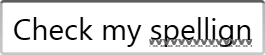
Both TextBox and RichTextBox offer built-in spellchecking. All
you need to do is set the SpellCheck.IsEnabled attached property to
True. As Figure 5-11 shows, this causes
“red squiggly” underlines, similar to those in Microsoft Word, to appear
under misspelled words.
The dictionary used for spellchecking honors the standard xml:lang attribute. Example 5-9 illustrates the use
of this attribute to select French. From code, setting the element’s
Language property has the same
effect.
<TextBox xml:lang="fr-FR" SpellCheck.IsEnabled="True"
         AcceptsReturn="True" />
As Figure 5-12 shows, this causes correctly spelled French to be accepted. But incorrect French and correct English will be underlined.

Label
Some controls do not have their own built-in caption; the most
widely used example is the TextBox
control. Label is used to provide a
caption for such controls. This might appear to be redundant, because
you can achieve the same visual effect without a full control—you
could just use the low-level TextBlock element. However, Label has an important focus handling
responsibility.
Well-designed user interfaces should be easy to use from the
keyboard. A common way of achieving this is to provide access keys.
You’ve already seen how to add an access key to a button, using either
an underscore in the text, or an explicit AccessText element. This is straightforward
for controls with an integral caption, such as a button. The TextBox poses slightly more of a challenge
than a Button when it comes to
access keys. A TextBox does not
have an intrinsic caption—the only text it displays is the text being
edited. The caption is supplied by a separate element to the left of
the TextBox, as shown in Figure 5-13.
This is where the Label
control comes in. The purpose of the Label control is to provide a place to put a
caption with an access key. When the access key is pressed, the
Label will redirect the focus to
the relevant control, which in this case is a TextBox.
Tip
Just as with a Button, you
can denote a Label control’s
access key by preceding the letter with an underscore.
How does the Label know to
which control it should redirect its access key? Label has a Target property, indicating the intended
target of the access key. We use a binding expression to connect the
label to its target. (We discuss binding expressions in detail in
Chapter 6.) The expressions in Example 5-10 simply set the Target properties to refer to the named
elements.
<LabelTarget="{Binding ElementName=nameText}">_Name:</Label> <TextBoxx:Name="nameText"Width="70" /> <LabelTarget="{Binding ElementName=questText}">_Quest:</Label> <TextBoxx:Name="questText"Width="70" />
You must supply a Target. In
the absence of this property, the Label control does nothing useful. In
particular, it does not choose the next element in the UI tree or the
Z order. Pressing the access key for a label without a target will
just cause Windows to play the alert sound, indicating that it was
unable to process the input.
ToolTip
The ToolTip control allows a
floating label to be displayed above some part of the user interface. It
is an unusual control in that it cannot be part of the normal user
interface tree—you can use it only in conjunction with another element.
It becomes visible only when the mouse pointer hovers over the target
element, as Figure 5-14 shows.

To associate a ToolTip with its
target element, you set it as the ToolTip property of its target, as shown in
Example 5-11.
<TextBox Width="100">
  <TextBox.ToolTip>
    <ToolTip Content="Type something here" />
  </TextBox.ToolTip>
</TextBox>
In fact, you don’t need to specify the ToolTip object explicitly. You can just set
the ToolTip property to a string, as
shown in Example 5-12.
If you set the property to anything other than a ToolTip, WPF creates the ToolTip control for you, and sets its Content property to the value of the target
element’s ToolTip property. Example 5-11 and Example 5-12 are therefore
equivalent.
ToolTip derives from ContentControl, so its content is not
restricted to simple strings—we can put anything we like in there, as
shown in Example 5-13.
<TextBox Width="100">
  <TextBox.ToolTip>
    <TextBlock FontSize="25">
      <Ellipse Fill="Orange" Width="20" Height="20" />
      Plain text is <Italic>so</Italic>
      <Span FontFamily="Old English Text MT">last century</Span>
      <Ellipse Fill="Orange" Width="20" Height="20" />
    </TextBlock>
  </TextBox.ToolTip>
</TextBox>
Figure 5-15 shows the results.
Note that the tool tip will normally close as soon as the mouse pointer
moves over it. This means that although it is possible to put
interactive elements such as buttons inside a tool tip, it’s not
typically a useful thing to do, because it’s not possible to click on
them. However, it is possible to subvert the auto-close behavior: you
can force the tool tip to open before the user hovers over the target by
setting its IsOpen property to
True. This causes the tool tip to
open immediately, and to remain open for as long as the target element’s
window has the focus. Or if you set IsOpen to True and also set StaysOpen to False, it will open immediately, and remain
open until you click somewhere outside of the tool tip. In these cases,
you could host interactive content inside a tool tip.

Tip
The ToolTip is shown in its
own top-level window. This is useful for tool tips on elements near
the edge of your window—if the tool tip is large enough that it flows
outside of the main window, it won’t be cropped.
GroupBox and Expander
GroupBox and Expander are very similar controls: both
provide a container for arbitrary content and a place for a header on
top. Figure 5-16 shows both
controls. Aside from their different appearances, the main difference
between these controls is that the Expander can be expanded and collapsed; the
user can click on the arrow at the top left to hide and show the
content. A GroupBox always shows its
content.
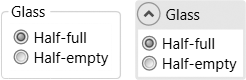
Both controls derive from HeaderedContentControl, which in turn derives
from ContentControl. So, we can place
whatever content we like directly inside the control, as shown in Example 5-14.
<StackPanel Orientation="Horizontal">

 <GroupBox Header="Glass">
    <Border Margin="2" Background="White" Padding="3">
      <StackPanel>
        <RadioButton Content="Half-full" IsChecked="True" />
        <RadioButton Content="Half-empty" />
      </StackPanel>
    </Border>
  </GroupBox>

 <Expander Header="Glass" IsExpanded="True"
       Background="#def" VerticalAlignment="Center" MinWidth="90"
       Margin="10,0">
    <Border Margin="2" Background="White" Padding="3">
      <StackPanel>
        <RadioButton Content="Half-full" IsChecked="True" />
        <RadioButton Content="Half-empty" />
      </StackPanel>
    </Border>
  </Expander>

</StackPanel>
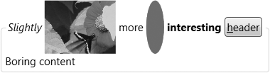
The HeaderedContentControl
supports a dual form of content model: not only can the body of an
Expander or GroupBox be anything you like, so can the
header. Example 5-15 uses a mixture of
text, video, graphics, and a control.
<GroupBox>
 <GroupBox.Header>
    <StackPanel Orientation="Horizontal">
      <TextBlock Text="Slightly " FontStyle="Italic" VerticalAlignment="Center" />
      <MediaElement Source="C:UsersPublicVideosSample VideosButterfly.wmv"
                    Width="80" />
      <TextBlock Text=" more " VerticalAlignment="Center" />
      <Ellipse Fill="Red" Width="20" Height="60" />
      <TextBlock Text=" interesting " VerticalAlignment="Center"
                 FontWeight="Bold" />
      <Button Content="_header" VerticalAlignment="Center" />
    </StackPanel>
  </GroupBox.Header>
  <TextBlock Text="Boring content" />
</GroupBox>
Figure 5-17 shows the results.
List Controls
WPF offers several controls that can present multiple items.
ListBox, ComboBox, and ListView can all present a linear sequence of
items. TreeView presents a hierarchy
of items. The TabControl may not seem
like an obvious relative of the ListBox, but it shares the basic features: it
presents a sequence of items (tab pages) and lets the user choose which
is the current item. All of these controls share a common base class,
ItemsControl.
The simplest way to use any of these controls is to add content to
their Items property. Example 5-16 shows the markup for a ComboBox with various elements added to its
Items.[24]. This example illustrates that all list controls allow any
content to be used as a list item—we’re not restricted to plain text.
This content model makes these list controls much more powerful than
their Win32 equivalents.
<ComboBox>
  <Button>Click!</Button>
  <TextBlock>Hello, world</TextBlock>
  <StackPanel Orientation="Horizontal">
    <TextBlock>Ellipse:</TextBlock>
    <Ellipse Fill="Blue" Width="100" />
  </StackPanel>
</ComboBox>
You also can use this technique with ListBox, TabControl and ListView. (TreeView is a little more involved, as the
whole point of that control is to show a tree of items, rather than a
simple list. We’ll see how to do that later.) As you can see in Figure 5-18, each control
presents our items in its own way. The ListBox and ComboBox generate a line in the list for each
item. The ListView does something
similar, although the lines it generates can display one item for each
column if necessary. The TabControl
puts each element in its own TabItem,
in order to present it in its own tab page. (Figure 5-18 shows just the
third item, but the other three are accessible through the three tab
headers.)

All controls derived from ItemsControl wrap items in order to present
them in a suitable way. This process is referred to as item container generation. Each control has a
corresponding container type, such as ComboBoxItem, ListBoxItem, TabItem,
ListViewItem, and TreeViewItem. Although the automatic container
generation can be convenient, in some cases you will want a little more
control. For example, the TabControl
shown in Figure 5-18
isn’t particularly useful—it has wrapped our items with tabs that have
no title. To fix this, we simply provide our own TabItem elements instead of letting the
TabControl generate them for us. We
can then set the Header property in
order to control the tab page caption, as Example 5-17 shows.
<TabControl>

  <TabItem Header="_Button">
    <Button>Click!</Button>
  </TabItem>

  <TabItem>
    <TabItem.Header>
      <TextBlock FontSize="18" FontFamily="Palatino Linotype">
        <AccessText>_Text</AccessText>
      </TextBlock>
    </TabItem.Header>

    <TextBlock>Hello, world</TextBlock>
  </TabItem>

  <TabItem>
    <TabItem.Header>
      <Ellipse Fill="Blue" Width="30" Height="20" />
    </TabItem.Header>

    <StackPanel Orientation="Horizontal">
      <TextBlock>Ellipse:</TextBlock>
      <Ellipse Fill="Blue" Width="100" />
    </StackPanel>
  </TabItem>

</TabControl>
This TabControl contains the
same three items as before, but this time with the TabItem elements specified explicitly. In the
first of these, the Header property
has been set to the text “_Button”. This uses the header’s support of
the content model: this is why we can use underscores to denote
accelerators. (TabItem derives from
HeaderedContentControl—the same base
class as GroupBox and Expander.) The other two items exploit the
content model’s support for nested content—the first uses a TextBlock to control the text appearance, and
the second puts an Ellipse into the
header instead of text. Figure 5-19 shows the
results.

Providing a fixed set of elements through the Items property makes sense for tab pages and
radio buttons, where you are likely to know what elements are required
when you design the user interface. But this may not be the case for
combo boxes and lists. To enable you to decide what items will appear at
runtime, all list controls offer an alternative means of populating the
list: data binding. Instead of using Items, you can provide a data source object
through the ItemsSource property, and
use data templates to determine how the elements appear. These
techniques are described in Chapter 6 and
Chapter 8.
Regardless of whether you use a fixed set of items or a bound data
source, you can always find out when the selected item changes by
handling the relevant event: SelectedItemChanged for the TreeView and SelectionChanged for the other controls. You
can then use either the SelectedItem
property (supported by all controls), or SelectedIndex (supported by everything except
TreeView) to find out which item is
currently selected.
The ListView and TreeView controls have a few extra features
that make them slightly different to use than the other controls in this
section. So, we will now look at the differences.
List View
ListView derives from
ListBox, adding support for a
grid-like view. To use this, you must give the View property a GridView[25] object describing the columns in the list. Example 5-18 shows a simple
example.
<ListView>
  <ListView.View>
    <GridView AllowsColumnReorder="true">
      <GridViewColumn Header="Name" />
      <GridViewColumn Header="Line Spacing" />
      <GridViewColumn Header="Sample" />
    </GridView>
  </ListView.View>
</ListView>
Figure 5-20 shows the
result. By default, the ListView
sets the column sizes to be as large as necessary—either as wide as
the header or as wide as required by the column content. You can also
specify a Width property if you
prefer. The Header property
supports the content model, so you are not limited to text for column
headers.
Tip
If you are using data binding, you will probably want to set
the column widths manually, because virtualization makes the
auto-sizing behavior slightly unpredictable. By default, a
data-bound ListView will
virtualize items (i.e., it only creates the UI elements for list
rows when they become visible). This significantly improves
performance for lists with large numbers of items, but it means the
control cannot measure every single list item upfront—it can measure
only the rows it has created. So if you use automatic sizing, the
columns will be made large enough to hold the rows that are
initially visible. If there are larger items further down the list
and not yet in view, the columns will not be large enough to
accommodate these.

Our ListView isn’t very
interesting yet, as it doesn’t contain any items. You can add user
interface elements as children, and they will be added to the Items property as before. However, this
isn’t terribly useful, because this doesn’t provide a way of filling
in each column in the list. Providing explicit ListViewItem containers doesn’t help
either—these don’t do anything more than the basic ListBoxItem. ListView isn’t designed to be
used with user interface elements in its Items property: it is really intended for
data binding scenarios. We will cover data binding in detail in the
next two chapters, but in order to show the ListView in action, we must see a sneak
preview. Example 5-19 creates a
populated ListView with three
columns.
<ListView ItemsSource="{x:Static Fonts.SystemFontFamilies}">
  <ListView.View>
    <GridView>
      <GridViewColumn Header="Name"
              DisplayMemberBinding="{Binding Source}" />

      <GridViewColumn Header="Line Spacing"
                      DisplayMemberBinding="{Binding LineSpacing}" />

      <GridViewColumn Header="Sample">
        <GridViewColumn.CellTemplate>
          <DataTemplate>
<TextBlock FontFamily="{Binding}" FontSize="20"
               Text="ABCDEFGabcdefg" />
</DataTemplate>
</GridViewColumn.CellTemplate>
      </GridViewColumn>
    </GridView>
  </ListView.View>
</ListView>
The control has been data-bound to the collection of FontFamily objects returned by the static
Fonts.SystemFontFamilies property.
This effectively fills the control’s Items collection with those FontFamily objects. The GridView then specifies three columns. The
first two use the DisplayMemberBinding property to indicate
what should be displayed. The binding expressions here simply extract
the Source and LineSpacing properties from the FontFamily object for each row. The third
column uses the alternative mechanism: the CellTemplate property. This allows you to
define a DataTemplate specifying
arbitrary markup to be instantiated for each row—in this case a
TextBlock is used, with its
FontFamily property bound to the
FontFamily object for the row. This
allows a preview sample of the font to be generated. Figure 5-21 shows the results.
Tip
Setting the DisplayMemberBinding property on a
particular column causes the CellTemplate property to be ignored on
that column, because the two are different mechanisms for
controlling the same thing. DisplayMemberBinding is provided for
convenience—it offers an easy way to display just a single piece of
information from the source in a TextBlock without having to provide a
complete template.

Because the CellTemplate
property lets us put arbitrary content into a column, we are not
limited to displaying fixed content. As Figure 5-22 shows, we are
free to create columns that contain controls such as checkboxes and
text boxes.

Again, this requires the ListView to be bound to a data source, a
technique that will be explained in the next chapter. But as a
preview, the markup for Figure 5-22 is shown in Example 5-20.
<Grid HorizontalAlignment="Center" VerticalAlignment="Center">
  <Grid.Resources>
    <XmlDataProvider x:Key="src" XPath="/Root">
      <x:XData>
        <Root xmlns="">
          <Item id="One" flag="True" value="A" />
          <Item id="Two" flag="True" value="B" />
          <Item id="Three" flag="False" value="C" />
          <Item id="Four" flag="True" value="D" />
        </Root>
      </x:XData>
    </XmlDataProvider>
  </Grid.Resources>

  <ListView DataContext="{StaticResource src}"
            ItemsSource="{Binding XPath=Item}">
    <ListView.View>

      <GridView>
        <GridViewColumn Header="ID"
                        DisplayMemberBinding="{Binding XPath=@id}" />
        <GridViewColumn Header="Enabled">
          <GridViewColumn.CellTemplate>
            <DataTemplate>
              <CheckBox IsChecked="{Binding XPath=@flag}" />
            </DataTemplate>
          </GridViewColumn.CellTemplate>
        </GridViewColumn>
        <GridViewColumn Header="Value">
          <GridViewColumn.CellTemplate>
            <DataTemplate>
              <TextBox Text="{Binding XPath=@value}" Width="70" />
            </DataTemplate>
          </GridViewColumn.CellTemplate>
        </GridViewColumn>
      </GridView>
    </ListView.View>
  </ListView>
</Grid>
The data source in this case is an embedded XML data island, but
any data source would work. The interesting feature of this example is
the use of the CellTemplate in the
GridViewColumn definitions. By
providing templates with controls, we have made the ListView editable. And by the wonder of data
binding, when the user makes changes with these controls, those
changes will be written back into the data source. Binding expressions
and data templates will be explained in detail in the next two
chapters.
Tree View
The TreeView control presents
a hierarchical view, instead of the simple linear sequence of items
the other list controls present. This means the TreeViewItem container needs to be able to
contain nested TreeViewItem
elements. Example 5-21 shows how this is
done.
<TreeView>
  <TreeViewItem Header="First top-level item" IsExpanded="True">
    <TreeViewItem Header="Child" />
    <TreeViewItem Header="Another child" IsExpanded="True">
      <TreeViewItem Header="Grandchild" />
      <TreeViewItem Header="Grandchild 2" />
    </TreeViewItem>
    <TreeViewItem Header="A third child" />
  </TreeViewItem>
  <TreeViewItem Header="Second top-level item">
    <TreeViewItem Header="Child a" />
    <TreeViewItem Header="Child b" />
    <TreeViewItem Header="Child c" />
  </TreeViewItem>

  <TreeViewItem IsExpanded="True">
    <TreeViewItem.Header>
      <StackPanel Orientation="Horizontal">
        <Ellipse Fill="Blue" Width="15" Height="15" />
                <TextBlock Text="Third top-level item" />
                <Ellipse Fill="Blue" Width="15" Height="15" />
            </StackPanel>
        </TreeViewItem.Header>

        <TreeViewItem Header="Child a" />
        <TreeViewItem Header="Child b" />
        <TreeViewItem Header="Child c" />
    </TreeViewItem>
</TreeView>
As Figure 5-23 shows, this defines a TreeView with nested items. Each TreeViewItem corresponds to a node in the
tree, with the Header property
supplying the caption for each node. This is another form of content
model, allowing us to use either plain text, or, as the third of the
top-level items illustrates, nested content.

As with the other list controls, you can discover which item is
selected with the SelectedItem
property and the SelectedItemChanged event. But unlike the
other controls, there is no SelectedIndex. Such a property makes sense
for controls that present a linear list of items, but it would not
work so well for a tree.
Because TreeView derives from
ItemsControl, it supports data
binding—you can point its ItemsSource at a list of objects and it will
generate a TreeViewItem for each
item. Of course, the point of a tree view is to display a hierarchy of
items. TreeView therefore supports
hierarchical data binding, an extension of basic list binding that
determines how child items are discovered. Hierarchical binding is
described in Chapter 7.
Menus
Many windows applications provide access to their functionality
through a hierarchy of menus. These are typically presented either as a
main menu at the top of the window, or as a pop-up “context” menu. WPF
provides two menu controls. Menu is
for permanently visible menus (such as a main menu), and ContextMenu is for context menus.
Tip
Menus in pre-WPF Windows applications are typically treated
differently from other user interface elements. In Win32, menus get a
distinct handle type and special event handling provisions. In Windows
Forms, most visible elements derive from a Control base class, but menus do not. This
means that menus tend to be somewhat inflexible—some user interface
toolkits choose not to use the built-in menu handling in Windows
simply to avoid the shortcomings. In WPF, menus are just normal
controls, so they do not have any special features or
restrictions.
Both kinds of menus are built in the same way—their contents
consist of a hierarchy of MenuItem
elements. Example 5-22 shows a typical example.
<Menu>
  <MenuItem Header="_File">
    <MenuItem Header="_New" />
    <MenuItem Header="_Open..." />
    <MenuItem Header="_Save" />
    <MenuItem Header="Sa_ve As..." />
    <Separator />
    <MenuItem Header="Page Se_tup..." />
    <MenuItem Header="_Print..." />
    <Separator />
    <MenuItem Header="E_xit" />
  </MenuItem>
  <MenuItem Header="_Edit">
    <MenuItem Header="_Undo" />
    <MenuItem Header="_Redo" />
    <Separator />
    <MenuItem Header="Cu_t" />
    <MenuItem Header="_Copy" />
    <MenuItem Header="_Paste" />
    <MenuItem Header="_Delete" />
    <Separator />
    <MenuItem Header="Select _All" />
  </MenuItem>
  <MenuItem Header="_Help">
    <MenuItem Header="Help _Topics" />
    <MenuItem Header="_About..." />
  </MenuItem>
</Menu>
Figure 5-24 shows the results.

ContextMenu is used in a very
similar way, although the appearance is different. The top level of a
Menu appears as a horizontal bar,
which you would typically put at the top of a window, but context menus
do not have this bar, their top level consisting of a pop up. This means
that a context menu needs a UI element from which to launch this pop up.
You attach a context menu to an element by setting that element’s
ContextMenu property. Example 5-23 shows a Grid element with a ContextMenu.
<Grid Background="Transparent">
  <Grid.ContextMenu>
    <ContextMenu>
      <MenuItem Header="Foo" />
      <MenuItem Header="Bar" />
    </ContextMenu>
  </Grid.ContextMenu>
...
</Grid>
With this context menu in place, a right-click anywhere on the
grid will bring up the context menu. (The grid’s Background property has been set to ensure
that this will work—if the Background
has its default null value, the grid will effectively be invisible to
the mouse unless the mouse is over one of the grid’s children. Using a
Transparent brush makes the grid
visible to the mouse, without making it visually opaque.) Figure 5-25 shows the context menu in action.

Each MenuItem has a Header property. For children of a Menu, the header determines the label shown on
the menu bar. For a MenuItem nested
either in a ContextMenu or inside
another MenuItem, the Header contains the content for that menu
line. The Header property supports
the content model, so it allows either plain text with optional
underscores to denote access keys, as shown in Example 5-22, or nested content. Example 5-24 shows a modified
version of one of the menu items, exploiting the ability to add
structure in order to add some graphics into the menu.
<MenuItem>
  <MenuItem.Header>
    <StackPanel Orientation="Horizontal">
      <AccessText>_New...</AccessText>
      <Ellipse Fill="Blue" Width="40" Height="15" Margin="10,0" />
    </StackPanel>
  </MenuItem.Header>
</MenuItem>
Note that it’s now necessary to supply an AccessText element if we want an access key.
With plain-text headers, this element was generated for us
automatically, but once nested content is in use, we need to define it
explicitly. Figure 5-26 shows the
results.

The menu in Example 5-22 doesn’t do anything
useful, because there are no event handlers or commands specified. There
are two ways in which you can hook a MenuItem up to some code. You can handle its
Click event in much the same way that
you would handle a button click. Alternatively, you can set the Command property on the MenuItem, as was described in Chapter 4.
Example 5-25 shows a modified
version of the Edit submenu with menu items associated with the relevant
standard commands. As long as the focus is in a control such as TextBox or RichTextBox that understands these standard
commands, the commands will be handled without needing any explicit
coding. If the focus is not in such a control, the commands will simply
bubble up. For example, the command can be handled by a command binding
registered for the window. If nothing handles the command, it will be
ignored.
<MenuItem Header="_Edit">

    <MenuItem Header="_Undo" Command="Undo" />
    <MenuItem Header="_Redo" Command="Redo"/>
    <Separator />
    <MenuItem Header="Cu_t" Command="Cut" />
    <MenuItem Header="_Copy" Command="Copy" />
    <MenuItem Header="_Paste" Command="Paste" />
    <MenuItem Header="_Delete" Command="Delete" />
    <Separator />
    <MenuItem Header="Select _All" Command="SelectAll" />
</MenuItem>
If you were to remove the Header properties from Example 5-25, you would find that the menu items
all still appear with the correct header text for the commands. This is
because RoutedUICommand knows the
display name for the command it represents, and MenuItem is able to extract the name. However,
there is one problem with taking advantage of this: you will lose the
accelerators. RoutedUICommand cannot
prescribe a particular access key, because access keys should be unique
within the scope of a particular menu. If a menu assigns the same access
key to more than one item in a menu, ambiguity ensues, and pressing the
access key will simply highlight the menu item rather than selecting it,
with further key presses alternating between the choices. This
significantly reduces how effectively access keys streamline user
input.
To guarantee a unique key for each menu item, a developer must
coordinate access keys with knowledge of which commands are used in
which menus. So, the appropriate place to assign access keys is the
menu, not the command. Imagine you’re writing a custom command of your
own—how would you choose which access key to use? You would be able to
choose only if you knew what other commands will be sharing a menu with
your command. Now consider WPF’s built-in commands—these will be used in
all sorts of contexts in any number of applications, and because there
are considerably more built-in commands than there are keys on the
keyboard, Microsoft cannot possibly assign access keys in a way
guaranteed to prevent ambiguity. Commands therefore don’t get to specify
the access key. So, in practice, you will normally want to define the
Header property for menu items
associated with commands, even though it may appear to be
optional.
Menu items often have a shortcut key as well as an access key. The access key works only when the menu is open. A shortcut such as Ctrl-S (for save) works whether the menu is open or not. Of course, the menu isn’t responsible for binding the control shortcut to the key gesture—as we saw in Chapter 4, we associate inputs with commands using input bindings. However, menus conventionally display shortcuts in order to help users discover them.
If a menu item’s Command has an
associated shortcut key, WPF will automatically display this in the
menu. Example 5-25 uses standard clipboard
and undo/redo commands, and these all have default shortcuts, so the
menu reflects this, as you can see in Figure 5-27.

If, for some reason, you choose not to use WPF’s command
system—maybe you have an existing application framework that provides
its own command abstraction—you can still display a shortcut. MenuItem provides an InputGestureText property that lets you choose
the text that appears in the normal place for such shortcuts. Example 5-26 shows a menu item
with both a shortcut and an access key.
<MenuItem Header="_New" InputGestureText="Ctrl+N" />Menu and ContextMenu both derive indirectly from
ItemsControl, the same base class as
all of the list controls. This means that you can use the ItemsSource property to populate a menu using
hierarchical data binding rather than fixed content. This could be
useful if you want to make your menu structure reconfigurable. See Chapter 6 for more details on how to use data
binding.
Toolbars
Most Windows applications offer toolbars as well as menus. Toolbars provide faster access for frequently used operations, because the user does not need to navigate through the menu system—the toolbar is always visible on-screen. Figure 5-28 shows a pair of typical toolbars.

WPF supports toolbars through the ToolBarTray and ToolBar controls. ToolBarTray provides a container into which
you can add multiple ToolBar
elements. Example 5-27 shows a simple
example with two toolbars; this is the markup for the toolbars in Figure 5-28.
<ToolBarTray>
  <ToolBar>
    <Button>
      <Canvas Width="16" Height="16" SnapsToDevicePixels="True">
        <Polygon Stroke="Black" StrokeThickness="0.5"
                 Points="2.5,1.5 9.5,1.5 12.5,4.5 12.5,15 2.5,15">
          <Polygon.Fill>
            <LinearGradientBrush StartPoint="1,1" EndPoint="0.2,0.7">
              <GradientStop Offset="0" Color="#AAA" />
              <GradientStop Offset="1" Color="White" />
            </LinearGradientBrush>
          </Polygon.Fill>
        </Polygon>
        <Polygon Stroke="Black" Fill="DarkGray" StrokeThickness="0.5"
                 StrokeLineJoin="Bevel"
                 Points="9.5,1.5 9.5,4.5 12.5,4.5" />
      </Canvas>
    </Button>

    <Button>
      <Canvas Width="16" Height="16" >
        <Polygon Stroke="Black" StrokeThickness="0.5" Fill="Khaki"
                 SnapsToDevicePixels="True"
                 Points="0.5,14.5 0.5,4.5 1.5,3.5 6.5,3.5 8.5,5.5
                         12.5,5.5 12.5,14.5" />
        <Polygon Stroke="Black" SnapsToDevicePixels="True"
                 StrokeThickness="0.5"
                 Points="1.5,14.5 4.5,7.5 15.5,7.5 12.5,14.5" >
          <Polygon.Fill>
            <LinearGradientBrush StartPoint="0.25,0" EndPoint="0.5,1">
              <GradientStop Offset="0" Color="#FF4" />
              <GradientStop Offset="1" Color="#CA7" />
            </LinearGradientBrush>
          </Polygon.Fill>
        </Polygon>
        <Path    Stroke="Blue" StrokeThickness="1"
                 Data="M 8,2 C 9,1 12,1 14,3"  />
        <Polygon Fill="Blue" Points="15,1 15.5,4.5 12,4" />
      </Canvas>
    </Button>
  </ToolBar>
  <ToolBar>
    <Button>Second toolbar</Button>
    <CheckBox IsChecked="True">Choice</CheckBox>
  </ToolBar>
</ToolBarTray>
This contains just two toolbars, with a couple of buttons each. In
this example, we have used some simple vector graphics to draw the usual
New and Open icons. The graphical elements used are explained in more
detail in Chapter 13. In practice, you would rarely put
graphics inline like this—you would usually expect drawings to be
resources that are simply referred to by the buttons in the toolbar. See
Chapter 12 for more details. The second toolbar just
uses the default visuals for a Button
and a CheckBox. As you can see, these
take on a flat, plain appearance when they appear in a toolbar.
Because toolbar buttons are just normal Button or CheckBox elements with specialized visuals,
there is nothing particularly special about their behavior. Toolbars
just provide a particular way of arranging and presenting controls. You
can also add other elements such as a TextBox or ComboBox. These will just be arranged on the
toolbar along with the buttons.
GridSplitter
GridSplitter lets you offer the
user a way to adjust the layout of your application, by changing the
size of a column or row in a grid. This lets you provide a similar
feature to Windows Explorer, where if you turn on the folder view, or
one of the other panels that can appear on the lefthand side of a
window, you can change the amount of space available to the panel by
dragging on the vertical bar between the panel and the main area. You
can use GridSplitter only to
rearrange a Grid panel (see Example 5-28).
<Grid Height="100" Width="400">
  <Grid.ColumnDefinitions>
    <ColumnDefinition Width="1*" />
    <ColumnDefinition Width="6" />
    <ColumnDefinition Width="2*" />
  </Grid.ColumnDefinitions>

  <Ellipse Grid.Column="0" Fill="Red" />
  <GridSplitter Grid.Column="1" HorizontalAlignment="Stretch" />
  <Ellipse Grid.Column="2" Fill="Blue" />
</Grid>
This puts a GridSplitter into
the middle of the three columns. As Figure 5-29
shows, if the user moves the mouse over the GridSplitter, the mouse pointer changes to the
horizontal resize arrow. Dragging the slider resizes the columns on
either side.

Where Are We?
Controls are the building blocks of applications. They represent the features of the interface with which the user interacts. Controls provide behavior, and they rely on styling and templates to present an appearance. WPF provides a set of built-in controls based on the controls commonly used in Windows applications. WPF significantly reduces the need for custom controls. In part, this is enabled by content models, but as we will see in Chapter 8 and Chapter 9, the extent to which built-in controls can be customized means that custom controls are necessary only in the most specialized of circumstances.
[23] * An upshot of this is that tools that know how to deal with Win32 controls will often not understand WPF controls. For example, the SDK Spy++ utility that lets you delve into the structure of a Win32 UI sees WPF applications as just one big HWND filling the entire window. (Fortunately, the UISpy SDK tool and the excellent WPF Snoop utility at http://www.blois.us/snoop/fills the gap left by Spy++.) However, WPF controls integrate with the accessibility features in Windows, so screen reader and automated test tools that use the automation APIs will typically continue to work.
[24] * This example does not mention the
Items property explicitly because
children of a ComboBox element in
XAML get added to its Items
property automatically. Appendix A details how XAML
content is assigned to properties.