
Capacity Planning and ROI are both tools that let you manage different features of a portfolio of projects. Capacity planning helps you to ensure that you have the resources to perform the project work, while ROI lets you calculate which projects will yield the best return on capital. In this chapter we introduce the capacity planning feature of P6 and review the following topics:
- Capacity Planning screens
- Customization
- Return on Investment (ROI)
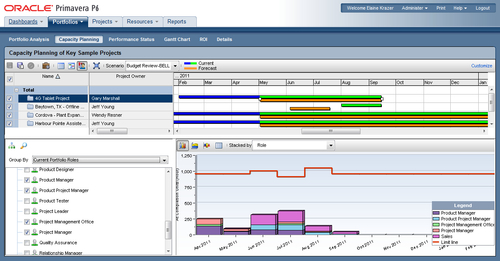
The Capacity Planning screen of the Portfolios section is a very powerful feature that allows users to clearly see which skills or equipment will be needed to complete a group of projects. The feature gives the user a windscreen (forward facing) view of resource usage and the landscape ahead. If the analysis highlights the fact that more cranes are needed, users have data to support decisions, such as renting or purchasing more cranes or moving the project to different dates to avoid over-allocation. This feature is best used when planning or bidding on future projects by allowing a user to stack all project timelines onto a single Gantt chart and view the resources needed month-by-month or per quarter as each bid or project is moved.

There is a lot going on in the previous screenshot! Let's break it down into more manageable sections.
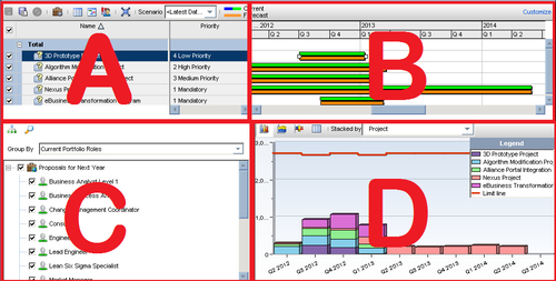
Frame A is a scorecard area with a list of all projects within the currently open portfolio. As with any scorecard, you may add columns to this view. To add columns, click on the Customize link at top right of frame A. In this customize screen, users can choose columns to show, select how the projects are grouped, set up a waterline analysis, and select a type of chart to view.
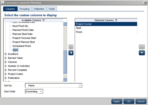
As in most areas of P6, to select a column to view, simply highlight it within the list on the left-hand side and use the arrow in the space between the two lists to send the selected column to the Selected Columns list on the right. Using the set of arrows at far right-hand side, users can re-order the columns in the view. In the web, all changes must be saved by clicking on the OK button.
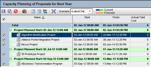
In the following example, we have removed the Project Owner column and added the Actual Total Cost column. The projects in the portfolio can be grouped using the Grouping tab of the Customize Capacity Planning window. Here we have grouped them by Project Planned Start.
If the grouping is simple, the color of text or band and the sort order are the only other adjustments to be made. However, if the criteria are hierarchical, you may select the number of indentions or level of the hierarchy to consider when grouping.
For example, suppose you have a hierarchical project code for location grouped by country, region, and then state.
In this case if we choose to group by location, then all regions and states will be listed together. However, if we choose to group using the To Level feature and group to level 3, all countries would be grouped together, and within that grouping would be a sub-group for each region, and within that grouping will be a grouping by state.

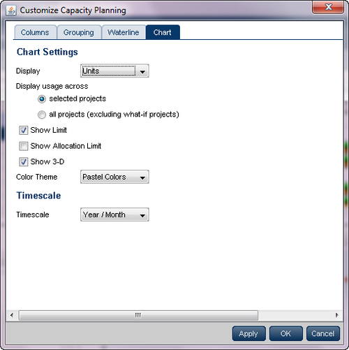
Using the Chart tab, users can change the Capacity Planning view to show Units or Costs in the Gantt chart, and can choose to display either only projects selected or the entire portfolio. Other adjustments can be made here to create a desired view.
Frame B is the top-right quarter of the Capacity Planning screen. This is the Gantt area where projects are represented using scheduled dates on the green bar. The orange bar is only seen in P6 on this screen and represents the forecast. The forecast bar will be the same as the schedule/current dates bar unless forecast dates are specifically used (which is not typical). The purpose of the two bars is best used when viewing bids or projects in the future.
The best feature of this frame is that its timeline is shared by area D, the capacity chart area. As the project lines are stacked against time in the Gantt area, they affect the histograms or other charts in the area just under—showing the capacity or workers it would take to complete the projects as forecasted. Therefore, if I move the orange (forecast) bar to the right or left, the chart area (D) also rearranges to show the different work effort in the new time frame.
In the following sample, several projects are shown top right and the second project forecast bar has been moved to earlier dates—to create a scenario in which we can evaluate the capacity of resources required to complete all the projects if we move one earlier.
Tip
If you move the bars without saving, no changes are permanent. However, if you move a project forecast bar and then use the Save button, the project is moved to the forecast bar dates and all dates within the project are changed to the new time frame (except constraints—they are generally a bad practice). The proper usage of this feature is to move the forecast bars to the desired dates and save as a scenario until you are certain the projects should be moved permanently. Scenarios can be used for decision-making and analysis.
The value of area B is best explained in combination with area C and D in mind.
The bottom-left frame C is a key element to capacity planning. This area is where the specific resources that we evaluate can be selected. This area has options to view resources in three ways:
- View only the roles assigned to projects in the currently selected portfolio
- View roles hierarchically as they are arranged in the system
- View roles by Role Teams. See more about Role Teams in Chapter 6, Resources

Another option in area C of Capacity Planning is the search feature where users may search for specific roles by name by using the first letter of the name or if the search criteria occur anywhere within the name.
The bottom- right pane of the Capacity Planning screen is where the magic happens; this is the area that displays the effect of the choices made in the three areas (A, B, and C). area D—the Capacity Planning Chart Work area. Based on projects shown in area A (scorecard area) and time frames selected in area B (Gantt area), and using the selected roles in area C, the capacity planning chart will show resources needed to accomplish the work in those projects for those roles in that timeframe.
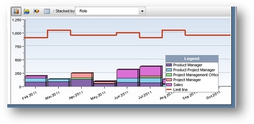
The limit line is set as the cumulative for all the selected roles and there are three types of charts for analysis. Look at each one for a full view of the situation.
For example, following are four specific roles related to sales and the project office (PM, Project Lead, Product lead, and Product PM). The limit line is the sum of hours for those roles available to the company (see Chapter 6 for more on the limit line settings). The projects (as they are in the Gantt chart) have these roles assigned to them and the total hours required for those roles is charted.
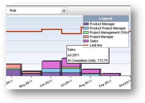
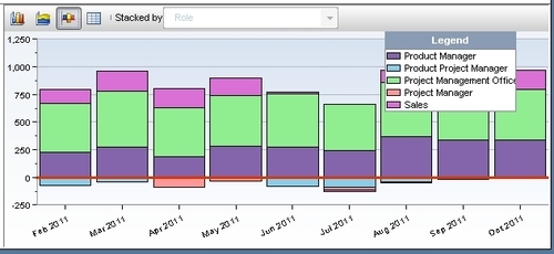
The first view shown is the stacked histogram sorted by role. By using this chart, users can evaluate spikes in usage of certain roles (see pink sales team in June and July) as well as overall allocation. By rolling a cursor over each stack in the histogram, details about the layers are shown.
Closer examination of the details shows a need for 173.75 hours of sales activities on the selected projects during July. If your company has only 20 salespersons working for eight hour per day, then you can expect 13.75 hours of overtime that month or move some activity to another time to avoid hiring or retraining.
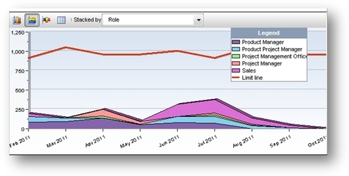
The second view choice is an area chart view. The area chart shows spikes in the overall portfolio. The selected portfolio of projects will create a spike of activity in April (mostly project managers) and another spike in June and July with sales being most active and product project managers being busy.
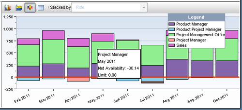
The third view option is the net availability chart view. This view allows a user to clearly see where the skill sets throughout the organization will be over allocated and by how many hours. This view is much like a waterline report where items under the line are over allocated:
If a user scrolls over the items under the red line, it's clear which roles are over allocated for that time frame. In this example, the project managers group is over allocated by 87.01 hours in April, 30.14 in May, and 30.14 in July.
All the data behind the chart may be viewed by clicking on the spreadsheet icon next to the views:

Dynamically as users move the forecast bars across the Gantt chart, the allocations change in the chart area for the selected roles. Entire role teams or individual roles may be selected as desired. Keep in mind, the allocations are only for the projects within the selected portfolio and will be different across all projects (likely a more severe over allocation than shown).