

09
Job:02-30056 Title: RP-Interior Design Reference and Specification
#175 Dtp:216 Page:146
(RAY)
134-153_30056.indd 146 3/4/13 7:35 PM
Text
14 6
THE INTERIOR DESIGN REFERENCE + SPECIFICATION BOOK
Saia Barbarese Topouzanov Architectes; Tétreault Parent Languedoc et Associés;
and Hal Ingberg. Photo by Marc Cramer.
Office dA. Photo by John Horner.
Simultaneous Contrast
Simultaneous contrast occurs as an optical il-
lusion: The complementary color of an applied
color is not itself objectively present, but appears
to be visible. Simultaneous contrast requires an
adjacent neutral color, or any other color that is
not complementary. The longer a background is
viewed, especially with more luminous colors, the
greater the intensity of the simultaneous effects.
Simultaneous contrasts are difficult to
capture photographically. In the Mon-
tréal Convention Centre, Saia Barbarese
Topouzanov playfully uses light against
painted color to suggest additional colors.
As the sun changes position and color
over the course of a day, new combina-
tions appear.
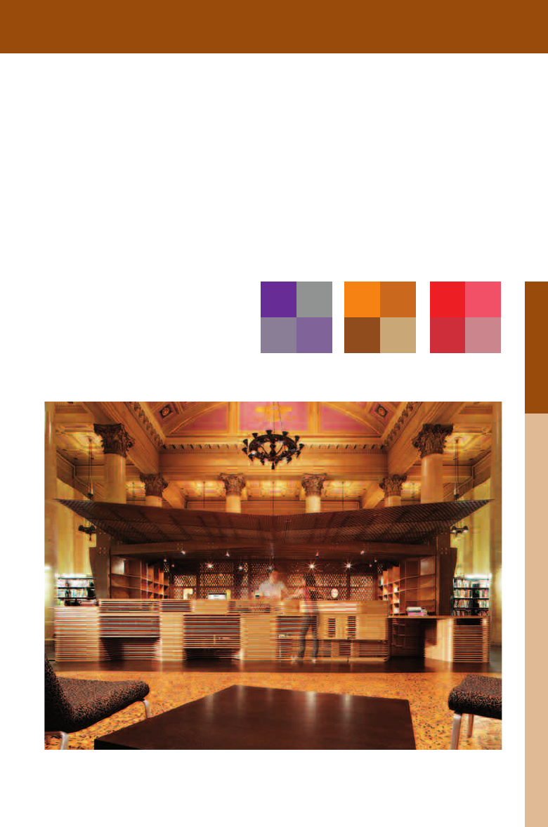
A library at the Rhode Island School
of Design by Office dA uses a natural
palette that lends itself to a contrast of
saturation. Various shades of browns
and yellows allow this intervention to fit
nicely within the classical architecture it
occupies. Accents of cooler colors in the
existing architecture also contribute to the
scheme’s success.
Job:02-30056 Title: RP-Interior Design Reference and Specification
#175 Dtp:216 Page:146
(RAY)
134-153_30056.indd 146 3/4/13 7:36 PM
09
Job:02-30056 Title: RP-Interior Design Reference and Specification
#175 Dtp:216 Page:147
Job:02-30056 Title: RP-Interior Design Reference and Specification
#175 Dtp:216 Page:146
(RAY)
134-153_30056.indd 147 3/4/13 7:35 PM
Text
147
Color
Saia Barbarese Topouzanov Architectes; Tétreault Parent Languedoc et Associés;
and Hal Ingberg. Photo by Marc Cramer.
Office dA. Photo by John Horner.
Contrast of Saturation
Color can be diluted via four methods to obtain dif-
ferent results: Adding white makes a color cooler;
adding black reduces the overall vitality of a color
and renders it more subdued and, in the absence
of light, quite dark; adding gray reduces the inten-
sity of a color and tends to neutralize it; adding the
complementary color produces various effects, de-
pending on the intensity of the colors being mixed,
their relative temperature, and their hue.
painted color to suggest additional colors.
A library at the Rhode Island School
of Design by Office dA uses a natural
palette that lends itself to a contrast of
saturation. Various shades of browns
and yellows allow this intervention to fit
nicely within the classical architecture it
occupies. Accents of cooler colors in the
existing architecture also contribute to the
scheme’s success.
Job:02-30056 Title: RP-Interior Design Reference and Specification
#175 Dtp:216 Page:147
Job:02-30056 Title: RP-Interior Design Reference and Specification
#175 Dtp:216 Page:146
(RAY)
134-153_30056.indd 147 3/4/13 7:36 PM

09
Job:02-30056 Title: RP-Interior Design Reference and Specification
#175 Dtp:216 Page:148
(RAY)
134-153_30056.indd 148 3/4/13 7:36 PM
Text
14 8
THE INTERIOR DESIGN REFERENCE + SPECIFICATION BOOK
Saturation
100 90 80 70 60 50 40 30 20 10 0
0 10 20 30 40 50 60 70 80 90 100
Shades
0 10 20 30 40 50 60 70 80 90 100
Tints
D’Aquino Monaco. Photo by Eric Laignel.
Hue
Contrast of Extension
Contrast of extension refers to the relative force
that a color exerts in relation to the other colors
in a system. Depending on the hue and value of
a color, careful consideration must be taken to
balance the addition of another color. The result
is a ratio that harmonizes the colors in play. Of
all the contrast rules, this is perhaps the most
subjective.
Balance is the fundamental principle behind
the contrast of extension. In this New York
townhouse, D’Aquino Monaco uses color
balance effectively—mixing paint, materials,
and accessories in a complex sequence
that achieves a sense of equilibrium.
COLOR TERMINOLOGY
Although it is difcult to talk about specic color through the use of nomenclature, it is impor-
tant to develop a vocabulary that can objectively evaluate the specic ways a color or set of
colors is being used. When discussing the effects of color, the following terms can serve as
the start of a common vocabulary.
1800K
Color Temperature
Job:02-30056 Title: RP-Interior Design Reference and Specification
#175 Dtp:216 Page:148
(RAY)
134-153_30056.indd 148 3/4/13 7:36 PM

09
Job:02-30056 Title: RP-Interior Design Reference and Specification
#175 Dtp:216 Page:149
Job:02-30056 Title: RP-Interior Design Reference and Specification
#175 Dtp:216 Page:148
(RAY)
134-153_30056.indd 149 3/4/13 7:36 PM
Text
149
Color
Saturation
100 90 80 70 60 50 40 30 20 10 0
0 10 20 30 40 50 60 70 80 90 100
Shades
0 10 20 30 40 50 60 70 80 90 100
Tints
D’Aquino Monaco. Photo by Eric Laignel.
Hue
Color Space: Refers to the nal output of a
color. RGB is typically used for illuminated
color, while CMY is used for absorptive
colors.
Color Temperature: Temperature of a light
source, measured in Kelvins. Lower tem-
peratures are considered warmer (adding a
yellow cast to objects), while higher tempera-
tures are considered cooler (adding a blue
cast to objects).
Hue: Gradation of color within a visible
spectrum.
Pantone: A color management system that is
used to specify consistent color for prints,
textiles, and paints.
Primary Colors: Group of colors that, when
mixed, can produce all other colors. Primary
colors cannot be made by other colors.
Secondary Colors: Colors that result from a
50 percent mixing of any two primary colors.
Saturation: Intensity of a color, expressed as
the degree to which it differs from white.
Schemes: Method of organizing color in
harmonious combinations.
Shades: Result of adding more black to an
existing color.
Tints: Result of adding more white to an
existing color.
Tones: Result of mixing a color with its com-
plement. An equal mix will result in a gray.
Balance is the fundamental principle behind
the contrast of extension. In this New York
balance effectively—mixing paint, materials,
COLOR TERMINOLOGY
Although it is difcult to talk about specic color through the use of nomenclature, it is impor-
tant to develop a vocabulary that can objectively evaluate the specic ways a color or set of
colors is being used. When discussing the effects of color, the following terms can serve as
the start of a common vocabulary.
1800K 5000K 16000K
Color Temperature
Job:02-30056 Title: RP-Interior Design Reference and Specification
#175 Dtp:216 Page:149
Job:02-30056 Title: RP-Interior Design Reference and Specification
#175 Dtp:216 Page:148
(RAY)
134-153_30056.indd 149 3/4/13 7:36 PM

09
Job:02-30056 Title: RP-Interior Design Reference and Specification
#175 Dtp:216 Page:150
(RAY)
134-153_30056.indd 150 3/4/13 7:36 PM
Text
150
THE INTERIOR DESIGN REFERENCE + SPECIFICATION BOOK
COLOR AND SPACE
The process by which color is chosen and utilized in a design has a profound effect on interior
space. The designer’s decisions can drastically change the spatial understanding of a project
and also influence how it is navigated. When used with knowledge and intent, color can add
perceived weight to surfaces, alter the basic proportions of a room, and variously be a calm-
ing or exciting factor. As the designer begins to explore and understand the surface effects of
color, it will become the basis of a rich visual and material palette.
Elements such as furni-
ture can emphasize the
volumetric reading of a
room. Here, the chairs,
matched with the red
walls, draw attention to
the room’s dimensions.
Volumetric Approaches to Color
Painting all aspects of a room the same color has the effect
of volumizing the space. This method of using color can be
particularly effective in making small spaces appear larger
or more intimate depending on the color choices. Volumetric
approaches work best in situations where they can be refer-
enced in sequence, such as an enfilade, or series of rooms
connected through doors.
Job:02-30056 Title: RP-Interior Design Reference and Specification
#175 Dtp:216 Page:150
(RAY)
134-153_30056.indd 150 3/4/13 7:36 PM
..................Content has been hidden....................
You can't read the all page of ebook, please click here login for view all page.