

09
Job:02-30056 Title: RP-Interior Design Reference and Specification
#175 Dtp:216 Page:141
Job:02-30056 Title: RP-Interior Design Reference and Specification
#175 Dtp:216 Page:140
(RAY)
134-153_30056.indd 141 3/4/13 7:35 PM
Text
141
Color
tie together a color scheme. Grays, too, have temperature. In the Pantone color system, cool
APPLYING RULES OF CONTRAST TO INTERIOR SPACE
In the seven variations on color contrast that Itten identified,
contrast was considered as a range of differences between the
compared effects of color interaction. The projects that follow
explore the practical application of Itten’s system to an interior
project—whether at the scale of a room or a building. As with
any system, continued exposure to and examination of the ef-
fects of each set of relationships will deepen understanding.
Materials have qualities of absorption, reflectance, and luminance that the abstract systems
of color do not take into account. Materials might contain many layers of color, and often vari-
within a three-dimensional space also affects how color is experienced. Through the complex
wood brown” holds true here. Materials with integral color—which require no finish other than
Color Schemes
Color schemes are the result of turning color combinations into a set of rules for an interior
palette. Grounded in color theory, the designer can creatively select and organize color in
harmonious combinations. In the abstract—that is, when color is not tied to a material—there
are six “classic” combinations of color: monochromatic, analogous, complementary, split
complementary, triadic, and tetradic. The examples below use a full-saturation color wheel,
but the designer can vary both saturation and brightness.
Analogous
Uses colors directly adjacent to the
chosen color. The prime color serves as
the dominant color in the scheme.
Monochromatic
Uses a single color in a variety of
saturations and lightnesses to unify
a scheme.
Complementary
High-contrast scheme developed
by paring the chosen color with that
directly opposite on the color wheel.
Split Complementary
Variation on the complementary
scheme that pairs the chosen color
with two adjacent colors.
Triadic
Uses colors equally spaced around the
color wheel. Produces high-contrast
schemes.
Tetradic
Uses two complementary color pairs.
Proportions of colors must be chosen
carefully to maintain balance.
Job:02-30056 Title: RP-Interior Design Reference and Specification
#175 Dtp:216 Page:141
Job:02-30056 Title: RP-Interior Design Reference and Specification
#175 Dtp:216 Page:140
(RAY)
134-153_30056.indd 141 3/4/13 7:36 PM

09
Job:02-30056 Title: RP-Interior Design Reference and Specification
#175 Dtp:216 Page:142
(RAY)
134-153_30056.indd 142 3/4/13 7:35 PM
Text
142
THE INTERIOR DESIGN REFERENCE + SPECIFICATION BOOK
eijkingdelouwere. Photo by Eric Laignel.
Ronan and Erwan Bouroullec. Photo courtesy of Maharam.
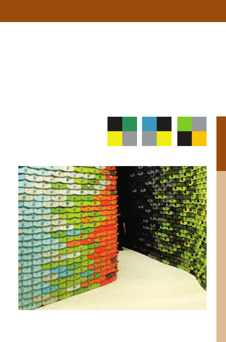
Contrast of Hue
The simplest of the rules, contrast of hue, func-
tions at the extremes of undiluted colors at the
greatest luminosity. Solutions that use contrast
of hue have a visual vibrancy and playful intensity.
This contrast always requires three colors, and it
is important to note that the effect lessens as the
colors move away from Itten’s three primaries.
For the interior of the SRK Legal Assist-
ance, the Dutch firm eijkingdelouwere use
contrast of hue to great effect. Colors
playfully interact through the space; lime-
yellows, blues, and reds in the felt poppy
figures lift the environment from staid
office to a lively series of colored spaces.
A showroom for the textile manufacturer
Kvadrat in Stockholm eschews the typical
neutral background for display in favor of
an innovative tile system developed by the
designers Ronan and Erwan Bouroullec.
The move from light to dark symbolizes a
shift in function—from open showrooms
to more intimate meeting spaces and
offices.
Job:02-30056 Title: RP-Interior Design Reference and Specification
#175 Dtp:216 Page:142
(RAY)
134-153_30056.indd 142 3/4/13 7:36 PM
09
Job:02-30056 Title: RP-Interior Design Reference and Specification
#175 Dtp:216 Page:143
Job:02-30056 Title: RP-Interior Design Reference and Specification
#175 Dtp:216 Page:142
(RAY)
134-153_30056.indd 143 3/4/13 7:35 PM
Text
143
Color
eijkingdelouwere. Photo by Eric Laignel.
Ronan and Erwan Bouroullec. Photo courtesy of Maharam.
Light-Dark Contrast
Light-dark contrast exists in the relationship be-
tween black and white—as well as in the range of
grays that exist between them. Itten saw gray as
an essentially achromatic color, shifting in rela-
tionship depending on the colors that surround it.
The key to this contrast is a deeper understand-
ing of shading and its effects.
ance, the Dutch firm eijkingdelouwere use
playfully interact through the space; lime-
yellows, blues, and reds in the felt poppy
office to a lively series of colored spaces.
A showroom for the textile manufacturer
Kvadrat in Stockholm eschews the typical
neutral background for display in favor of
an innovative tile system developed by the
designers Ronan and Erwan Bouroullec.
The move from light to dark symbolizes a
shift in function—from open showrooms
to more intimate meeting spaces and
offices.
Job:02-30056 Title: RP-Interior Design Reference and Specification
#175 Dtp:216 Page:143
Job:02-30056 Title: RP-Interior Design Reference and Specification
#175 Dtp:216 Page:142
(RAY)
134-153_30056.indd 143 3/4/13 7:36 PM

09
Job:02-30056 Title: RP-Interior Design Reference and Specification
#175 Dtp:216 Page:144
(RAY)
134-153_30056.indd 144 3/4/13 7:35 PM
Text
14 4
THE INTERIOR DESIGN REFERENCE + SPECIFICATION BOOK
Roy Design. Photo courtesy of Hotel QT.
Kuwabara Payne McKenna Blumberg Architects in association with
II BY IV Design Associates. Photo by David Wittaker.
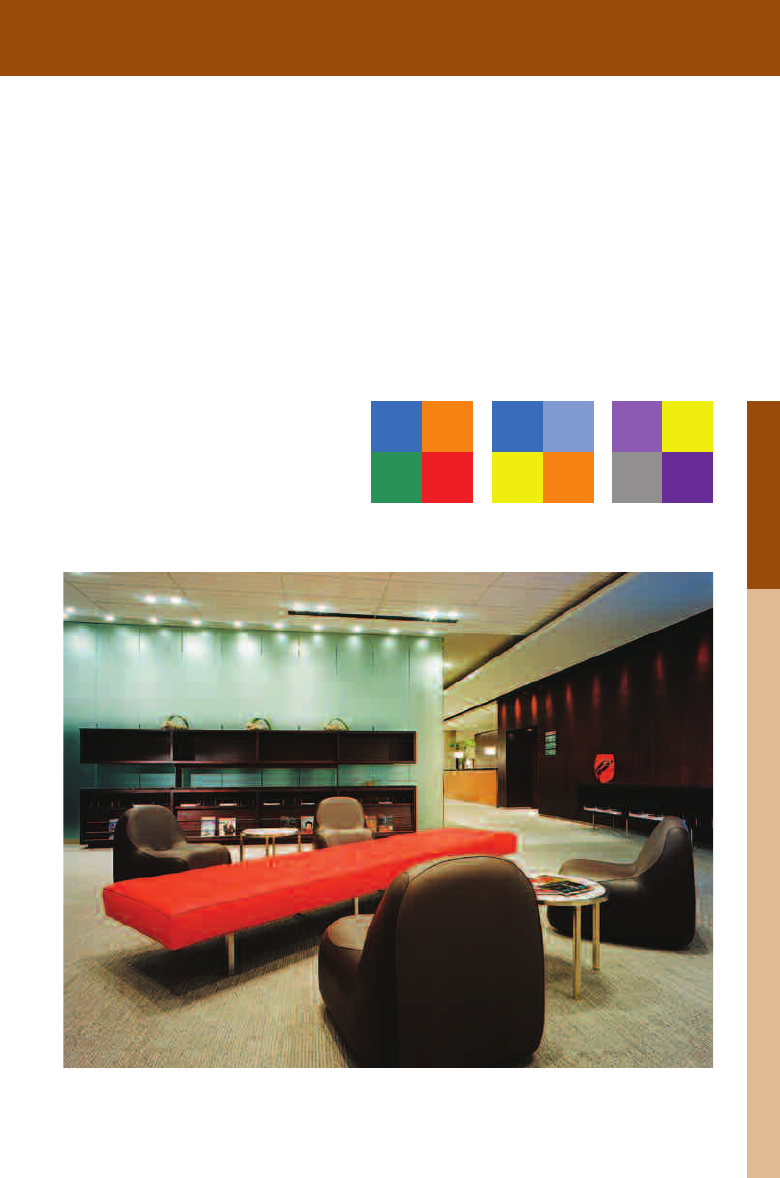
Cold-Warm Contrast
Particular colors can affect the relative comfort
of a room at a specific temperature. In fact, a
perceptual change in physical temperature occurs
in spaces when they are painted in cold versus
warm colors. For Itten, cold-warm contrasts were
highly versatile in their expressive powers.
For a lounge in the André Balazs Hotel QT,
Lindy Roy uses a cold-warm contrast to dis-
tinguish the different zones of the space.
The bar is surfaced in a cool blue that acts
as a functional highlight against the warm,
intimate spaces that surround it.
At Toronto’s Pearson International Airport,
the Maple Leaf lounge, designed by Kuwa-
bara Payne McKenna Blumberg in associa-
tion with II BY IV Design, uses complemen-
tary contrast in a relatively muted palette
to draw attention to specific moments
within the spatial sequence.
Job:02-30056 Title: RP-Interior Design Reference and Specification
#175 Dtp:216 Page:144
(RAY)
134-153_30056.indd 144 3/4/13 7:36 PM
09
Job:02-30056 Title: RP-Interior Design Reference and Specification
#175 Dtp:216 Page:145
Job:02-30056 Title: RP-Interior Design Reference and Specification
#175 Dtp:216 Page:144
(RAY)
134-153_30056.indd 145 3/4/13 7:35 PM
Text
145
Color
Roy Design. Photo courtesy of Hotel QT.
Kuwabara Payne McKenna Blumberg Architects in association with
II BY IV Design Associates. Photo by David Wittaker.
Complementary Contrast
Complements occur when two hues are mixed
and the result is a neutral gray-black. (In addi-
tive color systems, the result will be white.) Every
color within a color system has its complement;
finding a complementary color is a simple matter
of selecting opposite colors on Itten’s wheel. In
complementary contrasts, colors balance each
other.
For a lounge in the André Balazs Hotel QT,
Lindy Roy uses a cold-warm contrast to dis
-
tinguish the different zones of the space.
The bar is surfaced in a cool blue that acts
as a functional highlight against the warm,
At Toronto’s Pearson International Airport,
the Maple Leaf lounge, designed by Kuwa-
bara Payne McKenna Blumberg in associa-
tion with II BY IV Design, uses complemen-
tary contrast in a relatively muted palette
to draw attention to specific moments
within the spatial sequence.
Job:02-30056 Title: RP-Interior Design Reference and Specification
#175 Dtp:216 Page:145
Job:02-30056 Title: RP-Interior Design Reference and Specification
#175 Dtp:216 Page:144
(RAY)
134-153_30056.indd 145 3/4/13 7:36 PM
..................Content has been hidden....................
You can't read the all page of ebook, please click here login for view all page.