
Android UI Design: Using Views and Widgets via XML
In this chapter, we will take our Hello World application, which we created during the first part of the book, and work toward making the application user interface design for its various functional screens considerably more professional. In Android, this is done primarily via XML UI parameters for Android user interface widgets, which we already know are View subclasses.
At the same time, we are also going to utilize this chapter to give those of our readers who are not user interface designers a taste of the various design considerations that are encountered in striving to make a UI design appear professional, while also remaining easy to use for the end-users.
I’m going to again attempt to simultaneously accomplish these objectives; enhancing our Hello World application user interface considerably, while also covering key XML UI parameters at a low-level, in one unified chapter which will outline the techniques and capabilities of using XML to define user interface elements within the context of our Hello World application.
Android User Interface Elements: Android View and Subclasses
As I mentioned earlier in the book, all user interface elements, at least the visual ones that the user interfaces with to control the application, are subclasses of the Android View class, which means that a View is itself an object and a subclass of the java.lang.Object master Object class.
Some of the most common user interface widget objects and layout container objects, including ViewGroup, ImageView, and TextView, are direct sublasses of the View class. Others that we have already utilized, such as Button, VideoView, and ImageButton, are indirect subclasses of the View class.
Indirect subclasses are simply subclasses of subclasses; for instance, the Android Button class, which can be found (imported) via the android.widget package (you would import android.widget.Button in order to use a Button UI element object) is subclassed from the android.widget.TextView class. This is because a Button object has all the features that a TextView object has, plus additional features (the button look and feel elements), so it is logical to subclass a TextView object to create a Button object.
Other View direct subclasses that we will be looking at later in this book include AnalogClock and ProgressBar; however, many of the user interface widgets that we will be using are farther down in the View class hierarchy (that is, they’re more specialized user interface feature implementations) and are thus indirect subclasses of the Android View class.
In this chapter we’re going to focus on mainstream View classes or widgets that are used across all Android application development projects. Our app UI widgets will include direct subclasses TextView and ImageView, because images and text are the most important and often used elements in any app, as well as Button, ImageButton, EditText, and VideoView UI element widgets.
Optimizing Our NewPlanet Activity UI: The ImageView UI Widget
Let’s start with our first options menu item and Activity screen, defined in the NewPlanet.java class, which we wrote back in Chapter 3. This UI screen lets us click an image of a Planet to create that basic planet object inside of our Hello World Android application. If you forgot what it looks like, it’s shown again in this chapter, with planet images, in Figure 6-2.
As it sits right now, we are using the default Android application launch icon that the New Android Application Project dialog series created for us in Chapter 2 as a placeholder image. In this section we’ll finally replace those placeholder images with actual planet images, and later on we’ll use XML parameters to format them to fit the screen with professional results.
I have created four different resolution versions of each planet; one that is 256 pixels square for iTVs, one that is 192 pixels square for tablets, one that is 128 pixels square for touchscreen smartphones, and one that is 96 pixels square for mobile phones with smaller 240 or 320 pixel screens.
Putting Our Image Assets in Drawable DPI Folders
Next copy each of these planet image files into their appropriate drawable folder under the resource (res) folder. Note that we will be getting into all the theory behind developing these different resolution graphics assets very soon, in Chapter 7. For now, I’ll simply cover the basics of what we are doing here, so we can use drawables (bitmap imagery) in our user interface design work inside this chapter.
Let’s start with planet Earth, as that is our first XML ImageView tag, in our activity_add.xml layout container that we developed in Chapter 3. Using the Windows Explorer file manager, copy the earth256.png file into your Hello_World project resource folder, in the drawable-xhdpi folder at:
C:/Users/YourNameHere/workspace/Hello_World/res/drawable-xhdpi/
XHDPI stands for Extra High Density Pixel Imagery, and this folder contains our highest resolution image assets, in this case, a 256 pixel square Earth image. Next copy the earth192.png file into the drawable-hdpi folder, used for High Density Pixel Images, and then copy the earth128.png file into the drawable-mdpi folder, used for Medium Density Pixel Images, and finally, copy the earth96.png file into the drawable-ldpi folder used for Low Density Pixel Images.
Next, we are going to rename each of these four image files to earth.png. We do this because earth.png is the image asset name that we are going to reference in our XML mark-up and Java code, and Android automatically looks at what screen size is being used by the user, and go into the correct folder and get that resolution density image asset. We will be getting into this concept further in Chapter 7.
Next, we need to copy and rename the other five planet image assets, so that we have six .png files in each of the four drawable folders. Each of the four folders should have six .png files, each starting with just the name of the planet, and in all lowercase characters.
Next, we have to use the Refresh command in Eclipse to update our project folders to display these new assets that we have copied into these folders from “outside of” Eclipse (using the Windows Explorer file manager).
To do this, right-click your project folder and select Refresh from the menu, or alternatively you can left-click the folder and press the F5 function key on your computer keyboard. What this does is to tell Eclipse to scan all your project folders and files, and to update the Package Explorer navigation pane, as well as its own tracking routines, so that these image files, when called inside our code, will not get flagged as missing (or not present) from our project assets hierarchy.
Referencing and Aligning Our Planet Image Source Files
Next, we need to go into our activity_add.xml RelativeLayout XML file and change our XML mark-up that we wrote back in Chapter 4 to point to the proper planet filenames, which are referenced in each ImageView tag using the android:src parameter. Change the placeholder image, currently @drawable/ic_launcher, with the name of each planet in lowercase letters. The parameter for the first ImageView tag imageEarth would be as follows:
android:src="@drawable/earth"
After you do this for all six ImageView tags, click the Graphical Layout tab at the bottom of the editing pane, and use its preview feature to see if all six planets are showing. If they are, then you’ve done the previous steps in this work process correctly. Notice that all six planets, as a group, need to be moved over to the right a little bit. To accomplish this we will add the now familiar android:layout_marginLeft parameter. Because we want the entire layout (the group of planets as a whole) to be moved over, we will put this marginLeft parameter inside the parent RelativeLayout tag, as shown in the shaded line of code in Figure 6-1.
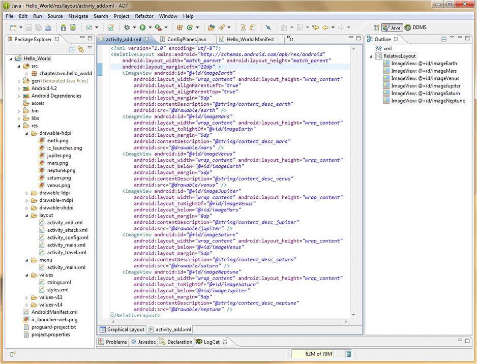
Figure 6-1. Add RelativeLayout parameter to center all planets and set the android:src parameter to new imagery
Use a setting value of 22 Density Independent Pixels (DIP, or DP) to center our New Planet selection ImageView PNG graphics on our NewPlanet Activity class user interface screen via the following line of XML markup:
android:layout_marginLeft="22dp"
Now go back and click the bottom Graphical Layout tab to preview this new android:marginLeft parameter you have added, and see how this 22 DIP setting pushes the group of planets into the center of the display screen for a more professional UI screen appearance. This is shown in Figure 6-2, along with the Eclipse Properties pane on the right, which you can make larger in your Graphical Layout Editor tab screen by placing your mouse over the top border of the Properties pane, when your cursor turns into a double-arrow drag-to-resize-me indicator, at which time you can drag this border up, giving yourself a larger properties editing area to work with.
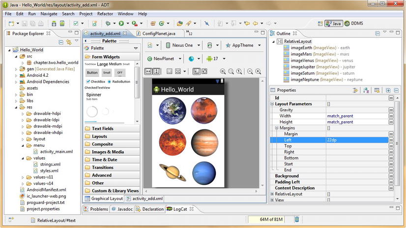
Figure 6-2. Preview of activity_add XML code, with planet images and new margin settings in Properties panel
Notice that the parameters that you coded in the XML mark-up view pane are also set in the Properties pane view, so you can add parameters in this way as well, if you want. Highlighted in blue is our Left Margin Layout Parameter 22dp setting that we just added. Also notice the simulated app user interface screen in the center, along with a much more professional view of our six planets. Things are shaping up nicely for this Activity.
Adding Screen Caption Text and Done Button
The next thing that makes this screen completely professional is adding a TextView UI widget (tag) at the top of the screen to tell users what the screen is for, as well as a Button they can click when they’re finished adding planets. The doneAddingButton Button UI element (tag) calls our finish() Activity method, and clicking the planet ImageView UI elements generates those new objects. We’ll write our Java code later on in the chapter; for now we are learning UI design via XML, so let’s add our tags.
First, let’s add in a Button user interface element tag, so that our users can exit this screen when they are done adding planets. The easiest way to accomplish this is to go into the activity_config.xml XML mark-up, and to copy the Done Configuring Button tag, and then paste that mark-up at the top of the activity_add.xml file, under the RelativeLayout container tag.
Change the android:id value to @+id/doneAddingButton and the android:text value to @string/button_name_done_add, and then go into your strings.xml file and copy and paste the button_name_done <string> tag, and create a button_name_done_add named string constant, with a value of: “All Done!”
The next thing that we want to do is to cut and paste (not copy) both the android:layout_alignParentLeft and android:layout_alignParentTop tags from the imageEarth ImageView tag, and utilize them in the Button tag we are adding. This is because the Button tag is now the top-most screen layout user interface element for this revised relative screen layout.
Because we want to right-align the new All Done Button UI element in the top-right corner of the screen, change android:layout_alignParentLeft to android:layout_alignParentRight and leave the android:alignParentTop alone. We haven’t really used any new parameters in our doneAddingButton UI element, we just “borrowed” the parameters that used to be in the top-left ImageView UI element, and changed them to create a top-right Button UI element. Next we will add a TextView UI element for our screen caption (see highlighted line in Figure 6-3).
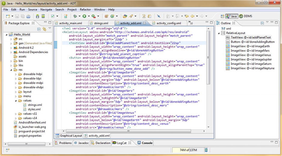
Figure 6-3. Adding a TextView tag to add a screen caption and a doneAddingButton Button tag to exit Activity
Next let’s copy the first TextView UI element (tag) from our activity_main XML layout container, and paste it above the Button tag we just created. Change the android:id to @+id/addPlanetText and the android:text parameter to point to @string/add_planet_caption, and then go into your strings.xml file and copy and paste the hello_world <string> tag and use it to create a add_planet_caption named string constant, with a value of: “Click Planet to Add” so that our users know what to do when they get to this screen.
Preview the UI design via the Graphical Layout Editor tab at the bottom of the edit pane, and you’ll notice that the text is a bit small, so go back into XML edit mode and add an android:textSize parameter set to 22sp right after the android:id parameter in the TextView tag as shown in Figure 6-3.
Text fonts use standard pixels (sp) rather than density independent pixels to define their values. If you try and use dp or dip with any font-related sizing, Eclipse will flag it and warn you to use sp values for sizing text.
The next thing we need to do is to align our screen caption text with the Button UI element, so that it looks professional and well-aligned, at the top of the screen layout. We can do this with one single parameter, called android:layout_alignBaseline which will align a UI element with a baseline alignment to another UI element, in this case, with our Button UI element.
Let’s implement that now, by setting the alignBaseline parameter to point to the android:id value of our Button UI element using the parameter code:
android:layout_alignBaseline="@+id/doneAddingButton"
This line of code is also shown in Figure 6-3 and when we now click the Graphical Layout Editor tab at the bottom of the edit pane we see both our larger font size and our Baseline alignment implemented in the UI design.
Also notice in Figure 6-4 that Eclipse actually shows us the baseline that it is using to align the text in the Button tag UI element with the screen caption TextView UI element. If you look closely you will see a green line that proves that our TextView and Button object are now Baseline aligned.
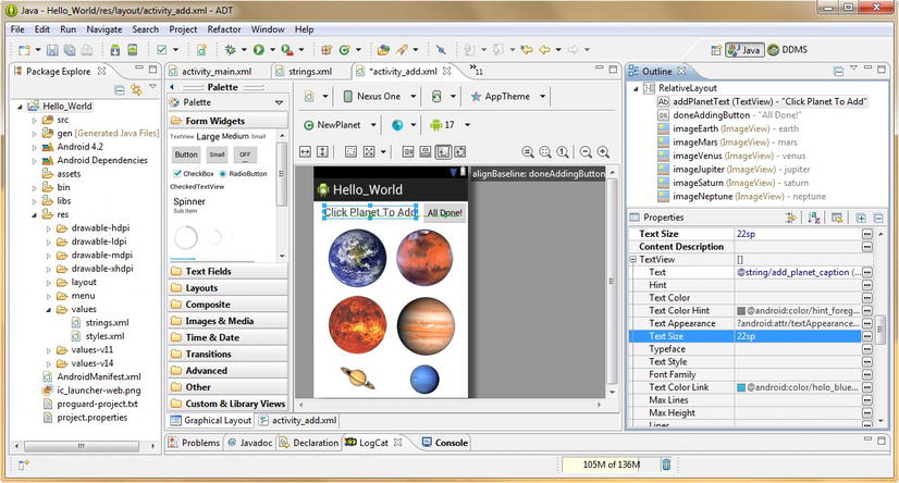
Figure 6-4. Viewing the TextView layout_alignBaseline parameter result relative to the doneAddingButton Button
If you are not seeing a green baseline, go back into XML edit mode pane and click the line of code for the alignBaseline parameter to highlight it.
Once that line of code is highlighted (in light blue), it will be the one that is previewed (specifically) in the Graphical Layout Editor view, once you click that tab again. Also notice in Figure 6-4 that I highlighted our Text Size parameter in the Properties pane, showing that it could also be set there as well. Next, let’s Run As Android Application, and see how our NewPlanet.java Activity screen user interface layout looks with all our new changes in place. The results can be seen in Figure 6-5.

Figure 6-5. Our NewPlanet Activity screen in the Nexus S emulator
Adding the Java Code to Incorporate Our New User Interface Elements
Finally, we need to make a couple of additions to our NewPlanet.java Java code to assimilate the changes we made in our XML UI designs into the Java code functions of this Add a New Planet Activity for our Hello_World Android application. The first thing we need to do is add a Button object.
Setting up our Button UI object in Java is similar to how we set up the ImageView object to handle a click on our Mars ImageView object. We declare our Button object using a line of Java code that declares a Button object, names that object doneButton, and wires it up to our XML definition via the findViewById() method referencing a doneAddingButton ID like this:
Button doneButton = (Button)findViewById(R.id.doneAddingButton);
Next, we utilize the familiar .setOnClickListener() method to set a new View.OnClickListener() for the doneButton Button object. This in turn contains an onClick() event handler that listens for a click and then executes a finish() method for our Activity, allowing the user to exit the Activity screen, and return to the Home Screen. The code looks like this:
doneButton.setOnClickListener(new View.OnClickListener() {
        @Override
        public void onClick(View v){
                finish();
        }
});
Next, we need to remove the finish() method call from the onClick() event handler method that is attached to our marsImage ImageView object, because we now have our doneButton UI Button to use to exit our Activity, and we no longer want the screen to go away when we click one of the planets.
In place of the finish() method, let’s add a Toast object and method call, to let our users know that the Mars object was in fact created. This is a logical place to introduce Android Toast objects, because they are usually used for user interface and user experience optimization and enhancement.
Introducing (and Utilizing) the Android Toast Class
Android Toast objects are used to send messages onto your Activity screen that appear for a predefined period of time sending a message to the user. In our case they will send the message “Mars Created” when the user clicks on the marsImage ImageView UI element so that the user knows that the Mars object has been created by the user clicking the image of that planet.
Toast objects are from the android.widget.Toast package and class and are a subclass of java.lang.Object (and not a subclass of android.view.View, as it does not need any of the View class features) because they are simple by nature, although they are also very effective when used well.
Declaring a Toast object is done most simply by using the .makeToast() method off of a Toast object. The method requires the current context, the message to be Toasted, and the duration in the form of a constant. There are two duration constants, LENGTH_LONG and LENGTH_SHORT, and we will be using the LENGTH_SHORT constant for a quick visual confirmation that our Mars planet has been created. The Toast call is coded as follows:
Toast.makeText(NewPlanet.this, "Mars Created", Toast.LENGTH_SHORT).show();
Notice that we have appended the Toast show() method using dot notation to the end of the Toast.makeText() method call. This is a great example of Java method chaining and this technique allows us to make more dense code, where an entire block of code can be written within a single line of code. To write this single line of code “long-hand,” using two separate lines of Java code, you would code the following:
Toast myToast = Toast.makeText(NewPlanet.this, "Mars Created", Toast.LENGTH_SHORT);
myToast.show();
As you can see here the first line of code we wrote was much more compact!
Now add this line of code we developed to Toast a message to the screen in place of the finish() method call we had before and our finished NewPlanet Java code will look like the code shown in Figure 6-6.
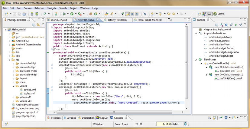
Figure 6-6. Adding a Button object and a Toast object and .makeText method call to our NewPlanet.java Activity
Notice that when we Run As Android Application to test our code, that we now get a screen that has an All Done button, and it creates a Mars object when we click the Mars image, and Toasts us feedback that the Mars object has been created.
We’ll finish the Java code for this area of our application a little bit later on, right now we are focusing on our user interface design, so let’s continue, and fine-tune our UI for our ConfigPlanet Activity screen next.
Optimizing Our ConfigPlanet Activity UI: Button and Text UI Widgets
Let’s refine our user interface design for our second options menu item, Configure Planet, by enhancing the XML mark-up in our activity_config.xml file. First, we’ll condense some of our Button tag XML mark-up by putting two tag parameters on each line, so we can fit some new UI element tags on the screen. Notice that tag parameters need only be separated by a single space character; parameters do not need to be on their own line. This can be seen in Figure 6-7, inside the LinearLayout, where our Button tags now only take up around a dozen lines of markup. To enhance this UI design and make the screen more functional, we will need to place some editable text fields on the right side of our UI screen across from each of our buttons.
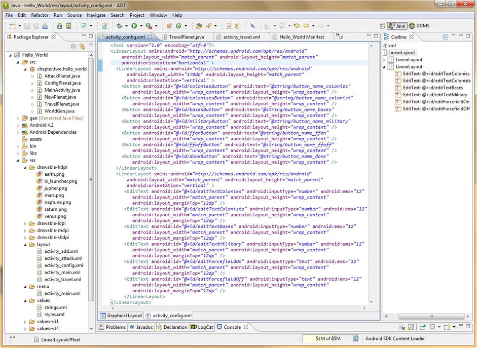
Figure 6-7. Adding EditText UI element tags and nesting two LinearLayouts to create a side-by-side UI layout
Creating Complex User Interface Designs Using Nested Layout Containers
To accomplish this, we need to nest two LinearLayout containers together, one for the left-side vertically aligned Button UI tags, and the other for the right-side vertically aligned EditText UI element tags. Let’s copy the LinearLayout opening tag, and paste it underneath the LinearLayout closing tag to start a new container, as shown in Figure 6-7. Copy a LinearLayout closing tag underneath that, so that our closing tag is in place as well.
Then copy the LinearLayout opening tag and paste it above the LinearLayout opening tag, to create a new top-level LinearLayout container, and change its android:orientation parameter from vertical to horizontal, because the two nested LinearLayout containers are going to be beside each other. Then copy the LinearLayout closing tag again as well, and paste it at the very bottom of the layout container so that the first horizontal LinearLayout tag wraps the two internal (nested) vertical LinearLayout container tags.
To set a width ratio between the two nested LinearLayouts we need to add an android:layout_width parameter to the first (left) tag, to define how much of the screen (170dp) it will have. The right LinearLayout takes the rest.
If you like, you can change the indentation of the nested tags slightly to show what is nested, as shown in Figure 6-7. Next, all we have to do is to add our EditText UI element tags to the inside of the second LinearLayout.
Introducing the Android EditText User Interface Element for Editable Text Fields
To add an EditText User Interface element, we can either drag the EditText UI element onto the right side of the screen, using the Graphical Layout Editor, or hand-code the EditText tag and its parameters, by writing the mark-up for one element, and then copying it five times while changing the parameters to match the Button ID and Input Type:
<EditText android:id="@+id/editTextColonies" android:inputType="number"
          android:ems="12" android:layout_width="match_parent"
          android:layout_height="wrap_content" android:layout_marginTop="12dp" />
The first EditText UI field is opposite the Add Colonies Button and has an android:id of editTextColonies and an android:inputType of number (matches up with integer data). The inputType parameter defines the type of data the field uses and needs to match up with the data type used in the Java code that will access that field, as we will see a bit later on when we write our Java code to populate these data fields. We use number and text data types for our inputType parameters but if needed there are other types, such as numberDecimal, for real (decimal) numbers as well.
The android:ems parameter sets the font size for the text values used in the data field, and we will start with a value of 12 ems, and then if we want larger text in our data fields, refine it from there a bit later. The next parameter for our EditText UI element tag is android:layout_width and that is set to match_parent, which tells Android to match the width of the EditText UI element (field) to the parent container object (tag), which in this case is the second nested LinearLayout.
The android:layout_height parameter in our EditText tag has a wrap_content value, which is essentially the opposite of a match_parent value. The wrap content constant means to conform the edges of the UI element to the content contained therein, whereas the match parent constant means the opposite: expand the edges of a UI element to the container that it is contained in.
Finally, we will use an android:layout_marginTop parameter of 12dp to line up each of our EditText fields with our Buttons, so that we have even spacing between the data fields, and so that each lines up with the bottom edge of the Button UI element that is immediately to the left of it.
Now that we have coded one representative EditText tag, let’s copy it five more times underneath itself and change the android:id parameters to match the button ID names and change the android:inputType parameter to text for the two Forcefield indicator fields, which will contain text values.
The end result of upgrading our Configure Planet Activity screen XML to include EditText data editing fields in side-by-side Linearlayouts can be seen in Figure 6-7, which shows our final XML code and an overview of the UI elements that we are using in the Outline pane on the right-hand side of Eclipse. Check to make sure that the current UI settings look good on the emulator screen by using the Run As Android Application work process.
Adding the Java Code to Incorporate Our Configure a Planet Screen’s New User Interface Elements
Next, let’s modify our ConfigPlanet.java Activity class Java code to “wire it up” to these new UI elements, so it becomes functional within our app.
The first thing that we want to do is to replicate our Button code for our doneButton Button object so that all our Buttons on the Activity screen are functional. Notice in Figure 6-8 that I made the onClick() code block a bit more compact by placing the finish(); statement inside of the curly braces on one line, because for now, there is only that one code statement.
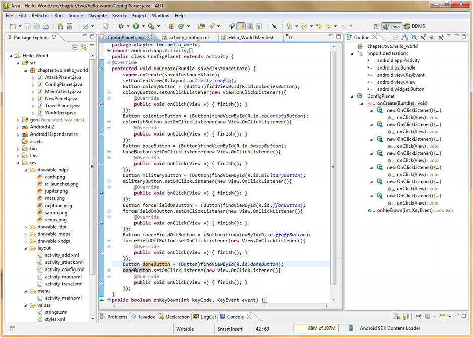
Figure 6-8. Adding Button objects and onClick() event handlers for each to our Java code in ConfigPlanet.java
Next, we need to copy all the doneButton related (5) lines of Java code six times underneath the doneButton code block as shown in Figure 6-8, so we create colonyButton, colonistButton, baseButton, militaryButton, forceFieldOnButton, and finally forceFieldOffButton blocks of code. Make sure to reference the correct XML ID names for each Button UI element in each code block, and make sure that the .setOnClickListener() method is connected to the correct Button object name that is defined in the line immediately above it. Finally, click the top minus sign icon in the left margin next to each block of code to collapse the code blocks as shown in Figure 6-9 so we have more editing room.
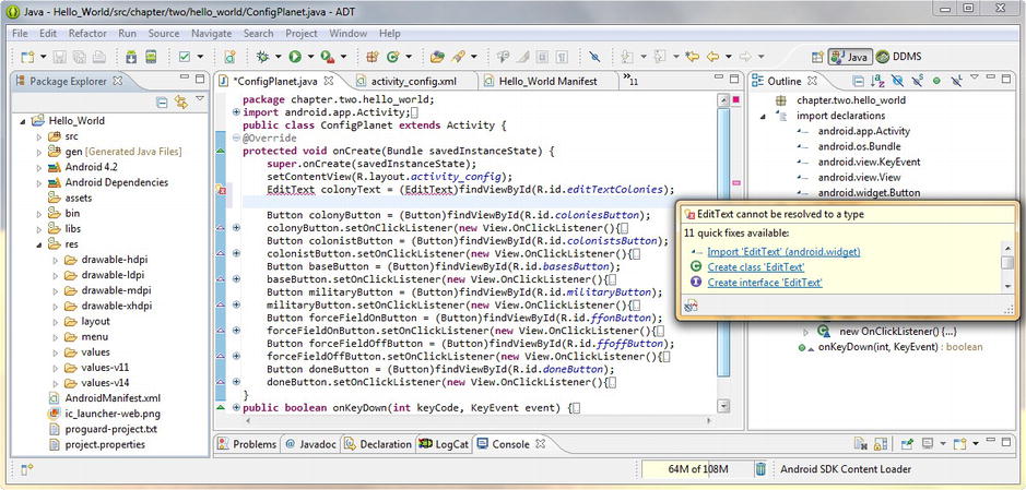
Figure 6-9. Add an EditText object named colonyText and Invoke Eclipse’s auto-import feature via: Import EditText
Now it is time to add our EditText UI objects to our Java code, so that we can utilize the data values that are put into these fields by the user in our program logic as we continue to build this app throughout the book.
You should be getting pretty good at declaring UI elements inside the Java code, using their widget type, name, and findViewById() method, like this:
EditText colonyText = (EditText)findViewById(R.id.editTextColonies);
Notice in Figure 6-9 that Eclipse error flags our EditText object, because we are not allowed to use it in our code until we import it, so mouse-over the red-underlined object, and click the Import EditText android.widget package option, to have Eclipse import our android.widget.EditText class.
The next thing we need to do is to set a default value inside our EditText field that conforms to how many of that attribute we suggest that users add. In the case of Colonies, we are using a “1” value, to add a Colony at a time. Text is set via the .setText() method with two parameters, a value, and a buffer type constant. Buffer types can be EDITABLE, NORMAL (Fixed), and SPANNABLE. For our colonyText object, our code would look like this:
EditText colonyText = (EditText)findViewById(R.id.editTextColonies);
colonyText.setText("1", EditText.BufferType.EDITABLE);
Now all we have to do is copy those last two lines of Java code five times underneath the first two lines, and change the colony to colonists, bases, military, forcefieldOn, and forcefieldOff. Then, make sure the XML ID tag names for each EditText UI element match our XML in activity_config.xml, and then change the “1” value to “100” for colonistsText and to “10” for militaryText to set more reasonable default values for those data fields.
For our forcefieldOn and forcefieldOff text data fields, we will use a “Forcefield is Off” for the forcefieldOffText data default setting, and a null (empty quotes) setting for the forcefieldOnText data default setting.
The final Java code for all of the five copied two-line code blocks should look like the following:
EditText colonistText = (EditText)findViewById(R.id.editTextColonists);
colonistText.setText("100", EditText.BufferType.EDITABLE);
EditText basesText = (EditText)findViewById(R.id.editTextBases);
basesText.setText("1", EditText.BufferType.EDITABLE);
EditText militaryText = (EditText)findViewById(R.id.editTextMilitary);
militaryText.setText("1", EditText.BufferType.EDITABLE);
EditText forcefieldOnText = (EditText)findViewById(R.id.editTextForcefieldOn);
forcefieldOnText.setText("", EditText.BufferType.EDITABLE);
EditText forcefieldOffText = (EditText)findViewById(R.id.editTextForcefieldOff);
forcefieldOffText.setText("Forcefield is Off", EditText.BufferType.EDITABLE);
Now we have set up our EditText UI elements in only a dozen lines of Java code as shown in Figure 6-10. Later we will add Java code to the onClick() event handlers for our Button UI elements that will take the data values from these EditText fields that we have set up using the .getText() method and set our WorldGen object data variables with those values accordingly.
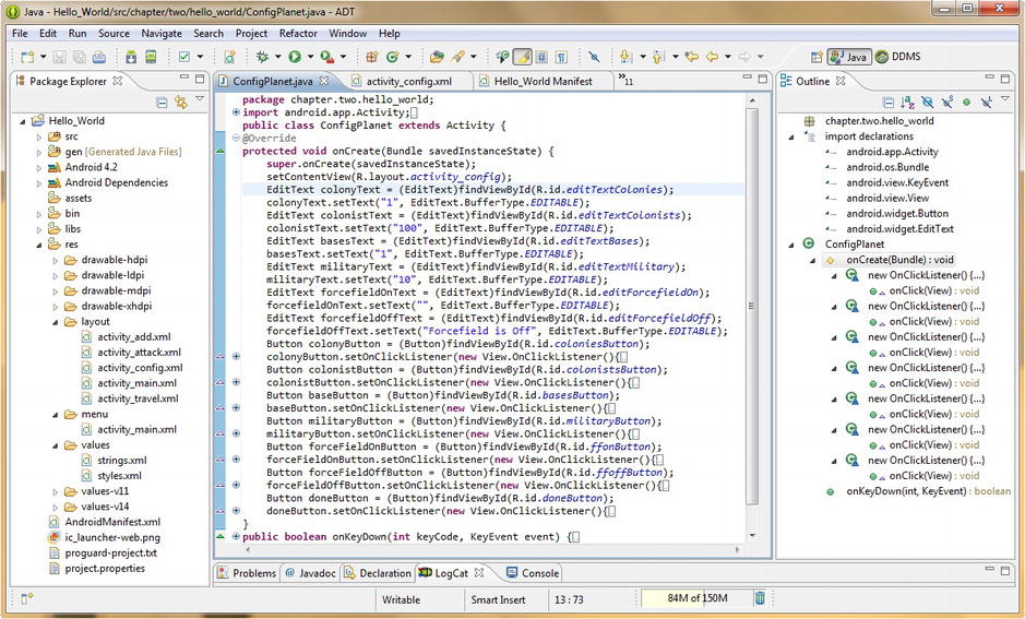
Figure 6-10. Copying the six EditText objects and .setText() methods to implement our EditText UI fields in Java
Next, we need to ascertain if our XML mark-up and Java code is giving us the more refined user interface design results that we have been trying to implement. Right-click the project folder and select the Run As Android Application menu item, and when the Nexus S emulator launches hit the menu button and the Configure Planet menu selection, and observe the UI screen.
Notice that we estimated the ems font size setting correctly, and that the data in the EditText fields is a nice size, so we will keep those tag parameter settings. However, the bottom of the EditText fields is not lining up perfectly with the bottom of the Button elements; it looks like the android:layout_marginTop values of 12dp are too large, and that pushes each data field down too far from the data field above it. So let’s reduce the marginTop value by 33% to a value of 8dp and Run As Android Application again.
As you can see in Figure 6-11 our Configure Planet UI screen lines up well and the data values set in our Java code appear correctly in each UI data field, just like we designed it. In Chapter 7, we add translucent buttons and spice things up quite a bit more, but for now, this Activity screen’s user interface design has been upgraded and implemented in our Java code, so let’s move on, and dial in our Travel to Planet Activity screen next. We’re making great progress on this app!
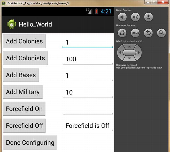
Figure 6-11. Configure Activity UI screen with Editable Text Fields implemented
Optimizing Our TravelPlanet Activity: Android’s VideoView Widget
Our TravelPlanet.java Activity class has the simplest XML mark-up code and will have the most complicated Java code (when we get into the chapters on Video, Chapters 11 and 12), as we will be working with an advanced type of new media: digital video. Our goal in this section is to make the Travel to Planet section of our application more professional in its appearance and user experience, and we are going to do that by getting rid of that Button that lies on top of our video viewscreen so that users can enjoy fullscreen video playback. To accomplish this we’ll need to remove the Button UI element from our UI.
Configuring Our VideoView User Interface Element
Go into the activity_travel.xml editing tab, and delete the Button UI element tag in its entirety from the FrameLayout container, as shown in Figure 6-12. Because we no longer have the button to click to exit our Activity, we will need to make the VideoView itself clickable, so let’s look for a parameter that will let us accomplish this. Type android, and then press the colon key to get the parameter options helper dialog from Eclipse, and then scroll down and look for any parameters that deal with clickability.
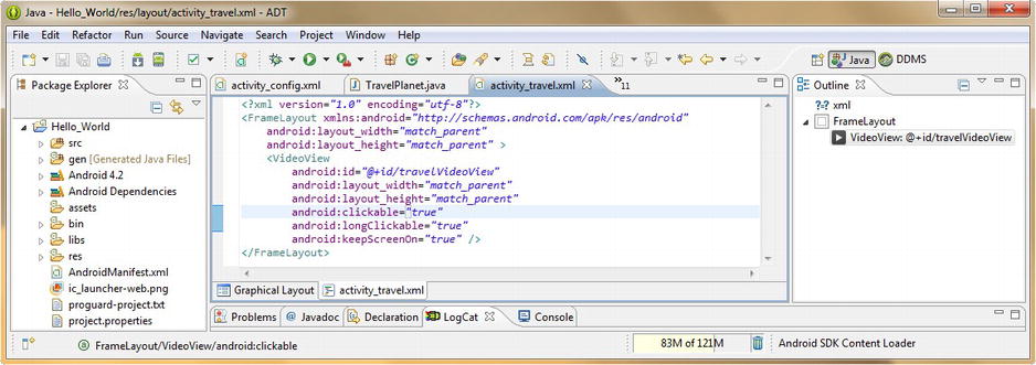
Figure 6-12. Removing the Button UI element tag and making the VideoView UI element clickable instead
Notice there are two parameters called android:clickable and android:longClickable on the list, double-click android:clickable to add it, and then using the same work process go back and double-click the android:longClickable parameter to add it as well, while we’re here writing mark-up. We implement clicks as well as long-clicks on our video screen using Android onTouch() events (because video is playing on the touchscreen) in our Java code later on in this chapter, as well as in Chapters 11 and 12, where we will be covering Digital Video in much greater depth.
Next, we add another UI parameter that enhances our user experience during the digital video playback, when our users are taking a tour of (traveling over) a planet’s surface. Many Android devices prioritize power savings over user experience, and because we don’t want our Android device screen to dim (or even to go dark) during our user’s travel experience, we’re going to look for a parameter that addresses this issue.
Again type in the android keyword and the colon key activator and bring up the parameter options helper dialog from Eclipse, and look for a parameter that will keep our Android device screen on during the VideoView playback.
It is important to note here (if you haven’t noted it already) that this Eclipse parameter options helper dialog will only populate its view with parameters that relate to (are usable with) the tag that you are typing the android keyword and colon activator within. Thus, this is a great way to find out exactly what parameters are available for each user interface element’s tag. Double-click the android:keepScreenOn parameter and add it.
Once you are finished editing your XML for the activity_travel.xml file, it should look like Figure 6-12. Now we just need to change our Java code to access what we have done in our XML editing session, so that everything fits together like a glove.
Adding the Java Code to Incorporate Our Travel to a Planet Screen’s New User Interface Elements
The first thing we need to do is to either remove the Java code that instantiates our Button object, or edit it, replacing our Button object with a travelVideo VideoView object as in this line of code:
VideoView travelVideo = (VideoView)findViewById(R.id.travelVideoView);
You will get one error highlight and one warning from Eclipse once you do this; acting on the error import android.widget.VideoView imports the VideoView class for usage, and the other yellow warning highlights the fact that you no longer need an import android.widget.Button statement, so you can now delete that import statement if you want to (you don’t absolutely have to—it’s a warning level and will not prevent the code from compiling and working correctly).
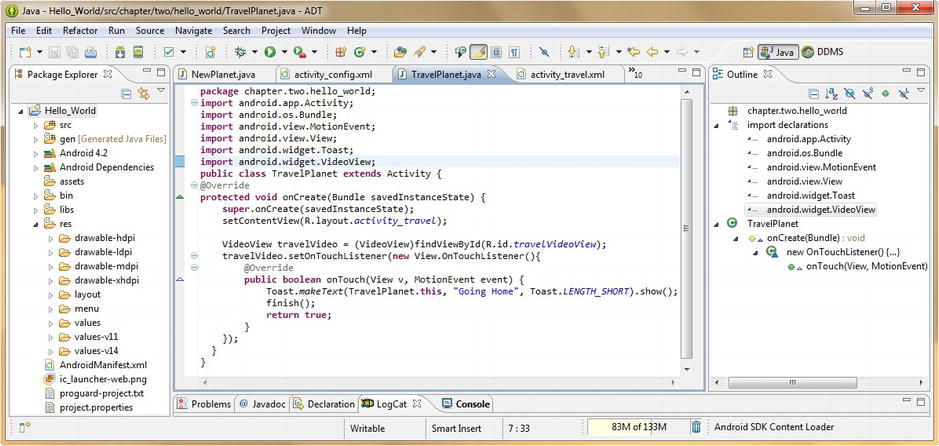
Figure 6-13 . Replacing the Button and onClick() handler with a VideoView object and onTouch() handler in Java
Once we have created our travelVideo VideoView object, we can set an event listener on it. Because digital video is best used via a touchscreen device, let’s take the opportunity to use the onTouch() event listener, instead of the onClick() event listener. To set the OnTouchListener(), use this code:
travelVideo.setOnTouchListener(new View.OnTouchListener() {
   @Override
   public boolean onTouch(View v, MotionEvent event) {
        Toast.makeText(TravelPlanet.this, "Going Home", Toast.LENGTH_SHORT).show();
        finish();
        return true;
   }
});
With this code, all our user has to do is to touch the screen (where the video will eventually be after we add it) and the onTouch() event handler broadcasts a Toast to the screen that says “Going Home” and then executes the Activity finish() method, taking the user back to the Home Page. So now, our VideoView UI element handles the event that the Button UI element used to, and the Button is not blocking our view of the Video viewscreen. This UI design has a more professional user experience.
In Chapter 7, if we need the touch event to control video playback or the video transport, then we might change the touch event into a longClick. For now, we are just putting the foundation in place, so that we can expand on it later on, but in a way such that it works well within the current application functionality. That is the best way to develop our code, by making sure that it works well at every level of its development.
So, let’s Run As Android Application, and be sure that the code works as it should. Once the app starts, hit the menu button, and select the Travel to Planet menu option, and it will take you to a black screen (blank video viewscreen) where you can click (simulating a finger touch) in the middle of the screen. Once you do this, a Toast message comes up that says “Going Home” and the app returns to the Home Screen. Now that we have 75% of our application Activity screens working, we need to fine-tune our Attack a Planet screen, and then we’ll be ready to get into some graphics design!
Optimizing Our AttackPlanet Activity UI: ImageButton UI Widgets
Before we modify the XML mark-up for our ImageButton tags in our attack_activity.xml LinearLayout container, we should put the image elements that our ImageButton tags will use for custom button icons into the correct resolution drawable resource folders. We did this earlier in the Configure Planet section of this chapter, regarding our six planet images that our ImageView tags used (only these icons are cooler). Let’s do this first.
Putting the Image Assets in Place
Copy the 96 pixel versions of the five ImageButton graphic .png files into your Hello_World/res/drawable-xhdpi/ folder. They are named attackbomb96px.png, attackinvade96px.png, attackvirus96px.png, attacklaser96px.png, and attackexit96px.png. A slick way to do this is to select the first one, and then hold down the Ctrl key on your keyboard, while selecting the other four. This allows non-contiguous file selection, whereas the Shift key will select a range of files (click the first file, hold down Shift, then click the last file in a desired range). Then right-click, select Copy, and then select the target folder, and right-click that and select Paste.
Once they are in the /res/drawable-xhdpi folder, remove the 96px part of the filename, so that the files (eventually, once we are finished with all this copying) all have the same generic names: attackbomb.png, attackinvade.png, attackvirus.png, attacklaser.png, and attackexit.png.
Next, do the exact same work process for the 80px versions of these five files, copying them into the /res/drawable-hdpi folder, and removing the 80px part of the filename so they are all generically named. Do the same work process again, with the 64px versions of these five files that need to go into the /res/drawable-mdpi folder, and finally again with the 48px versions of the five files, which go into the /res/drawable-ldpi folder.
Referencing, Aligning, and Compositing Our Attack Icon Image Source Files
Now we are ready to go into the Eclipse XML editing pane, and add the tag parameters that we need to enhance new user interface screen design. We will also need to change the image source filenames specified in the tag’s android:src parameter, so that our impressive new custom ImageButton graphic icons are correctly referenced in each respective ImageButton tag.
Let’s modify our ImageButton tags first (Figure 6-14), with our new filenames, as well as functional parameters, such as sound effects, background color values, and margins to put some space on our UI screen between the image graphics.

Figure 6-14. Upgrading ImageButton tag parameters to reference new images and add background transparency
Because eventually (after Chapter 7) all our application screens will have dark or black backgrounds, featuring the starfields and plasmafields found in space, let’s add a new parameter to our LinearLayout container that gives it a black background. We’ll accomplish this via the android:background parameter, and as we will learn in the Chapter 7, the color black is represented in computers via a #000000 value.
While we’re adding android:background parameters, let’s add the same tag parameter to each ImageButton, and use the value #00000000, which is the value for transparent, as the extra two zeros control transparency. Again we will be learning all about why this is in the next chapter on graphics.
Next, we will change the launcher_ic placeholder graphic (finally!), with our generic attack graphic names that are now located in each of our four resolution-specific drawable folders. If you don’t see their names in the Package Explorer /res/drawable folders, as shown in Figure 6-14, then you may have forgotten to right-click the Hello_World folder and to Refresh the IDE’s “view” of your project folder on your hard disk drive, after you copied the files into their proper folders earlier using Windows Explorer.
Once Eclipse can “see” the new files, change the launcher icon android:src parameter reference for each ImageButton to the first part of the new filename, as shown in Figure 6-14. To space out the ImageButton UI elements on a screen a bit more professionally, add an android:layout_margin parameter with an initial value of 9dp to put some space (no pun intended, at least not yet) around each of the new graphics we are using for our ImageButton.
Finally, let’s use the parameter helper dialog to find a sound effects tag parameter, by typing android and then pressing the colon key. Scroll down and search for a tag parameter relating to enabling sound effects for the ImageButton. Double-click to add the android:soundEffectsEnabled parameter and once you locate it on the list set its value to true.. Make sure that you make all four of these changes and additions for each of your five new ImageButton tags, as shown in Figures 6-14 and 6-15. Next we will add text.
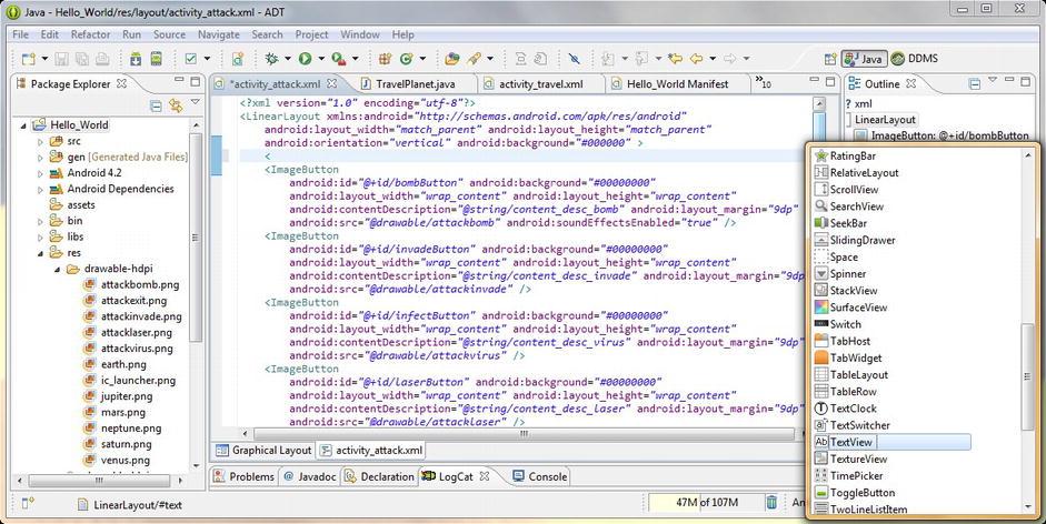
Figure 6-15. Pressing the left-facing chevron < character to invoke the add a tag helper dialog in Eclipse
Adding a Screen Caption TextView to Our XML Mark-up
To make sure the user knows what to do when they arrive at this Attack UI screen, let’s add in a caption at the top of our UI screen which tells the user what action to take when they are on this screen. Add a line of space before the first ImageButton tag (press your return key), as shown in Figure 6-15, and then press the left-facing chevron < key (Shift-Comma) on your keyboard, and notice that an add a tag helper dialog pops up in Eclipse.
Find the TextView tag, and double-click it to add it to your XML mark-up. Notice that there are hundreds of tags, enough to fill several books, and that you can use this pop-up helper to explore some of the less often used tags available. In this book, we are going to cover the tags you will most frequently use to implement text, images, video, animated UI elements, and the like, but feel free to explore the more niche UI elements via this cool feature when you have time. Now let’s configure our TextView caption.
Because our UI screen background is now black, let’s make our caption text white by using the android:textColor parameter and a data value of #FFFFFF, which as we will soon learn is the hexadecimal value for white. Set your text size to 18 standard pixels (sp), using an android:textSize parameter, and make sure to add the standard layout_width and layout_height parameter settings of wrap_content; if you forget these, Eclipse will flag your XML.
Finally, add an attack_planet_caption <string> tag to your strings.xml file, which sets this value: Select Attack Type Using Icon and then reference it via an android:text parameter, via a @strings/attack_planet_caption value.
To preview what you have done so far, you can use the Graphical Layout tab at the bottom of the edit pane, or use the Run As Android Application work process to get an even more precisely rendered view of what your UI screen will look like on an Android smartphone. As this Attack UI screen becomes more complex and detailed, you’ll see that the Graphical Layout preview is just an estimate, and does not provide as good a preview as the emulator.
As you will see in your preview, the UI screen has elements at the top and the left, but has a lot of black space and is not the professional looking UI screen that we are trying to achieve in this chapter, so we need to add some text to the right side of each ImageButton icon to tell the user what each icon does.
Creating a More Complex User Interface Design Using Nested LinearLayout Containers
To create a more complex UI, we will need to follow a work process similar to what we did to take our Configure Planet UI screen to the next level, and so let’s add two nested vertical LinearLayouts (one for ImageButtons and the other for TextViews) inside of one parent horizontal LinearLayout.
Copy the top LinearLayout tag underneath itself and change the orientation parameter on the first (now parent) LinearLayout to horizontal. Delete the android:background parameter for the second LinearLayout, as the first one (the parent) now sets that global parameter for the UI screen. Change the android:layout_width for the second LinearLayout to 70dp from match_parent as we now want the left LinearLayout to conform around our ImageButtons.
Remember to make sure that there are two nested LinearLayout closing tags at the bottom of your XML definition and then copy the second LinearLayout tag and paste it after the second to last LinearLayout closing tag, to create a third LinearLayout tag. Copy the TextView UI element into the second nested vertical LinearLayout container, as that container will be holding our TextView UI elements. Also, make sure that your second nested LinearLayout container also has a closing tag at the bottom of the XML UI definition, and indent the nested LinearLayouts as shown in Figure 6-16.

Figure 6-16. Nesting LinearLayout containers to add in TextView tags to label our Attack Planet Option icons
Next, let’s copy the attack_planet_caption TextView underneath itself to create an attack_planet_bomb TextView tag that we can configure for some larger and more colorful text to label what each Attack ImageButton icon does. Change the android:textColor value to #FFFFBB to make it yellow and change the android:textSize value to 25dp to make it 40% larger than the caption text. Add an android:layout_marginTop tag with an 18dp value, to push the text down from the screen caption, next to the first ImageButton.
Now, render the UI screen via your Graphical Layout and Run As Android Application work processes, and see how it looks. We still need a little fine-tuning before we copy this TextView tag four more times underneath itself to create our other TextView labels, so let’s do that next.
Fine-Tuning Our UI Design and Adding Text Labels to Our Attack Icons
Add an android:layout_marginLeft parameter, with a device independent pixel (DIP, or DP) value of 8dp to push our text a little bit away from our ImageView icon, and toward the center of the user interface screen.
Now we are ready to copy and paste this attack_planet_bomb TextView four more times underneath itself, to create our other attack_planet TextViews. Make sure to change the android:text parameters to reference <string> tag constants that you have created in your strings.xml file that create text labels for each of the TextViews according to what they do (see Figure 6-17).

Figure 6-17. Attack Planet UI screen preview in Nexus S emulator
Adjust the android:layout_marginTop parameter for the copied TextView tags to between 36dp and 40dp to space the labels near the center of each icon graphic, as shown in Figure 6-17. This is an iterative process, where you tweak these values and go back and forth from the emulator, until you have values that put each label in the middle of each icon on the screen. Next, change the textColor values to set a color gradient from yellow to purple.
Next, we need to upgrade our Java code in our AttackPlanet.java Activity subclass, to implement the four ImageButton objects that we have not yet implemented. Remember that we’ve already coded our exitButton ImageButton object earlier and had it call our Activity finish() method, and that Java code we will leave as-is, and, in fact, we will copy it and then paste it four more times, to create our other four ImageButton objects next.
Adding Java Code to Incorporate Our Attack a Planet Screen User Interface Elements
Copy the code block that includes the ImageButton object creation, and the .setOnClickListener code block that implements the OnClickListener() and onClick() methods four times underneath the exitButton object set-up code.
Leave the exitButton code as the fifth and final block of code, and go up to the first code block, and change the exitButton to bombButton in all three locations (name, reference, and method call). Next, let’s change the finish() method call to a Toast.makeText() method call, which tells our users what was done when they clicked the ImageButton icon graphic.
Our .makeText() Toast object method has an AttackPlanet class context, a Bombs Away! text message, and a short display length duration, like this:
Toast.makeText(AttackPlanet.this, "Bombs Away!", Toast.LENGTH_SHORT).show();
Next, perform this same work process to create invadeButton, infectButton, and laserButton ImageButton objects with onClick() event handlers that toast Troops Sent, Virus Spread, and Laser Fired! messages, respectively.
Figure 6-18 shows how the five code blocks should look once you are done!

Figure 6-18. Adding our ImageButton objects and onClick() handlers in AttackPlanet.java for each attack method
Now, we can test our AttackPlanet Activity User Interface in its entirety.
Right-click the project folder and Run As Android Application to launch the Nexus S emulator. After it loads, click the Menu button and select the Attack on Planet menu item, and after the Attack Planet UI screen appears, click each of the first four ImageButton icon graphics, and watch your Toast messages appear perfectly at the bottom of the UI screen. Then click the fifth Exit ImageButton, and watch the screen exit and return you Home!
We have now implemented the XML mark-up and Java code that makes our entire Hello World application 100% functional at the basic user interface design level, as well as at the navigational level. We are ready to implement some very cool rich media elements in the next couple sections of this book.
We will add these new media elements over the next several chapters, which cover graphics design, animation, digital video, and digital audio. This should be a lot of fun, as we now get to make this application really fun and game-like for all our end-users!
Summary
In this chapter, we took a much closer look at some of the most often used Android android.widget package user interface classes, and implemented them in our Java code as functional UI objects for our own Hello World application. We learned that UI element widgets are subclassed from the venerable Android View class, and we took a look at the most important and most universally used UI widget classes across Android application development projects.
During the chapter we learned more about Eclipse features, especially how we can bring up tag helper dialogs and parameter helper dialogs simply by typing < (the left-facing chevron character) on a blank line, and by typing in the android keyword, and then the colon key activator. This is a great way to explore the hundreds of tags and parameters that are available in the Android OS at any given time (on any given API Level installation).
For our New Planet Activity, we took a closer look at Android’s ImageView class, as well as at the Android TextView and Button classes, and we then implemented each of these UI element types at a more advanced level using some of their custom parameters in XML. We then instantiated each of these UI element objects inside our Java code base, to create a highly visual user interface for a New Planet selection screen that we needed for our users to use to select and create new planets inside our application.
For our Configure Planet Activity, we leveraged the Android Button class, as well as text editing fields via the Android EditText class, and we then implemented each of these UI element types with their custom parameters in XML, and then instantiated them in Java, to create our data entry user interface for a planet configuration data entry screen that we needed for our users to be able to define planet attributes in our application.
For our Travel Planet Activity, we looked at the Android VideoView class, and we implemented some advanced parameters in XML, so that our VideoView could be Clicked and LongClicked (or Touched and LongClicked) to implement features. We also made sure that any Android device screen would remain on during our Video content playback using an android:keepScreenOn parameter. Finally, we instantiated our VideoView object in Java, and implemented an OnTouchListener() and onTouch() event handler, to create a sleek user interface for an Inter-Planetary Travel digital video playback screen needed for our users to travel to the surface of their planets in our app.
For our Attack Planet Activity we looked at the Android ImageButton class, which allows Android developers to implement buttons that are made out of graphical assets, such as images and animation. We will be looking at this widget in more detail in the next chapter on graphics design, as you might imagine, but wanted to cover the basics before we got to that part of the book. We added custom button icon graphics to our ImageButtons to replace the placeholder images we were using and added other parameters that set the stage for our making this screen support sound effects and compositing that we will learn in future chapters. We then wired up these ImageButtons in our Java code, and made this UI screen both functional and professional in its user interface design.
We learned during this chapter about the Android Toast class and object, and how to implement a Toast, to broadcast feedback messages to our users to give them visual updates as to what tasks our app is doing during their use of our user interface screen Activity subclasses.
In the next chapter we will learn about using graphics in Android apps and we will start customizing our screen layouts and user interfaces for our Hello World Android application, using both XML mark-up code (for the most part), as well as Java code to define and implement these wow-factor user experiences and user interface elements. The next few chapters are going to be really fun, because we will be making our app commercially viable!