
Compositing in Android: Advanced Graphical User Interface Design
In this chapter, we will take the foundational digital imaging concepts that we mastered in the previous chapter, and build more complicated digital imaging constructs to add even more advanced graphics design-based (i.e., bitmap-based) user interface elements to our Hello World application. This will help you to make your app visually spectacular, whether it is a game, business app, utility app, or (hopefully) something altogether new and never before done.
We discuss multi-state user interface elements, which change the images that a user sees while using the UI, and provide the end-user visual feedback regarding what they are touching (or are clicking), and which user interface element was the last used. We composite various UI elements with other graphics design elements to create advanced, seamless visual effects; effects that span several different tags and their parameter settings, but which appear to function as one single UI entity.
We also finish making each of our app Activity screen user interfaces similar in their design and look and feel, adding unique (non-standard) UI elements that make our application completely custom on all visual levels. Many Android developers implement and use only the standard user interface widgets, and thus their apps feature only the standard Android look and feel, without using any imaging-based visual modifications that would make their Android application stand far apart from the rest of the market.
Multi-State UI Elements: The Normal, Pressed, and Focused States
Let’s take our ImageButton user interface elements that are on our Attack Planet Activity user interface screen to the next level, and change them into multi-state image buttons. Multi-state image buttons interactively change their button graphics, depending on what the user is doing (or has just done) to interact with them. Adding an interactive user interface element to your user interface design can take a user’s perception of the level of professionalism exhibited by your application to an entirely new level.
The normal state in a multi-state image button is the graphic element that you see on the user interface screen when you first arrive at that screen. In our Attack a Planet user interface screen, the normal state for these buttons would be the button icon graphics that we already have in place. You could also call this button state the default button image state.
The pressed state in a multi-state image button reveals itself whenever a user touches that button, which means a finger-touch on a touchscreen or a navigation button down action if a user is using nav-keys. For our new AttackPlanet multi-state ImageButton button-pressed image element, let’s add a golden hoop around the icon. In this way, when a user touches the Attack method icon on this user interface screen, a golden hoop encircles the icon, showing interactive feedback that the UI element is being touched.
The focused state in our multi-state button happens when the user releases (stops touching) that button and is using that user interface element. The user interface element is said to have focus because the user is using it, and it does not lose focus until the user selects another user interface element (touch another ImageButton UI element) or the operation attached to that UI element is completed, such as our Toast message currently acting as a placeholder in our Java code.
We utilize a silver hoop around our image button icons to show which one has focus, and is currently being used, and thus which one was the last one selected for use by our users. First we need to create our ImageButton source files for each of the three image states, and our normal state is already created, so we only need to create pressed and focused button states, using some advanced multi-layer compositing techniques in GIMP 2.8.
Creating Our ImageButton Multi-State Image Source Files
Let’s fire up GIMP 2.8, and do that now for each of our four attack mode icons, for each of our four pixel densities required by Android. That’s four attack mode image buttons times four pixel densities, times two button states, and that equals thirty-two different image assets that we need to create. Developing a professional Android app isn’t an easy process by any stretch of the imagination, if you want to do it right.
Add the four image buttons in four pixel densities that we already have, and we’re at 48 images for our four attack mode multi-state buttons. Finally, add another four pixel density assets for our Exit Attack Mode button, and you have 52 separate digital image assets that are needed to implement our Attack a Planet screen, Note that this is not including the background stars.png digital image, which brings the grand total for this one user interface screen to 53 digital image assets needed to create this advanced user interface screen design for each screen density. I thought this was an introductory book! Once we’re at the end of this book, you will find you will have used hundreds of assets developing your Android app!
Once GIMP has launched, use the File  Open menu sequence to find your attackinvade 96-pixel graphic in the drawable-XHDPI folder of your Android Hello_World project folder inside your workspace folder.
Let’s set-up GIMP’s working environment first, and use the View Zoom 2:1 menu sequence to set the view to 200%, as is shown in Figure 8-1.

Figure 8-1. Launch GIMP 2.8, zoom to 200% and then click the Layers tab on the right (looks like stacked white sheets of vellum)
Next, click the Layers tab at the top right (looks like stacked white vellum), so you can see that our image currently has a single layer called attackinvade.png, which is the indexed color PNG8 Soldier’s Face icon image that we just opened.
If you click the Channels tab (a stacked RGB color channels icon), you will see a single indexed color channel that contains our 8-bits of image data. If we add our hoop layer while our image is in indexed color mode, the hoop will only have a few colors with which to use to portray its 3D metal look, and will not look photo-real the way that we want it to. What we need to do is to convert our image into truecolor color mode before we import the next layer for the image compositing functions we’re about to perform.
In GIMP 2.8, the color depth that your image is currently set to use is found in the Image menu under the Mode sub-menu. If you access this Image Mode menu sequence, you will see several key image modes, including RGB (Truecolor mode), Grayscale (Monochrome mode) and Indexed color mode, which as you will see is the currently selected mode (a dot next to that sub-menu entry indicates the current mode).
Let’s change the color mode of our image before we go any further in our work process, so that we get the highest visual results from any additional truecolor image layers that we might add during this process. To change the color depth of the current image from Indexed (8-bit) to RGB (32-bit) color mode, select the Image Mode RGB menu sequence shown in Figure 8-2 to change the image mode from 8-bit to 32-bit color. If we don’t do this, any layer we add will use the 256 color palette for the image, which is taken from the initial image layer (data). This will constrain any future imagery (layers) imported later on to using those 256 colors; this will severely affect our visual quality, especially as we add more layers.

Figure 8-2. Convert image mode from indexed color to truecolor using the Image Mode RGB menu sequence
Once we have invoked an Image Mode RGB menu sequence to switch our GIMP image editing environment into Truecolor Mode, we can again click the Channels tab on the right, and see that we have now gone from having one channel, with an indexed color palette of 256 colors for our image, to an image editing situation where we have four color channels (or three color channels and a transparency channel). This is shown in Figure 8-3, and since our layer was selected (highlighted in blue) for use in Figure 8-1, so too are our four channels selected to maintain this selection from the Layer Editing Mode (tab) to the Channel Editing Mode (tab).

Figure 8-3. Click the Channels tab shown on the right to confirm there are now red, green, blue and alpha channels
Image editing software is modal, that is, whatever tool, color, and editing modes are set and active at any given point affect what happens when you use the current tool on your image. Thus, if you are in Layer Mode, and you edit the image in Layer Mode, it will affect data on all the channels in your image. However, if you want to edit the data on just the Green Channel of the image, you can switch into Channel Editing Mode to do this, by clicking the Channels tab and the Green Channel before you use those editing tools (any editing tool can be used in any mode).
This modal software operation is much more powerful in its ability to combine software features into any toolset the user wants to create. Thus, it yields more professional results, but it is also far more difficult to use effectively. The user must always keep track of what modes, settings, and tools are currently active at any given time during the use of a modal software package. These editing modes, tools, and settings combine in real-time to ultimately create the exact editing function that is being used.
Importing Our Gold Hoop Image for Compositing
Now we are ready to get down to business and import our golden hoop image into its own layer to set up our image compositing operation. To do this, we are going to use GIMP’s File Open as Layer… menu sequence, as shown in Figure 8-4. This will, as the tool-tip tells us, open up an image file as a layer in our Layers tab. Once you select this menu option, you get a dialog that lets you find the image asset named GoldHoop96.png, which is a truecolor PNG32 file with an alpha channel defining transparency.
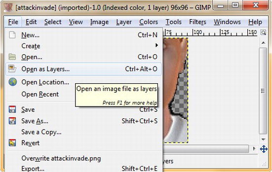
Figure 8-4. Importing the Hoop Layer using the File Open as Layers… menu sequence
After you select this file to open it, it is merged into the project as its own layer in the Layers tab. The Channels tab shows the merged RGBA channel data, as shown in Figure 8-5, and your image view shows the golden hoop seamlessly composited over the soldier’s face. Next, we need to move this new layer containing the soldier’s face down, so that the face moves into the center of the hoop. We do this so that it looks like our soldier is looking through the hoop, and so that the eyes are not covered. It is important to note that GIMP uses RGBA channel ordering, whereas Android uses ARGB, that is, when specifying channels in hexadecimal in Android, the first two positions are the alpha value, not the last two positions, as someone who works with Photoshop or GIMP might simply assume.
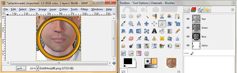
Figure 8-5. Hoop layer imported, and data combined in the RGBA channels, as shown on the right in the Channels tab
Centering Our Soldier’s Face in the Gold Hoop by Moving Its Layer Position
To move the face layer down into the hoop, select the lower layer with the face graphic, as shown in blue in Figure 8-6, and then also click the Move tool (a four-arrow cross, located in the second row, middle) to set the modal editing operation to move (move tool mode) the attackinvade layer (layer editing mode).

Figure 8-6. Select the Layers tab and the Move tool and move the face down into the hoop so top is tangent to inside of hoop
Once you do this, you can take your mouse and click and drag the face straight down into the center of the hoop, and then, if you like, you can use the left and right arrow keys on your keyboard to nudge the image into place, one pixel at a time. This fine-tunes your image centering operation, until the resulting composited image looks like it does in Figure 8-6.
Erasing the Unwanted Pixels Outside the Gold Hoop
Now, all we have to do is to select the Eraser tool shown in Figure 8-7 (fourth row down second icon) to put GIMP into Erase Mode and erase the parts of the soldier’s face and shirt that are outside of the hoop. Note that we are keeping the bottom (face) layer selected, so our image editing software modes include: Erase Tool Mode, RGB Truecolor Mode, and Layer Editing Mode set to the attackinvade.png imagery layer (which applies Eraser tool editing to all four channels at the same time for imagery on that layer only).

Figure 8-7. Use the Eraser tool and remove the parts of the soldier image that fall outside of the hoop as shown
Exporting Our attackinvadepress Button Icon State
Now, we are ready toexport our attackinvadepress button icon state into our drawable-xhdpi folder, and two of our three image state buttons (Normal and Pressed) will be ready to implement in XML code.
To do this, we use GIMP’s File Export menu sequence, name the file attackinvadepress.png, and finally, locate our workspace/Hello_World/res/drawable-xhdpi folder where we want to save this 96-pixel high-resolution (extra-high density pixel image) digital image file. After all this filename, folder pathname, and image type (.png extension) info has been specified in the GIMP Export Image dialog, you can then click the Export button to complete this operation, as shown in Figure 8-8.
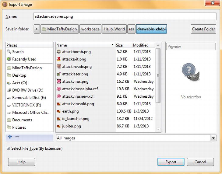
Figure 8-8. Using the Export Image dialog to save a truecolor .png filenamed attackinvaderpress.png in drawable-xhdpi folder
Note that because our GIMP Color Depth Mode is set to truecolor RGB that we are now exporting PNG32 truecolor PNG files with an alpha channel, but our file size has only doubled, from 8K to 16K, because we removed (erased) a lot of image data, and because the PNG32 compression algorithm is very efficient.
It is almost always desirable to use a PNG32 format over a PNG8 format if you can get the data footprint well-optimized, because the level of quality of the image data, as well as alpha channel, are considerably better (far more colors and more transparency values are utilized) in a PNG32 file than in a PNG8 file.
Creating Our attackinvadefocus Image Button State
Finally, we need to create our attackinvadefocus image button state. This is much easier, as much of our image editing work process for this third button state has already been accomplished for our attackimagepress image button state, including changing the image mode, moving the soldier’s face, and erasing pixels outside of the hoop perimeter. All we have to do now is to add a silver hoop to show focus.
Use the File Open as Layer… function, shown in Figure 8-4, to add another layer to our image compositing stack, by finding the SilverHoop96.png image, and importing it into our GIMP 2.8.4 project.
Because the result looks great, as shown in Figure 8-9, we can proceed to again use our File Export work process, shown in Figure 8-8, only this time, use the filename: attackimagefocus.png, and use the same drawable-xhdpi folder location, as this is a 96-pixel extra-high density pixel image file.

Figure 8-9. Use the File Open as Layer… menu sequence to open the SilverHoop.png and add it onto the Layer stack
Creating Our Other Resolution Density Multi-State ImageButton Icons
To create the other three size (80, 64 and 48 pixels) versions of attackinvadepress and attackinvadefocus, follow the work process outlined in the previous chapter in Figure 7-17 using the Image Scale Image… menu sequence, and image scaling dialog, to uniformly scale the images from 96 to 80 (and later 96 to 64 and 96 to 48) pixels. Be sure during each work process to click the eye icon on the SilverHoop96 layer to turn off its visibility, then use File Export to save the file in drawable-hdpi as attackinvadepress.png.
Once that is done, you can click the eye icon again to turn the SilverHoop96 layer visibility back on, and execute the File Export operation again, to create an attackinvadefocus.png in your drawable-hdpi folder. Once you have generated these two files, use the Edit Undo menu sequence to go back to your 96-pixel version, and do the entire work process outlined here to create 64-pixel MDPI and 48-pixel LDPI invade icon assets. It is important to note that the focus button state is not used on Android devices that have touchscreen only (such as our Nexus S emulator). This focused state is only used on Android devices that utilize a trackball, keypad, or keyboard navigation. Once a user touches the touchscreen (if the device has one), Android goes into touch mode, and in this mode of operation the focus button state is not used, but it is still installed and works on other Android device types (such as iTVs) that don’t use touchscreen.
Implementing Multi-State Buttons in XML: Android’s Selector Tag
Once you finish the work process outlined in the previous section for the other three image button icons (bomb, virus and laser), and create all 32 (4 x 4 x 2) images that we will need to implement the pressed and focused states of our multi-state ImageButton UI elements in our Attack Planet Activity screen, we can start coding the XML files (all four of them) that implement the <selector> tags. Selector tags allow Android to select from the three different button image state <item> tags from the image assets we now have in place in our drawable resource folders. Remember that our normal or default state images are already done, so this Activity user interface screen requires a total of 48 multi-state image assets, plus 4 resolution-specific images for our attackexit icon, so 52 images total, not including our stars background image,of course.
Creating a New Android XML File of Resource Type: Drawable
The first thing that we want to do is to create a New Android XML File. Right-click your Hello_World project’s drawable-xhdpi folder, and then select the New Android XML File creation wizard dialog. This dialog is shown in Figure 8-10, and automates XML file creation for you.

Figure 8-10. Creating a new Android XML file with a <selector> root element
Set the Resource Type to Drawable and the Project to Hello_World and name the File: attack_invade. Since Android does not use file extensions in XML and Java code, be sure not to name the file attackinvade as that is our PNG8 filename. Because underscores are allowed in Android file names, use an underscore between the words attack and invade, to simulate a space character between those words.
Next, find the Root Element named selector, and select that for our parent tag (root element) container, and finally click the Finish button to create the attack_invade.xml file. It’s important to note in Figure 8-11 that Android put the attack_invade.xml file in a /res/drawable/ folder, which it created as part of the New Android XML File operation. This is because the file references multiple resolution assets, so it goes once in the /res/drawable folder instead of in each drawable-dpi folder.
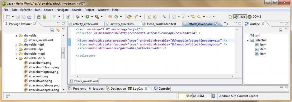
Figure 8-11. XML mark-up for multi-state ImageButton: adding <item> tags inside a <selector> tag in attack_invade.xml
Adding Android <item> Tags to our attack_invade.xml Multi-State XML Definition
Now that we have our attack_invade.xml file open in our editing pane, let’s add the three <item> tags that specify our three image states. The item tags contain one parameter for state definition and another for drawable asset definition. The pressed and focused multi-state item tags are coded like this:
<item android:state_pressed="true" android:drawable="@drawable/attackinvadepress" />
<item android:state_focused="true" android:drawable="@drawable/attackinvadefocus" />
The default or normal button state item tag does not have a multi-state parameter, it just has the image’s drawable asset reference parameter, and this <item> tag is added in last, as can be seen in Figure 8-11.
The order of these <item> tags in the selector container is important in this case, because that is the order in which these items are evaluated, much like the select (case) statement we used in our Java code.
Referencing Our New Multi-State ImageButton XML Definitions from Our Activity Screen Layout XML
The last thing that we need to do is open the tab for our activity_attack.xml user interface screen layout definition, and change the reference for the attackinvade button to point to attack_invade (XML) instead of attackinvade (PNG). This is so the chain of logic that Android goes through to implement the ImageButton now includes the multi-state XML selector logic in how it processes the use of that user interface element.
To implement the other three bomb, virus, and laser attack mode multi-state buttons, we must go through the work process shown in Figures 8-10 and 8-11 three more times, adding in XML <selector> definitions for attack_bomb.xml, attack_virus.xml, and attack_laser.xml multi-state image asset definition XML files.
Each of the selector XML files must point to the proper PNG8 (normal) and PNG32 (presses and focused) digital image asset filenames in the drawable sub-folders, and then we can reference these new XML file definitions in our activity_attack XML file, instead of referencing the default image state PNG8 filename.
Once all this work process is completed for each of our four attack mode buttons, our Attack a Planet user interface screen will be fully converted to feature multi-state ImageButton user interface elements!
Remember that when you test the user interface screen next using the Nexus S emulator that the focused image state does not show, as that Android device that we are emulating is a consumer electronics product that features a touchscreen only.
Figure 8-12 shows an Eclipse IDE with the XML files in the /res/drawable folder in the Package Explorer pane (highlighted in blue) for the attack_bomb, attack_invade, attack_laser, and attack_virus files that we just created (also notice the tabs for these files still open at the top of the Eclipse primary editing pane).
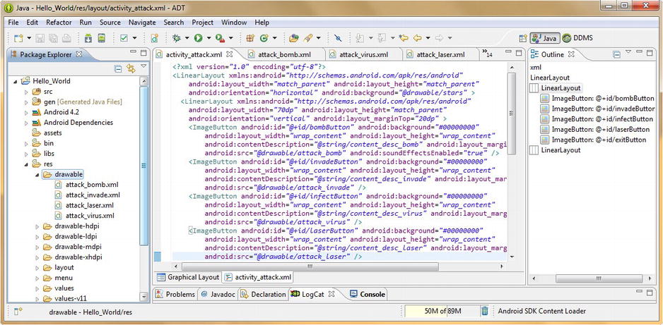
Figure 8-12. New XML mark-up in activity_attack.xml referencing the new multi-state image button selector XML files
The XML mark-up for our activity_attack user interface screen definition in Figure 8-12 also shows that we have changed all the android:src parameters for each of our ImageButton tags to point to the XML filenames, which use an underscore in the middle of each filename, instead of pointing to the PNG8 filenames, which do not use an underscore character in the middle.
Finally, we need to test the application, and our new multi-state ImageButton user interface elements, via the Run As Android Application work process. Launch a Nexus S emulator and click the Soldier Face icon for Invade a Planet, and you will see that the face moves into the center of the hoop when you click and hold down (via a mouse-down operation) the left mouse button, as shown in Figure 8-13.
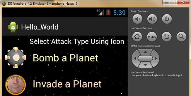
Figure 8-13. Running our app in the Nexus S emulator to test our attackinvade ImageButton multi-state image button
Be sure and also test all four of your attack mode button icons, to make sure that you have implemented all your activity XML mark-up and your <selector> XML mark-up and digital imagery references correctly.
Now it’s time to take our Configure Planet user interface screen to a more professional level, by adding a space-related background image, and then changing how our user interface elements composite over that new colliding galaxies image, so that we enhance the contrast ratio (readability) for this new UI Design.
Compositing Our UI Elements: Alpha, Color, Gravity, and TextStyle
Let’s take our Configure a Planet user interface to the next level, since this is the chapter on compositing for graphics design in Android. First we’ll add a visually impressive background called space, which shows two colliding galaxies. Next we’ll add new compositing and desktop publishing (DTP) parameters for our user interface screen element tags to maximize their contrast (visibility) and improve the UI look and feel using the new background in conjunction with new fonts, spacing, gravity, and alpha effects.
First, let’s copy the space1280x720.png, space1024x600.png, space 800x480.png, and space 480x320.png files into the XHDPI, HDPI, MDPI, and LDPI folders as we have done previously, and then rename them all once they are in place to space.png, which is the filename we will be referencing in our code later on.
Modifying Our activity_config XML Parameters to Composite Space Background Image with Our UI Elements
The first thing we want to do in our activity_config.xml file is to add an android:background parameter that points to our newly installed space.png files, using the @drawable/space reference parameter, as shown in Figure 8-14. If you click on the Graphical Layout tab at the bottom of the editing pane after you add in the new digital image background, you will see that our existing user interface elements have essentially disappeared, and so we’ll have to make some fairly drastic parameter changes to our current XML mark-up to make our UI look really professional with this space background.
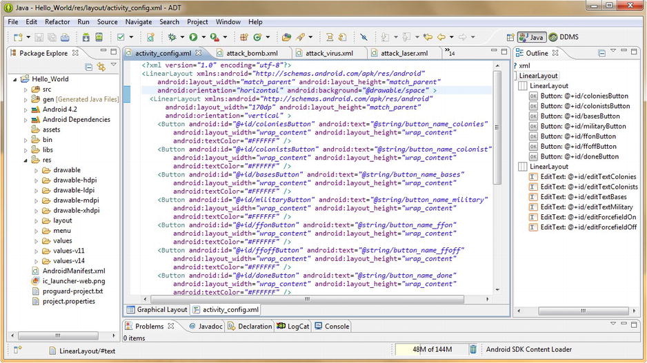
Figure 8-14. Editing our LinearLayout to add the space.png background and Button tags to add a white textColor value
Let’s start with the Button tags, and add in an android:textColor parameter, set to the hexadecimal value for white of #FFFFFF, as is shown in Figure 8-14. Once again, let’s use the Graphical Layout tab as a quick and easy screen preview, and see if our buttons have become easier to read. As you can see in Figure 8-15 this solves the problem for the Button UI elements, and they look great. However, the EditText text fields are nearly impossible to discern, and these will require a number of new tag parameters to make them both readable and ultimately professional in appearance.

Figure 8-15. Previewing our new Button and Background parameters in the Graphical Layout Editor
Improving the Contrast of Our EditText Fields Using Background Color and Alpha Transparency
To make our EditText text editing fields work with this amazing colliding galaxy background we will have to use a combination of bright background colors (white), some opacity (alpha channel) to allow the stars to shine through, and some better fonts, alignment and edit text field spacing to match (balance out) the button spacing on the opposite side of the screen layout.
The first EditText tag parameter we will want to add, so that we can see what we are doing on this dark background, is the android:background parameter, which we will set to the hexadecimal color value for white (#FFFFFF). To make this white background somewhat translucent, let’s also add an android:alpha parameter, which controls opacity (alpha channel value) for the UI element using a decimal range of Zero (transparent) to One (opaque). We use a 50% transparent setting of 0.5 to start off with. Now that we can see our text fields, we can next adjust our android:layout_marginTop parameter to space them out.
For the first EditText tag this equates to 13dp and the rest require an additional 10 dp, or a final setting of 23dp, to space them perfectly opposite each button, as you can see in the XML mark-up in Figure 8-16.

Figure 8-16. Editing our LinearLayout Container Tag and EditText Tags and their parameters
So now that our text fields are perfectly spaced out from top to bottom opposite each of their respective buttons, we need to space them out from left to right. They are touching the right-hand side of the UI screen and this looks unprofessional. Let’s adjust this to add some symmetry to the UI screen design.
Because we want to move all the EditText fields an even distance of 5dp, similar to the spacing on our buttons on the opposite side of the screen, let’s do that with a single tag in the LinearLayout container that holds them, instead of adding a half-dozen tags (one in each EditText element tag).
Once you add the android:layout_marginRight=“5dp” as shown in Figure 8-16, hit your Graphical Layout tab, and see how it looks. To get an even more precise look as to how it will all line up, use the Run As Android Application work process and look at the current UI design in the Nexus S emulator; you will see that it is starting to look truly amazing.
Formatting the Text Characteristics Inside Our EditText UI Elements
Now that we have the EditText UI container spaced out and composited perfectly with the screen and its background image, let’s set some parameters to optimize the text that is contained within that text field. For the numeric data entry text fields let’s specify a monospace font, which makes numeric entries especially readable; this is accomplished via the android:typeface=“monospace” parameter.
To make the text a bit more readable on the screen let’s also add an android:textStyle parameter, setting the font to use bold text to make the characters thicker and easier to read on smaller displays. Finally, to make the text look evenly spaced within the text field and be symmetrical on the right side of the display, let’s use a center parameter to center the text within each EditText data entry field. This is accomplished by using an android:gravity parameter set to center or android:gravity=“center” mark-up. The Android gravity parameter centers just about anything in Android, not just text, so become familiar with this parameter, and look for it in other types of user interface widgets and tags, as gravity can be very useful.
Now it’s time to use our Run As Android Application work process and to preview the outcome of all this user interface element tag parameter modification and optimization in the Nexus S emulator. As you can see in Figure 8-17, the Configure Activity user interface screen is really starting to look professional.
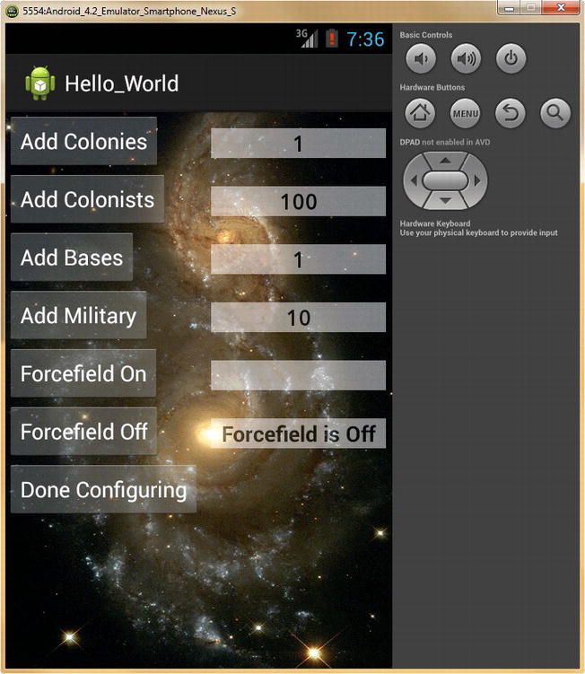
Figure 8-17. Previewing our finished Configure Activity screen in the Nexus S emulator
Next let’s take our Hello World application Home Screen to the next level by adding custom background imagery and an ImageView of the planet we’re on. We will customize these later on in the Animation chapters. Finally, we’ll color our text to match dazzling plasma light colors in a galaxy background image.
Upgrading Our App Home Screen: Adding an ImageView Tag and textColor Parameters
The first thing that we need to do to set-up for our all new Home Screen is to copy the galaxy480x320.png, galaxy800x480.png, galaxy1024x600.png and galaxy1280x720.png images into their respective drawable sub-folders, as we have done several times before. Once these are inside the LDPI, MDPI, HDPI, and XHDPI folders, respectively, rename them to simply be galaxy.png, and we will be ready to reference them in our XML mark-up in the activity_main.xml file, which defines our Hello World application Home Screen user interface design. Once we do this, we can then fine-tune our UI element colors, to match the galaxy image.
Because we want this new background image to span the entire layout container, we will add the parameter android:background to the RelativeLayout container tag, and set it equal to the @drawable/galaxy reference path to our galaxy.png files, as shown at the top of Figure 8-18.
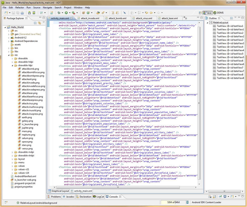
Figure 8-18. Adding galaxy.png background image; customizing textColor parameters to match plasma colors in image
Use the Graphical Layout tab to preview the image, and notice that the text now needs our attention, due to low contrast (readability). Let’s match our new text color to the orange and yellow hues prominent in the plasma on the right and bottom part of the background image.
Let’s make the label text on the left orange to balance out the orange at the top right of the background image, and the data text yellow to match the yellow plasma flares in the center of our background image. To create a matching orange color, leave the red channels on full intensity by using two F values and use less intensity in the green channels (remember equal red and green values result in yellow), by setting those two values to D, and even less intensity in the blue channels, by setting those two values to A, so the #RRGGBB values for a bright plasma orange are #FFDDAA. Since we know that equal Red and Green values yield a yellow color, we would want to use #FFFF99 to obtain a fully saturated yellow color, similar to the color that is in the plasma flare in the middle of the Home Screen background image.
Change all the android:textColor hexadecimal values in your activity_main.xml mark-up, as shown in Figure 8-18, and then use the Run As Android Application work process to see how our new Home Screen looks at this point. As you can see in Figure 8-19, the new screen is visually arresting and very pleasant to look at, so let’s now add a planet image to give the user a visual of the planet they are currently on as well.
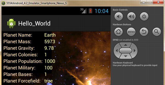
Figure 8-19. Previewing our new galaxy.png background image and our new text coloration in the Nexus S emulator
To add a planet image to our UI screen, use the ImageView tag and RelativeLayout positioning parameters as shown in Figure 8-20. The XML mark-up for the tag and its parameters should look like the following:
<ImageView android:id="@+id/imageEarth"
           android:src="@drawable/earth"
           android:background="#00000000"
           android:layout_width="wrap_width"
           android:layout_height="wrap_width"
           android:layout_marginLeft="12dp"
           android:layout_marginTop="8dp"
           android:layout_below="@+id/textView8"
           android:contentDescription="@string/content_desc_earth" />

Figure 8-20. Adding an ImageView tag to hold our Planet and configuring its background alpha and margin parameters
We will reference our earth.png source imagery, and set an alpha channel of #00000000 (#AARRGGBB), which is 100% transparent. We do this so that the compositing effect on our background galaxy image is completely seamless. Next we will use an android:layout_below parameter that references the TextView above it, and finally marginLeft and marginTop parameter settings of 12dp and 8dp, respectively, to position our planet image perfectly.
Now let’s do a final preview our work in the Nexus S emulator, via the Run As Android Application work process, and note that we now have a visual image of our current world, as well as the characteristics and settings for that world on the primary application Home Screen as shown in Figure 8-21.

Figure 8-21. Previewing our Hello_World app Home Screen in the Nexus S emulator
These user interface design improvements give our user visual feedback on the current world that they are dealing with, and also make the application appearance 100% more professional.
We will be enhancing this UI screen (as well as our other user interface screens) with animation and cool special image effects in future chapters, using a couple of other techniques and tag parameters. So be aware that we will be utilizing similar compositing concepts and techniques in future chapters on Animation and Video, where compositing will logically be needed, so you’ll soon have a chance to build on your recent compositing knowledge, and gain compositing experience.
Because this is the last chapter specifically addressing graphics design and compositing, I wanted to get all the primary imagery in place for this app as soon as possible, and get it seamlessly compositing with all the major user interface elements that we will be using within our “out of this world” Hello World app.
Next we will finally upgrade our Hello World application launch icon, because as we all know the devil is in the details, which not only shows on the Android device icon launch screen, but also at the top of the app.
Custom Activity Screen Title and App Icon: Details Make a Difference
The first thing we need to do is to copy the saturn36.png, saturn48.png, saturn72.png, and saturn96.png files into the LDPI, MDPI, HDPI, and XHDPI drawable folders, respectively, using the Windows Explorer file management utility, as shown in Figure 8-22. Rename ic_launcher to ic_launcher_old, and rename the saturn36.png file to helloworldicon.png. Later I show you how to implement a custom application icon filename, using XML mark-up in your application’s AndroidManifest.xml file.
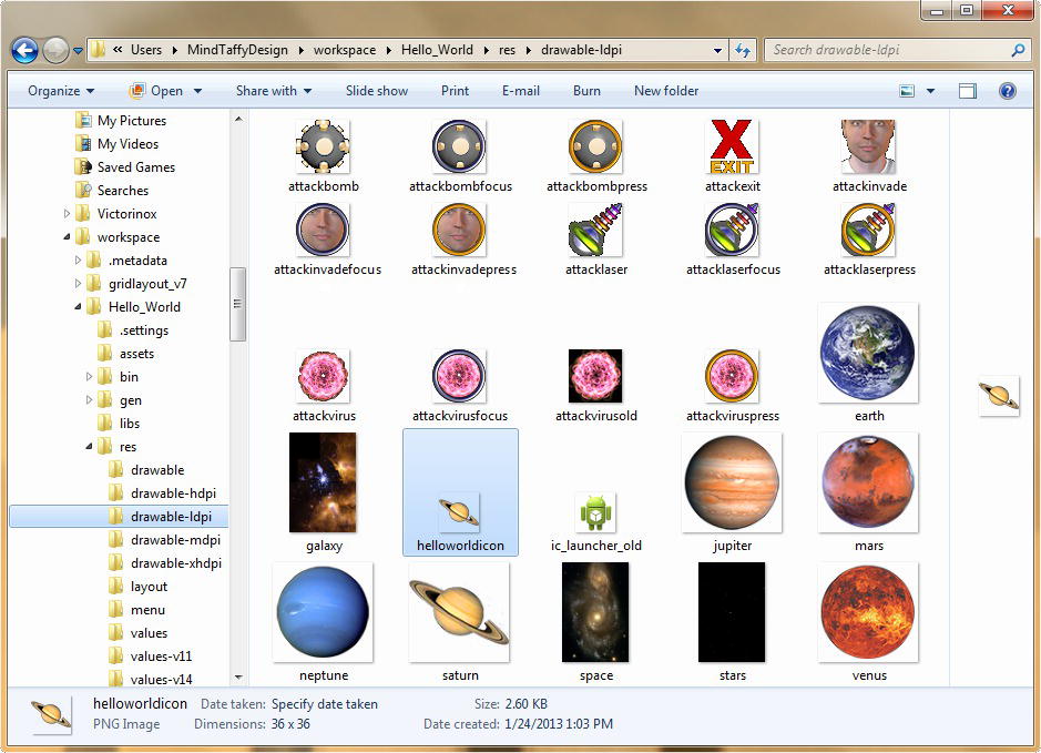
Figure 8-22. Renaming ic_launcher_old and adding a new helloworldicon.png application icon
Once your new custom application icon image files are in place in their respective drawable-dpi folders, the next thing that we need to do is to create some custom Activity user interface screen titles, known in Android as labels, in our strings.xml file in our resource values /res/values/ folder.
Creating Our Activity Screen Title Constants in the strings.xml File
Click the number in the top right of the Eclipse central editing pane (in Figure 8-23 it is 14) to drop-down the open files menu. Next, select the strings.xml file for editing, and change the app_name text value to Hello World - Home Screen. Copy and paste that <string> tag underneath itself four more times, so we can add titles (labels) for each of our four application Activity user interface screens.

Figure 8-23. Adding <string> tag constants in strings.xml for use in our Activity user interface screens as custom titles
Name each <string> tag constant with the name=“activity_title_type_planet” parameter and with the text value Hello World - Screen Title, for instance, a <string> tag for the NewPlanet Activity would look like:
<string name="activity_title_new_planet">Hello World - Create a Planet</string>
The five resulting <string> constant tags to label our app Activity screen titles can be seen in Figure 8-23.
Configuring Activity Screen Labels in Our Hello_World AndroidManifest XML File
Once we have our string constants defined and in place in the strings.xml file, we can then reference them from our AndroidManifest.xml file, which is where we are going to set up the android:label parameters for each of our Activity screens, which will install a custom screen title at the top of each Activity.
Click the number in the top right of the Eclipse central editing pane (in Figure 8-23 it is 14) to drop-down the open files menu. Next, select the AndroidManifest.xml file for editing and change the current android:icon parameter in the <application> tag to reference an @drawable/helloworldicon reference, which is the reference to our new Saturn icon image PNG file.
Next, in each of our <activity> tags add a new android:label parameter that references the new <string> tag constants that we just created by name via @string/activity_title, as shown in Figure 8-24.
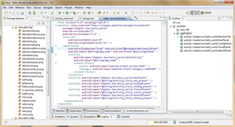
Figure 8-24. Adding a new application android:icon filename and android:label screen titles to our AndroidManifest.xml
For the NewPlanet.java Activity user interface screen, the parameter to place a custom title at the top of the application is android:label=“@string/activity_title_new_planet” which is fairly straight forward, once you know where Android wants you to put everything. So using the NewPlanet Activity <activity> tag as an example, the entire <activity> tag with the name and label parameters would look like this:
<activity android:name="chapter.two.hello_world.NewPlanet"
          android:label="string/activity_title_new_planet" />
Now let’s use the Eclipse Run As Android Application command, and launch the Nexus S emulator and see how the new icon and screen title looks at the top of our application. As you can see in Figure 8-25 the results are professional and an improvement over the previous screen title (Hello_World) and app icon (Android Bot) as they are now more specific to what our app is and what it is doing.
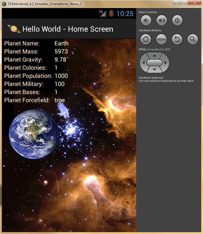
Figure 8-25. New Hello World Home Screen with new screen title and application icon
Click the Menu button in the upper-right of the Nexus S emulator and let’s see what our Activity UI screens look like with their new icons and screen titles. As you can see in Figure 8-26, our screens (the three that we have finished, the fourth TravelPlanet Activity screen we are going to implement in future Chapters 11 and 12 covering Digital Video) look great, and look far more custom and professional due to this attention to UI detail.

Figure 8-26. Previewing our Hello World application Activity screens with their new screen title labels and icons in place
Note that by using this android:label parameter to create our Activity screen title, we don’t have to use a TextView UI element at the top of our screen container, so we only need a TextView on two of the screens to instruct the user what to do when they get to the screen. On the Configure Planet UI screen, our button labels call the user to action, and thus we require no TextView UI elements on that screen at all.
Also notice that our Activity user interface screen titles (labels) closely match our Options Menu Labels, thus providing the user with excellent continuity throughout the application user interface infrastructure.
Now that we have the basic graphics elements composited together with our application’s user interface elements, we can proceed to implement more advanced new media elements such as Animation, Digital Audio, and Digital Video over the next several chapters.
Summary
In this chapter, we took a closer look at some of the more advanced user interface elements and image compositing concepts to take our Hello World application user interface design to the next level visually. We learned about multi-state user interface elements. These elements change an image to represent the current state of a user interface element, namely its default or normal state versus its touched or pressed state, as well as its in-use or focused state.
We learned how to create multi-channel images using GIMP 2.8.4, and learned about advanced modal imaging software operations, as well as digital imaging color modes, editing modes, and tool modes.
We used these modal digital imaging tools and software settings to create multi-state image buttons for our Attack a Planet icons, and created over 50 digital image assets to be used for all the various image resolution density levels in our Android application.
We learned how to use the XML <selector> tag and its children <item> tags to define our multi-state ImageButton user interface elements using XML mark-up, so that we do not have to write any Java code whatsoever to implement multi-state user interface elements in our Android application.
We learned that all XML files that define imaging-related structures, such as our <selector> multi-image constructs, go into the root /drawable folder, and then reference commonly named digital image elements within the drawable-dpi subfolders located underneath that drawable folder.
We learned that the focus button state is not used on Android devices which have touchscreens only (such as the Nexus S emulator). The focused state is used on Android devices that feature a trackball, nav-keys, mini-keypads, or external keyboard navigation hardware.
We learned that once a user touches a touchscreen (if an Android device has one), that the Android OS puts itself into touch mode. In this touch mode of operation, the focus button state is not used, but it is still installed, and will work on other Android device types (such as iTVs) that don’t use touchscreens. What this means for developers is that we still need to implement and accommodate focus button states in our Android application development.
We added new background imagery to our Activity screen user interfaces, to replace the black and white background colors. Next we added new tags and new parameters to upgrade those screens with color matching text, different fonts, text alignment, new imagery, improved margin spacing, and alpha channel-based translucency, to achieve a far more professional visual result.
We learned about the concept of gravity in Android, via the android:gravity parameter, which allows us to push or pull our user interface element into a certain orientation using gravity. User interface gravity is a concept that is certainly appropriate for us to learn about in an application regarding planets and space.
We learned about the concept of contrast and the need to keep a high contrast ratio between color brightness and saturation and the corresponding background image darkness, and learned more about 32-bit #AARRGGBB color theory by developing text colors for our Home Screen that matched colors in the background galaxy image. We did this by adjusting the relative hexadecimal color channel intensity via the two RR (Red), GG (Green) and BB (Blue) channel slots, which give us control over 256 levels of color intensity variation for each channel, for total color control equating to 16,777,216 color variations.
Finally, we learned how to implement our own custom application icon, as well as our own custom icon naming schemes by using the android:icon parameter inside of the <application> tag at the beginning of our AndroidManifest.xml file’s mark-up. We also learned how to implement custom Activity screen titles by using new android:label parameters in the AndroidManifest.xml file, inside of our <activity> tags, located near the bottom of our Hello_World Manifest XML mark-up application definition logic.
In the next chapter, we will start adding bitmap or frame-based animation and imaging special effects to the user interface screens for our Hello World Android application, and yet again, we’ll be using XML mark-up (for the most part) to define, and even implement, these animation and special effect elements.
What is a space application without a ton of cool special effects anyway? One that doesn’t sell very well, would be my guess. Let’s be sure that you don’t fall into that trap by making sure you have a solid grip in the next chapter on implementing raster animation and digital imaging special effects by utilizing Android’s built-in animation classes that have been provided to developers precisely for that purpose.