IN THIS CHAPTER
Inserting charts
Adding formatting attributes to charts
Editing chart parts and data
Using advanced charting techniques
Nothing gives your Excel numbers more impact than a chart. Charts can provide your audience with a visual understanding of what your numbers really mean and where your information is going. As it turns out, an overwhelming number of the human population is visually oriented anyway, so turning your numerical data into a visual format makes perfect sense and is sure to reach the widest audience. Think about it—staring at a column of numbers in a worksheet does not really have much impact, but when you present that same column of numbers as a pie chart or bar chart, then you begin to really see what each number represents. Suddenly, the ordinary number speaks volumes as it relates to the other data. The visual impact is quick and to the point.
Whether you're using a simple pie chart or a detailed scatter chart, Excel charts give your numbers a professional polish and the visual oomph needed to quickly convey the importance of your spreadsheet information. This chapter explores the various ways you can build and format charts. You learn how to use the new Elements Gallery to quickly choose a chart type, how to format various elements of a chart, and how to edit the chart data to suit your needs. You also learn all the necessary chart terminology and the details about each chart type.
In the Excel family, charts are the buttoned-up spreadsheet's funky, artistic cousin. Charts can take ordinary numerical data and make it look expressive and interesting, sort of like having an interior decorator over to rethink the display of your drab columns and rows. Adding charts in Office 2008 is easier than ever. In previous versions of Excel, the tried and true Chart Wizard walked you through all the necessary steps for building a chart. The process took several dialog boxes and lots of decisions. Today, the Chart Wizard is gone, and the new Elements Gallery is the go-to feature for charting and assigning other graphical objects. It offers a special category just for charts. All you have to do is open the Gallery to the Charts tab and pick a chart. It really is that easy. The Gallery lists a dizzying array of chart types to choose from, ranging from area charts to line charts, to surface charts, and every chart in between. So before you begin trying them out, look at what goes into basic chart anatomy and determine what chart type works best for your data.
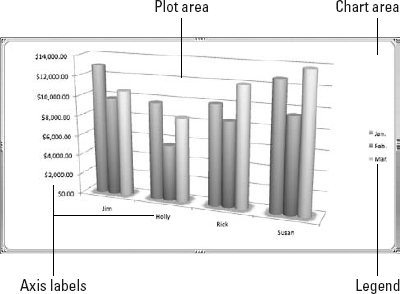
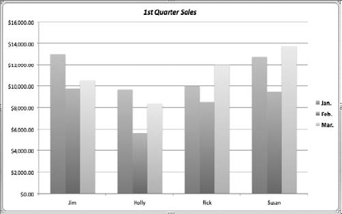
Charts are generally comprised of several key features or parts. Granted, not all charts look the same, but the general elements are usually consistent throughout the charting vernacular, with a few exceptions. For example, you can expect to find a legend, and maybe some axes and data points on a typical chart, and every chart includes a plot area and a chart area regardless of what kind of chart it is. To truly utilize your charts, you need to know basic chart terminology and how these chart parts work together. Start by looking at Figure 16.1. It shows a simple marked line chart that tracks monthly sales totals for four salespeople over the course of three months. When plotting this data in a worksheet, your sheet would contain a row for each salesperson and a column for each month. The intersecting cells where the rows and columns meet hold the sales totals for each month. You also could arrange the data another way, and show rows for each month and columns for each salesperson. No matter the arrangement, the result is a chart that emphasizes each person's contributions and compares them to the group.

Figure 16.1. This worksheet example tracks sales figures over the course of three months. The resulting line chart shows lines for each month and data markers on each line pinpointing each employee's sales totals.
Data points are the individual values you plot in a chart. In Figure 16.1, for example, the monthly sales total for each salesperson becomes a data point in the chart. In other words, the individual cell data is plotted as data points in the chart. Data markers are the graphical elements that represent data points in a chart, such as bullet points or shapes.
The data series is a group of related values in a chart. In Figure 16.1, the data series is the group of values over three month's time for each salesperson. Most charts use more than one data series, as is the case when tracking sales figures for four different salespeople. Each person's sales figures across three months become a data series. In many instances, the data series is the row of data or column of data in a worksheet.
Data categories are the categories you assign in a worksheet to organize data. In Figure 16.1, the data categories are the month names at the top of the data that organize the sales totals.
The axes in a chart display the horizontal and vertical scale upon which the data is plotted. The X axis, also called the category axis, is the horizontal scale, while the Y axis, also called the value axis, is the vertical scale. Depending on the chart style, one of the axes corresponds to the row or column headings in your worksheet. For example, in Figure 16.1, the marked line chart shows monetary values on the Y axis and salespeople names on the X axis. The plot area shows how much money each salesperson generated each month.
In Figure 16.2, the same data is plotted as a clustered cylinder column chart. Instead of lines, cylindrical columns indicate the changes in values, yet the X and Y axes stay the same.
Axis labels help identify what data is being plotted out in the chart. Labels in the worksheet can include data titles, names, categories, time intervals, months, years, and so on. In Figure 16.2, the Y axis labels indicate amounts for the monetary scale for the chart data, while the X axis labels represent each salesperson. Other charts you create might use labels like "Income in Millions" or "Projected Sales Growth."
The plot area is the middle of the chart where all the data appears. The plot area includes data points, data markers, data series, data labels, gridlines, and so on. For many charts, the plot area appears as a rectangle. In other charts, like pie charts and doughnut charts, the plot area is circular in shape.
The legend is a summary or map of what the chart is plotting, much like a map key. Depending on the type of chart, the legend identifies the data series and differentiates between the series. For example, in Figure 16.2, the legend shows each month's color and name as it appears in the plot area. Most legends appear to the side or top of the plot area.
The chart area is, quite simply, the entire chart. The chart area includes the plot area, axes, legend, and any chart title text. It also includes any borders you assign to the chart. You'll notice when you insert a chart into your worksheet, it appears as its own object as a box, which means you can move it, resize it, copy it, and delete it.
Gridlines, also called tick marks, appear in the plot area to help your audience line up chart data with the scale it is illustrating. In other words, gridlines or tick marks can help with readability of your chart. You can use major gridlines to show units or minor gridlines to further break up the scale between units. Figure 16.3 shows a chart with minor gridlines turned on.

Excel offers a dizzying array of chart types and variations of each kind. Before you begin turning your spreadsheet information into a chart, it is a good idea to determine what sort of chart is best suited for your data. At its heart, Excel's charting feature can compare data in five fundamental ways, as outlined in Table 16.1. Choosing the type of comparison you want to make can help you narrow down what type of chart to use. For example, a pie chart is perfect for comparing expenditures in a household budget, while a bar chart works well for comparing individual data, such as sales totals from a group of stores. Finding the right chart type can save you time and effort at the start of your charting tasks.
Table 16.1. Chart Comparisons
Comparison | Description |
|---|---|
Time Series | Compares values from different time periods to show changes over time. For example, comparing sales figures for every month of the year is a time series comparison. |
Correlation | Compares data series to form correlations. For example, comparing TV viewing ratings nationwide to viewing ratings in a particular age group is an example of correlation comparison. |
Part-to-Whole | Compares individual values to the sum of a data series. For example, comparing sales for a particular model number for a gadget to overall gadget sales is a part-to-whole comparison. |
Whole-to-Whole | Compares individual values to each other, or a data series to another data series. For example, comparing sales for gadgets from one manufacturer to the sales of the same gadgets from another manufacturer is a whole-to-whole comparison. |
Geographic | Compares values using a geographic basis. For example, comparing sales from each state or sales by country is an example of geographic comparison. |
Although you can preview any chart type using the Elements Gallery, the following descriptions might give you greater detail about the particular chart type and how it is used. In addition to the standard chart types, Excel's charting feature includes several subtypes for each. Subtypes include stacked, 100% stacked, and 3-D versions of the standard chart types. For example, you can assign a standard column chart, or you can use a stacked, 100% stacked, or 3-D subtype. The stacked subtype means the data series is displayed in one column or, in the case of the bar or line charts, whatever the chart's data point style dictates. The measurement of the chart element, such as the height of a column in a column chart, is the sum of the values for that particular data series category, yet each portion appears as a segment in the column. The 100% stacked subtype displays the percentages of the data series total, essentially showing how each value contributes in percentage to the whole.
Lastly, the 3-D subtype artistically renders the chart so that it appears three dimensional in perspective. Surface charts are the only Excel chart type that offers true three-dimensional aspects in plotting data. The other 3-D subtypes use three-dimensional graphics to create a 3-D appearance only. I'm anxiously looking forward to the day they start integrating 3-D glasses with viewing charts in Excel. That should really make the data pop!
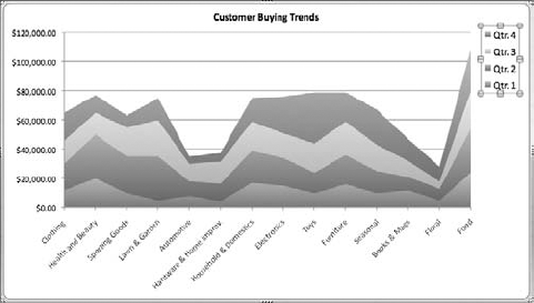
Area charts are most appropriate for showing trends or amounts of change over a period of time or across categories. Because area charts display the sum of the values, this chart type is useful for showing how the various parts contribute to the whole. Each line in an area chart represents a single data series. Area charts come in three versions: area, stacked, and 100% stacked. Plus, each version has 3-D renderings, making for a total of six different area charts. The stacked area chart shows trends in contributions over time or categories, while the 100% stacked area chart shows the percentage each value contributes over time or categories. Figure 16.4 shows an example of a stacked area chart.
Bar charts show comparisons between data using rectangular horizontal bars. Bar charts are great for emphasizing differences in data series. Bar charts come in several versions, the main differences being the graphical presentation of the bars themselves. You can assign a clustered bar, stacked bar, or 100% stacked bar, or 3-D versions of all three. If you are not fond of rectangular bars, you can use cones, cylinders, or pyramids instead. Each of the other graphical styles also has 3-D perspectives. In total, you have 15 different bar charts to choose from. Figure 16.5 shows a clustered bar chart.

Bubble charts are similar to XY (scatter) charts. They compare sets of three values: X, Y, and a third variable. Data markers appear as circular bubbles on the actual chart, with the largest bubble expressing the third variable in the set. For example, you might use a bubble chart to compare the number of products, sales totals, and the percentage of market share. In order to use a bubble chart, you need to place all the X values in one row or column, all the corresponding Y values in adjacent rows or columns, and the bubble values in the next adjacent row or column. Unlike some of the other chart types, bubble charts offer only two flavors: bubble or 3-D bubble. To view a bubble chart, see Figure 16.6.

Column charts show changes in data over a period of time or compares data. This chart type is good for displaying two or more values side by side. Column charts, like bar charts, use rectangular shapes to illustrate the extent of comparison, but the shapes run vertically instead of horizontally. Also like bar charts, column charts can be clustered or stacked using columns, cylinders, cones, or pyramids. You also can assign 3-D versions of each kind. In total, you can choose from 19 column charts. With sheer numbers alone, column charts win the popularity contest among chart types. Figure 16.7 shows an example of a clustered column chart.
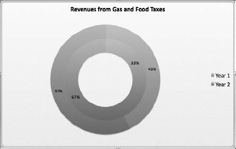
Doughnut charts, like the one shown in Figure 16.8, are circular and display data series in rings with a big, empty whole in the middle. Much like pie charts, doughnut charts allow readers to see the relationship of parts to the whole. Unlike pie charts, however, which show only one data series, doughnut charts can illustrate more than one data series. Each ring in the doughnut represents a different data series. You can assign a regular doughnut chart or an exploded doughnut chart. Don't worry, no real explosives are involved. Instead, it's simply an effect that makes the data appear to emanate from the center of the doughnut. It's a strange name, really.
Line charts are useful for showing trends in intervals, like time. You can use this chart type to track data points over time or categories with data markers or data points at the crucial intervals of change. For example, you might use a line chart to show the rate of change over time, using one or more data series. Each series has its own line on the chart. Line charts include regular line, stacked line, 100% stacked line, marked line, stacked marked line, 100% stacked marked line, and 3-D line. The marked versions of this chart type use small graphical shapes as data points along the line being charted. Figure 16.9 shows an example of a line chart.
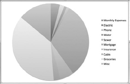
Using a single data series, a pie chart shows how the individual values are proportional to the sum of the values. Turning a household budget into a pie chart is a good example of this chart type. Each item in the budget appears as a wedge or piece of the pie, and the wedge size is proportional to the whole budget. The pie chart subtypes include 3-D pie, pie of pie, and exploded pie. Like the exploded doughnut chart, nothing is really exploding, rather the illusion of pie parts breaking off and emanating from the center. For an example of a pie chart, see Figure 16.10.

You can use radar charts, as shown in Figure 16.11, to display changes in values relative to a center point. As such, Radar charts look much like spider webs. Data points closest to the center represent low values, while data points further from the center represent higher values. You might use a radar chart to look at several factors all related to one item, such as comparing NFL quarterbacks' statistics or average monthly temperatures in the three most populated countries. Radar charts come in three flavors: radar, marked radar, and filled radar. The marked radar style shows values as data markers on the chart, while a filled radar style fills in a color for the data series area covered.

You can use Excel's stock charts to illustrate the fluctuation in stock prices. Stock charts come in four varieties: high-low-close, open-high-low-close, volume-high-low-close, and volume-open-high-low. You can also use them to chart scientific data, such as daily temperature values. When preparing data for a stock chart, you must organize the data in the right order on the worksheet. For example, to use a high-low-close stock chart, you must list three series of values, listing the high values first in one column, then the low values in the next column, and then the closing values in the final column. If you do not enter the values in the correct order, your chart will not be accurate. See Figure 16.12 to view a sample of a high-low-close stock chart.

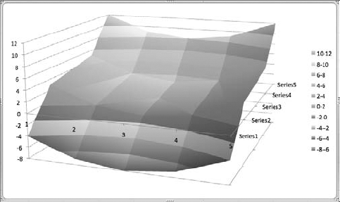
Surface charts, also called contour maps, look like topographical maps, as shown in Figure 16.13. They allow you to illustrate combinations between data values. Surface charts work by comparing how a variable (Z) changes according to two other variables (X and Y). This is the same as an actual topographical chart that shows how altitude (Z) changes with longitude and latitude (X and Y) on the earth's surface. Surface charts use colors and patterns to show where data values are the same. You can choose from 3-D surface, wireframe 3-D surface, contour, or wireframe contour charts. The wireframe perspective displays the chart data with a grid that flows with the rise and fall of values, while the contour perspective looks more like a folded map.
XY, or scatter, charts are used to illustrate relationships between numerical values or compare trends across uneven time periods using two or more data series. Scatter charts plot paired variables on a grid to view the relationship between them. Scatter charts come in the following styles: marked scatter, smooth marked scatter, smooth lined scatter, straight marked scatter, and straight lined scatter. Figure 16.14 shows an example of a straight marked scatter chart.
Even though Excel offers a variety of chart types, most people find themselves using the same few over and over again. The most commonly used chart types are column, pie, scatter, area, and line charts. All in all, choosing a chart type really comes down to deciding the best way to present your data, making it easy to understand at a glance. Let your guiding philosophy be this: Always choose a chart type that conveys your message in the simplest possible way.
Inserting a chart is easier than ever in Office 2008. Before you apply Excel's charting feature, you must first figure out which data to include in the chart. This may seem rather obvious, but it is often easy to miss something in your selection. Think about what data you want to emphasize as you're making your selection. When selecting data, keep the following points in mind:
Be sure to select any text labels appearing in the columns or rows to include with the chart data. For example, if your worksheet has text headings at the top of each column for your data series, be sure to include those cells, or if your rows include text labels for items, be sure to include those.
Unless the numbers are a part of your chart data, it is not necessary to include cells containing totals, such as a total at the bottom of a column.
You may find it easier to place a data series in a column rather than a row. This tends to keep your numeric data adjacent to each other and most resembles a list, which is how most people are used to seeing number data.
Do not include blank rows or columns in your selection, or your chart will end up with gaps, and your audience won't understand where they came from.
You can, in fact, also choose data to chart from non-adjacent cells. To do so, press and hold the

Now that you know which data to include in your chart, you are ready to insert a chart. Use the following steps to create a chart in Excel:
In your worksheet, select the data that you want to turn into a chart.
Click the Charts tab on Elements Gallery. You also can use the Insert menu; choose Insert

You can now cycle through the various chart types in the Gallery, clicking each tab to view its subtypes. Not all the subtypes fit onscreen, so you must use the scroll arrows at the far right end of the Gallery to view additional subtypes.
To apply any chart to your data, just click the chart you want on the Charts tab. Excel immediately creates a chart and places it on the worksheet as a floating object, much like a graphic or picture.
The chart object is treated as an embedded object in Excel. Figure 16.16 shows a newly inserted chart. Excel isn't always very careful about where it places a chart. Notice in this figure, the chart partially obscures the underlying data. I have not touched the chart yet in any way, honestly! Excel just thought that would be a good place for it, I guess. The good news is that because it's an object, the chart is moveable and resizable, and you can delete it when you no longer want it on the sheet. If you continue clicking other chart types in the Gallery, and as long as the chart is still selected on the worksheet, Excel continues to update the chart object to a new type. The chart is linked to your worksheet data, so if you make any changes to the cells associated with the chart, Excel updates the chart to reflect your changes.

Figure 16.15. The Charts tab on the Elements Gallery gives you fast access to every kind of chart you can create in Excel.
Now that you have a chart inserted onto your worksheet, make sure it's in the right location and the right size. To move a chart at any time, follow these steps:
Move the mouse pointer over the border edge of the chart object. The mouse pointer takes on the shape of a four-sided arrow pointer.
Click and drag the chart to a new location on the worksheet, and drop it in place.
Tip
Want to move the chart to another sheet? You can use the Chart menu; choose Chart
To resize a chart, follow these steps:
Hover the mouse pointer over a corner of the selected chart object until the pointer takes the shape of a double-sided arrow pointer.
Click and drag to resize the chart.
Drag toward the middle of the chart to make the chart smaller.
Drag away from the middle to make the chart larger.
If you press and hold the Shift key while dragging, Excel resizes the chart proportionately, which means all four sides are resized simultaneously and equally.
You also can remove a chart entirely from the worksheet by selecting the chart and pressing Delete. That's all there is to it. You can use the same technique to delete individual chart elements. If you ever accidentally delete the wrong chart or item, you can always activate the Undo command. Press
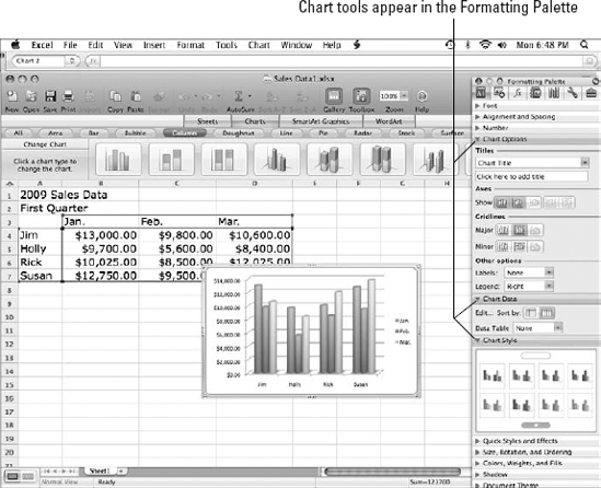
Figure 16.16. After you create a chart, the chart appears selected onscreen, and the Formatting Palette displays charting tools.
What About a Copy?
You can cut, copy, and paste chart objects. For example, you may want to copy a chart onto another worksheet, into another workbook, or to another document altogether. You can use the standard Cut, Copy, and Paste commands to cut and copy charts. With the chart selected, click the Copy button on the toolbar. You also can use the Edit menu; choose Edit
After inserting a chart, make sure you've referenced the correct data. If something looks amiss, you can make adjustments to the data using the Select Source Data dialog box or window. You can access this feature in several ways. If the chart is selected and the Formatting Palette is displayed, you can click the Edit button in the Chart Data pane of tools. You also can use two other methods to open the dialog box. You can use the Chart menu by choosing Chart
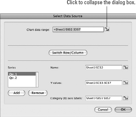
If the Chart data range box does not show the correct range, click the collapse button at the far-right side of the text box to minimize the dialog box. After it's minimized, you can select the correct range in the sheet and then click the expand button to view the entire dialog box again. Figure 16.18 shows a collapsed dialog box with the expand button. You also can type a range directly into the Chart data range field.
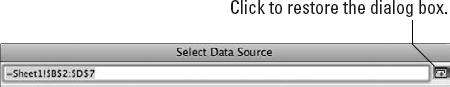
Figure 16.18. Collapse the dialog box to get it out of the way for selecting a new range, and then click the expand button to bring the dialog box back into full view.
If you prefer to see the horizontal (X) axis and vertical (Y) axis switched in your chart, you can click the Switch Row/Column button. This same command is accessible in the Formatting Palette under the Chart Data options. You can click the Sort by Row button or the Column button to swap axis orientation. When activated, this command causes Excel to reverse the two axes on the chart.
You can make changes to the individual data series in a chart using the Name and Values fields in the Select Data Source dialog box. In the Series box, select the series you want to edit. You can change the name of the selected series as it appears in the Legend by typing a new name in the Name field. You can change which cells are associated with the range using the Y values or X values field. Like the Chart data range field, you can click the collapse button to minimize the dialog box and select cells in the worksheet, and then click the expand button to maximize the dialog box again. Alternatively, you can type a range directly into the field. To remove a series from the chart, select the series and click the Remove button or press Delete. Any changes you make in the dialog box are immediately reflected in the chart. However, the changes are not permanent until you apply them using the OK button. After you finish editing the data, click OK to close the dialog box and apply any changes. If you decide not to apply any changes, click the Cancel button instead.
Note
Don't forget that if you make changes to the data on the worksheet, Excel also updates the data in your chart automatically.
Excel's charting tools include numerous ways to change and improve the appearance of your charts. You may want to change fonts, make the chart text larger and easier to read, add a title, add labels to the data points, rearrange items, and much more. Granted, Excel's charts look pretty darn good from the get-go, but you can always make them look even better. This section shows you how to tap in to the many tools available for making your charts look great. As with any formatting tools you use, be careful not to go overboard with all the bells and whistles. If you make your chart too busy with fonts, colors, and chart elements, your audience will be distracted by the chaos and miss the message your chart is trying to convey. Simplicity is the best approach for formatting.
When you select a chart, which you can do simply by clicking the chart object, the Formatting Palette automatically displays groups of tools related to charting, such as options for adding titles or displaying axes, gridlines, or labels. These groups, also called sections or panes, organize the options into logical sections. In addition, other graphic-related groups appear on the palette. We examine the main charting group first.
The Chart Options tools, which appear in Figure 16.19, include features for formatting the axes, gridlines, labels, and legend, and adding a title. You can use the Titles options to add a title to your chart. By default, titles appear at the very top of the chart, unless you move them to another location. To add a title, click the Titles field and click Chart Title. Depending on your chart type, you also can add titles to various axes on the chart. Next, click inside the field below the Titles field, where it says "Click here to add title," and type your title text. Anything you type appears automatically at the top of the chart. The title is actually contained in a text box on the chart, which means you can move or resize the box as needed.
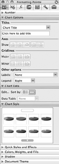
Figure 16.19. The Chart Options tools help you to fine-tune a chart's title, axes display, gridlines, data point labels, and legend.
You can use the Axes Show buttons, shown in Figure 16.19, to change how axes appear in a chart. The buttons act as toggles that turn an axis on or off. Click the Primary Vertical Axis or Primary Horizontal Axis buttons to toggle the X or Y axis on or off. In the case of stock or surface charts, you can toggle the Depth Axis on or off with the button. If your chart utilizes a second vertical or horizontal axis, you can toggle it on or off using the Secondary Vertical Axis or Secondary Horizontal Axis buttons. (The secondary axes are useful only if you're charting two different measurement scales on the same chart.)
The Gridlines buttons, shown in Figure 16.19, toggle gridlines on or off in the plot area. The Major buttons allow you to display the Vertical, Horizontal, or Depth gridlines for the major units of measurement in your chart. Use the Minor buttons to control the same gridlines for minor units.
Under the Other options section, shown in Figure 16.19, you can find controls for data point labels and the chart legend. Click the Labels field to view which data point labels you can turn on or off. Click the Legend field, and choose a position for the legend.
The Chart Data group of tools, shown in Figure 16.20, has only three options: the Edit button, Sort by toggles, and the Data Table field. You can use the Edit button to quickly open the Select Data Source dialog box and make changes to the data referenced by the chart. See the preceding section, "Editing Chart Data," to learn more about making changes to the source data upon which the chart was built.
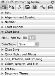
Figure 16.20. The Chart Data tools can help you edit your referenced data, switch columns and rows, and include original worksheet data along with the chart.
You can click the Sort by buttons to swap the horizontal (X) axis and the vertical (Y) axis in a chart. For example, perhaps your quarterly sales worksheet originally showed all the sales staff names in a column and all the month names in a row, but now that you see it in a chart, it might look better reversed. You can click the Row or Column button to switch the display.
If you plan on copying your chart to another document or program, you can use the Data Table feature to include the original worksheet cell data along with the chart. Click the Data Table field, and select an option. Choose Data Table to include the cell range from the worksheet that you originally used to create the chart. Excel inserts the cells at the bottom of the chart, looking much like they do in your original sheet. In essence, you've added a little bit of your worksheet to your chart, cells and contents combined. This little chunk of your worksheet is called a data table. If you want to add a legend key to the data table, choose the Data Table with Legend Keys option. Excel then adds the legend key information to the front of the data table. Figure 16.21 shows an example of a data table added to a chart. To remove the data table later, choose the None option instead.
The Chart Style group on the Formatting Palette shows a variety of color schemes you can apply to your chart. You can peruse from a long list of color selections, clicking the arrow buttons at the top and bottom of the group to view more. When you find a color scheme you like, click it and Excel applies it to the chart. The color schemes mainly involve changing the appearance of the graphics in a chart, such as the bars or columns in the plot area. Several of the schemes also include backgrounds for the entire chart area. Figure 16.22 shows the Chart Style group.
If you don't quite find the color scheme you wanted for a chart, you can look elsewhere in the Formatting Palette. The Document Theme section, shown in Figure 16.23, lists a myriad of preset, professional color schemes you can apply to your charts. Themes can help give all your Office documents, including worksheets and charts, a cohesive and similar feel. If you find a theme you like, click it to apply it to the selected chart. The Quick Styles and Effects group, shown in Figure 16.23, displays options for adding fill colors to your chart backgrounds and individual chart elements, along with tools for adding shadows, glows, reflections, 3-D effects, and text transformations. Not all the options are available for every chart, but you still can find plenty of styles and effects to play with and create just the right look for your data.
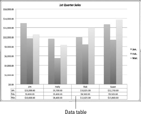
Figure 16.21. You can add cells from your worksheet to the chart, allowing other users to see the original data upon which the chart is based.

Figure 16.22. Change your chart's color scheme by selecting a new scheme from the Chart Style group.

Figure 16.23. The Formatting Palette also offers general groups of tools for formatting graphic objects, whether a chart or clip art.
You can use the tools in the Colors, Weights, and Fills section, also shown in Figure 16.23, to assign individual fill colors, line colors, and thicknesses to various parts of a chart. The Shadow section offers tools for creating and editing shadow effects. To learn more about using the formatting tools for graphic objects, see Chapter 30.
Note
Many of the formatting tools on the Formatting Palette also are available through dialog boxes. Like many commands among the Office suite, the tools show up in two or more places. Don't be alarmed by the duplication. Just use the method that best suits your work needs. The next section shows you how to use the dialog boxes to edit individual chart items.
What about formatting individual parts of a chart? Can you do that in Excel? Of course you can. Every element or item in a chart can be formatted. Plus, you can add additional elements if you need them. You can open a detailed formatting dialog box for every element in a chart and make changes to the attributes assigned to the element. For example, you can make all kinds of formatting changes to a data series in a bar chart. You can change the fill color of the bar, change the line color and thickness, add shadow and 3-D effects, change the way an axis is plotted, add labels, change the series order, and more. Best of all, you can make all these changes in one convenient location—the Format Data Series dialog box, as shown in Figure 16.24.
Note
For quick and easy formatting, you can always use the Formatting Palette. It offers lots of tools you can use to change fonts, alignment, fill colors, shadows, and more. It also includes groups of tools tailored just for charts: Chart Options, Chart Data, and Chart Style. See the preceding section to learn how to use the chart-specific tools in the palette.

Figure 16.24. You can open the Format Data Series dialog box to make changes to a selected data series in your chart.
Depending on the chart element, different formatting categories are available, and the name of the formatting dialog box changes as well. If you edit the plot area, for example, the dialog box is called the Format Plot Area box. If you edit an axis, the Format Axis dialog box appears. It's the same dialog box in principle, but it shows element-specific commands and tools each time. The formatting options for a data series in a pie chart differ from the options available for a Line chart. To summon any formatting dialog box, simply double-click the chart element you want to edit. You also can use the Format menu; choose Format
To help you understand the various formatting options you can apply to your charts, let's go through the basic chart elements and how to format each using the appropriate Format dialog box.
You can change the appearance of the chart area using the Format Chart Area dialog box. The chart area includes the background upon which the chart plot, legend, and title sit, and the fonts assigned to the chart. It also includes chart properties for controlling the embedded positioning of the chart. To open the dialog box, hover your mouse pointer over an empty area of the chart until the name of the element appears next to the pointer in a ScreenTip. If it says "Chart Area," double-click to open the dialog box. You also can use the Format menu to open the dialog box; click inside the chart area and choose Format

Figure 16.25. The Format Legend dialog box offers categories of settings for changing the legend's fill color and line style, applying a shadow effect, changing the font, and controlling the positioning of the legend on the chart.
Note
The Format Chart Area dialog box for a surface chart includes an extra formatting category—3-D Rotation. The settings in this category let you control the rotation properties for the surface chart's three axes and the scaling depth and height for the unique appearance of this chart type.
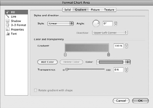
The Format Chart Area dialog box, shown in Figure 16.26, starts out with the Fill category at the top of the list, which offers options for controlling the fill color. By default, the color is set to white for any new chart you create. You can change the color to another solid color, change it to a gradient effect, insert a picture as a background, or apply a texture effect. With the Fill option selected, you see four tabs at the top of the dialog box: Solid, Gradient, Picture, and Texture. To change the background color, click the Solid tab, click the Color field, and choose a new color from the pop-up palette. To make the background transparent, choose the No Fill option. If the Theme Colors and Standard Colors don't offer enough selections, you can click More Colors to open the Colors dialog box for more color options.

To apply a gradient effect, which is simply a blend of colors or intensities, click the Gradient tab, as shown in Figure 16.27. You can use this tab to add a gradient based on one or more colors. The Gradient tab has two main areas of controls: Styles and direction, and Color and transparency. Start by selecting a color (or colors) with the Color field under the Color and transparency settings. The Gradient box immediately shows a sample of the selected color, along with some funny-looking markers. The color white is assigned by default, allowing you to create a blended effect between the color you chose and white. You can select and drag the markers to make adjustments to the color intensity. To add another color to the mix, click the Add Color button to add another marker to the sample, and use the Color field to change the color. You can then drag the new marker to adjust the intensities of the blend. To remove a color marker, select it and click the Delete Color button.
Tip
You also can choose a color before ever switching to the Gradient tab. Just select a color while the Solid tab is displayed and click the Gradient tab to continue creating the effect.
Next, click the Style field and choose a gradient style. None is selected by default. You can pick from Linear, Radial, Rectangle, and Path. If you choose a Linear effect, the gradient shows a color changing in intensity from one side to the other. You can make adjustments to the angle of the effect, either by turning the Angle dial or setting a degree in the degree field. If you select a Radial or Rectangular gradient, you can specify a direction for the color graduation.
For a more subtle effect, make adjustments to the Transparency setting. You can drag the Transparency marker to make changes or set a percentage level in the number field. After you've set up your gradient just the way you like it, you can click OK to exit the dialog box and apply your new formatting to the chart.
If you'd rather use a picture as a chart background, click the Picture tab in the Format Chart Area dialog box and click the Choose a Picture button. This opens the Choose a Picture dialog box, and you can navigate to the picture file you want to use. After you locate the image file, double-click it to add it to the Picture tab. You can then make adjustments to the transparency level, tiling (how an image repeats itself to fill the space), or rotation. Figure 16.28 shows the Picture tab with a picture ready to apply.
To use a texture as a background in your chart, click the Texture tab in the Format Chart Area dialog box and select from the list of preset textures. Figure 16.29 shows the Texture options. You can adjust the transparency setting of the texture by dragging the marker or setting a specific percentage of transparency.
Note
The Gradient, Picture, and Texture tabs all include a check box for rotating the item with the shape. If you enable this option, Excel allows the formatted background to be rotated along with the chart object.
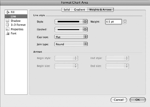
The Line category of formatting options offers three tabs you can use to control the border line of a chart: Solid, Gradient, and Weights & Arrows. By default, Excel applies a light gray border, but you can choose another color and control the thickness of the border line. To change the line color, click the Solid tab, click the Color field, and pick another color. To adjust the transparency setting, drag the Transparency marker or set a specific percentage. To turn the line color into a gradient blend, click the Gradient tab and choose a gradient Style and color. (Refer to the preceding section to learn how to apply a gradient effect, as shown in Figure 16.27.) To Change the line thickness and style, click the Weights & Arrows tab, as shown in Figure 16.30. Here you can use the Line style settings to change the line thickness, apply a dotted or dashed line border, and set the end cap type or corner shape. You also can directly type a line thickness into the Weight field. The Arrows settings are activated only when you format gridlines or axes in a chart.


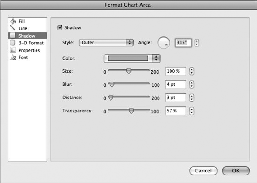
Click the Shadow category to view shadow effects you can assign to the chart area. The shadow options make the chart seem to cast a shadow behind it onto the worksheet. You might use this feature to give your chart the illusion of dimension. Click the Shadow check box, shown in Figure 16.31, to activate the settings. You can then change the shadow style, angle, color, size, blur effect, distance from the chart object, or transparency level.
Click the 3-D Format category to view 3-D settings you can assign to the chart area. You can choose from setting bevel effects, which add a dimensional bevel to the chart's edges, or setting depth and surface effects, which also lend a three-dimensional appearance to your chart. You can learn more about these settings in Chapter 30.
Click the Properties category in the Format Chart Area dialog box to view properties pertaining to object positioning. Figure 16.32 shows the Properties settings. At first glance, you might think the object positioning refers to controlling the exact position of a chart in a worksheet. It actually allows you to control how an embedded chart is positioned with cells in the worksheet. You can allow the chart to move and size with cells, move but don't size with cells, or don't move or size with cells at all. You also can deselect the Print object check box to prevent the chart from printing along with the worksheet. The Locked check box locks the chart only if the worksheet itself is protected. Learn more about protecting sheets and workbooks in Chapter 12.
When you insert a chart into your worksheet, one of the first things that may bother you is the extremely small type for the chart text, whether axes labels or the legend. Thankfully, you can set a larger (or smaller) font size for the text. For quick font controls, you don't have to look any farther than the Formatting Palette. Click the Font pane to view tools for changing the font, size, and color, and applying basic formatting, such as bold, italic, or underlining. However, because we're talking about the Format Chart Area dialog box in this section, you'll be happy to know you can find font and character spacing tools among the Font category of formatting options. With the Font tab selected, as shown in Figure 16.33, you can view Font, Color & Underline, and Basic Effects settings. To change the font, click the Font field and select another font. To change the style, such as regular, bold, italic, or bold italic, click the Font style field and pick the formatting you want to apply. To change the text size, click the Font size field and click a new size. As you make your selections, Excel immediately previews the formatting on the chart itself.
The Color & Underline settings allow you to change the font color and apply an underlining style and color. Click the appropriate field, and make your selection. The Basic Effects settings offer check boxes for turning on strikethrough, superscript, subscript, or capitalization options.
Click the Character Spacing tab to view settings for controlling the spacing between lines of text when two or more lines appear together in a chart and the spacing between characters.
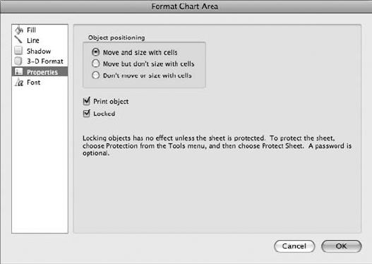
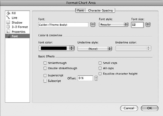
Figure 16.33. The Font settings allow you to set fonts, sizes, color, and character spacing for your chart text.
After you finish making changes to the chart area formatting, click OK to apply them to the chart.
You can change the appearance of the plot area using the Format Plot Area dialog box. The plot area includes the actual chart layout upon which the data series and axes sits. To open the dialog box, hover your mouse pointer over the middle area of the chart until the name of the element appears next the pointer in a ScreenTip. If it says "Plot Area," double-click to open the dialog box. You also can use the Format menu to open the dialog box; click inside the plot area, and choose Format
The Format Plot Area dialog box features four of the same categories found in the Format Chart Area dialog box: Fill, Line, Shadow, and 3-D Format. Instead of formatting the chart background, however, the settings control how the plot area appears. To review how these formatting controls work, revisit the preceding section, "Format the chart area."
To change the appearance of a single data series, you can open the Format Data Series dialog box. For example, you may want to assign another color to the data series columns of a column chart or the bubbles of a bubble chart. Or perhaps you'd like to use a texture or gradient effect instead of a solid color. To open the dialog box, hover your mouse pointer over a data series in the chart until the name of the element appears next the pointer in a ScreenTip. If it says "Series," double-click to open the dialog box. You also can use the Format menu to open the dialog box; click inside the chart area, and choose Format
The Format Data Series dialog box lists nine categories of formatting options, as shown in Figure 16.34. You've already learned about the Fill, Line, Shadow, and 3-D Format categories in the previous sections. Depending on the chart type, the Error Bars, Axis, Labels, and Options categories may appear in the list. As an advanced charting technique, the Error Bars category is covered in the "Advanced Charting,", up next in this chapter.
What Happened to the Chart Toolbar?
The good ole' Chart toolbar is still available in Excel 2008. You can still use it as a handy toolbar for editing charts. To open the toolbar, choose View

Figure 16.34. The Format Data Series dialog box has options for changing the appearance of a data series.
Note
If two or more series appear in a chart, the order category may appear in the Format Data Series dialog box, allowing you the option of changing the order in which the series appears in the chart.
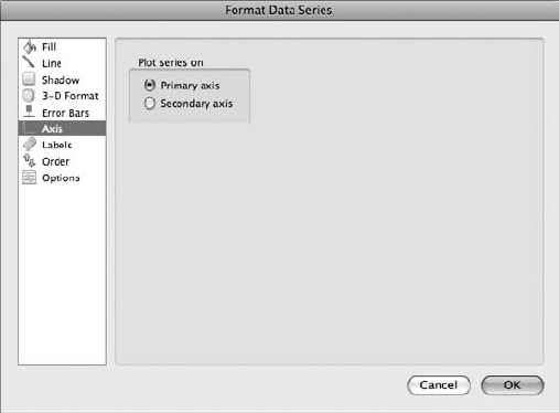
The Axis category is pretty simple. You can choose to plot the series on the primary axis or a secondary axis. For example, in some charts, you want to plot two different measurement scales, such as charting the mean soil temperature in both Fahrenheit and Celsius scale. To show both scales in the chart, turn on the Secondary axis in the Axis category, as shown in Figure 16.35. To return to just one scale again, click the Primary axis option.
By default, Excel does not add labels to a data series on the plotted chart. Instead the X or Y axis shows any labels associated with the charted data. To make the information easier to read, however, you may want to turn on certain labels. We've already covered how to turn on simple data series labels using the Chart Options pane on the Formatting Palette. Now look at the Labels category in the Format Data Series dialog box, shown in Figure 16.36. Depending on the chart type and data series, you can choose from six data labels: None, Show value, Show percent, Show category name, Show category name and percent, or Show bubble sizes. In a pie chart, you may want to show percentages in each pie wedge, for example. If you click the Show percent option, Excel displays a percentage label in each pie segment. If you're charting lots of data, you may want to go a step further and add a legend key next to each label, sort of like a color tag to help match up the selected series with the legend.
For all those little extra features, like adding drop lines to a data series or changing pie slice color variation, you can look in the Options category. This category's features vary from chart type to chart type. Some types, like the line chart, offer settings to add drop lines, high-low lines, and up-down bars to the data series in the chart. Others, like the radar chart, use this category to vary colors by point or add category labels.
Note
If you're using a line chart, the Format Data Series dialog box includes categories for formatting markers, such as changing the marker fill color, line thickness, and style.
You can change the appearance of an axis using the Format Axis dialog box. The axis is the vertical (Y) or horizontal (X) scale on the chart. You can edit each individually. To open the dialog box, move your mouse pointer over the axis of the chart until the name of the element appears next the pointer in a ScreenTip, and then double-click to open the dialog box. You also can use the Format menu to open the dialog box; click inside the chart area, and choose Format
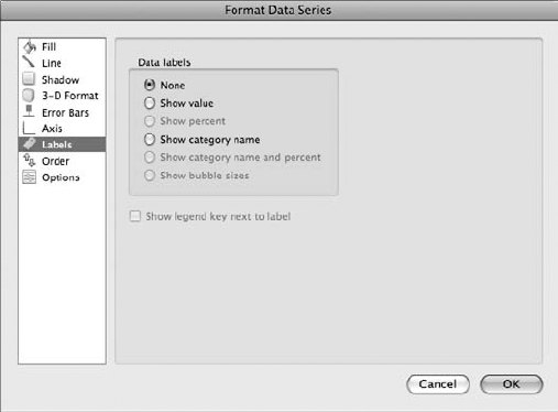
Figure 16.36. You can use the Labels category to turn labels on or off on the plotted area of the chart.
The Format Axis dialog box displays the same categories you've already learned about in the previous sections: Fill, Line, Shadow, 3-D Format, or Font. As always, the categories vary based on the chart type. In addition to those already covered, you may see these categories: Text Box, Number, and Scale.
The Text Box category, shown in Figure 16.37, displays settings for controlling text layout, AutoFit, and internal margins. You might notice when you select an axis to edit, it appears to be in a text box. As such, you can control how the text appears within the framework of the box. Click the Vertical alignment field to change the vertical positioning of text within the text box. By default, Excel places text horizontally in the text box for most chart types; however, you can rotate the text to make more room for your axis labels as they span the length of the scale. Click the Text direction field and select a text direction. Some chart types also let you change the order of lines and apply the AutoFit options to fit text. Lastly, you can use the Internal Margin settings to set margins around the inside of the text box.
To view number formats for your axis number data, click the Number category. The settings in this category are the same as those available through the Number pane on the Formatting Palette or in the number formats found in the Format Cells dialog box. The settings are not available for all chart types or axes.
Finally, the Scale category, shown in Figure 16.38, features settings for controlling the axis scale. You can set minimum and maximum amounts, display major or minor units, or change the display units entirely. For example, you may want to display hundreds instead of thousands or add labels to the units to help describe them for the user. The Scale options also include settings for reversing values, using a logarithmic scale, or displaying horizontal axis crosses.
To change the appearance of a chart's legend, you can open the Format Legend dialog box. To open the dialog box, hover your mouse pointer over the legend until the name of the element appears next the pointer in a ScreenTip. If it says "Legend," double-click to open the dialog box. You also can use the Format menu to open the dialog box; click inside the chart area, and choose Format


You can use the Format Title dialog box to make changes to a chart title, with the exception of actually editing the chart text. (To edit text, use the Chart Options pane in the Formatting Palette.) The dialog box offers six formatting categories: Fill, Line, Shadow, 3-D Format, Text Box, and Font. You can use the categories to change the fill color background of the legend, add a border or shadow, change the font or size, or control the positioning of text within the title text box. All these formatting categories are covered in previous sections.
The Format Gridlines dialog box is handy for making changes to the gridlines in the plot area. The dialog box offers three formatting categories: Line, Shadow, and Scale. You can use the categories to change the line color, thickness, add shadow effects, or turn major and minor tick marks on or off. All these formatting categories have been covered in previous sections, so flip back to review the options. You also can use the Formatting Palette to edit gridlines; you'll find the gridline tools in the Chart Options pane.
One last thing you can do to individual chart elements: You can move them around the chart or delete them entirely. For example, if you don't like where the legend is positioned, you can click it and move it to another area of the chart. Or if you decide you don't like the chart title, you can delete it. Select the title text box, and press Delete.
Tip
You can use the Drawing toolbar to add other elements to your charts, such as shapes or text boxes. For example, you may want to add another text box to insert a paragraph about the chart data. To learn more about using the Office 2008 graphics tools, see Chapter 30.
Excel has several advanced charting features you can utilize if your charting needs require them. You can add versatility to your charts using error bars or trend lines. For most charting tasks, the wide selection of chart types offered by the Elements Gallery suffices. However, you may encounter instances where additional features are needed. This section goes over a few advanced charting techniques you can try.
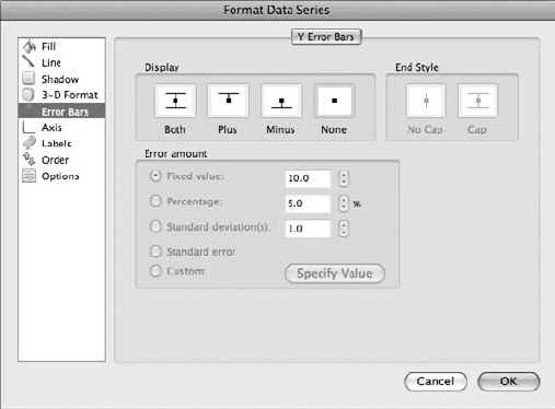
Some chart types, such as column charts, let you add error bars to the chart. Error bars allow you to show variability in the measures plotted in the chart. For example, if your chart tracks a stock or plots data from an opinion poll, you can use error bars to set the margin of error or range of movement that surrounds the data. Error bars let you specify a range around each data point. The range appears as an actual bar on the data series. Most charts place error bars along the horizontal (Y) axis. Scatter charts are the only charts that allow vertical (X) axis error bars. You can add error bars to area, bar, bubble, column, line, and scatter charts. Figure 16.39 shows the Error Bars category in the Format Data Series dialog box.
To add error bars, double-click the data series you want to edit. This opens the Format Data Series dialog box. You also can click the data series and choose Format
If you decide later to remove the bars, revisit the Format Data Series dialog box and select the None option.
One of the biggest attractions of using charts in Excel is their ability to show trends over time or categories. To further assist you in visually displaying such trends over the course of time, you can add trend lines to your chart. How does this feature work, you might ask? It works by using a mathematical model to accentuate patterns in the data and project future patterns. Trend lines are available only in unstacked area charts, bar charts, bubble charts, column charts, line charts, scatter charts, and stock charts. Because trend lines are helpful in making predictions regarding patterns in your charts, you might expect to find the feature lurking in a Format Data Series dialog box, but alas, it is not there. Instead, you must use the Chart menu to assign trend lines. Start by selecting the data series to which you want to apply a trend line. Next, choose Chart
Hauntingly similar to the Format Data Series dialog box, the Format Trendline dialog box offers four formatting categories: Line, Shadow, Type, and Options. We covered the Line and Shadow categories back in "Formatting individual chart elements," so we skip the coverage here. However, click the Type category to view the elusive trend line options. Figure 16.40 shows the Type category displayed in the Format Trendline dialog box.
Click the Trend/Regression type you want to apply. Depending on which type you select, additional parameters can be set. Excel adds a preview of the line in the chart and adds a description in the legend. Look at the descriptions for each type of trend line:
Linear: If your chart already looks like a line, this type of trend line works well. It closely follows rising or falling data as a line.
Logarithmic: If your chart data climbs and falls rapidly and then levels out, a logarithmic trend line works best. It exhibits a sharp curve at one end and gradually evens out.
Polynomial: If the chart data has numerous highs and lows in a rhythmic manner, a polynomial trend line may be the answer for your chart. Polynomial trend lines have large curves or humps.
Power: If your chart data shows steadily increasing or decreasing rates, power trend lines can easily show the acceleration with a smoothly curving upward line.
Exponential: If the chart data changes at an ever-increasing or decreasing rate, an exponential line is better for showing a curving line.
Moving Average: If your chart data shows cycles happening, a moving average trend line makes a good choice. It tries to smooth out fluctuations in the data.
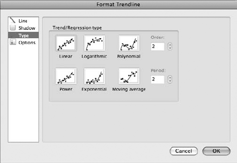
After establishing a trend line, click the Options category to find settings for naming the trend line, forecasting it forward or backward, or adding an R-squared value (this statistical value calculates how accurate the trend line fits the data). After you finish setting any additional options, click OK to apply the trend line to your chart.
In this chapter, you learned how to add, edit, and format charts. You learned about each type of chart available in Excel, how to insert a chart, and how to change the various aspects of a chart to improve the overall appearance of the data. We started out by exploring the chart types and finding out which ones were best suited for certain types of data. Next, you learned about the various elements that go into charts, such as the plot area, axes, and legend. You saw how easy it is to add charts using the new Elements Gallery. We went on to cover how to use the formatting tools available on the Formatting Palette to make your charts look good, as well accessing formatting settings for all the individual chart elements through the Format dialog boxes. Finally, you learned how to utilize some of the more advanced charting techniques in Excel, such as adding error bars and trend lines. As you can now see, charting your spreadsheet data has never been easier than it is in Office 2008.