
7. Identifying Major Market Tops and Bottoms: Other Tools to Consider
A basic tenet of virtually any analytical technique is the more evidence that points to a conclusion, the more likely that conclusion will be valid. In general terms, this is called the weight of evidence and applies equally to an examination of market conditions.
Thus far, we have discussed using the Wyckoff laws of Supply and Demand and Effort vs. Result in helping identify market tops and bottoms, together with Lowry’s application of the Law of Supply and Demand through the Buying Power and Selling Pressure Indexes. We have also discussed Wyckoff’s Law of Cause and Effect as used in establishing price targets for bull and bear markets through horizontal counts on point and figure charts. In terms of weight of evidence, therefore, we have price/volume action and independent measures of Buying and Selling, plus rough guidelines as to the likely extent of a bull or bear market. In this chapter, we add to this weight of evidence by introducing two other tools that have proved useful over the years in identifying major market tops and bottoms.
The NYSE Advance–Decline
Our first additional tool is an Advance–Decline Line based on issues traded on the New York Stock Exchange. Historically, the NYSE Advance–Decline Line has served as a sort of “canary in the coal mine” in providing a forewarning of major market tops. As an indicator, the Advance–Decline Line first came into use in the 1920s and 1930s through the work of Leonard P. Ayers, contemporaneous with the work of Wyckoff and Lowry. In its simplest terms, an Advance–Decline Line (or A–D Line as it is frequently abbreviated), is a cumulative net total of the issues advancing and declining on a day-to-day basis on an Exchange (the NYSE, for example) or in a market index such as the S&P 500. Thus, if there were 2520 issues advancing on the NYSE today and 488 declining, a net of 2032 would be added to the cumulative total. In contrast, if today had more declining than advancing issues, the net amount would be subtracted from the cumulative total. The result is a line that normally rises during a bull market and falls during a bear market. The utility of the A–D Line occurs when it fails to confirm new rally highs in a bull market.
This simple method of calculating an A–D Line is the most common, but there are other methods in use as well. One of the more popular is a “normalized” A–D Line. This normalization applies largely to the NYSE A–D Line and is intended to adjust for the larger number of issues traded today than were traded 30 or 40 years ago. The A–D Line is normalized by dividing the net amount of advancing and declining issues by the total number of issues traded that day (including those that are unchanged). The result is then added to the cumulative total just as in the regular A–D Line. For example, there were 1500 advancing issues today and 1300 declining issues with a total of 3140 issues traded (the total includes unchanged issues). Subtracting the 1300 declining issues from 1500 advancing issues yields a net of 200 issues. This net amount is then divided by the total number of issues traded, 3140, yielding a normalized number of .064. This amount is then added (given there are more advancing than declining issues today) to our cumulative total to produce the updated A–D Line. More declining issues would produce a negative number, which would be added to the cumulative total, resulting in a drop in the A–D Line for the day. We have plotted both the regular NYSE A–D Line and its normalized equivalent and found no major differences between the two, especially when applied to identifying major market tops and bottoms. Therefore, all the illustrations in this chapter use the simple version of the NYSE A–D Line.
Advance–Decline Lines and Major Market Tops and Bottoms
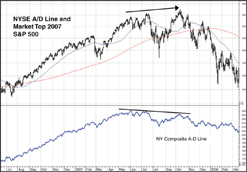
The role played by A–D Lines, most often the Composite NYSE A–D Line, in identifying market tops is as a nonconfirming indicator. We introduced the concept of negative divergences in discussing the Buying Power and Selling Pressure indexes as confirming or failing to confirm price highs and lows during the formation of major market tops and bottoms. The Composite NYSE A–D Line plays a similar role in failing to confirm, or negatively diverging from, rally highs in price. To use a recent example, Figure 7.1 shows the S&P 500 Index during the formation of the 2007 market top. The bottom plot on the graph is the Composite (also called the all-issues) NYSE A–D Line.1 Note that both the price of the S&P Index and the A–D Line made new rally highs in early June 2007. After about a month of trading sideways, the S&P 500 renewed its rally, recording another new high in mid-July. Notice, however, the July peak in the A–D Line is below its level in early June—that is, the A–D Line has failed to confirm the price high, setting up a negative divergence. This divergence then continues with the level of the A–D Line far below both its June or July readings at the nominal new rally high set by the S&P 500 Index in mid-October.
Figure 7.1. The NYSE A–D Line at the 2007 market top
Charts created with Metastock, a Thomson Reuters product.
One reason for the development of this negative divergence between the price indexes and the A–D Line is, as a bull market progresses, buying typically becomes more selective. This selectivity can be a result of investors viewing some stocks as overextended in their rallies or others as fundamentally overvalued. However, that’s only part of the story. Although the exact number varies slightly according to the source, approximately 50% of the issues traded on the NYSE are what might be classified as non-operating company issues. That is, they are something other than common stocks. These non-operating company issues include closed-end bond funds, preferred stocks, and American Depository Receipts (ADR) of foreign stocks. Notice that with the exception of the ADRs, these non-operating company issues tend to be sensitive to interest rates and therefore can act more as bond surrogates than common stocks.
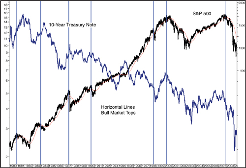
These interest-sensitive issues thus can play a role in the development of A–D Line negative divergences along with the other reasons for increasingly selective buying. As has been discussed in works by Martin Pring and John Murphy, among others, interest rate cycles tend to lead cycles in the equity market. That is, interest rates typically begin to rise as a business cycle matures. Figure 7.2 plots the yield on the 10-year treasury note versus the S&P 500. As is evident from the graph, interest rates begin rising prior to the major tops in the stock market—sometimes well in advance. Although these non-operating company issues can be carried along higher with the prevailing bullish sentiment, eventually, the lagging prices of these issues, due to higher interest rates, causes more and more selling, thus contributing to an increase in declining issues even as the equity market continues to climb. In fact, some studies have shown an A–D Line composed entirely of these interest-sensitive issues can provide an even earlier warning of a market top than the Composite A–D Line.
Figure 7.2. The 10-year treasury note typically leads trend changes in the S&P 500
Charts created with Metastock, a Thomson Reuters product.
Historically, divergences between the Composite NY A–D Line and the major market indexes have been one of the most reliable indications of the approaching end of a bull market. As shown in Table 7.1, of the 16 bull market tops since 1940, there have been only three instances, in 1946, 1952, and 1976, when no negative divergence occurred prior to the market top. However, lead times can vary widely, from an extreme of 23 months prior to the 2000 market top to just 1 month prior to the 1956 peak. On average, though, the lead time has been around 10 months and about 7½ months ex the outlier years in 1973 and 2000.
Table 7.1. NYSE All-Issues Advance-Decline Line Divergences at Bull Market Tops

In both 1973 and 2000, the much larger lag between the peak in the A–D Line and the market top appeared due to two factors. The bull market that peaked in 1973 was narrowly based and driven by the so-called “Nifty-Fifty” stocks, just as the bull market to the 2000 peak was fueled by the dot-com bubble. Also, leading up to both the 1973 and 2000 market tops, small- and mid-cap stocks were in the midst of a period of cyclical underperformance to the big-cap stocks. Together, these two factors were unique to these two market tops and account for much of the unusually long lead time between the A–D Line and the market peaks. In contrast, the lack of a negative divergence at the 1976 market top appeared due to an up cycle in relative performance by mid- and small-caps that followed the down cycle prior to the 1973 market top. In fact, reflecting the rally by small- and mid-caps, the A–D Line continued to climb after the DJIA peaked in September 1976, moving steadily higher throughout the plunge in the DJIA to the February 1977 low and not peaking until early September 1977.
Figures 7.3–7.7 show the NYSE all-issues A–D Line at the major market tops in 1969, 1973, 1976, 1981, and 2000. Although we have not included graphs for the 1984, 1987, 1991, or 1998 market tops, negative divergences between the A–D Line and the market indexes are not exclusive to secular bear markets such as the one from 1966 to 1982. They apply just as well to those four market tops in the secular bull market that lasted from 1982 to 2000.
Figure 7.3. NYSE A_D Line divergence at the 1968 market top
Charts created with Metastock, a Thomson Reuters product.

The negative divergence at the December 1968 market peak (Figure 7.3) is very minor but did exist, suggesting buying had become more selective in the rally to the 1969 peak than in the advance to the prior high in the bull market, in September, 1967. At 17 months, this lag between the peak in the A–D Line and market peak is the third longest, after the 1973 and 2000 market tops. Figure 7.4 shows the steady deterioration in market breadth3 prior to the 1973 market high. As explained earlier, much of this deterioration was due to the investment theme du jour, the so-called Nifty-Fifty or one-decision (buy it and forget it) stocks, which caused buying to be focused on a very select number of mostly big-cap issues.
Figure 7.4. NYSE A–D Line at the 1972-73 market top
Charts created with Metastock, a Thomson Reuters product.

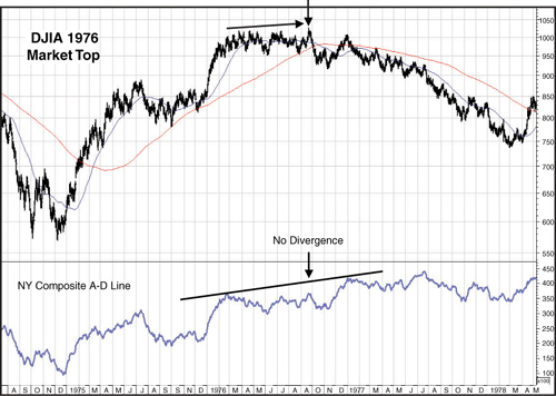
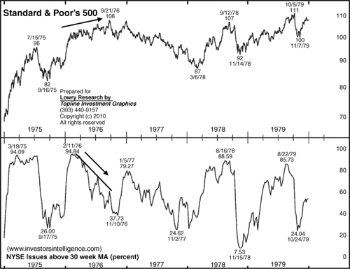
The one failure of the A–D Line to forecast a market top in our study occurred in 1976. As shown in Figure 7.5, the A–D remained in an uptrend dating back to the 1975 market low throughout the topping formation in 1976. In fact, as mentioned earlier, the NYSE A–D Line remained in an uptrend, not only throughout the topping formation, but also through the first two years of the 1976–80 bear market. While the 1973–74 bear market discredited the Nifty-Fifty stocks, virtually all of which cratered during the market decline, small- and mid-cap stocks, which had lagged going into the 1973 market top, enjoyed somewhat of a renaissance. Because small- and mid-caps far outnumber big caps on the NYSE, strength in these issues resulted in a rising A–D Line while the market indexes were falling.
Figure 7.5. No divergence by the NYSE A–D Line at the 1976 market top
Charts created with Metastock, a Thomson Reuters product.
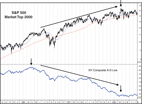
As shown in Figure 7.6, the A–D Line divergence prior to the 1981 market high began in September 1980, matching the average and median lag time of seven months. The biggest lag between the peak in the A–D Line and the market indexes in the years we have covered occurred prior to the 2000 market top (Figure 7.7). In this case, the high in the A–D Line occurred in April, 1998, which actually preceded the July–October 1998 minor bear market. However, rather than rebounding after that bear market had run its course, the A–D Line continued its descent, finally bottoming just about the time the market indexes peaked in early 2000. As discussed earlier, much of this lag in the A–D figures was due to a cyclical downturn by small-and mid-cap stocks. Ironically, for much of the 2000–2003 bear market, while big-cap and especially big-cap technology stocks, were being decimated, small- and mid-caps prospered. In fact, both the S&P Mid and Small Cap indexes continued to rally throughout the first couple years of the 2000–2003 bear market, reaching new rally highs in April, 2002. We discuss this further in Chapter 8, “The Curious Case of the 2000–2001 Market Top and Demise of the Secular Bull Market,” which is devoted to the unique aspects of the 2000–2001 market top.
Figure 7.6. NSYE A–D Line at the 1981 market top
Charts created with Metastock, a Thomson Reuters product.
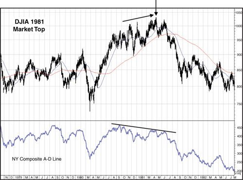
Figure 7.7. The long decline in the NYSE A–D Line prior to the 2000 market top
Charts created with Metastock, a Thomson Reuters product.
From these examples, it seems clear the A–D Line has historically provided regular warnings of impending market tops. It could be argued, of course, a lead time of 17 or 23 months seems of little use in timing a market top. In both cases, though, it is the environment of selective buying, combined with the other tools of price/volume, Supply/Demand, and target ranges that provide the evidence an important trend change is occurring.
At this point, a logical question is, while we have pointed out the utility of A–D Lines in anticipating market tops, what about market bottoms? In fact, in our coverage of market tops and bottoms since 1940, there are no instances when the NYSE A–D Line provided any help in identifying a major market bottom. To the contrary, in every major market bottom since 1940, the NYSE A–D Line recorded a new low right along with the price indexes. For a divergence to develop at a market bottom, there needs to be a pattern of increasingly selective selling. This selective selling results in a rising A–D line, which fails to confirm the lowest levels reached by the major price indexes in the bear market. That is, although the market indexes record a new low, the A–D Line is, at that point, above its most recent low, thus forming a positive (rather than negative) divergence with the market indexes.
However, history shows no such positive divergence at any bear market bottom in at least the past 70 years. And there appears to be a logical reason for a lack of A–D Line divergences at market bottoms. At market tops, selling is typically more fragmented, as there are any number of investors who are yet to be convinced the market has reached an important top. Therefore, selective, rather than widespread, selling continues throughout much of the formation of a market top. In contrast, a market bottom is often marked by panic selling in a climax where there is a wholesale dumping of stock. Put more directly, not everyone sells at once at a market top, but they tend to sell en mass at a market bottom. Thus, at market bottoms, there is little opportunity for the selectivity that allows for the A–D Line divergences at market tops.
Operating Companies Only Advance–Decline Lines
In recent years, concerns have developed that movements in the equity market are decoupling from long-term interest rates. This, in turn, calls into question the reliability of the all-issues A–D Line as a forecasting tool. Although the examples already discussed appear to discount this possibility, the use of a common stock-only A–D Line has become more popular. Simply put, an operating companies only (OCO) A–D Line excludes all non-common stock issues traded on the NYSE. The NYSE publishes breadth figures using common stocks only, and these data are most readily available on a weekly basis in Barrons. Consequently, construction of a common stock-only A–D Line requires no access to special data. However, as Charles Kirkpatrick points out in his book Technical Analysis: The Complete Resource for Financial Market Technicians,2 beginning in 2005, the NYSE changed its reporting requirements for common stocks, including only those issues with three or fewer letters in their ticker symbols. Consequently, the statistics before 2005 are not directly compatible with those that came after that date. There are, however, services, such as Carl Swenlin’s “Decision Point,” that calculate their own operating companies only data that avoid this lack of compatibility. But as is pointed out later in this chapter, a long history is not needed to construct an OCO A–D Line useful for warning of market tops.
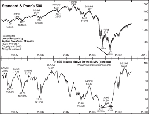
Comparisons between the NY all-issues A–D Line and its OCO counterpart are often helpful in identifying periods when gains in the A–D Line are due more to strength in the bond market than equity market. Typically, in those instances, the all-issues A–D Line will be climbing at a greater pace than the OCO Line. In these cases, the concern is a bond market rally could be masking greater weakness in the equity market. Thus far, though, disparities in performance between the two A–D Lines have been minimal at major market tops. Figure 7.8 shows a comparison of the NY Composite (all-issues) A–D Line and the OCO A–D Line at the 2007 market top. As can be seen, both A–D Lines failed to confirm the higher high set by the S&P 500 in July 2007, establishing a negative divergence and warning that a major top could be forming. Both A–D Lines were then well below their July levels when the S&P 500 set another new rally high in October 2007, further emphasizing the lack of breadth behind the rally. As can also be seen, a 120-day simple moving average can be helpful in identifying changes in trend for the OCO A–D Line.
Figure 7.8. The NYSE all-issues A–D Line and NY OCO A–D Line at the 2007 market top
Charts created with Metastock, a Thomson Reuters product.

Unfortunately, the OCO A–D Line was of no more help than the all-issues A–D in the rally to the 2000 market top, as both peaked in April 1998 and were in strong downtrends at the time of the early 2000 market highs. Judging by the history of market tops since 1992 (which is as far back as Lowry’s data go), there appears to be no compelling reason to keep an OCO A–D Line, given that it has thus far moved in accord with the all-issues A–D Line in establishing divergences prior to the three major market tops—1998, 2000, and 2007—since the early 1990s. That said, given the ease with which an OCO A–D Line can be constructed and maintained in today’s technology age, there seems little reason not to keep both—just in case.
The Cyclical Nature of Advance–Decline Lines
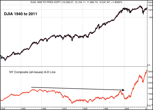
Before moving on to our next tool for identifying major market tops, there is one final but important point to make about using A–D Lines. Up until early 2005, the NY Composite A–D Line had a general downward bias in that it had never exceeded its 1957 peak reading (Figure 7.9). This caused some analysts to downplay the use of the A–D Line in identifying market tops because it was always (at least until 2005) below its peak reading. As such, it could not be considered as negatively diverging from a price index making new all-time highs, as was occurring with regularity from the early 1980s on. However, the utility of the A–D Line is not in its long-term trend, but in its trend relative to the current bull market. In other words, each time a new bull market begins, the clock is reset for the A–D Line in terms of when it reaches its peak reading. Therefore, divergences are measured, not against the long-term trend of the A–D Line, but against its trend in that particular bull market. This cyclical application has made the A–D Line very useful in forewarning of market tops, not its level relative to the very long-term trend. So it is key to remember that a divergence in the A–D Line is based on its peak reading for the current bull market. It also means a long history of the A–D Line is not necessary to identify a divergence at the next major market top.
Figure 7.9. The long term downward bias in the NYSE A-D Line, 1957-2005
Charts created with Metastock, a Thomson Reuters product.
Cyclical characteristics apply to the NYSE A–D Line, but the same it not true with the A–D Line for another major index—the NASDAQ Comp. As shown in Figure 7.10, there has been little interruption in the downtrend for the NASDAQ A–D Line, a downtrend that has existed for virtually the entire length of the NASDAQ Comp. Index. This persistent downside bias is due, according to most analysis, to the inclusion of the many micro-cap stocks traded on the NASDAQ. Historically, these companies and their stocks fail to survive for long periods of time. Thus, as these stocks lose their NASDAQ listing, they disappear from the A–D Line, giving it a downward bias. The end result is NASDAQ’s A–D Line fails to provide any useful guidance in terms of signaling the emergence of selective buying prior to a major top.
Figure 7.10. The long term downward bias in the NASDAQ Comp. A–D Line
Charts created with Metastock, a Thomson Reuters product.

Another Useful Indicator for Signaling a Major Market Top
Another means of measuring market breadth, in addition to the NYSE A–D Line, is the percentage of NY Issues trading above their 30-week moving average. (All examples use a simple, rather than weighted or exponential moving average.) An A–D Line measures breadth by netting the number of issues that advance or decline on a daily basis, even if an advance is by $0.01. Therefore, an A–D Line provides no indication of the strength of an advance or decline, simply whether more issues rose or fell. An indicator such as the percent of issues above their 30-week moving average (WMA), however, is more a measurement of breadth momentum. In other words, to register as a gain in this indicator, rather than simply closing higher for the day, a stock must move above a benchmark, in this case the 30-WMA. Because a simple 30-WMA is an average of a stock’s price over the past 30 weeks, a move above the 30-WMA indicates the stock is now at a level higher than its average price for the past 30 weeks. As such, it could be considered as a measure of strength and upside momentum. In turn, the percentage reading provides an indication of the breadth of the strength and momentum. Typically, in strong rallies, this percentage will steadily rise and confirm new rally highs with highs of its own. Divergences from price highs, however, indicate more selective strength, such as might be experienced as a rally matures and a major top approaches.
This percent indicator, therefore, can act as an important confirming or nonconfirming indicator along with the NYSE A–D Line in signaling the deteriorating strength that typically precedes a major market top. Not only are fewer issues advancing, but more and more stocks are falling below their average prices for the past 30 weeks (about 150 trading days). In addition, the percent indicator is more useful in signaling major market bottoms, while the A–D Line has, historically, provided no indications bear markets were ending.
Because both an A–D Line and a percentage of stocks above a moving average are measures of breadth, it’s reasonable to ask why one would work at a market bottom (the percent indicator) while the other does not (the A–D Line). The answer can be found in what each measures. Remember, an A–D Line simply indicates whether a stock rises or falls. The key point here is major market bottoms are not one-time affairs. That is, the bear market doesn’t end at one single point and a new bull market begins. As prior chapters show, major market bottoms are a process rather than an event. Thus, a stock may rally in the early phase of the bottoming process only to move lower later on. That move lower registers the stock as a declining component of the A–D Line. However, in rallying, that same stock may cross above a moving average, possibly far enough above so it is able to stay above the moving average even if the stock pulls back later on in the market’s bottoming process. As such, it remains in the “above” percentage for the indicator. About any moving average can be used as a benchmark for a percentage stocks indicator. However, a short term moving average could produce many changes in the percentage as both it and the stock display high levels of volatility—that is, it doesn’t take much of a price movement for them to shift higher or lower. We have found using a longer term moving average, such as the 30-week, reduces this volatility, thereby generating more reliable signals.
The 30-Week Moving Average in Practice
Every major market top in our study shows a divergence between the major price indexes and the percentage of NY stocks above their 30-WMA. We recommend using both the all-issues NYSE A–D Line and the percent stocks indicator in determining when conditions are developing that indicate a major market top is forming. Apart from adding to the weight of evidence, the 30-WMA also can also provide an indication of the selective strength leading to a major top when the A–D Line does not. For example, Figure 7.11 shows the 1976 market top. Recall there was no A–D Line divergence prior to the end of the 1975–1976 bull market. However, as the chart shows, the percentage of stocks above their 30-WMA began to deteriorate after the peak reading in February 1976, setting two substantially lower highs on rallies in the S&P 500 to the final high in September 1976. Thus although the A–D Line continued to rise, the 30-WMA percentage indicator provided clear evidence of deteriorating strength as the topping process progressed.
Figure 7.11. The percentage of stocks above their 30-WMA indicator at the 1976 market top
The percentage indicator can, at times, also be a dull instrument in timing a market top, which is why it should be used as a secondary tool, subordinate to the Wyckoff and Lowry analyses of Supply and Demand. For instance, as Figure 7.12 shows, the 30-WMA percent indicator topped in February 1971, a month before the NYSE A–D Line topped in March 1971, both long before the actual market peak in January 1973. Figure 7.13 shows a slightly shorter lead time going into the 2007 market top, as the percentage indicator peaked in December 2006 and then matched that peak in February 2007. The percentage then continued to deteriorate with a sharp drop subsequent to the top in the NYSE A–D Line in early June, suggesting a significantly weakening market condition prior to the rally to their October highs by the major price indexes.
Figure 7.12. The percent stocks indicator prior to the 1973 market top

Figure 7.13. The percent stocks indicator at the 2007 market top

Figures 7.14–7.16 illustrate how the 30-WMA percentage indicator can help at major market bottoms. Figure 7.14 shows the market bottom in 1982, where the final low was reached in August. However, the percentage bottomed in September 1981, setting a series of higher lows over the next 11 months, suggesting gradually strengthening market conditions. A similar positive divergence is evident in Figure 7.15 at the July and October 2002 market lows, as the percent indicator is clearly above its July low in October, despite the lower low in prices. Finally, Figure 7.16 shows the most recent market bottom, in 2009, with the percent indicator clearly above its October low at the March price low.
Figure 7.14. Positive divergence between the percent stocks indicator and the S&P 500 at the 1982 market bottom

Figure 7.15. The percent stocks indicator at the 2002–2003 market bottom

Figure 7.16. The percent stocks indicator at the 2008–2009 market bottom
Conclusion
When doing an analysis of major market tops and bottoms, or for that matter any aspect of stock market behavior, the more indicators that point to the same conclusion, the more accurate the analysis is likely to be. What we have attempted to do in this and the preceding chapters is put together a number of different indicators that, when used together, can provide a reliable guide to market conditions. It is important to remember this is not the same as simply using a lot of indicators. A pitfall of technical analysis is what is called multicolinearity, which is a fancy way of saying using a lot of indicators that measure the same thing. For instance, one might use ten different indicators, all of which measure market momentum. It’s no surprise that all will probably point to the same conclusion about market conditions. Our intent is aimed at providing a set of indicators that measure different things: the Wyckoff analysis—price/volume activity; the Lowry analysis—Supply and Demand; the A–D Lines—market breadth; and the percentage of stocks above their 30-WMA—a measure of breadth momentum. Used together, these analytical instruments can provide a powerful means for alerting investors about the formation of major market tops and bottoms. And with the ability to identify these key turning points, investors should be able to avoid a “roller coaster to nowhere” of constantly riding bull markets higher and bear markets lower, ending up with very little to show for the ride in terms of increasing portfolio value.
Endnotes
1. Unless otherwise noted, A–D Line refers to the NYSE Composite Advance–Decline Line.
2. Charles D. Kirkpatrick and Julie R Dahlquist, Technical Analysis: The Complete Resource for Financial Market Technicians (Upper Saddle River, N.J.: FT Press, 2006), p. 130.
3. Market breadth pertains to the number of advancing versus declining issues in an up or down move in the market, as in the breadth of a market rally or reaction.