
8. The Curious Case of the 2000–2001 Market Top and Demise of the Secular Bull Market
In 2007, Nassim Taleb published a book titled The Black Swan. The primary theme of the book is the impact of unforeseen events, that is, an event falling outside historical precedents. These so-called outliers can occur in nature, in human society, and in financial markets. Thus, while the Japanese constructed their nuclear power plants to withstand all expected earthquakes, the designers failed to anticipate a 9.0 magnitude quake and subsequent tsunami in March 2011 wiping out all back-up power, setting in motion a chain of events leading to the destruction of these plants. Similarly, the Nobel laureates at Long Term Capital Management did not account for a seismic shift in the bond markets rendering their trading models useless.
Such was also the case with the 2000–2001 market top. While the bubble in technology and Internet stocks was widely acknowledged, the speed at which these stocks crumbled was unanticipated. However, what made the 2000 market top unique was the localized nature of destruction. For example, while the S&P Technology Sector lost over 40% in 2000 alone, other S&P Sectors showed gains comparable to those that might occur in an entire bull market. Because of these unique features, the 2000–2001 market top is clearly different from other market tops discussed. Therefore, this market top, a black swan in its own right, seems to deserve a chapter all its own. The discussion of the 2000–2001 market top may also serve as a cautionary tale to help investors recognize and prepare for those tops that significantly deviate from the historical patterns.
It is generally acknowledged the market top in 2000–2001 marked the end of the great secular bull market that began in 1982 and saw the DJIA rise from a low at 776 in August 1982 to a high at 11,723 in January 2000. The ensuing bear market is regarded as one of the worst since the 1929–32 market plunge. In fact, though, apart from the evisceration of many stocks traded on the NASDAQ Exchange, the 2000–2003 decline represented a relatively modest bear market. And for small- and mid-cap stocks, the bear market was actually a relatively short-lived affair, no worse than the cyclical bear markets in the 1980s and 1990s. In this chapter, we examine what made the 2000–2001 market top and ensuing bear market unique and discuss ways investors might have avoided the worst of the decline.
The Major Market Indexes at the 2000–2001 Top and Ensuing Bear Market
One of the more readily identifiable features of the market top in 2000 was the different times at which the various market indexes peaked. Typically, the major indexes, such as the DJ Industrials, S&P 500, and NASDAQ Comp. tend to peak at about the same time. As Table 8.1 shows, at the 1972–1973 market top, all three of these indexes peaked on the same date—January 11, 1973. The S&P 500 led the way at the 1980–1981 market top, peaking on November 28, 1980, while the NASDAQ Comp. and DJIA peaked within a month of one another, on May 29, 1981, and April 27, 1981, respectively. Similarly, at the 2007 market top, the DJIA and S&P 500 topped on the same date, October 9, 2007, with the NASDAQ Comp. following about three weeks later on October 31, 2007.
Table 8.1. Tops in Major Price Indexes

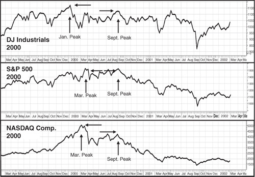
Contrast these performances with the market tops for these same indexes in 2000. The DJIA topped first (Figure 8.1) on January 14, 2000, followed by tops in the NASDAQ Comp. on March 10 and the S&P 500 on March 24. That seems like a reasonable clustering of tops, all within a couple months. That’s not the whole story though. As shown in Figure 8.1, while the March top in the NASDAQ Comp. was followed by a steep plunge, the DJIA and S&P 500 traded essentially sideways for the next five months. This sideways trading was followed by a rally in early September that took both the DJIA and S&P 500 back close to their rally peaks from earlier in the year. Specifically, the September 2000 rally took the DJIA back to a peak at 11,310, versus a January 2000 top at 11,723, for a loss of just 3.5%. The September rally took the S&P 500 even closer to its March 2000 peak at 1527, as the Index closed on September 1 2000 at 1520. Contrast this to the NASDAQ Comp., which, at its rally high in September, was at 4234, more than 16% below its March high at 5048.62.
Figure 8.1. 2000 market peaks for the DJIA, S&P 500, and NASDAQ Comp
Charts created with Metastock, a Thomson Reuters product.
The performances of the S&P Mid and Small Cap Indexes differed even more. Both the Mid and Small Cap Indexes reached rally highs in March 2000 (Figure 8.2). But unlike their big cap counterparts, both Indexes continued to climb throughout the next five months, reaching new rally highs in September significantly above their March levels. Although both the Mid and Small Cap Indexes suffered steep pullbacks in early 2001 and then again in August–September 2001, both were able to recover from these pullbacks to reach new all-time highs. In fact, as seen in Figure 8.2, peak readings in the two Indexes were not reached until April 2002.
Figure 8.2. S&P Small and Mid Cap Indexes, 2000-2002
Charts created with Metastock, a Thomson Reuters product.

In sum, the 2000–2001 market top, in terms of the performance by the various market indexes, presented a very mixed bag. Both the DJIA and S&P 500 spent most of the year trading sideways, testing their early year highs in September 2000. The S&P Mid and Small Cap Indexes performed even better, reaching new rally highs in September 2000. The NASDAQ Comp. was the only one of the major indexes showing a sharp decline throughout the year. Thus, in terms of losses in the major price indexes, up until the market highs in September, there really wasn’t much of a bear market at all during 2000, except, of course, for the implosion of the tech stock bubble where the impact was felt most acutely in the NASDAQ Comp. The diverse performances of the major market indexes was the first major difference between the 2000 market top and prior major market tops. The different performances also highlights the dangers of liquidating portfolios in response to the losses shown by the NASDAQ Index. In fact, this would have been exactly the wrong thing to do for portfolios invested in small and mid cap stocks outside the technology and telecommunications sectors and only slightly less damaging for big cap portfolios invested outside the bubble stocks.
Thus, a key differentiating feature of the 2000–2003 bear was the unequal distribution of losses. The sell-off was obviously painful for investors with heavy exposure to technology issues, as reflected by the nearly 78% loss in the NASDAQ Comp. But for investors who were either astute (lucky?) enough to exit their tech stocks near the top, or for those who avoided those stocks altogether, the 2000–2003 bear was a much less momentous affair, with losses in the DJIA and S&P 500 at 37.8% and 49.2%, respectively. In fact, the loss in the DJIA was not that much more than the average bear market decline of 32.2% from 1940 to 2000. And, for those fortunate enough to have large exposure to mid and small cap stocks, the 2000–2003 bear was a relatively short-lived (April–October 2002) and limited decline with the S&P Small Cap Index down 33.78% and the Mid Cap Index down 32.25%. In other words, there were plenty of places to hide in the 2000–2003 bear market to limit the damage to an investor’s portfolio.
In contrast, there was no place to hide during the 2007–2009 bear market. While the major market indexes showed a wide range of losses in the 2000–2003 bear decline, the opposite was true of the sell-off from October 2007 to March 2009. In this case, there was nowhere to hide, as the range of losses shown by the major indexes was so narrow as to be almost invisible. As Table 8.2 shows, all the major indexes—big, mid, and small—had losses within a few percentage points of one another, with the DJIA holding up best (if holding up is even applicable), while the S&P Small Cap Index ended with the largest loss. However, all were within the 50% range, while the same indexes showed losses during the 2000–2003 bear ranging from nearly 78% to just over 32%.
Table 8.2. Losses of Major Indexes 2007–2009

At this point, our reader might be asking, so market indexes topped at different times and showed widely different losses during the 2000–2003 bear market. How does this apply to identifying a major market top? Well, with indexes topping all over the place and with some showing losses of more than double others, using an analysis of just one major price index to define the market top could produce misleading results. In the case of the 2000–2003 top, it might be fair to ask regarding the major market indexes, which top are you referring to? The NASDAQ top in March 2000, the S&P 500 in September 2000, or maybe the S&P Small Cap top in April 2002? All of them would require their own analysis, and each would produce different results in terms of the subsequent bear trend. We try to partially resolve this conundrum by looking at the two indexes that were, in all likelihood, the most closely watched—the NASDAQ Comp. and S&P 500—and apply our analysis to the tops in those two indexes. But for now, we turn our attention to two other complexities of the 2000 market top, beginning with market breadth.
The 2000–2001 Market Top and the NYSE Advance–Decline Line
As noted in Chapter 7, Advance–Decline Lines have, historically, been one of the most useful indicators in warning of approaching major market tops. They accomplish this warning through divergences. That is, while the major price indexes are rallying to a series of new bull market highs, the A–D Lines record a series of lower peaks, or, in other words, diverge from the action of the price indexes. Historically, these divergences have occurred, on average, about 7 months prior to major market tops. However, this average includes some outliers, including a 17-month lead time prior to the 1968–1969 market top and, most significantly, a 23-month lead prior to the 2000–2001 market top. This nearly 2-year lead time has led some analysts to conclude the NYSE Composite Advance–Decline Line (A–D Line), which is the indicator most often used in signaling these divergences, was, in this case, almost worthless as a timing tool in terms of warning of the market’s final top. And in this case, as a timing tool, the A–D Line does appear of little use in identifying the ultimate market top. That said, the behavior of the A–D Line is another piece of the unusual character of the 2000–2001 market top, and as such, its behavior carries some useful information about what was going on in the stock market prior to the end of the bull market—information that could prove valuable in identifying a future anomalous market top.
The 23-month lag between the high in the A–D Line and, in this case, the DJIA, dated to April 1998, which ended a long uptrend in the A–D Line dating to early 1995. As shown in Figure 8.3, Point A, though, in one sense, the A–D Line did act as an accurate predictor of a bull market top—the July 1998 market high, which was followed by the 3-month bear market that ended in October 1998. So far, so good. The A–D Line bottomed in October, along with the major price indexes, right on schedule. However, rather than starting a new uptrend, the A–D Line rose for only about a month before renewing its downtrend. Clearly, something different was going on. Had the market indexes also turned lower, the decline in the A–D Line would have been of little consequence. But, as history shows, all the major indexes rebounded from the October 1998 lows into a new bull market that lasted for almost the next two years.
Figure 8.3. The NYSE A–D Line leading up to the 2000 market top
Charts created with Metastock, a Thomson Reuters product.
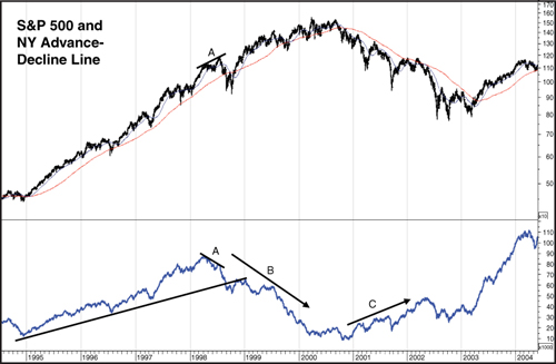
Generally, the steady downtrend in the A–D Line from late 1998 to early 2000 (Figure 8.3 Point B) is laid at the feet of the dot-com bubble in technology stocks. That is, many investors rushed into these technology and dot-com stocks at the expense of stocks in just about any other industry sector. However, the tech bubble burst with the top in the NASDAQ Comp. in March, 2000. That top was matched by a top in the S&P 500 in March and preceded by the January 2000 top in the DJIA. The tops in the DJIA and S&P 500 were tested in September 2000, and it was only then all three indexes dropped into a clearly defined bear trend. But here’s where it gets interesting. As shown in Figure 8.3, rather than joining the market indexes in a bear trend, the A–D Line actually bottomed in October 2000 and began an uptrend that lasted nearly 18 months, until May 2002 (Figure 8.3, Point C). To understand why, we need to first go back to the downtrend in the A–D Line from late 1998 to early 2000 when all the price indexes were rallying.
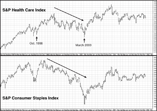
The lag in the A–D Line during those 14 months from 1998 to 2000 was due primarily to investor infatuation with all things dot-com plus those fellow-traveler stocks in the telecom and, to a lesser extent, consumer discretionary and industrial sectors. For example, even though the broad market indexes (and the DJIA) rallied after the 1998 bear market, two industry sectors, Consumer Staples and Healthcare, never recovered. Instead, both stayed in downtrends right up to early 2000 (Figure 8.4). Similarly, other sectors, such as Energy, Finance, and Basic Materials, had very erratic performances over this 14-month period, alternating between sharp rallies and equally sharp moves lower. Thus, there were clearly a number of areas of broad-based weakness that account for the lag in the A–D Line going into the 2000 market top. Renewed strength in these lagging sectors also helps explain what proved to be a very selective market in 2000 and the recovery by the DJIA and S&P 500 later in the year back almost to their early year highs.
Figure 8.4. Performances of the healthcare and consumer staples sectors 1998–2000
Charts created with Metastock, a Thomson Reuters product.
The Ten S&P Industry Sectors and the Market Top
Not only did the S&P industry sectors play a role in explaining the performance of the A–D Line prior to the 2000 market top, but they also played a very significant role in how the major market top formed in 2000–2001.
In the first section of this chapter, we discussed the different performances of the major price indexes in terms of when they peaked and how they behaved through the balance of 2000. In large part, the difference in performance between the DJIA, S&P 500, and NASDAQ Comp. can be attributed to gains and losses in the various S&P industry sectors.
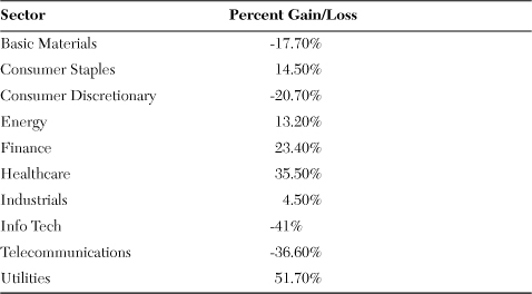
Except for those investors and traders caught up in the dot.com/ telecom frenzy, the year 2000 was not all that bad and, in one or two instances, relatively good. This much is evident in the performances of the ten S&P industry sectors for the year. We go into the exact timing of tops for the industry sectors a little later in this chapter, but for now their performances for the year can serve as an indication of how uneven returns were for 2000. Table 8.3 lists the gains/losses for the ten sectors from December 31, 1999, to December 29, 2000. As the table shows, for investors in Info Tech, Telecom, or Consumer Discretionary stocks, 2000 was a very bad year. On the other hand, investors holding utility stocks had every right to question, “What bear market?” with the Sector up by over 50%. Other than these extreme gains and losses, the performances of the remaining industry sectors varied from modest gains to modest losses. But with only four of the ten sectors showing losses for 2000, it would be very difficult to classify the year as a nasty bear market.
Table 8.3. Performance of Ten S&P Industry Sectors 12/31/99–12/29/00
Another way of looking at the performances of these industry sectors as they applied to the bear market is when they actually reached their peaks for the 1998–2000 bull market. Of the ten sectors, only two topped in 2000: Basic Materials in January and Info Tech in March. Two sectors reached their bull market peaks in 1999: Telecom in July and Consumer Discretionary in December. The other six sectors either peaked in 2001 (Finance in January, Utilities in April, and Energy and Industrials in May) or not until 2002 (Healthcare in March and Consumer Staples in May). In Figure 8.5, we plotted the points at which each industry sector topped relative to the S&P 500 Index in 1999–2002. As is evident, there is little uniformity in terms of when these sectors descended into bear trends.
Figure 8.5. Timing of industry sector bull market peaks at the 2000 and 2007 market tops
Charts created with Metastock, a Thomson Reuters product.
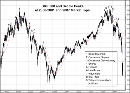
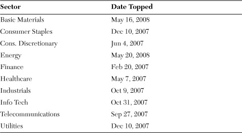
But might this scattered timing of rally highs for the sectors be the norm for major market tops? An examination of the 2007 market top suggests the answer to that question is no. Table 8.4 shows the times when each of the ten S&P industry sectors peaked at the 2007 market top. With the exception of the Finance Sector, which topped in February 2007 and the Energy and Basic Materials Sectors, which topped in May 2008, the peaks for the industry sectors were clustered either at or just prior to the July highs in the market indexes and at or slightly after the October 2007 peaks in the market indexes. This pattern is far different from the one at the 2000 market top, where the bull market highs for the ten sectors were scattered over a period of nearly three years, from the top in Telecom in July 1999 to the May 2002 top in Consumer Staples. Figure 8.5 illustrates the difference of the peaks in the S&P Sectors at the 2000 and 2007 market tops.
Table 8.4. Industry Sectors Tops in 2007–2008
In terms of when the most widespread damage was done in the 2000–2003 bear market, it seems clear the worst of the decline occurred from April 2002, when the small and mid cap indexes topped, to the reaction low in October 2002. There seems little reason to question the view the 2000 market top marked the end of the secular bull market that began in 1982. However, in terms of when the most damage was done in the 2000–2003 bear market, the six-month period between April and October 2002 seemed to have much in common with the cyclical bear markets in 1987, 1990, and 1998, each of which lasted three–four months. So if the end of the secular bull market is based on when the most widespread and long-lasting damage was done, then the 2007–2009 bear market might mark a better ending point for the secular bull that began in 1982.
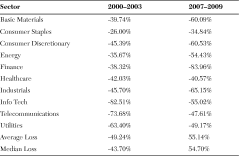
That more widespread damage was done in the 2007–2009 bear market than during the 2000–2003 bear appears borne out by the losses suffered by the S&P industry sectors. Table 8.5 compares the losses for each of the ten S&P sectors in the 2000–2003 and 2007–2009 bear markets. The average loss during the 2007–2009 bear was 55.14% with a median loss of 54.7%. In contrast, the average loss in the 2000–2003 bear market was 49.24% with a median loss of 43.7%. Clearly, the most significant damage in the 2000–2003 bear was limited to the Info Tech and Telecom sectors, while damage was more equally distributed in the 2007–2009 bear. The exception in this most recent bear market was the Financial Sector, which actually suffered a larger loss—83.96%—than the loss of 82.51% by the Tech Sector in the 2000–2003 bear. In fact, though, severe losses were probably more widespread in the tech stock meltdown when many of the dot-com stocks simply disappeared. The big drop in the Finance Sector in the 2007–2009 bear was more likely due to the evisceration of big cap names in the banking (Citicorp, Bank of America), insurance (AIG), and brokers/investment banking (Lehman Bros., Bear Sterns, Merrill Lynch) than to the disappearance of wide swaths of financial stocks.
Table 8.5. Losses for the Ten S&P Industry Sectors in the Bear Markets
Given the disparity in the timing of bull market tops for the various price indexes, and the even greater dispersion of peaks for the various industry sectors, when discussing the 2000 market top, as noted earlier it might be fair to ask, “Which market did you have in mind?” For that reason, in the next chapter, we split our analysis of the 2000 market top in terms of the application of the Wyckoff and Lowry principles, into two parts. First, we look at the market top for the S&P 500 and then follow with an analysis of the top for the NASDAQ Comp. Index. Although both indexes bottomed at the same time and in about the same way, their tops looked nothing alike. Consequently, it seems appropriate each top deserves its own examination. Although we use the Buying Power and Selling Pressure Indexes in our examination of the 2000 top in the S&P 500, these Indexes are not currently calculated for the NASDAQ Comp. Index. Consequently, we rely strictly on the Wyckoff analysis in our study of the NASDAQ Comp. in 2000. One final note: Although the DJIA has been used for our prior studies, given the disparities in performance between the DJIA and the other major indexes, the S&P 500 appears to offer a better proxy for the 2000–2001 market top.