
6. Building a Cause: How R.D. Wyckoff Uses Point and Figure Charts to Establish Price Targets
Thus far, we have described how Wyckoff’s laws of Supply and Demand and Effort vs. Result are useful tools in helping identify major market tops and bottoms. There is a third law, Cause and Effect, that is also an important component of a Wyckoff analysis. Briefly put, the Law of Cause and Effect states there is an equal and corresponding effect for every cause. In today’s terms, this law is often stated as “the bigger the base the bigger the rally.” For purposes of identifying major market tops and bottoms, the Law of Cause and Effect is useful in setting rough targets for bull and bear markets. For example, as prior chapters have illustrated, a new bull market is typically preceded by a period in which the major price indexes move in a roughly-defined trading range. This generally sideways pattern is termed the base, or basing pattern. This basing pattern is used to calculate the possible extent of the ensuing bull market. That is, when the basing period prior to a new bull market has been completed, a rough target range as to the extent of the ensuing market uptrend can be calculated from the extent, or width, of the base. Thus, indications of a bull market top (Buying Climax, Sign of Weakness, Break through the Ice, for example) that occur within the target range established by this base would, therefore, carry a higher probability of signaling the bull market is, indeed, over. The same technique of measuring the width of a topping pattern in a bull market is used for establishing a potential range for the ensuing bear market. Does it work? We let the reader judge this based on the illustrations that follow. First, though, we need to quickly review the tools needed to establish a target range, beginning with the charting technique.
Point and Figure Charts
Technical analysis uses many different forms of charts. Vertical bar charts and point and figure charts are two of the most basic. Unlike vertical charts, which have two axes (one for price, the other for time), point and figure charts have only one axis, the one for price. There are many excellent texts that cover the construction and interpretation of point and figure charts, so we limit ourselves to only a rudimentary discussion before going into their applications in establishing price targets for bull and bear markets.
There are two primary elements to a point and figure chart: box size and reversal amount. For the most part, the prices plotted utilize a trading day’s high or low. The charts are plotted on graph paper with boxes that form a grid. These boxes are then given price values: 1 point, 5 points, 10 points, and so on. The size of the box is typically dependent on the price of the security being charted. For instance, a one point per box chart might be appropriate for a stock trading in low single or double digits; however, using a one point box when charting a high priced stock such as Apple or Google would require reams of graph paper. Consequently, a large box size, likely in the range of 5 or 10 points per box, is more useful. The same applies when charting a market index. A point and figure chart of the S&P 500, for example, might use a box size of 20 points per box, while a box size of 100 points would likely be more applicable for charting the DJ Industrial Average.
The second element in a point and figure chart, the reversal amount, has changed over the years. Wyckoff, in his original analysis, typically used a one-box reversal. In current usage, however, each column must contain at least two boxes. That is, a reversal on the point and figure chart would be triggered by a change of two boxes. Thus a price change that reverses price by only one box would not be enough to begin a new column. Up to this day, purists consider the one-box reversal method as the only “valid” means of constructing a point and figure chart. For readers interested in more detail on this original method of point and figure charting, a good start is with The Point and Figure Method of Anticipating Stock Price Movements by Victor de Villiers, published in 1933, but available today in a reprinted edition by Marketplace Publishing. Another good source is Study Helps in Point and Figure Technique by Alexander Wheelan, published in 1954.
The three-box reversal method, which has arguably become the most popular form of point and figure charting today, was introduced in 1947 by Earl Blumenthal with his Chartcraft Service.1 Under this method, all price movement that encompasses less than three boxes is ignored. Over the years, the greater ease with which the three-box reversal can be plotted and the fact these charts can be constructed from data in the newspaper or from online sources has resulted in this method becoming regarded as the standard. It is not the purpose of this book to delve into the advantages or disadvantages of one-box versus three-box reversals. Each method has its strengths and weaknesses. For our purposes and for clarity of illustration, the examples used in this chapter are all based on the three-box reversal method.
Construction of a Point and Figure Chart
Constructing a basic bar chart of price movement requires drawing a straight line on a graph connecting the high and low price for the day, completing the process with a small horizontal line at the level of the closing price. Voila! You’re done (unless, of course, volume is also being plotted, which requires another vertical line plotted below the price bar). A point and figure chart, however, with its columns of Xs and Os can appear more intimidating. However, once learned, plotting a point and figure chart is a relatively quick and easy operation.
The basic point and figure chart consists of alternating columns of Xs and Os, with advancing prices represented by Xs and declining prices by Os. A key point to remember is for a three-box reversal chart, there can never be less than three boxes filled in a column. A second point to remember is that for a price to be plotted, it must be a round number. That is, for a column of rising prices, to advance from, say, 25 to 26, the price must be 26 or higher. There’s no rounding up from 25.99. For readers already conversant in point and figure charting, all this is well-known. For readers unfamiliar with the point and figure method, all this may serve to confuse rather than clarify. Thus, an illustration of how to construct a point and figure chart is in order (see Figure 6.1).
Figure 6.1. Constructing a point and figure chart

The stock XYZ in Figure 6.1 shows a series of price changes as follows: 35.5, 36, 36.9, 38.2, 38.8, 39.3, 38, 37.5, 36.3, 35.7, 34.7, 36, 37.2, 38. Each box has a value of one point, and the reversal amount is three boxes. The starting price, at 35.5 is not enough to plot on the graph because a move to 36 or higher is needed. The next price, 36, would be plotted (Plot 1). The next price, at 36.9, would not be plotted because the price must move to or through the next box price (37 in this case). However, the next day, the price moves to 38.2, which means two additional boxes can be filled (37 and 38 in Plot 2). The next price, 38.8, falls short of the next full box price. However, the next number, 39.3 fulfills the requirement of the next full box price and is plotted (Plot 3). This gives us a column of Xs from 36 to 39.
The move to 39 proves to be the high water mark for this rally, as prices turn lower, dropping to 38. Remember, though, this is a three-box reversal chart, so the price must drop a full three points in order to start a column of Os. The price subsequently drops to 37.5 then 36.3. Nothing is yet plotted, though, because the price must drop a full three points from the top price in the column of Xs. This means a drop to 36 or lower is needed. In fact, this is what happens next with the drop to 34.7. So in Plot 4, a column of Os is plotted. Because there was no price at 39 when prices began to drop, the first O is placed at 38 with an additional two Os plotted to complete the drop to 36.
The next day, prices fall further, to 34.7, so an additional O can be plotted at the 35 level. At this point, prices turn higher again, with a move to 36. Although this represents a full-box price, remember, just as a price change of three full boxes was needed to start the column of Os, a rally of three full boxes is needed for a new column of Xs. The stock price continues to rise, moving to 37.2 the next day. Nothing is yet plotted, though, as the price must rise to 38, a level reached the following day. Therefore, a new column of Xs is begun, starting at 36 and rising to 38 (Plot 5). Keep in mind, a column of Xs can only represent rising prices. To mark a move lower, it is necessary to move over one column and begin a new column of Os. With some practice, plotting point and figure charts becomes a relatively simple and quick process. It also allows an investor to update the price movement in a large number of stocks on a daily basis in a short period of time.
Point and Figure Charts as Applied to Major Market Tops and Bottoms: The Horizontal Count
One of the more common uses for point and figure charts is the calculation of anticipated targets for a rally or decline. There are two ways this calculation is determined, the horizontal and the vertical counts. As implied by the name, the horizontal count is determined by the width of a point and figure pattern. This would include a period in which prices move sideways in a relatively narrow range. The width of this range is the basis for the count, which is calculated by multiplying the number of boxes in the count by the box size and then by the reversal amount. In the case of a basing formation, the amount calculated is then typically added to the lowest point of the trading range to establish a target for the ensuing rally. So, for instance, if a trading range, or base, is 10 boxes-wide, with 5 points per box and a three-box reversal method used, the count would be calculated 10 × 5 × 3 = 150. This 150 points would then be added to the value of the lowest box in the range to establish a target price.
A vertical count is usually applied only to the three-box reversal method. It is calculated by counting the number of boxes in a column of Xs or Os. This count is then multiplied by the reversal amount (three for a three-box reversal) to determine the projected target. Wyckoff used only a horizontal count for his calculations; consequently, only this method of establishing a count is used for setting price target ranges on the market tops and bottoms discussed in this chapter.
Although the Wyckoff method has many uses for point and figure charts, for our purposes, their main application is to major market tops and bottoms. The formation of these tops and bottoms is reflected, as just noted, in broad horizontal point and figure patterns. In terms of Wyckoff’s Law of Cause and Effect, these horizontal patterns are the cause, and the larger the cause, the larger the likely effect or price target. In other words, the broader the top or bottom formation, the larger the following bull or bear market is likely to be. The extent of the horizontal postings in the topping or bottoming formation is termed the count. It is important to note that the count is not a precise tool as an indication of an exact upside or downside target, as will become evident through the examples in this chapter. It is also vital that the count is not done with a target already in mind so that a count is found simply to match expectations. Rather, a count should be done objectively with the target established from the count and not the other way around.
The first step in developing a count in a bottoming pattern is to find a sign of strength. Typically, this is a Last Point of Support (LPS) after a Sign of Strength rally. While there may be several LPSs in a bottoming process, the optimal point to use would be the one defined by the pullback (Backup to the Edge of the Creek) following a Jump Across the Creek, as this normally marks the end of the bottoming process and beginning of the mark up phase of the new bull market. The count is taken from right to left, usually to the first indication the bottoming process has begun, normally the Preliminary Support (PS).
Developing a count for a topping formation is similar. First, identify a rebound following a Sign of Weakness, usually a Last Point of Supply (LPSY). The point to use in this case is typically the top of the rally that serves as a test of the Break Through the Ice, considering this is the point where the topping formation is complete and the markdown phase of the new bear market begins. The count would then be taken from this point across to the left, typically to the Preliminary Supply (PSY) as the first indication a topping process has begun. This might seem like a lot of points to consider. But the simple way to remember them is to use the last and first signs of weakness in a topping pattern and the last and first signs of strength in a bottoming pattern. Plus these points would already have been identified when doing the initial Wyckoff analysis of the market tops and bottoms.
The count itself is established simply by counting the number of boxes from the starting to the ending points. In the case of a market bottom, that would be the number of boxes between the LPS and Preliminary Support. It is important to remember that all boxes, including empty boxes, are included in the count. The projected range is then established by multiplying the number of boxes in the count by the point value for each box and by the reversal amount. Thus, a 3-box reversal point and figure graph with box sizes of 10 points each and a horizontal count of 15 would have a projected count of 450 points: 10 × 15 × 3 = 450.
With the count established, the next step is to determine the target. However, rather than identifying a specific price target, the Wyckoff method establishes a target range. The initial point used to establish a target range is the level at which the count itself was taken. For example, in a bottoming pattern, the level of the count would be established by the Last Point of Support (LPS). The target price is identified by adding the count to the level of that Last Point of Support. Thus a horizontal count of 300 taken from a LPS at a level at 775 would suggest a target price of 1075.
The target range is then established by adding the count to the lowest point in the basing pattern, often a Spring, test of a Spring, Shakeout, or Selling Climax. It is usually best to use the most conservative count when establishing a range. Typically, this means using the Sign of Strength that represents the lowest price in the bottoming formation. Thus if a Spring were to drop to a level below that of the Selling Climax, the Spring would be used to establish the range. Taking the previous example, if the Spring were at a level of 700, then the target range would be 1000 (Spring price: 700 + 300 = 1000) to 1075 (Last Point of Support price: 775 + 300 = 1075).
A similar process is used in establishing a range from a topping formation. First, establish the count. Most often, the count begins at the level of a sign of weakness, usually the Last Point of Supply. When this point is identified, count the boxes from right to left to the first indication the topping process has begun, usually the point of Preliminary Supply. The next step is to subtract the count from the level where the count started, which again, is typically the LPSY. The target range is then established by subtracting the count from the highest point of a topping pattern such as a Buying Climax or Upthrust. So in the case of a top where the Upthrust represents the highest price, the target range would be determined by subtracting the count from the highest price in the Upthrust and also from the price of the LPSY.
To re-emphasize an earlier point before we get to the illustrations: counts are to be used only as an indication of possible targets. They should never be considered as indicating exact levels. The count provides no indication of whether the bull or bear market will reach or overshoot the target range. In general, we have found using price targets to be more hazardous to investment success than not. For instance, say a rally begins to falter well below its target. The temptation might be to ignore warning signs of a possible significant downside reversal. After all, the target has not yet been reached! Or a rally may overshoot its target, raising the temptation to sell, only to see prices continue to move substantially higher. In all cases, the measures already detailed in identifying a market top or bottom should predominate over any price target range. The utility of the target range is solely in its role as a possible confirming element of other, more reliable, indications of a top or bottom formation. With that caveat, let’s look at how the Law of Cause and Effect can be applied to the market tops and bottoms discussed in previous chapters.
The 1969 Market Top and Targets for the Bear Market
Taking the major tops and bottoms already discussed in chronological order, our initial venture into establishing a count is with the market top in 1968–1969 (Figure 6.2). The first step is to establish the level at which to take the count. In this case, this is the Last Point of Supply (LPSY). We then count from right to left to the initial sign of weakness, the point of Preliminary Supply (PSY). Keep in mind, not all the columns will necessarily be filled with an X or an O, but all must be counted nonetheless. Moving right to left from the LPSY to PSY establishes a total of 11 boxes. Given the relatively low price of the DJIA in 1969, we have assigned a box size of 10 points per box. Because this is a three-box reversal chart, the projected range is calculated by multiplying the box size (10) by the horizontal count (11) and the box size (3). So 10 × 11 × 3 = 330 points.
Figure 6.2. Establishing a count at the 1969 market top
Charts created with Metastock, a Thomson Reuters product.

With the projected count calculated, the next step is to determine the target range to the downside. The initial measuring point is typically the place where the count begins, in this case at the Last Point of Supply. The DJIA close at this point was at 969. The downside projection, though, should be as conservative as possible, meaning another measurement should be taken from the highest level of the topping process. In this case, the highest point was set on November 29, 1968, when the DJIA reached a level of 985. Note that rather than forming a top in a Buying Climax, the peak in the bull market was marked by about a week of churning action. Churning is a process in which prices fail to show any significant upside progress despite heavy volume. As such, it usually marks a period of distribution, as enough Supply is coming on the market to overcome the existing Demand. Although less dramatic than a Buying Climax, this churning action, when it occurs at the top of a substantial rally, can be just as decisive in marking a significant market top.
The downside projection for the bear market can now be calculated by subtracting the count from the two measuring points, the peak of these few days of churning (at 985) and LPSY (at 969). This produces a downside target range of 655 to 639 (985 - 330 = 655; 969 - 330 = 639). The actual close for the DJIA at the bear market low was on May 26, 1970, with a close at 631.16 and intraday low at 627.46. Keep in mind, and as will become apparent in subsequent examples, not all projections, either to the upside or downside, are as precise as this initial study. It is vital to remember these projections serve only as guides, not as hard and fast targets. Investors should always defer to market conditions themselves in determining whether a bull or bear market has concluded, regardless of whether or not a projected target has been reached.
One final note on chart construction—beginning in the early 1990s, data providers began supplying the actual high and low for the DJIA. Prior to that, the standard was the theoretical high and low (based on a calculation that all 30 DJIA stocks made their highs and lows for the session simultaneously). Consequently, highs and lows cited in the charts from the 60s, 70s, and 80s are based on the theoretical calculation. DJIA highs and lows from 2000 forward are cited using the actual high and low for a given day. This may seem like a rather esoteric and largely irrelevant difference. However, we found using the theoretical versus actual daily highs and lows in the DJIA did make a clear difference in the projected target ranges, with the actual high and low producing a more accurate target.
The 1970 Market Bottom and Targets for the 1970–1973 Bull Market
Our next study (Figure 6.3) is the 1970 market bottom and subsequent bull market to the 1973 top. The first step is to establish the level where the count should be taken. For a market bottom, the pullback following a Sign of Strength rally is the recommended starting point for a count. This is typically the Last Point of Support (LPS). In the 1970 bottom, the applicable Sign of Strength rally is the one that followed the Jump Across the Creek. The final Last Point of Support (LPS, at 707) marked the beginning of the strong initial rally in the 1970–1973 bull market. The count is then made from right to left to the first indication the bear market was concluding. For a market bottom, this first point is normally Preliminary Support (PS). Moving from right to left from the LPS to PS results in a count of 10 boxes (columns). Remember, a column does not have to be filled to be included in the count. Because the rally to the 1973 high took the DJIA over 1000, we used a box size of 11 points, slightly larger than the 10 points used for the 1969 top. And given this is also a three-box reversal chart, the calculation for the projected range is 10 (number of columns) × 11 (box size) × 3 (reversal amount) = 330 point range.
Figure 6.3. Establishing a count at the 1970 market bottom
Charts created with Metastock, a Thomson Reuters product.
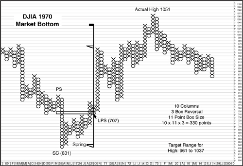
When the count is established, the next step is to choose the levels used for determining the target range. A conservative projection uses the low point of the bottoming process which, for the 1970 bottom, was the Selling Climax at a DJIA level of 631. The second level is where the count began, at the LPS at 707. Adding the 330 projected range to the SC low and to the LPS produces a target range of 961 to 1037. In this case, both fell short of the actual high of 1051, set on January 11, 1973. The projected high for the bull market, however, was probably close enough to alert an investor to begin looking for signs of a market top—signs that, as it turned out, were quick to develop.
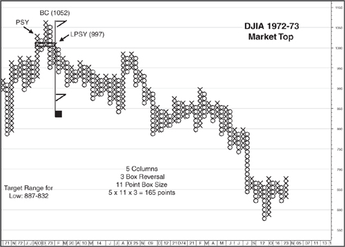
The 1972–73 Market Top and the Severe Bear Market into the 1975 Low
The 1972–1973 top (Figure 6.4) offers an object lesson about placing too much emphasis on a projected range. Although the 1973–1974 bear market was the most severe since the 1930s, the topping pattern at the end of the 1970–1972 bull market was compact and provided little evidence of the carnage to come. Other interpretations of the top might produce a different, more extensive count. However, the levels we have used appear to conform most closely to both a traditional Wyckoff analysis and to the actions of Lowry’s Buying Power and Selling Pressure Indexes. Accordingly, we identified the Last Point of Supply at the test of the Ice in mid-February at a level of 997. Counting right to left to Preliminary Supply yielded a count of just 5 boxes. We used an 11-point box size, consistent with the chart for the 1970 market bottom. This produced a projected count of 165 (11 × 3 × 5). Subtracting this count from the highest level of the topping formation, in this case the Buying Climax at 1051, and from the LPSY at 997 produced a target range of 886 to 832. As it turned out, this range was well short of the eventual bottom at 577, set in December 1974. The range, however, did identify the prolonged distribution pattern December 1973 to June 1974, which preceded the plunge to the final low of the bear market. Apart from unabashed curve fitting, any logical count from this December to June trading range carries far below the market’s actual low, providing no useful guide as to the extent of the decline when prices broke down from the range. Accordingly, the 1972–73 market top has to be noted as a cautionary example of the risk entailed in overemphasizing targets as part of an analysis.
Figure 6.4. Establishing a count at the 1972–73 market top
Charts created with Metastock, a Thomson Reuters product.
The 1974–1975 Market Bottom
The market bottom in 1974–1975 (see Figure 6.5) ended first with an initial Spring and then with another Spring in December, as prices dropped to a marginal new low but on rising Demand and falling Supply. The rally that followed the Spring represented a Sign of Strength, so our count begins on the pullback from this rally to the Last Point of Support.
Figure 6.5. Establishing a count at the 1974–75 market bottom
Charts created with Metastock, a Thomson Reuters product.
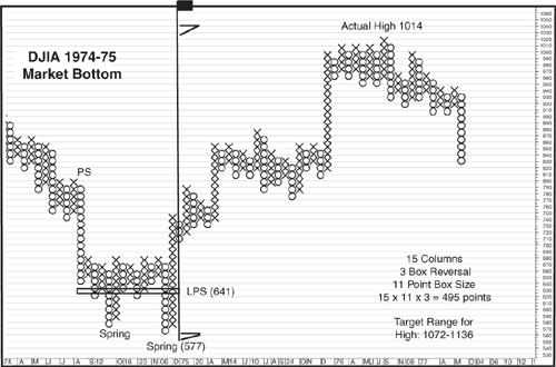
The limitations of using a three-box reversal chart are evident in this count, as the appropriate LPS came on a pullback in price too small to show up on the chart. Therefore, our count begins with the column representing the Sign of Strength rally off the Spring low. The count is taken right to left to the initial sign of a bottoming process, the Preliminary Support, encompassing 15 boxes. This produced a count of 495 (15 × 11 × 3 = 495). The most conservative target uses the close from the low of the trading range, which, in this case is the low formed by the Spring in December 1974, at 577. The other boundary for the target range for a market top is then established by adding the count to the level of the LPS at 641. The result is a target range of 1072 to 1136. As it turned out, this range was a little overoptimistic, as the actual high for the 1975–1976 bull market was set on September 21–22, 1976, at a close of 1014 and an intraday high at 1026. Both the close and intraday high were below the target range but were close enough nonetheless to alert an investor that the topping activity associated with the sideways movement beginning in early 1976 could be part of a major top.
The Drawn-Out Market Top in 1976
The market top in 1976 (Figure 6.6) was a long, drawn out affair encompassing most of the year. In fact, it is possible to extend the topping process to the recovery high reached in late December. This last gasp rally, however, is probably best treated as a secondary topping pattern apart from the major top formed between February and September. Even excluding the rally to the December high as part of the topping process, our count results in a target range considerably below the actual market low in March 1980.
Figure 6.6. Establishing a count at the 1976 market top
Charts created with Metastock, a Thomson Reuters product.
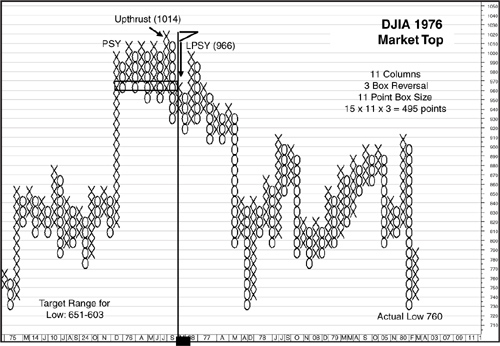
Counts at market tops begin with the rebound following a clear sign of weakness. In this case, the Sign of Weakness (SOW) followed the Upthrust to a new rally high in late September. This rapid decline was followed by a weak rebound to the Last Point of Supply in late October/early November. Our count, therefore starts at this LPSY and moves to the left to the first sign of a possible major top at the point of Preliminary Supply for a total of 11 boxes. Multiplying the 11 boxes by the box size of 11 and the 3-point reversal amount produces a count of 363. To establish the target range for a market bottom, we use the closing prices at the LPSY at 966 and at the Upthrust at 1014. Subtracting the 363 count from these two levels results in a target range of 651 to 603. This range proved too ambitious, as the actual market low was set in a classic selling climax on “Silver Thursday” March 27, 1980, the day the Hunt silver bubble burst. The intraday low, at 730 and closing low at 760, are both well above the target range. This, then, provides another good example of not allowing a projected target to obscure signs of an important market bottom.
The 1981 Market Top and Approaching End of the Secular Bear Market
The bull market initiated by the selling climax on “Silver Thursday” in March 1980 proved short-lived, as the topping process began with a point of Preliminary Supply in November 1980 (Figure 6.7). The subsequent bear market, which lasted until August 1982, proved to be the last gasp of the secular bear that had begun in 1966. This bear market also marked a sea change for market leadership, as the inflation-sensitive energy, precious metals, and basic materials stocks that had thrived in the late 1970s took a back seat to stocks that benefited from then-Federal Reserve Chairman Paul Volcker’s successful slaying of inflation. Thus, market leadership for much of the new secular bull market passed to financial, consumer staples, utility, and eventually to technology stocks in the bubble that ushered in the start of a new secular bear market in 2000.
Figure 6.7. Establishing a count at the 1981 market top
Charts created with Metastock, a Thomson Reuters product.
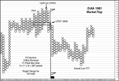
The initial point for a count begins with the rebound to the LPSY following the sharp decline and Sign of Weakness from the Upthrust to 1024. Counting right to left to the column representing the point of PSY encompasses 9 boxes. The box size for this chart is 11 points. As this is also a three-box reversal chart, the count would be calculated as 9 × 11 × 3 = 297 points. The target range for the bottom of the bear market is established by subtracting 297 from the level of the LPSY at 959 and from the top of the Upthrust at 1024. This produces a target range of 727 to 662. As has been the case with most of the projections from market tops, this range proved too pessimistic, given the actual closing low, on August 11, 1982, was at 777, with an intraday low set on April 6 at 770. Once again, though, the primary target of 727 was close enough to alert an investor a bottoming process that began in the low-800s/high-700s had the potential for a major market low.
The 1982 Market Bottom and the Start of the Secular Bull Market 1982–2000
One of the best indications the market bottom in 1982 (Figure 6.8) represented more than another cyclical low in an ongoing secular bear market was the extremely heavy volume that followed the August 11, 1982, market bottom. The sea change in leadership, from stocks that benefited from rising inflation to those most likely to benefit from falling inflation or disinflation provided another indication a major trend change for the stock market could be underway.
Figure 6.8. Establishing a count at the 1982 market bottom
Charts created with Metastock, a Thomson Reuters product.
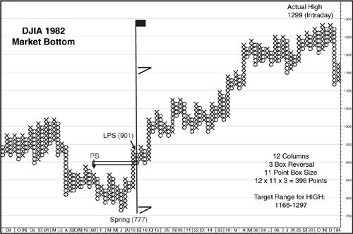
The beginning of the end of the secular bear market began quietly enough with a point of Preliminary Support that included a 90% Up Day. After a Selling Climax and several secondary tests of support, the final stage of the bottoming process began with a Spring and Sign of Strength rally that broke out to a new recovery high. This rally was followed by a minor pullback that created the starting point for our count, the Last Point of Support. In this case, given that the LPS occurred above the top of the bottoming process, the level of the count appears odd, as it includes no filled boxes.
As pointed out earlier, though, all boxes, whether filled or not, are included in the count. Starting at the LPS and moving to the left, we count 12 boxes (or columns in this case). The box size for this chart remains at 11 points per box, and the reversal amount remains at 3 boxes. Thus the count is calculated 12 × 11 × 3 = 396 points. The levels used to establish a target range are at the low point of the market bottom, at the Spring with a closing level at 777, and at the LPS, with a closing level at 901. Adding the count to these two levels results in a target range between 1166 and 1297. This is one instance where the count produced a range that, for all intents and purposes, called the market top. The closing high for the bull market was set on January 6, 1984, at 1287, with an intraday high set on January 13 at 1299, just two points above the upper end of the target range at 1297. But, as is evident in previous examples, projections this close are more the exception than the rule. It is therefore vital to remember that these projected targets for both bull and bear markets should be treated as guidelines rather than as levels set in stone, with the action of the market itself providing the best evidence whether or not a major top or bottom is in the process of forming.
The 2002–2003 Market Bottom
At this point, we are skipping to the 2003 market bottom as the unusual characteristics of the 2000 market top are such that it deserves a chapter all by itself.
The first indication that the 2000–2003 bear market (Figure 6.9) was coming to an end was a rally on heavy volume and a 90% Up Day in early July 2002. This was followed later in the month with a classic Selling Climax that was subsequently tested by a shakeout in October and Spring in March 2003. This Spring was followed by a Sign of Strength rally that included another 90% Up Day and also entailed a breakout (Jump Across the Creek in Wyckoff terms). The subsequent pullback to test the breakout was the LPS in the bottoming pattern and serves as the starting point for our count.
Figure 6.9. Establishing a count at the 2002–2003 market bottom
Charts created with Metastock, a Thomson Reuters product.
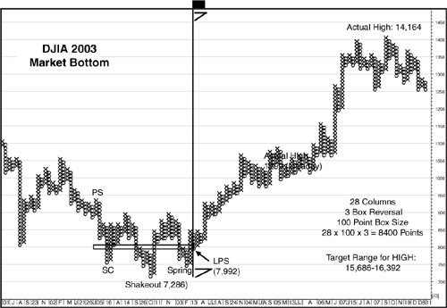
Moving right to left to the point of Preliminary Support yields a count of 28 boxes. Because the DJIA has moved into five-digit territory, the size of the boxes used in the point and figure chart has increased dramatically to 100 points per box. The three-box reversal method remains the same. The calculation for the count is therefore 100 × 28 × 3 = 8400 points. The target range is established by adding the count to the low point of the bottoming pattern—in this case at the October 2002 Shakeout, with a DJIA close at 7286, and at the level of the LPS, at a close of 7992. Given the count of 8400, this yields a target range of 15,686 to 16,392. This projection was well off the mark, as the final high of the 2003–2007 bull market was on October 9 2007, at 14,164, with an intraday high set on October 11 at 14,198. There is no way to rationalize this target as providing any guidance in the formation of the 2007 market peak, which began the topping process about 1600 points below the minimum target.
The 2002–2003 market bottom is one instance, however, that readily lends itself to an alternative count. In this alternative, the count is based on an apparent “head and shoulders” formation, with the July 2002 Selling Climax serving as the left shoulder, the October Shakeout at the head, and the March 2003 Spring as the right shoulder. Beginning at the right shoulder and concluding at the left shoulder results in a count of 23 boxes. Using the same 100-point box size and three-box reversal method yields a projected range of 6900. Adding this range of 6900 to the closing low of the 2002–2003 market bottom of 7287 on October 9, 2002, produces a target of 14187. With an actual closing high at 14,164 and intraday high at 14,198, this alternative count yields a result that virtually matches the actual high.
We should point out, though, that attempting to find alternative counts can end up causing more confusion than clarification, especially if an alternative count varies widely, as this one does, from the traditional count. Therefore, our recommendation is to stick with the traditional count, using the initial and final points of weakness (Preliminary Supply and Last Point of Supply) as the boundaries for a count at a market top and the initial and final signs of strength (Preliminary Support and Last Point of Support) for market bottoms.
The 2007 Market Top and Start of the Worst Bear Market Since the 1929–32 Wipeout
The preamble to the worst bear market since 1929–1932 started out with a heavy volume decline from a new bull market high in mid-July, marking a point of Preliminary Supply (Figure 6.10). The final top, in mid-October, was a relatively quiet affair, on light volume with no evidence of the panic buying that sometimes accompanies a market peak. However, prices moved steadily lower from there, eventually breaking down in early January 2008 in a crescendo of selling. The rebound from this panic selling comprised a test of the breakdown level—in Wyckoff terms, testing the Break through the Ice—and also a LPSY, providing the start for our point and figure count.
Figure 6.10. Establishing a count at the 2007 market top
Charts created with Metastock, a Thomson Reuters product.
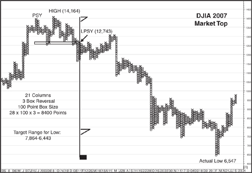
As has been the case with other market tops or bottoms, there are relatively few filled boxes in the count starting with the LPSY and carrying over to the point of PSY. However, it is the number of columns that is important, not whether the columns include filled boxes. Moving from right to left on the chart results in a horizontal count of 21 boxes. As was done with the 2002–2003 market bottom, a box size of 100 points is used for the DJIA. Taking the count of 21 boxes times the box size and the three-box reversal method results in 21 × 100 × 3 = 6300. One boundary of the target range for the bear market is calculated by subtracting 6300 from the LPSY, at a closing price of 12,743, producing a downside target of 6443. The other boundary of the target range, again using the most conservative measurement, which means using the high point of the topping pattern, is then calculated from the October market peak, with a close at 14,164. This produces a target range from 7864 to 6443. The actual closing low for the bear market, on March 9, 2009, was at 6547, about 100 points above the bottom of our projected range—not bad for a decline that took the DJIA down by over 7600 points, or nearly 54%.
Conclusion
This chapter began with a point and figure count that almost exactly targeted the actual bottom for a bear market and ended the chapter the same way. In between though, there were several examples of targets that were either far short or well above the actual extent of the bear and bull markets they purported to measure. Therefore, it is key to remember targets based on these horizontal counts are meant only as guidelines. Every once in a while the count might seem magical in pinpointing the actual high or low for a bull or bear market. But in the final analysis, the Wyckoff rules of price and volume, assisted by measures of Supply and Demand, such as Lowry’s Buying Power and Selling Pressure Indexes, are much more accurate in identifying the starting and ending points of major market tops and bottoms.
Endnote
1. Charles D. Kirkpatrick and Julie R Dahlquist, Technical Analysis: The Complete Resource for Financial Market Technicians (Upper Saddle River, N.J.: FT Press, 2006).