
The new app model and app parts
IN the previous chapter, you learned the ins and outs of creating and formatting webpages. Now that you have learned how to create and manage pages, it is time to learn about Microsoft SharePoint web parts. This chapter introduces you to the web parts in SharePoint 2013, details the deprecated web parts, and discusses the changes and improvements to existing web parts.
What is a web part? If you are new to SharePoint, you have probably never heard the term web parts. However, even if you are new to web parts, you may be familiar with something called widgets. Widgets, in a way, are similar to web parts. A web part is an ASP.NET server control that can be added to a Web Part zone or Web Part pages by users at run time in SharePoint. The web parts run in the context of the page. SharePoint has out-of-the-box web parts, and developers can write custom web parts that can be deployed to on-premises and SharePoint online environments.
Web parts were first introduced in Windows SharePoint Services (WSS) 2.0 to allow users to add or remove content on a webpage. In WSS 2.0, web parts were used for displaying list content. Web parts enable users who have the appropriate permission to modify the content, appearance, and behavior of web parts directly on SharePoint pages. As mentioned in Chapter 9 web parts can be added to Web Part zones on a page or on Web Part pages. Modifications to web parts can be applied to individual users on the site or to all users on the site through personal and shared views.
All web parts share a common set of properties that control their appearance, layout, and advanced characteristics, which can be accessed from the Web Part Tool pane. The common web part properties available in the tool pane can vary depending on the type of web part, due to permissions and properties hidden by a developer. Table 10-1 details the common web part properties.
Table 10-1. Common web part property options
Property | Description | |
Appearance | Title | Specifies the title of the web part that appears in the web part title bar. |
Height | Specifies the height of the web part. | |
Width | Specifies the width of the web part. | |
Chrome State | Specifies whether the entire web part appears on the page. By default, the chrome state is set to Normal and the entire web part appears. When the state is set to Minimized, only the title bar appears. | |
Chrome Type | Specifies whether the title bar and border of the web part frame are displayed. | |
Layout | Hidden | Specifies whether the web part is visible. If the check box is selected, the web part is visible only when you are editing the page. You can hide a web part if you want to use it to provide data to another web part through a web part connection, but you don’t want to display the web part on the page. |
Direction | Specifies the direction of the text in the web part content. For example, Arabic is a right-to-left language; English and most other European languages are left-to-right languages. This setting may not be available for all web parts. | |
Zone | Specifies the zone on the Web Part page where the web part is located. | |
Zone Index | Specifies the position of the web part in a zone when the zone contains more than one web part. To specify the order, type a positive integer in the text box. If the web parts in the zone are ordered from top to bottom, a value of 1 means the web part appears at the top of the zone. If the web parts in the zone are ordered from left to right, a value of 1 means that the web part appears on the left of the zone. | |
Advanced | Allow Minimize | Specifies whether the web part can be minimized. |
Allow Close | Specifies whether the web part can be removed from the Web Part page. | |
Allow Hide | Specifies whether the web part can be hidden. | |
Allow Zone Change | Specifies whether the web part can be moved to a different zone. | |
Allow Connections | Specifies whether the web part can connect to other web parts on the page. | |
Allow Editing in Personal View | Specifies whether the web part properties can be modified in a personal view. | |
Export Mode | Specifies the level of data that is permitted to be exported for this web part. Depending on your configuration, this setting may not be available. | |
Title URL | Specifies the URL of a file containing additional information about the web part. The file is displayed in a separate browser window when the user clicks the web part title. | |
Description | Specifies the ScreenTip that appears when the user rests the mouse pointer on the web part title or web part icon. | |
Help URL | Specifies the location of a file containing Help information about the web part. The Help information is displayed in a separate browser window when the user clicks the Help command on the web part menu. | |
Help Mode | Specifies how a browser will display Help content for a web part. | |
Catalog Icon Image URL | Specifies the location of an image to be used as the web part icon in the Web Part list. Image size must be 16 × 16 pixels. | |
Title Icon Image URL | Specifies the location of an image to be used in the web part title bar. Image size must be 16 × 16 pixels. | |
Import Error Message | Specifies a message that appears if there is a problem importing the web part. |
If you have a smart phone, you are already familiar with apps and how to obtain them. iPhone, Android, and Windows phones all have marketplaces where you can buy, download, and install apps for your phone. Microsoft has taken a similar approach with SharePoint 2013. The company has introduced a new app model in SharePoint 2013 that essentially has reinvented how third-party software can plug into SharePoint.
The architecture of SharePoint apps includes the following:
Self-contained, stand-alone applications of functionality. The back-end code for SharePoint apps can run outside of SharePoint (on other web servers, Windows Azure, and so on) and can be written using a number of web standards such as HTML, JavaScript, ASP.NET, and PHP. The connectivity and authentication back to SharePoint is handled by the SharePoint client-side object model (CSOM) and oAuth.
Mounted on SharePoint pages via iFrames that point to a domain other than the SharePoint server’s domain, which ensures complete client-side isolation between SharePoint and the nested app. The URL for the iFrame contains information the app uses on the back end to connect to SharePoint via the SharePoint CSOM.
Can be published to the public SharePoint Store or hosted in a private store.
Developers can write custom apps using the SharePoint app model. Apps can be added by users who have the appropriate permissions so long as the web application is configured in Central Administration to support apps.
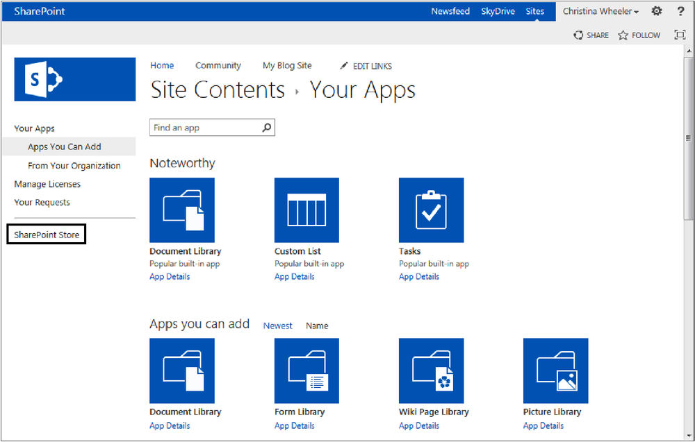
The link to the SharePoint Store is located in the left navigation of the Your Apps settings page, as shown in Figure 10-1. The SharePoint Store is shown in Figure 10-2.

Note
More details on the app model are covered in Chapter 23.
When is an app not an app? In SharePoint 2010, lists and libraries had associated web parts. In SharePoint 2013, lists and libraries are associated with apps. This means when a new list or library is created, SharePoint automatically creates a corresponding app for the list or library. The Site Contents page for SharePoint 2013 displays a link to Add An App, the list of existing site content, and a subsites section at the bottom, which lists all existing subsites along with a New Subsites link.
Figure 10-3 displays the Site Contents page showing the Add An App link and some existing content of a site.

When users want to add new content to a site, they Add An App from the Your Apps page within Site Contents, as displayed in Figure 10-4.

Every time a new version of SharePoint is released, new web parts are introduced and changes to some of the existing web parts are made. In SharePoint 2013, Microsoft has provided some new and exciting web parts and has made great improvements to existing web parts. This section looks at the new and existing web parts in SharePoint 2013.
In the past, SharePoint was not the best option for creating blog sites; therefore, companies often would integrate a third-party solution or site outside of SharePoint. When SharePoint 2010 was released, more organizations started using SharePoint for blog sites. SharePoint has three blog web parts available: the Blog Archives Web Part, the Blog Notifications Web Part, and the Blog Tools Web Part, each of which are detailed in Table 10-2. A blog site displaying the Blog Tools Web Part and the Archives Web Part is shown in Figure 10-5.
Table 10-2. Blog web parts in SharePoint 2013
Web part | Description | |
Blog Archives | Provides quick links to older blog posts. | |
Blog Notifications | Provides quick links to register for blog post notifications using alerts or Really Simple Syndication (RSS) feed. | |
Blog Tools | Provides blog owners and administrators with quick links to common settings pages and content lists for managing a blog site. Also, includes a drop-down menu to change the post layout to Basic, Boxed, or Inline. |

SharePoint 2013 includes five default business data web parts: the Business Data Actions Web Part, the Business Data Connectivity Filter Web Part, the Business Data Item Web Part, the Business Data Item Builder Web Part, the Business Data List Web Part, and the Business Data Related List Web Part. These web parts rely on the Business Connectivity Services (BCS). The full list of web parts available in SharePoint 2013 is displayed in Table 10-3.
Table 10-3. Business data web parts in SharePoint 2013
Web part | Description | |
Business Data Actions | Displays a list of actions from Business Data Connectivity. An action is something that can be performed on a single row of a business data item. | |
Business Data Connectivity Filter | Filters the contents of web parts using a list of values from Business Data Connectivity. This filter web parts adds a picker dialog box that enables the user to use a drop-down list to search for the specified entity. | |
Business Data Item | Displays one item from a data source in Business Data Connectivity. | |
Business Data Item Builder | Creates a Business Data item from parameters in the query string and provides it to other web parts. | |
Business Data List | Displays a list of items from a data source in Business Data Connectivity. | |
Business Data Related List | Displays a list of items related to one or more parent items from a data source in Business Data Connectivity. | |
Excel Web Access | Uses the Excel Web Access Web Part to interact with an Excel workbook as a webpage. | |
Indicator Details | Displays the details of a single Status Indicator. Status Indicators display an important measure for an organization and may be obtained from other data sources including SharePoint lists, Microsoft Excel workbooks, and Microsoft SQL Server 2005 Analysis Services key performance indicators (KPIs). | |
Status List | Shows a list of Status Indicators. Status Indicators display important measures for your organization, and show how your organization is performing with respect to your goals. | |
Visio Web Access | Enables the viewing and refreshing of Microsoft Visio Web Drawings. For more information, please see Chapter 17. |
Note
For more information on Excel Web Access, Indicator Details, and the Status List, see Chapter 15.
Remember the discussion boards in previous versions of SharePoint? One of the biggest complaints with older versions of SharePoint was the lack of features in the discussion boards. Most companies would not use the built-in discussion boards and instead would turn to third-party offerings. Fortunately, discussion boards are greatly improved in SharePoint 2013.
Similar to the MSDN forums, SharePoint 2013 now has community sites and a feature that can be activated on a site that provides a forum experience unlike it was before. This interactive forum includes the ability of “likes,” ratings, badges, and reputation scores. Table 10-4 lists the web parts that are a part of the community feature. A community site main page is shown in Figure 10-6. Figure 10-7 shows the members page.
Table 10-4. Community web parts in SharePoint 2013
Web part | Description | |
Tools | Provides community owners and administrators quick links to common settings pages and content lists for managing a community site. | |
Manage | Available for site owners and community moderators to manage discussions and categories, assign badges to members, and update reputation settings and community settings. | |
About This Community | Displays the community description and other properties such as date established. | |
Join | Provides the ability for nonmembers of a community site to join the community. The button hides itself if the user is already a member. | |
What’s Happening | Available for visitors and members to display the number of members, discussions, and replies within the community. | |
Top Contributors | Available for visitors and members to display the members who contribute to the community the most. | |
My Membership | Displays reputation and membership information for the current visitor of a community site. |


When web content management (WCM) and the publishing feature were integrated into previous versions of SharePoint, content rollup web parts were introduced. Content rollup web parts are useful for displaying dynamic content on a SharePoint page. This section covers all the available content rollup web parts in SharePoint 2013.
The Content Query Web Part (CQWP) is an out-of-the-box web part that was introduced in Microsoft Office SharePoint Server 2007. The core benefit of the CQWP is to aggregate content from all the subsites, lists, or libraries within a site collection so that content can be displayed in a single view. In the beginning, there was very minimal documentation on the CQWP; therefore, not many organizations used the web part because either they did not know about the web part or they did not know how to customize it. This web part is still a part of the publishing feature and becomes available when the publishing feature is activated.
Besides the need to aggregate content over multiple lists and libraries, there has been a need to display content from a single source across multiple subsites. For organizations that were not aware of the CQWP, it was common to see lists and libraries duplicated in various subsites to make the organization’s content available in all locations. Of course, that approach easily became a maintenance nightmare and was easily solved by implementing the CQWP to query the single list or library and place the web part in the subsites that needed to display the content.
Even though the CQWP is an out-of-the-box web part, it does require some customization for the query. When using the CQWP the first options that need to be configured are the options in the Query section. Table 10-5 provides the details of the available query options.
Table 10-5. CQWP Query Options
Property | Description | |
Source | Select the source where you want to query the data from. Options include querying content from the entire the site collection, query from a specific site and all subsites, or query items from a specific list. | |
List Type | Select the list type you want to pull data from. | |
Content Type | Select the content type group and content type you want to query. When creating content it is recommended to use custom content types for content you intend to roll-up as it provides better filtering. | |
Select this option to use audience targeting. If the “Include items that are not targeted” option is selected then the items that do not have a target audience value will also display in the results. | ||
Navigation Context | Setting that allows the ability to filter the content results by the page navigation term. | |
Additional Filters | Include any additional fields you want to filter on. The list of available fields change based on the content type selected for the querying. |
The Presentation section of the CQWP contains the properties to configure the grouping, sorting, and styling of the results. Table 10-6 displays the available options.
Table 10-6. CQWP Presentation Options
Property | Description | |
Grouping and Sorting | Settings for grouping and sorting. Select the drop-down list value for the field you want to group the items by. To group by site select the Site option in the Group items by drop-down list. Grouping is optional. The Sort items by option defaults to Created in descending order with the limit of displaying 15 items in the display. You can change the field to sort the items by and also change the limit on the items displayed. | |
The Group style is used for changing the styling of the grouped items. The value is set to Default and is not used unless the Group items by option is set. The Item style is used for the styling of the individual items that are returned in the results. These styles are XSL styles, not CSS styles. Please see Table 10-7 to learn more about the XSL style sheets. | ||
Fields to display | Setting to specify what fields you want to map to the item styles. Type the name of the field you want to map to each available field slot. The fields available for mapping change based on the Item style that is selected in the Item style setting. | |
Feed | Setting to indicate whether or not a RSS feed will be generated for the results of the query. | |
Additional Filters | Include any additional fields you want to filter on. The list of available fields change based on the content type selected for the querying. |
The CQWP use XSLT to render its content. The three XSL files used to render the fields in the styles are the same files used in SharePoint 2010. These files can be modified in Microsoft SharePoint Designer to include additional templates to use in the CQWP. The three XSL files used by the CQWP are described in Table 10-7.
Table 10-7. CQWP XSL files used for rendering
File | Location | Description |
ContentQueryMain.xsl | Style LibraryXSL Style SheetsContentQueryMain.xsl | Contains logic that receives all the content, parses it, and sends the appropriate calls to the Header and Item templates for each item. |
ItemStyle.xsl | Style LibraryXSL Style SheetsItemStyle.xsl | Contains style definitions that apply to row items. One row of data is processed at a time to ensure that the style and data in the item rows are consistent. |
Header.xsl | Style LibraryXSL Style SheetsHeader.xsl | Contains Group style definitions that define how to display a header. |
Note
For more details on the XSL templates, go to the MSDN article, “How to: Customize XSL for the SharePoint Content by Query Web Part (ECM),” located at http://msdn.microsoft.com/en-us/library/bb447557.aspx.
Even though the CQWP was a powerful web part in SharePoint Server 2007, there were still some improvements that needed to be made. When SharePoint 2010 was released, Microsoft improved the CQWP, which made it even more powerful.
The improvements made to the CQWP in SharePoint 2010 included:
Fields to display
Slots A slot is a marker in the Item Style template that is filled with the content at run time. The mappings between the slots and the fields to display can be set in the property pane of the CQWP, which is shown in Figure 10-8.
PageFieldValue A token that allows users to specify fields on a page layout and dynamically replaces the value of the filter with the current page’s field value to filter query results.
PageQueryStringValue A token that allows users to specify query string parameters to filter query results, as shown in Figure 10-9.

Note
For more details, go to the MSDN ECM Team Blog, “What’s New with the Content Query Web Part,” located at http://blogs.msdn.com/b/ecm/archive/2010/05/14/what-s-new-with-the-content-query-web-part.aspx.
Note
The recommended best practice for modifying the XSL templates for the CQWP is to create your own custom XSL files (instead of overwriting the existing XSL files) and link them to your CQWP. Remove sentence. Adding new section.
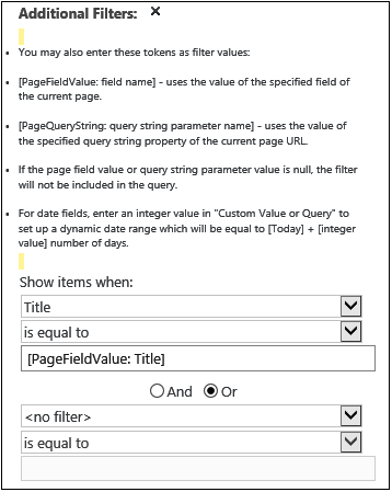
Another new feature in the CQWP is the ability to filter the content results by the page navigation term. This means that you can create your site navigation within the Term Store and use it within your sites. Figure 10-10 displays the property added to the CQWP Edit mode panel, and Figure 10-11 shows the Managed Metadata Term Store, displaying the settings for Site Navigation and Intended Use properties.


The most used rollup web part has been the Content Query Web Part (CQWP). In SharePoint 2013, Microsoft has introduced a powerful and versatile web part called the Content Search Web Part (CSWP). This new Content Search Web Part is similar to the CQWP; however, it displays items that are results of a search query that you specify. When you add the part to the page, it will show recently modified items from the current site; however, you can change this setting to show items from another site or list by editing the web part and changing its search criteria. When new content is discovered by search, the CSWP will display an updated list of items each time the page is viewed.
One of the limitations of the out-of-the-box CQWP is that it is only able to query content within a single site collection. CSWP, however, can be a more powerful search tool when a feature called cross-site publishing is used. Cross-site publishing allows content to be displayed and maintained in one or more authoring site collections and in one or more publishing site collections. When the publishing feature is activated, lists and libraries can be enabled as catalogs, which allows the content to be reused in other site collections. The content can be displayed in a publishing site collection when the content of the list or library catalogs has been crawled and added to the search index.
Note
For more details, go to the Microsoft TechNet article, “What’s new in web content management for SharePoint 2013 Preview publishing sites,” located at http://technet.microsoft.com/en-us/library/jj219688(v=office.15)#BKMK_Catalog_enabled.
Choosing which web part is best to use, CQWP or CSWP, depends on your requirements. Table 10-8 lists the differences between these two web parts.
Table 10-8. Differences between the CQWP and the CSWP
CQWP | CSWP | |
Content returned | Returns any content from several scopes (site collection, site, or list) based on the selected content type and filters to display results. | Returns any content from the search index. |
Accuracy | Instant content. | Returns content as fresh as the latest crawl. |
Versions display | Major and minor versions are displayed. | Because search crawls only major versions, only major versions are displayed in the results. |
Results availability | Displays content regardless of whether the site is marked to not be indexed. | Does not display content from sites marked to not be indexed. |
Note
For more information on the Content Search Web Part, see Chapter 12.
The Project Summary Web Part provides a high-level view of events and tasks involved in a project and is included by default on the home page of Project sites. This web part can also be added to any other site that includes a task list. The Project Summary Web Part displays information about a project in an easy-to-read overview, as shown in Figure 10-12 and Figure 10-13.

Figure 10-12. The default view of the Project Summary Web Part provides an easy-to-read overview of a project.

The Timeline Web Part, which is included in the Project Summary Web Part, was added in SharePoint 2013 to provide new functionality taken from Microsoft Project Server to display a timeline of tasks. The Timeline Web Part also allows users to display or remove tasks or subtasks from the timeline. Figure 10-14 displays what the web part looks like when it’s first added to a page. Figure 10-15 shows the property options that can be set.

The Relevant Documents Web Part is an out-of-the-box web part used for document management to help create a personalized view of the documents you (as the current logged-on user) are working on (see Figure 10-16).

Figure 10-16. The Relevant Documents Web Part enables a user to see the current documents he or she is working on.
The Relevant Documents Web Part allows you to do the following:
Display documents that were last modified by the current user.
Display documents that were created by the current user.
Display documents that are checked out to the current user.
Display a link to the folder or list containing a particular document.
The RSS Viewer Web Part can be used to display RSS feeds in your SharePoint site. The web part can subscribe to RSS feeds from SharePoint lists and libraries or from another website.
Once the RSS Viewer Web Part is added to a page, you can set the following properties:
RSS feed URL. Input the URL to SharePoint list or library or to an external website.
Feed refresh time (in minutes). The amount of time that you want the feed to refresh. The default is set to 120 sections.
Feed Limit. The limit on how many items you want to display from the feed. The default setting is 5.
Show feed title and description. A check box option disabled by default, to hide and show the feed title and description.
Data view properties. Located in the Data View Properties section, the XSL Editor can be used to modify the transformation of data, as shown in Figure 10-17.

The WSRP Viewer Web Part displays portlets from websites using WSRP 1.1. Web Services for Report Portals (WSRP) is an OASIS network protocol standard designed for communications with remote portlets. The WSRP Viewer was in MOSS 2007 and is not a common web part used by organizations.
Note
For more information, see the MSDN article, “Interoperability Scenarios and Technologies for SharePoint Server 2007,” located at http://msdn.microsoft.com/en-us/library/ee230448(v=office.12).aspx.
The XML Viewer Web Part can be used to display structured data and XML-based documents and forms and display it in SharePoint. This web part can be used to display structured data from database tables or queries, XML-based documents, and XML forms that combine structured and unstructured data.
Content can be added to the XML Viewer Web Part in the following two ways:
XML and XSL editors. The XML and XSL source editors, located on the Web Part Tool pane, are plain-text editors that are intended for users who have knowledge of XML and XSLT syntax.
XML and XSL links. Instead of editing the XML and XSLT, you can enter a hyperlink to a text file that contains the XML and XSLT source code. The two valid hyperlink protocols that can be used are http:// and https://. An absolute URL or a relative URL can be used; however, you cannot use a file path.
The XML Viewer Web Part is often used for displaying a Twitter feed, as shown in Figure 10-18.

Filter web parts, which are a part of SharePoint Server 2013, connect to web parts that contain one or more sets of data and filter that data based on user input. Some of the filter web parts filter data automatically, and others enable people viewing a page to enter values or select values from a list. The types of filter web parts you may want to use depends on the data source, type of interaction you want from a user for the data source, and the desired results that you want displayed for the data source. Table 10-9 displays the filter web parts available in SharePoint 2013, grouped by the type of filter.
Table 10-9. Filter web parts available in SharePoint 2013
Web part | Description | |
ALLOWS USERS TO SPECIFY VALUES MANUALLY | ||
Date Filter | Filter contents by allowing users to enter or pick a date. | |
Query String (URL) Filter | Filters using values passed via the query string. | |
Text Filter | Filters by allowing users to enter a text value. | |
Choice Filter | Filters using a list of values entered by the page author. | |
Business Data Connectivity Filter | Filters using a list of values from the Business Data Connectivity. | |
SharePoint List Filter | Filters using a list of values. | |
SQL Server Analysis Services Filter | Filters using a list of values from SQL Server Analysis Services cubes. | |
FILTER THE WEB PART PAGE AUTOMATICALLY | ||
Current User Filter | Filters using properties of the current user. | |
Query String (URL) Filter | Filters using values passed via the query string. | |
Page Field Filter | Filters using information about the current page. |
SharePoint includes two types of web parts for forms: the HTML Form Web Part and the InfoPath Form Web Part. This section provides the details of these two web parts.
The HTML Form Web Part can be used to connect to and pass data to other web parts. This web part uses a standard text box and a Go button that can be used as is or customized. For example, you can use the default HTML Form Web Part to pass the value, such as region, to a List View Web Part to filter the data by that region. You can customize the HTML Form Web Part by using the Source Editor located on the tool pane. The elements that you can use are the standard text box, options buttons, check boxes, multiline text boxes, and list boxes. You can also add labels and assign default values to the controls.
When you add the HTML Form Web Part to a page, you get the default standard text box and Go button, as shown in Figure 10-19.

Figure 10-20 displays the Source Editor dialog box containing the default source for the text box and Go button.

Figure 10-20. This HTML Form Web Part Source Editor dialog box contains the default code for the text box and Go button.
The following must be considered when customizing the HTML Form Web Part:
Only one Go button can be used to pass data to another web part.
The HTML Form Web Part uses the FORM element, and certain HTML elements cannot be used inside the FORM element. This includes HTML, BODY, and FORM elements.
All form field names must be unique. Each form field name value is used to connect to a corresponding column name in the web part you are connecting to.
You can have more than one element (text box, option buttons, and so on) on your form; however, only one field can be connected to a web part. However, different fields from the same form can be connected to different web parts on the page.
Two or more fields can be connected to another web part if the web part can accept multiple parameters.
The HTML Form Web Part only provides data to another connectable web part and cannot get data from another connectable web part.
To use the HTML Form Web Part, you must have the list you want to filter—with the column you want to filter on—visible on the same page as the HTML Form Web Part.
Follow these steps to connect an HTML Form Web Part to another web part:
Browse to the page that contains the web part that you want to filter or go to the location where you want to create a new page.
From the Settings menu, click Edit Page or Add A Page.
If the Edit command is disabled, then you may not have the appropriate permissions to edit the page and need to contact your administrator to get the appropriate rights.
Locate the HTML Form Web Part on the page or add the HTML Form Web Part to the page.
To add the HTML Form Web Part to your page, select the Insert tab, and then click Web Part. Select Forms in the Categories list. Select HTML Form Web Part, and then click Add.
From the HTML Form Web Part, click the down arrow, and then select Connections | Provide Form Value To.
Select the name of the web part you want to connect to.
Only the web parts that allow connections will show up in the list.
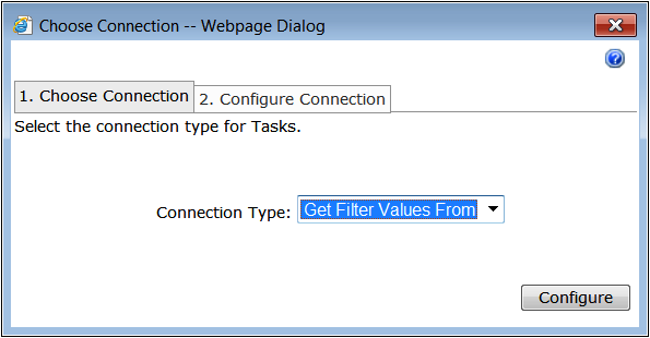
From the Choose Connection dialog box, select the Choose Connection tab (selected by default).
Make sure that the Connection Type drop-down has Get Filter Values From selected, and then click Configure, as shown here.
Select the field you want to use to filter for the HTML Form Web Part.
Because the values sent from the HTML Form Web Part are text values, the fields do not have to have the same names, nor do they have to be the same data type.
Click Finish, then click Exit Edit mode or Save/Check In/Publish if you are using a publishing page.
Test your HTML Form Web Part to see if the connected web part updates with the filtered data by searching a value on the field and then click Go.

The InfoPath Form Web Part can be used to display a Microsoft InfoPath browser-enabled form that is published to a form or document library. You can also display a browser form that has been associated with a SharePoint list form that has been customized using InfoPath 2013. Once you add an InfoPath Form Web Part to a page, you can connect the web part to other web parts on the page or send or receive data from the web part. The InfoPath Form Web Part is linked to the employees list default InfoPath form modified using InfoPath 2013.
Follow these steps to connect an InfoPath Form Web Part to another web part:
Browse to the page that contains the web part that you want to filter or go to the location where you want to create a new page.
From the Settings menu, click Edit Page or Add A Page.
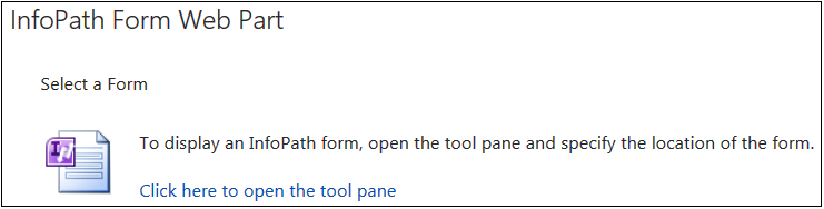
Locate the InfoPath Form Web Part on the page or add the InfoPath Form Web Part to the page, as shown in the following graphic.
To add the InfoPath Form Web Part to your page, select the Insert tab, and then click Web Part. Select Forms in the Categories list. Select InfoPath Form Web Part, and then click Add.
From the InfoPath Form Web Part, click the down arrow and select Edit Web Part.
Set the desired properties, as detailed in Table 10-10.
Table 10-10. InfoPath Form Web Part properties
Property
Description
List or Library
Specify the list or library that contains the published InfoPath form.
Content type
Specify the content type of the form. This is required if more than one InfoPath form has been published as a content type or added as a library template. If no selection is made, a default content type is selected.
Option to prevent or allow data entry in list form.
Show InfoPath Ribbon or toolbar
Option to display or hide the InfoPath ribbon or toolbar. If cleared, make sure that the user can use the InfoPath form by adding a Submit button to the form.
Send data to connected web parts when page loads
Option to send or not send the first row of data to one or more connected web parts when the page first displays and to show or hide any default values.
Select the form view to display by default
If the form has two or more views defined, select the view to display from the drop-down list.
Select the action to perform after a form has been submitted
Select one of the following options:
Close The Form Closes the form and displays the following message: “The form has been closed.”
Open A New Form Opens a new blank form.
Leave The Form Open Keeps the form open.
Once the web part is configured, click the menu of the InfoPath Web Part and select Connections.
Select one of the following commands:
Send Data To. Displays a list of web parts on the page that can receive form data. The InfoPath Form Web Part can be a library form that has output parameters defined or a list form.
Get Form Data. Displays a List View Web Part based on a list or library. Users can select forms from the List View Web Part to display a specific form in the InfoPath Form Web Part.
Get Data From. Displays another web part that sends one or more fields of data to the InfoPath Form Web Part, which must have input parameters defined and can be a library form or a list form.
The media and content web parts in SharePoint 2013 include some existing and new web parts. This section covers both the new and existing web parts.
The Content Editor Web Part (CEWP) is intended for adding HTML content to a SharePoint page. This web part was included in previous versions of SharePoint; however, many organizations overused this web part and did not understand when they should and should not use it for their site. Before we talk about the recommendations on when to use it, let’s first discuss how to use it. The CEWP can be added to a page and then modified to contain the desired content.
Content can be added to the CEWP in the following three ways:
Rich text editor. When the CEWP is added to a page, the user can click the Click Here To Add New Content link inside the web part to enable the rich text editor. The FORMAT TEXT tab becomes active on the ribbon so that the text can be formatted.
HTML source editor. Another option is to use the source editor, which can be accessed from the Edit Source ribbon button located in the Markup section of the FORMAT TEXT tab. Clicking this button will open the HTML Source dialog box, which is a plain-text control.
Content link. Instead of editing content directly in the web part, you can link to existing content by entering a hyperlink to the text file containing the HTML source code. This setting is located in the Content Editor Tool pane. It is recommended to use this option when you want to reuse HTML content throughout the site. This is a common approach for linking to HTML source code that contains jQuery scripting.
The CEWP ended up getting a bad name because of how many people misused the web part in the past. Some organizations used the CEWP to contain all their content in their site instead of using actual content pages. This is not recommended because the CEWP is not actual SharePoint content, which means there is no metadata. However, it is recommended to use the CEWP when doing such things as CSS spot treatments, loading jQuery, and adding items to the site that aren’t specific content. A common example is using the CEWP to add some CSS to hide the Quick Launch menu. By adding the inline style to the CEWP, the user can hide the Quick Launch menu for a particular page instead of affecting the rest of the site.
The Getting Started With Your Site Web Part displays a set of tiles with common SharePoint actions. Figure 10-21 shows how this web part looks when it is added to a page.

The Image Viewer Web Part is used to display a specified image on a page. This web part can be configured to control the alternate text, vertical/horizontal alignment, and the web part background color.
An image can be displayed in the Image Viewer Web Part in two ways:
URL to the image file
Connect the Image Viewer Web Part to another web part.
For example, you can connect a List View Web Part (which contains contacts) to an Image Viewer Web Part. Each time a row is selected in the List View Web Part (that contains a column with a hyperlink to a file that contains a picture of the contact), the picture of the contact will display in the Image Viewer Web Part.
The Page Viewer Web Part is used to display a webpage, file, or folder that is presented in an iFrame. The linked content of the Page Viewer Web Part is isolated, which ensures that any of the HTML elements displayed as content in the web part through the iFrame do not conflict with other HTML elements on the page. The web part displays the content asynchronously, which means the users can view the page and use the other web parts even if the content in the Page Viewer Web Part takes a long time to load.
The Picture Library Slideshow Web Part is used to display a slideshow of images and photos from a picture library. The pictures can be displayed in sequential or random order and transitioned based on the duration setting. The Title and Description can also be displayed and configured based on a Display With Drop-Down List setting.
A new embedding feature was added to the SharePoint 2013 ribbon that allows the embedding of media or scripts. The Video and Audio menu section labeled “Embed” allows users to paste iFrame code for embedding YouTube videos and other video and audio media. The Embed Code button allows users to paste HTML and JavaScript code. No matter which button will be used for embedding, a modal dialog box opens containing an input to paste the script or embedded code. A preview of the content will display below the input box, and once submitted, the source is added to the rich text editor called “Snippet.” The Script Editor Web Part works the same way; however, it is a web part, so it can be exported and reused.
Because allowing every iFrame to be added to a page can lead to potential scripting security problems, there is an option to change the security settings for what you want to allow. Allowed sources can be configured under the site collection administration setting called HTML Field Security. This setting offers the following configuration options:
Do not permit contributors to insert iFrames from external domains into pages on this site.
Permit contributors to insert iFrames from any external domain into pages on this site.
Permit contributors to insert iFrames from the following list of external domains into pages on this site (Figure 10-22).

The social collaboration features in SharePoint 2013 offer an improved administration and user experience. The Newsfeed page in My Site continues to provide an aggregated view of activities; however, the feed is improved, with new microblogging functionality. The Newsfeed, previously referred to as the “activity feed” in SharePoint 2010, offers a Facebook-style activity feed that enables users to post messages, “like” posts, and follow contacts or documents. Users also have the ability to receive email alerts when there is new activity on a subject the user has subscribed to. The Site Feed Web Part is the web part associated with the Newsfeed feature that can be added to any site.
A new memory cache called the Distributed Cache has been implemented in SharePoint 2013 to maintain the Newsfeed. This new memory cache uses AppFabric for Windows Server, which better supports the read and write operations generated by users’ activities and participation in microblogging.
Every time a new version of SharePoint is released, there are always at least a few web parts that end up either being deprecated or completely removed.
The following web parts have been deprecated in SharePoint 2013:
Recent Activities Web Part
Chart Web Part
Status Indicator and Status List Web Parts
Web Analytics Web Part
The Recent Activities Web Part, which is a part of the My Site features, has been replaced with the new Site Feed Web Part. The Site Feed Web Part is part of the Newsfeed feature that supports multithreaded conversations and dynamic feed retrieval.
The Chart Web Part is no longer available; however, similar features can be exposed from service applications such as Excel Services. If you used the Chart Web Part in SharePoint 2010 and migrate to SharePoint 2013, you will still be able to use the existing Chart web parts.
Status Indicators and Status Lists are no longer available in SharePoint 2013. If you used them in SharePoint 2010 and migrate to SharePoint 2013, then you can still continue to use the existing Chart Web Parts. If you did not use Status Indicators and Status Lists, you can use other functionality such as Excel Services to create KPIs.
Note
KPIs are a part of the business intelligence features and are covered more in Chapter 15 and Chapter 16.
The Web Analytics service has been discontinued in SharePoint 2013, as Web Analytics processing is now a component of the Search service. The new analytics infrastructure encompasses SharePoint, and the Analytics Processing Component runs analytics jobs to analyze content in the search index and on user actions performed on SharePoint sites.
When upgrading to SharePoint 2013 from SharePoint 2010, the Web Analytics service is not upgraded to the Analytics Processing Component, and the databases containing the Web Analytics from SharePoint 2010 are not removed. However, the databases are not used or maintained by the Analytics Processing Component. Therefore, documents on sites upgraded from SharePoint 2010 will show a hit count of 0.
Reports from Web Analytics that get carried over are the top items in a site; however, reports that show referring URL, browser traffic, and top users of a site are not carried forward and used by the Analytics Processing Component in SharePoint 2013. Because SharePoint 2013 does not support the Web Analytics Web Part, all pages in the upgraded site that contain this web part will render, and a message will display informing the user that the web part is no longer supported.
This chapter provided a high-level overview of web parts and the new app model in SharePoint 2013, as well as the different types of web parts available for use. This includes the blog web parts, community web parts, content rollup web parts, form web parts, media and content web parts, and many others. There are so many ways to use the various out-of-the-box web parts to create an eye-pleasing, content-rich, dynamic site.