
IN the previous chapter, you learned how to use Microsoft Excel Services and Microsoft SQL Server 2012 to provide business intelligence (BI) for your organization. Although Excel Services is powerful on its own, you can take it further by using PerformancePoint Services. This chapter reviews the features of PerformancePoint and demonstrates the steps to build powerful, rich dashboards to display key performance indicators (KPIs) and data visualizations in the form of scorecards, analytic reports, and filters.
PerformancePoint (formerly ProClarity) enables users to create BI dashboards that provide insight into an organization’s performance. PerformancePoint was first offered in November 2007 as an independent BI product called PerformancePoint Server 2007, which could be set up to be used with Microsoft Office SharePoint Server (MOSS) 2007. Before its initial release, Microsoft offered the product as Community Technology Preview releases starting in mid-2006. That same year, Microsoft acquired ProClarity Corporation, which enabled Microsoft to add deep analytics for reports. In April 2009, the development of the separate product stopped; the dashboard, scorecard, and analytic reporting components were incorporated into Microsoft SharePoint Server 2010 and the product then became known as PerformancePoint Services. In SharePoint 2013, there are both UI enhancements and server-side improvements to PerformancePoint Services, which are discussed in the following sections.
With the introduction of Dashboard Designer in SharePoint Server 2010, the BI user interface was a big improvement from Microsoft SharePoint Server 2007. However, there still were some features that were lacking, which usually led organizations to implement other third-party BI solutions. With the improvements in SharePoint Server 2013, organizations are starting to realize that a third-party solution may not be necessary anymore. This section covers the high-level UI enhancements that have been implemented in this new release.
Themes have been somewhat of a challenge in the past in Microsoft SharePoint, and it was nearly impossible to change the look and feel of core PerformancePoint functionality. This has changed in SharePoint 2013 with better theme support. Now when a dashboard is published from the Dashboard Designer to SharePoint, the dashboard for the most part will adopt the new theme configured for the site. Because the dashboard is a set of pages with web parts, the site owners can change the theme or create new themes to apply to the dashboards without touching Dashboard Designer. There is one caveat, however. Chart web parts do not conform to the applied theme because the graphics are created on the server and displayed as images to the browser.
Even though there are other devices on the market, one of the common devices that some companies use within their organization is the iPad. iPads were a challenge compared to other tablet devices because iPads use the Safari browser instead of Windows Internet Explorer or the other common browsers used on other tablet devices. When SharePoint Server 2010 was released, PerformancePoint content could not be viewed on iPads until the December 2011 Cumulative Update (CU) was released. Even though this release provided the support for PerformancePoint content to be viewed on iPads, there were still many drawbacks, which led companies to either pursue or keep a third-party BI solution instead of using the built-in SharePoint BI features. One of the big drawbacks was that only certain types of reports could be viewed on the iPad and Reporting Services reports were not supported. In the release of SharePoint Server 2013, Microsoft has implemented better iPad support so that PerformancePoint dashboards can be accessed from iPads through the Safari browser and the user has the ability to use touch to interact with the form intuitively and effectively.
The filter control is also improved in SharePoint 2013, which includes the ability to select all, clear all, reset to default, select children, get all filter items (when the 5,000 limit is reached), dynamically size, apply bolding, and use measure-based filtering, as well as other performance improvements. The filter search now works in similar ways because search is implemented in the PivotTable filter in Microsoft Excel. There are search filters, data sources, member selection, and MDX queries.
Enhancements have been made to the BI Center with integrated support for PowerPivot, Power View, and Excel Services.
Dashboard Designer can now be started from the SharePoint ribbon without having to navigate to the old BI Center landing page. The appearance of the PerformancePoint ribbon tab is based on content type, so it appears in document libraries where the “Web Part page” content type is present and in lists where any of the PerformancePoint content types have been added.
In addition to the UI enhancements, the server-side improvements in SharePoint Server 2013 also play a part in why more organizations are deciding to implement the built-in SharePoint BI features instead of using a third-party solution. This section covers the server-side improvements of the BI features that have been implemented in this new release.
In previous versions, dashboard creators had to create and publish dashboards from Dashboard Designer for each environment. There was no way to deploy from server to server, and each dashboard had to be manually created. This provided challenges because the SharePoint administrators had to do the work of creating each new dashboard for production environments. This has all changed with SharePoint 2013. PerformancePoint now has better migration support, which fits into the software development lifecycle (SDLC) models, providing the ability to migrate dashboards from SharePoint 2010 to SharePoint 2013 and copy and move PerformancePoint Services content between SharePoint sites. Dashboards can now be bundled into a single file, which can be handed off to the SharePoint administrator to deploy, eliminating the need for manual deployment. Furthermore, users with appropriate permissions can now connect to production environments using Dashboard Designer.
Note
Even though users with the appropriate permissions can connect to production environments using Dashboard Designer, it is not recommended to take this approach because dashboards can now be exported and imported across environments. The recommended approach is to have the users connect directly to QA instead and then export the dashboards from QA and import them into production.
PerformancePoint now integrates more smoothly with SQL Server Analysis Services (SSAS) by supporting the concept of the “effective user.” Effective user and SSAS is a more advanced feature, which saves the SharePoint administrator from having to set up Kerberos constrained delegation in order to use per-user authentication.
The PerformancePoint Dashboard Designer included with PerformancePoint Services is a tool used to create powerful dashboards for your organization. If PerformancePoint Services is configured, users with the necessary permissions can create a wide variety of PerformancePoint items such as data sources, dashboards, scorecards, KPIs, indicators, filters, and reports, as listed in Table 16-1.
Table 16-1. PerformancePoint Dashboard Designer items
Items | Description |
Data sources | Data sources are connections to databases that can be used for scorecards, reports, and filters created in Dashboard Designer. |
Dashboards | Dashboards are containers used to display scorecards and reports. When creating dashboards, you start by selecting a page template. Page templates contain one or more dashboard zones, which can be added, removed, and configured to different zone sizes. Reports, scorecards, and filters can be added to the page template zones. |
Scorecards | Scorecards are dashboard items that show performance for one or more metrics, which compare actual results to specified goals and display the results by using graphical indicators. |
KPIs | KPIs are metrics used in scorecards that include target and actual values, and graphical indicators that show whether performance is on or off target. |
Indicators | Indicators are graphical symbols that are used in KPIs to show whether performance is on or off target. Stoplight symbols are the most commonly used indicators. Green circles indicate performance is on target, yellow triangles indicate performance is not far off target, and red diamonds indicate poor performance. |
Filters | Filters are individual dashboard items that enable users to focus on specific information. |
Reports | Reports are dashboard items that display information in tables or charts. A variety of reports can be created, such as bar charts, pie charts, line charts, and tables, otherwise known as grids. Some reports can be created directly in Dashboard Designer and web parts can be created to display existing reports that are hosted on other servers. |
The advantages of using Dashboard Designer instead of other methods such as Excel include the following:
Reusability. Improvements to the BI Center Site template include a new look and easier use.
Copy/Paste. Dashboard Designer includes the ability to copy/paste dashboard items, which saves time and rework for dashboard authors.
Linking. When creating dashboards, dashboard items (such as scorecard KPIs) can be linked to other reports, such as SQL Server Reporting Services reports and analytic charts and grids.
Time Intelligence. Timeline Intelligence functionality can be included in dashboards that can easily display time periods such as Year to Date or Last Six Months.
Drilling. Depending on how the dashboard is set up, users can drill up and down within the data to see higher or lower levels of information. The drilled reports and scorecards can be exported by the user to Microsoft PowerPoint or Excel.
When getting Dashboard Designer up and running for the first time, a few considerations must be made to set it up properly. One consideration is whether you are using a computer that is on the same domain as the SharePoint environment or using a computer that is not on the same domain, as the set-up steps are slightly different for each situation.
When using a computer that is on the same domain (that is, the same Active Directory forest) as the SharePoint site, the user authentication process is better than not being on the same domain. Instead of being prompted for credentials each time, users will be automatically authenticated from their computers using their Windows domain accounts, providing a seamless experience. Additional settings are required through the browser for the user authentication to be passed automatically. Internet Explorer includes predefined security zones that enable you to set security options for each zone and add and remove sites depending on the level of trust in a website. If you are a local administrator of your computer, you can update the settings yourself; however, if your organization does not allow the properties to be changed, the administrator would need to update the settings for you.
Note
For more information on Internet Explorer security zones, go to: http://support.microsoft.com/kb/174360.
If the SharePoint URL has not already been set in the local intranet or trusted sites zone, follow these steps to set user authentication:
Open Internet Explorer, and then navigate to the Internet Explorer option settings by clicking on Tools (icon) | Internet Options.
Click the Security tab. Add the site to either the Local Intranet zone or the Trusted Sites zone, as follows:
Input the SharePoint URL, if it is not already in the text box, as shown in the following graphic, and then click Add.


When you try to start Dashboard Designer from the browser of a computer that is not on the same domain or not on a domain at all, you will encounter an authentication error. Even through you input your SharePoint credentials when prompted for the SharePoint site, your local NT credentials will automatically get passed to the Dashboard Designer, causing a permission issue, as shown in Figure 16-1.

Figure 16-1. An authentication error appears when Dashboard Designer is started from a computer that is not on a domain.
To get around this issue, the credentials need to be stored in the Windows Credential Manager so that the local NT credentials will not be passed to Dashboard Designer. Credential Manager is a “digital locker” that Windows uses to store logon credentials (for example, user name and password) for websites, servers, or other computers on your network. The credentials are split into three categories:
Windows credentials. Used by Windows and its services.
Certificate-based credentials. Used with smart cards in more complex business network environments.
Generic credentials. Defined and used by some installed programs, such as Windows Live ID, which is stored and used in Windows Live Security Essentials.
Note
Windows 8 contains one more set of credentials, called web credentials. Web credentials are used by Internet Explorer to log on automatically to specified websites.
To add a Windows credential for your SharePoint site, follow these steps:
Open up the Credential Manager.
Click Start | Control Panel | User Accounts And Family Safety | User Accounts, then click Credential Manager or click Manage Windows Credentials.
Click Add A Windows Credential.
Type in the Internet address, User Name, and Password, as shown here, and then click OK.

You should now see your newly added credentials in the list of Windows credentials. If you made a mistake, simply expand the credential to access the options to Edit or Remove From Vault, as shown here.

Now that the authentication settings have been configured for your environment, the next step is to start Dashboard Designer.
Note
When starting Dashboard Designer for the first time, it is recommended that you use Internet Explorer. If using Mozilla Firefox, make sure that the Microsoft .NET Framework Assistant 1.1 is installed before attempting to install Dashboard Designer and Safari is not supported. When starting the Dashboard Designer, you may be prompted to install it the first time. If that happens, click Run to install. Once installed, you can start Dashboard Designer by using the Start Menu (Start | All Programs | SharePoint | PerformancePoint Dashboard Designer).
To start Dashboard Designer, follow these steps:
From the browser, open your BI SharePoint site.
Click PerformancePoint Content in the left navigation.
Click New Item to start Dashboard Designer. The progress window appears, as shown here.
Once Dashboard Designer is started and started, Dashboard Designer will open on your desktop. As shown in Figure 16-2, in the lower-left corner of the Dashboard Designer workspace, the site shows Unconnected for both User and Connected To. The unconnected status means Dashboard Designer does not have an existing connection to any SharePoint sites and needs to be configured.


Because Dashboard Designer is unconnected, the next step is to configure Dashboard Designer to connect to the SharePoint site. Follow these steps to create the connection in Dashboard Designer:
In Dashboard Designer, click File menu, and then click Designer Options.
Click the Server tab.
Set the SharePoint URL to your SharePoint site, as shown in the following graphic, and then click Connect.
Click OK.

Once successfully connected, Dashboard Designer will open an Untitled Workspace and display the libraries that are a part of the Business Intelligence site, as shown in Figure 16-3.

This section walks through the user interface and settings to help you become familiar with Dashboard Designer.
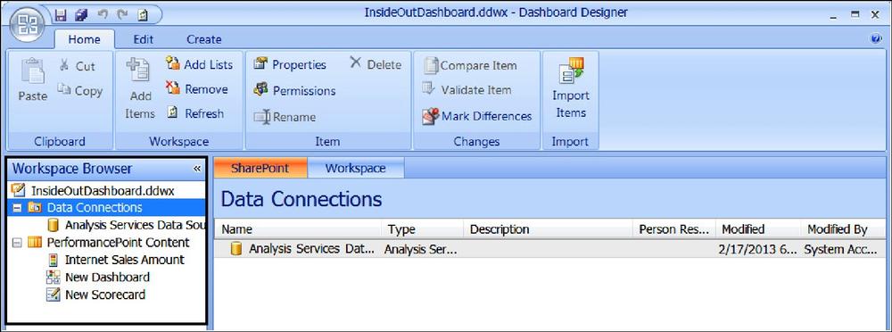
The Workspace Browser pane is located on the left side of the Dashboard Designer and contains two categories of dashboard items: Data Connections and PerformancePoint Content. The Workspace Browser uses right-click functionality to perform tasks for the dashboard items inside the Workspace Browser pane, as shown in Figure 16-4.
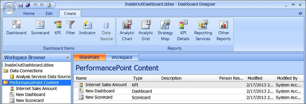
The Dashboard Designer ribbon includes three main tabs: Home, Edit, and Create.
Home tab The Home tab includes toolbar commands used to view and open dashboard items, as shown in Figure 16-5.

Edit tab The Edit tab includes toolbar commands used to change dashboard items, as shown in Figure 16-6. The items in the Edit tab are dynamic, meaning only commands and buttons that are specific to the particular dashboard items that you want to edit are enabled or disabled based on the type of dashboard item that is open in the center pane of the workspace.

Figure 16-6. The Edit tab in Dashboard Designer changes depending on the Dashboard item open in the center pane.
The ribbon buttons for the Edit tab are split into the following groups: Font, Header, View, Settings, and Comments, as shown in Figure 16-7. The buttons will be enabled or disabled based on what is selected in the center pane of Dashboard Designer.

Figure 16-7. The Edit tab View commands are enabled when a scorecard is the center pane workspace item.
The Settings ribbon button in the View group opens the View Settings dialog box for Interactivity, Display, Toolbar, and Filters. Figure 16-8 illustrates the Interactivity options.

Figure 16-8. The Interactivity options may be enabled or disabled based on how you want the user to interact with the scorecard.
The Interactivity settings are the options you can enable and disable based on how you want the user to be able to interact with the scorecard. Table 16-2 lists the details of the Interactivity setting options.
Table 16-2. Dashboard Designer interactivity setting options
Option | Description | |
Allow | Expand/Collapse (+/-) | Enable dashboard authors and users to expand and collapse scorecard rows and columns. |
Row Members | Enable dashboard authors and users to expand and collapse all scorecard rows. | |
Column Members | Enable dashboard authors and users to expand and collapse scorecard columns. | |
Comments | Enable dashboard authors and users to leave comments in scorecard cells. To use this option, Enable Comments must be selected in the Central Administration settings for the PerformancePoint Services. | |
Allow Once Deployed | Drill Down | Enable dashboard users to drill down to see lower levels of detail in scorecard rows and columns. |
Row Members | Enable dashboard authors and users to drill down on data in scorecard rows. | |
Column Members | Enable dashboard authors and users to drill down on data in scorecard columns. | |
Show Details | Enable dashboard authors and users to view transaction-level details for a particular scorecard value. | |
Filter By Status | Enable dashboard authors and users to filter information displayed in a scorecard by KPIs. | |
Filter | Enable dashboard authors and users to apply filters to a scorecard such as Top 10 and Value Filters. | |
Sort | Enable dashboard authors and users to sort scorecard rows and columns. |
The Display settings shown in Figure 16-9 are the options for rendering the scorecard, such as show/hide the actual and target headers, whether you want the text in the cells to wrap, show/hide gridlines, whether you want to display a message in the cells that return empty cells, and the message you want to display in the cells that have an error. Table 16-3 lists the details of the Display setting options.

Table 16-3. Dashboard Designer display setting options
Option | Description | |
Show | Actual And Target Headers | Enable to display actual and target headings in the scorecard. |
Wrapped Text In Cells | Enable to wrap text in scorecard cells. This is useful for scorecards where row or column members have longer names. | |
Gridlines | Enable to display gridlines in scorecard. | |
Messages | Empty Cells | Use this option to specify what should display in the empty scorecard cells. |
Error Cells | Use this option to specify what should display in the scorecard cells that have errors. |
The Toolbar settings are the options for the actual toolbar of the scorecard. When creating a scorecard, these options are not enabled by default; however, to enable them, check the desired settings for the toolbar in the View Settings dialog box shown in Figure 16-10. Table 16-4 lists the details of the Toolbar setting options.

Table 16-4. Dashboard Designer toolbar setting options
Description | |
Show Scorecard Toolbar | Select to display the toolbar in the scorecard. |
Filter By Status | Select to display the Filter By Status toolbar command in the scorecard toolbar. |
Default Rollup (average weighted) | Select to display the Default Rollup toolbar command in the scorecard toolbar. |
Worst Indicator Rollup | Select to display the Worst Indicator Rollup toolbar command in the scorecard. |
Indicator Count Rollup | Select to display the Indicator Count Rollup toolbar command in the scorecard. |
Show As Tree | Select to display the Show As Tree toolbar command in the scorecard. |
Collapse All | Select to display the Collapse All toolbar command in the scorecard. |
Select to display the Expand All toolbar command in the scorecard. | |
Show Inline Text | This option does not work in the current version of PerformancePoint Services; therefore leave it cleared. |
The Filter settings shown in Figure 16-11 are the options for filtering a scorecard. Table 16-5 lists the details of the Filter setting options.

Table 16-5. Dashboard Designer filter setting options
Option | Description |
Filter Empty Rows | Select to prevent empty rows from displaying in the scorecard. |
Filter By Status | Select any of the options (On Target, Slightly Off Target, Off Target) to display only the KPIs that have the status that you select. |
Create tab The Create tab includes toolbar commands used to create dashboard items, and each toolbar command opens a wizard that guides you through the creation of the item.
When Data Connections is selected in the Workspace Browser, the Edit tab will enable the Data Sources ribbon button, as shown in Figure 16-12.

Figure 16-12. The Data Source ribbon button is enabled when Data Connections is selected in the Workspace Browser.
When PerformancePoint Content is selected in the Workspace Browser, the Edit tab will disable the Data Sources ribbon button and the rest of the buttons will become enabled, as shown in Figure 16-13.
The center pane has specific tabs available based on what is selected in the Workspace Browser.
SharePoint and Workspace tabs The SharePoint and Workspace tabs are available when one of the category items is selected in the Workspace Browser. These tabs are used to view lists of dashboard items created by yourself and other dashboard authors.
Editor tab The Editor tab, shown in Figure 16-14, is available for most dashboard items, including dashboards, scorecards, KPIs, filters, indicators, and reports (except analytic charts and grids). The Editor tab is used to add or change data that you use for your dashboard items. The Editor tab can also be used to preview scorecards and reports.

Figure 16-14. The Dashboard Designer Editor tab is used to add or change data that you use for your dashboard items.
Properties tab The Properties tab, shown in Figure 16-15, is available for all types of dashboard items and is used to specify the item’s name, description, owner (referred to as Person Responsible), and the display folder for the item that is in the SharePoint list or library.
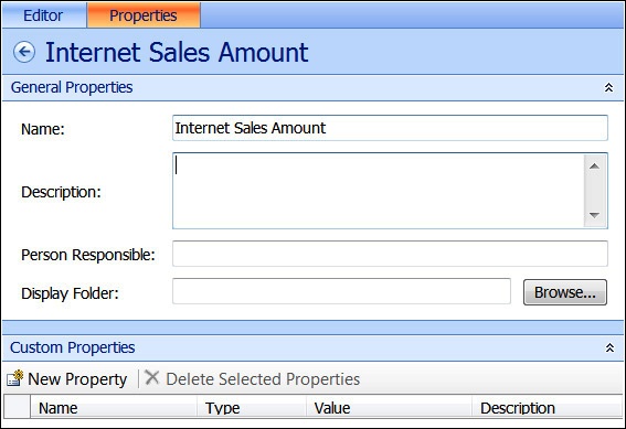
Figure 16-15. Use the Dashboard Designer Properties tab to identify the general properties of dashboard items.
Time tab The Time tab, shown in Figure 16-16, is available for the data sources and is used to configure a data source to work with Time Intelligence by specifying time period levels such as days, months, or years.

View tab The View tab is available for some types of data sources, such as tabular data sources. The view tab is used to preview the data or to specify column definitions.
The right pane of Dashboard Designer includes the Details pane, shown in Figure 16-17, which is only visible when creating, viewing, or modifying specific dashboard items. You use the Details pane to add, remove, or change the content that you display in the dashboard. The items displayed in the Details pane vary according to the specific dashboard that is selected. When a scorecard is open, the Details pane lists items such as KPIs, Metrics, Aggregations, Dimensions, and other items relevant to the scorecard. When an Analytic Chart or Grid is open, the Details pane lists items such as Dimensions, Measures, and Named Sets.

Before creating dashboards in Dashboard Designer, data connections must be created first. Data sources defined in Dashboard Designer are stored in the trusted data connection library of the site. The data source template options for creating data sources for PerformancePoint Services in Dashboard Designer are shown in Figure 16-18 and include the following:

Figure 16-18. Five data source template options are available for creating data sources for PerformancePoint Services in Dashboard Designer.
Analysis Services. Connects to multidimensional cube data in SSAS
Excel Services. Connects to an Excel Services file
Import From Excel Workbook. Connects to fixed values imported from Excel
SharePoint List. Connects to a SharePoint list
SQL Server Table. Connects to a SQL Server table
Analysis Services is a more advanced implementation for PerformancePoint Services. This section covers how to create an Analysis Services data source in Dashboard Designer. SSAS must be configured in order to complete the steps in this section.
When creating a data connection to Analysis Services, you have three authentication options:
Unattended Service Account. All users connect by using the Unattended Service Account that has been defined for the PerformancePoint shared service when the data source is accessed.
Credentials stored in a Secure Store target application. All users connect using the credentials from the specified Secure Store target application when the data source is accessed.
Per-user identity. The current user’s identity will be used to access the data source. Requires Kerberos or the EffectiveUserName property set in the PerformancePoint Application Settings in Central Administration.
Follow these steps to create an Analysis Services data source in Dashboard Designer:
From Dashboard Designer, click the Create tab, and then click Data Source (or right-click the Data Connections library and select New Data Source).
Click Analysis Services, and then click OK. This will open the Editor for the new data source.
In the Connection Settings, select the preferred method to connect to the data source.
For Use Standard Connection:
Type the full path for the server, then select the database name from the Database drop-down list.
(Optional) In the Roles text box, type the name of an administrator or database role. For multiple roles, type the names of the roles and separate them with commas.
For Use The Following Connection:
In the Connection String text box, type the connection string to the server—including the cube name you want to connect to.
From the Cube drop-down list, select the cube that you want to use as the data source.
Note
If Dashboard Designer is not connected to SSAS, the issue is related to the incorrect ADOMD.NET feature being installed. Refer to “Installing ADOMD.NET from SQL Server 2008 R2 Feature Pack” in Chapter 14.
In the Data Source Settings, select the desired authentication method.
Unattended Service Account: Leave this option selected if you set the Unattended Service Account in the PerformancePoint Services Application Settings.
Use A Stored Account: Enter the Application ID of the Secure Store target application.
Per-User Identity
In the Formatting Dimension drop-down, select the desired dimension formatting needed for the report.
For Cache Lifetime, type the refresh rate (in minutes) for the cache for the desired time you would like the data source to update at this interval.
Click Test Data Source to confirm that the data connection is configured correctly, as shown here.
On the Properties tab, set the Name to “Adventure Works Data Source.”
(Optional) Set the Description, Person Responsible, and Display Folder of the data source.
Switch to the Time tab.
Choose Date.Date.Calendar in the Time Dimension drop-down list, and then click the Browse button for the Member control.
In the Select Member dialog box, select January 1, 2005.
Choose Day in the Hierarchy Level drop-down list.
Set the Reference Date to the first day of the latest year available from the data (for example, 1/1/2010 if it is 2010).
Choose the time member associations for each member level, as follows:
Calendar Year: Year
Calendar Semester: Semester
Calendar Quarter: Quarter
Month: Month
Date: Day
In the Workspace Browser, under Data Connections, right-click the data source and click Save.

A data source can be made from Dashboard Designer to data within Excel files that have been published to Excel Services and are stored in a SharePoint site. The published parameter values can be modified from within PerformancePoint Services and are useful when a parameter is an input to a value of a published cell.
Note
PerformancePoint Services accesses external data sources by using a delegated Windows identity and external data sources must reside within the same domain as the SharePoint 2013 server farm. If the external data sources do not reside within the same domain, the authentication to the eternal data source will fail.
To create an Excel Services data source connection, follow these steps:
In Dashboard Designer, click the Create tab and then click Data Source (or right-click the Data Connections library and select New Data Source).
Click Excel Services, and then click OK. This will open the Editor for the new data source.
Input the SharePoint URL for the Excel Services site.
From the Document Library drop-down, select the document library where the workbook is located.
From the Excel Workbook drop-down list, select the workbook you want to connect to.
In the Item Name, select or type in the Name Range or table value.
Note
A Named Range is required for connecting to an Excel Services data source in Dashboard Designer. Steps to define a named item in Excel 2013 can be found at http://office.microsoft.com/en-us/sharepoint-server-help/share-workbooks-using-excel-services-HA102772301.aspx.
In the Data Source Settings, select the desired authentication method:
Unattended Service Account: Leave this option selected if you set the Unattended Service Account in the PerformancePoint Services Application Settings.
Use A Stored Account: Enter the Application ID of the Secure Store target application.
Per-User Identity.
Click Test Data Source, shown here, to confirm that the data connection is configured correctly.
From the Properties tab, set the Name, Description, Person Responsible, and Display Folder of the data source.
From the Time tab, select the desired Time options for this data source.
Click the View tab, then click the Preview Data button to preview the results, as shown here.
In the Workspace Browser under the Data Connections, right-click the data source and click Save.


Data from a SharePoint list can be used as a data source for PerformancePoint Services, and the connection can be made to any kind of SharePoint list.
To create a SharePoint list data source connection, follow these steps:
From Dashboard Designer, click the Create tab, and then click Data Source (or right-click the Data Connections library and select New Data Source).
In the Select A Data Source Template dialog box, select the SharePoint list located in the All or Tabular List category pane and then click OK.
In the Connection Settings of the center pane Editor tab, select the preferred method to connect to the data source.
In Cache Lifetime, type the refresh rate (in minutes) for the cache.
Data from this data source will update according to the interval that you specify.
In the Connection Settings section, type the URL of the SharePoint site.
In the SharePoint Site List drop-down menu, select a List collection.
In the List drop-down menu, select the SharePoint list that you want from the collection.
Click Test Data Source to confirm that the data connection is configured correctly.
In the Workspace Browser, rename your data source, and then right-click the data source and click Save.
A SQL Server table or view can be used as a data source in PerformancePoint Services. Only tables and views can be used, and the SQL data is read only from Dashboard Designer.
To create a SQL Server table data source connection, follow these steps:
From Dashboard Designer, click the Create tab, and then click Data Source (or right-click the Data Connections library and select New Data Source).
In the Select A Data Source Template dialog box, select the SQL Server table located in the All or Tabular List category pane. Click OK.
In the Connection Settings, select the method to connect to the data source:
For Use A Standard Connection:
Type the full path for the server to which you want to connect.
In the Database drop-down list, select the database name you want to use.
For Use A Specific Connection String:
Type a connection string with the full path of the server and database to which you want to connect.
In the Table drop-down list, select the specific table that you want to use.
In Data Source Settings, select the desired authentication method.
Unattended Service Account: Leave this option selected if you set the Unattended Service Account in the PerformancePoint Services Application Settings.
Use A Stored Account: Enter the Application ID of the Secure Store target application.
Per-User Identity.
Click Test Data Source to confirm that the data connection is configured correctly.
In the Workspace Browser, rename your data source, and then right-click the data source and click Save.
This section covers all the available dashboard items that can be created using PerformancePoint Services Dashboard Designer.
Scorecards are dashboard items that show the performance of one or more metrics and can be created using the PerformancePoint Dashboard Designer within SharePoint. Scorecards are used to compare actual results to specified goals, and the results are displayed in graphical indicators. Scorecards resemble a table that typically has Target and Actual value columns and one or more KPIs.
Scorecards can be created from the following two methods using the PerformancePoint Dashboard Designer:
Scorecard Wizard. A basic scorecard can be created quickly and easily by using the wizard. This method is useful for users who are new to the Dashboard Designer and do not have many existing dashboard items that are available for reuse. When using the wizard, you select a data source that will be used by at least one KPI in the scorecard, and then create the scorecard and finish configuring the workspace.
Blank Scorecard. Instead of using the wizard, you can create a blank scorecard and then manually add the KPIs and other graphical indicators. This method is useful when dashboard authors have created one or more KPIs.
The PerformancePoint Dashboard Designer can be configured to default the creation to use the wizard or to create a blank scorecard every time you create a scorecard. To update the setting, follow these steps:
In Dashboard Designer, click File and then click Designer Options.
On the Personalize tab, select (or clear) the option for the Use Wizards To Create Scorecards. Click OK.
Follow these steps to create a blank scorecard using Dashboard Designer:
In Dashboard Designer, click PerformancePoint Content in the Workspace Browser.
On the Create tab, click Scorecard (or right-click PerformancePoint Content and select New | Scorecard).
If the Scorecard Wizard appears, select the Blank Scorecard template located in the Standard category and then click OK.
In the center pane, click the Properties tab and set the Name of your scorecard to Performance By Country.
(Optional) For Display Folder, specify a location for the scorecard by selecting or creating a folder.
In the Workspace Browser, right-click the scorecard and click Save.
Follow these steps to create a KPI for a scorecard:
In Dashboard Designer, click PerformancePoint Content in the Workspace Browser.
From the Create tab, click KPI (or right-click PerformancePoint Content and select New | KPI).
In the Select A KPI Template dialog box, choose Blank KPI and click OK.
The next step is to define the actual value as Year to Date (YTD).
Click the Name for Actual and rename it YTD.
Click the 1 (Fixed values) link in the Data Mappings column for YTD.
In the Fixed Values Data Source Mapping dialog box, click Change Source. Select the Adventure Works Data Source data connection and click OK.
Choose Reseller Sales Amount in the Select A Measure drop-down list and click New Time Intelligence Filter.
Enter a time formula of YearToDate, as shown here, and click OK.
Click the (Default) link in the Number column for YTD, shown here. Choose Currency in the Format drop-down list and then click OK.
Next, we define the target value as last year’s sales plus 25 percent.
Click the 1 (Fixed values) link in the Data Mappings column for Target.
In the Fixed Values Data Source Mapping dialog box, click Change Source and switch to the Calculated Metric tab. Select Blank Calculation, as shown here, and click OK.
In the Calculated Metrics Data Source Mapping dialog box, delete Value2 and rename Value1 to LastYearsSales.
Click the 1 (Fixed Values) link for LastYearsSales.
On the Fixed Values Data Source Mapping, click Change Source and select the Adventure Works Data Source data connection. Click OK.
Choose Reseller Sales Amount in the Select A Measure drop-down list and click New Time Intelligence Filter.
Enter Year-1 for the time formula, as shown here, and click OK.
Click OK to close the Dimensional Data Source Mapping dialog box. Enter LastYearsSales*1.25 for the formula, and then click OK.
Click the (Default) link in the Number column for Target.
Choose Currency in the Format drop-down list and click OK.
Click the Properties tab, and then rename the New KPI to Performance.
In the Workspace Browser, right-click the scorecard and click Save.


A scorecard typically contains at least one KPI but can contain multiple KPIs that use the same or different data sources. Follow these steps to add KPIs to a scorecard:
In Dashboard Designer, under the PerformancePoint Content in the Workspace Browser, click the Performance scorecard that was created in the earlier procedure.
First, place performance KPIs on the scorecard.
With the Editor tab active in the center pane, locate the KPIs in the Details pane on the right.
Expand the KPIs and then drag the Performance KPI onto the Drop Items Here block on the left side.
On the Edit tab in the ribbon, click Update to display the changes that have been made to the scorecard.
Next, we add geography dimensions to the scorecard.
In the Details pane, expand the Dimensions node.
Drag the Geography dimension to the right side of the Performance cell.
In the Select Members dialog box, right-click All Geography and select Autoselect Members, and then select Country.
On the Edit tab in the ribbon, click Update to display the changes that have been made to the scorecard.
Right-click Performance in the center pane and click Hide.
In the Workspace Browser, right-click the Performance scorecard and click Save.

Dashboard Designer provides the ability to create various PerformancePoint Services reports. These reports include Analytic Chart, Analytic Grid, Excel Services, KPI Details, Reporting Services, and Strategy Map.
In Dashboard Designer, you can create analytic reports for your dashboards that are dynamic, visual representations of data displayed as interactive line charts, bar charts, pie charts, or tables (grids). Analytic Chart and Analytic Grid reports use data stored in SSAS.
To create an Analytic Chart report to display the sales by year, follow these steps:
In Dashboard Designer, click PerformancePoint Content in the Workspace Browser.
On the Create tab on the ribbon, click Analytic Chart.
In the Select A Data Source window, select the Adventure Works Data Source data connection that you want to use. Click Finish.
The analytic report opens for editing in the workspace center pane.
In the Details pane, expand the Measures node.
Drag Reseller Sales Amount into the Bottom Axis section of the center pane.
Expand Dimensions, and then expand the Reseller nodes in the Details pane.
Drag Business Type to the Series section.
From the center pane, click the Properties tab and rename the report to Sales By Reseller Type.
(Optional) To specify a location for the report, click Display Folder and select or create a folder.
In the Workspace Browser, right-click the report, and click Save.

Strategy map reports can show relationships between objectives, goals, and KPIs. Strategy maps have their roots in the Balanced Scorecard framework, which defines organizational performance by using the following four perspectives:
Financial. Perspective that typically includes metrics such as revenue, cost, and profit.
Customer. Also known as the customer satisfaction perspective, this perspective typically includes metrics such as customer counts, market share, and number of complaints.
Internal process. Also known as the operations perspective, this perspective typically includes metrics such as time to market for new products, service error rates, and quality control measures.
Learning and growth. Also known as the human resources perspective, this perspective typically includes metrics such as employee turnover rates, the number of new employees, and hiring data.
A Balanced Scorecard is typically a dashboard page consisting of the following:
A scorecard displaying performance metrics across the organization using the four perspectives described previously and contains four groups of KPIs that correspond to those perspectives.
A strategy map that includes four groups of shapes (one group of shapes for each perspective) that is connected to the scorecard KPIs.
Note
Although the Balanced Scorecard framework is useful, you do not have to follow it when creating your strategy map. You can create your strategy map using any combination of KPIs and objectives in a scorecard.
To create a strategy map, follow these steps:
In Dashboard Designer, click PerformancePoint Content in the Workspace Browser.
Click the Create tab on the ribbon and then click Strategy Map (located in the Reports group).
In the Select A Scorecard step wizard, select the scorecard that you want to use and click Finish.
The strategy map opens in the Workspace center pane.
Click the Edit tab on the ribbon, and then click Edit Strategy Map.
In the Strategy Map Editor dialog box, do one of the following:
If you have an existing Microsoft Visio diagram, click Import Visio File. Browse to the location where the Visio diagram is saved and then click Open.
If you want to create a new Visio diagram, click Stencil. Browse to the location where the Visio stencils are located and then click Open.
Use the stencil shapes to create your Visio diagram in the Strategy Map Editor dialog box.
Click a shape in the Visio diagram and click Connect Shape.
In the Connect Shape dialog box, click the cell that you want to connect to the shape that you selected.
Click Connect.
(This step is optional.) To replace the text inside a shape with the text that is used for the scorecard KPI, select Show KPI Name In Shape Text.
Repeat steps 4–6 for each shape in the Visio diagram that you want to connect to the scorecard KPIs.
When finished connecting shapes to KPIs, click Close, and in the Strategy Map Editor dialog box, click Apply.
From the center pane, click the Properties tab and type the name that you want to use for the report.
(Optional) To specify a location for the report, click Display Folder and select or create a folder.
In the Workspace Browser, right-click the strategy map and click Save.
Using Dashboard Designer, you can create a KPI Details report that is a view type used to show additional information about scorecard values and properties. The KPI Details report serves as a companion to a scorecard and is not used in a dashboard without its corresponding scorecard on the same dashboard page. When users click the cells in a scorecard, the KPI Details report updates to display the particular information about the value clicked.
To create a KPI Details report using Dashboard Designer, follow these steps:
Click the Create tab on the ribbon and click KPI Details (located in the Reports group).
Click the Editor tab in the center pane, as shown here, and specify the information that you want to display in the report.
Table 16-6 lists the information that you may include in the KPI Details report.
Table 16-6. KPI Details report options showing KPI section, option, and description
In the center pane, click the Properties tab and type the name that you want to use for the report.
(Optional) To specify a location for the report, click Display Folder and select or create a folder.
In the Workspace Browser, right-click the report, and click Save.

Now that you have created reports and scorecards, the next step is to create a dashboard to display the dashboard items. When creating dashboards, a page layout template must be selected to create pages to contain the dashboard items. Dashboard pages can be created using Dashboard Designer. You start by selecting a page template and then add the dashboard items to the page.
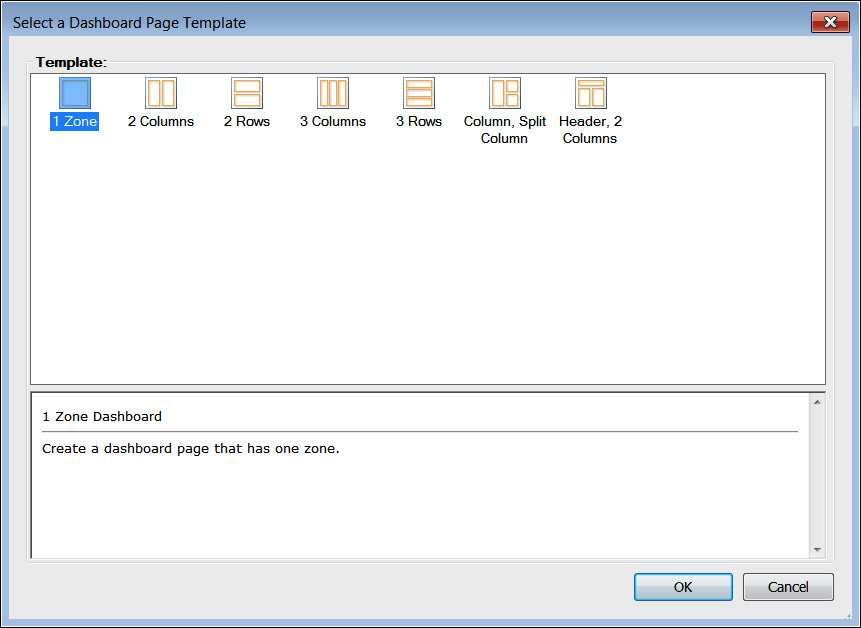
Seven page layout templates are available for dashboards, as shown in Figure 16-19, and are listed as follows:
Note
Select the page layout template that best suits the content that you want to display. It is recommended not to display too many items in a single page, or else the individual items on the page may not display properly. You can easily add more pages to the dashboard to display a large number of reports and scorecards.
In this task, you will create a dashboard to display the performance scorecard and Analytic Chart report to connect the content created earlier in this chapter. The connection will allow filtering of the report by using the currently selected country from the Performance scorecard.
To create a dashboard page, follow these steps:
In Dashboard Designer, click PerformancePoint Content in the Workspace Browser.
On the Create tab, click Dashboard (or right-click PerformancePoint Content and select New | Dashboard).
In the Select A Dashboard Page Template dialog box, select the 2 Columns page layout template for the dashboard.
On the Properties tab in the center pane, update the Name for your dashboard by setting it to Performance Dashboard. Set all other optional properties if desired.
On the Editor tab in the center pane, rename the dashboard page by clicking the dashboard page name to highlight and then type a new name for the page. Set the name to Country.
In the Workspace Browser, right-click the dashboard and click Save.
Next, you will add the dashboard items to the newly created dashboard page. To add the dashboard items to the Country page, follow these steps:
In Dashboard Designer, under PerformancePoint Content in the Workspace Browser, click the Performance Dashboard to edit.
In the Pages section, click the Country page to edit.
In the Details pane, expand the Scorecards | PerformancePoint Content nodes.
Drag the Performance By Country scorecard into the left column.
In the Details pane, expand the Reports | PerformancePoint Content nodes.
Drag the Sales By Reseller Type report to the right column, as shown in the following graphic.

Note
It is recommended to put dashboard filters in a separate zone from the scorecard and reports to keep chart legends and reports from not displaying correctly. Also, consider using the Header, 2 Columns page layout template for pages that will include dashboard filters. You can place the filters in the Header zone and put the scorecards and reports in the other zones.
If adding an Excel Services report, be sure to use the autosize setting, or else additional scrollbars may display in the deployed dashboard. To specify the autosize setting, perform these steps:
Once the Excel Services report has been added to the dashboard, click the Edit tab on the ribbon and click Edit Item.
On the Size tab, select Auto-size Width and Auto-size Height, as shown in the following graphic, and then click OK.

Next, we need to connect the selected country to the Analytic Chart report. To do so, perform these steps:
In the center pane, drag the Row Member | Member Unique Name item from the scorecard to the report.
In the Connection dialog box, change the Source drop-down value to Member Row:Member Unique Name, and then click OK.
In the Workspace Browser, right-click the dashboard and click Save.
Dashboard zones can be configured on pages created from the page templates. This section provides instructions to add or remove zones and to configure the sizing of the zones.
To add or remove a zone on a dashboard page, perform these steps:
On the center pane Editor tab, right-click the Dashboard Content section and click one of the following options:
Add Left. Adds a new zone to the left of the pointer
Add Right. Adds a new zone to the right of the pointer
Add Above. Adds a new zone above the pointer
Add Below. Adds a new zone below the pointer
Split Zone. Divides the zone nearest to the pointer into two zones of equal size
Delete Zone. Removes the zone nearest to the pointer
To change the size of the zone on a dashboard page, perform these steps:
On the center pane Editor tab, right-click the Dashboard Content section and then right-click the zone that you want to modify.
On the Size tab, set the width and height settings for the zone.
Zones can be sized only based on percentage and cannot be autosized or sized to specific pixel counts.
On the Orientation tab, arrange the items in the zone.
The options available are Horizontal, Vertical, or Stacked. Horizontal arranges multiple items in a row. Vertical arranges multiple items in a column. Stacked layers multiple items in the same location on the dashboard page, and dashboard users use a drop-down list to switch between the items.
Click OK to save your changes.
Once you have assembled a dashboard and are ready to view and use it, the next step is to publish or “deploy” it to the SharePoint document library that contains the PerformancePoint content.
To deploy a PerformancePoint Services Dashboard, perform these steps:
In Dashboard Designer, click PerformancePoint Content in the Workspace Browser.
On the Home tab ribbon, click Refresh to refresh the list of dashboard items that you and other dashboard authors have saved to SharePoint.
Under PerformancePoint Content in the Workspace Browser, right-click the Performance Dashboard and click Deploy To SharePoint.
If you are publishing the dashboard for the first time, the Deploy To dialog box appears, as shown here.

A Deploy To SharePoint Site dialog box will appear, displaying the status of the dashboard deployment, as shown here.

Once the deployment is successful, the browser window will open automatically to display the dashboard, as shown here.
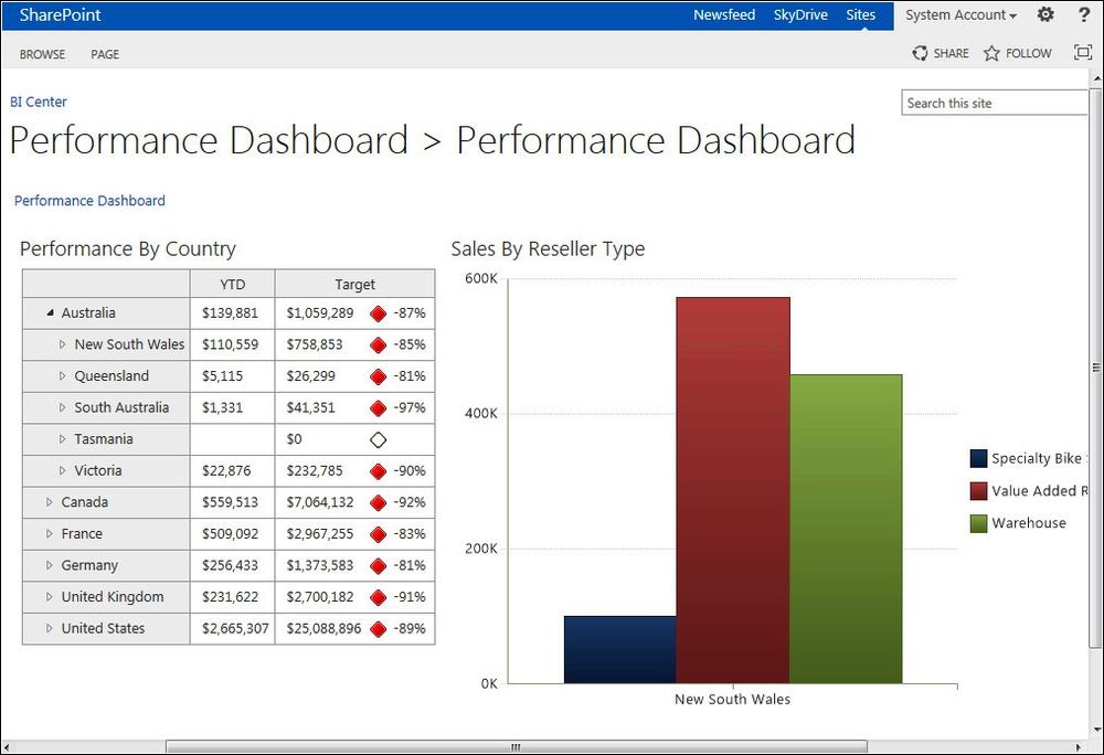
As you drill down into the Performance By Country content, the graph on the right will update dynamically based on the items selected.
As you have seen in this chapter, PerformancePoint Services is a powerful BI solution for SharePoint 2013. It has come a long way from when it was first integrated into SharePoint. PerformancePoint Services enables users to create BI dashboards that can help provide insight into the organization’s performance. This chapter touched on the features and capabilities necessary for creating powerful dashboards, scorecards, and reports. You learned how to create data connections, scorecards, KPIs, and reports and display them in dashboards that you deployed to SharePoint. Now that you have learned about the BI features in SharePoint 2013, the next chapter focuses on working with Visio Services.