7. Typography
Typography basics
Tired of 12 pt. Helvetica? Now you’ll have some fun. In this chapter, not only will you learn how to change basic type attributes (point size, font, etc.), you’ll also learn how to add professional touches, such as smart (curly) quotation marks.
To resize type using the Measurements palette
- Choose the Content tool.
- Select the text to be resized.
- Display the Classic tab or Character Attributes tab of the Measurements palette.
- Double-click the Size field on the right side of the palette
 , enter a point size (2–720) in an increment as small as .001 point, then press Return/Enter. You don’t have to enter the “pt.”
The Character Attributes tab of the Measurements palette
, enter a point size (2–720) in an increment as small as .001 point, then press Return/Enter. You don’t have to enter the “pt.”
The Character Attributes tab of the Measurements paletteor
Choose a preset size from the Size menu.

Tip
Cmd-Shift-/Ctrl-Shift-opens the Character Attributes dialog box and selects the Size field in one keystroke.
Use the keyboard method to resize type if selected text contains more than one point size—all the type will resize at once.

To resize type using the keyboard
- Choose the Content tool.
- Select the text to be resized.
- Press Cmd-Shift-</Ctrl-Shift-< to reduce the text in preset sizes or > to enlarge it. Or press Cmd-Option-Shift-</Ctrl-Alt-Shift-< to reduce the text in 1-point increments or > to enlarge it.
If you’re new to typography, read “Type for print” on page 136. For further reading on this topic, explore one of Robin Williams’ terrifically helpful books, such as The Non-Designer’s Type Book, 2nd edition (Peachpit Press).
To change fonts
- Choose the Content tool.
- Select the text to be modified.
- Display the Classic tab or Character Attributes tab of the Measurements palette.
- Choose a font from the Font menu .
A partial Font submenu in Mac OS X; the main entries are font family names, and the submenu lists available variations of that font, such as bold or italic.
or
Click in the Font field to the left of the current font name, type the first few characters of the desired font name, then press Return/Enter
 . The Measurements palette’s Classic and Character Attributes tabs provide a Font area at right.
or
Choose a font from the Style > Font submenu.


![]()
QuarkXPress offers full support for OpenType fonts, which may offer additional style options such as Old Style Figures. The reality is that OpenType fonts are just gaining ground in publishing and most offer few style options. To see the options available for an OpenType font, display the OpenType area at the bottom of the Character Attributes dialog box (Style > Character) or click the OpenType menu ![]() on the Classic or Character Attributes tab of the Measurements palette.
on the Classic or Character Attributes tab of the Measurements palette.
Note: Looking for boldface or italic? Choose the actual bold or italic font from the Font submenu—such as MrsEavesBold—as it’s less likely to cause a printing error.
To style type
- Choose the Content tool.
- Select the text to be styled.
- Display the Classic tab or Character Attributes tab of the Measurements palette.
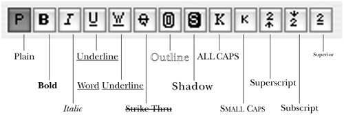
- Click one or more style buttons .
The type style buttons on the Measurements palette
Tip
To remove all styling from selected type, click the “P” button. To remove one style at a time, click any selected style button. If a style is half gray, it means not all the currently selected type has that style.
Tip
Superscript type sits above the baseline (as in ®). Subscript type sits below the baseline (as in 2). Superior type aligns with the cap height of the type and is reduced in point size (as in 18th). Adjust the proportions of these styles in QuarkXPress (Edit, in Windows) > Preferences > Print Layout > Character (try reducing the “VScale” percentage).
Tip
You have various options for converting the case of selected text: the All Caps type style, the Small Caps type style (which converts lowercase letters to smaller versions of capital letters), and the Style > Change Case submenu, new to QuarkXPress 7, which lets you change the case of the letters to UPPERCASE, lowercase, or Title Case.
Kerning and tracking
Kerning is the manual adjustment of space between a pair of characters (the cursor is inserted between them). Tracking, the adjustment of the space to the right of one or more selected characters, can be used for fine-tuning or for creating a variety of typographic effects. The same area of the Measurements palette is used for tracking as for kerning. Note: Before kerning manually, go to QuarkXPress (Edit, in Windows) > Preferences > Print Layout > Character and make sure Auto Kern Above is on, at, or below the minimum type size of your text.
To kern or track type manually using the Measurements palette
- Choose the Content tool, and zoom in on the type you’re going to kern or track.
- Display the Classic tab tab or Character Attributes tab of the Measurements palette.
- For kerning, click between two characters . For tracking, select any number of consecutive characters.
Click between two characters to kern them—the space after a T or W often needs adjustment.
- Click the right Tracking & Kerning arrow to add space or the left arrow to remove space –
 . To track or kern in a finer increment, Option-click/Alt-click the right or left arrow.
 Now the “T” and the “o” are closer together.
 A phrase with positive tracking values A phrase with a negative tracking value of –6
or
Enter a value between –500% and 500% in the Tracking & Kerning field in an increment as small as .001.


Tip
To restore normal tracking to selected text or to restore normal kerning at a text insertion point, enter 0 in the Tracking & Kerning field.
Tip
To apply tracking or kerning values via a dialog box, choose Style > Track or Kern. To adjust the letterspacing for longer passages of text, use an H&J (see pages 117–119).
This is the quickest method for tracking—and it’s our favorite.
To kern or track using the keyboard
- Choose the Content tool.
- Click between two characters or select any number of characters.
- Press Cmd-Shift-[/Ctrl-Shift-[ (left bracket) to remove space, or ] (right bracket) to add space –. To kern or track in a finer increment, include the Option/Alt key in the shortcut.
These are a few of the character pairs that often need extra kerning, particularly if they’re set in a large point size. Wide tracking (letterspacing) is popular nowadays, especially since it’s so easy to do. We use it only for short passages, though, as it’s tiring to read in long passages. Small caps, as in this illustration, look nice “tracked out,” as does very chunky or very thin type (for example, the condensed variation of a font).

Use the Word Space Tracking* shortcut described in the following instructions to adjust inter-word spacing in an isolated phrase, such as a large headline.
Note: To adjust inter-word spacing in repetitive text (e.g., subheads) or in a larger body of text, create an H&J that has tightened word spacing and apply it via a style sheet. That’s how we tightened the word spacing of subheads in this book (as in the words “To adjust inter-word spacing:” below).
To adjust inter-word spacing
- Choose the Content tool.
- Select one or more words.
- In Mac OS X, press Cmd-Control-Shift-[ (left bracket) to remove space or ] (right bracket) to add space –. For finer word space adjustments, include the Option key. In Windows, press Ctrl-Shift-1 or Ctrl-Shift-2.
This phrase has normal word spacing. Here the same phrase has a Word Space Tracking value of –10. Negative word space tracking adds a professional touch to headlines and other large-sized text.

To remove kerning and word space tracking
- Choose the Content tool.
- Select the kerned text.
- Choose Utilities > Remove Manual Kerning.[* This command has no effect on character tracking values.
Some character pairs, because of their shape and how they happen to fit side by side, have noticeable gaps between them. To help with this problem, fonts have hundreds of built-in kerning pairs—character duos that are nudged together slightly. To turn this pair kerning on, go to QuarkXPress (Edit, in Windows) > Preferences > Print Layout > Character, and check Auto Kern Above.
If you’re unhappy with the default spacing in a particular kerning pair or pairs that appear repetitively in your layouts, you can use QuarkXPress’s kerning editor to specify your own kerning values.
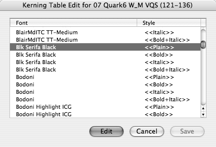
To use the Kerning Table Editor
- Choose Utilities > Kerning Table Edit. If it’s unavailable, enable the Kern-Track Editor XTension (see page 377).
- Click the name of the font that you want to edit , then click Edit.
Click the font whose kerning you want to edit, then click Edit.
or
Double-click the name of the font that you want to edit.
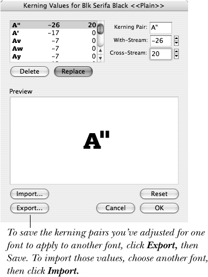
- Click a kerning pair on the list.
or
In the Kerning Pair field, type a kerning pair.
- In the With-Stream field, enter a new kerning value or click the up or down arrow (a negative value will bring characters closer together). Option-click/Alt-click either arrow to kern in a finer increment.
- Optional: To adjust the vertical spacing between a kerning pair (e.g., to change the position of a punctuation mark), using the same techniques, change the Cross-Stream value.
- When you’re satisfied with the Preview , click Replace to replace the existing pair or click Add to add it as a new pair.
Note the Preview as you change a kerning pair’s With-Stream (horizontal) or Cross-Stream (vertical) values.
- Click OK, then click Save.
Typographic tips and tricks
Normal text has a horizontal scale of 100%. Raising this value makes type wider (extends it); lowering this value below 100% makes type narrower (condenses it). Changing the vertical scaling percentage changes only a character’s height. This is different from changing point sizes!
Note: Because the Scale command affects only the vertical parts of letters—not the horizontals (or vice versa)—it causes letter shapes to become distorted. For more narrow (or expanded) characters that look more balanced, we recommend using a Condensed (or Expanded) typeface instead of applying the Horizontal Scale command to Regular characters ![]() –
–![]() . We rarely use the Scale feature (call us type purists).
. We rarely use the Scale feature (call us type purists).
![]() This is Futura Regular, Horizontal Scale 0.
This is Futura Regular, Horizontal Scale 0.
![]() Here a condensed font is faked by applying a Horizontal Scale value of 30% to Futura Regular.
Here a condensed font is faked by applying a Horizontal Scale value of 30% to Futura Regular.
![]() We think the proportions are more balanced in Futura Condensed Regular (Horizontal Scale 0), a typeface that’s condensed to begin with.
We think the proportions are more balanced in Futura Condensed Regular (Horizontal Scale 0), a typeface that’s condensed to begin with.
To scale type using the Measurements palette
- Choose the Content tool.
- Select the text to be scaled.
- Display the Character Attributes tab of the Measurements palette.
- For horizontal scaling, click the Scale Text Horizontally button at left, then enter a percentage between 25 and 99 to condense the type (make it narrower than normal) or a percentage between 101 and 400 to expand the type (make it wider than normal) . A Horizontal Scale of 60%, for example, will condense type by 40%; a Horizontal Scale of 125% will expand type by 25%.
In the Character Attributes tab of the Measurements palette, click the Scale Text Horizontally or Scale Text Vertically button, then enter a value.
or
Click the Scale Text Vertically button, then enter the desired percentage.
- Press Return/Enter to apply the changes. .
Horizontal scaling is used for stylizing type.

Tip
You can also choose Style > Horizontal/Vertical Scale. The Character Attributes dialog box will open, with the Scale field selected. Choose Horizontal or Vertical from the menu and enter a percentage value.
To scale type horizontally or vertically using the keyboard
- Choose the Content tool.
- Select the text to be scaled.
- Hold down Cmd/Ctrl and press [ (left bracket) to condense or shorten the type in 5% increments, or ] (right bracket) to expand or lengthen it –. Include the Option/Alt key to scale in 1% increments. Scaling will be horizontal or vertical depending on which option is currently selected in the Character Attributes dialog box.
Normal (100%) horizontal and vertical scale 75% vertical scale 75% horizontal scale 110% horizontal scale


This method for scaling type interactively rather than by specifying an exact point size is appropriate when you’re working visually—trying to make a headline or a logo look just so. You can’t use it on text in a linked box or on a text path created using the Line Text-Path or Orthogonal Text-Path tool.
To scale type interactively
- Choose the Item or Content tool.
- To scale type while preserving the proportions of the type and the box or path, Cmd-Option-Shift-drag/Ctrl-Alt-Shift-drag a handle –
 . The leading will readjust proportionately.
The original text The text and box are scaled interactively, and the proportions of both are preserved.
. The leading will readjust proportionately.
The original text The text and box are scaled interactively, and the proportions of both are preserved.or
To scale type and its box (or path) without preserving their proportions, Cmd-drag/Ctrl-drag a side midpoint handle to scale horizontally or a top or bottom midpoint handle to scale vertically. The type will condense or expand to fit the shape of the box or path.


Tip
To restore normal scaling to type, select it, choose Style > Horizontal/Vertical Scale, then enter 100 in the Scale field.
Tip
To scale type on a path, make sure Item > Edit > Shape is off. You should see the handles of the bounding box when the path is selected, not the anchor points.
Using the Baseline Shift command, you can shift one or more characters above or below the baseline. Don’t use this command to shift a whole paragraph—that’s the job of leading. Use Baseline Shift only to fiddle with a little bit of type—to nudge a bullet, a dash, or an anchored item slightly upward or downward, or to shift the position of text on a Bézier path. A Baseline Shift value can be incorporated into a paragraph or character style sheet.
To vertically shift type using the Measurements palette
- Choose the Content tool.
- Select the characters to be shifted.
- Display the Character Attributes tab of the Measurements palette.
- Click the arrows next to the Baseline field in the middle of the palette.
or
In the Baseline field, enter a value up to three times the point size of the type to be shifted. Enter a minus sign (–) before the number to shift the type below the baseline
–. Press Return/Enter to see the changes. A positive Baseline Shift value shifts characters above the baseline; a negative Baseline Shift shifts characters below the baseline. The “C” was shifted down. Baseline Shift is handy for creating signs, company logos, and the like.


Tip
If you change the point size of type that has a Baseline Shift value other than zero, the Baseline Shift value will adjust accordingly.
To vertically shift type using the keyboard
- Choose the Content tool.
- Select the characters to be shifted.
- In Mac OS X, press Cmd-Option-Shift-+ (plus) to raise the type above the baseline in 1-point increments or - (hyphen) to lower the type below the baseline.
In Windows, press Ctrl-Alt-Shift-)(close paren) or ((open paren).
Tip
To access the Baseline Shift field in the Character Attributes dialog box, choose Style > Baseline Shift.
It’s easy to input the curly, smart quotation marks that professional typesetters use or foreign language quotation marks, such as guillemets «». With the Smart Quotes feature on—as it is by default—press ′ to produce a single quotation mark in the style currently specified in the Input Settings pane of the Preferences dialog box (‘ in English) or press Shift-′ to produce a double quotation mark (“ or ”).
To turn on Smart Quotes
- Choose QuarkXPress (Edit, in Windows) > Preferences (Cmd-Option-Shift-Y/Ctrl-Alt-Shift-Y).
- Click Input Settings under Application.
- Check Smart Quotes.
- Choose a style for the quotes from the Quotes: Format menu .
- Click OK .
Use Smart Quotes for quotation marks and apostrophes.


Tip
To produce foot ′ and inch ″ marks when Smart Quotes is checked, press Control-′/Ctrl-′ for a foot mark or Control-Shift-″/Ctrl-Shift-″ for an inch mark. If you’re working with a lot of these marks, you can temporarily uncheck Smart Quotes.
Tip
If you import text with Convert Quotes checked in the Import Text dialog box, smart quotes will be substituted for straight quotes.
Tip
In place of absent letters, use an apostrophe, not a smart quote. For example, a date should be written like this: ’94, not like this: ‘94. Here’s another example: Sugar ’n’ spice. To enter an apostrophe manually, press Option-Shift-]/Alt-].
Please—we beg of you—use straight quotes only for foot and inch marks ![]() (not for quotation marks). Or better yet, use oblique foot and inch marks, called prime marks
(not for quotation marks). Or better yet, use oblique foot and inch marks, called prime marks ![]() . To insert prime marks, use the Glyphs palette (Window > Glyphs). Choose Symbol from the font menu and scroll to locate the characters
. To insert prime marks, use the Glyphs palette (Window > Glyphs). Choose Symbol from the font menu and scroll to locate the characters ![]() . Double-click a character to insert it at the text insertion point.
. Double-click a character to insert it at the text insertion point.
![]() Use straight quotes for feet, inches, minutes, seconds...
Use straight quotes for feet, inches, minutes, seconds...
![]() ... or better yet, use prime marks.
... or better yet, use prime marks.

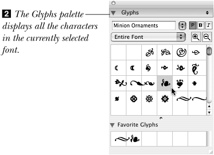
![]() Use the Glyphs palette to insert special characters from any font.
Use the Glyphs palette to insert special characters from any font.

QuarkXPress 7 makes it easy to insert any special characters included in a font, such as an accented é, a cent symbol ¢, or a decorative “dingbat” character ![]() .
.
![]() A few Zapf Dingbats characters
A few Zapf Dingbats characters
To insert special characters via the Glyphs palette
- Choose the Content tool, then click in your text to create an insertion point.
- Choose Window > Glyphs.
- From the font menu at the top, choose a font .
- Scroll through the characters to locate the special character you want to use. If necessary, click the magnifying glass to enlarge the preview area.
- When you locate the character you want to insert, double-click it . If you use the character frequently, you can drag it to the Favorite Glyphs area.
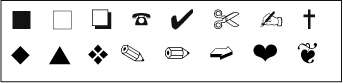
You can use a symbol to separate sentences or paragraphs or to mark the end of a story or article. But don’t limit yourself to the Zapf Dingbat and Symbol fonts—other symbol fonts are available. These symbols are from Adobe’s Minion Ornaments font.

Tip
Characters from symbol fonts such as Zapf Dingbats are often used for bullets or for decoration. To insert dingbats repetitively, as in a bulleted list, use a character style sheet.
To insert special characters from the keyboard
While you’re typing, it’s faster to enter frequently used special characters using keyboard shortcuts. Keyboard shortcuts for various special characters are listed at left and in Appendix A.
Tip
You may often find yourself entering a single special character in Zapf Dingbats and Symbol font. Because of this, QuarkXPress provides a quick method for entering one character in those fonts. For a Zapf Dingbat character, press Cmd-Option-Z (Mac only). For a Symbol character, press Cmd-Option-Q/Ctrl-Alt-Q. Note: For this shortcut to work, in Preferences > Application > Undo, the Redo Key setting must be Cmd-Shift-Z/Ctrl-Shift-Z.
Hanging punctuation
If you’re setting larger text that starts or ends with punctuation (a pull quote in an article, for example, or a quotation on a book jacket), the paragraph alignment will be more pleasing if the punctuation hangs outside the main body of the text. Unfortunately, achieving this is not a flip-of-the-switch operation. Here are a few methods:
• Create a hanging indent using either positive or negative indents (see page 108).
• Use the Indent Here character (Utilities > Insert Character > Special > Indent Here; Cmd-(backslash)/Ctrl-). ![]() –
–![]() .
.
![]() Non-hanging punctuation
Non-hanging punctuation
![]() Hanging punctuation, created using a hanging indent: The left alignment of the paragraph is cleaner.
Hanging punctuation, created using a hanging indent: The left alignment of the paragraph is cleaner.
![]() Even better: Here the second line is aligned with the stem of the “T.”
Even better: Here the second line is aligned with the stem of the “T.”
• Type a space before the punctuation mark ![]() , then apply negative kerning
, then apply negative kerning ![]() .
.

![]() To create hanging punctuation using kerning, insert a space to the left of the first character in the paragraph...
To create hanging punctuation using kerning, insert a space to the left of the first character in the paragraph...

![]() ...and then apply negative kerning. It may look peculiar on screen but it will print just fine.
...and then apply negative kerning. It may look peculiar on screen but it will print just fine.
Tip
You can also use either of the first two techniques to hang a large initial cap.
Copyfitting
If you need to squeeze text into a tight space or bring up a stubborn orphan word or hyphenated word (horrors!) from the end of a paragraph, use whichever of these techniques you think your readers are least likely to notice:
• Choose an H&J with Auto Hyphenation checked or insert discretionary hyphens (Utilities > Insert Character > Special > Discretionary Hyphen; Cmd-hyphen/Ctrl-hyphen).
• Apply –0.5, –1, or –2 tracking, but not more!
• Rewrite the copy—delete, add, rearrange, or substitute words (only if you have permission to do so or it’s your writing!).
• Widen the column a tiny bit.
• Apply 99% horizontal scaling.
• Apply slightly tighter word spacing by using an H&J.
• Switch to a condensed font.

To create side-by-side paragraphs, anchor a text box at left (Measurements palette > Classic tab > Align With Text Ascent), shift its baseline up if necessary, and create a hanging indent for the main paragraph (see page 132). You might also use a table.

Here, an anchored box with a 10% black background is used as a drop cap.
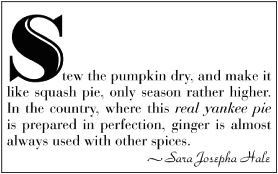
Ultra simple, but oh so elegant: We chose a different font for the first character (Bodoni Highlight), and enlarged it. This is called a raised initial cap.
Get your dashes straight
When to use a regular hyphen: To write a compound word, as in “three-year-old.”
When to use an en dash (Option-hyphen/Ctrl-Alt-Shift-hyphen): Between a range of numbers, as in “Figures 4-6”; a time frame, as in “4–6 weeks”; a distance, as in “4–6 miles”; or a negative number, as in –8.
When to use an em dash (Option-Shift-hyphen/Ctrl-Shift-=): To break up a sentence, as in “Bunny rabbit—excuse me—stay here.” Don’t add a whole space around an em or en dash—it will be too noticeable (as in this sentence). Instead, you can add a little bit of space by kerning—as in this sentence—or use a narrow flex space, which is a variation of a standard en space (Option-Shift-Spacebar/Ctrl-Shift-5 inserts a breaking flex space). Specify the Flex Space Width percentage in QuarkXPress (Edit, in Windows) > Preferences > Print Layout Character. Or use an em dash with built-in thin spaces around it from an expert font set.
To create a nonbreaking standard hyphen (as in “write-off”), press Cmd- =/Ctrl-=.
While it is definitely worth memorizing the keyboard shortcuts for dashes and maybe even special kinds of spaces, QuarkXPress does let you cheat. With the text insertion bar in text, choose Utilities > Insert Character > Special or Special Nonbreaking. You’ll see all the dashes you want plus “nonbreaking” varieties, which work like glue and won’t break at the end of a line.
Dot, dot, dot
To produce an ellipsis character (...), press Option-;/Alt+0133. If those dots are too close together for your comfort, you can type periods instead and then track them out a little bit (...). Or you can type a period (.), then a non-breaking flex space (Cmd-Option-Shift-Space bar/Ctrl-Alt-Shift-5), then a period, then a flex space, and so on (. . .).
Fractions
There are several ways to produce fractions in QuarkXPress:
• Use the Glyphs palette (Window > Glyphs) to ferret out the fractions included with a font. Most fonts include at least ¼, ½, and ¾ ![]() .
.

![]() Most fonts, such as New Baskerville (used for body text in this book), offer fractions for ¼, ½, and ¾. Use the Glyphs palette to find them.
Most fonts, such as New Baskerville (used for body text in this book), offer fractions for ¼, ½, and ¾. Use the Glyphs palette to find them.
• Use an OpenType font that has the Fractions style available (not in brackets). For example, Zapfino Extra LTX Pro offers expert fraction formatting ![]() . If you’re buying an OpenType font for this purpose, make sure it has the Fractions option.
. If you’re buying an OpenType font for this purpose, make sure it has the Fractions option.

![]() Choosing Fractions from the OpenType menu on the Character Attributes tab of the Measurements palette creates fractions for any numerals.
Choosing Fractions from the OpenType menu on the Character Attributes tab of the Measurements palette creates fractions for any numerals.
• Purchase a font family that includes a fraction variation (such as MrsEavesFractions ![]() ) or purchase a font that consists of only fractions or only numerators and denominators.
) or purchase a font that consists of only fractions or only numerators and denominators.
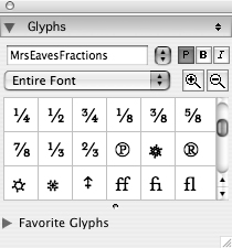
![]() Some of the options in the MrsEavesFractions font
Some of the options in the MrsEavesFractions font
• Type the numerator, a slash, and the denominator, select all the characters, then choose Style > Type Style > Make Fraction. The fraction will look like this: ¾. You can kern between the characters in this type of fraction ![]() .
.
![]() Results with Style > Type Style > Make Fraction in 24-point New Baskerville.
Results with Style > Type Style > Make Fraction in 24-point New Baskerville.
Tip
You can specify Fraction/Price preferences in QuarkXPress (Edit, in Windows) > Preferences > Application > Fraction/Price (see page 370). Fraction/Price is part of the Type Tricks XTension that ships with QuarkXPress.
• If all else fails, you can build a fraction by hand ![]() . First, type the numerator. Second, type the fraction slash (in Mac OS X, pressing Option-Shift-1; in Windows, type a slash, preferably from an expert font). Third, type the denominator. Apply Superior type style to the numerator, then apply both the Superior and Subscript type styles to the denominator. You can adjust the type style offset, scale, etc., in QuarkXPress (Edit, in Windows) > Preferences > Print Layout > Character.
. First, type the numerator. Second, type the fraction slash (in Mac OS X, pressing Option-Shift-1; in Windows, type a slash, preferably from an expert font). Third, type the denominator. Apply Superior type style to the numerator, then apply both the Superior and Subscript type styles to the denominator. You can adjust the type style offset, scale, etc., in QuarkXPress (Edit, in Windows) > Preferences > Print Layout > Character.
![]() Fractions in the same font, but created manually with type styles and fraction slash characters.
Fractions in the same font, but created manually with type styles and fraction slash characters.
Ligatures
No, we’re not talking about a medieval weapon here. A ligature is a pair (or more) of characters that are joined into one ![]() . Like smart quotes and the proper use of dashes, this is just another typographic trick that makes things look nicer. In general, we use ligatures in body copy. We also use them on a case-by-case basis in display copy, such as headlines, depending on the font.
. Like smart quotes and the proper use of dashes, this is just another typographic trick that makes things look nicer. In general, we use ligatures in body copy. We also use them on a case-by-case basis in display copy, such as headlines, depending on the font.
![]() The most common ligatures are for the character pairs fi and fl. At left, with ligatures turned off, the dot on the “i” overlaps poorly with the “f.” At right, ligatures are enabled and the transition is smooth.
The most common ligatures are for the character pairs fi and fl. At left, with ligatures turned off, the dot on the “i” overlaps poorly with the “f.” At right, ligatures are enabled and the transition is smooth.
To apply ligatures to standard fonts
- Choose the Content tool and select the text you want to have ligatures.
- Display the Character Attributes tab of the Measurements palette.
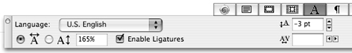
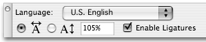
- Check Enable Ligatures .
The Enable Ligatures check box in the Character Attributes tab of the Measurements palette; the Character Attributes dialog box (Style > Character) provides this check box as well.
Tip
Sometimes, ligatures don’t look right—particularly with loose tracking and some letter combinations—but you can use a preferences setting to control their application. In QuarkXPress (Edit, in Windows) > Preferences > Print Layout > Character, you can set a Break Above value that specifies, for example, that if you track out +2, you no longer want ligatures ![]() . In addition, you can check Not “ffi” or “ffl” as ligatures can look funny for these letter combinations (can you tell, we turned them off in this sentence?).
. In addition, you can check Not “ffi” or “ffl” as ligatures can look funny for these letter combinations (can you tell, we turned them off in this sentence?).
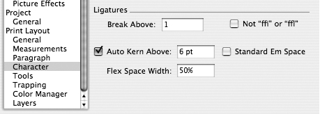
![]() The Break Above field in the Character pane of Print Layout Preferences controls how much tracking you can apply before ligatures “break” apart; the default setting is 1. If you don’t want ligatures on fi and fl in words such as “office” or “waffle,” check Not “ffi” or “ffl”. This is unchecked by default.
The Break Above field in the Character pane of Print Layout Preferences controls how much tracking you can apply before ligatures “break” apart; the default setting is 1. If you don’t want ligatures on fi and fl in words such as “office” or “waffle,” check Not “ffi” or “ffl”. This is unchecked by default.
Tip
If you check Enable Ligatures and nothing happens, it may be because the font doesn’t include ligatures.
To apply ligatures to OpenType fonts
Some OpenType fonts provide ligatures beyond the standard “fi” and “fl” ![]() . In the OpenType menu (Character Attributes tab of the Measurements palette), if Standard Ligatures or Discretionary Ligatures is available (without brackets around it), you can apply that style to selected text. The Glyphs palette (Window menu) shows which ligatures are available.
. In the OpenType menu (Character Attributes tab of the Measurements palette), if Standard Ligatures or Discretionary Ligatures is available (without brackets around it), you can apply that style to selected text. The Glyphs palette (Window menu) shows which ligatures are available.

![]() Zapfino Extra LTX Pro is already a beautiful script font as you can see at left. An OpenType font with many special style options available, look what happens when we choose Standard Ligatures (we get the more flowing “fi” ligature) and Discretionary Ligatures (we get the flambloyant “st”).
Zapfino Extra LTX Pro is already a beautiful script font as you can see at left. An OpenType font with many special style options available, look what happens when we choose Standard Ligatures (we get the more flowing “fi” ligature) and Discretionary Ligatures (we get the flambloyant “st”).
Setting type for print output
Our philosophy about choosing fonts for print output is similar to our philosophy about friendship:
• For body text: Pick a few sturdy, dependable serif font families that you really like, and get to know them well. Serif fonts are the least tiring to read. A few of our current favorites in this category include New Baskerville (which you’re reading now), Sabon, and Caslon. Garamond and Goudy are other good classics.
• For emphasis: Use fonts from the same family—not from different families—using regular for the main text and bold or italics for emphasis.
• For subheads, headers, and the like: Pick a strong, contrasting sans serif face, such as Frutiger, Futura, Gill Sans, or Franklin Gothic.
Then, just as there are acquaintances you enjoy seeing once in a while but would tire of if you saw every day, there are special fonts you should choose only for special occasions. Fonts that fall into this category include script faces and other decorative faces, such as Caflisch Script Bold, which you see in the sidebar headers in this book. They’re great for party invitations, drop caps, headlines, and the like but would be tiring to read in long passages. Just as it’s good to stand by your old, reliable friends, it’s also good to be open to meeting new “faces.”
The best way to learn more about typography is to observe it in the world around you. Whether it’s a poster, annual report, newspaper, brochure, book cover, cosmetics label, menu, shopping bag, or even the credits you see at the movie theater, wherever you see text (unless it’s written by hand), it’s typeset in a particular font.
* Word Space Tracking and Remove Manual Kerning are part of TypeTricks, an XTension that ships with QuarkXPress.