
Zabbix is a flexible monitoring system. Once implemented on an installation, it is ready to support a heavy workload and will help you acquire a huge amount of every kind of data. The next step is to graph your data, interpolate, and correlate the metrics between them. The strong point is that you can relate different type of metrics on the same axis of time, analyzing patterns of heavy and light utilization, identifying services and equipment that fail most frequently in your infrastructure, and capturing relationships between the metrics of connected services.
Beyond the standard graphs facility, Zabbix offers you a way to create your custom graphs and to add them on your own template, thus creating an easy method to propagate your graphs across all the servers. Those custom graphs (and also the standard and simple graphs) can be collected into screens. Inside Zabbix, a screen can contain different kinds of information—simple graphs, custom graphs, other screens, plain text information, trigger overviews, and so on.
In this chapter, we will cover the following topics:
- Generating custom graphs
- Creating and using maps with shortcuts and nested maps
- Creating a dynamic screen
- Creating and setting up slides for a large monitor display
- Generating an SLA report
As a practical example, you can think of a big data center, where there are different layers or levels of support; usually, the first level of support needs to have a general overview of what is happening on your data center, the second level can be the first level of support divided for typology of service, for example, DBA, application servers, and so on. Now, your DBA (second level of support) will need the entire database-related metrics, whereas an application server specialist most probably will need all the Java metrics, plus some other standard metrics, such as CPU memory usage. Zabbix's responses to this requirement are maps, screens, and slides.
Once you create all your graphs and have retrieved all the metrics and messages you need, you can easily create screens that collect, for instance, all the DBA-related graphs plus some other standard metrics; it will be easy to create a rotation of those screens. The screen will be collected on slides, and each level of support will see its groups of screens in a slide show, which has an immediate qualitative and quantitative vision of what is going on.
Data center support is most probably the most complex slide show to implement, but in this chapter, you will see how easy it is to create it. Once you have all the pieces (simple graphs, custom graphs, triggers, and so on), you can use them and also reuse them on different visualization types. On most of the slides, for instance, all the vital parameters, such as CPU, memory, swap usage, and network I/O, need to be graphed. Once done, your custom graphs can be reused in a wide number of dynamic elements. Zabbix provides another great functionality, that is, the ability to create dynamics maps. A map is a graphical representation of a network infrastructure. All those features will be discussed in this chapter.
When you are finally ready to implement your own custom visualization screen, it is fundamental to bear in mind the audience, their skills or background, and their needs. Basically, be aware of what message you will deliver with your graphs.
Graphs are powerful tools to transmit your message; they are a flexible instrument that can be used to give more strength to your speech as well as give a qualitative overview of your service or infrastructure. This chapter is pleasant and will enable you to communicate using all the Zabbix graphical elements.
Inside Zabbix, you can divide the graphs into two categories—simple graphs and custom graphs. Both of these are analyzed in the next section.
Simple graphs in Zabbix are something really immediate since you don't need to put in a lot of effort to configure this feature. You only need to go to Monitoring | Latest data, eventually filter by the item name, and click on the graph. Zabbix will show you the historical graph, as shown in the following screenshot:
Clearly, you can graph only numeric items, and all the other kinds of data, such as text, can't be shown on a graph. On the latest data item, you will see the graph link instead—a link that will show the history.
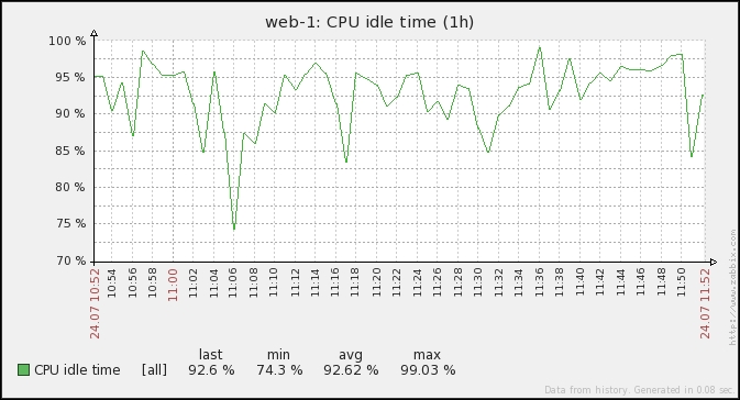
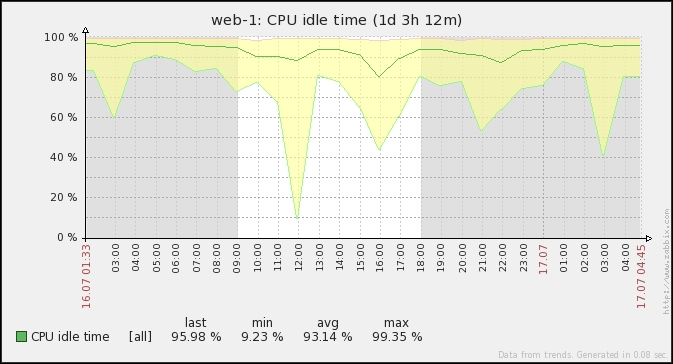
At the top of the graphs, there is the time period selector. If you enlarge this period, you will see the aggregated data. As long as the period is little and you would like to see very recent data, you will see a single line. If the period is going to enquire the database for old data, you will see three lines. This fact is tied to history and trends; since the values are contained in the history table, the graph will only show one line. Once you're going to retrieve data from the trends, there will be three lines, as shown in the following screenshot:
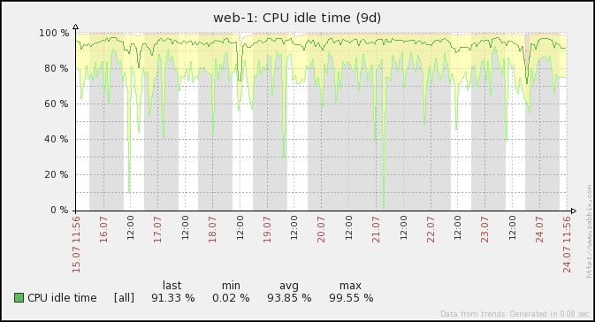
In the previous screenshot, we can see three lines that define a yellow area. This area is designed by the minimum and maximum values, and the green line represents the mean value. For a quite complete discussion about trends/history tables, see Chapter 1, Deploying Zabbix. Here, it is important to have all those three values graphed.
In the following screenshot, you can see how the mean values may vary with respect to the minimum and maximum values. In particular, it is interesting to see how the mean value remains almost the same at 12:00 too. You can see quite an important drop in the CPU idle time (the light-green line) that didn't influence the mean value (green line) too much since, most likely, it was only a small and quick drop, so it is basically lost on the mean value but not on our graph since Zabbix preserves the minimum and maximum values.
Graphs show the working hours with a white background, and the non-working hours in gray (using the original template); the working time is not displayed if the graph needs to show more than 3 months. This is shown in the following screenshot:
Simple graphs are intended just to graph some on-the-spot metrics and check a particular item. Of course, it is important to interpolate the data; for instance, on the CPU, you have different metrics and it is important to have all of them.
This is a brand-new feature available, starting with Zabbix 2.4. It's actually a very nice feature as it enable you to create on the fly an ad hoc graph.
Now Zabbix can graph and represent, on the same graph, multiple metrics related to the same timescale.
To have an ad hoc graph generated for your metrics, you simply need to go to Monitoring | Latest data and, from there, mark the checkbox relative to the item you would like to graph, as shown in the following screenshot:
At the bottom of the same page, you need to choose in the drop-down menu the kind of graph you prefer—the default graph is stacked, but it can be switched to the standard graph—and then, click on Go.
The result of our example is shown in the following screenshot:
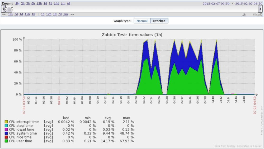
Note that on this screen, you can quickly switch between Stacked and Normal.
Now we can dig a little into those ad hoc graphs and see some nice features.
Now let's see something that can be quickly reused later on your screens.
Zabbix generates URLs for custom ad hoc graphs, such as http://<YOUR-ZABBIX-GUI>/zabbix/history.php?sid=<SID >&form_refresh=2&action=batchgraph&itemids[23701]=23701&itemids[23709]=23709&itemids[23705]=23705&itemids[23707]=23707&itemids[23704]=23704&itemids[23702]=23702&graphtype=1&period=3600.
This URL is composed of many components:
sid: This represents your session ID and is not strictly requiredform_refresh: This is a kind of refresh option—not strictly requireditemids[id]=value: This is the actual item that Zabbix will show you on the graphaction=[batchgraph|showgraph]: This specifies the kind of graph we want
It is quite interesting to see how we can quickly switch from the default batchgraph action in the URL by just replacing it with showgraph. The main difference here is that batchgraph will show you only average values in the graph. Instead, it can be a lot more useful to use showgraph, which includes the triggers—the maximum and minimum values for each item.
An example of the same graph seen before with showgraph is as follows:
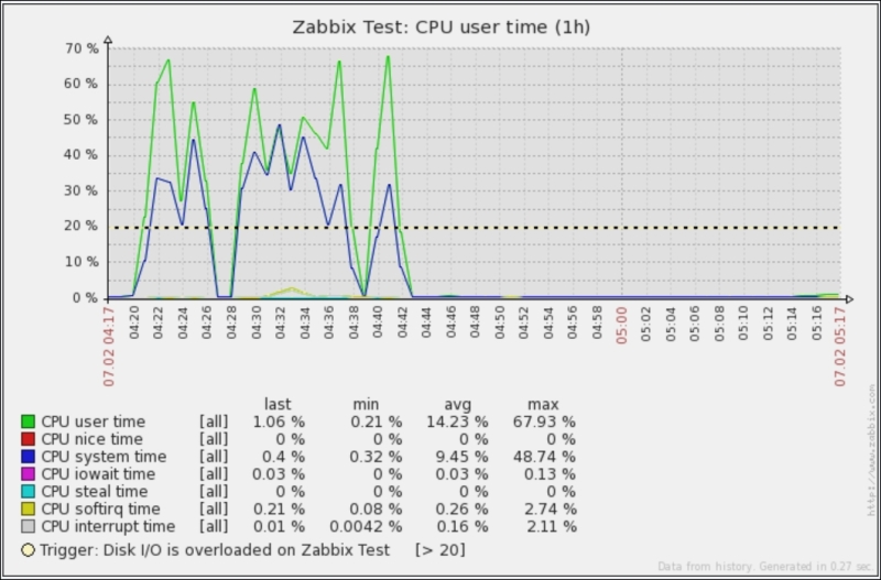
Here, you can clearly see that you now have the trigger included. Since you can find it very useful to use this kind of approach, especially when you're an application-specific engineer and you're looking for standard graphs that are not strictly required on your standard template, let's see another hidden functionality.
Now if you want to retrieve the graph directly to reuse it somewhere else, the only thing you need to do is call with the same parameter, but instead of using the history.php page, you need to use chart.php. The output will be the following screenshot:
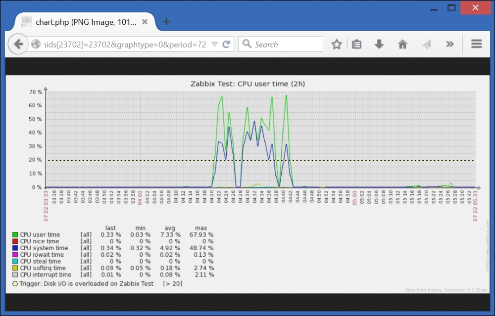
The web page will display only the pure graph. Then, you can quickly save the most used graphs among your favorites and retrieve them with a single click!
We have only discussed the graph components here rather than the full interaction functionality and their importance in seeing historical trends or delving into a specific time period on a particular date. Zabbix offers the custom graphs functionality—these graphs need to be created and customized by hand. For instance, there are certain predefined graphs on the standard Template OS Linux. To create a custom graph, you need to go to Configuration | Hosts (or Templates), click on Graphs, and then on Create graph.
Graphs on Zabbix are really a strong point of the monitoring infrastructure. Inside this custom graph, you can choose whether you want to show the working time and the legend using different kinds of graphs. The details of the CPU Utilization graph are shown in the following screenshot:
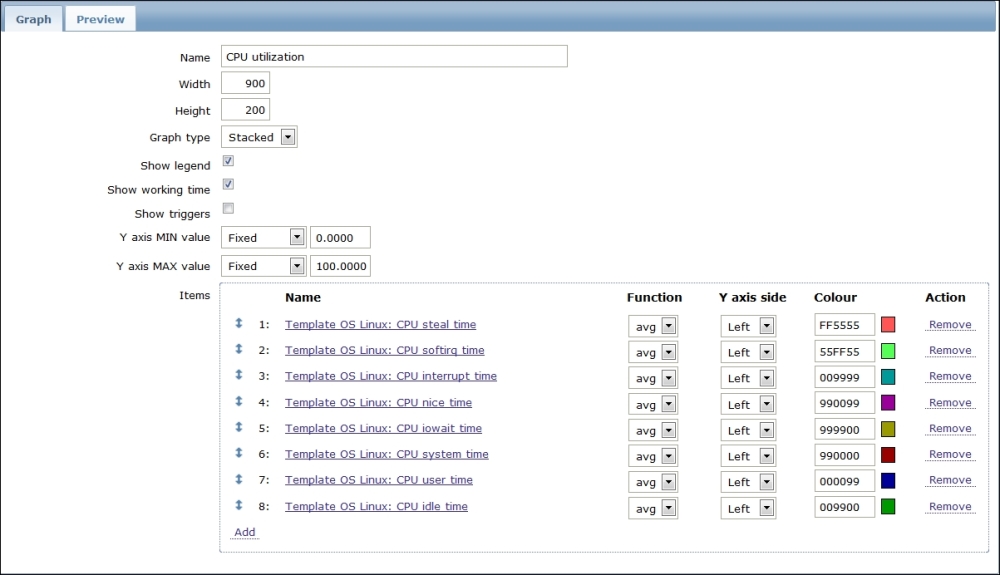
As you can see, the following graph is stacked and shows the legend of the x axis defined with a fixed y axis scale. In this particular case, it doesn't make any sense to use a variable for the minimum or maximum values of the y axis since the sum of all the components represents the whole CPU and each component is a percentage. Since a stacked graph represents the sum of all the stacked components, this one will always be 100 percent, as shown in the following screenshot:
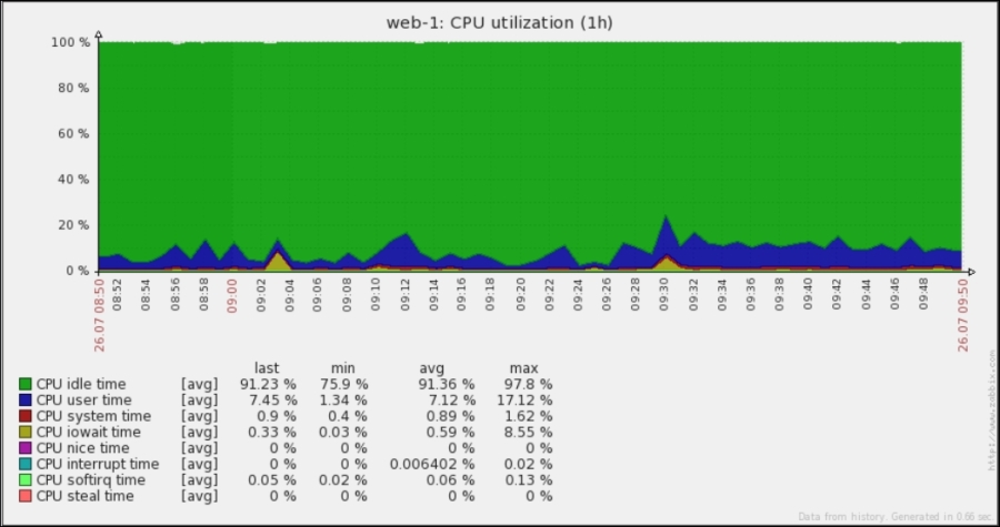
There are a few considerations when it comes to triggers and working hours. These are only two checks, but they change the flavor of the graph. In the previous graph, the working hours are displayed on the graph but not the triggers, which is mostly because there aren't triggers defined for those metrics. The working hours, as mentioned earlier, are displayed in white. Displaying working hours is really useful in all the cases where your server has two different life cycles or serves two different tasks. As a practical example, you can think about a server placed in New York that monitors and acquires all the market transactions of the U.S. market. If the working hours—as in this case—coincide with the market's opening hours, the server will, most probably, acquire data most of the time. Think about what will happen if the same trading company works in the Asian market; most probably, they will enquire the server in New York to see what happened while the market was open. Now, in this example, the server will provide a service in two different scenarios and have the working hours displayed in a graph, which can be really useful.
Now, if you want to display the triggers in your graph, you only need to mark the Show triggers checkbox, and all the triggers defined will be displayed on the graph. Now, it can happen that you don't see any lines about the triggers in your graph; for instance, look at the following screenshot:
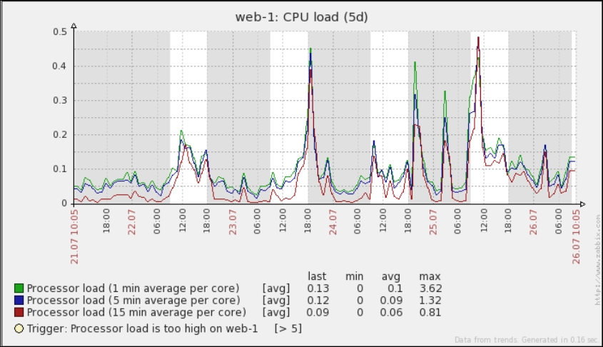
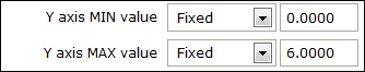
Now where is your expected trigger line? Well, it is simple. Since the trigger is defined for a processor load greater than five, to display this line you need to make a few changes in this graph, in particular the Y axis MIN value and Y axis MAX value fields. In the default, predefined CPU load graph, the minimum value is defined as zero and the maximum value is calculated. Both need to be changed as follows:
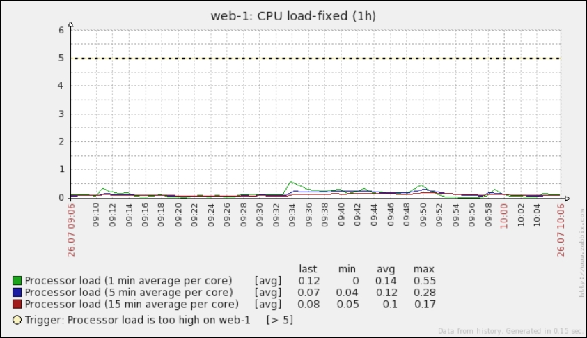
Now refresh your graph. Finally, you will see the trigger line, which wasn't visible in the previous chart because the CPU was almost idle, and the trigger threshold was too high and not displayed due to the auto-scaling on the y axis. This is shown in the following screenshot:
Zabbix supports the following kinds of custom graph:
- Normal
- Stacked
- Pie
- Exploded
Zabbix also supports different kinds of drawing styles. Graphs that display the network I/O, for instance, can be made using gradient lines; this will draw an area with a marked line for the border, so you can see the incoming and outgoing network traffic on the same scale. An example of this kind is shown in the following screenshot, which is easy to read. Since you don't have the total throughput to have graphed the total amount from the incoming packet, the outgoing packet is the better one to be chosen for a stacked graph. In stacked graphs, the two areas are summarized and stacked, so the graph will display the total bandwidth consumed.
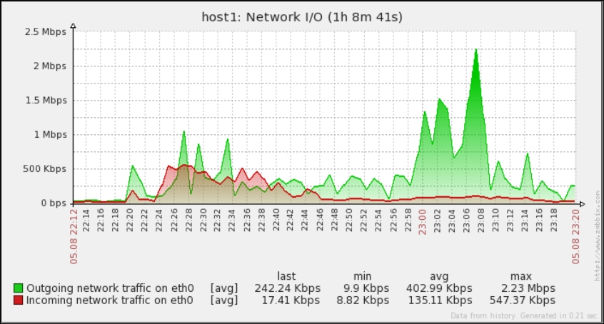
To highlight the difference between a normal graph and a stacked one, the following screenshot displays the same graph during the same time period, so it will be easier to compare them:
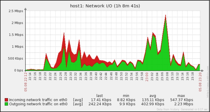
As you can see, the peaks and the top line are made by aggregating the network input and output of your network card. The preceding graph represents the whole network traffic handled by your network card.
Zabbix is quite a flexible system and the graphs are really customizable to better explore all the possible combinations of attributes and parameters that can be customized. All the possible combinations of graph attributes are reviewed in the following table:
This second table describes the item configuration:
Note
You can easily play with all those functionalities and attributes. In version 2.0 of Zabbix, you have a Preview tab that is really useful when you're configuring a graph inside a host. If you're defining your graph at a template level, this tab is useless because it doesn't display the data. When you are working with templates, it is better to use two windows to see in real time by refreshing (the F5 key) the changes directly against the host that inherits the graphs from the template.
All the options previously described are really useful to customize your graphs as you have understood that graphs are really customizable and flexible elements.