1. The Interface
What is QuarkXPress?
QuarkXPress is a page layout application. A page layout application is a central gathering place for text, photographs, graphics, lines, and tables, all of which together make up a page or series of pages. QuarkXPress can be used to produce anything from a tiny hanging tag for a line of apparel to a multiple-volume encyclopedia. A finished layout can be output on a home laser printer (newsletter, party invitation, etc.), output on a high-end imagesetter for final printing by a commercial printer (book, magazine, brochure, etc.), or exported for online viewing.
This chapter is a reference guide to the basic QuarkXPress features. In the remaining chapters you’ll learn how to actually build pages and page elements.
The QuarkXPress building blocks
• To place text on a page, you must type or import text into or onto a text box  or text path
  of any shape.
A text box with a frame
Text on a path
Similarly, to place a picture on a page, you must first create a container for it, whether it’s a rectangular or irregularly shaped picture box. Then you can import a picture into it. If you want the border of a text or picture box to print, you must apply a frame to it  –
– .
.

A picture in a picture box (with a delicate .5-point frame)

A picture in a box without a frame
• Lines can be straight or curved and function as decorative elements. Tables hold a grid of cells, which in turn can contain text or pictures.
• A text box, text path, picture box, table, or line is called an item. The picture or text a box contains is called its contents.
• Tool selection appears as a step in most of the instructions in this book. To create an item, for example, you’ll use an item creation tool, such as the Line tool or the Rectangle Text Box tool.
To move a whole item or a group of items across a page, you’ll use the Item tool , since you’ll be working with the overall container.
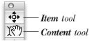
The two workhorse tools
To copy/paste, delete, or restyle text or a picture after it is input or imported, you’ll use the Content tool, since you’ll be working with the contents of, not the outside of, the container.
For some tasks, the Item and Content tools are interchangeable. For example, the Content tool can be used to reshape or resize items, or to select multiple items, and the Item tool can be used to import a picture.
• An item or its contents must be selected before either one can be modified –.

A picture box that isn’t selected

Eight handles display when a box is selected.
• The Measurements palette is context sensitive, offering different options and controls (grouped into sets called tabs) depending on which tool is selected and what type of item is selected. The default (Classic) tab displays the most commonly used item controls on the left and content controls on the right.
• When an item is selected with the Item tool, the Measurements palette provides options for modifying item attributes—dimensions, location, frame, color, etc. (, next page). When an item is selected with the Content tool, the palette provides options for editing the content—font, size, picture scale, etc. (, next page).
When the Item tool and a picture box are selected, the Classic tab of the Measurements palette provides controls for modifying the box itself (left side) and controls for modifying the picture (right side). The navigator tab bar (at the top) lets you switch to the Frame, Runaround, Clipping, Space/Align, and Drop Shadow tabs.

When the Content tool and a text box are selected, the Classic tab provides controls for modifying the box itself (left side) and controls for formatting the text (right side). The navigator tab bar lets you switch to the Text, Frame, Runaround, Character Attributes, Paragraph Attributes, Space/Align, Tabs, and Drop Shadow tabs. Other controls are available for lines, text paths, tables, and multiple-selected items.
• To change tabs on the Measurements palette, choose from the navigator tab bar that pops up when you place the mouse near the palette. Point at an icon to see the name of its tab (see page 18).
If it’s not one thing, it’s another
Our first encounter with QuarkXPress was in 1988 (ancient history in the software world), and we were impressed with its precision but frustrated by the inflexibility of its parent/child architecture. New items were drawn inside—and constrained by—existing items.
Now QuarkXPress is as flexible as it originally was brittle. Not only can you place an item anywhere, you can turn just about anything (text box, text path, picture box, or line) into something else –. Just to whet your appetite, these are a few of the easy conversions you can make:
• Change a text box into a picture box, a line into a box or a text path—and vice versa.
• Make a text box, picture box, or table cell contentless—capable only of being recolored or resized.
• Change a standard box into a Bézier box or Bézier line, or vice versa.
• Change a text character into a picture box—and then into a text box!
• Convert text into a table; convert a table into a text box or a group of items.
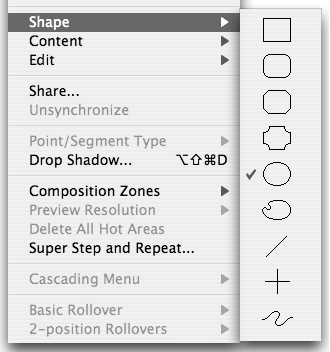
Using the Item > Shape submenu, you can convert one shape into another, such as a box into a line or a standard box into a Bézier box.
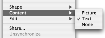
Using the Item > Content submenu, you can change a text box into a picture box, or vice versa, or make any box contentless. You can change the content of a table cell, too.

The QuarkXPress building blocks: Picture boxes, text boxes, text paths, lines, and tables (not illustrated).
Projects and layouts
In most applications, one file on your computer represents one project that you’re working on. And in fact, not too long ago, QuarkXPress restricted you to working in this way, too, as each file represented a single document intended for one publication in one page size. But since version 6, QuarkXPress files have become “project” files, which can contain multiple “layout” files. The advantage of this structure is that you can now store multiple layouts of different sizes for the same client in one project file ; you can synchronize text, pictures, and formatting across the layouts in the project; and you can ensure consistency with shared style sheets, colors, H&Js, and other features.

This is a QuarkXPress project window. There are three layouts in this project, as indicated by the three tabs at the bottom of the project window.
The projects and layouts structure is useful for campaigns—such as a restaurant opening—that share text and graphic elements but may not all be the same size. By splitting the project window or creating new windows for the same project, you can display multiple layouts and drag elements between them .
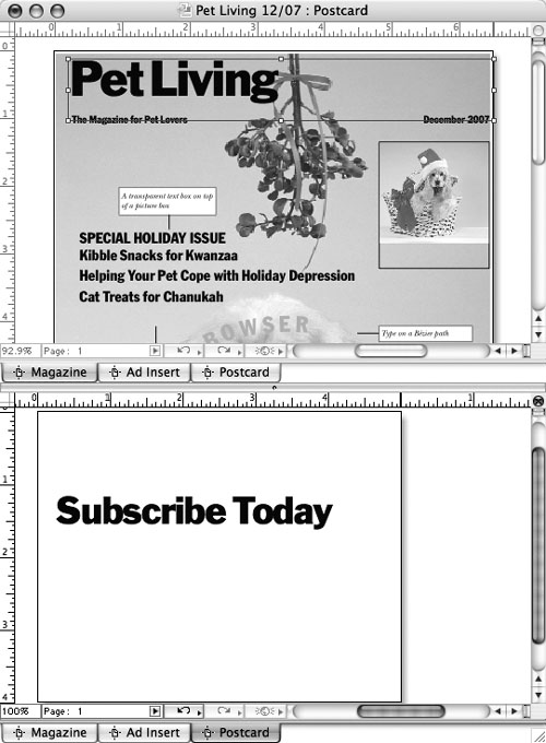
You can split the QuarkXPress project window or open multiple windows to display multiple layouts at the same time.
For users who are confused by the project/layout structure (in particular, having to name both the project and individual layouts), QuarkXPress 7 offers a Single Layout Mode in which the project contains only a single layout.
Print layouts and Web layouts
As you learn how to create print layouts, bear in mind that most of the features used to create print layouts are also available for creating Web layouts. If you’re designing for both print and the Web, the ability to create Web layouts with familiar tools may be helpful—plus, you can convert layouts from print to Web, easily share design elements, and synchronize print and Web content. Web layouts aren’t covered in this book, per se, but are covered on the companion Web site (see page 34 for more details).
The QuarkXPress screen in Mac OS X
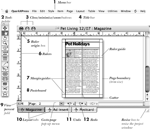
By default, the Tools palette and the Measurements palette display along with a palette group containing the Style Sheets, Colors, and Page Layout palettes (shown ungrouped here).


Key to the QuarkXPress screen in Mac OS X
Click any menu name to access a list of commands. XTension commands are also accessed via the menu bar.
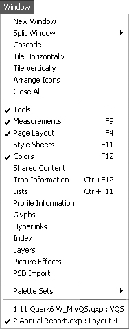
2 Palettes
Most of the palettes are opened from the Window menu, including: Tools, Measurements, Page Layout, Style Sheets, Colors, Shared Content, Trap Information, Lists, Profile Information, Glyphs, Index, Layers, Picture Effects, PSD Import, and more. Many of the commands found under the menu bar can be accessed more quickly from the Measurements palette. Palettes that are open when you quit QuarkXPress will reopen when the application is relaunched. You can save sets of open palettes for different kinds of tasks.
3 Close/minimize/zoom buttons
To close a file or a palette, click its close (red) button. Click the minimize (yellow) button to stow it in the Dock. Click the zoom (green) button to enlarge a window to maximum size.
4 Title bar
The name of the project and the currently displayed layout are displayed on the project title bar. Drag the title bar to move the project window.
5 Ruler origin box
Drag from the ruler origin box to reposition the intersection of the horizontal and vertical rulers, also known as the zero point. Click the ruler origin box again to reset the zero point to the upper-left corner of the page. Each layout can have a different ruler origin position.
6 Rulers
You can choose inches, inches decimal, picas, points, millimeters, centimeters, ciceros, or agates as the default measurement increment for rulers and entry fields in print layouts. To display the rulers, make sure View > Rulers is checked. Non-printing guides, which are dragged from the vertical and horizontal rulers, are used for aligning and positioning objects.
7 Margin guides
Margin guides don’t print. Make sure View > Guides is checked to display guides.
8 Pasteboard
This functions as a scratchboard for creating items or to store them for later use.
9 View percent field
The zoom level of a layout is displayed, and can be modified, in this field.
10 Layout tabs
Display a layout by clicking its tab. You can split the project window (Window > Split Window) or open new project windows (Window > New Window) and display different layouts from the same project.
11 Undo
Click to undo the last undoable edit, or choose from the pop-up menu.
12 Redo
Click to redo the last redoable edit, or choose from the pop-up menu.
The QuarkXPress screen in Windows

By default, the Tools palette and the Measurements palette display along with a palette group containing the Style Sheets, Colors, and Page Layout palettes (shown ungrouped here).


Key to the QuarkXPress screen in Windows
1 Application (or project) Control menu
The application Control menu commands are Restore, Move, Size, Minimize, Maximize, and Close. The project Control menu commands are Restore, Move, Size, Minimize, Maximize, Close, and Next.
2 Application title bar
The application title bar contains the name of the application. If a project is maximized, the project name appears in the title bar.
3 Menu bar
Press any menu name to access commands.
4 Application (or project) minimize button
Click the application minimize button to shrink the application to an icon on the Taskbar; click the icon to restore the application window to its previous size. Click the project minimize button to shrink the project to an icon at the bottom left corner of the application window. Click the icon to restore the project window to its previous size.
5 Application (or project) maximize/restore button
Click the application or project restore button to restore a window to its previous size. When a window is at its restored size, the restore button turns into a maximize button. Click the maximize button to enlarge the window.
6 Close button
To close the application, a project, a dialog box, or a palette, click its close button.
7 Palettes
Most of the palettes are opened from the Window menu, including: Tools, Measurements, Page Layout, Style Sheets, Colors, Shared Content, Trap Information, Lists, Profile Information, Glyphs, Index, Layers, Picture Effects, PSD Import, and more. Many of the commands found under the menu bar can be accessed more quickly from the Measurements palette. Palettes that are open when you quit QuarkXPress will reopen when the application is relaunched. You can save sets of open palettes for different kinds of tasks.
8 Project title bar
The name of the project and the currently displayed layout are shown on the title bar. Drag the title bar to move the layout within the application window (this won’t work if the project window is maximized).
9 Ruler origin box
Drag from the ruler origin box to reposition the intersection of the horizontal and vertical rulers (the “zero point”). Click the ruler origin box again to reset the zero point to the upper-left corner of the page. Each layout can have a different ruler origin position.
10 Rulers
You can choose inches, inches decimal, picas, points, millimeters, centimeters, ciceros, or agates as the default measurement increment for rulers and entry fields in print layouts. To display the rulers, make sure View > Rulers is checked. Non-printing guides, which are dragged from the vertical and horizontal rulers, are used for aligning and positioning objects.
11 Pasteboard
This functions as a scratchboard for creating items or to store them for later use.
12 Margin guides
Margin guides don’t print. Make sure View > Guides is checked to display guides.
13 Layout tabs
Display a layout by clicking its tab. You can split the project window (Window > Split Window) or open new project windows (Window > New Window) and display different layouts from the same project.
14 & 15 Undo & Redo
Click to undo or redo the last undoable edit, or choose from a list of recent commands on the pop-up menu.
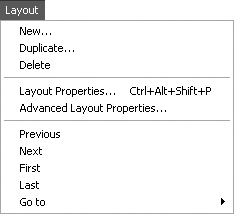
The QuarkXPress menus in Mac OS X
The Preferences command is on this menu.


Text selected

Line selected

Picture selected


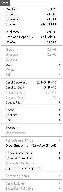
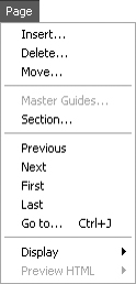
The QuarkXPress menus in Windows
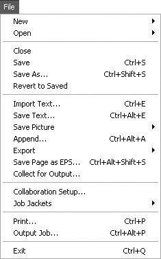


Text selected

Line selected

Picture selected


Dialog boxes
Numbers can be typed into dialog box fields in any of the measurement units that are used in QuarkXPress. Click OK or press Return/Enter to exit a dialog box and implement the indicated changes.
A dialog box opens when you choose any menu command that ends with an ellipsis (...); you can also use a keyboard shortcut when one is assigned.
Tip
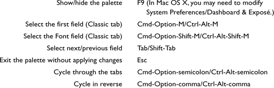
In any dialog box, you can press Tab to select the next field or press Shift-Tab to select the previous field.
Tip
For some dialog boxes, you can use the Cmd-Z/Ctrl-Z shortcut (for undo) while the dialog box is open to restore the last-used values.

In Windows, if you press Alt plus the letter on the keyboard that corresponds to an underlined letter in a dialog box, that field will be selected. For example, in the dialog box illustrated above, pressing Alt-W selects the Width field.

The Character Attributes dialog box
Dialog box panes
In many dialog boxes—such as Modify, Paragraph Attributes , Preferences, and Utilities—several panes containing related controls are housed under one roof to provide one-stop shopping. Pane names are shown in tabs across the top or in a scroll list on the left side. Simply click a tab or an item in the list to switch between panes.

In the Modify dialog box, the availability of controls varies depending on the type of item or items selected. If you select a text box, for example, you can use the Text pane to change the vertical alignment, use the Frame pane to add a frame, and use the Box pane to add a background color. If you select a picture box, other panes will be available, such as Clipping and OPI. If multiple items are selected, only the tabs containing settings that are common to all the items will display.
The QuarkXPress palettes*
The Tools palette
The Tools palette contains more than 30 tools for item creation and editing.
• To open the Tools palette, make sure Window > Tools (F8) is checked.
• Choose a visible tool by clicking it. Choose a “hidden,” related tool from a pop-out menu (drag from the little arrowhead).
• The default Tools palette is pictured at right. To move a tool from a pop-out menu to its own slot on the palette, hold down Control/Ctrl as you choose the tool. Control-click/Ctrl-click a tool to restore it to its default pop-out menu.
• Hold down Option/Alt and choose any item creation or linking tool to keep it selected. To deselect a tool, click another tool.
• To set preferences for a tool, double-click the tool, then click Modify.
• To access the Item tool while the Content tool is chosen, hold down Cmd/Ctrl.
• To restore the default Tools palette, choose QuarkXPress (Edit, in Windows) > Preferences > Print Layout > Tools, click Default Tool Palette, then click OK.
• If Show Tool Tips is checked in QuarkXPress (Edit, in Windows) > Preferences > Application > Input Settings, you can rest the pointer on any visible tool or palette button and its name will appear on the screen.
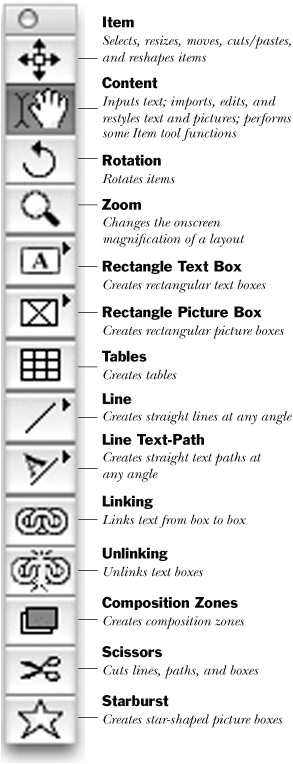
Tools on the default pop-out menus
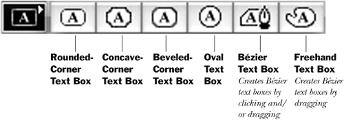
Text Box tools

Picture Box tools
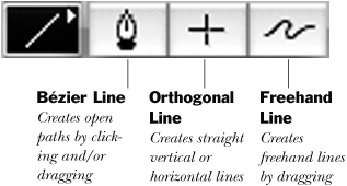
Line tools

Text-Path tools
The Measurements palette
Experienced QuarkXPress users will be happy to know that the newly expanded Measurements palette (Window > Measurements) consolidates most of the commands and options that are available under the menus. The palette now contains multiple tabs and many more options, which vary depending on what kind of item and which tool are selected in the layout. The palette is blank when nothing is selected.
The default tab on the Measurements palette, Classic, provides the most commonly used item and content formatting options. To display one of the other tabs, rest the pointer on the palette to make the nagivator tab bar appear, then click an icon on the tab bar. You can also choose from a full list of tabs on the context menu.
To keep the navigator tab bar on display, Control-click/right-click the palette title bar (at the far left) and choose Always Show Tab Bar. Or if it gets in the way, choose Show Tab on Rollover instead. And finally, if you don’t want to use the navigator tab bar at all, choose Always Hide Tab Bar and use the context menu or keyboard commands to switch tabs—or pretend you’re in a previous version and forget about the tabs entirely.
The Classic tab when the Content tool and a text box are selected: Controls on the left side let you modify the text box; controls on the right affect selected text or the text insertion point.
The Text tab is available when a text box is selected. These controls mirror those in the Text pane of the Modify dialog box (Item > Modify).
The Frame tab is available when a text box or picture box is selected. These controls mirror those in the Frame pane of the Modify dialog box (Item > Modify).
The Runaround tab is available when a text box is selected. These controls mirror those in the Runaround pane of the Modify dialog box (Item > Modify).
The Character Attributes tab is available when the text insertion bar is in text. These controls mirror those in the Character Attributes dialog box (Style > Character).
The Paragraph Attributes tab is available when the text insertion bar is in text. These controls mirror those in the Paragraph Attributes dialog box (Style > Formats).
The Space/Align tab is available when multiple items are selected. You can access some of these controls, and display this tab, from the Item > Space/Align submenu.
The Tabs tab is available when the text insertion bar is in text. These controls mirror those in the Tabs pane of the Paragraph Attributes dialog box (Style > Tabs), but are more interactive.
The Drop Shadow tab is available when a text box is selected. These controls mirror those in the Drop Shadow pane of the Modify dialog box (Item > Modify).
The Classic tab when a picture box is selected. Controls on the left side let you modify the picture box (size, location); controls on the right affect the picture itself (scale, mask).
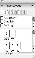
The Page Layout palette
The Page Layout palette lets you rearrange, insert, and delete layout pages; move through a layout; create and modify master pages; apply master pages to layout pages; and renumber sections of a layout. Display a layout page by double-clicking its icon or by clicking its number.

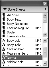
The Style Sheets palette
The Style Sheets palette lets you apply style sheets, which are sets of character and paragraph specifications.

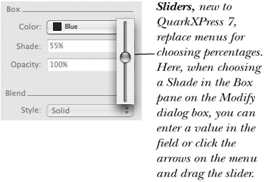
The Colors palette
The Colors palette lets you apply colors and blends at varying shades and opacities.

The Shared Content palette
The Shared Content palette contains text boxes, stories, picture boxes, and pictures that have their box and/or content attributes synchronized. When you drag anything from the Shared Content palette into a layout, any changes you make to that individual item’s synchronized attributes are reflected in other instances of the item throughout the entire project.
For example, say you add a text box containing legal boilerplate to the Shared Content palette, synchronize the box attributes and the text formatting, and then drag that boilerplate into various layouts in the project. If you resize the box or change the text formatting, all other instances of the boilerplate throughout the project will be updated to reflect the changes.

The Info area describes which aspects of the selected shared item are synchronized.
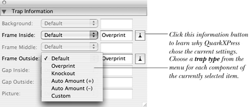
The Trap Information palette
Trapping controls how overlapping colors print, helping prevent gaps and ink buildup. The Trap Information palette lets you assign trapping specifications to individual items.
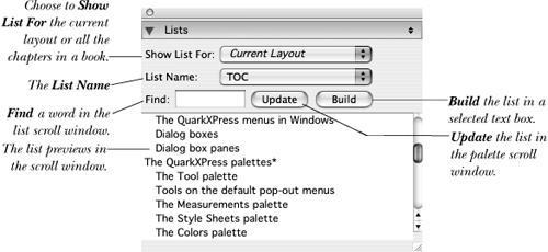
The Lists palette
The Lists palette lets you build a table of contents for the current layout or for multiple chapter files in a book. The list is generated from text in paragraph or character style sheets and can be alphabetized.
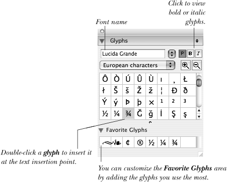
The Glyphs palette
The Glyphs palette displays all the characters within a font. So why isn’t it called the “Character palette”? A glyph is actually a representation of a character within a font. Depending on the font, there may be more than one glyph representing that character. For example, it’s common for expert fonts to contain multiple variations of a single numeral, such as a standard numeral 1 and a superscript numeral 1.
Using the Glyphs palette, you can quickly locate and insert glyphs within a font, and you can save glyphs as global favorites for easy access.
The Layers palette
The Layers palette lets you organize items in a layout according to their front-to-back stacking order. Using this palette, you can create new layers, move an item to a different layer, merge two or more layers together, restack layers, delete layers, lock/unlock layers, and make layers temporarily invisible or nonprintable.

The Find/Change palette
The Find/Change palette (Edit menu) lets you search for and replace any combination of text and formatting.

This is the expanded Find/Change palette, when Ignore Attributes is unchecked.
The PSD Import palette
The PSD Import palette lets you access any layers, channels, and paths built into native Adobe Photoshop files that you import into a QuarkXPress picture box. You can use this palette to experiment with various changes to a Photoshop image. For example, you can control the blending mode and opacity for layers, apply a different color to any channel, and control which channels and paths display and/or print.

The Picture Effects palette
The Picture Effects palette lets you adjust an image by using features such as Levels, Curves, and Brightness/Contrast, and it lets you apply special effects such as Emboss or Add Noise. You may be familiar with some of these controls from an image editing application. Using the palette, you can add effects, modify them, turn them on and off, change their order, delete them, and save them as presets for applying to other images.

Library palettes
Libraries aren’t palettes, per se. They’re separate user-created files that are used for storing any type of individual items, combinations of items, or groups of items, including picture boxes (with or without pictures), text boxes (with or without text), lines, text paths, and tables.
To add an item to a library, simply drag it into the palette. To retrieve an item (or group) from a library, drag it from the library into your project window; a copy of the item will appear in your layout. You can create an unlimited number of library palettes, and more than one library palette can be open at a time.

Book palettes
A book is a collection of individual chapter files in which style sheets, colors, H&Js (settings for hyphenation and justification), lists, and dashes & stripes (line and frame styles) can be synchronized. Each book has its own palette that lets you add, delete, print, and change the order of chapters.
The Status column on the palette shows whether a chapter is Available, Modified, Missing, or Open on your computer. If a user name is listed, it means that another person on your network has that chapter open on their computer.

Managing palettes onscreen
Although you’ll find that using palettes is incredibly convenient, they can lead to palette-itis. In this condition, your screen is littered with palettes that you’re constantly moving, resizing, opening, and closing just to see your pages. This is a common problem with many programs that QuarkXPress solves by allowing you to group palettes and save palettes in sets.
The default palette group contains the Style Sheets, Colors, and Page Layout palettes, but you can change that . All the palettes can be grouped except for the Tools palette, Measurements palette, and Book palettes. Control-click/Right-click a palette’s title bar to open a context menu containing the controls for modifying palette groups:
• Choose a palette name to add it to the group.
• Choose Detach [palette name] to remove the palette from a group.
• Choose Close [palette name] to hide the palette.

You can customize palette groups to your liking.
To make a palette group go away, Control-click/Right-click the bar at the top of the group and choose Close Palette Group from the context menu.
Click the triangle on the left end of a palette’s title bar to collapse that palette to just a title bar; click again to expand it. Cmd-click/Ctrl-click any title bar in a palette group to expand or collapse all the palettes in the group.
If you use specific palettes for specific tasks, you can save palette collections as sets.
• To save the current palette configuration as a set, choose Window > Palette Sets > Save Palette Set As. Enter a name in the Save As field and, if you wish, specify a keyboard shortcut.
• To display a set, choose it from the Window > Palette Sets submenu or press the keyboard shortcut.
Context menus
Many commands and features can be accessed using context menus –, thus eliminating the need to trek all the way over to a menu or even to a palette. The choices on a context menu vary depending on whether the pointer is over the pasteboard, the rulers, a blank area, or a picture box, text box, contentless box, text path, line, table, or palette. To see what’s available on a context menu, Control-click/Right-click any item, page, interface element such as a palette, etc.
Note: In Mac OS, if Control-clicking doesn’t open a context menu, go to QuarkXPress > Preferences, Input Settings pane, and click Control Key: Key Press Activates: Contextual Menu. (With Control Key Activates: Zoom chosen, you’ll have to press Control-Shift-click to open a context menu.)

This context menu appears if you Control-click/Right-click a line with the Item tool.

This context menu appears if you Control-click/Right-click a picture with the Item tool.

This context menu appears if you Control-click/Right-click a text box with the Content tool.
You can buy XTensions developed by Quark or third parties for everything from creating footnotes to imposing pages for the press to creating interactive Flash files. Quark offers a variety of free XTensions as well, but let the buyer beware—these are often still in development and may not work perfectly. Most XTensions are available in a demo version so you can try them out before shelling out beans. For more information on XTensions, visit:
• www.quark.com/products/xtensions

Imposer, from the Quark Print Collection of XTensions, arranges pages for printing and binding.
XTending XPress with XTensions
What’s an XTension?
QuarkXPress doesn’t do everything. In fact, one of its strengths is that third-party developers—and Quark itself—have written hundreds of add-on software modules called XTensions that extend or enhance the program’s features. XTensions perform a variety of tasks, from simple object alignment to catalog databasing, and they range in price from petty cash to hundreds of dollars.
A small sampling of XTensions are mentioned in this book. Some XTensions are available for Mac OS X only, and some are available for both platforms. Make sure whatever XTensions you buy are optimized for QuarkXPress version 7 (at the time of this writing, we couldn’t verify availability of the XTensions mentioned). To get information about an XTension that’s installed in your system, choose Utilities > XTensions Manager, click the XTension name, then click About.
Where should I install them?
To use an XTension, it has to be installed in the XTension folder inside the QuarkXPress application folder. Some XTensions ship with an installer that will do the job for you; others must be copied manually into the XTension folder. If an installer places an XTension in the QuarkXPress folder but not in the XTension folder, make sure to drag it into the XTension folder yourself.
Once an XTension has been correctly installed on your hard drive, you can use the XTensions Manager feature within the application to enable or disable it (Utilities menu). To use a newly enabled XTension, you must re-launch QuarkXPress. In QuarkXPress (Edit, in Windows) > Preferences > Application > XTensions Manager, you can choose whether the XTensions Manager opens automatically upon launch.
Measurement units
Most values in palettes and dialog boxes display in the current default horizontal or vertical measurement units. To change the default units for future layouts, close all projects; to change the units for just the currently displayed layout, leave it open. Choose QuarkXPress (Edit, in Windows) > Preferences. Under Print Layout (or Default Print Layout), click Measurements, then for Horizontal and/or Vertical, choose Inches, Inches Decimal, Picas, Points, Millimeters, Centimeters, Ciceros, or Agates. A different unit can be chosen for each layout in a project. With a layout displayed, you can also Control-click/Right-click either ruler and choose from the Measure submenu as well.

Control-click/Right-click the ruler to access the Measure submenu and quickly change measurement systems for the active layout
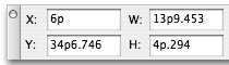
To enter a value in a non-default unit –, you must use the proper abbreviation (see the sidebar). For example, you can use “pt” for points, but not “pts”. Agates, in case you’re wondering, are used for measuring vertical column lengths in classified ads.

When Return/Enter is pressed, the value is converted into the currently chosen default measurement units.
Picas and points
A pica is the standard unit of measure used in the graphic arts industry. Six picas equals 1 inch; 1 pica equals 12 points. Picas and points can be combined in the same entry field. For example, to indicate 4 picas and 6 points, you would enter “4p6.”
Regardless of the current units, points are always used to measure type sizes, leading, rule widths, frame widths, and line widths.
Using math in fields
In addition to entering values in fields, you can perform math. For example, to make a box twice as wide as it was before, enter *2 after the current width. Use the operators +, −, * (multiply), or / (divide) and press Return/Enter to complete the operation.

Preferences (a sneak preview)
Preferences are default settings that can be chosen at the application level, project level, and individual layout level. The Preferences dialog box is discussed in detail in Chapter 22, and some preferences are discussed in individual chapters when they pertain to a particular task.
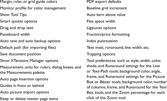
You’ll learn gradually which preferences affect which features or tasks—and when it matters. In the shaded box below, you’ll see a listing of a few of the many preferences, just to give you an idea of some of the available options.
Preferences are chosen in QuarkXPress (Edit, in Windows) > Preferences. Click an option in the scroll list at left to display that pane. Here’s an example of the way we’ve notated it: QuarkXPress (Edit, in Windows) > Preferences > Application > Input Settings.
Note: If you add, edit, or delete specifications such as colors when no projects are open, those specifications become the defaults for all future projects. Some of the default specifications you can edit include: style sheets, colors, H&Js (settings for hyphenation and justification), lists, dashes & stripes, auxiliary dictionaries, and hyphenation exceptions. The same holds true for any Default Print Layout preferences that are changed while no projects are open, such as measurement units, Auto Page Insertion, or Auto Picture Import.
* The palettes open from the Window menu.