
Chapter 7. Trend Lines
Once you understand that you can use charts as a graphical representation of human emotion, pattern recognition is the tool that will enable you to begin capitalizing on the opportunities that present themselves on a daily basis.
Charts are readily available for all to see and use. Interpreting and using these charts is a different matter altogether. To the untrained eye, a stock chart is like a book to an illiterate person. It doesn’t matter how big the words are printed or how basic the language. If the person has no comprehension or understanding of how to read, the book has no meaning. The information held within a single stock chart is so vast it is nearly impossible to unlock all the clues that a chart has to share about the potential of a stock or the general market. Attempting to decipher every bit of information is overkill. However, a basic understanding of charts can give you a significant edge in your pursuit of profits. When you begin to obtain profits by using basic pattern recognition, I believe you will embark on a lifelong quest to improve your chart-reading skills.
You might wonder whether traders trade according to technical patterns within charts because they lead to profits, or if technical patterns within charts lead to profits because traders trade them. The answer is both. You must accept the fact that sometimes a chart pattern develops because it is self-fulfilling and enough traders are expecting the same result. With most traders positioning for a move, it is sometimes forced to happen. As we’ll discuss, however, my goal for you is to eventually find an edge within the self-fulfilling nature of many patterns that allows you to capitalize when the obvious pattern fails.
My pattern-recognition strategy can be divided into two primary categories: the lateral trend and the angular trend. At this point, you might be wondering about specific technical patterns that you’ve heard about and that have become popular over the years (e.g., cup and handle, head and shoulders, double bottom, and bearish wedge). Although increasing your knowledge about various patterns and the intricacies of each is important as you mature as a trader, within every famed pattern you can find lateral and angular trends from which you can make trading decisions. Consider, for example, the cup and handle pattern shown in Figure 7.1.
Figure 7.1 A traditional cup and handle pattern in American Express.

Chart courtesy of Worden—www.Worden.com.
You can easily see where the cup and handle pattern derives its name. However, also plotted on the chart is the angular, descending trend line connecting the key points that make up the handle. In addition, I have plotted on the chart the lateral trend that connects the left and right side of the cup. You can observe the pattern as a whole, but you can also easily participate in a cup and handle break, by actually trading the descending or lateral trend line, as we’ll discuss in Chapter 11, “Determining Entry Points.”
The head and shoulders pattern is also mentioned quite often. You can see this pattern in the Goldman Sachs chart that Figure 7.2 shows. You can see the area that serves as the neckline for the head and shoulders pattern is also a clear lateral trend support line.
Figure 7.2 A traditional head and shoulders pattern in Goldman Sachs (GS) with lateral trend line support.
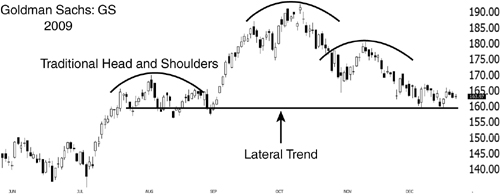
Chart courtesy of Worden—www.Worden.com.
I have yet to find a popular pattern that doesn’t have its foundation in either a lateral or angular trend, and therefore I do not spend time teaching specific patterns. Based on my experience, it’s better to focus on the mechanics you can use to recognize and profit from the foundational trend lines instead of getting caught up in the multitude of specific patterns that exist today. There is also a dangerous tendency when reviewing named patterns to become somewhat blind to other possibilities. Let’s suppose you stumble on a cup and handle chart with the intention of playing only the pivot break above the handle’s highest point, the traditional execution for a cup and handle pattern. Observing only the named pattern, you may miss completely the ascending trend line that connects the lowest point of the cup and the lowest point of the handle and therefore not act on an ascending trend break down should this occur. You can see an example of this in Figure 7.3, the same American Express chart shown earlier in this chapter.
Figure 7.3 A traditional cup and handle pattern in American Express with an ascending angular trend.

Chart courtesy of Worden—www.Worden.com.
When you embark on the pattern-recognition strategy, it is easy to become overwhelmed and make trading much too complicated. In the beginning, you must start with the basics, similar to a batter who spends time in a batting cage or a golfer on a driving range. One of the best exercises to begin your foray into pattern recognition is to identify and observe lateral trends. A lateral trend means that you can draw a horizontal line on a stock chart, connecting at minimum two high or low points, thereby creating a line that graphically becomes the lateral trend. Figure 7.4 is a daily chart of Apple Inc. (AAPL) in March 2009 that reflects a basic lateral trend line. At this point, do not infer anything from this chart. It is shown here just so that you can see what a lateral trend line looks like. Notice how the two highs can be connected to form a line. You can extend this line out into the future so that it becomes your lateral trend line.
Figure 7.4 A lateral trend line connecting two points in Apple Inc.

Chart courtesy of Worden—www.Worden.com.
In Chapter 6, “Timing the Entry,” I discussed how investors become emotionally attached to a specific price point. This emotional attachment creates an inflection point for the stock, a price at which an emotional connection exists that favors a substantial increase in volatility, once the stock trades at or near this key level. Initially, it might be a news event or some other catalyst that sparks the key reversal creating the first significant point. If the news was negative and the stock dropped significantly, many traders might resolve to sell once the stock recovers or returns to the level from which the weakness first set in. When the stock makes its way back to this first inflection point, traders who might have been waiting to sell will do so, thus exiting the game and sparking another reversal at or near the original level.
The second time our key inflection point comes into play, it is still primarily driven by the human emotions tied to this level rather than other traders trading the pattern being developed. The reason for that is it takes at least two inflection points to create a trend line. If the second inflection point is still in question, it is only an assumption by the trader who thinks this level will in fact prove significant. This is a dangerous assumption and one reason I rarely involve myself in a pattern before an identifiable trend (with two or more inflection points) is first developed. Once the trend is identified for all to see, the pattern quickly moves from one being controlled by traders originally involved to a pattern being traded by traders who have identified the key level in play. At this point, the trend line in question usually becomes self-fulfilling as you and other traders cue in on this level as a natural turning point for the stock. Should this inflection point be above where a stock is currently trading, it might act as a ceiling or resistance for the stock. Should this inflection point be below, it could easily act as a floor or support for the stock.
As more time goes by, these points take on greater significance as more and more traders can see them developing clearly. As more traders become involved with the key level in play, once this level is breached, the stock has the potential to begin a very large move as traders scramble to reverse their positions and new inflection points for the stock begin to evolve.
Figure 7.5 shows a lateral trend line acting as resistance on the chart of IBM from August 2009. You can see that a line has been drawn connecting the peaks and thereby creating a natural ceiling for the stock over a certain period of time. Each time the stock returns to this level, it is sent back down as the level acts as overhead resistance.
Figure 7.5 A lateral trend line acting as resistance for IBM.

Chart courtesy of Worden—www.Worden.com.
Just as multiple points from which a stock declined may create a lateral resistance trend, as Figure 7.5 illustrates, multiple support points from which a stock reversed upward may create a lateral support trend line. Figure 7.6 is the same Goldman Sachs chart shown earlier.
Figure 7.6 A lateral trend line acting as support for Goldman Sachs.
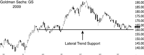
Chart courtesy of Worden—www.Worden.com.
One common problem with traders who study technical analysis is that they never take the time to truly understand why it works, and so they sometimes get a bit lost in the minutia of technical patterns. Take, for instance, the preceding exercise. You will rarely be able to plot a flawless lateral trend line because rarely will a stock reverse at exactly the same price two or more consecutive times and thus allow you to plot this line perfectly. The stock will often reverse very close to the first level, but not precisely, before reversing. Or it might move above or below, albeit slightly, before turning around. Pondering the rationale behind the lateral trend, you should understand that the price point is of more significance earlier in the lateral trend’s history than it is later on. The reason for this is the same reason the lateral trend is created in the first place: The earlier the lateral trend is within its development, the more human emotion is present. Once the lateral trend has matured and the stock has returned to the key price point on more than two occasions, other traders have become involved and are trying to profit from the pattern.
Suppose, for example, that a stock reaches the $30 level and reverses, heading sharply lower. The $30 level becomes the point at which shareholders started to lose money regardless of whether they bought here or had unrealized profits, which is what connects this level emotionally with those holding the stock. Eventually, after a drop, the stock slowly recovers and returns very close to the $30 level. At this time, those who have been holding the stock sell because they feel relieved to have at least gotten back to where they were before the surprise drop. When the stock declines for the second time from this $30 level, it becomes clear that this level is now of significant technical importance and more traders than just those initially involved will be drawn to this company name, seeking to deploy whatever strategy they prefer, around this key level. It is at this point that the general area becomes more important than the specific price. As the stock returns to that general area of support or resistance, more and more traders become involved. It should no longer be viewed as an exact level but rather a general level from which we can gauge the stock’s next move.
Before I discuss how to utilize the lateral trend for profit, we need to review the second basic category of pattern recognition: the angular trend.
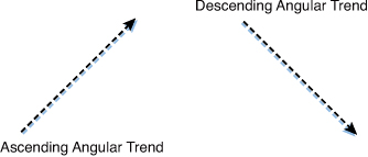
The angular trend can be divided into two segments depending on the direction of the angle, ascending or descending. Like the lateral trend, the angular trend can act as both a support or a resistance level and can therefore be used as a trading edge in either direction. Unlike a lateral trend, which typically marks a stock that has been moving sideways, the angular trend can be seen on a stock chart that has been increasing or decreasing in price over a set period of time. Figure 7.7 shows a basic outline of an ascending trend.
Figure 7.7 A basic representation of an ascending and descending angular trend.
Much like lateral trends, an angular trend first begins with a key inflection point, sparked by an unknown catalyst. Let’s assume for a moment that a stock has been on a steady descent for some time because the general market has been weak and the prospects for growth for this company have been waning. When the stock reaches a new all-time low of around $10 per share, the company announces a new product that should boost revenues significantly and revive the company’s stagnant brand. In only a few trading sessions, the stock shoots up 15%, moving from $10 to $11.50. You should have no anxiety over missing the initial move. Instead, you wait patiently for the appropriate point of entry, which will come once the angular, ascending trend has developed and been confirmed. When the initial move in the stock wanes, the stock should begin to digest the recent gains, possibly falling back to the $10.75 level. If the stock were to follow the development of a lateral rather than ascending trend, it might very well fall all the way back to the $10 level. However, in this example, that is not the case. For whatever reason, something that is irrelevant to you the technical trader, the stock does not retrace its entire 15% move. Instead, after coming back toward the $10.75 range, the stock turns up again and advances to $12. The recent advance creates what is called a higher low, and marks the second inflection point needed to create our ascending angular trend. For whatever reason, traders were not willing to wait for the stock to give back the entire move and instead decided to buy up shares on the first sign of weakness. Figure 7.8 shows IBM in January 2009 after an angular trend began to develop as noted. It is at this point, after the angular trend has been established, that you can seek to profit from the pattern.
Figure 7.8 An ascending angular trend in IBM.
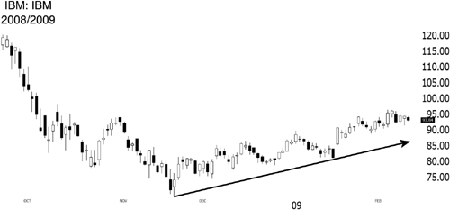
Chart courtesy of Worden—www.Worden.com.
Similar to the previously mentioned bullish scenario is the bearish case at which point a stock tops out and subsequently starts its decline. Through its descent, the stock develops a series of lower lows and lower highs, thus enabling you to draw a descending trend on the chart representing the stock in question.
In our bullish example, where the stock initially reversed at $10 and subsequently put in a higher low at $10.75, these two points became the basis for the angular ascending trend. If you were to connect those points but continue your ascending line farther on the chart, you would be plotting a potential path for the stock to move and logical support points for pullbacks. Once the trend is established, many traders might seek to act on this line as a guide, from either a speculative perspective or from a longer-term investing perspective. If you desire to slowly accumulate shares of this company, you may use this ascending trend for some time as a point from which to add shares, or for a shorter term speculative trade you might look to buy the dip and profit from any bounce off this line. After the trend has been established, traders actually playing the trend influence it much more than do initial traders who have an emotional tie to the price point.
Once you know how to recognize these trends, you must learn how they provide you an edge in trading. You can use these trend lines as guides toward profits in two basic ways. The first strategy is to go with the trend, assuming it will continue and seeking to profit by buying or selling at predetermined inflection points. The other strategy is to buy or sell a stock after a definite change in trend has occurred. Chapter 14, “Using and Controlling Risk to Your Advantage,” discusses risk and trade management in detail. For now, however, we remain focused on the methodology behind capitalizing on the opportunities presented. Different market environments will typically favor one strategy over another, so it is important that you become proficient and comfortable in both trading with the trend and trading a break in the trend. This is challenging, which is why I recommend that you stick to just one discipline until you achieve a certain level of mastery and confidence. When you feel comfortable executing one strategy, you can explore the second strategy.
In conjunction with these strategies (going with the trend or trading a trend break), there are two methodologies of capital deployment: anticipatory and reactionary. Your schedule and available time usually dictates which one you choose. A passive trader might not be willing or able to sit in front of a computer all day and may be forced to take a position in anticipation of a bounce or break occurring. The reactionary trader will see the action unfolding and then act. I don’t believe one methodology is superior to another, and that is why I never accept the excuse from those who say they just don’t have the time to be a successful trader. Many of the most successful traders are rarely able to be in front of their computer on a weekly basis, let alone a daily basis. It is a myth that all successful traders sit in front of multiple screens with access to lightning-speed information and trade a gazillion shares every day. Although this is certainly the case in some instances, it is not a mandate for success.
While your own schedule and the amount of time you can spend in front of the computer during a market day may vary, what will always remain consistent among all trading strategies or capital deployment methodologies is the work involved in finding the patterns to trade. Unfortunately, this is just something that does not have a shortcut. Even though countless scanning products exist, there is simply no replacing the value gained when you take the time to go through hundreds of charts, not only stalking prey, but also gaining a feel and a perspective for what the market as a whole may be “saying.” To consistently identify a strong list of opportunities, it is important that you develop a daily or weekly routine that includes chart work. Although they might not always be successful, you will at least be ready should an opportunity present itself. A great way to begin is by repeating the previous exercise, consistently going through the NASDAQ 100 time and again. Through this exercise, you will begin to see the patterns emerge and trend lines develop. You will see the character of the stock as it moves around a key inflection point, and you will begin to attune to the market and its movements.
Figure 7.9 Fifth Third Bancorp breaks above a descending angular trend once acting as resistance.
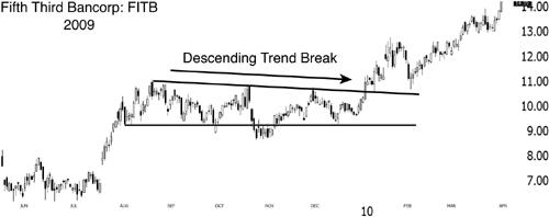
Chart courtesy of Worden—www.Worden.com.
Figures 7.9 through 7.13 display different trading strategies, along with different capital deployment methodologies, across different time frames. Study these examples and use them for reference as you eventually pursue your own opportunities in the future.
In late 2009, Fifth Third Bancorp had been consolidating under an angular descending downtrend for several months. On January 7, the stock broke above this downtrend and proceeded to pursue a multimonth rise. An anticipatory trader could have taken this trade ahead of the break, setting a stop below the previous November lows, while a reactionary trader could have moved in when the stock broke and closed above this line. Each trader would have secured a hefty profit over the next several weeks as the stock advanced.
Figure 7.10 Potash breaks above a lateral trend line once acting as resistance.

Chart courtesy of Worden—www.Worden.com.
In the early part of 2009, Potash had established a lateral trend going back to late 2008. The stock was not able to break this lateral trend until May 2009, when it moved approximately $10 from its initial break point. Once again, both the anticipatory and reactionary trader could have secured hefty profits on the trend break within a few short weeks. The stock did, however, revert back to its breakout level in June 2009, which would have stopped our disciplined traders and left them with at least partial profits on the trade.
Figure 7.11 Exxon Mobile breaks below an ascending angular trend once acting as support.

Chart courtesy of Worden–www.Worden.com.
All throughout 2009, Exxon Mobile used an ascending angular trend for support, as noted in Figure 7.11. In January 2010, however, the stock broke below this line, falling almost 10% before its recovery.
Figure 7.12 Chesapeake Energy breaks below an ascending angular trend once acting as support.

Chart courtesy of Worden—www.Worden.com.
Chesapeake Energy had already fallen a great deal from its all time highs in August 2008 prior to a relief rally that developed an ascending angular trend. In September 2008, the stock gapped below this line, never to see this area again. Observing the angular trend development, an anticipatory trader could have moved in with a short position ahead of the reversal, placing a stop above the previous July highs, while a reactionary trader could have moved in when the break occurred. Once the ascending trend line was violated, the stock suffered a considerable decline, which would have resulted in significant profits for each trader.
Figure 7.13 The NASDAQ 100 breaks below a multi-year ascending trend line once acting as support.

Chart courtesy of Worden—www.Worden.com.
Many times, observing the weekly charts of the indices will be of great help as you evaluate the overall market health. Figure 7.13 displays the weekly chart of the NASDAQ 100 from its 2002 low through 2008. Once the index breached this line, the selling picked up significantly, signaling the end of a multiyear uptrend. If nothing else, this could have been used as a significant warning sign that a bear market was imminent and appropriate action could have been taken.