
CHAPTER 7
Kids 8–10: The “Cool” Factor
Provide Instructions After Failure
“Poopyhead” Is a Perfectly Acceptable User Name
Hudson, Age 8
It doesn’t stop being magic just because you know how it works.
—Terry Pratchett
When kids reach age 8 or so, you start seeing a big shift in terms of cognition, confidence, and independence. They’re not little kids anymore, dependent on parents and teachers; in fact, in certain areas, they are more sophisticated than the adults in their lives. They’re starting to understand, accurately, the ramifications of their actions, and they realize that the world doesn’t end when they don’t play by the rules. This feeling is extremely liberating for the pre-‘tweens. You’ll see a resurgence in insecurity in the 10–12-year-olds, but the 8–10s are ready to take over the world. Look out.
Who Are They?
Children in the 8–10 range are pretty complex. They like being seen as the authorities on their favorite topics; they enjoy the “shock factor” that comes with really crazy, gross, or annoying things; and they are much less concerned about what others think of them than the 6–8s were. Table 7.1 highlights some of the 8–10 characteristics.
Getting Away with It
All this added confidence and knowledge can lead to a sense of invincibility among 8–10s. They’re not particularly afraid of anything online, since it’s an area they play in all the time and are inherently comfortable with. Couple this with an increased focus on identity awareness, and you’ve got a potentially dangerous situation on your hands. Kids as young as age 8 are accessing social media sites and apps and are being “friended” by folks they don’t know. As designers, for both kids and adults, we have increased responsibility to look out for our young users. This may be the most important aspect of designing for 8–10s.
Now let’s take a look at each of the characteristics in Table 7.1 and see what they mean when designing for 8–10-year-olds.
TABLE 7.1 CONSIDERATIONS FOR 8–10-YEAR-OLDS
8–10-year-olds… |
This means that… |
You’ll want to… |
Like to be the experts. |
They don’t read instructions; they just jump in and start doing. |
Use post-failure messaging to teach instead of up-front directions. |
Can take into account multiple aspects of a problem in order to solve it. |
They like more complicated, challenging interfaces that require them to think. |
Keep the level of complexity relatively high, but not impossible to figure out. |
Can tell the difference between ads and actual content. |
They’re starting to dislike and distrust ads. Ads that are too numerous/too big can cause them to abandon an experience. |
Create a real visual separation between ads and content. |
Are starting to realize that adults don’t have all the answers. |
They feel more empowered to push back on rules, ideas, and directions. |
Invite them to be silly. Provide opportunities for nuances instead of black-and-white rules. |
Are confident enough with their interpersonal skills to be less frightened of strangers online. |
They’re more open to chatting online with people they know and those they don’t. |
Be very careful about how you introduce social elements. Even if they seem harmless, kids will find a way to get around them. |
Have figured out that if they fib about themselves online, chances are no one will know. |
They fib about their identity online, usually about age but sometimes about other stuff, too, just for the thrill of doing something illicit. |
Put less emphasis on identity and more on self-expression and accomplishment. If you need age-gating, use parental opt-in to get demographic info. |
Provide Instructions After Failure
“Failure” is probably not the right word to use here, but it’s how kids will see their initial attempts to master an interface. Unlike our 6–8s, our 8–10s don’t look for instructions before beginning, so they might not be completely successful the first time they use your design. While a 6-year-old probably won’t try something without adequate direction, a 9-year-old will size up the interface, determine if it’s worth his time, and jump right in. This presents a huge opportunity for teaching—after the kid fails the first time.
Using confirmation and error messages to provide incremental instruction is very powerful for this age group. And most kids’ sites aren’t doing this. Since children aren’t reading directions before starting, why not use follow-up messages to teach?
I did a research study several years ago for Pepperidge Farm’s Goldfish Fun site. The site does a great job of providing up-front instructions, but it misses a teaching opportunity with its follow-up messaging. The 9-year-olds I worked with opened the games and immediately started playing, ignoring the directions. When I asked about the directions, most of the answers included something like “Oh, this looks easy. I’ll just start playing,” or “I’m really good at these kinds of games.” When the kids didn’t perform as well as they’d liked on the games, some of them got discouraged and looked for help, while others gave up and moved on to different games altogether.
Eventually, kids gravitated to Goldfish Fun’s Catapult Chaos—a physics game that lets players control the angle and velocity of a virtual marble launched from a spoon to knock down a bunch of items (see Figure 7.1). Kids have to try and knock down as many of the items as they can.
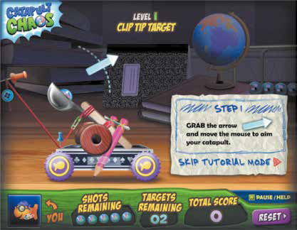
Kids ignored the contextual help on Catapult Chaos and clicked the “Skip Tutorial Mode” button to start playing.
Catapult Chaos followed all the rules for designing for kids. Instead of a lengthy instruction screen, it presented contextual tips for mastering the game. It demonstrated how to play through animation. But the kids ignored all of this. They just wanted to play.
During the research sessions, one little boy played this game almost the entire time. In fact, the only way I was able to tear him away from the computer was to show him the American Express gift card I had for him to thank him for his participation. He kept tweaking the position of his spoon and the power of his marble launch repeatedly to see if he could achieve the Total Takedown Bonus, awarded when the player knocked down everything at once. His tweaks were mostly random, though, and his frustration increased whenever his score decreased. He clicked on the “Help” link, but the instructions there were too general to provide any real assistance (see Figure 7.2).

Catapult Chaos’s instructions are too general to provide help on how to improve your score.
No messages appeared during game play, and he didn’t see any type of confirmation except for a basic “nice job!” after he finished the level. He would have been able to increase both his knowledge and his score if messages were displayed periodically during the round, saying: “Try increasing your power meter this time!” or “What would happen if you tilted your spoon a little further down?” The goal here is not to provide a cheat or to minimize the exploratory aspects of the experience, but rather to set kids up for success in a meaningful way.
NOTE FOLLOWING UP
Using follow-up messaging as a teaching tool works for adult audiences, too. Think about the last time you filled out a form online. Did you read instructions before beginning, or did you just start entering your information? If you missed a field or entered incomplete data, did you get a general “Oops, try again” message, or did you get specific instructions on what you did wrong and how to fix it? Which did you prefer?
A team I worked with at Comcast designed an interface allowing customers with subscriptions to watch programs online. The first iteration of this system was really complicated, due to technical limitations and legal complications. Customers had to download and install two different pieces of software and log in three times. The team designed a really helpful set of instructions, but during usability testing learned that no one was reading it; rather, customers were waiting for context-based feedback to help them correct their mistakes. The team revised its approach and created a series of highly personalized “error” messages that essentially coached customers through the process. People were still frustrated, but the frustration was markedly less when the messages provided explicit information on how to recover and proceed.
Up the Complexity
Last year, I led the “Bring your kids to work day” activities at Comcast. I got to “teach” twenty-five 8–10-year-olds and their parents how to design apps. For the first part of the session, I interviewed the kids about their favorite apps. Most of these apps were games, and the games were of surprisingly high complexity, like Jelly Car, Doodle Jump, Plants vs. Zombies, Angry Birds, and Minecraft. The kids cited very few educational apps or apps that were designed specifically for kids. And when it came time for them to sketch out their ideas for new apps, the level of complexity they wanted to include was impressive. One 9-year-old (whose dad, it must be noted, is a brilliant software engineer) sketched an idea for a game that was a combination of Angry Birds and Plants vs. Zombies. It was basically impossible to play, given his explanation, and the kids were more excited about this than any of the other ideas presented.
This doesn’t mean that, as designers, we should create games and apps that exist only to be difficult. Rather, for our 8–10s, we should think about activities that require dexterity, skill, accomplishment, and the ability to improve over time. If the value proposition’s high enough, kids will be incredibly loyal players, at least until the next cool challenge comes along.
Let’s take a look at Pocket Frogs, an app that lets players discover, breed, collect, and trade frogs with other players.
Pocket Frogs is pretty complicated. You collect frogs, feed and care for them, and then breed them to create even rarer species. There are all kinds of rules around which frogs can be bred with other frogs (see Figure 7.3).

Pocket Frogs’ complex set of breeding rules appeals to 8–10-year-olds.
The great thing about Pocket Frogs is that the interface itself is pretty intuitive, but the rules are quite complex. There’s a whole currency system—including money, potions, and stamps—that users must figure out in order to buy stuff to keep their frogs happy. Players also have to learn which frogs are comparable in worth to other frogs in order to make reasonable trades. It’s a game that can take awhile to master, but provides the opportunity for immediate and ongoing reward. Some 8–10-year-olds like this. They’re not necessarily looking for a game or app that they can master right away. Younger kids love repetition and prefer to excel immediately at something that they can accomplish over and over again. When kids turn age 8 or so, they like games that provide more of a complex “journey,” where they can continue to learn, grow, and discover over time.
Ads Aren’t Content
Until kids reach age 5 or so, they’re unable to tell the difference between commercials and regular TV programming. This is a real problem for parents and educators, because it’s difficult to raise media-literate kids if they’re constantly targeted by advertisers without understanding why and what it’s all about. In 1992, the Children’s Television Act imposed rules around advertising for kids, mandating that among other things, commercials for licensed character toys should not be shown during the programs featuring the characters—so, GI Joe toy commercials can’t be shown during GI Joe cartoons. The rules have since become more stringent, and some channels featuring programming for very young children don’t permit commercials targeting kids to be shown at all during these shows.
Fortunately, guidelines around TV and online advertising for kids continue to evolve. CARU, the Children’s Advertising Review Unit, a U.S. organization with members across government, advertising, programming, and the private sector, publishes the Self-Regulatory Guidelines for Children’s Advertising with information on complying with various government advertising and privacy rules. They also route consumer complaints to the proper government agencies.
Despite all these efforts, some unscrupulous advertisers/programmers still manage to get ads through. The good news, however, is that the 8–10s are pretty savvy when it comes to advertising. In fact, they’ll react negatively when they see an ad unit crop up in a content area. Good news, except if you rely on ads to keep your site or app afloat.
The answer? Well, it’s complicated. The best thing to do is to acknowledge the existence of ads within your experience and call them out clearly so that kids can ignore or process them as they see fit. Advertisers will want to be in compliance, so they’ll most likely agree to the visual treatment you place around their ad units.
The Campbell’s Soup Company’s kid sites do a good job calling out advertising. They use an indicator, called “Ad Nooze,” to identify the components of the site that are trying to sell instead of entertain (see Figure 7.4).

On the Goldfish Fun site, an “Ad Nooze” indicator tells kids that they’re looking at an ad.
Kids using the Goldfish Fun site understand that whenever they see the “Ad Nooze” indicator, they should put their savvy consumer hats on. Nickelodeon also pops up an indicator for ads, but theirs is much more subtle (see Figure 7.5)

Nick.com’s advertisement indicator is very small and blends into the background.
Nick.com is following CARU guidelines, but to the minimum. The word “ADVERTISEMENT” is pretty small, and a bit hard to read. Kids will figure out that this is an ad, but will be more likely to get annoyed that it’s interrupting their content experience. It’s best to clearly identify the ads within your interface, to meet user needs and be in compliance with government regulations.
“Poopyhead” Is a Perfectly Acceptable User Name
Kids learn, at around age 8, that adults don’t always have all the answers and can sometimes be—shockingly—wrong. Instead of tacitly acknowledging this and moving on, kids tend to exploit this by pushing back. They taunt the adults in their lives with curse words they learned in the playground, they scare younger siblings with dead bugs, and they break the rules they think are dumb. While it can be hard for parents to deal with these behaviors, as designers, we have a responsibility to encourage them and let these kids rule, at least within our environments. By permitting kids to break the rules within the experiences we design, we’re validating their intelligence and sophistication in the safe confines of a digital space.
Of course, you don’t want the interface you design to be a free-for-all. You want all your users to feel comfortable. As a result, you’ll want to curb the particularly outrageous behaviors while encouraging the silly, harmless ones.
A good way to do this is to give kids creative license when developing their online personas. If you let kids pick ridiculous user names (as long as these don’t include obscenities or personally identifiable information), they’ll feel as though they’ve trumped the system and pulled one over on the adults who are behind the experience. And they’ll feel a secret thrill every time they log in with the name “poopyhead.”
ROBLOX is a fantastic site where kids can create their own virtual worlds for other players to explore. They can build and program items within the world to have specific behaviors, to match their grandiose imaginations. In short, they can create a world in which anything is possible. And, while the name “poopyhead” is already taken, ROBLOX is quick to provide creative alternatives (see Figure 7.6).

ROBLOX lets kids be creative when picking user names.
Another great way to let kids be the authority is to support unconventional behaviors within your experience. While the 6–8s get really uncomfortable when rules are broken, they also love it. Why can’t the crazy zombie pop out of the tree trunk and scare the next-door neighbor? Or why can’t the cat sprout wings and land on the teacher’s head?
ROBLOX, although its interface is confusing, lets kids pretty much create and build any type of environment they want, with their own rules around behaviors, activities, and physics (see Figures 7.7 and 7.8). It is based on the concept of Constructionism, which maintains that kids learn concepts like logic, language, and math as they build things on their own.

Kids can build their own ROBLOX worlds.

Kids can add and delete items from their ROBLOX worlds.
NOTE THE THEORY BEHIND IT
The theory of constructionism was developed by Dr. Seymour Papert, a professor and mathematician at MIT. Dr. Papert is considered one of the top authorities on technology and learning. In his book, Mindstorms: Children, Computers, and Powerful Ideas, Dr. Papert describes how kids learn complex concepts in mathematics, logic, and language by creating their own computer programs. It’s definitely worth a read for anyone interested in educational technology.1
Despite its overall awesomeness, ROBLOX is pretty hard to use across the board. It’s got a steep learning curve, despite the common icons and symbols it uses to communicate functionality. A typical 9-year-old will have a difficult time figuring out how to get started building stuff. I got confused simply trying to move items around on the screen, and somehow invoked the situation in Figure 7.9.
I do like how the system provides feedback on the user’s actions after she performs them. Although kids like to jump in, do stuff, and learn how to improve after failing, I’m not sure a 9-year-old would be able to understand what to do here. It would be great if the error messages in the ROBLOX code contained some teaching information, like “This means you need to close the builder menu before continuing.” Overall, though, the idea and spirit behind ROBLOX is exciting and inspiring. Letting kids build and explore their own environments supports how the 8–10s behave and allows them to be experts within their own domain.

I have no idea what this screen is telling me.
Of course, you may not have the ability, budget, or license to design a completely open system where kids can control the behavior of their characters or elements. However, you can incorporate some of these ideas on a smaller scale. Let them be silly, give them chances to run the show even in small bursts—for example, user names, avatars, and so on—and celebrate their unconventional behaviors and ideas.
A Matter of Trust
While the 6–8s are scared of people they don’t know, the 8–10s tend to be more gregarious and social, especially online. Since the Internet is a domain they know, better, possibly, than the adults in their lives, they’re pretty confident in their abilities to use it. This confidence includes communicating with people online. How can a device as trusted and well known as a computer or tablet hurt them in any way, especially given their expertise in the space? As a designer, you need to be aware of this, not just when designing kid sites, but when designing any site with a social component.
I did some research using the Club Penguin site about a year ago. One 8-year-old boy, who was uncharacteristically reluctant to communicate with other players, even using the canned chat mechanism, told me a story about how his sister, who was 10 at the time, gave the family phone number to a man she met online. The man called, their dad answered the phone, got the guy’s number and gave it to his brother who happened to be an FBI agent. Uncle FBI Agent came over the next day and scared the crap out of these kids about giving personal information out online. “If you talk to people online, they’ll find out where you live and come to your house and steal your stuff,” the kid told me.
Most of your users probably won’t have FBI agents in their family, but it’s still your responsibility (and legal obligation) to protect them online.
So how do you engage these outgoing, social, technologically confident kids in your designs? Carefully. Age-gating and parental consent aren’t enough, because, as you’ll see in a bit, these kids fib (aka outright lie). If you’re designing a site for kids, “social” should only be a component, an enhancement to your site’s main purpose. Kids will emphasize the social piece if they find the rest of the experience boring or “too babyish.” To them, being social online means being mature and grown-up. Those are the main value propositions of any social component for kids. So, if you make your experience itself feel “grown-up,” the social component will be less of an allure. To do this, you’ll want to make sure that your design isn’t patronizing or condescending, and you should use simple, plain language that doesn’t try too hard to sound cool.
Everloop is a site designed to give kids between 8 and 13 the “social network experience” within a safe, monitored, parentally controlled environment (see Figure 7.10). The concepts behind it are really strong. Kids can join various “loops” to communicate with like-minded people, and parents can control the level of engagement their kids can have, restricting IM usage and requesting notifications when their kids make new friends.
This is all very good. However, what the site’s design communicates is, “Hey kids, you’re too immature to use ‘real’ sites like Facebook, so here’s this lame, dumbed-down version with music and videos, because that’s what you kids like.”

Everloop’s goals are noble, but its design talks down to kids.
This site was clearly designed by well-meaning adults who believe they know what kids like and want. Using the phrase “Just for Us,” while communicating the value proposition of the site, will deter kids from engaging, since it’s so obviously targeting kids. Kids will gravitate toward the chat and networking functionality here since the self-referential games, goobs (pranks you can play on your friends), and videos are presented in a rather condescending way. Using a color scheme that’s similar to Facebook, and including functionality that’s similar to Facebook, merely reinforces the fact that this, in fact, is not Facebook, but rather a “lite” version. This is the kind of site that parents love and kids hate.
If the design focused more on what it offers instead of pushing the “for kids” angle, kids would be more excited to participate in the loops and features and less interested in the chatting and messaging components. And thus, they’d be less likely to chat with people they didn’t know, simply for the sake of doing so, and focus more on the common interests and elements that brought them together.
It’s OK to Lie if Nobody Gets Hurt
I remember the first time I saw a kid fib in a user-research session. Alyssa was 9, and we were looking at sites that required registration in order to play games. When filling out the registration form, Alyssa said she was 11, and that she lived in New Jersey, not Pennsylvania. These little fibs were minor, and would have no impact on the site Alyssa was trying to access. I asked her why she had lied. “Well,” she said, “It’s okay to lie if nobody gets hurt.” When I probed further, Alyssa explained that she really didn’t know why she had lied about her age and state, but she just “felt like it.”
This happens a lot. The idea of lying about who you are online and having nothing bad happen because of it is extremely powerful to these kids, who, for the most part, are honest and well meaning in their real-world interactions. There’s a certain thrill associated with saying you’re 11 when you’re really 9. This situation presents interesting implications for designers, even when designing experiences meant for adult audiences, because ultimately, you never really know who your users are.
Kids will mostly lie about who they are, not about what grade they’re in or what their interests are. They also tend to stay true to their gender, since that is such a key component of their identity. But things like age, location, and physical appearance are completely up for grabs.
This isn’t necessarily a bad thing. Experimenting with these things in the context of the Internet lets kids explore concepts of identity in a relatively safe environment. Where they run into trouble is on sites like Facebook, where kids have to be at least 13 in order to participate. In this case, a little white lie can lead to unwanted interactions. There are rules and regulations for these types of environments, but it’s hard for site administrators to weed out everyone who may or may not be lying about their age, as this could be almost anyone. And since most sites’ Terms and Conditions and EULAs (end-user license agreements) are walls of text, few people, let alone kids, read them all the way through.
The best way to get around this is to emphasize the more interesting aspects of identity and downplay characteristics like age and location. Collecting demographic information is important when deciding what content to show to specific users, or for marketing purposes, but if you place less importance on this and more on the other components of a child’s identity, you’ll reduce the likelihood of harmless fibbing.
The Candystand site, geared toward kids ages 8 and up, has a pretty standard registration process (see Figure 7.11.)

Kids will probably lie about their age on the Candystand registration page.
Chances are, if kids are going to lie, they’ll put in an incorrect birthday here. The form is simple enough, but asks for just enough information to be annoying. Kids don’t understand why they have to register to use sites anyway, and if they feel like they’re being judged because of their age, or that they might not be able to use all site features if they’re too young, they’ll make up a birth date.
A better approach here would be to put the emphasis on the user name, since that’s where kids can be most creative. They can create a password and then do something fun, like pick their Zodiac sign, or click an image of what the weather’s like on their birthday. They can then select the year. Letting them be creative in other areas of the registration process will make them less likely to want to be creative in selecting their birth year or location. If you need a parent’s email address, make a space for them to enter it, but create some basic features of the site that they can use without parental consent. When they try to access an area that requires a parent’s approval, you can then prompt them for the email address. This breaks up the process while still setting them up for success. Which, ultimately, is your primary goal as experience designers.
Oh, and that Facebook module on the right? As we discussed earlier, Facebook’s Terms & Conditions mandate a minimum age of 13 in order to use their services. When you’re designing for kids, and your experience requires registration, don’t encourage them to sign in with a Facebook account. It doesn’t matter that some of them already have Facebook accounts. You’re encouraging them to violate the T&Cs, and that’s probably not a great idea. Build your own registration process. If kids are excited enough about what your site will let them do, they’ll register. And if you design wisely, they’ll even use real data.
PARENTS ARE USERS, TOO
If you’re a parent of a child between the ages of 8 and 10, chances are you’ve seen a parental opt-in email. These messages alert parents to the fact that their children have signed up to use a site with a community component, where they can save or store personal data, artwork, or photos, or where they may be able to interact with others. These messages also give parents basic information about the site’s goals, mission, and benefits, as well as how they can access the site and see what their child has been up to.
Most of these emails have long disclaimers, privacy policies, terms and conditions, as well as detailed information about how to monitor their child’s behavior. I haven’t seen many instances of well-designed parental opt-in emails, but the folks at DIY do a great job with theirs (see Figure 7.12). Written in plain language, this opt-in message tells a story—what the site is, how it works, and what role their child plays in the overall experience.
The basic grid, big and clear buttons, and easy-to-read text ensure that parents will actually take a few minutes to understand how it might benefit their child to use DIY. If the email were more cluttered or filled with more legalese, parents might be less likely to give their consent for their children to participate. But with this email, DIY shows it has nothing to hide. While COPPA only requires that a company send an email, if you, as a designer, pay attention to the design and messaging, it will help busy parents cut through the clutter and understand what their kids are doing online.

DIY’s parental consent email helps parents understand the site’s purpose.
There’s been lots of controversy lately on toys, games, and interfaces targeting girls. While I believe it’s lazy and presumptuous for toy companies to slap pink on something, dumb it down a little, and call it “For Girls,” there are marked differences in how girls and boys prefer to play. Girls tend to prefer games requiring exploration, discovery, and collaboration while boys prefer competition, action, and advancement. Also, boys like to use their advanced spatial skills during play while girls prefer to use complex reasoning.
To get past this, you should design as you would for adults, by understanding your target users’ needs, behaviors, and attitudes. Design for how kids play, rather than who they are. For example, if you want to create an experience that appeals to girls, develop complex problems for them to solve based on relationships and connections. Webkinz does this well, as does Pocket Frogs—kids have to control multiple variables to keep their pets happy and safe, which is the ultimate value proposition (see Figure 7.13).

Webkinz’s emphasis on connection, care, and discovery appeals to the way that girls play.
If you want to create experiences targeting boys, include more opportunities for traditional game-play focusing on immediate gratification, timed competitions, races, and anything “physical” (knocking stuff down, blowing stuff up, and so on). Tank Hero (best for kids 9 and up due to some mild violence) definitely accomplishes this (see Figure 7.14).

Tank Hero focuses on both strategy and physical ability, which boys enjoy.
Chances are, if you’re designing an experience for kids, you’re looking to meet the needs of both genders. You’ll want to examine the overall project and user goals and determine which experience would best accomplish them. If your goals are broad, like “learn multiplication,” you’ll have an easier time crafting experiences involving both action and discovery. If your goals are more specific, like “create complex structures using all these different parts and share them with others,” you’ll want to think about the behaviors these goals support and design accordingly.
Like design itself, gender differences aren’t black and white. Girls enjoy shoot-‘em-up games as much as boys like exploration. The key is to make sure that your interface supports differences in play style, skills, and preferred behaviors of your users.
Chapter Checklist
As you’ve seen, designing for 8–10-year-olds is a completely different endeavor than designing for younger—and, as we’ll see in a moment, older—kids. When creating sites and apps for these children, make sure that you address the following information.
Now let’s take a look at the oldest age group, the 10–12-year-olds. As you’ll see, these guys are very complex and sophisticated, with highly developed cognitive skills, but they still need some special treatment when it comes to design.
Favorite App: Fluff Rescue
Iris is a very sophisticated 9-year-old. She loves to read, draw, hang out with her friends, peruse the New York Times Health section, and play games on her family’s iPad; preferably, games that involve a lot of complex problem solving. “I like games that keep on going and that don’t just end,” she said.
Iris’s current favorite is a game called Fluff Rescue (see Figures 7.15 and 7.16). “I like it because it feels like you’re helping,” she said. “You’re giving a pet with no home a home, and you get to raise them. You feel satisfied because it means you’re helping.”

Fluff Rescue lets kids adopt, build homes, and care for pets.
The premise? “You get to adopt animals and keep them in your backyard or sell them. Animals wander around, and when you see one you want to adopt, you click on it to buy it. If you have enough money, it goes into the station for what its condition is to get healed.” The app has a complex currency system that Iris has figured out: “Money is worth a lot more in Fluff Rescue than it is in a game like Dragonvale because things cost less. So 5,000 coins probably equals 100,000 coins in Dragonvale. It’s simple. You don’t get as much money in Fluff Rescue.”
Helping animals, solving problems, making money, and discovering story lines are all part of what makes the game exciting for Iris. “You have to learn to understand stuff and make choices. You have to decide whether to buy something that costs more money if you think you’re going to get more money.”

Kids have to make sure their pets are fed and happy in order to earn currency in Fluff Rescue.
Iris approaches games and apps the way many 8–10-year-old girls do—she finds one she loves and plays it whenever she gets the chance. She immerses herself in the experience over time and finds reward in the small achievements of caring for a pet and finding it a home. And Fluff Rescue lends itself perfectly to the schedule of a kid busy with school, family, extra-curricular activities, drawing, and reading. “When I find an app I like, I play it a lot. I collect money every day. When I get a new game, it becomes part of tradition. It’s like brushing my teeth or washing my hands.”
In addition to apps, Iris likes dorkdiaries.com because it lets her delve deeper into the Dork Diaries book series, learn more about the characters, read the blog, and get updates. “Dork Diaries is for older kids, because the books are longer, and they have complicated problems.”
The themes that Iris looks for in the apps she downloads are narrative, continuity, problem-solving, balancing complex needs, and earning/exchanging currency. Some of this speaks to gender, as girls tend to prefer the detailed and complex to the quick and exciting, but it also reflects cognitive maturity and the need for greater challenges.