
CHAPTER 4
Kids 2–4: Little People, Big Expectations
Assign a Single Behavior to On-Screen Elements
Maintain a Strong Separation Between Foreground and Background
Make Literal Use of Pictures and Icons
Support, Don’t Enforce, Gender Differences
Emerson or Easton, twins, Age 4
We must teach our children to dream with their eyes open.
—Harry Edwards
Kids between ages 2 and 4 are fascinating. They’re transforming from babies into real little people. They’re developing opinions, preferences, and personalities of their own. They’re starting to express their feelings through words. And they’re wonderful to design for, because they haven’t yet formed assumptions about how the world should work.
In this chapter, we’ll talk about how to design for these kids. We’ll look at who they are, what they like, and how to create experiences that appeal to their physical, emotional, and cognitive skills.
Who Are They?
Let’s take a look at some key characteristics in Table 4.1 that shape the behavior and attitudes of 2–4-year-olds and how these might impact your design decisions.
When creating experiences for 2–4-year-olds, you’ll need to remember that these kids are just figuring out how to use technology. They haven’t developed expectations about how things should work yet. You’ll have lots of opportunities to be creative with this group, but you may need to reconsider some basic visual and interaction design principles in order to design an experience that meets their needs.
Let’s go through each of the items in Table 4.1 to understand the implications that these elements have when designing for 2–4-year-olds.
Create a Clear Visual Ranking
Children in this age group can’t easily tell what the “important” parts of an interface are. They tend to click on just about everything to see what happens; it’s all part of the game for them. So you’ll want to create a strong visual separation between the elements that users can interact with and those they can’t.
Let’s look at two examples from kids’ TV show websites. The first example, from the Caillou website, shows how a clear hierarchy makes it easy for kids to tell what they’re supposed to click on. The second example, Angelina Ballerina, shows what happens without this visual ranking and how this can be confusing for young children.
TABLE 4.1 CONSIDERATIONS FOR 2–4-YEAR-OLDS
2–4-year-olds… |
This means that… |
You’ll want to… |
Focus on details instead of the “big picture.” |
They can’t distinguish main elements of an interface from the details. |
Create a very clear visual distinction between interactive items and design extras. |
Can rank items by only one characteristic at a time (i.e., color, shape, and so on). |
They get overwhelmed when there are too many variables competing for their attention. |
Pick a smallish set of easily identifiable elements (like colors) and use them consistently throughout your design. |
Can only associate a single function with an item or object. |
If an item expands or makes a sound on rollover, they’ll believe that’s the sole purpose of that item and won’t know to click on it. |
Limit the behavior of your navigation elements to navigation (for example, don’t have them pop up or make noise). |
Can only see items on a screen in two dimensions, not three. |
Everything on a screen looks like it’s in a single, flat plane to them. |
Make your foreground items much clearer and more detailed than stuff in the background. |
Are just learning to think abstractly. |
They are unable to understand icons and symbols that are second nature to adults. |
Use icons that are highly representative of the task you’re trying to communicate. |
Use sound to identify items in their environment. |
They get confused when different sounds have different meanings (for example, a police siren and an ambulance siren). |
Make sure that every sound you use has a specific meaning and function. |
Are starting to develop their own identity. |
They develop a sense of self at around age 2, complete with gender identity, which forms very early. |
Create a design that allows for gender identification without forcing kids down a specific gender path. |
On the Caillou site, kids can launch mini-games from items in the environment. Almost all the elements on the site react in some way, but only the ones with the white borders have games associated with them (see Figure 4.1). This visual distinction is easy to recognize, even without the accompanying voice prompts.
In Figure 4.1, the dollhouse and train, which have white borders, launch games when clicked. The items without the borders (for example, the rug, sun, and bookshelf) animate when users mouse over them, but they don’t open any additional functionality. This distinction makes it easy for kids to learn how to access the games and to remember what to do on return visits.
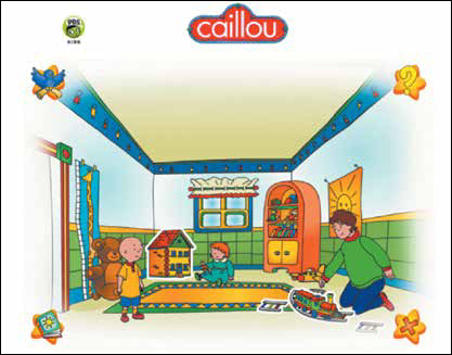
It’s easy to see that items with white borders on the Caillou site will launch games.
It’s important to note that kids under age 6 tend to associate only one behavior or action with an object, which means that to an average 4-year-old, if something on the screen moves when he touches it, that’s all it’s supposed to do. So you’ll want to make sure that your navigational items look clickable, but don’t do anything too interesting to detract from their purpose. We’ll explore this in more detail later in this chapter.
On the Angelina Ballerina site, children can launch various activities by clicking the windows in the schoolhouse; however, it’s really hard to figure this out. Only by mousing over the windows and waiting for an overlay to pop up can users tell if there is an activity there or not (see Figures 4.2 and 4.3). This visual hierarchy is confusing to kids, because everything on the screen looks the same and seems to be of the same level of importance.

On the Angelina Ballerina site, kids have to roll over the windows to find out how to play the games.

The overlay with words on Angelina Ballerina is the only way that users know they can play a game. Unfortunately, most of these users don’t read yet.
If the clickable windows in the above screens were highlighted or differentiated in some way, it would be easier for kids to know what to do. For example, if the mice in the windows were dancing, or were dressed in brighter colors, or were a bit larger, children would know that something would happen if they clicked on them. Currently, their size and colors blend in with the pale background, which makes them hard for a young child to see.
Kids haven’t cultivated the visual filtering skills adults have. They’re unable to understand hierarchy unless it’s clearly communicated through visual indicators. If your interactive elements aren’t prominent enough, kids will have to learn what to click on through trial and error, and you’ll run the risk of alienating and possibly losing your audience.
Use a Few Bright Colors
There is a popular misconception among designers that kids like lots of colors. It’s true that younger children love things that are bright and bold, but actually they prefer a limited color palette and can get overwhelmed if there are too many colors competing for their attention. Because kids between ages 2 and 4 hone in on details instead of the big picture, a design with lots of different colors and shades, as well as textures, makes it harder for them to figure out what to click on.
Let’s look at an iPhone app called Smack That Gugl (see Figure 4.4) to see how the developers have creatively limited their color palette to increase usability for kids.
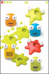
Smack That Gugl does a great job using a limited palette with bright colors.
The premise of Smack That Gugl is very simple: smack the creatures before they explode. The designers of this app used just five colors for their interface. By positioning bright colorful elements on a plain white background, they made it easy for kids to know what to click and touch. If they had used any additional colors, even within the same color family, it would have increased the visual complexity for kids and made it difficult for them to use. Older children look for more visual excitement when it comes to color and texture, but younger ones prefer simplicity.
Color serves as the primary “preattentive variable” for 2–4-year-olds, meaning that they mentally categorize items based on color instead of size, shape, or location. This is true for adults, too, but adults have the ability to continue to categorize cognitively based on other factors as well.
In a similar game called Smack Match Gugl (see Figure 4.5), kids can play against the device, sliding Gugls to the opposite side of the “field” before they explode. The designers rely on color alone—as opposed to shape, size, or orientation—to differentiate between the two “teams” of Gugls. This colorizing puts much less cognitive burden on little users, as they can easily identify which Gugls are on their team and which are not. It also ensures a greater level of success for them as they play the game.

Smack Match Gugl uses color to help its young users categorize.
PARENTS ARE USERS, TOO
As adorable as the Gugl game is, it makes a lot (A LOT) of noise. It also occasionally pops up messages asking the user to sign in to the GameCenter. For parents who “pass it back”—for example, hand tablets and smartphones over to kids as a form of distraction for a long car trip or in a restaurant—it’s really annoying to have to constantly reach back and close a dialog box or correct an error. These messages can have financial and privacy implications as well, particularly when they ask for access to Facebook accounts, photos, location data, or permission for the user to make in-app store purchases. When designing apps for kids, make sure there are “set it and forget it” parental controls for things like volume, upsells, and messaging so that parents can set their preferences once and hand the device over without worry.
Assign a Single Behavior to On-Screen Elements
I did some in-home interviews with 2- and 3-year-olds last year and asked them to show me their favorite toys. Most of these favorites were toys with electronic components, like toy laptops, cell phones, or dolls that spoke or sang. When I asked the kids to show me how the toy worked, most of them showed me a single feature of the toy, like a noise it made when they pushed a particular button, or an action it performed when they shook or squeezed it.
The follow-up conversations with parents were very interesting:
“We spent all this money on a toy tablet for Gabriella, but she only does one or two things with it,” said Gabby’s mom. “She likes to push the picture of the fish and hear it say ‘fish.’ In fact, she calls it her ‘fishie machine.’”
“My parents got Leo this little computer,” said Leo’s mother. “It’s supposed to teach him letters and colors and words. There’s one button that makes a loud honking noise when you push it. That’s the only thing this child will do with this computer. He hasn’t learned anything from it, I don’t think. A waste of money, if you ask me.”
This tendency, to associate a single behavior with an object or item, manifests itself in digital environments as well. If an element on-screen makes a noise or jumps around when the child rolls over it, the child is going to think that’s the sole purpose of the element. This becomes especially problematic when designing navigation.
Many designers think that in order to get a child to click on something, that thing needs to attract her attention. As a result, we see navigation buttons highlight, move, and chime on rollover. Unfortunately, that will make young children less likely to click them, as they’ll believe their only function is to highlight, move, or chime. Let’s look at an example.
Daniel Tiger’s Neighborhood is a wonderful TV show with a great companion website that has activities and games for the under-four crowd. Its designers fell into the familiar trap, however, of creating navigation that reacts when a child mouses over it (or, on a mobile device, taps it a single time.) Take a look at the “Printables” button in Figure 4.6. The top navigation bar shows the default state of the button, and the bottom bar shows the expanded and angled button that appears when the user places her mouse on it, on the desktop site.
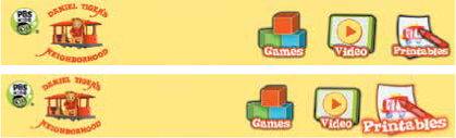
Keep navigation static so kids won’t get confused about its purpose.
Interestingly, when a child uses the Daniel Tiger’s Neighborhood site on a tablet, the navigation changes appear when the child taps an icon, requiring two taps to actually navigate to that section of the site. This further reinforces the idea that the only purpose these images serve is to get bigger and shift position, as that’s all they do when tapped.
I actually witnessed this phenomenon first-hand during a baseline usability test of a kids’ website (and have seen it many times since.)
When designing the site, we thought it would be cute to have the characters in the navigation pop up and make a sound when users rolled over them. During the test, kids got so excited when they saw the characters jumping around that they forgot to actually click on the items to see more content.
Bottom line: If you feel compelled to add audio and animation to your navigation because you think kids might not understand it, you may need to revisit the design of your buttons.
Maintain a Strong Separation Between Foreground and Background
Children are able to see things in 3D starting at around 5 months of age, when both their eyes start working at the same time;1 however, they can’t really visualize a 3D experience on a flat screen until they’re almost 5 years old.2 As a result, it’s hard to figure out how to position elements so as to give them context. You’ll want to make a realistic-looking interface, so these very literal-minded users understand what’s going on, but it’s better to focus on using color and detail for foreground (important) elements and rely on simple shapes and muted colors for background (secondary) elements, instead of designing a fully realized environment.
Figure 4.7 highlights Little Pim Spanish for iPad, where you’ll see that the Panda characters are brighter and more detailed than the background. There is enough visual information in the background to communicate context and representation (for example, you can tell you’re outside on the grass), but it has limited texture and detail to help kids understand that those things are less important.
Let’s contrast that with Handy Manny’s Workshop (see Figure 4.8). This interface will look very flat to a young child. The main characters in the toolbox blend into the background simply because they are at the same level of fidelity as the rest of the screen, which makes it hard for kids to understand what’s in the front and what’s in the back. Instead, it will all look like a lot of clutter, and young users will have a hard time figuring out what to tap.

Little Pim Spanish uses less color and detail in the background to help kids focus on the important parts of the interface.

Handy Manny’s Workshop has a very detailed background, which will make it difficult for kids to identify what it is they need to do.
Make Literal Use of Pictures and Icons
Kids ages 2–4 are just beginning to understand abstract thought. As a result, icons and images common to adults can confuse them. By the age of 3, most of them understand that clicking on an “X” closes a window, and that left- and right-pointing arrows move forward and backward, but this behavior is learned, not understood.
Of course, kids in this age group can’t read, so pictures and icons are even more important. As a general rule of thumb, if you need more than a word or two to describe how something is supposed to work, the interaction is too complicated. You know you’re on the right track if you can identify a representative symbol to communicate your task.
TIP KEEP IT SIMPLE
You’ll know your design is too complicated for 2–4-year-olds if it needs text or audio instructions. Any design—or part of a design—requiring more than a couple of words to describe what kids are supposed to do needs to be re-thought.
The Nick Jr. website uses iconography that’s probably confusing to a lot of young children. Take this control panel from the Backyardigans section, for example (see Figure 4.9.) The game’s icon, a video game controller, isn’t a great choice here, because it represents a specific interaction model unrelated to the website. Kids of this age group may not have even seen a video game controller like this before, as game systems like Nintendo and XBOX target older kids. A better choice would have been an image of a child playing a computer or tablet game, to give the users some information about the types of things they’ll see in that section.
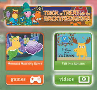
Nick Jr.’s control panel has confusing iconography.
The video icon is confusing, too. Young children don’t yet understand that a green, left-facing arrow means “play.” Also, as we discussed in Chapter 2, “Playing and Learning,” since these kids only see things from their own perspective, they’ll look for something that implies watching a video, not playing a video. The difference is subtle, but important. A TV or video monitor would be a better option here.
Some other options for common icons include the following examples in Table 4.2
TABLE 4.2 APPROPRIATE ICONS FOR 2–4-YEAR-OLDS
Action |
Symbol |
Description |
|
A piece of paper with a picture on it |
|
Favorite/Save |
|
A heart or a star |
Start |
|
A finger pointing |
Finish/End |
|
A stop sign |
Share |
|
Two people sharing something between them |
Volume |
|
An ear, with “sound waves” coming out from it. No sound waves = no sound; 3 sound waves = loudest sound |


For Chapter 10 of this book, I designed a video app to demonstrate how interfaces need to change for kids of different ages. As part of this exercise, I wanted to use a set of icons to represent different subject areas. This ended up being more difficult than I expected, because I needed concrete imagery to represent abstract topics like “communication.” I worked with an illustrator, Shelby Bertsch, on these icons, and we went back and forth several times, as it took awhile to find pictures that did an adequate job of representing the concepts I wanted to include. Looking at the pictures below, you can see how the pictures represent the following topics:

These icons shown in the sidebar may not seem intuitive to you, but that’s because you’re able to think abstractly, and you’re already used to common symbols used in interface design. To a child under 4, these make a lot of sense.
You’ll notice that some of these icons—like the heart and the stop sign—are actually symbols, as opposed to real representations of the actions. However, kids learn these symbols at an early age and have already assimilated them into their cognitive toolbox. When choosing your icons, you’ll want to make sure that you take this into consideration. And, of course, you’ll want to evaluate and test your icon choices with actual kids during the “assess” stage of the process.
Use Clear Audio Cues
Some designers believe that, when designing for young children, everything has to make noise. While it’s true that these younger users like auditory feedback, there has to be a method to the madness. Sound needs to communicate, inform, and instruct, as opposed to simply entertain. It’s better to identify specific conventions for sound types and stick to those rather than to have noises coming from all over the place. This principle is true because kids of this age are only able to associate a single response or action to an element.
You’ll need to be strategic when thinking about how to use audio in your interface. First, identify the types of sounds you want to include, and then figure out a single use for each type. Table 4.3 shows a sample inventory chart that may help you plan how to identify your sounds.
If you’re planning on having lots of sounds, you may want to create a more detailed inventory with columns for characters, elements, specific actions, and so on. Establishing audio conventions relatively early in the design process will help ensure that you use sounds consistently and appropriately, which will in turn help your young users figure out how to use your design. Let’s look at an example.
Sago Mini Sound Box is a phenomenal app designed for toddlers and preschoolers. What makes this app great is that it lets kids interact with the entire device, not just images on the screen. This specific interaction helps improve the child’s gross and fine motor skills and teaches some basic physics concepts as well. The premise is simple: kids first select a sound category and then create different sounds by tapping to add multi-colored circles, which, when dragged, crack open to reveal various friendly household animals. Kids can make all sorts of collective noises by shaking, swishing, and rotating their device so that the circles whirl around and ricochet off the sides of the screen. (Incidentally, this app captivates middle-aged adults as well.)
TABLE 4.3 SAMPLE INVENTORY OF SOUNDS
Sound Type |
Description |
Use |
Voice-over |
Brief sound bites from characters, no more than five-word sentences |
Instruction/explanation/invitation (for example, “Touch the ball to play!”) |
Music |
Short (1–2 seconds), upbeat, continuous tunes |
Beginning/completing a task (for example, winning a game, starting a new activity, leaving a virtual space) |
Beep |
Quick single beep sound |
“Time’s Up” or “Try Again” |
Doorbell |
Loud “Ding-Dong” |
When a new character or element enters the screen |
Click |
Very brief, smooth single click sound |
User action (for example, moving a game piece, pressing a key, or selecting a navigation item) |
Mini Sound Box does a great job with its audio cues, which is especially difficult, given that it’s a sound-creation toy. The designers created a very clear distinction between system sounds and sounds produced by kids as part of the game (see Figure 4.10.) In fact, they limited their system sounds to only the essential pieces of functionality (adding a circle, opening a circle, tapping an animal) and let the kids create the rest of the sounds within the app experience itself. There are no extraneous sounds for selecting a category or navigating back to the landing screen, just little sound files communicating progress to keep kids engaged.
Mini Sound Box features a home screen with no verbal or written instructions, which is an extremely difficult feat. An upbeat song plays when kids open the app, to let them know it’s working and ready for them to play. Big pictures with familiar images enable kids to engage with the app immediately, but tapping these images doesn’t produce additional noise. It just takes kids to the next screen, which shows an adorable cartoon animal ushering in one of the sound circles (see Figure 4.11).

Mini Sound Box uses specific sounds to communicate progress and functionality.
A short animation introduces the concept of sound circles to kids using the app.
Kids can tap anywhere on the screen to add additional sound circles. Depending on the category initially selected, the sounds can be percussion instruments, piano chords, barks, tweets, meows, or cars and trucks. Any movement of the device itself zooms the circles around the screen, releasing a cacophony of wonderfully discordant sounds (see Figure 4.12.)

Mini Sound Box helps children work on their fine motor skills by letting them interact with the entire device.
What makes this an all-around great app for preschoolers, in addition to its clear audio cues, is that it promotes exploration and discovery, has a flow but allows for non-linear play, and provides rewarding visual and auditory feedback with every interaction.
Another wonderful aspect of this app is that it works for kids around the globe, as the sounds used don’t require knowledge of any specific language or culture.
Support, Don’t Enforce, Gender Differences
Children begin to identify gender at around age 2. A child who likes to play with neutral items, like blocks and balls, may start choosing baby dolls and dress-up clothes or superheroes and cars at this age. Neuroscientist Lise Eliot, in her book Pink Brain, Blue Brain,3 explains that these differences in gender identification come from small competency differences in infant brains that are then reinforced by adults. For example, boys’ brains develop certain types of spatial reasoning skills earlier than girls’ brains, while baby girls make eye contact earlier and develop the ability to empathize and communicate earlier. The result? “Boys are better at math,” and “girls are more nurturing.”
At around age 2, children will start developing their own rules for gender behavior (for example, boys like Batman and girls like Cinderella.)
So what does this mean in terms of design? If you’re creating a site meant to appeal to both genders, you’ll want to make sure that you have an equal balance of activities requiring spatial skills and promoting exploration. Keep the characters gender-neutral, like the Gugls, or create an even balance of male and female characters. It’s a good idea, if you’re able, to make your characters non-human, like Disney does with it’s Jungle Junction (see Figure 4.13.)
While these animals have genders, they don’t base their actions on their genders. This design allows children to identify with the characters without siloing themselves into gender-specific behavior patterns.

Disney’s Jungle Junction features animals instead of humans.
Chapter Checklist
Before we move on to designing for 4–6-year-olds, here’s a checklist to help you if you’re developing sites or apps for younger kids:
In the next chapter, we’ll see some shifts in cognition and behavior as we look at slightly older kids and learn how to design for them.
Noah, an adorable bundle of boy, worships everything his 6-year-old brother does. When his brother started playing with LEGO bricks, Noah wanted to play too, but the little pieces were too small for him to actually build anything of substance. He enjoyed playing with DUPLO blocks (essentially, larger LEGO bricks), but he didn’t have the level of concentration to play with them for more than a few minutes at a time.
Noah’s father downloaded some LEGO-themed apps, and Noah immediately gravitated to the Minifigures game, which allows kids to match up the different parts of a minifig and collect entire series. Noah loves the big buttons, the sounds, and, most of all, making crazy mixed-up minifigs (see Figure 4.14).

LEGO Minifigures game lets kids mix-and-match their own characters.
Noah had a hard time answering my questions while he was playing, but when he showed me his father’s iPhone, he kept saying “Series! Series!” I didn’t quite understand what he meant, but then he quickly navigated to the app, opened it, and showed me how he used it to build minifigs. When Noah “correctly” completed a minifig (see Figure 4.15), he showed me the character screen and then the series page, which had a collection of all the minifigs he’d completed to date.
“This is my series,” he said proudly. “These are my guys!”
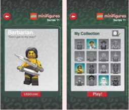
Noah loves collecting minifigs and adding them to the app.
The main themes that surfaced during my time with Noah included discovery, creation, irreverence, and experimentation, with accomplishment a very distant second. He just loved playing on the iPhone and creating funny characters. He understood that the ultimate goal of the game was to add items to his “series,” but like most 2–4-year-olds, his main focus was on the play itself.

Emil Ovemar is the producer and cofounder of Toca Boca, a play studio that makes digital toys for kids. Toca Boca has released 17 titles since its inception in 2010, including the award-winning Toca Tea Party, Toca Kitchen, and Toca Robot Lab. Its newest game, Toca Tailor, won a 2013 iKids Award for “Best Game App—6 and Up.” Emil lives in Stockholm with his wife, Frida, and kids Abbe and Annie.
DLG: I love the concept of “digital toys.” How did this idea (and Toca Boca) come about? How did you decide to make this your focus?
EO: My colleague Bjorn Jeffery and I worked together at a company called Bonnier Group in 2009. He and I were charged with coming up with prototypes and new ideas for existing, traditional media such as magazines and books, but we wanted to do something new. We looked at all the different options and asked ourselves, “What are people already willing to pay for?” When the topic of creating something for kids came up, I was excited, since I had two kids—ages 5 and 3 at the time—and was starting to see how technology could enter their lives. Parents are willing to pay for educational toys and experiences to help their kids, and I saw this as an opportunity to work on something I was interested in that could benefit kids.
I’ve always been interested in the ideas of play and fun, and to design something that incorporated these interests in a visually entertaining way was exciting to me. I did some research on what we could do to engage kids, and what I found was not very interesting. Most of the apps available for kids were either simple games or straight instructional experiences. In observing my kids with my iPhone, I saw that they used the device itself as a toy, and they didn’t seek out particular games or apps. They liked the sounds it played when they touched different buttons and the animations it played when they switched screens. I thought, why can’t we create something that kids can just play with? Why can’t we make a toy from the technology itself?
This led to some explorations around creating a new type of toy, and as a result, a new way to play, using advances in touch-screen technology. Toca Boca was born from these explorations (see Figure 4.16).
DLG: Where do your ideas for games come from? How do you decide which ones to build?
EO: We start with a broad concept and theme and then identify opportunities for play within that theme. For example, with Toca Hair Salon, although hair salons are associated with fashion and beauty, we wanted to focus on the fun things that could happen when you play and interact with hair (see Figure 4.17).

Toca Band lets kids make music in unexpected ways.

Toca Hair Salon lets kids do interesting things with hair.
So we created a bunch of characters, each with a different type of hair, and then focused on all the different things you could do, like cutting, dyeing, washing, and shaving. We concentrated on making these micro-interactions as fun and interesting as possible. So the theme serves as the vehicle for the play, but then the smaller aspects of the theme become the actual game.
DLG: How do you involve kids into your design and development process? What kinds of participatory design activities do you conduct? How much do kids influence what you build and why?
EO: We involve kids throughout the design process. In the beginning, after we identify our concept and theme, we create paper prototypes for small, small aspects of the experience. We use plain paper, or sometimes we use strings on cardboard, and then we put it in front of kids and watch what they do. If they don’t respond, we go back and ask ourselves what we need to change, about either the theme or the interactions.
Sometimes, we’ll put real physical toys in front of kids and then watch them and ask questions. When we were building Toca Train, we gave kids toy trains and just watched how the kids interacted with them and the different things they were trying to do. We kept asking ourselves, what is it that the toymakers have missed that we can do in a digital space? How can we hack the notion of play so kids can do more interesting things?
A great example of this happened when we were working on Toca Tea Party. I cut out a bunch of pictures—of teacups, plates, utensils—and then laid them out on the floor in front of my kids. I thought about things that might happen at a real tea party that might be interesting and unexpected. When I was pouring the juice, I pretended that some had spilled, and the kids loved it. That made me think about how to incorporate these fun little “conflicts” into the overall experience. Kids are great at uncovering these because of their ability to hone in on details.
DLG: What are the most important differences between designing for adults and designing for kids?
EO: When we think about designing for adults, or designing games for adult audiences, we usually think of them having some purpose. For example, there are games that adults play to help them with behavior change, or things that they do to earn badges in a gamification environment. But there are very few things adults do digitally for pure enjoyment. That’s a major difference. Kids learn, communicate, and grow through play itself, whereas adults usually need a larger purpose for doing so.
Another thing that’s different is that feedback is really important when designing for kids. All kinds of feedback. Adults prefer feedback when they do something wrong, or to confirm when they do something right. Kids like to get feedback from a system whenever they do anything at all. They like it when something fun and unexpected happens. Adults don’t tend to like the unexpected. Also, the idea of friction is different from kids to adults. Adults do not like friction; they like the tasks to be as straightforward as possible. With kids, they like a little friction, a little challenge. For kids, something like pouring juice or stacking boxes in a digital environment should have an element of adventure to it. Adults just want to get it done. 