CHAPTER 5
Kids 4–6: The “Muddy Middle”
A little nonsense now and then is relished by the wisest men.
—Roald Dahl
I call kids between ages 4 and 6 the “muddy middle,” because they’re stuck right in between the cute, cuddly preschool children and the savvy, sophisticated elementary-schoolers. They’re too old for games designed for toddlers, but they can’t quite read yet, so they struggle with sites and apps geared toward older kids. Unfortunately, you rarely see a digital product designed specifically for this age group, because they’re hard to pin down, but these little guys are full of ideas, knowledge, creativity, and charisma.
Like the 2–4s, these children are still in the preoperational stage, but they present their own set of design challenges based on where they are cognitively, physically, and emotionally.
Who Are They?
Table 5.1 shows some key characteristics that shape the behavior and attitudes of 4–6-year-olds and how these might impact your design decisions.
You’ll find that 4–6-year-olds have learned “the rules” for how to behave, how to communicate, and how to play. Now they’re looking for ways to bend and break these rules. They understand limitations—angry parents, broken toys, and sad friends have taught them well—but they still take every opportunity to test these limitations. Digital environments provide a perfect place for these active kids to challenge the status quo and learn more about the world around them.
Make It Social
When you think of social design for adults, you may think of experiences that let users communicate and interact with others. The same is true of social design for kids, but in this case, “others” doesn’t have to mean other kids or even other humans. It means that kids need to feel like part of the experience, and they need to be able to observe and understand the interactions of characters in the experience, as players and contributors. Kids at this age understand that individual differences, feelings, and ideas are important and exciting. Showcasing these differences within the experience and directly communicating with users allows this social aspect to come through and provide additional depth and context to interactions.
TABLE 5.1 CONSIDERATIONS FOR 4–6-YEAR-OLDS
4–6-year-olds… |
This means that… |
You’ll want to… |
Are empathetic. |
They’re beginning to see things from other perspectives. |
Make interactions feel more “social,” even if the kids aren’t actually communicating with others. |
Have an intense curiosity about the world. |
They’re very interested in learning new ideas, activities, and skills, but may become frustrated when that learning takes longer than they would like. |
Set attainable goals for the tasks and activities you create. Provide context-based help and support so kids have an easier time processing information. |
Are easily sidetracked. |
They sometimes have trouble following through on a task or activity. |
Keep activities simple, short, and rewarding. Provide feedback and encouragement after milestones. |
Have wild imaginations. |
They prefer to create on their own rather than following strict instructions or step-by-step directions. |
Make “rules” for play/engagement as basic as possible and allow for a lot of invention, self-expression, and storytelling. |
Are developing increased memory function. |
Can recall complex sequences of events just by watching someone perform them. |
Include multi-step activities and games, with more than one main goal (for example, touch the red stars and green apples to get points of different values). |
Sometimes, making something feel social is as easy as presenting it in the first person. When characters, elements, and instructions speak directly to kids, it makes it easier for them to empathize and immerse themselves in the experience.
Let’s take a look at an example from Seussville. The designers of this highly engaging site keep the uniqueness of Dr. Seuss’s characters vibrantly alive in their lovely character chooser. Every character (and I do mean every) from every Dr. Seuss book glides by on whimsical conveyor belts, letting the user pick one to play with (see Figure 5.1).
This character chooser provides a strong social experience for kids, because it allows them to “meet” and build relationships with the individual characters. Kids can control the viewer, from a first-person perspective, to see the visual differences among the characters, as well as personality details that make the characters unique, much like how they’d go about meeting people in real life (without the conveyor belt, of course).
When users choose a character, they are shown a quote, a book list, and details about the character on the pull-down screen to the right. On the left side of the screen, a list of games and activities featuring the character magically appears.
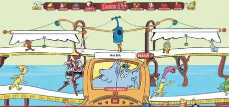
Seussville presents a first-person perspective to kids.

Seussville feels social, even though kids don’t interact with other humans.
This social experience is carried through across most of the games on the site. For example, when users pick the “Horton Hears a Tune” game from Horton the elephant’s list of activities, they can compose their own melody on the groovy organ-like instrument under the supportive eyes of Horton himself. Then, in true social fashion, they can save their tune and share it with family and friends.

“Horton Hears a Tune” lets kids compose music and share it.
Make Learning Part of the Game
As a designer, you know that providing help when and where your users need it works better than forcing them to leave the task they’re trying to complete to get help. This is especially true for 4–6-year-olds, who have a strong curiosity for why things are the way they are and want to know everything right away. Unlike the “school stinks” mentality of earlier generations, today’s kids are fascinated with learning and want to soak up as much information as possible.
This new attitude could be because learning is more dynamic, more hands-on, and more inventive than it’s been in the past, or because computers, tablets, and other digital teaching tools make learning fun. However, younger kids still lack patience when learning takes longer than they’d like. You’ll want to provide short, manageable instructions to make learning fast, easy, and pleasurable, and to incorporate learning into the experience itself.
The Dinosaur Chess app does a great job with structured teaching, as well as on-the-spot assistance to help kids learn how to play chess (see Figure 5.4). Upon launching the app, children get to choose what they want to do. The great thing about Dinosaur Chess is that it’s not just all about chess—kids can take lessons, check their overall progress, and even participate in a “dino fight!”
One perk is how the app links the activities via a treasure-hunt-style map on the menu screen. It gently recommends a progression through the activities (which older kids will follow), but is subtle enough to allow exploration. This feature is great for kids who like to break the rules, because it establishes a flow, yet invites users to deviate from it in a subtle yet effective way.

Dinosaur Chess offers many opportunities for learning.
When users select the “learn” option, they are taken to a screen where an avuncular dinosaur (who, for some reason, is Scottish) talks kids through the mechanics of chess in a non-intimidating way. Since these kids are still learning to read, the designers used voice-overs instead of text, which works really well here.
The lessons are broken up into short, manageable chunks—essential for learning via listening—which let the 4–6s learn a little at a time and progress when they are ready. The children can also try out various moves after learning them, which is particularly effective with younger users who learn by seeing and doing (see Figure 5.5).
If this app were designed for an adult audience, the lessons would be a little longer and would probably include text explanations in addition to the audio, since a combination of listening and reading works best for grown-ups. However, the brief audio segments coupled with animated examples are perfect for younger users’ short attention spans and desire to learn as much as quickly as possible.
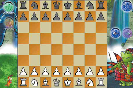
Dinosaur Chess teaches kids how to play chess in short, informational chunks.
My favorite aspect of Dinosaur Chess is its guided playing. At any point during the game, kids can press the “?” button for help. Instead of popping a layer, which many sites and apps do (even those designed for a younger audience), Dinosaur Chess uses subtle animation and voice-overs to show the users what their next moves should be, as shown in Figure 5.6.

Dinosaur Chess uses animation and voice-overs to provide contextual help.
TIP DON’T DUMB IT DOWN
When creating an experience for this age group, don’t fall into the trap of “dumbing down” your design. These kids are more sophisticated than they may appear initially. They’re capable of solving relatively complex problems, they’re able to mentally categorize quite efficiently, they’ve got a decent-sized vocabulary, and they’re technologically savvy. Although they may gravitate toward games designed for younger kids, they’re ready for more complicated interactions.
Give Feedback and Reinforcement
As anyone knows who has dealt with this age group, 4–6-year-olds have short attention spans. This is particularly true of the younger ones, because kids ages 6 and up are able to pay attention for longer periods of time and absorb more information in a single session. What’s interesting (and challenging) about these younger ones is that they get frustrated at themselves for not being able to focus, and then they channel that frustration onto the experience.
A common response to this from designers is: “Well, I’ll make my app/game/site super fun and interesting so that kids will want to play longer.” That’s not going to happen. A better approach is to identify opportunities within the experience to provide feedback, in order to encourage kids to continue.
Here are some ways to keep children focused on a particular activity:
• Limit distractions. With a child audience, designers tend to want to make everything on the screen do something, but if you want your 4–6s to complete a task (for example, finish a puzzle or play a game), then remove extra functionality.
• Break it up. As when you’re designing for 2-4s, it’s best to break activities for 4–6s into manageable components. The components can be a bit bigger than ones you might design for a younger audience, but many clear, simple steps are better than fewer, longer ones. While adult users prefer to complete as few steps as possible, and scroll down to finish a task on a screen, 4–6s like finishing a step and moving to a new screen.
• Make it rewarding. Provide feedback after each piece of an activity is completed, which will help your users stay motivated to continue. If you have the time and budget, use a combination of feedback mechanisms, to keep an element of surprise and discovery in the task-completion process.
Keep It Free-Form
The 4–6-age bracket gravitates toward activities that are open and free-form, with simple, basic rules (and lots of opportunities to deviate from the rules). This changes pretty dramatically when kids hit age 7 or so. At that point, they become quite focused on staying within boundaries and need a certain level of structure in order to feel comfortable. However, these younger kids like to break the rules and test limits, and digital environments are the perfect places to do this.
Zoopz.com has a great mosaic-maker tool, which lets kids enhance existing mosaic designs or create their own from scratch (see Figures 5.7 and 5.8).

An existing mosaic design from Zoopz.com, which lets kids experiment and test limits.

Zoopz.com mosaic-creator enables kids to create their own cool designs.
The nice thing about Zoopz is that it requires little to no explanation in order to make mosaics—kids can jump right in and start playing. This feature is important, as younger ones will get frustrated if they need to listen to detailed instructions before getting started and will likely move on to something else before the instructions are complete. Typically, 4- and 5-year-olds will leave websites and close apps that they can’t immediately figure out. Older kids will hang around and pay attention to directions if the perceived reward is high enough, but young ones abandon the site right away. So if your game allows for free exploration, make sure that it’s really free and doesn’t require lots of information in order to play.
An important thing to note about open exploration/creation: If you’re designing something with a “takeaway,” as Zoopz is, make sure that kids can either print or save their creations. The only thing kids like better than playing by their own rules is showing their work to others. Zoopz misses an opportunity here, because it doesn’t offer the ability for kids to share their work, or print it out to show to friends and family. This feature becomes even more important as kids get older. We’ll talk at length about sharing, saving, and storing in Chapter 6, “Kid 6–8: The Big Kids.”
Keep It Challenging
The worst insult from a child between the ages of 4 and 5 is to call something “babyish.” They’re part of the big-kid crowd now, and the last thing they want is to feel like they’re using a site or playing a game that’s meant for younger kids. Unfortunately, it’s hard to pin down exactly what “babyish” means, because the definition changes from kid to kid, but in my experience, children call something “babyish” when it’s not difficult or challenging enough for them. Since kids show increased memory function (and more sophisticated motor skills) starting at around age 4, adding multiple steps to games and activities helps keep them on their toes.
As designers, we instinctively want to make stuff that users can master immediately. If you’re designing for elementary-school kids, you’ll want to move away from that mindset. While it’s true that children need to be able to easily figure out the objectives of a game or app right away, they don’t necessarily have to do it perfectly the first time. Instead, build in easier layers early on so that kids can complete them quickly, but throw in some extras that might be a little harder for them. For example, if you’re designing a game where kids have to shoot at flying objects, send in a super-fast projectile they have to catch to win extra points or add a harder “bonus round.” Kids will be less likely to call something “babyish” if it takes them several tries to master. And they’ll appreciate the vote of confidence you’re giving to their memory and agility.
PARENTS ARE USERS, TOO
When adding complexity to your game or app, you’ll still need to make the basic premise simple and clear. A little parental intervention is sometimes necessary, in order to explain rules and demonstrate interactions, but when parents or siblings have to become very involved in game mechanics, it’s frustrating for all parties.
Try not to place too much emphasis on “winning” and keep the perceived “rewards” small and unexciting, if you have them at all. Kids tend to ask parents to step in and help with the trickier parts if the reward for winning is really high. While I believe that a parent should be in the room when kids are online and should check on kids frequently when they’re using a device, too much involvement takes away some autonomy from the kids and prevents them from learning as much as they could and should.
Chapter Checklist
Here’s a checklist for designing for 4–6-year-olds.
In the next chapter, we’ll see some bigger changes in how children relate to technology and the design challenges that come with those changes.
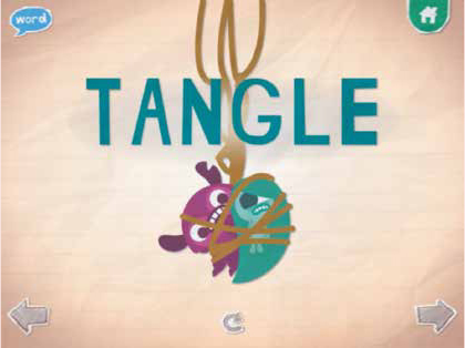
When I asked Samantha to show me her favorite app, she skipped right over all the Disney Princess apps on her mother’s phone and went right to Endless Alphabet (see Figure 5.9). This fantastic little game lets kids use animated letter creatures to spell interesting words like nibble, pester, and zigzag. The app reads the word, gives a definition, and then lets the user drag the letter characters to their place within the word. As the child drags the letter, it makes its signature sound in a funny voice; for example, when the letter A is tapped, it goes “ah ah ah ah AH!” in a funny little-girl voice. The app also shows an animation of the word and its meaning (see Figure 5.10.)
I asked Samantha what she liked best about Endless Alphabet. She said, “I love that I get to pick the words I want to do. I don’t have to go in order like ABCDE.” This reinforces what we know about 4–6-year-olds: They like a little structure, but enjoy the freedom to choose their own direction and discover the app’s functions independently as they explore. Samantha also liked “the letter guys’ funny voices” and the way the letters “squiggle and jump when you drag them.” This immediate feedback and delightful little lagniappe of the animated letters helped engage Samantha in the app and highlight the learning it was designed to provide.
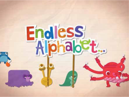
Endless Alphabet lets kids play with letters and words.
What she liked least about Endless Alphabet was that (with the free version), there are only a limited number of words to choose from. “I want some new words!” Samantha said. “I’ve done vegetable like a hundred times already!” Samantha’s mother will most likely splurge and pay the $5.99 for the full app, since Samantha can now recognize words “in real life” like tangle, multiply, and sticky, and her interest in letters and reading has increased.
The main themes I noticed while observing Samantha and asking her questions were exploration, surprise, response, and self-direction. I was also really interested to note that she recognized the fact that she was learning, and that she thought that was really cool. “This is a fun game, but it also teaches me. I already know all the letters. This shows me how they make words together and how I can make words and learn new ones. I love it!”
Through sound, animation, and imagery, Endless Alphabet shows kids the meaning of words instead of just telling them.