
23
Using SharePoint Designer to Customize Master Pages
In this lesson, you learn how to use SharePoint Designer to customize the layout of all the pages in your SharePoint site by using Master Pages. This lesson does not delve deeply into CSS or JavaScript, which are both HTML technologies that can be used in Master Pages, but it does touch on where they are used. An understanding of HTML and XML is a requirement.
INTRODUCTION TO SHAREPOINT DESIGNER
SharePoint Designer is used for customizations that aren't possible using SharePoint settings. It is designed for use by power users who aren't developers, and thus sits between using SharePoint web settings and Visual Studio in both complexity and capability. SharePoint Designer works only when connected to a SharePoint site — once a site is opened, the screen in Figure 23-1 is displayed.
The design surface is split into a navigation bar showing the site objects down the left, a context-sensitive ribbon on the top, with the remainder of the screen reserved for editing. The site settings are displayed on the opening screen.

Clicking the Master Pages link brings up a list of Master Pages, as shown in Figure 23-2.
Because all SharePoint content, including the Master Pages, is stored in SharePoint lists, the version control and document approval features are all enabled. In addition, in order to change the master page, it is necessary to click Edit File in Advanced Mode rather than just opening it.
 For all SharePoint default content, such as the four Master Pages shown in Figure 23-2, it is always better to copy the master page and change the site settings to use it rather than editing the SharePoint content.

MASTER PAGE CONCEPTS
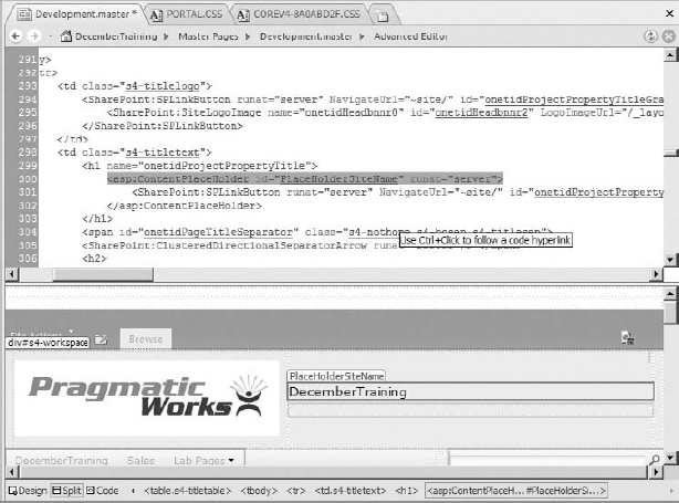
On a SharePoint site, just like on a website, some elements will be common to all pages, such as the navigation bar and ribbon on top, and the navigation bar on the left. However, these elements, despite being common, will be represented differently according to the specific page — for instance, some pages will hide the left navigation bar. This is where Master Pages come in — a master page includes zones that will be set according to the specific page, allowing for relative repositioning of different content without the page needing to be changed. Pages can also activate different zones, or update different zones. In Figure 23-3, where the Development.master master page is open in split view, the PlaceholderSiteName is used to show a dynamic site name. In this view, the title is set to December Training, but when a page is browsed it is updated to the familiar breadcrumb.
Other placeholders are in place for the main content, the navigation, and even the ribbon. These placeholders will be processed into final content in combination with the page content, as well as the current security settings, to produce each page that the users see.

MASTER PAGES IN SHAREPOINT
Editing in SharePoint Designer is best accomplished using a split view to see both the code and the preview. To activate this view, click on View  Split in the ribbon.
Several areas within the master page are important in SharePoint Master Pages. Most of these areas are not places that you will change, but rather are pieces of content you will need to include when you are creating your own master page. Before changing them in any way, copy the v4 master page to Development.master.
In SharePoint's default Master Pages, the areas (mostly HTML tags) listed within the content placeholders table are mostly contained within <div> tags, which are linked to CSS classes — this is a good model to follow when building your own Master Pages: creating your site structure; and styling using <div> tags. The areas contained within these tags can be content placeholders — sections that will be replaced when the page is rendered, either from SharePoint content or from page content. They can also be native tags such as the image tag used for the help link. Finally, there are XML tags specific to SharePoint: all of these will open the tag with SharePoint: and the tag name.
Changing the CSS class that is used is covered in a later section of this lesson.
The following table lists all the content placeholders.
CONTENT PLACEHOLDERS
The first area to be aware of is contained within the SharePoint:SPRibbon tag, as shown in Figure 23-4.

The items contained within the SharePoint ribbon include the styling of the ribbon and the items within the Site Actions menu, as well as the context-sensitive menu. The only change that is advised within the ribbon is changing the CSS class to style the ribbon.
The second area is the content contained within the tag <asp:ContentPlaceHolder id=“PlaceHolderSiteName” runat=“server”>.
This is the placeholder for the site title, as shown in Figure 23-5.
Right below this is the tag <asp:ContentPlaceHolder id=“PlaceHolderPageTitleInTitleArea” runat=“server” /> — this tag is the breadcrumb, and though it is often associated with the site title, it by no means has to be, so feel free to move it around.
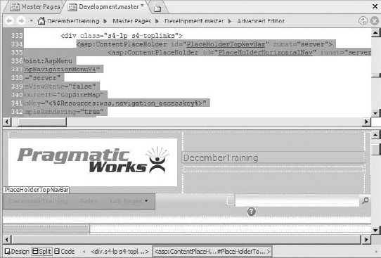
The next area of interest is the tag <asp:ContentPlaceHolder id=“PlaceHolderTopNavBar” runat=“server”> — the contents of this tag mark where the global navigation goes. Generally speaking, don't touch the contents of this tag — some settings might be changed for truly advanced customizations, but they are few and far between. Typically, you would change only the CSS class and move this tag around your page. See Figure 23-6.

The <asp:ContentPlaceHolder id=“PlaceHolderSearchArea” runat=“server”> tag is for the search area — in this case, only move the tag around, as shown in Figure 23-7, it doesn't even have a CSS class set here.

As shown in Figure 23-8, the help icon is a single image tag: <img src=“/_layouts/images/fgimg.png” alt=“<%$Resources:wss,multipages_helplinkalt_text%>” style=“left:-0px !important;top:-309px !important;position:absolute;” align=“absmiddle” border=“0” runat=“server” />.
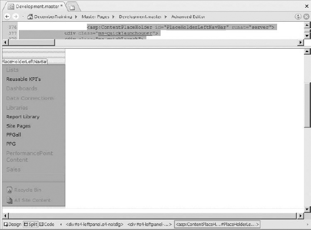
The next set of areas are grouped together under the <div id=“s4-leftpanel” class=“s4-notdlg”> tag in the V4.master page. Several of these placeholders are not typically used in a Business Intelligence center. The tag containing the main areas for the left-hand navigation is the <asp:ContentPlaceHolder id=“PlaceHolderLeftNavBar” runat=“server”> tag, as shown in Figure 23-9.
As you can see, all the items currently shown in the nav also show here in design mode, but they will update automatically as the site changes. It should be noted that nav is an often used shortening of navigation. It's also worth noting that within this particular tag are multiple areas.
The tag starting <SharePoint:AspMenu id=“QuickLaunchMenu” is contained within a tag <SharePoint:UIVersionedContent UIVersion=“3” runat=“server”> and hence doesn't apply in SharePoint 2010 (version 4) — so don't get confused when it doesn't change anything on your page.

Looking a little further down, a tag starting with <SharePoint:AspMenu id=“V4QuickLaunchMenu” is contained in a tag <SharePoint:UIVersionedContent UIVersion=“4” runat=“server”> and therefore applies to SharePoint 2010. This versioning is used when functionality has changed substantially between SharePoint 2007 and SharePoint 2010.
One of the possible changes we can make to this navigation involves changing the orientation to horizontal, the static display levels to 1, and the dynamic display levels to 1. This will make the navigation behave like the top nav, that is, be laid out horizontally and have flyouts for the lower levels. Obviously, the design will need to be adjusted to suit the new layout, or the navigation will end up distorted, as shown in Figure 23-10.

The final tag of interest is <asp:ContentPlaceHolder id=“PlaceHolderQuickLaunchBottom” runat=“server”>. The contents of this tag contain the Recycle Bin and All Site Content links. As long as the content within the tags starting with <Sharepoint are unchanged, the items within this placeholder can be moved around as desired.
CSS IN MASTER PAGES
The CSS link that SharePoint uses in the master page is <SharePoint:CssLink runat=“server” Version=“4”/>. When the page is rendered, this will be replaced with CSS links similar to the following:
<link rel=“stylesheet” type=“text/css”
href=“/_layouts/1033/styles/portal.css?rev=0gSit0FmDdWuMu7kF0JZ9g%3D%3D”
/>
<link rel=“stylesheet” type=“text/css”
 href=“/_catalogs/theme/Themed/EC8F5A82/search-7E1AFF02.css?ctag=4”
/>
<link rel=“stylesheet” type=“text/css”
href=“/_catalogs/theme/Themed/EC8F5A82/wiki-ECF524AA.css?ctag=4”
/>
<link rel=“stylesheet” type=“text/css”
href=“/_catalogs/theme/Themed/EC8F5A82/corev4-8A0ABD2F.css?ctag=4”
/>
A key point to note here is that CSS changes that are theme specific would need to go into the CSS files associated with that theme. For styling that works for all pages using this master page, you insert a new CSS link. Start by copying your CSS file to %Program Files%Common FilesMicrosoft SharedWeb Server Extensions14TEMPLATELAYOUTS1033styles (1033 being the standard locale — if you are using a non-standard locale, use the appropriate folder instead).
Then add a line directly below the tag to point to your CSS file, similar to the following two lines:
<SharePoint:CssLink runat=“server” Version=“4”/>
<link rel=“stylesheet” type=“text/css”
href=“/_layouts/1033/styles/development.css”
/>
Adding JavaScript to the Master Page functions exactly the same way as adding a reference to a CSS file, except that it goes directly in the %Program Files%Common FilesMicrosoft SharedWeb Server Extensions14TEMPLATELAYOUTS1033 folder rather than the styles subfolder.
A good way to start customizing the styles is to copy the existing styles, rename and modify them, and put them in your new style sheet.
To copy the existing styles when you're not on the SharePoint machine, right-click a SharePoint page and view the source. Copy the contents of the href attribute, and paste them at the end of the site URL. For example, href=“/_catalogs/theme/Themed/EC8F5A82/corev4-8A0ABD2F.css?ctag=4”/> for the site http://bi.sharepoint.com will become http://bi.sharepoint.com/_catalogs/theme/Themed/EC8F5A82/corev4-8A0ABD2F.css?ctag=4. Save this file to your local machine to have a separate copy of the file. You can then upload this style sheet to a SharePoint library to use instead of using the folder structure on the server.
For instance, if you wanted to change the styling of the title, start by browsing to the title placeholder — <asp:ContentPlaceHolder id=“PlaceHolderSiteName” runat=“server”>. In this case, the style is held in the tag containing the placeholder, as shown in Figure 23-11.
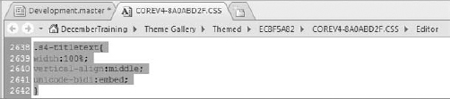
The CSS class is s4-titletext. Hold down the Ctrl key, and click s4-titletext to jump to the class definition. As shown in Figure 23-12, the appropriate style sheet from the current theme will be opened.
Editing the style sheet here will apply to this theme only. Often, this will be a good approach during development and testing. When moving to a production system, it is a good idea to do a new style sheet file to remove any irrelevant styles.
However, these are cascading style sheets, so multiple styles may apply. Do a search for s4-titletext to find any other styles that will be applied, as shown in Figure 23-13.

In this instance, only the first style will apply, because the subsequent styles require that the other classes are also applied. That is, for the second style to be applied, the class would have to be “s4-titletext ms-titlewpTitleArea”.
Copy the entire style into your new CSS file, and rename s4-titletext to dev-titletext, to give the code below as the sole contents of your development.css file. Add an additional line to align the text to the center.
The contents of Development.css should be the following:
.dev-titletext{
width:100%;
vertical-align:middle;
unicode-bidi:embed;

align:center;
}
The final step is to change the reference in the class name, to look like this : <td class=“dev-titletext”>.
This stepwise editing of existing styles is a good way to learn how CSS works — for a complete restyle, it is better to create a new set of styles and build them into the Master Page.
TRY IT
In this Try It, you copy the master page and customize it to have a new, more minimal look.
Lesson Requirements
Copy the v4.master file in the Master Pages library to dev-minimal.master, and create a dev-minimal.css to store your style changes. Delete the search box and help icon, and move the left-hand nav to sit in their place. Remove the Recycle Bin and All Site Content menu items. Make this navigation bar horizontal, with flyouts for the second menu rather than static menu items.
Hints
- Reuse the styles of the <div> around the search box to position the left-hand navigation correctly in its new position.
- If you need to go back and edit changes to your CSS, you will need to restart IIS. Do this by going Start Run and typing IISReset, then hitting Enter.
- When searching for tags, search for the ID if the whole value isn't found, to allow for whitespace differences.
The final contents of your dev-minimal.css file should look like the code below:
.dev-spacer{
padding:0px !important;
}
.dev-rp{
float:right;
padding:2px 10px 2px 5px;
}
.dev-rp div,.dev-lpi div{
display:inline;
}

.dev-ca{
 background:#fff;
margin-left:0px;
margin-right:0px;
min-height:324px;
}
Step-by-Step
- Create an empty dev-minimal.css in %Program Files%Common FilesMicrosoft SharedWeb Server Extensions14TEMPLATELAYOUTS1033styles. Add this line to include a reference to the original CSS file: @import “corev4.ss”;
- Copy v4.master to dev-minimal.master by copying, pasting, and renaming the new file. Click Yes when asked about changing attached pages.
- Edit dev-minimal.master by right-clicking and selecting Edit File in Advanced Mode.
- Click Yes when SharePoint Designer asks if you want to check the file out.
- Search for <div id=“s4-searcharea” class=“s4-search s4-rp”>.
- Delete <SharePoint:DelegateControl runat=“server” ControlId=“SmallSearchInputBox” Version=“4”/> to remove the search box.
- Delete all content between and including the <span class=“s4-help”> and </span> tags to remove the help box.
- Ctrl-click S4-search, and copy the highlighted text to your new CSS file. Rename S4-search to dev-spacer.
- Return to the Master Page and Ctrl-click S4-rp, and copy the highlighted text to your new CSS file. Rename the CSS class S4-rp to dev-rp.
Also copy:
.s4-rp div,.s4-lpi div{
display:inline;
}
This code sits directly below the previous piece of code, and we are copying it because, as a style applying to s4-rp, we need to include the style changes it applies.
- Change the s4 in the text you just copied to dev.
- Change the two class references to the new names, and rename the div to dev-rightpanel:
<div id=“dev-rightpanel” class=“dev-spacer dev-rp”>
- Cut all the code inside the <div id=“s4-leftpanel-content”> and </div> closing tags. The easiest way to do this is to highlight this tag by clicking in the design surface, or by right-clicking on the tag and clicking Select Tag, then cutting all of it, pasting it into Notepad, and deleting the open and close tags before copying again. See Figure 23-14 for the highlighted text. This is just some of the appropriate text; it is a large section.
- Look for all instances of StaticDisplayLevels=“2” within the code you pasted and change them to StaticDisplayLevels=“1”.
- Look for all instances of DynamicDisplayLevels=“0” within the code you pasted and change them to DynamicDisplayLevels=“1”.
- Look for all instances of Orientation=“Vertical” within the code you pasted and change them to Orientation=“Horizontal”. See Figure 23-15 for an example.
- Paste this code between the <div id=“dev-rightpanel” class=“dev-spacer dev-rp”> and </div> tags. Put it directly after the opening tag, and before any other content in this tag.

The full code after making the changes is included on the website at www.wrox.com.
- Find the tag <asp:ContentPlaceHolder id=“PlaceHolderQuickLaunchBottom” runat=“server”> and delete it, and everything until the next closing </asp:ContentPlaceHolder> tag. Make sure to keep these opening and closing tags and only delete the content. Select the tag, copy to Notepad, and paste it back once you've deleted the content inside.
- Find the tag starting <SharePoint:AspMenu ID=“TopNavigationMenuV4” (remember to search for the TopNavigationMenuV4 to find this tag), and copy its CSS class value — s4-tn. This is the top navigation menu, and all you need is this class name.
- Search for the tag starting with <SharePoint:AspMenu id=“V4QuickLaunchMenu”. This is the left navigation menu. Replace the current CSS class value (s4-ql) with the value copied in the previous step — s4-tn. This will give the new navigation the same formatting as the old one.
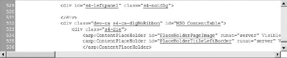
- Search for the tag <div class=“s4-ca s4-ca-dlgNoRibbon” id=“MSO_ContentTable” style=“left: 0px; top: 0px”> — this is the tag containing the main content on the page.
- Ctrl-click s4-ca.
- Copy the content into dev-minimal.css, changing the name to dev-ca.
- Change the left margin to be 0, as in the following code:
.dev-ca{ background:#fff; margin-left:0px; margin-right:0px; min-height:324px; } - Change the class reference in the master page to be dev-ca instead of s4-ca, as shown in Figure 23-16. Change back to the master page tab where you did the Ctrl-Click in order to do this.
- Save the css file.
- Save the master page. Click Yes when the message box asking about customizing the page from the site definition comes up.
- Click Master Pages on the left menu.
- Right-click dev-minimal and choose Check-in.
- Select Publish a Major Version.
- Click Yes to approve the document.
- On the page that opens, scroll over dev-minimal, and choose Approve/Reject from the drop-down menu.
- Select Approved and click OK.
- Click Site Actions Site Settings.
- Click on Manage Site Features under Site Actions.
- If the SharePoint Server Publishing feature is not active, click on Activate.
- Click on Site Settings in the breadcrumb.
- Click Master Pages under Look and Feel.
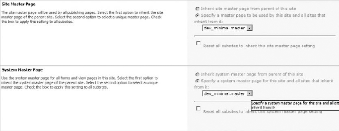
- Select dev-minimal in both drop-downs, and set the CSS file to be used to
as shown in Figure 23-17.
/_Layouts/1033/styles/dev-minimal.css
- Click OK.
- Click the site title to see the master page being used, as shown in Figure 23-18.

 Please select Lesson 23 on the DVD to view the video that accompanies this lesson.