
Analytic pipelines are not built from raw data in a single step. Rather, development is an iterative process that involves understanding the data in greater detail and systematically refining both model and inputs to solve a problem. A key part of this cycle is interactive data analysis and visualization, which can provide initial ideas for features in our predictive modeling or clues as to why an application is not behaving as expected.
Spreadsheet programs are one kind of interactive tool for this sort of exploration: they allow the user to import tabular information, pivot and summarize data, and generate charts. However, what if the data in question is too large for such a spreadsheet application? What if the data is not tabular, or is not displayed effectively as a line or bar chart? In the former case, we could simply obtain a more powerful computer, but the latter is more problematic. Simply put, many traditional data visualization tools are not well suited to complex data types such as text or images. Additionally, spreadsheet programs often assume data is in a finalized form, whereas in practice we will often need to clean up the raw data before analysis. We might also want to calculate more complex statistics than simple averages or sums. Finally, using the same programming tools to clean up and visualize our data as well as generate the model itself and test its performance allows a more streamlined development process.
In this chapter we introduce interactive Python (IPython) notebook applications (Pérez, Fernando, and Brian E. Granger. IPython: a system for interactive scientific computing. Computing in Science & Engineering 9.3 (2007): 21-29). The notebooks form a data preparation, exploration, and modeling environment that runs inside a web browser. The commands typed in the input cells of an IPython notebook are translated and executed as they are received: this kind of interactive programming is helpful for data exploration, where we may refine our efforts and successively develop more detailed analyses. Recording our work in these Notebooks will help to both backtrack during debugging and serve as a record of insights that can be easily shared with colleagues.
In this chapter we will discuss the following topics:
- Reading raw data into an IPython notebook, cleaning it, and manipulating it using the Pandas library.
- Using IPython to process numerical, categorical, geospatial, or time-series data, and perform basic statistical analyses.
- Basic exploratory analyses: summary statistics (mean, variance, median), distributions (histogram and kernel density), and auto-correlation (time-series).
- An introduction to distributed data processing with Spark RDDs and DataFrames.
We will start our explorations in IPython by loading a text file into a DataFrame, calculating some summary statistics, and visualizing distributions. For this exercise we'll use a set of movie ratings and metadata from the Internet Movie Database (http://www.imdb.com/) to investigate what factors might correlate with high ratings for films on this website. Such information might be helpful, for example, in developing a recommendation system based on this kind of user feedback.
To follow along with the examples, you should have a Windows, Linux, or Mac OSX operating system installed on your computer and access to the Internet. There are a number of options available to install IPython: since each of these resources includes installation guides, we provide a summary of the available sources and direct the reader to the relevant documentation for more in-depth instructions.
- For most users, a pre-bundled Python environment such as Anaconda (Continuum Analytics) or Canopy (Enthought) provides an out-of-the-box distribution with IPython and all the libraries we will use in these exercises: these products are self-contained, and thus you should not have to worry about conflicting versions or dependency management.
- For more ambitious users, you can install a python distribution of your choice, followed by individual installation of the required libraries using package managers such as
piporeasy_install.
Let's get started with the following steps:
- Once you've installed IPython, open the command prompt (terminal) on your computer and type:
jupyter notebookNote that depending upon where you installed the program, the
jupytercommand may require the binary file that launchesjupyterto be on your system path. You should see a series of commands like the following in your terminal:
This starts the kernel, the python interpreter that computes the result of commands entered into the notebook. If you want to stop the notebook, type Ctrl + C, and enter yes, and the kernel will shut down.
- When the kernel starts, your default web browser should also open, giving you a homepage that looks like this:

- The Files tab (see above) will show you all of the files in the directory where you started the IPython process. Clicking Running will give you a list of all running notebooks – there are none when you start:

- Finally, the Clusters panel gives a list of external clusters, should we decide to parallelize our calculations by submitting commands to be processed on more than one machine. We won't worry about this for now, but it will come in useful later when we begin to train predictive models, a task that may often be accelerated by distributing the work among many computers or processors.
- Returning to the Files tab, you will notice two options in the top right-hand corner. One is to Upload a file: while we are running IPython locally, it could just as easily be running on a remote server, with the analyst accessing the notebook through a browser. In this case, to interact with files stored on our own machine, we can use this button to open a prompt and selected the desired files to upload to the server, where we could then analyze them in the notebook. The New tab lets you create a new folder, text file, a Python terminal running in the browser, or a notebook.
For now, let's open the sample notebook for this chapter by double clicking on B04881_chapter02_code01.ipynb. This opens the notebook:
The notebook consists of a series of cells, areas of text where we can type python code, execute it, and see the results of the commands. The python code in each cell can be executed by clicking the
 button on the toolbar, and a new cell can be inserted below the current one by clicking
  .
.
-
While the import statements in the first cell probably look familiar from your experience of using python in the command line or in a script, the
%matplotlibinline command is not actually python: it is a markup instruction to the notebook thatmatplotlibimages are to be displayed inline the browser. We enter this command at the beginning of the notebook so that all of our later plots use this setting. To run the import statements, click the button or press Ctrl + Enter. The
 ln[1]on the cell may briefly change to[*]as the command executes. There will be no output in this case, as all we did was import library dependencies. Now that our environment is ready, we can start examining some data.
To start, we will import the data in movies.csv into a DataFrame object using the Pandas library (McKinney, Wes. Python for data analysis: Data wrangling with Pandas, NumPy, and IPython. O'Reilly Media, Inc., 2012). This DataFrame resembles traditional spreadsheet software and allows powerful extensions such as custom transformations and aggregations. These may be combined with numerical methods, such as those available in NumPy, for more advanced statistical analysis of the data. Let us continue our analysis:
-
If this were a new notebook, to add new cells we would go to the toolbar, click Insert and Insert Cell Below, or use the . button. However, in this example all the cells are already generated, therefore we run the following command in the second cell:
We've now created a DataFrame object using the Pandas library,
>>> imdb_ratings = pd.read_csv('movies.csv')imdb_ratings, and can begin analyzing the data. - Let's start by peeking at the beginning and end of the data using
head()andtail(). Notice that by default this command returns the first five rows of data, but we can supply an integer argument to the command to specify the number of lines to return. Also, by default the first line of the file is assumed to contain the column names, which in this case is correct. Typing:>>> imdb_ratings.head()Gives the following output:

We can similarly look at the last 15 lines of the data by typing:
>>> imdb_ratings.tail(15)
- Looking at individual rows gives us a sense of what kind of data the file contains: we can also look at summaries for all rows in each column using the command
describe(), which returns the number of records, mean value, and other aggregate statistics. Try typing:>>> imdb_ratings.describe()This gives the following output:

- Column names and their datatypes can be accessed using the properties
columnsanddtypes. Typing:>>> imdb_ratings.columnsGives us the names of the columns:

If we issue the command:
>>> imdb_ratings.dtypes - As we can see, the datatypes of the columns have been automatically inferred when we first loaded the file:

- If we want to access the data in individual columns, we can do so using either
{DataFrame_name}.{column_name}or{DataFrame_name}['column_name'](similar to a python dictionary). For example, typing:>>> imdb_ratings.year.head()or
>>> imdb_ratings['year'].head()Gives the following output:

Without much work, we can already use these simple commands to ask a number of diagnostic questions about the data. Do the summary statistics we generated using describe() make sense (for example, the max rating should be 10, while the minimum is 1)? Is the data correctly parsed into the columns we expect?
Looking back at the first five rows of data we visualized using the
head() command, this initial inspection also reveals some formatting issues we might want to consider. In the budget column, several entries have the value NaN, representing missing values. If we were going to try to predict movie ratings based on features including budget, we might need to come up with a rule to fill in these missing values, or encode them in a way that is correctly represented to the algorithm.
Now that we have looked at the basic features of the Pandas DataFrame, let us start applying some transformations and calculations to this data beyond the simple statistics we obtained through describe(). For example, if we wanted to calculate how many films belong to each release year, we can use following command:
>>> imdb_ratings.value_counts()
Which gives the output:

Notice that the result is by default sorted by the count of records in each year (with the most films in this dataset released in 2002). What if we wanted to sort by the release year? The sort_index() command orders the result by its index (the year to which the count belongs). The index is similar to the axis of a plot, with values representing the point at each axis tick. Using the command:
>>> imdb_ratings.year.value_counts().sort_index(ascending=False)
Gives the following output:

We can also use the DataFrame to begin asking analytical questions about the data, logically slicing and sub-selecting as we might in a database query. For example, let us select the subset of films released after 1999 with an R rating using the following command:
>>> imdb_ratings[(imdb_ratings.year > 1999) & (imdb_ratings.mpaa == 'R')].head()
This gives the following output:

Similarly, we can group the data by any column(s) and calculate aggregated statistics using the groupby command and pass an array of calculations to perform as an argument to aggregate. Let us use the mean and standard deviation functions from NumPy to find the average and variation in ratings for films released in a given year:
>>> imdb_ratings.groupby('year').rating.aggregate([np.mean,np.std])
This gives:

However, sometimes the questions we want to ask require us to reshape or transform the raw data we are given. This will happen frequently in later chapters, when we develop features for predictive models. Pandas provide many tools for performing this kind of transformation. For example, while it would also be interesting to aggregate the data based on genre, we notice that in this dataset each genre is represented as a single column, with 1 or 0 indicating whether a film belongs to a given genre. It would be more useful for us to have a single column indicating which genre the film belongs to for use in aggregation operations. We can make such a column using the command idxmax() with the argument 1 to represent the maximum argument across columns (0 would represent the max index along rows), which returns the column with the greatest value out of those selected. Typing:
>>>imdb_ratings['genre']=imdb_ratings[['Action','Animation','Comedy','Drama','Documentary','Romance']].idxmax(1)
Gives the following result when we examine this new genre column using:
>>> imdb_ratings['genre'].head()

We may also perhaps like to plot the data with colors representing a particular genre. To generate a color code for each genre, we can use a custom mapping function with the following commands:
>>> genres_map = {"Action": 'red', "Animation": 'blue', "Comedy": 'yellow', "Drama": 'green', "Documentary": 'orange', "Romance": 'purple'}
>>> imdb_ratings['genre_color'] = imdb_ratings['genre'].apply(lambda x: genres_map[x])
We can verify the output by typing:
>>> imdb_ratings['genre_color'].head()
Which gives:

We can also transpose the table and perform statistical calculations using the pivot_table command, which can perform aggregate calculations on groupings of rows and columns as in a spreadsheet. For example, to calculate the average rating per genre per year we can use the following command:
>>>pd.pivot_table(imdb_ratings,values='rating',index='year',columns=['genre'],aggfunc=np.mean)
Which gives the output:

Now that we have performed some exploratory calculations, let us look at some visualizations of this information.
One of the practical features of IPython notebooks is the ability to plot data inline with our analyses. For example, if we wanted to visualize the distribution of film lengths we could use the command:
>>> imdb_ratings.length.plot()

However, this is not really a very attractive image. To make a more aesthetically pleasing plot, we can change the default style using the style.use() command. Let us change the style to ggplot, which is used in the ggplot graphical library (Wickham, Hadley. ggplot: An Implementation of the Grammar of Graphics. R package version 0.4. 0 (2006)). Typing the following commands:
>>> matplotlib.style.use('ggplot')
>>> imdb_ratings.length.plot()
Gives a much more attractive graphic:

As you can see preceding, the default plot is a line chart. The line chart plots each datapoint (movie runtime) as a line, ordered from left to right by their row number in the DataFrame. To make a density plot of films by their genre, we can plot using the groupby command with the argument type=kde. KDE is an abbreviation for Kernel Density Estimate (Rosenblatt, Murray. Remarks on some nonparametric estimates of a density function. The Annals of Mathematical Statistics 27.3 (1956): 832-837; Parzen, Emanuel. On estimation of a probability density function and mode. The annals of mathematical statistics 33.3 (1962): 1065-1076), meaning that for each point (film runtime) we estimate the density (proportion of the population with that runtime) with the equation:

Where f(x) is an estimate of the probability density, n is the number of records in our dataset, h is a bandwidth parameter, and K is a kernel function. As an example, if K were the Gaussian kernel given by:

where σ is the standard deviation and μ is the mean of the normal distribution, then the KDE represents the average density of all other datapoints in a normally distributed 'window' around a given point x. The width of this window is given by h. Thus, the KDE allows us to plot a smoothed representation of a histogram by plotting not the absolute count at a given point, but a continuous probability estimate at the point. To this KDE plot, let us also add annotations for the axes, and limit the maximum runtime to 2 hrs using the following commands:
>>> plot1 = imdb_ratings.groupby('genre').length.plot(kind='kde',xlim=(0,120),legend='genre')
>>>plot1[0].set_xlabel('Number of Minutes')
>>>plot1[0].set_title('Distribution of Films by Runtime Minutes')
Which gives the following plot:
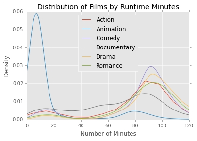
We see, unsurprisingly, that many animated films are short, while others categories average around 90 minutes in length. We can also plot similar density curves to examine the distribution of ratings between genres using the following commands:
>>> plot2 = imdb_ratings.groupby('genre').rating.plot(kind='kde',xlim=(0,10),legend='genre')
>>> plot2[0].set_xlabel('Ratings')
>>> plot2[0].set_title('Distribution of Ratings')
Which gives the following plot:

Interestingly, documentaries have on average the highest rating, while action films have the lowest. We could also visualize this same information using a boxplot using the following commands:
>>> pd.pivot_table(imdb_ratings,values='rating',index='title',columns=['genre']).
plot(kind='box',by='genre').
set_ylabel('Rating')
This gives the boxplot as follows:

We can also use the notebook to start to make this sort of plotting automated for a dataset. For example, we often would like to look at the marginal plot of each variable (its single-dimensional distribution) compared to all others in order to find correlations between columns in our dataset. We can do this using the built-in scatter_matrix function:
>>> from pandas.tools.plotting import scatter_matrix
>>> scatter_matrix(imdb_ratings[['year','length','budget','rating','votes']], alpha=0.2, figsize=(6, 6), diagonal='kde')
This will allow us to plot the pairwise distribution of all the variables we have selected, giving us an overview of potential correlations between them:

This single plot actually gives a lot of information. For example, it shows that in general higher budget films have higher ratings, and films made in the 1920s have higher average rating than those before. Using this sort of scatter matrix, we can look for correlations that might guide the development of a predictive model, such as a predictor of ratings given other movie features. All we need to do is give this function a subset of columns in the DataFrame to plot (since we want to exclude non-numerical data which cannot be visualized in this way), and we can replicate this analysis for any new dataset.
What if we want to visualize these distributions in more detail? As an example, lets break the correlation between length and rating by genre using the following commands:
>>> fig, axes = plt.subplots(nrows=3, ncols=2, figsize=(15,15))
>>> row = 0
>>> col = 0
>>> for index, genre in imdb_ratings.groupby('genre'):
…    if row > 2:
…        row = 0
…       col += 1
…    genre.groupby('genre').
....plot(ax=axes[row,col],kind='scatter',x='length',y='rating',s=np.sqrt(genre['votes']),c=genre['genre_color'],xlim=(0,120),ylim=(0,10),alpha=0.5,label=index)
…    row += 1
In this command, we create a 3x2 grid to hold plots for our six genres. We then iterate over the data groups by genre, and if we have reached the third row we reset and move to the second column. We then plot the data, using the genre_color column we generated previously, along with the index (the genre group) to label the plot. We scale the size of each point (representing an individual film) by the number of votes it received. The resulting scatterplots show the relationship between length and genre, with the size of the point giving sense of how much confidence we should place in the value of the point.

Now that we have looked at some basic analysis using categorical data and numerical data, let's continue with a special case of numerical data – time series.