
Silverlight applications can be dynamic even if they do not use JavaScript. The content can be transformed and animated, both of which we will cover here. The transformation is nothing that you can watch, but rather a calculation that takes effect when the plug-in renders the Silverlight content. For example, you can rotate or skew elements. An animation, on the other hand, can really change the visual appearance of the applications: elements may move or change their color. As always, you will find many small and self-contained examples that showcase the most interesting and important Silverlight options.
A transformation is technically only a change of one or more values. For instance, if an element is rotated, its position and the location of all the drawing points of the element change. If an element is moved to another position (that’s a transformation as well), basically the positions of all corners of the element change (if we leave fillings aside). Silverlight supports five transformations:
Let’s start with the <TranslateTransform>
element, which just changes the position of an element, much like
setting a related property such as Canvas.Left or
Canvas.Top would do.
To execute a transformation, you have to use the
<
element. You need to replace Element.RenderTransform>Element with the
type of object you want to transform. So, to transform a
<Rectangle> object, use
<Rectangle.RenderTransform>. To transform a
<TextBlock> object, use <TextBlock.RenderTransform>.
Within the
<Element.RenderTransform>
element, you need to put the transformation element; in this example, it
is <TranslateTransform>. This element expects two
attributes, X and Y, denoting the new
x and y coordinates of the
associated element’s left corner, as you can see here:
<TextBlock Text="...">
  <TextBlock.RenderTransform>
    <TranslateTransform X="10" Y="20" />
  </TextBlock.RenderTransform>
</TextBlock>
Example 7-1 starts with the “Hello World” example from Chapter 2 and translates both a rectangle and a text block. In the result, you will see both the original elements and the translated ones (Figure 7-1).
Example 7-1. Translating elements, the XAML file (Page.xaml, project TranslateTransform)
<UserControl x:Class="TranslateTransform.Page"
    xmlns="http://schemas.microsoft.com/client/2007"
    xmlns:x="http://schemas.microsoft.com/winfx/2006/xaml"
    Width="450" Height="300">
  <Grid x:Name="LayoutRoot" Background="White">
    <Canvas>

      <Rectangle Width="300" Height="150" Stroke="Orange" StrokeThickness="15" />
      <TextBlock FontFamily="Arial" FontSize="56" Canvas.Left="25" Canvas.Top="40"
        Foreground="Black" Text="Silverlight" />

      <Rectangle Width="300” Height="150" Stroke="Orange" StrokeThickness="15">
        <Rectangle.RenderTransform>
          <TranslateTransform X="350" Y="175" />
        </Rectangle.RenderTransform>
      </Rectangle>

      <TextBlock FontFamily="Arial" FontSize="56" Canvas.Left="25" Canvas.Top="40"
        Foreground="Black" Text="Silverlight">
        <TextBlock.RenderTransform>
          <TranslateTransform X="350" Y="175" />
        </TextBlock.RenderTransform>
      </TextBlock>

    </Canvas>
  </Grid>
</UserControl> 
You can scale elements using <ScaleTransform>.
You can scale both horizontally (ScaleX
attribute) and vertically (ScaleY attribute), and may also
provide the center coordinates (CenterX and CenterY
attributes). The scaling value is actually a factor. For instance, a
scaling value of 2 doubles the horizontal or vertical size,
whereas a factor of 0.5 halves it. Example 7-2 scales both ways, as Figure 7-2
shows.
Example 7-2. Scaling elements, the XAML file (Page.xaml, project ScaleTransform)
<UserControl x:Class="ScaleTransform.Page"
    xmlns="http://schemas.microsoft.com/client/2007"
    xmlns:x="http://schemas.microsoft.com/winfx/2006/xaml"
    Width="600" Height="400">
  <Grid x:Name="LayoutRoot" Background="White">
    <Canvas>

      <Rectangle Width="300" Height="150" Stroke="Orange" StrokeThickness="15" />
      <TextBlock FontFamily="Arial" FontSize="56" Canvas.Left="25" Canvas.Top="40"
        Foreground="Black" Text="Silverlight" />
      <Rectangle Canvas.Left="350" Canvas.Top="175"
        Width="300" Height="150" Stroke="Orange" StrokeThickness="15">
        <Rectangle.RenderTransform>
          <ScaleTransform ScaleX="1.5" ScaleY="0.5" />
        </Rectangle.RenderTransform>
      </Rectangle>
      <TextBlock FontFamily="Arial" FontSize="56"
        Canvas.Left="375" Canvas.Top="215" Foreground="Black"
        Text="Silverlight">
        <TextBlock.RenderTransform>
          <ScaleTransform ScaleX="1.5" ScaleY="0.5" />
        </TextBlock.RenderTransform>
      </TextBlock>

    </Canvas>
  </Grid>
</UserControl> 
The next transformation effect on our list is skewing, represented
in Silverlight using the <SkewTransform> element. You can skew
using a horizontal angle (AngleX) and a vertical angle
(AngleY). Again, you can provide the center of the
transformation by setting the CenterX and
CenterY attributes. The code in Example 7-3
uses a horizontal skewing of 45 degrees and a vertical skewing of –30
degrees (which is the same as 330 degrees, because 360 degrees is a full
circle). Figure 7-3 shows the result.
Example 7-3. Skewing elements, the XAML file (Page.xaml, project SkewTransform)
<UserControl x:Class="SkewTransform.Page"
    xmlns="http://schemas.microsoft.com/client/2007"
    xmlns:x="http://schemas.microsoft.com/winfx/2006/xaml"
    Width="600" Height="400">
  <Grid x:Name="LayoutRoot" Background="White">
    <Canvas>

      <Rectangle Width="300" Height="150" Stroke="Orange" StrokeThickness="15" />
      <TextBlock FontFamily="Arial" FontSize="56" Canvas.Left="25" Canvas.Top="40"
             Foreground="Black" Text="Silverlight" />

      <Rectangle Canvas.Left="350" Canvas.Top="175"
        Width="300" Height="150" Stroke="Orange" StrokeThickness="15">
        <Rectangle.RenderTransform>
          <SkewTransform CenterX="50" CenterY="25"  AngleX="45" AngleY="-30" />
        </Rectangle.RenderTransform>
      </Rectangle>
      <TextBlock FontFamily="Arial" FontSize="56"
        Canvas.Left="375" Canvas.Top="215" Foreground="Black"
        Text="Silverlight">
        <TextBlock.RenderTransform>
          <SkewTransform CenterX="50" CenterY="25"  AngleX="45" AngleY="-30" />
        </TextBlock.RenderTransform>
      </TextBlock>

    </Canvas>
  </Grid>
</UserControl> 
The final “simple” transformation is rotation, or
<RotateTransform> in Silverlight. All you need to
provide is the rotation angle (in degrees) in the Angle
property. By default, the element rotates around its top-left corner, that
is, the relative coordinates (0,0). You can define this rotation point
yourself by using the CenterX and CenterY
attributes.
In Example 7-4, the <Rectangle>
element is rotated 45 degrees, around the point (150,50). To
appropriately rotate the <TextBlock> element by the same number of degrees, you need to take into
account that the text block is translated 25 pixels to the right and 40
pixels to the bottom compared to the rectangle. This needs to be
compensated in the rotation point, so we get (150-25,50-r0), or (125,10).
As Figure 7-4 shows, the relative position of the text
block within the rectangle remains intact this way.
Example 7-4. Rotating elements, the XAML file (Page.xaml, project RotateTransform)
<UserControl x:Class="RotateTransform.Page"
    xmlns="http://schemas.microsoft.com/client/2007"
    xmlns:x="http://schemas.microsoft.com/winfx/2006/xaml"
    Width="600" Height="400">
  <Grid x:Name="LayoutRoot" Background="White">
    <Canvas>

      <Rectangle Width="300" Height="150" Stroke="Orange" StrokeThickness="15" />
      <TextBlock FontFamily="Arial" FontSize="56" Canvas.Left="25" Canvas.Top="40"
        Foreground="Black" Text="Silverlight" />

      <Rectangle Canvas.Left="350" Canvas.Top="175"
        Width="300" Height="150" Stroke="Orange" StrokeThickness="15">
        <Rectangle.RenderTransform>
          <RotateTransform Angle="-45" CenterX="150" CenterY="50" />
        </Rectangle.RenderTransform>
      </Rectangle>
      <TextBlock FontFamily="Arial" FontSize="56"
        Canvas.Left="375" Canvas.Top="215" Foreground="Black"
        Text="Silverlight">
        <TextBlock.RenderTransform>
          <RotateTransform Angle="-45" CenterX="125" CenterY="10" />
        </TextBlock.RenderTransform>
      </TextBlock>

    </Canvas>
  </Grid>
</UserControl> 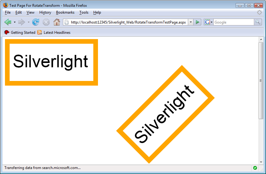
To use more transformations at one time, you have to group them (the
Silverlight object model and the XAML syntax do not allow multiple
transform elements directly underneath
<).
But this limitation does not lead to an enormous extra effort. All you
have to do is put a Element.RenderTransform><TransformGroup> element within the
<
element and put your transformations in there. Example 7-5
shows such a transformation. As you can see in Figure 7-5, the code just translates the elements and skews
them (you will notice that in contrast to previous examples, there are no
Element.RenderTransform>Canvas.Left and Canvas.Top properties set for
the transformed objects).
Example 7-5. Grouping transformations, the XAML file (Page.xaml, project TransformGroup)
<UserControl x:Class="TransformGroup.Page"
    xmlns="http://schemas.microsoft.com/client/2007"
    xmlns:x="http://schemas.microsoft.com/winfx/2006/xaml"
    Width="600" Height="400">
  <Grid x:Name="LayoutRoot" Background="White">
    <Canvas>

      <Rectangle Width="300" Height="150" Stroke="Orange" StrokeThickness="15" />
      <TextBlock FontFamily="Arial" FontSize="56" Canvas.Left="25" Canvas.Top="40"
        Foreground="Black" Text="Silverlight" />

      <Rectangle Width="300" Height="150" Stroke="Orange" StrokeThickness="15">
        <Rectangle.RenderTransform>
          <TransformGroup>
            <TranslateTransform X="350" Y="175" />
            <SkewTransform CenterX="425" CenterY="265" AngleX="45" AngleY="-30" />
          </TransformGroup>
        </Rectangle.RenderTransform>
      </Rectangle>
      <TextBlock FontFamily="Arial" FontSize="56" Foreground="Black"
        Text="Silverlight">
        <TextBlock.RenderTransform>
          <TransformGroup>
            <TranslateTransform X="375" Y="215" />
            <SkewTransform CenterX="425" CenterY="265" AngleX="45" AngleY="-30" />
          </TransformGroup>
          </TextBlock.RenderTransform>
      </TextBlock>

    </Canvas>
  </Grid>
</UserControl> 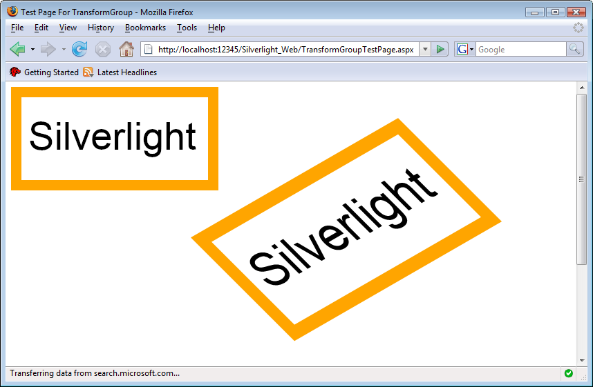
The complex calculations that are the basis for all Silverlight transformations can be further generalized. Every point (x,y) is multiplied by a 3×3 matrix to calculate its new coordinates. Since Silverlight supports only 2D, the third column of this matrix is always (0,0,1), because we cannot use a z coordinate. However, the other two columns are used by the previously shown transformations. For instance, the first two values in the first two rows are used to scale and skew elements; the first two values in the third row of the matrix provide the value to which an element is translated. By setting all values at once, you can combine translating, skewing, and scaling transformations.
The math behind these calculations is beyond the scope of this book,
but we will show you how this is done in markup. You need to use
the <MatrixTransform> element; its
Matrix property expects the first two values of each of the
three matrix rows to be a comma-separated list. Have a look at the code in
Example 7-6 and then try to figure out what effect these
values will have. The solution is shown in Figure 7-6.
Example 7-6. Transforming using a matrix, the XAML file (Page.xaml, project MatrixTransform)
<UserControl x:Class="HelloWorld.Page"
    xmlns="http://schemas.microsoft.com/client/2007"
    xmlns:x="http://schemas.microsoft.com/winfx/2006/xaml"
    Width="600" Height="400">
  <Grid x:Name="LayoutRoot" Background="White">
    <Canvas>

      <Rectangle Width="300" Height="150" Stroke="Orange" StrokeThickness="15" />
      <TextBlock FontFamily="Arial" FontSize="56" Canvas.Left="25" Canvas.Top="40"
        Foreground="Black" Text="Silverlight" />

      <Rectangle Canvas.Left="300"
        Width="300" Height="150" Stroke="Orange" StrokeThickness="15">
        <Rectangle.RenderTransform>
          <MatrixTransform Matrix="1,1.5,1.25,1.25,1.5,1" />
        </Rectangle.RenderTransform>
      </Rectangle>
      <TextBlock FontFamily="Arial" FontSize="56" Canvas.Left="325"
        Foreground="Black" Text="Silverlight">
        <TextBlock.RenderTransform>
          <MatrixTransform Matrix="1,1.5,1.25,1.25,1.5,1" />
        </TextBlock.RenderTransform>
      </TextBlock>

    </Canvas>
  </Grid>
</UserControl> 
Animations are usually just a cheap visual effect that is based on
an element’s properties being changed. So, for instance, if an element
moves from the top-left to the bottom-right corner of the canvas, its
Canvas.Left and Canvas.Top properties are changed a few times per second. If an element fades in
from out of nowhere, its Opacity value
is animated, from 100% to 0%. So, theoretically, you could rely
solely on C# and its access to Silverlight elements’ properties to create
animations. Of course, it is much more convenient to use the built-in
animation support. Setting up an animation requires quite a number of steps, but the
result can be very rewarding.
Creating an animation requires several steps and a couple of lines of markup, so IntelliSense is really handy here. For example, to smoothly move an element to another position you need to animate the element. For reasons that will become clear in a minute, you should name that element:
<TextBlock FontFamily="Arial" FontSize="56" Canvas.Left="25" Canvas.Top="40"
           Foreground="Black" Text="Silverlight" x:Name="MyTextBlock">
...
</TextBlock>
Within this element, define a trigger using a <TextBlock.Triggers> element
(if you were to animate a rectangle, you would use
<Rectangle.Triggers>, etc.). An actual trigger
(represented by <EventTrigger>) is activated when an event is fired. This event is provided
in the RoutedEvent attribute of
<EventTrigger>. Currently, Silverlight supports only
one event, Element.LoadedElement is the name of the object that
contains the trigger (here it is TextBlock):
<TextBlock FontFamily="Arial" FontSize="56" Canvas.Left="25" Canvas.Top="40"
           Foreground="Black" Text="Silverlight" x:Name="MyTextBlock">
  <TextBlock.Triggers>
    <EventTrigger RoutedEvent="TextBlock.Loaded">
    ...
    </EventTrigger>
  </TextBlock.Triggers>
</TextBlock>
Within the event trigger, a storyboard
is created. <BeginStoryboard> and <Storyboard> are the two necessary
elements. A storyboard is a set of one or more animations. You can
try to compare what a storyboard does for animations to what the
<TransformGroup> element does to transformations, which is to group several of
them together. An animation can consist of several individual
animations, but more on that in a minute:
<TextBlock FontFamily="Arial" FontSize="56" Canvas.Left="25" Canvas.Top="40"
           Foreground="Black" Text="Silverlight" x:Name="MyTextBlock">
  <TextBlock.Triggers>
    <EventTrigger RoutedEvent="TextBlock.Loaded">
      <BeginStoryboard>
        <Storyboard>
        ...
        </Storyboard>
      </BeginStoryboard>
    </EventTrigger>
  </TextBlock.Triggers>
</TextBlock>
Silverlight supports several animations, and we will cover all of
them in the next section. To complete the current example, let’s
introduce the most common animation: <DoubleAnimation>. This animation “animates” a value from a start value to an end
value—for instance, from 1 to 10. Every animation runs a certain amount
of time. Within that interval, the associated animation value is
gradually changed, from the start value to the end value. When the value
goes from 1 to 10, these values might be 1, 1.1, 1.2, and so on until
10, depending on the duration of the animation. If the value that is
animated is the x coordinate of the element to be
animated, this creates the visual effect of the element smoothly moving
from one point to another.
When using an animation, you will usually need several of these properties:
AutoReverseReverses the animation if it has ended (i.e., moves the element back to where it started)
DurationThe duration of an animation, using the syntax
hh:mm:ss(hours, minutes, seconds)FromToByA relative value indicating by how much to change the animation (an alternative approach for using
To)RepeatBehaviorWhat to do if the animation has ended; you can provide a (total) duration, a number of times to repeat, or mark it
Foreverif the animation should repeat endlesslyStoryboard.TargetNameThe name of the element that needs to be animated (therefore, we needed to assign a name)
Storyboard.TargetProperty
Note
The value of Storyboard.TargetProperty is the name
of the property that receives the animated values. If the property
includes a dot (such as in Canvas.Left and
Canvas.Top), you need to enclose the complete property
name in parentheses—for example, (Canvas.Left) and
(Canvas.Top).
Adding a <DoubleAnimation> concludes the code,
which is shown in Example 7-7. Both the rectangle and
the text are moved 300 pixels to the right, using the default animation
duration (here it is one second). Visual Studio 2008 may complain that
it does not know <Rectangle.Triggers> and <EventTrigger>, but it works
nevertheless, as Figure 7-7 shows.
Example 7-7. Using <DoubleAnimation>, the XAML file (Page.xaml, project DoubleAnimation)
<UserControl x:Class="DoubleAnimation.Page"
    xmlns="http://schemas.microsoft.com/client/2007"
    xmlns:x="http://schemas.microsoft.com/winfx/2006/xaml"
    Width="600" Height="400">
  <Grid x:Name="LayoutRoot" Background="White">
    <Canvas>

      <Rectangle Width="300" Height="150" Stroke="Orange" StrokeThickness="15"
        x:Name="MyRectangle">
        <Rectangle.Triggers>
          <EventTrigger RoutedEvent="Rectangle.Loaded">
            <BeginStoryboard>
              <Storyboard>
                <DoubleAnimation
                  From="0" To="300.456"
                  Storyboard.TargetName="MyRectangle"
                  Storyboard.TargetProperty="(Canvas.Left)" />
              </Storyboard>
            </BeginStoryboard>
          </EventTrigger>
        </Rectangle.Triggers>
      </Rectangle>
      <TextBlock FontFamily="Arial" FontSize="56" Canvas.Left="25" Canvas.Top="40"
        Foreground="Black" Text="Silverlight" x:Name="MyTextBlock">
        <TextBlock.Triggers>
          <EventTrigger RoutedEvent="TextBlock.Loaded">
            <BeginStoryboard>
              <Storyboard>
                <DoubleAnimation
                  From="25" To="325.456"
                  Storyboard.TargetName="MyTextBlock"
                  Storyboard.TargetProperty="(Canvas.Left)" />
              </Storyboard>
            </BeginStoryboard>
          </EventTrigger>
        </TextBlock.Triggers>
      </TextBlock>

    </Canvas>
  </Grid>
</UserControl> 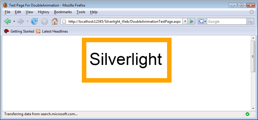
If you set up an animation that way, it will start immediately
after the trigger has been activated. Silverlight allows you to change
this behavior. Every animation also supports the BeginTime attribute, where you define the
time (again using the hh:mm:ss syntax) when the animation
starts. The code from Example 7-8 combines two <DoubleAnimation> elements: the first
one moves the element to the right, and the second one moves it to the
bottom. The second animation starts after three seconds, which happens
to be the exact time when the first animation has ended. Figure 7-8 shows the second phase of the storyboard: the
element is moving down.
Example 7-8. Combining animations and starting them later, the XAML file (Page.xaml, project DoubleAnimations)
<UserControl x:Class="DoubleAnimations.Page"
    xmlns="http://schemas.microsoft.com/client/2007"
    xmlns:x="http://schemas.microsoft.com/winfx/2006/xaml"
    Width="600" Height="400">
  <Grid x:Name="LayoutRoot" Background="White">
    <Canvas>

      <Rectangle Width="300" Height="150" Stroke="Orange" StrokeThickness="15"
        x:Name="MyRectangle">
        <Rectangle.Triggers>
          <EventTrigger RoutedEvent="Rectangle.Loaded">
            <BeginStoryboard>
              <Storyboard>
                <DoubleAnimation
                  From="0" To="300.456" Duration="0:0:3"
                  Storyboard.TargetName="MyRectangle"
                  Storyboard.TargetProperty="(Canvas.Left)" />
                <DoubleAnimation
                  From="0" To="150" BeginTime="0:0:3" Duration="0:0:3"
                  Storyboard.TargetName="MyRectangle"
                  Storyboard.TargetProperty="(Canvas.Top)" />
              </Storyboard>
            </BeginStoryboard>
          </EventTrigger>
        </Rectangle.Triggers>
      </Rectangle>
      <TextBlock FontFamily="Arial" FontSize="56" Canvas.Left="25" Canvas.Top="40"
        Foreground="Black" Text="Silverlight" x:Name="MyTextBlock">
        <TextBlock.Triggers>
          <EventTrigger RoutedEvent="TextBlock.Loaded">
            <BeginStoryboard>
              <Storyboard>
                <DoubleAnimation
                  From="25" To="325.456" Duration="0:0:3"
                  Storyboard.TargetName="MyTextBlock"
                  Storyboard.TargetProperty="(Canvas.Left)" />
                <DoubleAnimation
                  From="40" To="190" BeginTime="0:0:3" Duration="0:0:3"
                  Storyboard.TargetName="MyTextBlock"
                  Storyboard.TargetProperty="(Canvas.Top)" />
              </Storyboard>
            </BeginStoryboard>
          </EventTrigger>
        </TextBlock.Triggers>
      </TextBlock>

    </Canvas>
  </Grid>
</UserControl> 
Note
If you omit the BeginTime attribute in Example 7-8, both animations run at the same time, making
the elements move diagonally.
Apart from
<DoubleAnimation>, Silverlight also comes with
support for two additional animations with a more specific
purpose:
ColorAnimation(animates a color value—e.g.,Orange)PointAnimation(animates a point—e.g.,0,0)
Animating a color works wherever you have a Color
property. That means you
cannot animate, say, the
Stroke property. However, you can use a SolidColorBrush and animate the
Color property there.
The rest is easy. Use the <ColorAnimation>
element, set a From and a To color, and
Silverlight takes care of the
rest, as Example 7-9 shows (see Figure 7-9 for the browser output).
Example 7-9. Animating a color, the XAML file (Page.xaml, project ColorAnimation)
<UserControl x:Class="ColorAnimation.Page"
    xmlns="http://schemas.microsoft.com/client/2007"
    xmlns:x="http://schemas.microsoft.com/winfx/2006/xaml"
    Width="600" Height="400">
  <Grid x:Name="LayoutRoot" Background="White">
    <Canvas>
      <Rectangle Width="300" Height="150" StrokeThickness="15" x:Name=
          "MyRectangle">
        <Rectangle.Triggers>
          <EventTrigger RoutedEvent="Rectangle.Loaded">
            <BeginStoryboard>
              <Storyboard>
                <ColorAnimation
                  From="Green" To="Orange" Duration="0:0:5"
                  Storyboard.TargetName="MyBrush"
                  Storyboard.TargetProperty="Color" />
              </Storyboard>
            </BeginStoryboard>
          </EventTrigger>
        </Rectangle.Triggers>
        <Rectangle.Stroke>
          <SolidColorBrush x:Name="MyBrush" />
        </Rectangle.Stroke>
      </Rectangle>
      <TextBlock FontFamily="Arial" FontSize="56" Canvas.Left="25"
           Canvas.Top="40"
        Foreground="Black" Text="Silverlight" />
    </Canvas>
  </Grid>
</UserControl> 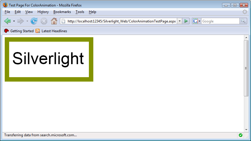
Note
Internally, Silverlight is using the RGB values of the colors used and then animates these values. This is why you get only shades of gray when animating black (RGB values 0, 0, 0) to white (RGB values 255, 255, 255), since the colors “between” these two values have the same amount of red, green, and blue.
A point animation (<PointAnimation> in
Silverlight’s XAML) animates a point from a start point to
an end point (or by a certain distance in the coordinate system using
By). To use it, you need to animate a property that
requires a point as a value. One example for that is the
<LinearGradientBrush>: its StartPoint and EndPoint
attributes are both points. So, let’s assume we have such a
brush:
<LinearGradientBrush StartPoint="0,0" EndPoint="1,1" x:Name="MyGradient">
  <GradientStop Color="Red" Offset="0.0" />
  <GradientStop Color="Green" Offset="0.5" />
  <GradientStop Color="Blue" Offset="1.0" />
</LinearGradientBrush>
To animate this brush’s StartPoint property, a
<PointAnimation> element such as the following would
do:
<PointAnimation
  From="0,0" To="1,0" Duration="0:0:4"
  Storyboard.TargetName="MyGradient"
  Storyboard.TargetProperty="StartPoint" />
The code in Example 7-10 combines two animations: the start point of the gradient is moved from the top-left to the top-right corner and the end point of the gradient is moved from the bottom-left to the bottom-right corner. Figure 7-10 shows the Silverlight application in the browser during this animation: the gradient is moving.
Example 7-10. Animating a point, the XAML file (Page.xaml, project PointAnimation)
<UserControl x:Class="PointAnimation.Page"
    xmlns="http://schemas.microsoft.com/client/2007"
    xmlns:x="http://schemas.microsoft.com/winfx/2006/xaml"
    Width="600" Height="400">
  <Grid x:Name="LayoutRoot" Background="White">
    <Canvas>

      <Rectangle Width="300" Height="150" StrokeThickness="15" x:Name="MyRectangle">
        <Rectangle.Triggers>
          <EventTrigger RoutedEvent="Rectangle.Loaded">
            <BeginStoryboard>
              <Storyboard>
                <PointAnimation
                  From="0,0" To="1,0" Duration="0:0:4"
                  Storyboard.TargetName="MyGradient"
                  Storyboard.TargetProperty="StartPoint" />
                <PointAnimation
                  From="1,1" To="0,1" Duration="0:0:4"
                  Storyboard.TargetName="MyGradient"
                  Storyboard.TargetProperty="EndPoint" />
              </Storyboard>
            </BeginStoryboard>
          </EventTrigger>
        </Rectangle.Triggers>
        <Rectangle.Stroke>
          <LinearGradientBrush StartPoint="0,0" EndPoint="1,1" x:Name="MyGradient">
            <GradientStop Color="Red" Offset="0.0" />
            <GradientStop Color="Green" Offset="0.5" />
            <GradientStop Color="Blue" Offset="1.0" />
          </LinearGradientBrush>
        </Rectangle.Stroke>
      </Rectangle>
      <TextBlock FontFamily="Arial" FontSize="56" Canvas.Left="25" Canvas.Top="40"
        Foreground="Black" Text="Silverlight" />

    </Canvas>
  </Grid>
</UserControl> 
All of the animations so far were quite flexible in terms of the beginning and end times, but there was one severe restriction: every animation only took care of exactly one value that was animated. A bit more complex, but also a bit more flexible, are so-called keyframe animations. The term keyframe is used heavily in Adobe Flash and identifies a frame during the course of a Flash movie where a certain state in the application must be reached (e.g., objects need to have specific positions). Silverlight uses keyframes only as part of special animations, but the approach is comparable: when a keyframe is reached, a certain object value must be met.
All three animation types we know so far
(<DoubleAnimation>,
<ColorAnimation>, and
<PointAnimation>) can also be used with keyframes.
Then the names of the elements change (to <DoubleAnimationUsingKeyFrames>,
<ColorAnimationUsingKeyFrames>, and
<PointAnimationUsingKeyFrames>). Within each element, you provide the number of keyframes.
Every keyframe needs at least two values, or attributes:
When you have one keyframe after two seconds (providing a value of 10), and another one after four seconds (providing a value of 20), the value that you assign in these two frames will be animated between them. How this value is animated from 10 to 20 will be defined by the second keyframe. There are different ways to interpolate the value, and the second keyframe needs to confirm which of these methods is used. Silverlight currently supports three methods:
Every keyframe can come in different flavors: different type of
value that is animated (Double, Color,
Point) and a different type of interpolation method (Linear, Discrete,
Spline). The name of the keyframe element in XAML is the
concatenation of interpolation
type, value type, and KeyFrame. Therefore, a keyframe that
uses a spline interpolation of colors would be represented by
the <SplineColorKeyFrame> element.
Apart from that, keyframe animations just work as animations without keyframes. So, without further ado, have a look at Example 7-11 where the rectangle and the text block are moved around the canvas. The animations for the x and the y coordinate consist of four subanimations each. We are using a splined animation each time. Figure 7-11 shows the application in the animations.
Example 7-11. Animating using keyframes, the XAML file (Page.xaml, project KeyFrameAnimation)
<UserControl x:Class="KeyFrameAnimation.Page"
    xmlns="http://schemas.microsoft.com/client/2007"
    xmlns:x="http://schemas.microsoft.com/winfx/2006/xaml"
    Width="600" Height="400">
  <Grid x:Name="LayoutRoot" Background="White">
    <Canvas>

      <Rectangle Width="300" Height="150" Stroke="Orange" StrokeThickness="15"
x:Name="MyRectangle">
        <Rectangle.Triggers>
          <EventTrigger RoutedEvent="Rectangle.Loaded">
            <BeginStoryboard>
              <Storyboard>
                <DoubleAnimationUsingKeyFrames
                  Storyboard.TargetName="MyRectangle"
                  Storyboard.TargetProperty="(Canvas.Left)"
                  Duration="0:0:8">
                  <SplineDoubleKeyFrame Value="300" KeyTime="0:0:2"
                    KeySpline="0.25,0.75 0.75,0.25" />
                  <SplineDoubleKeyFrame Value="100" KeyTime="0:0:4"
                    KeySpline="0.75,0.25 0.25,0.75" />
                  <SplineDoubleKeyFrame Value="50" KeyTime="0:0:6"
                    KeySpline="0.25,0.75 0.75,0.25" />
                  <SplineDoubleKeyFrame Value="200" KeyTime="0:0:8"
                    KeySpline="0.75,0.25 0.25,0.75" />
                </DoubleAnimationUsingKeyFrames>
                <DoubleAnimationUsingKeyFrames
                  Storyboard.TargetName="MyRectangle"
                  Storyboard.TargetProperty="(Canvas.Top)"
                  Duration="0:0:8">
                  <SplineDoubleKeyFrame Value="50" KeyTime="0:0:2"
                    KeySpline="0.25,0.75 0.75,0.25" />
                  <SplineDoubleKeyFrame Value="250" KeyTime="0:0:4"
                    KeySpline="0.75,0.25 0.25,0.75" />
                  <SplineDoubleKeyFrame Value="50" KeyTime="0:0:6"
                    KeySpline="0.25,0.75 0.75,0.25" />
                  <SplineDoubleKeyFrame Value="100" KeyTime="0:0:8"
                    KeySpline="0.75,0.25 0.25,0.75" />
                </DoubleAnimationUsingKeyFrames>
              </Storyboard>
            </BeginStoryboard>
          </EventTrigger>
        </Rectangle.Triggers>
      </Rectangle>
      <Canvas Canvas.Left="25" Canvas.Top="40">
        <TextBlock FontFamily="Arial" FontSize="56" Foreground="Black"
          Text="Silverlight" x:Name="MyTextBlock">
          <TextBlock.Triggers>
            <EventTrigger RoutedEvent="TextBlock.Loaded">
              <BeginStoryboard>
                <Storyboard>
                  <DoubleAnimationUsingKeyFrames
          Storyboard.TargetName="MyTextBlock"
          Storyboard.TargetProperty="(Canvas.Left)"
          Duration="0:0:8">
          <SplineDoubleKeyFrame Value="300" KeyTime="0:0:2"
          KeySpline="0.25,0.75 0.75,0.25" />
          <SplineDoubleKeyFrame Value="100" KeyTime="0:0:4"
          KeySpline="0.75,0.25 0.25,0.75" />
          <SplineDoubleKeyFrame Value="50" KeyTime="0:0:6"
          KeySpline="0.25,0.75 0.75,0.25" />
          <SplineDoubleKeyFrame Value="200" KeyTime="0:0:8"
          KeySpline="0.75,0.25 0.25,0.75" />
          </DoubleAnimationUsingKeyFrames>
          <DoubleAnimationUsingKeyFrames
          Storyboard.TargetName="MyTextBlock"
          Storyboard.TargetProperty="(Canvas.Top)"
          Duration="0:0:8">
          <SplineDoubleKeyFrame Value="50" KeyTime="0:0:2"
          KeySpline="0.25,0.75 0.75,0.25" />
          <SplineDoubleKeyFrame Value="250" KeyTime="0:0:4"
          KeySpline="0.75,0.25 0.25,0.75" />
          <SplineDoubleKeyFrame Value="50" KeyTime="0:0:6"
          KeySpline="0.25,0.75 0.75,0.25" />
          <SplineDoubleKeyFrame Value="100" KeyTime="0:0:8"
          KeySpline="0.75,0.25 0.25,0.75" />
          </DoubleAnimationUsingKeyFrames>
                </Storyboard>
              </BeginStoryboard>
            </EventTrigger>
          </TextBlock.Triggers>
        </TextBlock>
      </Canvas>

    </Canvas>
  </Grid>
</UserControl> 
The final example in this chapter will show you how animations are exposed in C# code. This allows you to control animations from script code and will also provide a means to overcome the limitation of animations always starting when the XAML files were loaded. The example will start the animation when the mouse hovers over the elements on the canvas, pause it when the mouse leaves the canvas, and resume it again when the mouse pointer is back.
Since we need C# code in the example, we will use a XAML code-behind C# file. The Visual Studio project template has already created the file Page.xaml.cs for us. We have looked at these .xaml.cs files before (e.g., in Chapter 6), but just to make sure, have a look at Example 7-12, where you’ll see the file as it comes with the template.
Example 7-12. Scripting animations, the original C# file (Page.xaml.cs, project AnimationResources)
using System;
using System.Windows;
using System.Windows.Controls;
using System.Windows.Documents;
using System.Windows.Ink;
using System.Windows.Input;
using System.Windows.Media;
using System.Windows.Media.Animation;
using System.Windows.Shapes;

namespace AnimationResources
{
    public partial class Page : UserControl
    {
        public Page()
        {
            // Required to initialize variables
            InitializeComponent();
        }
    }
}
To access an animation, you need to provide a name for the <Storyboard> element, because you
can only control the playing state of storyboards, not individual
animations. The code in this example introduces a new element,
<Canvas.Resources>, which is not required for the example, but shows a nice
way to separate animations from the elements that are animated. <Canvas.Resources> contains resources,
which are elements that are referenced or used elsewhere in the
Silverlight application. In this example, we just put two (named!) storyboards in
there. Each storyboard contains a <DoubleAnimation>
element that runs forever, and we have also set AutoReverse
to True:
<Canvas.Resources>
  <Storyboard x:Name="MyRectangleStoryboard">
    <DoubleAnimation
      From="0" To="300.456"
      Storyboard.TargetName="MyRectangle"
      Storyboard.TargetProperty="(Canvas.Left)"
      AutoReverse="True" RepeatBehavior="Forever"/>
  </Storyboard>
  <Storyboard x:Name="MyTextBlockStoryboard">
    <DoubleAnimation
      From="0" To="300.456"
      Storyboard.TargetName="MyTextBlock"
      Storyboard.TargetProperty="(Canvas.Left)"
      AutoReverse="True" RepeatBehavior="Forever"/>
  </Storyboard>
</Canvas.Resources>
As you can see, the two animations change the
x coordinate of a rectangle (MyRectangle) and a text block
(MyTextBlock).
Caution
You can take the process of separating a storyboard from the
animated element using <Canvas.Resources> one step
further by omitting the Storyboard.TargetName property and setting
it dynamically from C#. However, you can do that only if the animation
has not yet started.
Example 7-13 shows the complete XAML markup. Note
that there are two mouse event handlers in the
<Canvas> element, but no triggers on the page.
Example 7-13. Scripting animations, the XAML file (Page.xaml, project AnimationResources)
<UserControl x:Class="AnimationResources.Page"
    xmlns="http://schemas.microsoft.com/client/2007"
    xmlns:x="http://schemas.microsoft.com/winfx/2006/xaml"
    Width="600" Height="400">
  <Grid x:Name="LayoutRoot" Background="White">
    <Canvas MouseEnter="beginAnimation" MouseLeave="pauseAnimation">
      <Canvas.Resources>
        <Storyboard x:Name="MyRectangleStoryboard">
          <DoubleAnimation
            From="0" To="300.456"
            Storyboard.TargetName="MyRectangle"
            Storyboard.TargetProperty="(Canvas.Left)"
            AutoReverse="True" RepeatBehavior="Forever"/>
        </Storyboard>
        <Storyboard x:Name="MyTextBlockStoryboard">
          <DoubleAnimation
            From="0" To="300.456"
            Storyboard.TargetName="MyTextBlock"
            Storyboard.TargetProperty="(Canvas.Left)"
            AutoReverse="True" RepeatBehavior="Forever"/>
        </Storyboard>
      </Canvas.Resources>
      <Rectangle Width="300" Height="150" Stroke="Orange" StrokeThickness="15"
        x:Name="MyRectangle"/>
      <Canvas Canvas.Left="25" Canvas.Top="40">
        <TextBlock FontFamily="Arial" FontSize="56" Foreground="Black"
          Text="Silverlight" x:Name="MyTextBlock"/>
      </Canvas>
    </Canvas>
  </Grid>
</UserControl>
Accessing such a storyboard is easy. Just use the well-known
FindName() method introduced in Chapter 6 and provide the name of the
<Storyboard> element, or alternatively access the
storyboards by their names. You can then control the animations using
these five methods:
We now need to work on the event handlers. When the mouse leaves
the canvas, we pause the animations using the pause() method. Here is the code:
private void pauseAnimation(object sender, MouseEventArgs e)
{
  MyRectangleStoryboard.Pause();
  MyTextBlockStoryboard.Pause();
}
Starting the animations is a bit more complicated because the
Begin() method starts an animation (or a storyboard, to
be exact) at the very beginning, but does not resume paused animations
at their current position. On the other hand, the
Resume() method resumes a paused animation, but does
not start a stopped one. Therefore, the C# property hasBegun needs to remember whether the
animation has already been started. Once an animation has been started,
it will not be stopped (only eventually paused), since
RepeatBehavior has been set to Forever. This
allows us to implement the MouseHover
event handler. Example 7-14 shows the complete
code.
Example 7-14. Scripting animations, the XAML C# file (Page.xaml.cs, project AnimationResources)
using System.Windows.Controls;
using System.Windows.Input;
using System.Windows.Media.Animation;
namespace AnimationResources
{
public partial class Page : UserControl
{
private bool hasBegun = false;
public Page()
{
// Required to initialize variables
InitializeComponent();
}
private void beginAnimation(object sender, MouseEventArgs e)
{
if (hasBegun)
{
MyRectangleStoryboard.Resume();
MyTextBlockStoryboard.Resume();
}
else
{
MyRectangleStoryboard.Begin();
MyTextBlockStoryboard.Begin();
hasBegun = true;
}
}
private void pauseAnimation(object sender, MouseEventArgs e)
{
MyRectangleStoryboard.Pause();
MyTextBlockStoryboard.Pause();
}
}
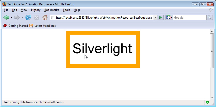
} Figure 7-12 shows the application in action (but you’ll get the real experience when you try the code on your own). When the mouse hovers over the canvas, the animation starts. If you move the mouse pointer off the canvas, the animation stops, but if the mouse pointer returns, the animation continues at the same position at which it previously stopped.
Transformations and animations are quite different concepts, but both can achieve impressive effects with little effort. With bigger projects, you will probably resort to Microsoft Expression Blend 2.5 to get these effects up and running, but this chapter also showed you how to use code to provide additional functionality. And, by the way, you can also combine the two techniques presented here—transformations can be animated too.
In Chapter 8, you’ll see how you can make use of sound, video, and other media to enrich your Silverlight application.
- http://silverlight.net/quickstarts/silverlight10/animations.aspx
Microsoft quickstart on Silverlight 1.0 animations