XAML is an XML dialect, so you’ll see a lot of angle brackets here and throughout this book. In this chapter, we will have a look at the most important XAML elements used in a Silverlight application. It is virtually impossible to cover them all in a book of this size, but we will present as many as possible to let you dive into XAML with maximum speed and get a sense of the power of Silverlight markup.
If you have already worked with XAML for WPF applications, you already know most of what is covered in this chapter (and most of Chapter 7 as well). However, there are some subtle differences: Silverlight does not support the full XAML format that WPF does, but only a (quite decent) subset. Future releases of Silverlight will increase the percentage of supported WPF elements and attributes, but some things just will not work in a web browser as they do in a desktop application.
In Silverlight 1.0, the root element of every XAML file is <Canvas>, which
defines the area that holds the Silverlight content (Positioning Elements later will show other uses for the <Canvas> element). This has changed with
Silverlight 2, providing you with more flexibility. However, when you are
using the Silverlight Script web site template, you
indeed have <Canvas> as your root
element, in the following fashion:
<Canvas xmlns="http://schemas.microsoft.com/client/2007"
        xmlns:x="http://schemas.microsoft.com/winfx/2006/xaml">
  ...
</Canvas>
If you are using the Silverlight Project template, the original structure looks different:
<UserControl x:Class="HelloWorld.Page"
    xmlns="http://schemas.microsoft.com/client/2007"
    xmlns:x="http://schemas.microsoft.com/winfx/2006/xaml"
    Width="400" Height="300">
    <Grid x:Name="LayoutRoot" Background="White">
      ...
    </Grid>
</UserControl>
We are using the project template for most of this book. To facilitate
a migration to the script template, most examples will use <Canvas> as the first element, either in the
form of the root element (script template) or as the first element
within <Grid> (project
template). Whatever way you prefer, always remember to put the correct
namespaces at the beginning.
The first example used to introduce most technologies is some
variation of “Hello World” (see Chapter 3 for such an
example). This chapter will start with something like “Hello World” as
well: we will add text to the Silverlight content developed in Chapter 4. The element used for this is
<TextBlock> (an example of which is shown in Figure 3-5) and there are two ways to provide this
text:
Within the
Textattribute of the elementAs a text node within the element
Example 5-1 uses the latter approach to output some
simple text. Note that using text within <TextBlock>
was not allowed in older Silverlight versions, but it worked
nevertheless; Figure 5-1 proves that it still
does.
Example 5-1. Using simple text, the XAML file (Page.xaml, project Text1)
<UserControl x:Class="Text1.Page"
    xmlns="http://schemas.microsoft.com/client/2007"
    xmlns:x="http://schemas.microsoft.com/winfx/2006/xaml"
    Width="400" Height="300">
  <Grid x:Name="LayoutRoot" Background="White">
    <Canvas>
      <TextBlock>Silverlight</TextBlock>
    </Canvas>
  </Grid>
</UserControl>
To repeat the structure of a Silverlight application from Chapter 3, you need more files to make this example work in a
web browser. If you are using the project template, you already saw in
Chapter 3 that the <asp:Silverlight> control (part of the
ASP.NET 3.5 Extensions) does the trick. If you are using the web site and
do not want to rely on the Extensions, there is an alternative approach.
First, you need JavaScript code that initializes the Silverlight content.
The SDK and the script templates contain a file called Silverlight.js that provides you with the
functionality to embed Silverlight content into an HTML page. The page
hosting the Silverlight content uses the Silverlight.js file and calls one of its
methods, Silverlight.createObjectEx(), as you can see in Example 5-2. For most of the
remainder of this book, we will use the project-based template; however,
it requires little effort to port these examples to the script web site
template.
Example 5-2. Using simple text, the JavaScript code (excerpt from Default.html, project ScriptWeb)
if (!window.Silverlight)
    window.Silverlight = {};

  Silverlight.createDelegate = function(instance, method) {
    return function() {
          return method.apply(instance, arguments);
      }
  }

  var scene = new ScriptWeb1.Scene();

  Silverlight.createObjectEx({
    source: 'Scene.xaml',
    parentElement: document.getElementById('silverlightPlugInHost'),
    id: 'silverlightPlugIn',
    properties: {
      width: '100%',
      height: '100%',
      background:'white',
      version: '1.0'
    },
    events: {
      onLoad: Silverlight.createDelegate(scene, scene.handleLoad),
      onError: function(sender, args) {
      var errorDiv = document.getElementById("errorLocation");
      if (errorDiv != null) {
        var errorText = args.errorType + "- " + args.errorMessage;

        if (args.ErrorType == "ParserError") {
          errorText += "<br>File: " + args.xamlFile;
          errorText += ", line " + args.lineNumber;
          errorText += " character " + args.charPosition;
        }
        else if (args.ErrorType == "RuntimeError") {
          errorText += "<br>line " + args.lineNumber;
          errorText += " character " +  args.charPosition;
        }
        errorDiv.innerHTML = errorText;
      }
    }
    },
    context: null
  });
Note the highlighted code elements:
The
sourceproperty must be filled with the URL of the XAML file.The
parentElementproperty must be filled with a reference to the DOM element that will hold the Silverlight content.The
idproperty provides a value that JavaScript code may use to access the Silverlight content (see Chapter 15 for details).
Now let’s have a closer look at the HTML file that is used as the
primary page to be loaded in the browser. The HTML page needs to contain
a <div> container with the same ID that
has been provided in the parentElement property. Finally, the
page needs to include the JavaScript code from Example 5-2. Example 5-3 has the full code, and
Figure 5-1 shows the output—the text appears.
Example 5-3. Using simple text, the HTML file (Default.html, project ScriptWeb)
<html xmlns="http://www.w3.org/1999/xhtml">
<head>
  <title>ScriptWeb1</title>

  <script type="text/javascript" src="Silverlight.js"></script>
  <script type="text/javascript" src="Scene.js"></script>
    <style type="text/css">
    #errorLocation {
      font-size: small;
      color: Gray;
    }
    #silverlightControlHost {
      height: 480px;
            width: 640px;
    }

  </style>
</head>

<body>
    <!-- Runtime errors from Silverlight will be displayed here.
  This will contain debugging information and should be removed or hidden
    when debugging is completed -->
  <div id='errorLocation'></div>

  <div id="silverlightPlugInHost">
    <script type="text/javascript">
      if (!window.Silverlight)
          window.Silverlight = {};

        Silverlight.createDelegate = function(instance, method) {
          return function() {
                return method.apply(instance, arguments);
            }
        }

        var scene = new ScriptWeb1.Scene();

        Silverlight.createObjectEx({
          source: 'Scene.xaml',
          parentElement: document.getElementById('silverlightPlugInHost'),
          id: 'silverlightPlugIn',
          properties: {
            width: '100%',
            height: '100%',
            background:'white',
            version: '1.0'
          },
          events: {
            onLoad: Silverlight.createDelegate(scene, scene.handleLoad),
            onError: function(sender, args) {
            var errorDiv = document.getElementById("errorLocation");
            if (errorDiv != null) {
              var errorText = args.errorType + "- " + args.errorMessage;

              if (args.ErrorType == "ParserError") {
                errorText += "<br>File: " + args.xamlFile;
                errorText += ", line " + args.lineNumber;
                errorText += " character " + args.charPosition;
              }
              else if (args.ErrorType == "RuntimeError") {
                errorText += "<br>line " + args.lineNumber;
                errorText += " character " +  args.charPosition;
              }
              errorDiv.innerHTML = errorText;
            }
          }
          },
          context: null
        });
    </script>
  </div>
</body>
</html>
Note
Creating new Silverlight apps starts with copying and pasting most of the time. When creating new content, you need copies of the HTML file, the XAML file, and, optionally, the XAML JavaScript file (you will see such a file in action in Chapter 6). Then you just have to update all filenames and you are set. Therefore, we will print the HTML file only if it is beneficial to better understand the concept of a given example. We will also avoid reprinting the HTML file with the JavaScript code if there is no special additional information in it. The code downloads for this book always come with complete, running code.
Figure 5-1 shows the default layout for text: the text uses the Lucida font, has a size of 11 points, and is displayed in black. To make this possible, the font does not even have to be installed on the client (or on the server); it is part of the plug-in. Therefore, the experience on Mac OS X is almost the same, as Figure 5-2 shows.


Apart from the Lucida font, several other fonts are also supported cross-platform:
Other fonts, even if they are installed on the client, are not supported; Silverlight uses Lucida if the font name is invalid.
Note
It is possible to load external OpenType or TrueType (TTF) fonts and use them within a Silverlight application. Refer to Chapter 16 for details.
There are several ways to apply these fonts. First of all, some of
the <TextBlock> attributes come in handy:
You can easily apply these attributes to a
<TextBlock> element. However, if you would like to use
different formattings in one <TextBlock>, you have
another option. Use the <Run> element within
<TextBlock> to provide inline formatting options. This
concept can be compared to HTML: imagine <TextBlock> as
a <div> element and <Run> as a <span> element within that
<div> element. The styles of the
<div> element provide the basic layout of the text
within, but <span> styles may override
<div> styles.
Example 5-4 shows some styling options. It also introduces a new XAML element:
- The
<LineBreak>element - The
Foregroundattribute This defines the foreground (here it is text) color. You can use a defined color name (
Red,Green,Blue, etc.), or an RGB triple (#ff0000,#00ff00,#0000ff, etc.), or aRGB. The “a” stands for alphatransparency. Just provide a value between 0 (00) and 255 (ff) that defines the degree of the nontransparency. If you set it to00, the element is fully transparent (e.g., the background is seen, the element is not). If you set it toff, the element is not transparent at all, so you do not see the background. If you use a value in between, the background shines through at the given degree. For instance,#7fffff00is a yellow (ffff00) that is about 50% transparent (7fis hex for 127).
Note
You can also provide the background color for an element, using
the Background property.
Refer to Figure 5-3 for the output in the browser.
Example 5-4. Text styling options, the XAML file (Page.xaml, project Text2)
<UserControl x:Class="Text2.Page"
    xmlns="http://schemas.microsoft.com/client/2007"
    xmlns:x="http://schemas.microsoft.com/winfx/2006/xaml"
    Width="400" Height="300">
  <Grid x:Name="LayoutRoot" Background="White">
    <Canvas>
      <TextBlock Foreground="Blue" FontFamily="Arial" FontSize="24" FontWeight="Bold">
        Arial, 24pt, Bold, Blue
        <LineBreak />
        <Run FontSize="36" FontWeight="Light" Text="Arial, 36pt, Light, Blue" />
        <LineBreak />
        <Run FontFamily="Times New Roman" Foreground="#7fffff00" Text="Times New Roman,
        24pt, Bold, Yellow" />
      </TextBlock>
    </Canvas>
  </Grid>
</UserControl> 
Most typical Silverlight visual elements are shapes: geometrical elements that make up the visual experience of the application. This section will cover many of the available options.
Before we dive into the different supported shapes, we will examine formatting options. There are several of them, and many of them are specific to certain shapes, but the following three properties are shared among all shapes:
We start with probably the easiest shape: a line, represented in
XAML by the <Line> element. You need to provide the
start and end points of the line and use the Silverlight coordinate system
(which is pixel-based; the origin is in the top-left corner). The
associated attribute names are X1, Y1,
X2, and Y2. Example 5-5 paints a
simple triangle, using three lines, and Figure 5-4 shows
the browser output. Note that thanks to the 5-pixel width of the strokes,
the corners of the triangle are not perfect.
Example 5-5. A triangle with three lines, the XAML file (Page.xaml, project Line)
<UserControl x:Class="Line.Page"
    xmlns="http://schemas.microsoft.com/client/2007"
    xmlns:x="http://schemas.microsoft.com/winfx/2006/xaml"
    Width="400" Height="300">
  <Grid x:Name="LayoutRoot" Background="White">
    <Canvas>
      <Line Stroke="Red" StrokeThickness="5" X1="200" Y1="50" X2="350"
        Y2="250" />
      <Line Stroke="Green" StrokeThickness="5" X1="350" Y1="250" X2="50"
        Y2="250" />
      <Line Stroke="Blue" StrokeThickness="5" X1="50" Y1="250" X2="200"
        Y2="50" />
    </Canvas>
  </Grid>
</UserControl> 
If you want to create a closed shape, such as a triangle, rectangle,
and so on, you would be better off using the <Polygon>
element, which combines all points. In the Points
property, you need to provide a list of points, using this
format:
X1,Y1 X2,Y2 X3,Y3 ... Xn,YnThe rendering algorithm is as follows: the first point is connected
with the second one, the second one with the third one, and so on; at some
time, point number n–1nn
Note
If you want to omit the final step (e.g., if you create a shape
that is not closed because the last point is not connected with the
first one), use <Polyline> instead of
<Polygon>.
Example 5-6 once again creates the same triangle as
before, but this time the corners are much better, as Figure 5-5 shows. Since we cannot use alternating edge colors
when using <Polygon>, we added an additional visual
effect by setting the Fill property.
Example 5-6. A triangle as a polygon, the XAML file (Page.xaml, project Polygon)
<UserControl x:Class="Polygon.Page"
    xmlns="http://schemas.microsoft.com/client/2007"
    xmlns:x="http://schemas.microsoft.com/winfx/2006/xaml"
    Width="400" Height="300">
  <Grid x:Name="LayoutRoot" Background="White">
    <Canvas>
      <Polygon Points="200,50 350,250 50,250"
        Stroke="Black" StrokeThickness="5" Fill="Orange" />
    </Canvas>
  </Grid>
</UserControl> 
A special case of a polygon is a rectangle, represented in
Silverlight with the <Rectangle>
element. Here you do not provide the coordinates of all corners (or of the
top-left and bottom-right corner), but take a different approach: you
provide the width and height of the rectangle in its Width
and Height attributes. The actual position of the rectangle
is provided using the technique introduced in Positioning Elements
later, so we will omit this feature for now. However, we would like to
showcase another feature of <Rectangle>: rounded
corners.
A rounded corner is actually an ellipsis (which will get coverage of
its own next). You can now provide the radius of that ellipsis. If the
horizontal and vertical radii are the same, you get a circle, which is the
most common option for a rounded corner. However, you can also provide different
radius values to create a different visual effect. The attributes you need
to use are RadiusX and RadiusY.
Example 5-7 uses an ellipsis with a RadiusX:RadiusY ratio of 100:1. In Figure 5-6 you see the result: the rounded corners slightly
overlap the two horizontal edges of the rectangle.
Example 5-7. A rectangle with rounded corners, the XAML file (Page.xaml, project Rectangle)
<UserControl x:Class="Rectangle.Page"
    xmlns="http://schemas.microsoft.com/client/2007"
    xmlns:x="http://schemas.microsoft.com/winfx/2006/xaml"
    Width="400" Height="300">
  <Grid x:Name="LayoutRoot" Background="White">
    <Canvas>
      <Rectangle Width="200" Height="150"
        Stroke="Black" StrokeThickness="5" Fill="Orange"
        RadiusX="100" RadiusY="1"/>
    </Canvas>
  </Grid>
</UserControl> 
The final shape is also the most important one, especially if you
have a complex design, such as a path, or the <Path>
element. Its most important property is Data, which
contains information defining the path. To tell the truth, it’s usually
design tools that create paths, since any shape, regardless of how complex
it is, can be transformed into a path. This section will provide you with
a crash course on path syntax.
A path consists of several painting instructions: moving the virtual “pen” to a certain position, drawing certain shapes, and ending the drawing. Every instruction starts with a (case-insensitive) letter that identifies the instruction, and several parameters may follow.
The first part of a path is the so-called fill rule. This takes care
of a special case: what happens if elements in the path overlap. You may
choose between the default values F0
and F1:
F0Stands for
EvenOdd, meaning that points that have an even number of path segments between them and the end of the canvas are considered outside the path; points with an odd number are considered inside and would be filled.F1Stands for
NonZero, meaning that all points where a line between the point and the end of the canvas crosses the path from the left side as often as from the right side are considered inside the path.
Generally, EvenOdd is what you
will want, and since it is the default value, you do not have to provide
it at all.
Next up are the instructions. The first one is usually
M, which stands for “move.” This moves the virtual pen to a certain
position but does not start drawing. The following path would put the pen
at x coordinate 40 and y
coordinate 30:
M 40,30
Starting from that point, several shapes are possible. We will start
once again with a line, denoted by the L command. You have to
provide only the end point of the line—the starting point is defined by
the current pen position! The following path would therefore draw a line
from (40,30) to (70,80):
M 40,30 L 70,80
Note
Special cases of lines are horizontal lines (H
command) and vertical lines (V command). For horizontal
lines you need to provide only the x coordinate of
the end point; for vertical lines you need to provide only the
y coordinate of the end point.
By using lines, you can create any geometric shape that does not
have curves. For curves, however, several options exist. The A command draws an elliptical arc. You need to provide a set of parameters:
The x and y radii of the ellipsis
The rotation angle of the ellipsis (use degrees)
Whether the angle is larger than 180 degrees (
1) or not (0)Whether the arc is drawn in a positive direction (
1) or not (0)The end point of the arc
The following markup would create an arc from (50,50) to (100,50), using an x and y radius of 75 each, with a 90-degree rotation angle in the positive direction:
M 50,50 A 50,50 90 0 1 100,50
A type of curve that is very common in the vector graphics field is
the Bézier curve, named after French automobile designer Pierre
Bézier. Assume that you have two points, A and B. Bézier defined a couple
of mathematical equations that define curves between those points. The
easiest one is a linear curve, but they are easy to draw without any extra
help from Silverlight. However, there are more complex variants. A
quadratic Bézier curve (called that because in the defining formula values
are squared) uses a so-called control point to shape the exact look of the
curve. The associated Silverlight path command, Q, provides
the coordinates of this control point and also of the end point; remember
that the start point is again defined by the current position of the
pen.
The following markup moves the pen to (125,125) and creates a Bézier curve to (175,75), using (110,60) as a control point:
M 125,125 Q 110,60 175,75
A cubic Bézier curve goes one step further and uses two control
points. The associated Silverlight path command is C.
Here is an example—the curve goes from (150,125) to
(50,100), using the two control points (125,175) and (20,125):
M 150,125 C 125,175 20,125 50,100
Note
More advanced Bézier curves are available as well: they take the
previous point of the curve into account, making the curve look
smoother. For “smooth,” the sister of the quadratic Bézier curve uses
the S command, and the “smooth” cubic Bézier curve uses
T. The syntax is the same as with the Q and
C commands.
One final command is missing. It is called Z and it closes a path, meaning that the
pen draws a straight line to the beginning of the path.
Example 5-8 shows several of the previous path commands in action. In Figure 5-7, working clockwise, you can see a straight line, an elliptical arc to the right of the straight line, a quadratic Bézier curve to the right of the arc, and a cubic Bézier curve. The control points for the Bézier curves have been marked with an X so that you can see which points the curves are approaching. These markers have also been created using a path (drawing two crossing lines).
Example 5-8. Using paths, the XAML file (Page.xaml, project Path)
<UserControl x:Class="Path.Page"
    xmlns="http://schemas.microsoft.com/client/2007"
    xmlns:x="http://schemas.microsoft.com/winfx/2006/xaml"
    Width="400" Height="300">
  <Grid x:Name="LayoutRoot" Background="White">
    <Canvas>

      <Path Data="M 20,10 L 40,70"
        Stroke="Red" StrokeThickness="5" />

      <Path Data="M 50,50 A 50,50 90 0 1 100,50"
        Stroke="Yellow" StrokeThickness="5" />

      <Path Data="M 125,75 Q 200,100 175,125"
        Stroke="Green" StrokeThickness="5" />
      <Path Data="M 195,95 L 205,105 M 205,95 L 195,105"
        Stroke="Black" StrokeThickness="2" />

      <Path Data="M 150,125 C 125,175 20,125 50,100"
        Stroke="Blue" StrokeThickness="5" />
      <Path Data="M 120,170 L 130,180 M 130,170 L 120,180"
        Stroke="Black" StrokeThickness="2" />
      <Path Data="M 15,120 L 25,130 M 25,120 L 15,130"
        Stroke="Black" StrokeThickness="2" />

    </Canvas>
  </Grid>
</UserControl> 
As mentioned at the beginning of this section, creating a path manually can be painful, so you should use graphics software for that. However, you can now analyze and understand paths that are created by vector graphic programs.
Tip
If you have used SVG before, this path syntax will be very similar to what you are used to. Most vector formats use the same features for their paths, so the different forms of syntax are very alike.
One more shape should not be forgotten: an ellipse, represented
by the <Ellipse> element. The most
important attributes are Width and Height,
defining the size of the ellipse. Example 5-9 shows the
code for using an ellipse, and Figure 5-8 shows the
browser output.
Example 5-9. Using an ellipse, the XAML file (Page.xaml, project Ellipse)
<UserControl x:Class="Ellipse.Page"
    xmlns="http://schemas.microsoft.com/client/2007"
    xmlns:x="http://schemas.microsoft.com/winfx/2006/xaml"
    Width="400" Height="300">
  <Grid x:Name="LayoutRoot" Background="White">
    <Canvas>
      <Ellipse Width="400" Height="300"
        Stroke="Black" StrokeThickness="5" Fill="Orange" />
    </Canvas>
  </Grid>
</UserControl> 
Tip
When the ellipse has the same width and height, you get a circle.
If you don’t specify the position of an element, it is positioned
at the origin (0,0) of the display area. You can try this out yourself:
create a Silverlight XAML file and put some <TextBlock>
elements on it. The text contents within those elements will
overlap, since all text is displayed with the top-left corner at
(0,0).
You can change this for most elements by setting their Canvas.Top and Canvas.Left
properties. These properties denote the x and
y coordinates of the element, respectively. The
following text block would be shown 50 pixels to the right, 100 pixels to
the bottom:
<TextBlock Canvas.Left="50" Canvas.Top="100" Text="Silverlight" />
However, there is more to positioning, and here the
<Canvas> element comes into play again. A canvas can also have a
position:
<Canvas Canvas.Left="50" Canvas.Top="100">
...
</Canvas>
The clue is that all elements within the canvas are positioned relative to the surrounding canvas. Have a look at Example 5-10, for instance.
Example 5-10. Nested, positioned canvases in the XAML file (Page.xaml, project Canvas)
<UserControl x:Class="Canvas.Page"
    xmlns="http://schemas.microsoft.com/client/2007"
    xmlns:x="http://schemas.microsoft.com/winfx/2006/xaml"
    Width="400" Height="300">
  <Grid x:Name="LayoutRoot" Background="White">
    <Canvas Width="500" Height="500" Background="Red">
      <Canvas Canvas.Left="50" Canvas.Top="50" Background="Green"
          Width="400" Height="400">
        <Canvas Canvas.Left="50" Canvas.Top="50" Background="Yellow"
            Width="300" Height="300">
          <Canvas Canvas.Left="50" Canvas.Top="50" Background="Blue"
              Width="200" Height="200">
            <TextBlock Canvas.Left="50" Canvas.Top="50" FontSize="20"
                 Text="Silverlight"/>
          </Canvas>
        </Canvas>
      </Canvas>
    </Canvas>
  </Grid>
</UserControl>
It contains several canvases, each (except for the outer one) having
Canvas.Left="50” and Canvas.Top="50”. Inside the
innermost <Canvas> element resides a <TextBlock> element with
Canvas.Left="50” and Canvas.Top="50” as well.
Each indentation always refers to the parent canvas and is not an absolute
coordinate. Therefore, each canvas starts 50 pixels to the right and 50
pixels to the bottom from where its parent canvas starts. The
Canvas.Left and Canvas.Top properties are also
called dependency properties: they
depend on their parent <Canvas> element. Likewise,
<Canvas> elements may be called dependency objects.
Figure 5-9 shows the browser output.

Caution
Only <Canvas> elements that have a fixed width
and height show their background color. If you omit this information,
the background remains the default, which in our example is
white.
Of course, these canvases overlap each other. Silverlight uses the
following approach: all elements are stacked onto each other, so there is
a (virtual) third dimension. Therefore, the text from Example 5-10 resides on top of all canvases, since this element
comes last in the document. This is why the text can be seen at all. In
CSS, there is a property called z-index that assigns the
“z coordinate” of an element: the higher the value,
the further up on the stack it is.
Silverlight uses the same principle. You may assign a z-index by
setting the Canvas.ZIndex
property. Note that you can also nest z-index values; however, these
values are compared only on the same element level. Assume that you have a
canvas with z-index 3 that contains two
rectangles with z-index 2 and z-index 1. The rectangle with the higher z-index
is placed above the one with the lower z-index. However, the outer canvas
will not overlap the rectangles, although its z-index is higher.
Example 5-11 is a variation of Example 5-10: everything except the outer canvas is gone, but we
added rectangles. Usually they would overlap, similar to Figure 5-9, but this time we set Canvas.ZIndex so that the “inner” elements have
a lower z-index. Therefore, the first rectangle is drawn over the second
one, the second one is drawn over the third one, and so on. The lowest
z-index is assigned to the text block. This text block is now overlapped
by the blue rectangle. Therefore, the text itself is not visible, as Figure 5-10 shows.
Example 5-11. Setting the z-index, the XAML file (Page.xaml, project ZIndex)
<UserControl x:Class="ZIndex.Page"
    xmlns="http://schemas.microsoft.com/client/2007"
    xmlns:x="http://schemas.microsoft.com/winfx/2006/xaml"
    Width="400" Height="300">
  <Grid x:Name="LayoutRoot" Background="White">
    <Canvas Width="500" Height="500" Background="White">
      <Rectangle Canvas.Left="50" Canvas.Top="50" Fill="Red"
        Width="200" Height="200" Canvas.ZIndex="5"/>
      <Rectangle Canvas.Left="100" Canvas.Top="100" Fill="Green"
        Width="200" Height="200" Canvas.ZIndex="4"/>
      <Rectangle Canvas.Left="150" Canvas.Top="150" Fill="Yellow"
        Width="200" Height="200" Canvas.ZIndex="3"/>
      <Rectangle Canvas.Left="200" Canvas.Top="200" Fill="Blue"
        Width="200" Height="200" Canvas.ZIndex="2"/>
      <TextBlock Canvas.Left="250" Canvas.Top="250" FontSize="20"
        Text="Silverlight" Canvas.ZIndex="1"/>
    </Canvas>
  </Grid>
</UserControl> 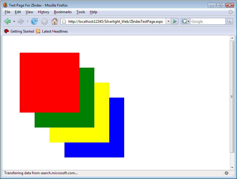
Although Silverlight is a vector-based technology, pixel images are supported
too. The XAML element is (conveniently) named <Image>.
Apart from the default properties, such as
Canvas.Left, Canvas.Top, Height,
and Width, <Image> needs to know which
graphics to show. This information is provided in the Source
property. You can use both local and remote URLs, and you can use two
supported graphics formats: JPEG and PNG. Example 5-12 has
the code, and Figure 5-11 shows the associated
output.
Example 5-12. Using an image, the XAML file (Page.xaml, project Image)
<UserControl x:Class="Image.Page"
    xmlns="http://schemas.microsoft.com/client/2007"
    xmlns:x="http://schemas.microsoft.com/winfx/2006/xaml"
    Width="400" Height="300">
  <Grid x:Name="LayoutRoot" Background="White">
    <Canvas>
      <Image Source="silverlight.png" />
    </Canvas>
  </Grid>
</UserControl> 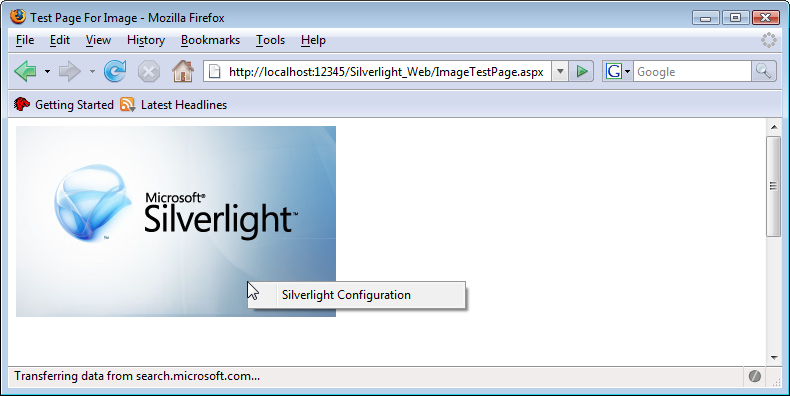
Note
When using images, you can also track the data transfer using JavaScript, as Chapter 16 shows.
The final basic XAML elements used to design a static (i.e., nonmoving) UI are brushes. A brush is used just like a “real” brush—you can paint with it. However, Silverlight brushes offer more: you can paint with color, you can paint gradients, you can paint images, and you can even paint videos.
Brushes can be used as alternatives to attributes such as Background, Fill, and
Stroke. However, you need to alter your syntax a bit. Instead of
using the attribute, you use a subelement, <.
For example, filling a rectangle would look as follows:ElementYouWantToBrush.OldAttribute>
<Rectangle>
  <Rectangle.Fill>
    <!-- brushes go here -->
  </Rectangle.Fill>
</Rectangle>
The “easiest” brush is called SolidColorBrush
because it uses only one solid color, and there are no changes
within the color or gradients. Actually, when using attributes such as
Background,
Fill, or Stroke as we have done so far in this book, we
were implicitly using a SolidColorBrush. However, the
alternative syntax works as well. Example 5-13 has the same
output as Example 5-11 (Figure 5-10), but
it is using the <SolidColorBrush> element. Note how the
color used by the brush is defined by its Color
attribute.
Example 5-13. Using a solid color brush, the XAML file (Page.xaml, project SolidColorBrush)
<UserControl x:Class="SolidColorBrush.Page"
    xmlns="http://schemas.microsoft.com/client/2007"
    xmlns:x="http://schemas.microsoft.com/winfx/2006/xaml"
    Width="500" Height="500">
  <Grid x:Name="LayoutRoot" Background="White">
    <Canvas Width="500" Height="500" Background="White">
      <Rectangle Canvas.Left="50" Canvas.Top="50" Width="200" Height="200"
        Canvas.ZIndex="5">
        <Rectangle.Fill>
          <SolidColorBrush Color="Red" />
        </Rectangle.Fill>
      </Rectangle>
      <Rectangle Canvas.Left="100" Canvas.Top="100" Width="200" Height="200"
        Canvas.ZIndex="4">
        <Rectangle.Fill>
          <SolidColorBrush Color="Green" />
        </Rectangle.Fill>
      </Rectangle>
      <Rectangle Canvas.Left="150" Canvas.Top="150" Width="200" Height="200"
        Canvas.ZIndex="3">
        <Rectangle.Fill>
          <SolidColorBrush Color="Yellow" />
        </Rectangle.Fill>
      </Rectangle>
      <Rectangle Canvas.Left="200" Canvas.Top="200" Width="200" Height="200"
        Canvas.ZIndex="2">
        <Rectangle.Fill>
          <SolidColorBrush Color="Blue" />
        </Rectangle.Fill>
      </Rectangle>
      <TextBlock Canvas.Left="250" Canvas.Top="250" FontSize="20"
        Text="Silverlight" Canvas.ZIndex="1"/>
    </Canvas>
  </Grid>
</UserControl>
Brushes can do unique things. The most typical example is gradients.
A common form of a gradient is a radial gradient: the gradient starts at a
given origin (quite often the center of an object) and then goes radially
to the borders of the object. You can define an arbitrary number of stop
points: these are points where a certain color must be matched. So, all
you need to do is to define the stop points and associated colors;
Silverlight automatically calculates and draws all colors in between. The
XAML element for the brush is
<RadialGradientBrush>.
You must define a few parameters for this gradient:
CenterThe center of the objects. You need to provide values between 0 and 1 for both the x and y coordinates. Silverlight then calculates the actual coordinates based on the dimension of the target object.
GradientOriginThe center of the gradient. Again, provide values between 0 and 1 for both coordinates.
RadiusX,RadiusYThe x and y radii of the gradient, again as values between 0 and 1.
Stop colors are defined using the <GradientStop> element. You need to provide the color (Color attribute) and the
offset (Offset attribute, value between 0 and 1). Example 5-14 shows a radial gradient with three stop colors, and
Figure 5-12 has the output.
Example 5-14. Using a radial gradient, the XAML file (Page.xaml, project RadialGradientBrush)
<UserControl x:Class="RadialGradientBrush.Page"
    xmlns="http://schemas.microsoft.com/client/2007"
    xmlns:x="http://schemas.microsoft.com/winfx/2006/xaml"
    Width="600" Height="600">
  <Grid x:Name="LayoutRoot" Background="White">
    <Canvas>
      <Ellipse Width="600" Height="600" Stroke="Black">
        <Ellipse.Fill>
          <RadialGradientBrush
            Center="0.5 0.5" GradientOrigin="0.33 0.67"
            RadiusX="0.5" RadiusY="0.5">
            <GradientStop Color="Red" Offset="0"/>
            <GradientStop Color="Green" Offset="0.33"/>
            <GradientStop Color="Blue" Offset="0.67"/>
          </RadialGradientBrush>
        </Ellipse.Fill>
      </Ellipse>
    </Canvas>
  </Grid>
</UserControl> 
The other form of gradient is a linear gradient: the color change
does not happen radially, but instead along a gradient axis. In the
associated XAML element, <LinearGradientBrush>, you need to assign a start point and an end point, once again using values between 0 and 1, which are then mapped to
the actual coordinates. Example 5-15 shows
<LinearGradientBrush> in action, and also includes a
line and markers that represent the radial axis and the stop points (trust
me with the values), as you can see in Figure 5-13.
Example 5-15. Using a linear gradient, the XAML file (Page.xaml, project LinearGradientBrush)
<UserControl x:Class="LinearGradientBrush.Page"
    xmlns="http://schemas.microsoft.com/client/2007"
    xmlns:x="http://schemas.microsoft.com/winfx/2006/xaml"
    Width="600" Height="600">
  <Grid x:Name="LayoutRoot" Background="White">
    <Canvas>
      <Rectangle Width="600" Height="600" Stroke="Black">
        <Rectangle.Fill>
          <LinearGradientBrush StartPoint="0.1 0.9" EndPoint="0.9 0.1">
            <GradientStop Color="Red" Offset="0"/>
            <GradientStop Color="Green" Offset="0.33"/>
            <GradientStop Color="Blue" Offset="0.67"/>
          </LinearGradientBrush>
        </Rectangle.Fill>
      </Rectangle>
      <Path Stroke="Black" Data="M 55 535 L 65 545 M 65 535 L 55 545" />
      <Path Stroke="Black" Data="M 215 375 L 225 385 M 225 375 L 215 385" />
      <Path Stroke="Black" Data="M 375 215 L 385 225 M 385 215 L 375 225" />
      <Line X1="60" Y1="540" X2="540" Y2="60" Stroke="#7f000000" />
    </Canvas>
  </Grid>
</UserControl> 
A final brush option is to use a special “filling” for a brush: an image or a video file. So, when you have an image to fill an object, Silverlight can automatically stretch the content so that it fits. You could also play a video as a background for a rectangle or within an ellipsis, just to give you a few ideas.
Using both brushes, ImageBrush and
VideoBrush, is quite similar. You have to provide the name of
the source file in an associated attribute, which is called
ImageSource for <ImageBrush> and
SourceName for <VideoBrush>. You can
instruct Silverlight on how to stretch the content so that it fits using
the Stretch attribute, assigning one of
these values:
NoneFillThe content fills up the whole available area, losing its aspect ratio.
UniformThe content size is increased, maintaining the aspect ratio, until the content has either the width or the height of the display area.
UniformToFillThe content size is increased, maintaining the aspect ratio, until the content width and height are greater than or equal to the width and height of the display area. If necessary, parts of the content are cropped.
Example 5-16 shows an image that is used to fill an ellipsis. You can see in Figure 5-14 that this works as expected and that you can display a rectangular image and video content as well as use other shapes. You can find more information on using video in general in Chapter 8.
Example 5-16. Using an image brush, the XAML file (Page.xaml, project ImageBrush)
<UserControl x:Class="ImageBrush.Page"
    xmlns="http://schemas.microsoft.com/client/2007"
    xmlns:x="http://schemas.microsoft.com/winfx/2006/xaml"
    Width="400" Height="300">
  <Grid x:Name="LayoutRoot" Background="White">
    <Canvas>
      <Ellipse Canvas.Top="75" Width="300" Height="150" Stroke="Black">
        <Ellipse.Fill>
          <ImageBrush ImageSource="silverlight.png" />
        </Ellipse.Fill>
      </Ellipse>
    </Canvas>
  </Grid>
</UserControl> 
Note
An alternative approach to defining the outline of an object is
to use the Clip property and provide a
Geometry object as its value, which will define the desired
shape.
There are many shapes in XAML, almost too many to keep track of, but we covered the most important ones. And honestly, usually the UI comes out of a design tool; as a programmer, you just have to add functionality, and you’ll learn how to do that in Chapter 6!
The big advantage of using <Canvas> elements is that you can give them absolute positions. The big
disadvantage of using <Canvas>
elements is that you can give them absolute positions. Absolute
coordinates allow you to create a layout that looks exactly the same on
every client, no matter what its screen resolution is. Sometimes this is
the desired behavior (think modal dialog boxes). However, sometimes this
is exactly what you do not want (imagine a web browser that only works in
an 800×600 resolution, even if you have a much bigger screen). If you
want your elements to adapt to the window and screen size, you have to use
other elements.
One of them is the <StackPanel> element, which does exactly what its name suggests: it stacks
elements, either next to each other or above and below each other. The
latter case is the default behavior, but of course you can change that.
<StackPanel> elements support a great number of
attributes; here is a selection of useful ones:
Example 5-17 uses both vertical and horizontal orientation modes, as you can see in Figure 5-15.
Example 5-17. Using StackPanel, the XAML file (Page.xaml, project StackPanel)
<UserControl x:Class="StackPanel.Page"
    xmlns="http://schemas.microsoft.com/client/2007"
    xmlns:x="http://schemas.microsoft.com/winfx/2006/xaml"
    Width="400" Height="300">
    <Grid x:Name="LayoutRoot" Background="White">
    <StackPanel Orientation="Horizontal" Margin="10" VerticalAlignment="Center">
      <TextBlock Text="one" FontSize="24" />
      <TextBlock Text="two" FontSize="36" />
      <TextBlock Text="three" FontSize="48" />
    </StackPanel>
    <StackPanel Orientation="Vertical" Margin="10" HorizontalAlignment="Right">
      <TextBlock Text="four" FontSize="72" />
      <TextBlock Text="five" FontSize="64" />
      <TextBlock Text="six" FontSize="60" />
    </StackPanel>
  </Grid>
</UserControl>
Another XAML element that facilitates setting up a layout
is Grid. It can be compared to HTML tables
and allows you to structure content in rows and columns. Future updates of
this book will add more detailed coverage of this XAML element.
- XAML in a Nutshell by Lori A. MacVittie (O’Reilly)
A good introduction to XAML