
In the first years of HTML and the World Wide Web, developers used
now-deprecated tags such as <font> extensively to
change the appearance of elements on a page. This approach worked well but
had some disadvantages: sharing a layout among multiple pages and elements
required extensive copy-and-paste operations, and from an architectural
point of view, mixing layout information and actual content is a bad idea.
Enter Cascading Style Sheets (CSS), a technology to define so-called
styles that can be applied to elements. This keeps layout and content
information apart and also enables reuse.
Thanks to the split in XAML and C#, Silverlight is very keen on separating code and content. This chapter introduces several techniques to separate content and layout. You will learn how to apply style information to elements and also to reuse layouts. With Silverlight templates, you have a mighty tool to shape the visual representation of almost every Silverlight element. Finally, the Visual State Manager helps you handle complex elements that look different depending on the context.
So far, we’ve used element properties such as
FontSize and Foreground to fine-tune
the visual appearance of an XAML element. But this gets cumbersome if you
have, say, several elements of the same type on a page and want them all
to look uniform. Hello, copy-and-paste.
One possible remedy is the use of styles in Silverlight, which are
comparable to the CSS styles you know from HTML. We will first learn how
to apply a style, and then we’ll discuss how to reuse it. Suppose, for
instance, that we have a <TextBlock> element and
want to use several properties of it as a style. To do that, we can use
the <TextBlock.Style> element within the
<TextBlock> element. To put it more generally, we
use the <
element within the
Element.Style><
element:Element>
<TextBlock>
  <TextBlock.Style>
    <!-- ... -->
  </TextBlock.Style>
</TextBlock>
Within the
<
element, the Element.Style><Style> element defines the style.
Its TargetType property is used to
define the type of element the style is applied to. This does not seem to
make much sense in our example because <Style> is
used within <TextBlock> anyway, but the
TargetType property is very important when we discuss
reusing style information:
<TextBlock.Style>
  <Style TargetType="TextBlock">
    <!-- ... -->
  </Style>
</TextBlock.Style>
Within the <Style> element, the
<Setter> element is used to assign values (the
Value attribute) to specific properties (the
PropertyName attribute). The following code snippet
would render the text in 56 pt, black Arial:
<Style TargetType="TextBlock">
  <Setter Property="FontFamily" Value="Arial" />
  <Setter Property="FontSize" Value="56" />
  <Setter Property="Foreground" Value="Black" />
</Style>
This approach works very well for all properties that accept string
values, but imagine that we would like to use a more complex brush for the
Foreground property of the TextBlock
element. To achieve that, we must use a subelement of
<Setter>, which is
<Setter.Value>. Within that element we can then
define the desired value—for instance, a brush:
<Setter Property="Foreground">
  <Setter.Value>
    <SolidColorBrush Color="Black" />
  </Setter.Value>
</Setter>
Example 11-1 shows a complete code example and uses
both <Setter> and <Setter.Value>. The output of that
code should look like Figure 11-1.
Example 11-1. Using a style, the XAML file (Page.xaml, project Style)
<UserControl x:Class="Style.Page"
    xmlns="http://schemas.microsoft.com/winfx/2006/xaml/presentation"
    xmlns:x="http://schemas.microsoft.com/winfx/2006/xaml"
    Width="400" Height="300">
    <Canvas x:Name="LayoutRoot" Background="White">
        <Rectangle Width="300" Height="150"
                   Stroke="Orange" StrokeThickness="15" />
        <TextBlock Canvas.Left="25" Canvas.Top="40" Text="Silverlight">
            <TextBlock.Style>
                <Style TargetType="TextBlock">
                    <Setter Property="FontFamily" Value="Arial" />
                    <Setter Property="FontSize" Value="56" />
                    <Setter Property="Foreground">
                        <Setter.Value>
                            <SolidColorBrush Color="Black" />
                        </Setter.Value>
                    </Setter>
                </Style>
            </TextBlock.Style>
        </TextBlock>
    </Canvas>
</UserControl>
As mentioned earlier, the main idea of using style information is
not only to separate layout and content, but also to reuse information.
Silverlight allows this by providing a mechanism to turn styles into
resources and then to bind those resources to XAML elements. To create
such a resource, you could create an
<
subelement of
Element.Resources>< (note that
Element>Element is a placeholder) and define the style
there. However, the resource is then always tied to the specific element.
You would want to make the style a resource of the
LayoutRoot element of your page.
A more logical place to put the style is the
App.xaml file, which has not been extensively used so
far. It contains application-wide settings and therefore also
application-wide resources. The code in Example 11-2
defines two style resources, one for <Rectangle> elements and one for
<TextBlock> elements. Note that every style has
its x:Key attribute set (not to be confused with
x:Name!); this will later be used to bind the style to
a given element.
Example 11-2. Using styles as resources, the application XAML file (App.xaml, project StyleResource)
<Application xmlns="http://schemas.microsoft.com/winfx/2006/xaml/presentation"
             xmlns:x="http://schemas.microsoft.com/winfx/2006/xaml"
             x:Class="StyleResource.App"
             >
    <Application.Resources>
        <Style TargetType="Rectangle" x:Key="rectangleStyle">
            <Setter Property="Width" Value="300" />
            <Setter Property="Height" Value="150" />
            <Setter Property="Stroke" Value="Orange" />
            <Setter Property="StrokeThickness" Value="15" />
        </Style>
        <Style TargetType="TextBlock" x:Key="textBlockStyle">
            <Setter Property="FontFamily" Value="Arial" />
            <Setter Property="FontSize" Value="56" />
            <Setter Property="Foreground">
                <Setter.Value>
                    <SolidColorBrush Color="Black" />
                </Setter.Value>
            </Setter>
        </Style>
    </Application.Resources>
</Application>
Note
To stick with the CSS analogy: using the Style
attribute is comparable to CSS inline styles; using a page resource
corresponds to CSS’s on-page styles; and defining resources in
App.xaml may be linked to global, external CSS
files.
To apply such a style to an element, you need to use a syntax that
looks very similar to the one used for data binding in Chapter 10. Just set the Style property of the
target element to {StaticResource
, and Silverlight takes
care of the rest. Refer to Example 11-3, which will lead to
the same output as Example 11-1.KeyOfStyle}
Example 11-3. Using styles as resources, the XAML file (Page.xaml, project StyleResource)
<UserControl x:Class="StyleResource.Page"
    xmlns="http://schemas.microsoft.com/winfx/2006/xaml/presentation"
    xmlns:x="http://schemas.microsoft.com/winfx/2006/xaml"
    Width="400" Height="300">
    <Canvas x:Name="LayoutRoot" Background="White">
        <Rectangle Style="{StaticResource rectangleStyle}" />
        <TextBlock Canvas.Left="25" Canvas.Top="40" Text="Silverlight"
                   Style="{StaticResource textBlockStyle}" />
    </Canvas>
</UserControl>Usability studies suggest that users have the best experience with an application if they immediately understand the function of each element on every page. Designers, on the other hand, often feel a need to create new and innovative ways to navigate and use an application, which sometimes work very well and sometimes fail spectacularly. Admittedly, many sites can benefit from a layout that’s outside the box, but there are downsides as well.
Say you want to create your own buttons so that they look a bit
different from what the Silverlight <Button>
element provides. Creating an element that looks like
a (fancy) button is easy, but creating an element that
behaves like a button is harder.
Enter templates. This Silverlight feature allows developers to
provide templates for the rendering of common Silverlight elements. This
means you can control the layout of an element (to a certain extent) but
keep its functionality. This section will use the
<Button> element as its basis and will cover
several ways to use templates.
Getting started with templates is easy. To define a custom template
for the (generic)
<, use its
Element><
subelement, and use Element.Template><ControlTemplate> to define what’s in
the template. Example 11-4 redefines the button so that it
uses an orange <Rectangle>.
Example 11-4. Using a template, the XAML file (Page.xaml, project Template)
<UserControl x:Class="Template.Page"
    xmlns="http://schemas.microsoft.com/winfx/2006/xaml/presentation"
    xmlns:x="http://schemas.microsoft.com/winfx/2006/xaml"
    Width="400" Height="300">
    <Canvas x:Name="LayoutRoot" Background="White">
        <Button Content="Click me!">
            <Button.Template>
                <ControlTemplate>
                    <Rectangle Width="300" Height="150"
                               Stroke="Orange" StrokeThickness="15" />
                </ControlTemplate>
            </Button.Template>
        </Button>
    </Canvas>
</UserControl>
Caution
The <ContentTemplate> element may have
only one child node in XAML. So if you want to use multiple XAML
elements, you need to use one “root” node, like
<Canvas>, to group them.
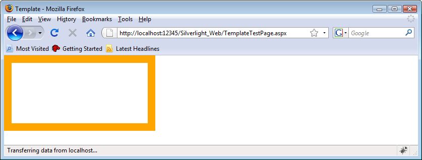
Figure 11-2 shows the new button.
So far, the application’s behavior is far from perfect. For
example, the button template is using a fixed width and height that might
collide with the <Button> element’s
Width and Height properties. But
data binding comes to the rescue and allows it to bind the outer control’s
properties to the template. The syntax follows the pattern used for data
binding and style binding: {TemplateBinding
. The following
snippet shows what this may look like:NameOfProperty}
<Button Content="Click me!" Width="200" Height="100"
        FontFamily="Arial" FontSize="36">
  <Button.Template>
    <ControlTemplate>
      <Rectangle
        Width="{TemplateBinding Width}" Height="{TemplateBinding Height}"
        Stroke="Orange" StrokeThickness="15" />
    </ControlTemplate>
  </Button.Template>
</Button>
Another downside of the current application is that the content of
the button (the Content attribute) is nowhere to be
seen. Silverlight templates support a specific XAML element that takes
care of displaying the content of an element:
<ContentPresenter>. Wherever you put this element
within your template, the content portion of the parent element will be
rendered.
The markup in Example 11-5 uses template binding to
apply the Width and Height
properties, and it uses the <ContentPresenter>
element to display the content appropriately. As you can see in Figure 11-3, the content automatically receives the font styles
assigned in the <Button> element, courtesy of the
implementation of <ContentPresenter>.
Example 11-5. Using a template with binding and content, the XAML file (Page.xaml, project TemplateBinding)
<UserControl x:Class="TemplateBinding.Page"
    xmlns="http://schemas.microsoft.com/winfx/2006/xaml/presentation"
    xmlns:x="http://schemas.microsoft.com/winfx/2006/xaml"
    Width="400" Height="300">
    <Canvas x:Name="LayoutRoot" Background="White">
        <Button Content="Click me!" Width="200" Height="100"
                FontFamily="Arial" FontSize="36">
            <Button.Template>
                <ControlTemplate>
                    <Canvas>
                        <Rectangle Width="{TemplateBinding Width}"
                                   Height="{TemplateBinding Height}"
                                   Stroke="Orange" StrokeThickness="15" />
                        <ContentPresenter Canvas.Left="25" Canvas.Top="30" />
                    </Canvas>
                </ControlTemplate>
            </Button.Template>
        </Button>
    </Canvas>
</UserControl>
Not happy with how the <ContentPresenter>
element renders the content of the button? Two interesting aspects of
Silverlight help in that situation. One is that you can set
ContentPresenter’s properties, such as
Content, and the other is that you may once again use
template binding to access attributes of the parent element. The code in
Example 11-6 sets the Content property
of ContentPresenter to a text block and uses the font
family, font size, and text information provided to the
<Button> element.
Example 11-6. Using ContentPresenter with template binding, the XAML file (Page.xaml, project TemplateBindingContent)
<UserControl x:Class="TemplateBindingContent.Page"
    xmlns="http://schemas.microsoft.com/winfx/2006/xaml/presentation"
    xmlns:x="http://schemas.microsoft.com/winfx/2006/xaml"
    Width="400" Height="300">
    <Canvas x:Name="LayoutRoot" Background="White">
        <Button Content="Click me!" Width="200" Height="100"
                FontFamily="Arial" FontSize="36">
            <Button.Template>
                <ControlTemplate>
                    <Canvas>
                        <Rectangle Width="{TemplateBinding Width}"
                                   Height="{TemplateBinding Height}"
                                   Stroke="Orange" StrokeThickness="15" />
                        <ContentPresenter Canvas.Left="25" Canvas.Top="30">
                            <ContentPresenter.Content>
                                <TextBlock
                                    FontFamily="{TemplateBinding FontFamily}"
                                    FontSize="{TemplateBinding FontSize}"
                                    Text="{TemplateBinding Content}" />
                            </ContentPresenter.Content>
                        </ContentPresenter>
                   </Canvas>
                </ControlTemplate>
            </Button.Template>
        </Button>
    </Canvas>
</UserControl>
Tip
You can, of course, use style resources as well. Just apply the syntax from Styles earlier in this chapter.
As you can see, Silverlight provides you with the means to tune the layout of common controls to a large extent. In the next section we will discuss how different states of a control may be fine-tuned, too.
Several Silverlight controls, like
Button, have multiple states. In the case of the
button, the states include the normal state, the state when the mouse
pointer is hovered over the button, the state when the button is clicked,
and so on. Previously we have adjusted the visual representation of the
button in its normal state, but we have not taken the various states into
account. The Silverlight mechanism responsible for managing the various
visual states of a control is the Visual State Manager, also represented
by the <VisualStateManager>
XAML element. When working with a <Button>
element, the Visual State Manager may process the following
states:
DisabledThe button may not be clicked (i.e., the click does not have an effect)
FocusedThe button has the focus
MouseOverThe mouse pointer is over the button
NormalThe default state of the button
PressedThe button is being clicked
UnfocusedThe button loses the focus
These six states are grouped into focus states and common states.
Focused and Unfocused are focus
states; all other states are common states. This is an important
differentiation, as you will see in the following paragraph.
When using the Visual State Manager, you can provide templates for
each state, grouped by the state
type. The first element you will use is
<VisualStateManager.VisualStateGroups>. Within
that element, you can provide state display information for each group in
the <VisualStateGroup> element and for each state
in the <VisualState> element.
<VisualState> is a subelement of
<VisualStateGroup>.
First of all, you have to make sure that you apply the correct names
to the elements. Set the x:Name attribute of
<VisualStateGroup> to either
"CommonStates" or "FocusStates", and
set the x:Name attribute of
<VisualState> to the name of the state you want
to work on:
<VisualStateManager.VisualStateGroups>
  <VisualStateGroup x:Name="CommonStates">
    <VisualState x:Name="Normal">
      <!-- ... -->
    </VisualState>
  </VisualStateGroup>
</VisualStateManager>
The Visual State Manager’s main purpose is to render animations when
a specific state is reached. Therefore, you can use the
<StoryBoard> element within
<VisualState> to define an animation tied to that
state. In our example, we want the opacity of the button’s
<Rectangle> element to decrease when the mouse
hovers over it and to increase when the mouse leaves it. To have access to
the rectangle’s opacity value, we need to change it a bit by using a brush
(which, unlike the rectangle itself, has an Opacity
property):
<Rectangle Width="{TemplateBinding Width}" Height="{TemplateBinding Height}"
           StrokeThickness="15">
  <Rectangle.Stroke>
    <SolidColorBrush Color="Orange" Opacity="1.0" x:Name="rectangleStroke" />
  </Rectangle.Stroke>
</Rectangle>
Note how we assigned a name to the brush. This name allows us to use the brush as an animation target:
<DoubleAnimation From="0.5" To="1.0"
                 Storyboard.TargetName="rectangleStroke"
                 Storyboard.TargetProperty="Opacity" />
The code in Example 11-7 brings everything together.
In the Normal state, the opacity of the button
increases to 1.0, whereas in the MouseOver state, the
opacity decreases to 0.5. Figure 11-4 shows the result in
the browser.
Example 11-7. Using the Visual State Manager and visual states, the XAML file (Page.xaml, project TemplateStates)
<UserControl x:Class="TemplateStates.Page"
    xmlns="http://schemas.microsoft.com/winfx/2006/xaml/presentation"
    xmlns:x="http://schemas.microsoft.com/winfx/2006/xaml"
    Width="400" Height="300">
    <Canvas x:Name="LayoutRoot" Background="White">
        <Button Content="Click me!" Width="200" Height="100"
                FontFamily="Arial" FontSize="36" >
            <Button.Template>
                <ControlTemplate>
                    <Canvas>
                        <Rectangle Width="{TemplateBinding Width}"
                                   Height="{TemplateBinding Height}"
                                   StrokeThickness="15">
                            <Rectangle.Stroke>
                                <SolidColorBrush Color="Orange" Opacity="1.0"
                                                 x:Name="rectangleStroke" />
                            </Rectangle.Stroke>
                        </Rectangle>
                        <ContentPresenter Canvas.Left="25" Canvas.Top="30">
                            <ContentPresenter.Content>
                                <TextBlock
                                    FontFamily="{TemplateBinding FontFamily}"
                                    FontSize="{TemplateBinding FontSize}"
                                    Text="{TemplateBinding Content}" />
                            </ContentPresenter.Content>
                        </ContentPresenter>

                        <VisualStateManager.VisualStateGroups>
                            <VisualStateGroup x:Name="CommonStates">
                                <VisualState x:Name="Normal">
                                    <Storyboard Duration="00:00:00.5">
                                        <DoubleAnimation
                                            From="0.5" To="1.0"
                                            Storyboard.TargetName="rectangleStroke"
                                            Storyboard.TargetProperty="Opacity" />
                                    </Storyboard>
                                </VisualState>
                                <VisualState x:Name="MouseOver">
                                    <Storyboard Duration="00:00:00.5">
                                        <DoubleAnimation
                                            From="1.0" To="0.5"
                                            Storyboard.TargetName="rectangleStroke"
                                            Storyboard.TargetProperty="Opacity" />
                                    </Storyboard>
                                </VisualState>
                            </VisualStateGroup>
                        </VisualStateManager.VisualStateGroups>
                    </Canvas>
                </ControlTemplate>
            </Button.Template>
        </Button>
    </Canvas>
</UserControl>
If you run the application in the browser, you will notice a strange
effect: initially the button is at 1.0 opacity, then immediately changes
to 0.5 opacity, and then animates back to 1.0 opacity. This is caused by
the fact that the button initially receives the Normal
state, even though it has not been in the MouseOver
state. For these scenarios, the Visual State Manager provides a different
approach to assigning animations. Instead of tying animations to a
specific state (as <VisualState> does), it ties
the animation to a transition from one state to another (for instance,
from MouseOver to Normal). The
corresponding XAML element is <VisualTransition>.
It works just like <VisualState>, with the
notable difference that instead of providing the state name, you have to
provide the previous state (the From attribute) and the
new state (the To attribute):
<VisualTransition From="MouseOver" To="Normal" >
  <Storyboard Duration="00:00:00.5" >
    <DoubleAnimation From="0.5" To="1.0"
                     Storyboard.TargetName="rectangleStroke"
                     Storyboard.TargetProperty="Opacity" />
  </Storyboard>
</VisualTransition>
Example 11-8 shows
<VisualTransition> in action. The animations in
the <VisualState> elements have been altered so
that they no longer have a duration or From value; the
<VisualTransition> elements take care that,
depending on which state transition occurs, the appropriate animation is
run.
Example 11-8. Using the Visual State Manager and transitions, the XAML file (Page.xaml, project TemplateStatesTransitions)
<UserControl x:Class="TemplateStatesTransitions.Page"
    xmlns="http://schemas.microsoft.com/winfx/2006/xaml/presentation"
    xmlns:x="http://schemas.microsoft.com/winfx/2006/xaml"
    Width="400" Height="300">
    <Canvas x:Name="LayoutRoot" Background="White">
        <Button Content="Click me!" Width="200" Height="100"
                FontFamily="Arial" FontSize="36" >
            <Button.Template>
                <ControlTemplate>
                    <Canvas>
                        <Rectangle Width="{TemplateBinding Width}"
                                   Height="{TemplateBinding Height}"
                                   StrokeThickness="15">
                            <Rectangle.Stroke>
                                <SolidColorBrush Color="Orange" Opacity="1.0"
                                                 x:Name="rectangleStroke" />
                            </Rectangle.Stroke>
                        </Rectangle>
                        <ContentPresenter Canvas.Left="25" Canvas.Top="30">
                            <ContentPresenter.Content>
                                <TextBlock
                                    FontFamily="{TemplateBinding FontFamily}"
                                    FontSize="{TemplateBinding FontSize}"
                                    Text="{TemplateBinding Content}" />
                            </ContentPresenter.Content>
                        </ContentPresenter>

                        <VisualStateManager.VisualStateGroups>
                            <VisualStateGroup x:Name="CommonStates">
                                <VisualState x:Name="Normal">
                                    <Storyboard>
                                        <DoubleAnimation
                                            To="1.0"
                                            Storyboard.TargetName="rectangleStroke"
                                            Storyboard.TargetProperty="Opacity" />
                                    </Storyboard>
                                </VisualState>
                                <VisualState x:Name="MouseOver">
                                    <Storyboard>
                                        <DoubleAnimation
                                            To="0.5"
                                            Storyboard.TargetName="rectangleStroke"
                                            Storyboard.TargetProperty="Opacity" />
                                    </Storyboard>
                                </VisualState>
                                <VisualStateGroup.Transitions>
                                    <VisualTransition From="MouseOver" To="Normal" >
                                        <Storyboard Duration="00:00:00.5" >
                                            <DoubleAnimation
                                                From="0.5" To="1.0"
                                                Storyboard.TargetName="rectangleStroke"
                                                Storyboard.TargetProperty="Opacity" />
                                        </Storyboard>
                                    </VisualTransition>
                                    <VisualTransition From="Normal" To="MouseOver">
                                        <Storyboard Duration="00:00:00.5" >
                                            <DoubleAnimation
                                                From="1.0" To="0.5"
                                                Storyboard.TargetName="rectangleStroke"
                                                Storyboard.TargetProperty="Opacity" />
                                        </Storyboard>
                                    </VisualTransition>
                                </VisualStateGroup.Transitions>
                            </VisualStateGroup>
                        </VisualStateManager.VisualStateGroups>
                    </Canvas>
                </ControlTemplate>
            </Button.Template>
        </Button>
    </Canvas>
</UserControl>
Note
Note that the <VisualTransition> elements
must be placed within a
<VisualStateGroup.Transitions> element.
This chapter showed several means to hook into the rendering of common Silverlight elements using styles and templates, and it also demonstrated how you can use the Visual State Manager to keep a control’s functionality without sacrificing any flexibility regarding the layout.