
Now, as we understand the mathematics behind the k-means clustering better, let us implement it on a dataset and see how to glean insights from the performed clustering.
The dataset we will be using for this is about wine. Each observation represents a separate sample of wine and has information about the chemical composition of that wine. Some wine connoisseur painstakingly analyzed various samples of wine to create this dataset. Each column of the dataset has information about the composition of one chemical. There is one column called quality as well, which is based on the ratings given by the professional wine testers.
The prices of wines are generally decided by the ratings given by the professional testers. However, this can be very subjective and certainly there is a scope for a more logical process to wine prices. One approach is to cluster them based on their chemical compositions and quality and then price the similar clusters together based on the desirable components present in the wine clusters.
Let us import and have a look at this dataset:
import pandas as pd
df=pd.read_csv('E:/Personal/Learning/Predictive Modeling Book/Book Datasets/Clustering/wine.csv',sep=';')
df.head()
The output looks as follows:

Fig. 7.15: The first few observations of the wine dataset
As one can observe, it has 12 columns as follows:

Fig. 7.16: The column names of the wine dataset
There are 1599 observations in this dataset.
Let us focus on the quality variable for a while and plot a histogram to see the number of wine samples in each quality type:
import matplotlib.pyplot as plt
% matplotlib inline
plt.hist(df['quality'])
The code shows the following output:

Fig. 7.17: The histogram of wine quality. The majority of samples have been rated 6 or 7 for quality
As it is evident from the plot, more than 75% of the samples were assigned the quality of 5 and 6. Also, let's look at the mean of the various chemical compositions across samples for the different groups of the wine quality:
df.groupby('quality').mean()The code shows the following output:

Fig. 7.18: The mean values of all the numerical columns for each value of quality
Some observations based on this table are as follows:
- The lesser the volatile acidity and chlorides, the higher the wine quality
- The more the sulphates and citric acid content, the higher the wine quality
- The density and pH don't vary much across the wine quality
Next, let's proceed with clustering these observations using k-means.
As discussed above, normalizing the values is important to get the clustering right. This can be achieved by applying the following formula to each value in the dataset:
To normalize our dataset, we write the following code snippet:
df_norm = (df - df.min()) / (df.max() - df.min())
df_norm.head()
This results in a data frame with normalized values for entire data frame as follows:
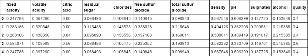
Fig. 7.19 Normalized wine dataset
Hierarchical clustering or agglomerative clustering can be implemented using the AgglomerativeClustering method in scikit-learn's cluster library as shown in the following code. It returns a label for each row denoting which cluster that row belongs to. The number of clusters needs to be defined in advance. We have used the ward method of linkage:
from sklearn.cluster import AgglomerativeClustering
ward = AgglomerativeClustering(n_clusters=6, linkage='ward').fit(df_norm)
md=pd.Series(ward.labels_)
We can plot a histogram of cluster labels to get a sense of how many rows belong to a particular cluster:
import matplotlib.pyplot as plt
% matplotlib inline
plt.hist(md)
plt.title('Histogram of Cluster Label')
plt.xlabel('Cluster')
plt.ylabel('Frequency')
The plot looks as follows. The observations are more uniformly distributed across the cluster except Cluster 2 that has more observations than the others:

Fig. 7.20: The histogram of Cluster Labels. Samples are more-or-less uniformly distributed across clusters
It also outputs the children for each non-leaf node. This would be an array with the shape (number of non-leaf nodes, 2) as there would be two immediate children for any non-leaf node:
ward.children_
The code shows the following output:

Fig. 7.21: The child array containing two child elements for each non-leaf node
Let us randomly choose 6 as the required number of clusters for now as there were that many groups of quality in the dataset. Then, to cluster the observations, one needs to write the following code snippet:
from sklearn.cluster import KMeans
from sklearn import datasets
model=KMeans(n_clusters=6)
model.fit(df_norm)
The preceding snippet fits the k-means clustering model to the wine dataset. To know which observation belongs to which of the clusters, one can call the labels_ parameter of the model. It returns an array depicting the cluster the row belongs to:
model.labels_
The output of the code is as follows:
Fig. 7.22: Cluster labels for each row
For better observation, let us make this array part of the data frame so that we can look at the cluster each row belongs to, in the same data frame:
md=pd.Series(model.labels_)
df_norm['clust']=md
df_norm.head()
The output of the code shows the following datasheet:

Fig. 7.23: The wine dataset with a clust column depicting the cluster the row belongs to
The last column clust of the data frame denotes the cluster to which that particular observation belongs. The 1st, 2nd, 3rd, and 5th observations belong to the 3rd cluster (counting starts from 0), while the 4th observation belongs to the 2nd cluster.
The final cluster's centroids for each cluster can be found out as follows:
model.cluster_centers_
Note that each cluster centroid would have 12 coordinates as there are 12 variables in the dataset.
The dataset is as follows:

Fig. 7.24: Cluster centroids for each of the six clusters
The J-score can be thought of as the sum of the squared distance between points and cluster centroid for each point and cluster. For an efficient cluster, the J-score should be as low as possible. The value of the J-score can be found as follows:
model.inertia_
The value comes out to be 186.56.
Let us plot a histogram for the clust variable to get an idea of the number of observations in each cluster:
import matplotlib.pyplot as plt
% matplotlib inline
plt.hist(df_norm['clust'])
plt.title('Histogram of Clusters')
plt.xlabel('Cluster')
plt.ylabel('Frequency')
The code shows the following output:

Fig. 7.25: The histogram of cluster labels
As can be observed, the number of wine samples is more uniformly (or rather normally) distributed in this case when compared to the distribution based on the wine quality. This is an improvement from the classification based on the wine quality as it provides us with better segregated and identifiable clusters.
This clustering can be used to price the wine samples in the same cluster similarly and target the customers who prefer the particular ingredient of wine by marketing them as a different brand having that ingredient as its specialty.
Let us calculate the mean of the composition for each cluster and each component. If you observe the output table, it is exactly similar to the six cluster centroids observed above. This is because the cluster centroids are nothing but the mean of the coordinates of all the observations in a particular cluster:
df_norm.groupby('clust').mean()
Fig. 7.26: The mean of all the numerical columns for different clusters
The wine quality and taste mainly depends on the quantity of acid, alcohol, and sugar. A few examples of how the information on clustering can be used for efficient marketing and pricing are as follows:
- People from cooler regions prefer wines with higher volatile acid content. So, clusters 2 and 5 can be marketed in cooler (temperature-wise) markets.
- Some people might prefer wine with higher alcohol content, and the wine samples from clusters 3 and 5 can be marketed to them.
- Some connoisseurs trust others' judgment more and they might like to go with professional wine testers' judgments. These kinds of people should be sold the wine samples from clusters 3 and 5 as they have high mean quality.
More information from the wine industry can be combined with this result to form a better marketing and pricing strategy.