C H A P T E R 4
Laying Out a Report
Now it is time to delve into the area in the IDE in which you’ll probably spend the most time: the Design tab. The real creative magic begins here, and we don’t mean because a wizard or two might be involved.
Different report requests and target audiences mean that the look and feel of each report will not be uniform. One user might expect drill-down functionality, while others might need full, detailed listings of data for printing. Whatever the case, SSRS provides many tools in the Toolbox for rapid and efficient building of high-quality reports that can be immediately deployed from within BIDS. In the following sections, you’ll take the sample data and put it to use as you explore the functionality of each of the available tools and data regions.
For each object we demonstrate, we’ll give the graphical representation of the design environment as well as its RDL counterpart. Note that defined sections of the RDL file contain every aspect of a report, from the general layout to pagination. This is important because it’s often easier to work directly within the RDL file to alter a report. As we show how to add functionality to the sample report projects, we’ll point out sections of the RDL files where the graphical report design is converted to code.
Setting Up Pagination
To begin, look at the general report properties for the new report. While on the Design tab, select Report and then Report Properties from the drop-down menu on the toolbar.
There are four selections in the Report Properties dialog box: Page Setup, Code, References, and Variables. For now, you’re concerned with the Page Setup selection. As you can see in Figure 4-1, the Page Setup dialog contains property settings for pagination, such as page width and margins. It’s only since SSRS for 2008 that we’ve been able to select standard page formatting options such as Portrait or Landscape orientation. Your selection sets the Width and Height property values automatically. Because a number of reports will be printed in landscape format, choose Landscape. Leave all margins at 1 inch each. If you are still on SSRS 2005, you will need to set the height and width properties to represent Landscape characteristics like 11 inches in width by 8.5 inches in height.
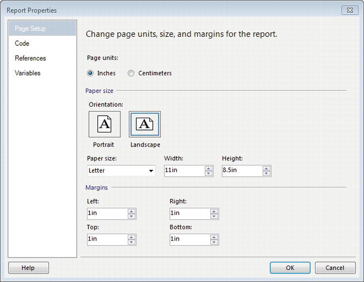
Figure 4-1. Report Properties Layout tab
If you are using 2005, the Layout tab will also have a Columns setting, where you can specify the number of columns. This section was removed in 2008, but it is still a property of the Report. We use multi-column reports frequently in the medical industry, primarily for printing labels.
Using Report Objects
In the next few sections, you will look at the report objects to see their basic functionality and learn how you can tap into each one’s unique versatility when developing reports. At this point, if you have not already done so, open the Pro_SSRS solution that we have provided with starting points and completed samples, and refer to it as you work through the individual object sections. We will cover the following report objects:
List: This is a free-form container object for a single data grouping.
Textbox: The textbox report in SSRS 2008 is probably the most long-awaited enhancement. In previous version of SSRS, textboxes were nothing more than containers for strings of uniform literal text and/or field values from data sets; all had to have the same formatting. Since the SSRS 2008 release, this is no longer the case.
Table: This is used for tabular reports with rows and columns, but provides single or multiple date groups.
Rectangle: Like the List, the Rectangle is a container, although it provides no data groupings.
Matrix: This report object, like the Table, provides multiple grouping levels, but lays data out as a cross-tab or pivot-style report.
In SSRS for 2008, Microsoft introduced the Tablix control, which at its core is a conglomeration of row-level grouping and column-level grouping. Before SSRS 2008, it was difficult to create a report that combined these two levels of grouping. You can use the Tablix properties in three controls, List, Matrix, and Table, creating on-the-fly column or row groups at any level within the three report objects. RDL code for Tablix support has been added as well, as you will see as we go through the report objects that support Tablix properties. In Chapter 6, you will see more detail on adding Tablix properties to a report.
Implementing a List
The List data region is one of the two free-form container objects that allow grouping of data, the other being Rectangle. The two objects are similar in that they can contain other report objects and data regions. Free-form data regions don’t constrain the layout of fields to a fixed format; the person creating the report is responsible for aligning the objects.
Because the List contains a grouping level, you can use the List data region only with a single dataset. Note that the List data region displays one record at a time from the dataset based on this grouping. By default, no grouping is assigned to a list.
To learn how you can use the List data region with the Emp_Svc_Cost stored procedure, which returns detail records for the number of visits for patients, you will add a List to the design area and drag fields from the dataset into it. You will use Employee_Name, Patient_Name, Visit_Count, and Estimated_Cost to show total visits and cost for each patient/employee combination.
In the Pro_SSRS solution, the list sample’s starting-point report is called List Start. This report has a data source and dataset, called emp_svc_cost, already defined for the localhost server, which should match your environment if you are using BIDS to connect to your local SQL Server.
To begin, open the List Start report, and click the Layout tab. Before we get started on creating the report, click on Report ![]() View
View ![]() Ruler to make the ruler visible on the designer. Next, add the List report object to the report by double-clicking the List object in the Toolbox. The List control is automatically added to the upper-left area of the design grid. Grab the lower-right corner of the List and drag it down until it is approximately 7 inches wide by 1 inch in height.
Ruler to make the ruler visible on the designer. Next, add the List report object to the report by double-clicking the List object in the Toolbox. The List control is automatically added to the upper-left area of the design grid. Grab the lower-right corner of the List and drag it down until it is approximately 7 inches wide by 1 inch in height.
Next, select the Datasets in the Report Data toolbar, expand the emp_svc_cost dataset, drag the fields in the following list to the design area, and place them in the List data region:
Patient_NameEmployee_NameService_TypeEstimated_CostVisit_Count
Now add the Sum function to the Visit_Count and Estimate_Cost fields so that each field will be of the syntax =Sum(Fields!fieldname.Value). If you had added a grouping level to the list (you will do that shortly), the Sum function would have been automatically added to these fields.
Next, size the fields so that when you’re finished, the report looks like Figure 4-2. In Visual Studio 2010 and BIDS, as you work with the layout of report objects, the design environment has been enhanced to control automatic alignment as you drag and drop objects, so it is far easier to design professional-looking reports. At this point, however, you aren’t concerned with beauty, but with functionality.

Figure 4-2. List data region with ungrouped fields
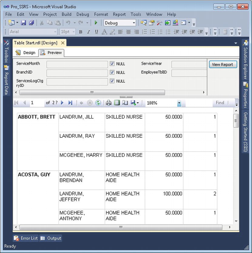
When you click the preview button, the report will generate and display visit information for each patient and employee (see Figure 4-3). Notice that the sum of the fields Visit_Count and Estimated_Cost is the same for each record. Each sum amount is the same for all patients and employees because you have not yet defined any grouping for the List itself. You will do that next.

Figure 4-3. Preview of the List data region
For the List we added, there is a default (Details) row grouping as evidence in the Row Groups area of the report. However, no field value is currently assigned as the group; it is simply blank. To add grouping, click the down arrow on the Row Groups (Details) and select Group Properties. Add two fields by clicking Add in the Group Expressions area—Patient_Name and then Employee_Name—as group expressions.
The preview of the new List with grouping levels now shows the correct number of visits for each patient and employee combination. However, notice that in Figure 4-4 Bill Shakespeare is showing up multiple times, with 37 visits for employee Bailey McDonald and eight visits for employee Sherri McDonald, for example. What you really want to see is Bill Shakespeare once with all the employee and visit information grouped in the figure. You could remove the grouping for the employee from the List, but that would cause the report to group all the patients’ visits under a single employee and reflect the data inaccurately. In former versions of SSRS, only a nested List would achieve this level of multiple groupings and the report developer may have needed to look at using an alternative report object, like a table—that would have got the level of desired grouping, but would have lost the free-form feel of the report. Since SSRS 2008, however, the List object includes Tablix properties. In other words, when you add a List object from the Toolbox onto the design surface, a Tablix is created. The Table and Matrix objects also share the Tablix Properties are implemented as a Tablix. With Tablix properties, it is possible to create a parent group above the default Details Group and add the patient name information there, so the desired fields, Patient_Name and Employee_Name, can now be grouped hierarchically.
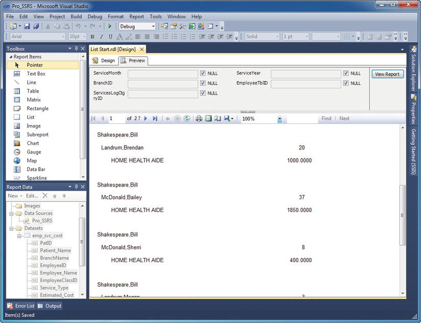
Figure 4-4. Previewed report with duplicate patient
In SSRS 2005, you would have had to add two Lists, one nested in the other, to produce output that would allow for multiple groupings in one container object. We showed that approach in the previous edition of this book. However, with the introduction of Tablix properties, we can simply add another grouping above Employee_Name. To do this, right-click the details row of the List box where we added the fields, and select Add Group; then Parent Group under the Row Group submenu, as shown in Figure 4-5. For the group, select Patient_Name as the expression. You will notice that a new column is added for your new Patient_Name group. Select the Patient_Name textbox that we added earlier and delete it from the details section.
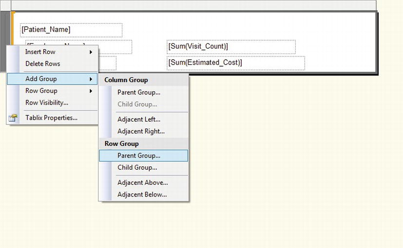
Figure 4-5. Adding the Patient_Name grouping to the List
Now, after a few modifications of spacing and alignment when you preview the report grouped by Patient_Name and the child group Employee_Name, you can see that multiple employees are associated with a single patient. Along with each employee displaying the correct total number of visits and estimated cost (see Figure 4-6).

Figure 4-6. Previewed report with parent group
Listing 4-1 shows a section of the RDL file with a sampling of the List data region you just created. Notice in the XML schema that the <List> element encapsulates everything that has been graphically added to the List data region, including all formatting and grouping. As you can see in the RDL, the List control we selected inherits properties of the new Tablix functionality.
Listing 4-1. RDL List Section
<TablixRowHierarchy>

        <TablixMembers>

        <TablixMember>

                <Group Name="Patient_Name">

                <GroupExpressions>

                        <GroupExpression>=Fields!Patient_Name.Value</GroupExpression>
                </GroupExpressions>

                </Group>

                <TablixHeader>

                <Size>1.08333in</Size>

                <CellContents>

                        <Textbox Name="Patient_Name1">

                        <CanGrow>true</CanGrow>

                        <KeepTogether>true</KeepTogether>

                        <Paragraphs>

                                <Paragraph>

                                <TextRuns>

                                        <TextRun>

                                        <Value>=Fields!Patient_Name.Value</Value>

                                        <Style />

                                        </TextRun>

                                </TextRuns>

                                <Style />

                                </Paragraph>

                        </Paragraphs>

                        <rd:DefaultName>Patient_Name1</rd:DefaultName>

                        <Style>

                                <Border>

                                <Style>None</Style>

                                </Border>

                                <PaddingLeft>2pt</PaddingLeft>

                                <PaddingRight>2pt</PaddingRight>

                                <PaddingTop>2pt</PaddingTop>

                                <PaddingBottom>2pt</PaddingBottom>
![]() Note To access the full RDL file from within BIDS, select View with the Design tab open, and then Code from the drop-down menu. If you are working in Visual Studio 2010, press F7 and use Shift+F7 to toggle between Code and Designer modes.
Note To access the full RDL file from within BIDS, select View with the Design tab open, and then Code from the drop-down menu. If you are working in Visual Studio 2010, press F7 and use Shift+F7 to toggle between Code and Designer modes.
The completed report for the List object is called Lists.rdl in the Pro_SSRS project.
Implementing a Textbox
The Textbox control had a major upgrade from SSRS 2005 to 2008, but nothing has changed since. Thankfully, it now supports rich formatting for text, not to be confused with Rich Text Formatting. What is possible now was not possible, or at least very difficult, to do in SSRS 2005. You can now format text blocks individually inside a single textbox as well as combine fields from datasets using placeholders within the textbox. This is all accomplished via HTML tags that can be imported as expression values for the textbox itself or contained within a dataset and rendered with the report.
To learn how to create a textbox that has rich formatting, start with the TextBox_Start.rdl report that contains an empty Textbox control. Open TextBox_Start.rdl in the Pro_SSRS solution. The initial report will look like Figure 4-7.

Figure 4-7. TextBox_Start report with blank textbox
For this example, let’s assume that, as a report designer, you have been tasked with merging literal text with data in a form letter that will be sent to patients as a survey. The survey, which we will complete in Chapter 6, will include information about a patient’s specific visits, but must otherwise be a generic template with the same questions for each patient. The report will also include bold, underline, and italic font properties in a single Textbox.
The first thing to understand about textboxes since SSRS 2008 is placeholders. A placeholder is simply a location in the Textbox that will contain individual portions of the Textbox and can have custom formatting for the value or expressions inside it. Each placeholder has its own properties as well, such as Tooltips, Actions, and Alignment.
First, click in the textbox of the TextBox_Start report to select it. Then, right-click and select Create Placeholder. You will see the Textbox properties, as in Figure 4-8.
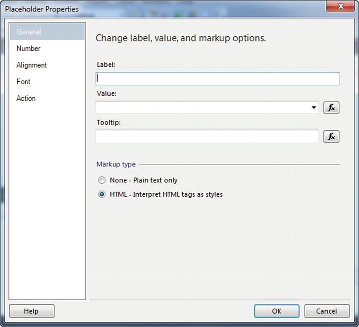
Figure 4-8. Textbox Placeholder properties
For this demonstration, you will add a simple date placeholder, a greeting, and a data field, each with different formatting styles. In Chapter 6, you will expand on this by creating a patient survey form letter that combines multiple objects like Rectangle and Table to deliver a detailed report of services rendered along with the survey. For a simple Textbox like this one, no grouping is available for the dataset, Pro_SSRS_DS, so you will use the First function to extract the patient name from the dataset for this example.
With the Placeholder Properties dialogue box still open, type “Today” in the Label field and “=NOW()” in the Value field. One important note on formatting is that if HTML is selected on the General tab, other date-formatting rules on the Number tab will not be applied. Therefore, for this placeholder, select None – Plain Text Only as in Figure 4-9.
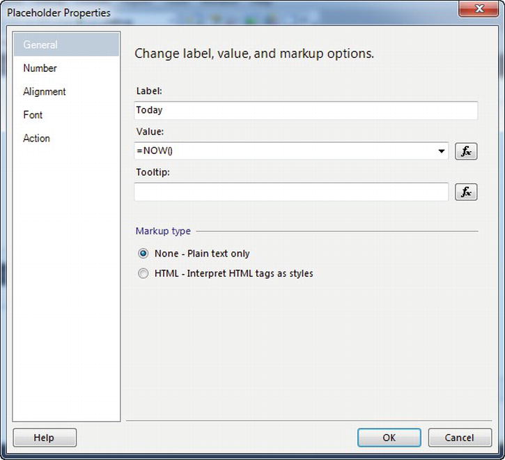
Figure 4-9. Value properties for the first textbox placeholder
On the Number tab, select Date for the Category and for the Style select Monday, January 31, 2000 as in Figure 4-10, and then click OK.
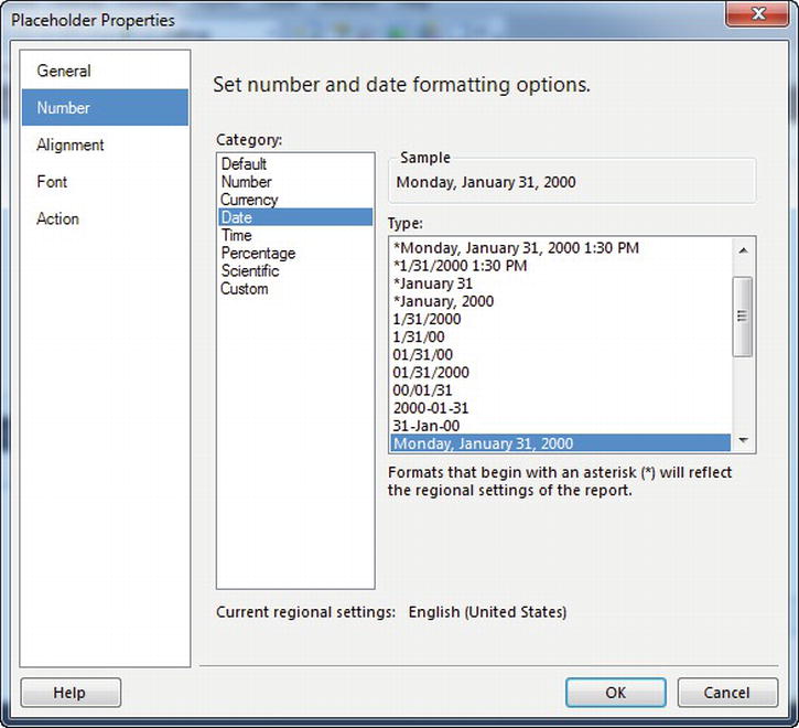
Figure 4-10. Plain text date formatting for the textbox placeholder
Back on the Design tab, click below the placeholder we just added to go to the next line in the Textbox. Type the word “Dear” directly into the textbox and follow it with a space. This will serve as the greeting for the letter. Now, right-click the location directly after the space you typed, and select Create Placeholder again. For the label, type “Patient Name.” For the expression, open the expression builder by clicking the expression button to the right of the value field. Click DataSets in the Category box and in the Item box select Pro_SSRS_DS. In the Values box select First(Patient_Name). Notice, as in Figure 4-11, that the value is expanded to be =First(Fields!Patient_Name.Value, "Pro_SSRS_DS"). You will notice here, and throughout the book, that in SSRS 2012, full expression values for fields have been condensed for ease of use and clarity. Fields!Patient_Name.Value, for example, will often be displayed as simply [Patient_Name] in design mode.
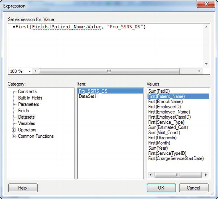
Figure 4-11. Patient Name value for the textbox
Rendering the report at this point does not effectively show how you can have multiple formats in a single textbox. However, adding individual formatting at this point is as easy as selecting your placeholders and choosing whatever format you desire. Highlight the Today placeholder, making sure that the entire label is selected. Next, click the italic button from the toolbar. Then, select the Patient Name placeholder and click the bold button. Figure 4-12 shows a preview of a single Textbox object with multiple formats.

Figure 4-12. Output of multiple formats for a single textbox
As stated earlier, even custom formatting as simple as this was not available in SSRS 2005, so SSRS 2008 represents a huge leap forward in report design. In the next chapter, you will produce reports that are more sophisticated by importing HTML formatting directly from a SQL table, as well as records from multiple datasets, to create a full custom patient survey letter.
The completed report for the Textbox object is called TextBox.rdl and is in the Pro_SSRS project.
Implementing a Table
The Table data region provides a means of organizing data into tabular rows and columns with possible multiple grouping levels. Every Table data region has, by default, a row that contains detail records as well as Table headers and footers. You can group tables on individual fields from a single dataset or with expressions that might combine multiple fields. Tables make it easy to design a uniform report because of the structured nature of the Table. Fields from the dataset are simply added to a cell within the Table, and when the report is rendered, it’s automatically formatted. The List data region provides much of the same functionality as tables, but you have to position and align fields manually.
The starting-point report for the Table report object that we will demonstrate in this section is called Table Start.rdl. You will find it in the Pro_SSRS project, in the Source Code/Download area for the book on the Apress site. Open the Table Start.rdl file in BIDS to begin.
As you did with the List, you will begin on the Design tab and double-click the Table in the Toolbox. This adds a Table to the report design area. Next, drag the same fields you used for the list example to the detail row of the table—Employee_Name, Service_Type, Estimated_Cost, and Visit_Count as detail information and Patient_Name for the group. To add the first four fields to the detail row, you need to add a fourth column to the Table. You accomplish this by right-clicking the bar at the top of the middle column and selecting Insert Column to the Right. You now have four equally sized columns to which you can drag the four fields so that the report appears as it does in Figure 4-13, with the fields placed in the detail row of the Table. You will wait to add the Patient_Name field until you add a grouping level. Notice that the column headings for each of the fields are added automatically when the fields are dropped into the individual cells.
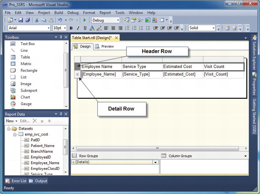
Figure 4-13. Table data region with detail rows
To add the Patient_Name field to the Table so that the report has the same functionality as the list you created previously, you need to insert a group in the Table. To do this, simply drag the Patient_Name field in the emp_svc_cost dataset down into the Row Groups section and release it just above the (Details) row group as shown in Figure 4-14 below.

Figure 4-14. Creating a Row Group using drag-and-drop
You can view the Group Properties by clicking the down arrow to the right of the Patient_Name group and then selecting the Group Properties option (see Figure 4-15).

Figure 4-15. Grouping Properties dialog box
To distinguish the patient from the employee, make the Patient_Name cell bold. For clarity, delete each of the headers that were originally added when you added the detail row fields— click the cells of the header, and press the Delete key. Next, resize the columns, if required, to expand the Patient Name and Employee Name columns. You can accomplish this either by dragging the right edge of each column to the right or by selecting the entire column and entering the desired width in inches in the Properties window. You can get to the context-sensitive Properties windows by pressing F4.
Finally, you need to set an additional grouping level for the detail row, as you did for the header row that contains the Patient_Name field. Right-click (Details) in Row Groups and select Group Properties. Click Add and select the Employee_Name field to be grouped on the details row. You also need to make sure the Estimated_Cost and Visit_Count fields have the Sum function applied to them—=Sum(Fields!Estimated_Cost.Value), for example— and then you can preview the report. An easy way to accomplish this is to highlight the Estimated Cost expression in the Table, right click it and select Sum under the Summarize By submenu. When the report is rendered, it performs similarly to the List you created previously, as shown in Figure 4-16.
You can add more grouping levels to the Table at this point if you need to, but for now you’ll learn how to combine the Table with the free-form Rectangle to show how it’s possible to extend beyond the structured nature of the Table while maintaining multiple grouping levels.
The RDL listing for the Table you’ve created will span many pages, so we have chosen, where appropriate, to include a section of the RDL output for each of the data regions. In Listing 4-2, you can see a complete <TablixCell> section that would be a child node to the <TablixCell>, <TablixRow>, and ultimately the <Tablix> elements. The particular cell from the Table that the RDL is referencing is the Patient_Name field that you added to its own grouping in the Table. Notice also that the field has a section of RDL that defines CanGrow. Assigning the CanGrow property to a cell within the Table data region enables it to expand automatically to fit the length of the data that it contains. The opposite is achievable too, by assigning the CanShrink property.
![]() Note In all releases since SSRS 2008, the
Note In all releases since SSRS 2008, the Tablix property refers to Table, Matrix, and List objects, and therefore the RDL, which previously referenced Table or Matrix specifically, now references Tablix.
Listing 4-2. RDL Section for Table Data Region
<TablixCell>

<CellContents>

    <Textbox Name="textbox3">

    <CanGrow>true</CanGrow>

    <KeepTogether>true</KeepTogether>

    <Paragraphs>

        <Paragraph>

        <TextRuns>

            <TextRun>

            <Value />

            <Style />

        </TextRun>

        </TextRuns>

        <Style />

        </Paragraph>

    </Paragraphs>

    <rd:DefaultName>textbox3</rd:DefaultName>

    <ZIndex>17</ZIndex>

    <Style>

    <PaddingLeft>2pt</PaddingLeft>

    <PaddingRight>2pt</PaddingRight>

    <PaddingTop>2pt</PaddingTop>

    <PaddingBottom>2pt</PaddingBottom>

    </Style>
The completed report for the Table object is called Table.rdl and is in the Pro_SSRS project.
Implementing a Rectangle
The Rectangle data region, as discussed earlier, is similar to the List data region in that it’s a free-form container object for report items and encapsulates all the objects into one defined area, so when it’s repositioned or deleted altogether, the objects inside are repositioned or deleted too. As with all the other report objects and data regions we’ll cover, you can position and scope the rectangle inside other data regions.
The Rectangle data region is more limited than the List data region, as it contains no grouping levels. You can, however, group the objects or data regions inside a Rectangle and use rectangles in several creative ways in an SSRS report. You will pick up where you left off on the previous sample, using the Table data region, and add a Rectangle as a placeholder inside the table. This way, you can add a level of free-form design to the report while maintaining the structure afforded by the Table data region. In this example, we will also use the Textbox report object that we introduced previously. A Textbox can contain literal string values such as a report title; it might also contain an expression. You can use a Textbox object to add titles to the free-form objects that you place inside the Rectangle.
The starting-point report for this section is called Rectangle Start.rdl. It’s available in the Pro_SSRS project in the Source Code/Download area for the book on the Apress site.
To begin, open the Rectangle Start.rdl report, and follow these steps to add a rectangle to the entire detail row:
- Drag a Rectangle data region from the Toolbox into the extended detail row in the Rectangle Start report.
- Drag two fields,
Visit_CountandEstimated_Cost, from theemp_svc_costdataset into the detail area. Place them vertically so that theVisit_Countfield is above theEstimated_Costfield. Notice that SSRS automatically assigns theSumaggregate function to the fields.- Drag two textboxes from the Toolbox into the rectangle to the left of the two fields you just added. The textboxes, which can contain expressions or literal strings, serve as labels. Inside the textboxes, type Visit Count and Estimated Cost, respectively.
- Add formatting to the textboxes by selecting both with shift-click and then setting the text color property to Firebrick and the font size to 12 point. You will also make the Estimated_Cost and Visit_Count fields bold. You can find these settings on the standard formatting toolbar or in the Properties window. When complete, the report layout will look like it does in Figure 4-17.

Figure 4-17. Rectangle in table with formatting
When you preview the report, the Estimated_Cost field doesn’t appear to be in the correct format, which should be currency. Each textbox contains formatting properties that you can set in several ways. In the Layout tab, right-click the textbox that contains the sum of the Estimated_Cost data field, and select Properties. You can set the format for the textbox value on the Format tab of the Textbox Properties dialog box. Alternatively, you can alter the Format property in the Properties window. Choose Currency (see Figure 4-18). The default currency format, with a code of “C,” contains two decimal places. If you wish, you can override this by choosing Custom and typing “C0” or “C1”, which would give you no decimal places or one decimal place, respectively. For this example, leave the default two decimal places.

Figure 4-18. Choosing Format using Text Box dialog box
When you click OK and preview the report, you can see that you now have a single detail row that’s formatted with vertically aligned, appropriately formatted textboxes, as shown in Figure 4-19. Using a Rectangle in this manner allows more flexibility when adding several free-form elements to a report while still providing the multiple grouping levels of the table.
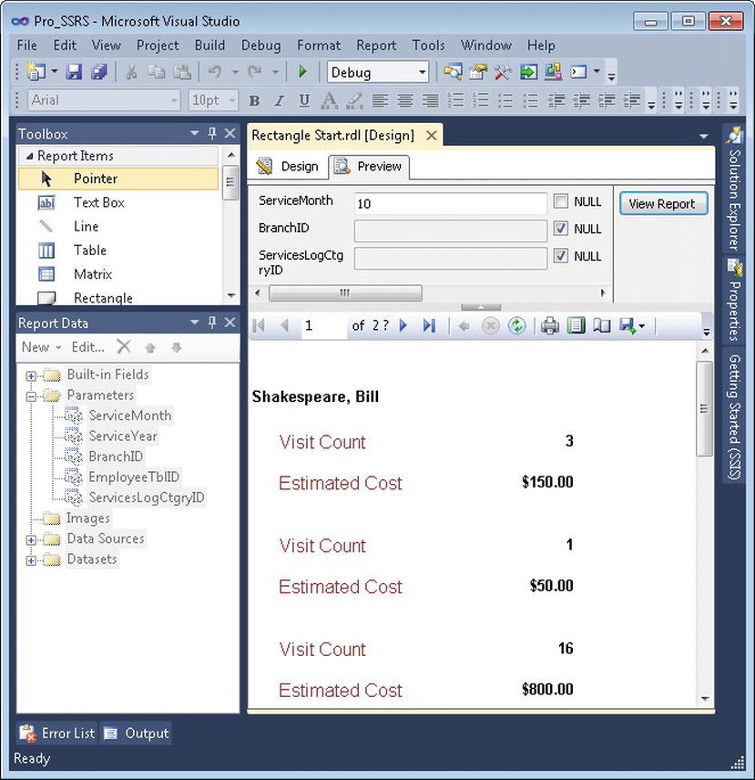
Figure 4-19. Preview of table with formatting
You can see the RDL output of the Rectangle that you added to the table in Listing 4-3.
Listing 4-3. RDL Output for Rectangle
<Rectangle Name="rectangle1">

 <ReportItems>

   <Textbox Name="Visit_Count">

     <CanGrow>true</CanGrow>

     <KeepTogether>true</KeepTogether>

       <Paragraphs>

       <Paragraph>

         <TextRuns>

                <TextRun>

             <Value>=Sum(Fields!Visit_Count.Value)</Value>

                <Style>

               <FontWeight>Bold</FontWeight>

                </Style>

                </TextRun>

                </TextRuns>

         <Style>

           <TextAlign>Right</TextAlign>

                </Style>
The completed report for the Rectangle object is called Rectangle.rdl and is located in the Pro_SSRS project.
Implementing a Matrix
You can use the Matrix data region to produce output formatted in rows and columns around aggregated measures. A Matrix in SSRS is similar to a pivot table or a cross-tab report. You can group data fields in a Matrix together with other fields, producing a natural summary and detail relationship. Simple single-level Matrix data regions with one column and one row provide valuable BI that you can deploy for quick analysis. This is true for data derived from standard SQL queries or from data derived from an MDX query used with Analysis Services (covered in Chapter 12). For now, we’ll introduce some of the properties of the Matrix data region and use the stored procedure, Emp_Svc_Cost, to populate it with the Estimated_Cost value for each patient over a given time. You concatenate the field values for Year and Month to use for the column grouping section of the Matrix, and Patient_Name for the row grouping.
The starting point report for the Matrix object, demonstrated in this section, is available in the Pro_SSRS project in the Source Code/Download area for the book on the Apress site. This report is called Matrix Start.rdl.
By default, a Matrix data region holds only three cells, defining Columns, Rows, and Data cells, as shown in Figure 4-20. You can use the fourth blank cell at the top left for a label or for an expression-and-parameter combination that can control the layout of the Matrix, such as expanding or collapsing groups interactively—we will demonstrate later.
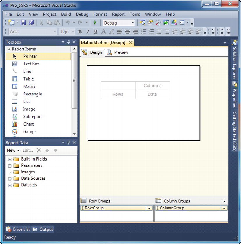
Figure 4-20. Matrix data region
With the Matrix Start.rdl report open, double-click the Matrix object in the Toolbox, which will automatically add a Matrix to the design area of the report. Next, drag two fields onto the Matrix, Patient_Name and Estimated_Cost, from the emp_svc_cost dataset. They go in the Rows and Data areas, respectively. For the Columns area, define an expression that concatenates the Service_Year and Service_Month fields. Note that you may have to delete the header that was added automatically for the Estimated Cost field. The expression is as follows:
=Fields!Year.Value & " - " & Fields!Month.Value
You also use this expression to create a custom grouping with the combined fields. To group the Columns area on the expression, right-click ColumnGroup in the Row and Column Groups area of the report and select Group Properties Place the preceding expression in the Group On section, and click OK. Next, left-align the Estimated_Cost field, and set the formatting to Currency, as demonstrated in the previous section. When you preview the report, you can see that the Matrix shows the estimated cost of care for the familiar patients for each month they had service, as shown in Figure 4-21.
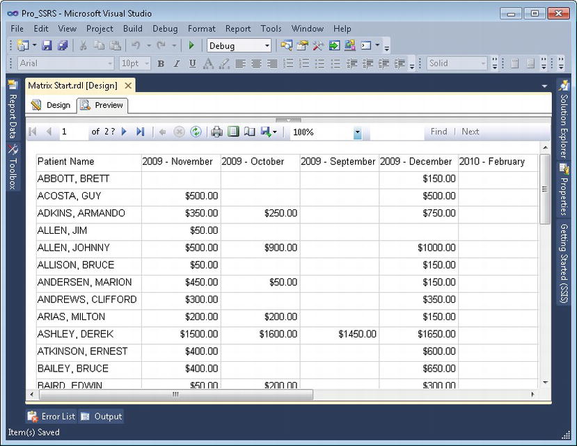
Figure 4-21. Matrix data region preview
You can see the RDL output of the Matrix in Listing 4-4.
Listing 4-4. Matrix RDL Listing
<Tablix Name="matrix1">

        <TablixCorner>

          <TablixCornerRows>

            <TablixCornerRow>

              <TablixCornerCell>

                <CellContents>

                        <Textbox Name="textbox1">

                        <CanGrow>true</CanGrow>

                    <KeepTogether>true</KeepTogether>

                    <Paragraphs>

                      <Paragraph>

                        <TextRuns>

                          <TextRun>

                            <Value />

                            <Style />

                          </TextRun>

           </TextRuns>

           <Style />

      </Paragraph>

</Paragraphs>

<ZIndex>3</ZIndex>

<DataElementOutput>NoOutput</DataElementOutput>

<Style>

      <PaddingLeft>2pt</PaddingLeft>

      <PaddingRight>2pt</PaddingRight>

      <PaddingTop>2pt</PaddingTop>

      <PaddingBottom>2pt</PaddingBottom>

</Style>
The completed report for the Matrix object is called Matrix.rdl and is available in the Pro_SSRS project.
Summary
In this chapter, you learned that each report consists of defined elements that are based on a defined schema in the RDL, which gives SSRS the advantage of standardization. We covered the report objects that make up reports and viewed their properties and functionality. You also saw for each object how the graphical design components are directly translated to RDL through the design process. Now that you’re more comfortable with the design environment, you’ll learn how to use it to design and deploy some real reports.
In the next chapter, we’ll show how to spice up reports by adding graphs and charts. You can look at a graph or a chart as just another type of report, but they are visually different enough to treat separately in their own chapter.