
10. Where Are We Now?
As discussed in earlier chapters, the most recent major market bottom began forming in the fourth quarter of 2008 and was finalized with the establishment of the March 2009 low. The subsequent bull market, which evolved from that low, remains in force as of this writing in February 2011 and, at present, there is a lack of evidence indicating a major top is close at hand. Before discussing why a continued primary uptrend in the stock market appears likely in the months ahead, we first examine the life of the bull market thus far.
The Bull Market
As the major market indexes embarked on a sustained primary uptrend following the establishment of the final low in the 2008–2009 major market bottom, Lowry’s measures of the intermediate-term trends of Supply and Demand, Selling Pressure and Buying Power, acted in a manner uncharacteristic of a market in the midst of a new bull trend. During the initial stage of a new bull market, Selling Pressure typically drops at about the same rate as Buying Power rises, showing that Supply is being withdrawn at the same rate investor Demand is expanding.
In the case of the rally off the March 2009 low, however, there was a clear sluggishness in the contraction of Selling Pressure, as shown in Figure 10.1 (Point A). Specifically, in the month following the March 9 low, Buying Power increased 65 points while Selling Pressure declined 31 points, less than half the increase in Buying Power. This sluggishness in Selling Pressure persisted over the subsequent month. And as of May 8, 2009, Selling Pressure was just 34 points below its March 2009 peak, while Buying Power had risen 76 points from its equivalent low (Point B). One viable explanation for the sluggishness in the contraction of Selling Pressure was investors’ lack of faith in the advance. Given the severity of the preceding bear market, sellers remained active during the initial advance from the March 2009 bottom, unwilling to believe that preceding carnage of the 2007–2009 bear market had fully played itself out.
Figure 10.1. The 2008–2009 major market bottom and subsequent Bull Market
Charts created with Metastock, a Thomson Reuters product.
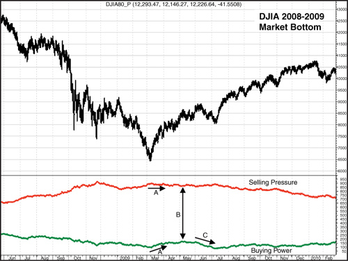
Following this two-month period of rapidly expanding Demand and sluggishly contracting Supply, concern regarding the sustainability of the uptrend apparently increased, as Buying Power, following its former brisk expansion, began to erode. This erosion began in early June 2009, (Point C), just as the market was in the process of forming a corrective top that eventually led to a month-long pullback in the market. During this decline, Buying Power fell 77 points and broke below the 96 reading recorded at the March 2009 bear market low. Thus, confidence in the new bull market diminished further still.
Nonetheless, the internal weakness implied by the sluggish contraction in Supply and subsequent drop in Demand never fully played out in the actions of the major market indexes, as the March 2009 low was never challenged. This was the first time in Lowry’s history, which dates back to 1933, where such an extensive rally occurred with the Buying Power Index dropping to new lows. It is also important to note that this was also the first time in Lowry’s history where a five-month rally occurred on persistently contracting volume. The contraction in volume, as well as the market pullback into the July low, helped account for the decline in Buying Power. This contraction of volume is clearly evident in Figure 10.2, the 30-day moving average of NYSE Up Volume plus Down Volume.
Figure 10.2. S&P 500 and 30-day moving average of NYSE Composite Up Volume plus Down Volume
Charts created with Metastock, a Thomson Reuters product.
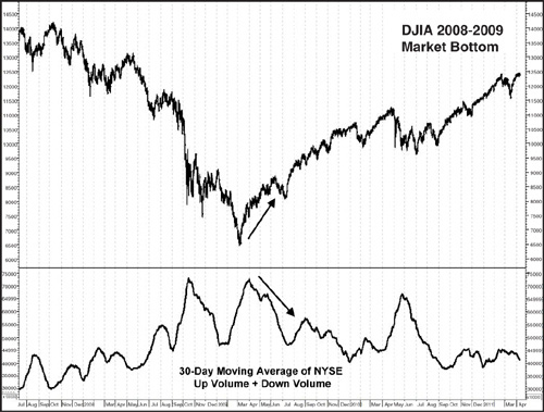
Note that this volume data is compiled using total NYSE Composite Volume, not merely NYSE floor volume. With the growing role of off-exchange trading, using only floor volume probably no longer paints quite an accurate picture of trading activity. Total Composite Volume, however, takes into account all sources outside the floor of the Exchange, including dark pools.
Despite the anomalies of the initial stages of the new bull trend, the market stabilized in early July 2009, and during the subsequent advance, conditions began to appear more typical of a market in the midst of a new primary advance. To quote an excerpt from Lowry’s weekly Primary Trend Perspective published on August 7, 2009, “...measures of Supply, Demand and volume all appear to be strengthening, which is more consistent with a sustainable rally.”
The primary uptrend forged on throughout the third and fourth quarters of 2009. It was not until January 2010 that a correction developed which appeared to threaten the uptrend in place since the July 2009 low. The pullback got off to a rather harrowing start, with the Dow Jones Industrial Average producing four triple-digit declines in the span of five sessions. And two of those declines were in excess of 200 points. All told, that decline, which persisted from January 19, 2010, through February 8, 2010, shaved 7.6% off the Dow Jones Industrial Average.
Although the health of the primary uptrend may have been called into question by some as the early 2010 sell-off persisted, it was the condition of the market prior to that decline that suggested the pullback did not represent the start of a major move lower. First, as shown in Figure 10.3, at the January 19 market high, Selling Pressure remained in a downtrend, having recorded its lowest reading since the bull market began in March 2009. Over Lowry’s 78-year history encompassing 18 bull market tops since 1937, there is not a single instance of Selling Pressure recording a new low at a major market peak. In contrast, Selling Pressure tends to establish a well-defined uptrend several months prior to a major market top, reflecting the increased selling that occurs in the latter stages of a bull market.
Figure 10.3. DJIA Bull Market confirmed by Buying Power and Selling Pressure
Charts created with Metastock, a Thomson Reuters product.

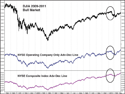
Market breadth also indicated the early 2010 decline did not represent the beginning of the end of the bull market. As discussed in Chapter 7, “Indentifying Major Tops and Bottoms: Other Tools to Consider,” buying tends to diminish while selective selling starts to emerge during the formation of major market tops. These factors become evident in the various market indexes’ Advance–Decline Lines, which fail to confirm the new rally highs in their underlying price indexes. However, at the January 19, 2010 market top, the NYSE Composite all-issues, NYSE Operating Companies Only, S&P 500, S&P Mid Cap and NASDAQ Comp. A–D Lines all confirmed the new highs reached by their respective price indexes. Figure 10.4 depicts the A–D Lines of the NYSE Comp. Index as well as NYSE Operating Company Only Index. Given the lack of supporting evidence a major market top had been reached, the probabilities appeared to favor an eventual resumption of the bull market after the correction ran its course.
Figure 10.4. NYSE all-issues and operating company only A–D Lines
Charts created with Metastock, a Thomson Reuters product.
Indeed, the market recovered steadily from the February 8 low and by March 17, 2010, had established a new closing high for the bull market. This advance continued virtually uninterrupted until the next intermediate-term top on April 26, 2010. It was the sell-off following this high that tested the mettle of those investors holding long positions in favor an ongoing bull market.
Specifically, during the nine-day decline from the April 26 high through the May 7 close, volume surged, three 90% Downside Days developed, and the Dow Jones Industrial Average lost in excess of 800 points, for a total percentage decline of 7.4%. During this period, the infamous “Flash Crash” occurred (Figure 10.5). This cascade of selling on the afternoon of May 6, 2010 resulted, at one point, in a nearly 1000 point loss on the day in the Dow Jones Industrial Average. Although the precise cause of the debacle is yet to be conclusively determined, generalized blame has been placed on computerized high frequency trading, as noted in a subsequent report resulting from a joint investigation by the U.S. Securities and Exchange Commission (SEC) and the Commodity Futures Trading Commission (CFTC).1
Figure 10.5. DJIA along with Buying Power and Selling Pressure during May 2010 “Flash Crash”
Charts created with Metastock, a Thomson Reuters product.

Although the market rebounded following the flash crash, it would not be until nearly six months later, in early November 2010, that the bull market finally resumed. During the period from late April through November 2010, skepticism regarding the market’s ability to resume the bull trend abounded. This was not surprising, considering that at the nadir of the correction from the April 2010 closing high, the DJIA had fallen 13.6% (closing basis). The losses were even worse in the S&P 500 and NASDAQ Comp., which dropped 16% and 17.3%, respectively.
With many prominent analysts and market pundits pounding the table declaring a new bear market was underway, Lowry’s maintained the stance that the pullback, albeit painful, represented a correction within an ongoing primary uptrend. The reasoning behind this opinion was simple: Prior to the sell-off, there was a lack of evidence indicating a major top was at hand. This declaration was based on the same metrics observed during the decline from the January 2010 high.
Specifically, as was the case in January 2010, Selling Pressure did not experience a sustained uptrend heading into the April high. As already noted, there has never been a case in Lowry’s history, which dates back to the early 1930s, where a bear market has begun with the Selling Pressure Index at its low. And at the April market highs, the downtrend in Selling Pressure dating back to the November 2008 peak remained intact, with the Index reaching a new low in its ongoing downtrend on April 23, one session prior to the peak in the Dow Jones Industrial Average (Figure 10.5). It is also clear in Figure 10.5 that Demand remained strong heading into the April high, given the uptrend in Buying Power.
In addition, the various A–D Lines monitored at Lowry’s once again failed to indicate narrowing participation in the advance heading into the April top. The NYSE Composite all-issues, NYSE Operating Companies Only, S&P 500, S&P Mid Cap and NASDAQ Comp. A–D Lines all confirmed the new highs reached by their respective price indexes in the month of April. Figure 10.6 provides a look at the A–D Lines of the NYSE Comp. Index as well as NYSE Operating Company Only Index during this time period. Thus, while the market’s tumble from the April high was significant, there was a lack of evidence suggesting investors should move to a heavily defensive position in anticipation of a forthcoming bear market.
Figure 10.6. NYSE all-issues and operating company only A–D Lines
Charts created with Metastock, a Thomson Reuters product.

In early July 2010, worries about the market’s broader trend were focused on what appeared to be a major topping pattern in the market, known in technical analysis jargon as a “head and shoulders top,” as shown in Figure 10.7. A detailed description of the characteristics of this top can be found in any basic book on the subject of Technical Analysis or by just performing a Google search on the term. Some analysts were of the opinion that the price action from the top established in January 2010 through the breakdown below the late May/early June lows on June 30, 2010, represented a confirmed head and shoulders top. However, the forces of Supply and Demand were at odds with that opinion. Specifically, evidence of expanding Supply and contracting Demand was absent throughout the so-called topping formation. Had the formation of a major top been underway, eroding Demand should have been evident. To the contrary, Demand was expanding, with Buying Power rising from 150 at the start of the pattern in January 2010 to a level of 219 during the June 30, 2010, breakdown.
Figure 10.7. DJIA and proposed head and shoulders topping pattern
Charts created with Metastock, a Thomson Reuters product.

In addition, had a major top been in place, evidence of distribution should have been present. However, that was not the case, as Selling Pressure, after a reading at 752 in the early stages of the presumed head and shoulders pattern, was 32 points lower at 720 on June 30. In brief, measures of breadth (A–D Lines) and Supply and Demand all appeared to call into question whether the pattern actually represented a “classic” major topping formation.
Granted, using the Wyckoff methodology, the January 2010 high could have reasonably been labeled Preliminary Supply while the April peak could have been considered a potential major top. However, this example illustrates the importance of confirming elements such as the A–D Lines and measurements of Supply and Demand, all of which argued against the possibility a major top was at hand.
Indeed, the forces of Supply and Demand were proven reliable gauges of future market action as the late June break to new lows in the decline from the April high proved temporary and actually marked the low point of the correction. Subsequent gyrations in the weeks ahead were eventually resolved with an advance that surpassed the April rally peak in early November, as shown in Figure 10.7 (Point A). A modest pullback then developed throughout the rest of November, and by mid-December, the market, as represented by the Dow Jones Industrial Average (Point B), had recovered to new rally highs in its primary uptrend.
From that time through mid-February 2011, the equity market has been in the midst of a virtually uninterrupted move higher. This uptrend in equity prices is being confirmed by the actions of Supply and Demand, as Selling Pressure continues to steadily contract while Buying Power is in the midst of a persistent expansion. In fact, by December 20, 2010, Buying Power rose to a dominant position over Selling Pressure for the first time in three years, as shown by Point C.
History has shown that the amount of strength required to push Buying Power above Selling Pressure is often just about the same amount of strength required to push prices to a temporary overbought level. Thus, market corrections often occur shortly after Buying Power/Selling Pressure crossing points. However, such was not the case this time as following the December 20 cross, the market continued its advance to higher highs within its primary uptrend, with the spread between Buying Power and Selling Pressure consistently widening, as shown by Point D.
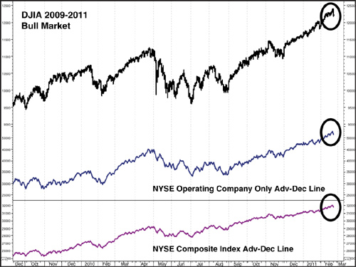
As of mid-February 2011, the Dow Jones Industrial Average, S&P 500, NASDAQ Composite Index, New York Composite Index, S&P 400 Mid Cap Index and S&P 600 Small Index were all sitting at new highs in their respective primary uptrends dating back to the March 2009 bear market low. In fact, the S&P 400 Mid Cap Index is currently trading at a new all-time high. Also Buying Power and Selling Pressure are confirming the ongoing health of the primary uptrend, as the former is at a new rally high, and the latter is at a new reaction low, as shown in Figure 10.7. The various A–D Lines referenced previously in this chapter are providing confirmation of the of the bull market, as all are sitting at new rally highs. A final look at the A–D Lines of the NYSE Comp. Index and the NY Operating Company Only Index is shown in Figure 10.8.
Figure 10.8. NYSE all-issues and operating company only A–D Lines
Charts created with Metastock, a Thomson Reuters product.
A final clue that neither the January 2010 nor the April 2010 top represented a major market high was provided by the application of Wyckoff’s Law of Cause and Effect. This Law is applied through price projections for bull and bear markets through point and figure counts of major market tops and bottoms, as detailed in Chapter 6, “Building a Cause: How R.D. Wyckoff Uses Point and Figure Charts to Establish Price Targets.” And the point and figure count for the 2008–2009 market bottom suggested the tops in January and April 2010 in the DJIA fell far short of the projected target range.
According to the Wyckoff method, the point and figure count for a market bottom is taken between two points, Preliminary Support and the Last Point of Support. The count represents the number of columns between those two points. Figure 10.9 of the DJIA uses the same three-box reversal method detailed in Chapter 6, with each box worth 100 points, also the same for the DJIA market tops and bottoms since 2000. As identified in the analysis of the 2009 market bottom in Chapter 5, “How Major Market Bottoms Form: Part II, Accumulation and Breakout,” Preliminary Support is identified as the rally in mid-September to about 11,500 in the DJIA. The Last Point of Support is similarly identified as the early April pullback to around 7500.
Figure 10.9. Point and figure chart of the DJIA: determining a potential target range for the Bull Market
Charts created with Metastock, a Thomson Reuters product.
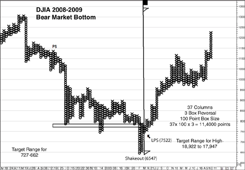
The count is established by moving right to left along the level of this LPS to the column representing PS. This results in a count of 37 columns (boxes). The count is then finalized by multiplying the count (37) times the box size (100 points) times the reversal amount (3). Thus the count is 37 × 100 × 3 = 11,400 points.
This count is next used to establish the target range for the subsequent bull market and is projected from the level where the count originated (LPS) and also from the lowest point of the bottom formation, which in this case is the March 2009 market low. Adding the 11,400 count to the LPS at 7522 and to the March low 2009 at 6657 results in a target range of 17,947 to 18,922 for the current bull market in the Dow Jones Industrial Average.
As shown in the examples in Chapter 6, target ranges can sometimes be very accurate but other times not even close to the actual high of a bull market or low of a bear market. The ranges are used strictly as guides and potential benchmarks and are subordinate to other means of identifying market tops and bottoms. That said, the fact the target range for this bull market was so far above the January or April highs added another element to the evidence neither high was likely to represent a major market top.
The market has passed the two-year anniversary of the March 2009 bear market low. And given the evidence available from the intermediate-term trends of Supply and Demand, as well as from measures of market breadth and price target projections, the probabilities appear to favor a continued bull market in the months ahead.
Endnote
1. See www.sec.gov/news/studies/2010/marketevents-report.pdf.