25. WPF Graphics and Multimedia
Objectives
In this chapter you’ll learn:
• To manipulate fonts.
• To draw basic WPF shapes.
• To use WPF brushes to customize the Fill or Background of an object.
• To use WPF transforms to reposition or reorient GUI elements.
• To completely customize the look of a control while maintaining its functionality.
• To animate the properties of a GUI element.
• To transform and animate 3-D objects.
• To use speech synthesis and recognition.
Nowadays people’s visual imagination is so much more sophisticated, so much more developed, particularly in young people, that now you can make an image which just slightly suggests something, they can make of it what they will.
—Robert Doisneau
In shape, it is perfectly elliptical. In texture, it is smooth and lustrous. In color, it ranges from pale alabaster to warm terra cotta.
—Sydney J Harris, “Tribute to an Egg”
Outline
25.1 Introduction
25.2 Controlling Fonts
25.3 Basic Shapes
25.4 Polygons and Polylines
25.5 Brushes
25.6 Transforms
25.7 WPF Customization: A Television GUI
25.8 Animations
25.9 (Optional) 3-D Objects and Transforms
25.10 Speech Synthesis and Speech Recognition
25.11 Wrap-Up
25.1 Introduction
This chapter overviews WPF’s graphics and multimedia capabilities, including two-dimensional and three-dimensional shapes, fonts, transformations, animations, audio and video. WPF integrates drawing and animation features that were previously available only in special libraries (such as DirectX). The graphics system in WPF is designed to use your computer’s graphics hardware to reduce the load on the CPU.
WPF graphics use resolution-independent units of measurement, making applications more uniform and portable across devices. The size properties of graphic elements in WPF are measured in machine-independent pixels, where one pixel typically represents 1/96 of an inch—however, this depends on the computer’s DPI (dots per inch) setting. The graphics engine determines the correct pixel count so that all users see elements of the same size on all devices.
Graphic elements are rendered on screen using a vector-based system in which calculations determine how to size and scale each element, allowing graphic elements to be preserved across any rendering size. This produces smoother graphics than the so-called raster-based systems, in which the precise pixels are specified for each graphical element. Raster-based graphics tend to degrade in appearance as they’re scaled larger. Vector-based graphics appear smooth at any scale. Graphic elements other than images and video are drawn using WPF’s vector-based system, so they look good at any screen resolution.
The basic 2-D shapes are Lines, Rectangles and Ellipses. WPF also has controls that can be used to create custom shapes or curves. Brushes can be used to fill an element with solid colors, complex patterns, gradients, images or videos, allowing for unique and interesting visual experiences. WPF’s robust animation and transform capabilities allow you to further customize GUIs. Transforms reposition and reorient graphic elements.
WPF also includes 3-D modeling and rendering capabilities. In addition, 2-D manipulations can be applied to 3-D objects as well. You can find more information on WPF in our WPF Resource Center at www.deitel.com/wpf/. The chapter ends with an introduction to speech synthesis and recognition.
25.2 Controlling Fonts
This section introduces how to control fonts by modifying the font properties of a Text-Block control in the XAML code. Figure 25.1 shows how to use TextBlocks and how to change the properties to control the appearance of the displayed text.
Fig. 25.1. Formatting fonts in XAML code.


The text that you want to display in the TextBlock is placed between the TextBlock tags. The FontFamily property defines the font of the displayed text. This property can be set to any font. Lines 10, 14 and 18 define the separate TextBlock fonts to be Arial, Times New Roman and Courier New, respectively. If the font is not specified or is not available, the default font, Segoe UI for Windows Vista/Windows 7, is used (lines 24 and 33).
The FontSize property defines the text size measured in points. When no FontSize is specified, the property is set to the default value of 12 (this is actually determined by System.MessageFontSize). The font sizes are defined in lines 10 and 18. In lines 14, 24 and 33, the FontSize is not defined so the default is used.
TextBlocks have various properties that can further modify the font. Lines 10 and 19 set the FontWeight property to Bold to make the font thicker. This property can be set either to a numeric value (1–999) or to a predefined descriptive value—such as Light or UltraBold—to define the thickness of the text. You can use the FontStyle property to make the text either Italic or Oblique—which is simply a more emphasized italic. Line 19 sets the FontStyle property to Italic.
You can also define TextDecorations for a TextBlock to draw a horizontal line through the text. Overline and Baseline—shown in the fourth TextBlock of Fig. 25.1—create lines above the text and at the base of the text, respectively (lines 26–27). Strike-through and Underline—shown in the fifth TextBlock—create lines through the middle of the text and under the text, respectively (lines 35–36). The Underline option leaves a small amount of space between the text and the line, unlike the Baseline. The Location property of the TextDecoration class defines which decoration you want to apply.
25.3 Basic Shapes
WPF has several built-in shapes. The BasicShapes example (Fig. 25.2) shows you how to display Lines, Rectangles and Ellipses.
Fig. 25.2. Drawing basic shapes in XAML.

The first shape drawn uses the Rectangle object to create a filled rectangle in the window. Notice that the layout control is a Canvas allowing us to use coordinates to position the shapes. To specify the upper-left corner of the Rectangle at lines 9–10, we set the Canvas.Left and Canvas.Top properties to 90 and 30, respectively. We then set the Width and Height properties to 150 and 90, respectively, to specify the size. To define the Rectangle’s color, we use the Fill property (line 10). You can assign any Color or Brush to this property. Rectangles also have a Stroke property, which defines the color of the outline of the shape (line 20). If either the Fill or the Stroke is not specified, that property will be rendered transparently. For this reason, the blue Rectangle in the window has no outline, while the second Rectangle drawn has only an outline (with a transparent center). Shape objects have a StrokeThickness property which defines the thickness of the outline. The default value for StrokeThickness is 1 pixel.
A Line is defined by its two endpoints—X1, Y1 and X2, Y2. Lines have a Stroke property that defines the color of the line. In this example, the lines are all set to have black Strokes (lines 13–16 and 25–26).
To draw a circle or ellipse, you can use the Ellipse control. The placement and size of an Ellipse is defined like a Rectangle—with the Canvas.Left and Canvas.Top properties for the upper-left corner, and the Width and Height properties for the size (line 23). Together, the Canvas.Left, Canvas.Top, Width and Height of an Ellipse define a “bounding rectangle” in which the Ellipse touches the center of each side of the rectangle. To draw a circle, provide the same value for the Width and Height properties. As with Rectangles, having an unspecified Fill property for an Ellipse makes the shape’s fill transparent (lines 29–30).
25.4 Polygons and Polylines
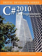
There are two shape controls for drawing multisided shapes—Polyline and Polygon. Polyline draws a series of connected lines defined by a set of points, while Polygon does the same but connects the start and end points to make a closed figure. The application DrawPolygons (Fig. 25.3) allows you to click anywhere on the Canvas to define points for one of three shapes. You select which shape you want to display by selecting one of the RadioButtons in the second column. The difference between the Filled Polygon and the Polygon options is that the former has a Fill property specified while the latter does not.
Fig. 25.3. Defining Polylines and Polygons in XAML.

The code defines a two-column GUI (lines 9–10). The first column contains a Canvas (lines 15–22) that the user interacts with to create the points of the selected shape. Embedded in the Canvas are a Polyline (lines 17–18) and two Polygons—one with a Fill (lines 20–21) and one without (line 19). The Visibility of a control can be set to Visible, Collapsed or Hidden. This property is initially set to Collapsed for all three shapes (lines 18, 19 and 21), because we’ll display only the shape that corresponds to the selected RadioButton. The difference between Hidden and Collapsed is that a Hidden object occupies space in the GUI but is not visible, while a Collapsed object has a Width and Height of 0. As you can see, Polyline and Polygon objects have Fill and Stroke properties like the simple shapes we discussed earlier.
The RadioButtons (lines 30–40) allow you to select which shape appears in the Canvas. There is also a Button (lines 45–46) that clears the shape’s points to allow you to start over. The code-behind file for this application is shown in Fig. 25.4.
Fig. 25.4. Drawing Polylines and Polygons.


To allow the user to specify a variable number of points, line 12 declares a Point-Collection, which is a collection that stores Point objects. This keeps track of each mouse-click location. The collection’s Add method adds new points to the end of the collection. When the application executes, we set the Points property (lines 19–21) of each shape to reference the PointCollection instance variable created in line 12.
We created a MouseDown event handler to capture mouse clicks on the Canvas (lines 25–30). When the user clicks the mouse on the Canvas, the mouse coordinates are recorded (line 29) and the points collection is updated. Since the Points property of each of the three shapes has a reference to our PointCollection object, the shapes are automatically updated with the new Point. The Polyline and Polygon shapes connect the Points based on the ordering in the collection.
Each RadioButton’s Checked event handler sets the corresponding shape’s Visibility property to Visible and sets the other two to Collapsed to display the correct shape in the Canvas. For example, the lineRadio_Checked event handler (lines 39–45) makes polyLine Visible (line 42) and makes polygon and filledPolygon Collapsed (lines 43–44). The other two RadioButton event handlers are defined similarly in lines 48–55 and lines 58–65.
The clearButton_Click event handler erases the stored collection of Points (line 35). The Clear method of the PointCollection points erases its elements.
25.5 Brushes
Brushes change an element’s graphic properties, such as the Fill, Stroke or Background. A SolidColorBrush fills the element with the specified color. To customize elements further, you can use ImageBrushes, VisualBrushes and gradient brushes. Run the Using-Brushes application (Fig. 25.5) to see Brushes applied to TextBlocks and Ellipses.
Fig. 25.5. Applying brushes to various XAML elements.


ImageBrush
An ImageBrush paints an image into the property it is assigned to (such as a Background). For instance, the TextBlock with the text “Image” and the Ellipse next to it are both filled with the same flower picture. To fill the text, we can assign the ImageBrush to the Foreground property of the TextBlock. The Foreground property specifies the fill for the text itself while the Background property specifies the fill for the area surrounding the text. Notice in lines 32–35 we apply the ImageBrush with its ImageSource set to the file we want to display (the image file must be included in the project). We can also assign the brush to the Fill of the Ellipse (lines 41–43) to display the image inside the shape.
VisualBrush and MediaElement
This example displays a video in a TextBlock’s Foreground and an Ellipse’s Fill. To use audio or video in a WPF application, you use the MediaElement control. Before using a video file in your application, add it to your Visual Studio project by first selecting the Add Existing Item... option in the Project menu. In the file dialog that appears, find and select the video you want to use. In the drop-down menu next to the File Name TextBox, you must change the selection to All Files (*.*) to be able to find your file. Once you have selected your file, click Add. Select the newly added video in the Solution Explorer. Then, in the Properties window, change the Copy to Output Directory property to Copy if newer. This tells the project to copy your video to the project’s output directory where it can directly reference the file. You can now set the Source property of your MediaElement to the video. In the UsingBrushes application, we use nasa.wmv (line 52 and 64).
We use the VisualBrush element to display a video in the desired controls. Lines 50–54 define the Brush with a MediaElement assigned to its Visual property. In this property you can completely customize the look of the brush. By assigning the video to this property, we can apply the brush to the Foreground of the TextBlock (lines 48–55) and the Fill of the Ellipse (lines 61–67) to play the video inside the controls. Notice that the Fill of the third Row’s elements is different in each screen capture in Fig. 25.5. This is because the video is playing inside the two elements.
Gradients
A gradient is a gradual transition through two or more colors. Gradients can be applied as the background or fill for various elements. There are two types of gradients in WPF—LinearGradientBrush and RadialGradientBrush. The LinearGradientBrush transitions through colors along a straight path. The RadialGradientBrush transitions through colors radially outward from a specified point. Linear gradients are discussed in the Using-Gradients example, which displays a gradient across the window. This was created by applying a LinearGradientBrush to a Rectangle’s Fill. The gradient starts white and transitions linearly to black from left to right. You can set the RGBA values of the start and end colors to change the look of the gradient. The values entered in the TextBoxes must be in the range 0–255 for the application to run properly. If you set either color’s alpha value to less than 255, you’ll see the text “Transparency test” in the background, showing that the Rectangle is semitransparent. The XAML code for this application is shown in Fig. 25.6.
Fig. 25.6. Defining gradients in XAML.


The GUI for this application contains a single Rectangle with a LinearGradient-Brush applied to its Fill (lines 20–30). We define the StartPoint and EndPoint of the gradient in line 22. You must assign logical points to these properties, meaning the x- and y-coordinates take values between 0 and 1, inclusive. Logical points are used to reference locations in the control independent of the actual size. The point (0,0) represents the top-left corner while the point (1,1) represents the bottom-right corner. The gradient will transition linearly from the start to the end—for RadialGradientBrush, the StartPoint rep-resents the center of the gradient.
A gradient is defined using GradientStop controls. A GradientStop defines a single color along the gradient. You can define as many stops as you want by embedding them in the brush element. A GradientStop is defined by its Offset and Color properties. The Color property defines the color you want the gradient to transition to—lines 25 and 27 indicate that the gradient transitions through white and black. The Offset property defines where along the linear transition you want the color to appear. You can assign any double value between 0 and 1, inclusive, which represent the start and end of the gradient. In the example we use 0.0 and 1.0 offsets (lines 24 and 26), indicating that these colors appear at the start and end of the gradient (which were defined in line 22), respectively. The code in Fig. 25.7 allows the user to set the Colors of the two stops.
Fig. 25.7. Customizing gradients.

When fromButton is clicked, we use the Text properties of the corresponding Text-Boxes to obtain the RGBA values and create a new color. We then assign it to the Color property of startGradient (lines 21–25). When the toButton is clicked, we do the same for stopGradient’s Color (lines 32–36).
25.6 Transforms
A transform can be applied to any UI element to reposition or reorient the graphic. There are several types of transforms. Here we discuss TranslateTransform, RotateTransform, SkewTransform and ScaleTransform. A TranslateTransform moves an object to a new location. A RotateTransform rotates the object around a point and by a specified RotationAngle. A SkewTransform skews (or shears) the object. A ScaleTransform scales the object’s x- and y-coordinate points by different specified amounts. See Section 25.7 for an example using a SkewTransform and a ScaleTransform.
The next example draws a star using the Polygon control and uses RotateTransforms to create a circle of randomly colored stars. Figure 25.8 shows the XAML code and a sample output. Lines 10–11 define a Polygon in the shape of a star. The Polygon’s Points property is defined here in a new syntax. Each Point in the collection is defined with a comma separating the x- and y- coordinates. A single space separates each Point. We defined ten Points in the collection. The code-behind file is shown in Fig. 25.9.
Fig. 25.8. Defining a Polygon representing a star in XAML.

Fig. 25.9. Applying transforms to a Polygon.

In the code-behind, we replicate star 18 times and apply a different RotateTrans-form to each to get the circle of Polygons shown in the screen capture of Fig. 25.8. Each iteration of the loop duplicates star by creating a new Polygon with the same set of points (lines 22–23). To generate the random colors for each star, we use the Random class’s Next-Bytes method, which assigns a random value in the range 0–255 to each element in its Byte array argument. Lines 25–26 define a four-element Byte array and supply the array to the NextBytes method. We then create a new Brush with a color that uses the four randomly generated values as its RGBA values (lines 27–29).
To apply a rotation to the new Polygon, we set the RenderTransform property to a new RotateTransform object (lines 32–34). Each iteration of the loop assigns a new rotation-angle value by using the control variable multiplied by 20 as the RotationAngle argument. The first argument in the RotateTransform’s constructor is the angle by which to rotate the object. The next two arguments are the x- and y-coordinates of the point of rotation. The center of the circle of stars is the point (150,150) because all 18 stars were rotated about that point. Each new shape is added as a new Child element to mainCanvas (line 35) so it can be rendered on screen.
25.7 WPF Customization: A Television GUI
In Chapter 24, we introduced several techniques for customizing the appearance of WPF controls. We revisit them in this section, now that we have a basic understanding of how to create and manipulate 2-D graphics in WPF. You’ll learn to apply combinations of shapes, brushes and transforms to define every aspect of a control’s appearance and to create graphically sophisticated GUIs.
This case study models a television. The GUI depicts a 3-D-looking environment featuring a TV that can be turned on and off. When it is on, the user can play, pause and stop the TV’s video. When the video plays, a semitransparent reflection plays simultaneously on what appears to be a flat surface in front of the screen (Fig. 25.10).
Fig. 25.10. GUI representing a television.

The TV GUI may appear overwhelmingly complex, but it’s actually just a basic WPF GUI built using controls with modified appearances. This example demonstrates the use of WPF bitmap effects to apply simple visual effects to some of the GUI elements. In addition, it introduces opacity masks, which can be used to hide parts of an element. Other than these two new concepts, the TV application is created using only the WPF elements and concepts that you’ve already learned. Figure 25.11 presents the XAML markup and a screen capture of the application when it first loads. The video used in this case study is a public-domain NASA video entitled Animation: To the Moon and can be downloaded from the NASA website (www.nasa.gov/multimedia/hd/index.html).
Fig. 25.11. TV GUI showing the versatility of WPF customization (XAML).


WPF Effects
WPF allows you to apply graphical effects to any GUI element. There are two predefined effects—the DropShadowEffect, which gives an element a shadow as if a light were shining at it (Fig. 25.11, lines 163–165), and the BlurEffect, which makes an element’s appearance blurry. The System.Windows.Media.Effects namespace also contains the more generalized ShaderEffect class, which allows you to build and use your own custom shader effects. For more information on the ShaderEffect class, visit Microsoft’s developer center.
bit.ly/ShaderEffect
You can apply an effect to any element by setting its Effect property. Each Effect has its own unique properties. For example, DropShadowEffect’s ShadowDepth property specifies the distance from the element to the shadow (line 164), while a BlurEffect’s KernelType property specifies the type of blur filter it uses and its Radius property specifies the filter’s size.
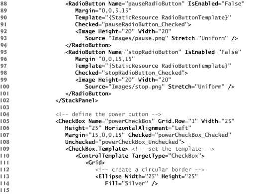
Creating Buttons on the TV
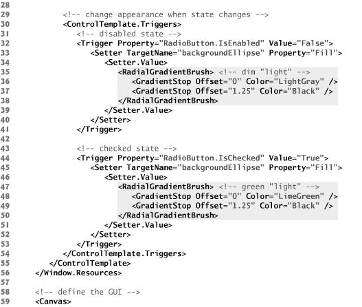
The representations of TV buttons in this example are not Button controls. The play, pause, and stop buttons are RadioButtons, and the power button is a CheckBox. Lines 9–55 and 110–152 define the ControlTemplates used to render the RadioButtons and CheckBox, respectively. The two templates are defined similarly, so we discuss only the RadioButton template in detail.
In the background of each button are two circles, defined by Ellipse objects. The larger Ellipse acts as a border (line 13). The smaller Ellipse is colored by a RadialGradientBrush. The gradient is a light color in the center and becomes black as it extends farther out. This makes it appear to be a source of light (lines 16–23). The content of the RadioButton is then applied on top of the two Ellipses (line 26).
The images used in this example are transparent outlines of the play, pause, and stop symbols on a black background. When the button is applied over the RadialGradient-Brush, it appears to be illuminated. In its default state (enabled and unchecked), each playback button glows red. This represents the TV being on, with the playback option not active. When the application first loads, the TV is off, so the playback buttons are disabled. In this state, the background gradient is gray. When a playback option is active (i.e., RadioButton is checked), it glows green. The latter two deviations in appearance when the control changes states are defined by triggers (lines 30–54).
The power button, represented by a CheckBox, behaves similarly. When the TV is off (i.e., CheckBox is unchecked), the control is gray. When the user presses the power button and turns the TV on (i.e., CheckBox becomes checked), the control turns green. The power button is never disabled.
Creating the TV Interface
The TV panel is represented by a beveled Border with a gray background (lines 61–166). Recall that a Border is a ContentControl and can host only one direct child element. Thus, all of the Border’s elements are contained in a Grid layout container. Nested within the TV panel is another Border with a black background containing a MediaElement control (lines 70–76). This portrays the TV’s screen. The power button is placed in the bottom-left corner, and the playback buttons are bound in a StackPanel in the bottom-right corner (lines 79–154).
Creating the Reflection of the TV Screen
Lines 169–196 define the GUI’s video reflection using a Rectangle element nested in a Border. The Rectangle’s Fill is a VisualBrush that is bound to the MediaElement (lines 172–180). To invert the video, we define a ScaleTransform and specify it as the RelativeTransform property, which is common to all brushes (lines 176–178). You can invert an element by setting the ScaleX or ScaleY—the amounts by which to scale the respective coordinates—property of a ScaleTransform to a negative number. In this example, we set ScaleY to -1 and CenterY to 0.5, inverting the VisualBrush vertically centered around the midpoint. The CenterX and CenterY properties specify the point from which the image expands or contracts. When you scale an image, most of the points move as a result of the altered size. The center point is the only point that stays at its original location when ScaleX and ScaleY are set to values other than 1.
To achieve the semitransparent look, we applied an opacity mask to the Rectangle by setting the OpacityMask property (lines 184–189). The mask uses a LinearGradient-Brush that changes from black near the top to transparent near the bottom. When the gradient is applied as an opacity mask, the gradient translates to a range from completely opaque, where it is black, to completely transparent. In this example, we set the Offset of the black GradientStop to -0.25, so that even the opaque edge of the mask is slightly transparent. We also set the Offset of the transparent GradientStop to 0.5, indicating that only the top half of the Rectangle (or bottom half of the movie) should display.
Skewing the GUI Components to Create a 3-D Look
When you draw a three-dimensional object on a two-dimensional plane, you are creating a 2-D projection of that 3-D environment. For example, to represent a simple box, you draw three adjoining parallelograms. Each face of the box is actually a flat, skewed rectangle rather than a 2-D view of a 3-D object. You can apply the same concept to create simple 3-D-looking GUIs without using a 3-D engine.
In this case study, we applied a SkewTransform to the TV representation, skewing it vertically by 15 degrees clockwise from the x-axis (lines 158–160). The reflection is then skewed vertically by 15 degrees clockwise from the x-axis and horizontally by 45 degrees clockwise from the y-axis (lines 193–195). Thus the GUI becomes a 2-D orthographic projection of a 3-D space with the axes 105, 120, and 135 degrees from each other, as shown in Fig. 25.12. Unlike a perspective projection, an orthographic projection does not show depth. Thus, the TV GUI does not present a realistic 3-D view, but rather a graphical representation. In Section 25.9, we present a 3-D object in perspective.
Fig. 25.12. The effect of skewing the TV application’s GUI components.

Examining the Code-Behind Class
Figure 25.13 presents the code-behind class that provides the functionality for the TV application. When the user turns on the TV (i.e., checks the powerCheckBox), the reflection is made visible and the playback options are enabled (lines 16–26). When the user turns off the TV, the MediaElement’s Close method is called to close the media. In addition, the reflection is made invisible and the playback options are disabled (lines 29–45).
Fig. 25.13. TV GUI showing the versatility of WPF customization (code-behind).


Whenever one of the RadioButtons that represent each playback option is checked, the MediaElement executes the corresponding task (lines 48–66). The methods that execute these tasks are built into the MediaElement control. Playback can be modified programmatically only if the LoadedBehavior is Manual (line 75 in Fig. 25.11).
25.8 Animations
An animation in WPF applications simply means a transition of a property from one value to another in a specified amount of time. Most graphic properties of a control can be animated. The UsingAnimations example (Fig. 25.14) shows a video’s size being animated. A MediaElement along with two input TextBoxes—one for Width and one for Height—and an animate Button are created in the GUI. When you click the animate Button, the video’s Width and Height properties animate to the values typed in the corresponding TextBoxes by the user.
Fig. 25.14. Animating the width and height of a video.


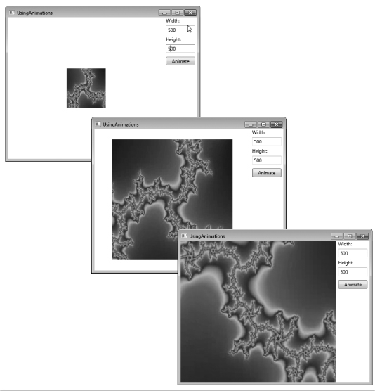
As you can see, the animations create a smooth transition from the original Height and Width to the new values. Lines 31–43 define a Storyboard element embedded in the Button’s click event Trigger. A Storyboard contains embedded animation elements. When the Storyboard begins executing (line 30), all embedded animations execute. A Storyboard has two important properties—TargetName and TargetProperty. The TargetName (line 31) specifies which control to animate. The TargetProperty specifies which property of the animated control to change. In this case, the Width (line 34) and Height (line 40) are the TargetProperties, because we’re changing the size of the video. Both the TargetName and TargetProperty can be defined in the Storyboard or in the animation element itself.
To animate a property, you can use one of several animation classes available in WPF. We use the DoubleAnimation for the size properties—PointAnimations and Color-Animations are two other commonly used animation classes. A DoubleAnimation animates properties of type Double. The Width and Height animations are defined in lines 33–36 and 39–42, respectively. Lines 35–36 define the To property of the Width animation, which specifies the value of the Width at the end of the animation. We use data binding to set this to the value in the widthValue TextBox. The animation also has a Duration property that specifies how long the animation takes. Notice in line 33 that we set the Duration of the Width animation to 0:0:2, meaning the animation takes 0 hours, 0 minutes and 2 seconds. You can specify fractions of a second by using a decimal point. Hour and minute values must be integers. Animations also have a From property which defines a constant starting value of the animated property.
Since we’re animating the video’s Width and Height properties separately, it is not always displayed at its original width and height. In line 13, we define the MediaElement’s Stretch property. This is a property for graphic elements and determines how the media stretches to fit the size of its enclosure. This property can be set to None, Uniform, UniformToFill or Fill. None allows the media to stay at its native size regardless of the container’s size. Uniform resizes the media to its largest possible size while maintaining its native aspect ratio. A video’s aspect ratio is the proportion between its width and height. Keeping this ratio at its original value ensures that the video does not look “stretched.” UniformToFill resizes the media to completely fill the container while still keeping its aspect ratio—as a result, it could be cropped. When an image or video is cropped, the pieces of the edges are cut off from the media in order to fit the shape of the container. Fill forces the media to be resized to the size of the container (aspect ratio is not preserved). In the example, we use Fill to show the changing size of the container.
25.9 (Optional) 3-D Objects and Transforms
WPF has substantial three-dimensional graphics capabilities. Once a 3-D shape is created, it can be manipulated using 3-D transforms and animations. This section requires an understanding of 3-D analytical geometry. Readers without a strong background in these geometric concepts can still enjoy this section. We overview several advanced WPF 3-D capabilities.
The next example creates a rotating pyramid. The user can change the axis of rotation to see all sides of the object. The XAML code for this application is shown in Fig. 25.15.
Fig. 25.15. Animating a 3-D object.


The first step in creating a 3-D object is to create a Viewport3D control (lines 29–76). The viewport represents the 2-D view the user sees when the application executes. This control defines a rendering surface for the content and contains content that represents the 3-D objects to render.
Create a ModelVisual3D object (lines 37–75) to define a 3-D object in a Viewport3D control. ModelVisual3D’s Content property contains the shapes you wish to define in your space. To add multiple objects to the Content, embed them in a Model3DGroup element.
Creating the 3-D Object
3-D objects in WPF are modeled as sets of triangles, because you need a minimum of three points to make a flat surface. Every surface must be created or approximated as a collection of triangles. For this reason, shapes with flat surfaces (like cubes) are relatively simple to create, while curved surfaces (like spheres) are extremely complex. To make more complicated 3-D elements, you can use 3-D application development tools such as Electric Rain’s ZAM 3D (erain.com/products/zam3d/DefaultPDC.asp), which generates the XAML markup.
Use the GeometryModel3D element to define a shape (lines 45–72). This control creates and textures your 3-D model. First we discuss this control’s Geometry property (lines 57–62). Use the MeshGeometry3D control (lines 58–61) to specify the exact shape of the object you want to create in the Geometry property. To create the object, you need two collections—one is a set of points to represent the vertices, and the other uses those vertices to specify the triangles that define the shape. These collections are assigned to the Positions and TriangleIndices properties of MeshGeometry3D, respectively. The points that we assigned to the Positions attribute (lines 58–59) are shown in a 3-D space in Fig. 25.16. The view in the figure does not directly correspond to the view of the pyramid shown in the application. In the application, if you change the camera’s Position (as you’ll soon learn) to "5,5,5", LookDirection to "-1,-1,-1" and UpDirection to "0,1,0", you’ll see the pyramid in the same orientation as in Fig. 25.16.
Fig. 25.16. 3-D points making up a pyramid with a square base.

The points are labeled in the order they’re defined in the Positions collection. For instance, the text 0. (1,1,0) in the diagram refers to the first defined point, which has an index of 0 in the collection. Points in 3-D are defined with the notation “(x-coordinate, y-coordinate, z-coordinate).” With these points, we can define the triangles that we use to model the 3-D shape. The TriangleIndices property specifies the three corners of each individual triangle in the collection. The first element in the collection defined in line 59 is (0,4,1). This indicates that we want to create a triangle with corners at points 0, 4 and 1 defined in the Positions collection. You can see this triangle in Fig. 25.16 (the front-most triangle in the picture). We can define all the sides of the pyramid by defining the rest of the triangles. Note also that while the pyramid has five flat surfaces, there are six triangles defined, because we need two triangles to create the pyramid’s square base.
The order in which you define the triangle’s corners dictates which side is considered the “front” versus the “back.” Suppose you want to create a flat square in your viewport. This can be done using two triangles, as shown in Fig. 25.17. If you want the surface facing toward you to be the “front,” you must define the corners in counterclockwise order. So, to define the lower-left triangle, you need to define the triangle as "0,1,3". The upper-right triangle needs to be "1,2,3". By default, the “front” of the triangle is drawn with your defined Material (described in the next section) while the “back” is made transparent. Therefore, the order in which you define the triangle’s vertices is significant.
Fig. 25.17. Defining two triangles to create a square in 3-D space.

Using a Brush on the Surface of a 3-D Object
By defining the Material property of the GeometryModel3D, we can specify what type of brush to use when painting each surface of the 3-D object. There are several different controls you can use to set the Material property. Each control gives a different “look” to the surface. Figure 25.18 describes the available controls.
Fig. 25.18. 3-D material controls.

In the example, we use the DiffuseMaterial control. We can assign the brushes described in Section 25.5 to the material’s Brush property to define how to paint the 3-D object’s surface. We use an ImageBrush with cover.png as its source (line 68) to draw an image on the pyramid.
Notice in line 61 of Fig. 25.15 that we define the TextureCoordinates of the 3-D object. This property takes a PointCollection and determines how the Material is mapped onto the object’s surfaces. If this property is not defined, the brush may not render correctly on the surface. The TextureCoordinates property defines which point on the image is mapped onto which vertex—an intersection of two or more edges—of the object.
Notice we assigned the String "0,0 1,0 0,1 1,1 0,0" to the TextureCoordinates property. This String is translated into a PointCollection containing Points (0,0), (1,0), (0,1), (1,1) and (0,0). These points are logical points—as described in Section 25.5—on the image. The five points defined here correspond directly to the five points defined in the Positions collection. The image’s top-left corner (0,0)—defined first in Texture-Coordinates—is mapped onto the first point in the Positions collection (1,1,0). The bottom-right corner (1,1) of the image—defined fourth in TextureCoordinates—is mapped onto the fourth point in the Positions collection (-1,-1,0). The other two corners are also mapped accordingly to the second and third points. This makes the image fully appear on the bottom surface of the pyramid, since that face is rectangular.
If a point is shared by two adjacent sides, you may not want to map the same point of the image to that particular vertex for the two different sides. To have complete control over how the brush is mapped onto the surfaces of the object, you may need to define a vertex more than once in the Positions collection.
Defining a Camera and a Light Source
The Camera property of Viewport3D (lines 30–34) defines a virtual camera for viewing the defined 3-D space. In this example, we use a PerspectiveCamera to define what the user sees. We must set the camera’s Position, LookDirection and UpDirection (lines 32–33). The Position property requires a Point3D object which defines a 3-D point, while the LookDirection and UpDirection require Vector3D objects which define vectors in 3-D space. 3-D vectors are defined by an x-, a y- and a z-component (defined in that order in the XAML markup). For instance, the vector applied to the UpDirection is written as "0,0,1" (line 33) and represents a vector with an x- and y-component of 0, and a z-component of 1. This vector points in the positive direction of the z-axis.
The Position defines the location of the camera in the 3-D space. The LookDirection defines the direction in which the camera is pointed. The UpDirection defines the orientation of the camera by specifying the upward direction in the viewport. If the UpDirection in this example were set to "0,0,-1" then the pyramid would appear “upside-down” in the viewport.
Unlike 2-D objects, a 3-D object needs a virtual light source so the camera can actually “see” the 3-D scene. In the Model3DGroup, which groups all of the ModelVisual3D’s objects, we define two DirectionalLight objects (lines 42–43) to illuminate the pyramid. This control creates uniform rays of light pointing in the direction specified by the Direction property. This property receives a vector that points in the direction of the light. You can also define the Color property to change the light’s color.
Animating the 3-D Object
As with 2-D animations, there is a set of 3-D animations that can be applied to 3-D objects. Lines 47–54 define the Transform property of the GeometryModel3D element that models a pyramid. We use the RotateTransform3D control to implement a rotation of the pyramid. We then use the AxisAngleRotation3D to strictly define the transform’s rotation (lines 50–51). The Angle and Axis properties can be modified to customize the transform. The Angle is initially set to 0 (that is, not rotated) and the Axis of rotation to the z-axis, represented by the vector defined as "0,0,1" (line 51).
To animate the rotation, we created a Storyboard that modifies the Angle property of the AxisAngleRotation3D (lines 17–23). Notice we set the RepeatBehavior of the Storyboard to Forever (line 18), indicating that the animation repeats continuously while the window is open. This Storyboard is set to begin when the page loads (line 15).
The application contains RadioButtons at the bottom of the window that change the axis of rotation. The code-behind for this functionality appears in Fig. 25.19. With each RadioButton’s Checked event, we change the Axis of rotation to the appropriate Vector3D. We also change the Position of the PerspectiveCamera to give a better view of the rotating object. For instance, when xButton is clicked, we change the axis of rotation to the x-axis (line 19) and the camera’s position to give a better view (line 20).
Fig. 25.19. Changing the axis of rotation for a 3-D animation.

25.10 Speech Synthesis and Speech Recognition
Speech-based interfaces make computers easier to use for people with disabilities (and others). Speech synthesizers, or text-to-speech (TTS) systems, read text out loud and are an ideal method for communicating information to sight-impaired individuals. Speech recognizers, or speech-to-text (STT) systems, transform human speech (input through a microphone) into text and are a good way to gather input or commands from users who have difficulty with keyboards and mice. .NET 4.0 provides powerful tools for working with speech synthesis and recognition. The program shown in Figs. 25.20–25.21 provides explanations of the various kinds of programming tips found in this book using an STT system (and the mouse) as input and a TTS system (and text) as output.
Fig. 25.20. Text-To-Speech and Speech-To-Text (XAML).


Fig. 25.21. Text-To-Speech and Speech-To-Text code-behind.


Our speech application’s GUI (Fig. 25.20) consists of a vertical StackPanel containing a TextBox, a Button and a series of horizontal StackPanels containing Images and TextBlocks that label those Images.
Figure 25.21 provides the speech application’s functionality. The user either clicks an Image or speaks its name into a microphone, then the GUI displays a text description of the concept which that image or phrase represents, and a speech synthesizer speaks this description. To use .NET’s speech synthesis and recognition classes, you must add a reference to System.Speech to the project as follows:
- Right click the project name in the Solution Explorer then select Add Reference....
- On the .NET tab of the Add Reference dialog, locate and select
System.Speechand click OK.
You must also import the System.Speech.Synthesis and System.Speech.Recognition namespaces (lines 5–6).
Instance Variables
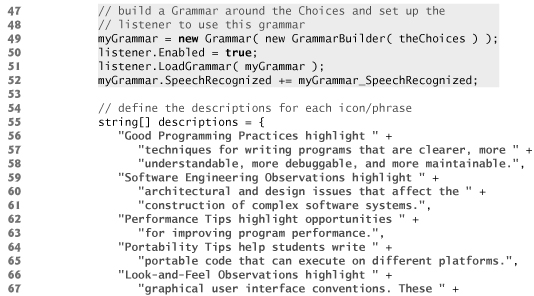
You can now add instance variables of types SpeechRecognizer, Grammar and Speech-Synthesizer (lines 15, 18 and 21). The SpeechRecognizer class has several ways to recognize input phrases. The most reliable involves building a Grammar containing the exact phrases that the SpeechRecognizer can receive as spoken input. The SpeechSynthesizer object speaks text, using one of several voices. Variable displayString (line 24) keeps track of the description that will be displayed and spoken. Lines 27–28 and 31–32 declare two objects of type Dictionary (namespace System.Collections.Generic). A Dictionary is a collection of key/value pairs, in which each key has a corresponding value. The Dictionary imageDescriptions contains pairs of Images and strings, and the Dictionary phraseDescriptions contains pairs of strings and strings. These Dictionary objects associate each input phrase and each clickable Image with the corresponding description phrase to be displayed and spoken.
Constructor
In the constructor (lines 34–97), the application initializes the input phrases and places them in a Choices collection (lines 39–45). A Choices collection is used to build a Grammar (lines 49–51). Line 52 registers the listener for the Grammar’s SpeechRecognized event. Lines 55–80 create an array of the programming-tip descriptions. Lines 83–89 add each image and its corresponding description to the imageDescriptions Dictionary. Lines 92–94 add each programming-tip name and corresponding description to the phraseDescriptions Dictionary. Finally, line 96 sets the SpeechSynthesizer object’s Rate property to -4 to slow down the default rate of speech.
Method SpeechButton_Click
Method SpeechButton_Click (lines 101–104) calls the SpeechSynthesizer’s Speak-Async method to speak the contents of SpeechBox. SpeechSynthesizers also have a Speak method, which is not asynchronous, and SpeakSsml and SpeakSsmlAsynch, methods specifically for use with Speech Synthesis Markup Language (SSML)—an XML vocabulary created particularly for TTS systems. For more information on SSML, visit www.xml.com/pub/a/2004/10/20/ssml.html.
Method Image_MouseDown
Method Image_MouseDown (lines 106–113) handles the MouseDown events for all the Image objects. When the user clicks an Image, the program casts sender to type Image, then passes the results as input into the imageDescriptions Dictionary to retrieve the corresponding description string. This string is assigned to displayString (line 111). We then call DisplaySpeak to display displayString at the bottom of the window and cause the SpeechSynthesizer to speak it.
Method myGrammar_SpeechRecognized
Method myGrammar_SpeechRecognized (lines 117–127) is called whenever the Speech-Recognizer detects that one of the input phrases defined in myGrammar was spoken. The Result property of the RecognitionEventArgs parameter contains the recognized text. We use the phraseDescriptions Dictionary object to determine which description to display (line 122). We cannot call DisplaySpeak directly here, because GUI events and the SpeechRecognizer events operate on different threads—they are processes being executed in parallel, independently from one another and without access to each other’s methods. Every method that modifies the GUI must be called via the GUI thread of execution. To do this, we use a Dispatcher object (lines 125–126) to invoke the method. The method to call must be wrapped in a so-called delegate object. An Action delegate object represents a method with no parameters.
Method DisplaySpeak
Method DisplaySpeak (lines 131–135) outputs displayString to the screen by updating InfoBlock’s Text property and to the speakers by calling the SpeechSynthesizer’s SpeakAsync method.
25.11 Wrap-Up
In this chapter you learned how to manipulate graphic elements in your WPF application. We introduced how to control fonts using the properties of TextBlocks. You learned to change the TextBlock’s FontFamily, FontSize, FontWeight and FontStyle in XAML. We also demonstrated the TextDecorations Underline, Overline, Baseline and Strikethrough. Next, you learned how to create basic shapes such as Lines, Rectangles and Ellipses. You set the Fill and Stroke of these shapes. We then discussed an application that created a Polyline and two Polygons. These controls allow you to create multisided objects using a set of Points in a PointCollection.
You learned that there are several types of brushes for customizing an object’s Fill. We demonstrated the SolidColorBrush, the ImageBrush, the VisualBrush and the LinearGradientBrush. Though the VisualBrush was used only with a MediaElement, this brush has a wide range of capabilities.
We explained how to apply transforms to an object to reposition or reorient any graphic element. You used transforms such as the TranslateTransform, the Rotate-Transform, the SkewTransform and the ScaleTransform to manipulate various controls.
The television GUI application used ControlTemplates and BitmapEffects to create a completely customized 3-D-looking television set. You saw how to use Control-Templates to customize the look of RadioButtons and CheckBoxes. The application also included an opacity mask, which can be used on any shape to define the opaque or transparent regions of the control. Opacity masks are particularly useful with images and video where you cannot change the Fill to directly control transparency.
We showed how animations can be applied to transition properties from one value to another. Common 2-D animation types include DoubleAnimations, PointAnimations and ColorAnimations.
You learned how to create a 3-D space using a Viewport3D control. You saw how to model 3-D objects as sets of triangles using the MeshGeometry3D control. The ImageBrush, which was previously applied to a 2-D object, was used to display a book-cover image on the surface of the 3-D pyramid using GeometryModel3D’s mapping techniques. We discussed how to include lighting and camera objects in your Viewport3D to modify the view shown in the application. We showed how similar transforms and animations are in 2-D and 3-D.
Finally, we introduced the speech synthesis and speech recognition APIs. You learned how to make the computer speak text and how to receive voice input. You also learned how to create a Grammar of phrases that the user can speak to control the program. In Chapter 26, we discuss XML and LINQ to XML.