24. GUI with Windows Presentation Foundation
Objectives
In this chapter you’ll learn:
• To mark up data using XML.
• To define a WPF GUI with Extensible Application Markup Language (XAML).
• To handle WPF user-interface events.
• To use WPF’s commands feature to handle common application tasks such as cut, copy and paste.
• To customize the look-and-feel of WPF GUIs using styles and control templates.
• To use data binding to display data in WPF controls.
My function is to present old masterpieces in modern frames.
—Rudolf Bing
Instead of being a static one-time event, bonding is a process, a dynamic and continuous one.
—Julius Segal
...they do not declare but only hint.
—Friedrich Nietzsche
Science is the knowledge of consequences, and dependence of one fact upon another.
—Thomas Hobbes
Here form is content, content is form.
—Samuel Beckett
Outline
24.1 Introduction
24.2 Windows Presentation Foundation (WPF)
24.3 XML Basics
24.4 Structuring Data
24.5 XML Namespaces
24.6 Declarative GUI Programming Using XAML
24.7 Creating a WPF Application in Visual C# Express
24.8 Laying Out Controls
24.8.1 General Layout Principles
24.8.2 Layout in Action
24.9 Event Handling
24.10 Commands and Common Application Tasks
24.11 WPF GUI Customization
24.12 Using Styles to Change the Appearance of Controls
24.13 Customizing Windows
24.14 Defining a Control’s Appearance with Control Templates
24.15 Data-Driven GUIs with Data Binding
24.16 Wrap-Up
24.17 Web Resources
24.1 Introduction
In Chapters 14–15, you built GUIs using Windows Forms. In this chapter, you’ll build GUIs using Windows Presentation Foundation (WPF)—Microsoft’s newer framework for GUI, graphics, animation and multimedia. In Chapter 25, WPF Graphics and Multimedia, you’ll learn how to incorporate 2D graphics, 3D graphics, animation, audio and video in WPF applications. In Chapter 29, Silverlight and Rich Internet Applications, we’ll demonstrate how to use Silverlight (a subset of WPF for web applications) to create Internet applications.
We begin with an introduction to WPF. Next, we discuss an important tool for creating WPF applications called XAML (pronounced “zammel”)—Extensible Application Markup Language. XAML is a descriptive markup language that can be used to define and arrange GUI controls without any C# code. Its syntax is XML (Extensible Markup Language), a widely supported standard for describing data that is commonly used to exchange that data between applications over the Internet. We present an introduction to XML in Sections 24.3–24.5. Section 24.6 demonstrates how to define a WPF GUI with XAML. Sections 24.7–24.10 demonstrate the basics of creating a WPF GUI—layout, controls and events. You’ll also learn new capabilities that are available in WPF controls and event handling.
WPF allows you to easily customize the look-and-feel of a GUI beyond what is possible in Windows Forms. Sections 24.11–24.14 demonstrate several techniques for manipulating the appearance of your GUIs. WPF also allows you to create data-driven GUIs that interact with many types of data. We demonstrate how to do this in Section 24.15.
24.2 Windows Presentation Foundation (WPF)
Previously, you often had to use multiple technologies to build client applications. If a Windows Forms application required video and audio capabilities, you needed to incorporate an additional technology such as Windows Media Player. Likewise, if your application required 3D graphics capabilities, you had to incorporate a separate technology such as Direct3D. WPF provides a single platform capable of handling both of these requirements, and more. It enables you to use one technology to build applications containing GUI, images, animation, 2D or 3D graphics, audio and video capabilities. In this chapter and Chapters 25 and 29, we demonstrate each of these capabilities.
WPF can interoperate with existing technologies. For example, you can include WPF controls in Windows Forms applications to incorporate multimedia content (such as audio or video) without converting the entire application to WPF, which could be a costly and time-consuming process. You can also use Windows Forms controls in WPF applications.
WPF’s ability to use the acceleration capabilities of your computer’s graphics hardware increases your applications’ performance. In addition, WPF generates vector-based graphics and is resolution independent. Vector-based graphics are defined, not by a grid of pixels as raster-based graphics are, but rather by mathematical models. An advantage of vector-based graphics is that when you change the resolution, there is no loss of quality. Hence, the graphics become portable to a great variety of devices. Moreover, your applications won’t appear smaller on higher-resolution screens. Instead, they’ll remain the same size and display sharper. Chapter 25 presents more information about vector-based graphics and resolution independence.
Building a GUI with WPF is similar to building a GUI with Windows Forms—you drag-and-drop predefined controls from the Toolbox onto the design area. Many WPF controls correspond directly to those in Windows Forms. Just as in a Windows Forms application, the functionality is event driven. Many of the Windows Forms events you’re familiar with are also in WPF. A WPF Button, for example, is similar to a Windows Forms Button, and both raise Click events.
There are several important differences between the two technologies, though. The WPF layout scheme is different. WPF properties and events have more capabilities. Most notably, WPF allows designers to define the appearance and content of a GUI without any C# code by defining it in XAML, a descriptive markup language (that is, a text-based notation for describing something).
Introduction to XAML
In Windows Forms, when you use the designer to create a GUI, the IDE generates code statements that create and configure the controls. In WPF, it generates XAML markup (that is, a text-based notation for describing data). Because markup is designed to be readable by both humans and computers, you can also manually write XAML markup to define GUI controls. When you compile your WPF application, a XAML compiler generates code to create and configure controls based on your XAML markup. This technique of defining what the GUI should contain without specifying how to generate it is an example of declarative programming.
XAML allows designers and programmers to work together more efficiently. Without writing any code, a graphic designer can edit the look-and-feel of an application using a design tool, such as Microsoft’s Expression Blend—a XAML graphic design program. A programmer can import the XAML markup into Visual Studio and focus on coding the logic that gives an application its functionality. Even if you’re working alone, however, this separation of front-end appearance from back-end logic improves your program’s organization and makes it easier to maintain. XAML is an essential component of WPF programming.
Because XAML is implemented with XML, it’s important that you understand the basics of XML before we continue our discussion of XAML and WPF GUIs.
24.3 XML Basics
The Extensible Markup Language was developed in 1996 by the World Wide Web Consortium’s (W3C’s) XML Working Group. XML is a widely supported standard for describing data that is commonly used to exchange that data between applications over the Internet. It permits document authors to create markup for virtually any type of information. This enables them to create entirely new markup languages for describing any type of data, such as mathematical formulas, software-configuration instructions, chemical molecular structures, music, news, recipes and financial reports. XML describes data in a way that both human beings and computers can understand.
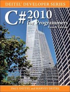
Figure 24.1 is a simple XML document that describes information for a baseball player. We focus on lines 5–11 to introduce basic XML syntax. You’ll learn about the other elements of this document in Section 24.4.
Fig. 24.1. XML that describes a baseball player’s information.
XML documents contain text that represents content (that is, data), such as John (line 6), and elements that specify the document’s structure, such as firstName (line 6). XML documents delimit elements with start tags and end tags. A start tag consists of the element name in angle brackets (for example, <player> and <firstName> in lines 5 and 6, respectively). An end tag consists of the element name preceded by a forward slash (/) in angle brackets (for example, </firstName> and </player> in lines 6 and 11, respectively). An element’s start and end tags enclose text that represents a piece of data (for example, the firstName of the player—John—in line 6, which is enclosed by the <firstName> start tag and and </firstName> end tag) or other elements (for example, the firstName, lastName, and battingAverage elements in the player element). Every XML document must have exactly one root element that contains all the other elements. In Fig. 24.1, player (lines 5–11) is the root element.
Some XML-based markup languages include XHTML (Extensible HyperText Markup Language—HTML’s replacement for marking up web content), MathML (for mathematics), VoiceXML™ (for speech), CML (Chemical Markup Language—for chemistry) and XBRL (Extensible Business Reporting Language—for financial data exchange). ODF (Open Document Format—developed by Sun Microsystems) and OOXML (Office Open XML—developed by Microsoft as a replacement for the old proprietary Microsoft Office formats) are two competing standards for electronic office documents such as spreadsheets, presentations, and word processing documents. These markup languages are called XML vocabularies and provide a means for describing particular types of data in standardized, structured ways.
Massive amounts of data are currently stored on the Internet in a variety of formats (for example, databases, web pages, text files). Based on current trends, it’s likely that much of this data, especially that which is passed between systems, will soon take the form of XML. Organizations see XML as the future of data encoding. Information-technology groups are planning ways to integrate XML into their systems. Industry groups are developing custom XML vocabularies for most major industries that will allow computer-based business applications to communicate in common languages. For example, web services, which we discuss in Chapter 28, allow web-based applications to exchange data seamlessly through standard protocols based on XML. Also, web services are described by an XML vocabulary called WSDL (Web Services Description Language).
The next generation of the Internet and World Wide Web is being built on a foundation of XML, which enables the development of more sophisticated web-based applications. XML allows you to assign meaning to what would otherwise be random pieces of data. As a result, programs can “understand” the data they manipulate. For example, a web browser might view a street address listed on a simple HTML web page as a string of characters without any real meaning. In an XML document, however, this data can be clearly identified (that is, marked up) as an address. A program that uses the document can recognize this data as an address and provide links to a map of that location, driving directions from that location or other location-specific information. Likewise, an application can recognize names of people, dates, ISBN numbers and any other type of XML-encoded data. Based on this data, the application can present users with other related information, providing a richer, more meaningful user experience.
Viewing and Modifying XML Documents
XML documents are portable. Viewing or modifying an XML document—a text file, usually with the .xml file-name extension—does not require special software, although many software tools exist, and new ones are frequently released that make it more convenient to develop XML-based applications. Most text editors can open XML documents for viewing and editing. Visual C# Express includes an XML editor that provides IntelliSense. The editor also checks that the document is well formed and is valid if a schema (discussed shortly) is present. Also, most web browsers can display an XML document in a formatted manner that shows its structure. We demonstrate this using Internet Explorer in Section 24.4. One important characteristic of XML is that it’s both human readable and machine readable.
Processing XML Documents
Processing an XML document requires software called an XML parser (or XML processor). A parser makes the document’s data available to applications. While reading the contents of an XML document, a parser checks that the document follows the syntax rules specified by the W3C’s XML Recommendation (www.w3.org/XML). XML syntax requires a single root element, a start tag and end tag for each element and properly nested tags (that is, the end tag for a nested element must appear before the end tag of the enclosing element). Furthermore, XML is case sensitive, so the proper capitalization must be used in elements. A document that conforms to this syntax is a well-formed XML document, and is syntactically correct. We present fundamental XML syntax in Section 24.4. If an XML parser can process an XML document successfully, that XML document is well formed. Parsers can provide access to XML-encoded data in well-formed documents only—if a document is not well-formed, the parser will report an error to the user or calling application.
Often, XML parsers are built into software such as Visual Studio or available for download over the Internet. Popular parsers include Microsoft XML Core Services (MSXML), the .NET Framework’s XmlReader class, the Apache Software Foundation’s Xerces (available from xerces.apache.org) and the open-source Expat XML Parser (available from expat.sourceforge.net).
Validating XML Documents
An XML document can optionally reference a Document Type Definition (DTD) or a W3C XML Schema (referred to simply as a “schema” for the rest of this book) that defines the XML document’s proper structure. When an XML document references a DTD or a schema, some parsers (called validating parsers) can use the DTD/schema to check that it has the appropriate structure. If the XML document conforms to the DTD/schema (that is, the document has the appropriate structure), the XML document is valid. For example, if in Fig. 24.1 we were referencing a DTD that specifies that a player element must have firstName, lastName and battingAverage elements, then omitting the last-Name element (line 8) would cause the XML document player.xml to be invalid. The XML document would still be well formed, however, because it follows proper XML syntax (that is, it has one root element, and each element has a start and an end tag). By definition, a valid XML document is well formed. Parsers that cannot check for document conformity against DTDs/schemas are nonvalidating parsers—they determine only whether an XML document is well formed.
For more information about validation, DTDs and schemas, as well as the key differences between these two types of structural specifications, see Chapter 26. For now, schemas are XML documents themselves, whereas DTDs are not. As you’ll learn in Chapter 26, this difference presents several advantages in using schemas over DTDs.
Software Engineering Observation 24.1
DTDs and schemas are essential for business-to-business (B2B) transactions and mission-critical systems. Validating XML documents ensures that disparate systems can manipulate data structured in standardized ways and prevents errors caused by missing or malformed data.
Formatting and Manipulating XML Documents
XML documents contain only data, not formatting instructions, so applications that process XML documents must decide how to manipulate or display each document’s data. For example, a PDA (personal digital assistant) may render an XML document differently than a wireless phone or a desktop computer. You can use Extensible Stylesheet Language (XSL) to specify rendering instructions for different platforms. We discuss XSL in Chapter 26.
XML-processing programs can also search, sort and manipulate XML data using technologies such as XSL. Some other XML-related technologies are XPath (XML Path Language—a language for accessing parts of an XML document), XSL-FO (XSL Formatting Objects—an XML vocabulary used to describe document formatting) and XSLT (XSL Transformations—a language for transforming XML documents into other documents). We present XSLT and XPath in Chapter 26. We’ll also present new C# features that greatly simplify working with XML in your code. With these features, XSLT and similar technologies are not needed while coding in C#, but they remain relevant on platforms where C# and .NET are not available.
24.4 Structuring Data
In Fig. 24.2, we present an XML document that marks up a simple article using XML. The line numbers shown are for reference only and are not part of the XML document.
Fig. 24.2. XML used to mark up an article.

This document begins with an XML declaration (line 1), which identifies the document as an XML document. The version attribute specifies the XML version to which the document conforms. The current XML standard is version 1.0. Though the W3C released a version 1.1 specification in February 2004, this newer version is not yet widely supported. The W3C may continue to release new versions as XML evolves to meet the requirements of different fields.
Some XML documents also specify an encoding attribute in the XML declaration. An encoding specifies how characters are stored in memory and on disk—historically, the way an uppercase "A" was stored on one computer architecture was different than the way it was stored on a different computer architecture. Appendix F discusses Unicode, which specifies encodings that can describe characters in any written language. An introduction to different encodings in XML can be found at the website bit.ly/EncodeXMLData.
Portability Tip 24.1

Documents should include the XML declaration to identify the version of XML used. A document that lacks an XML declaration might be assumed erroneously to conform to the latest version of XML—in which case, errors could result.
XML comments (lines 2–3), which begin with <!-- and end with -->, can be placed almost anywhere in an XML document. XML comments can span to multiple lines—an end marker on each line is not needed; the end marker can appear on a subsequent line, as long as there is exactly one end marker (-->) for each begin marker (<!--). Comments are used in XML for documentation purposes. Line 4 is a blank line. As in a C# program, blank lines, whitespaces and indentation are used in XML to improve readability. Later you’ll see that the blank lines are normally ignored by XML parsers.
Common Programming Error 24.2
In an XML document, each start tag must have a matching end tag; omitting either tag is an error. Soon, you’ll learn how such errors are detected.
Common Programming Error 24.3
XML is case sensitive. Using different cases for the start-tag and end-tag names for the same element is a syntax error.
In Fig. 24.2, article (lines 5–20) is the root element. The lines that precede the root element (lines 1–4) are the XML prolog. In an XML prolog, the XML declaration must appear before the comments and any other markup.
The elements we used in the example do not come from any specific markup language. Instead, we chose the element names and markup structure that best describe our particular data. You can invent whatever elements make sense for the particular data you’re dealing with. For example, element title (line 6) contains text that describes the article’s title (for example, Simple XML). Similarly, date (line 8), author (lines 10–13), firstName (line 11), lastName (line 12), summary (line 15) and content (lines 17–19) contain text that describes the date, author, the author’s first name, the author’s last name, a summary and the content of the document, respectively. XML element and attribute names can be of any length and may contain letters, digits, underscores, hyphens and periods. However, they must begin with either a letter or an underscore, and they should not begin with “xml” in any combination of uppercase and lowercase letters (for example, XML, Xml, xMl), as this is reserved for use in the XML standards.
Good Programming Practice 24.1
XML element names should be meaningful to humans and should not use abbreviations.
XML elements are nested to form hierarchies—with the root element at the top of the hierarchy. This allows document authors to create parent/child relationships between data. For example, elements title, date, author, summary and content are nested within article. Elements firstName and lastName are nested within author.
Common Programming Error 24.5
Nesting XML tags improperly is a syntax error—it causes an XML document to not be well-formed. For example, <x><y>hello</x></y> is an error, because the </y> tag must precede the </x> tag.
Any element that contains other elements (for example, article or author) is a container element. Container elements also are called parent elements. Elements nested inside a container element are child elements (or children) of that container element.
Viewing an XML Document in Internet Explorer
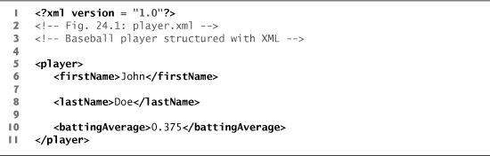
The XML document in Fig. 24.2 is simply a text file named article.xml. This document does not contain formatting information for the article. The reason is that XML is a technology for describing the structure of data. Formatting and displaying data from an XML document are application-specific issues. For example, when the user loads article.xml in Internet Explorer (IE), MSXML (Microsoft XML Core Services) parses and displays the document’s data. Internet Explorer uses a built-in style sheet to format the data. The resulting format of the data (Fig. 24.3) is similar to the format of the listing in Fig. 24.2. In Chapter 26, we show how to create style sheets to transform your XML data into various formats suitable for display.
Fig. 24.3. article.xml displayed by Internet Explorer.
a)

b)
Note the minus sign (–) and plus sign (+) in the screenshots of Fig. 24.3. Although these symbols are not part of the XML document, Internet Explorer places them next to every container element. A minus sign indicates that Internet Explorer is displaying the container element’s child elements. Clicking the minus sign next to an element collapses that element (that is, causes Internet Explorer to hide the container element’s children and replace the minus sign with a plus sign). Conversely, clicking the plus sign next to an element expands that element (that is, causes Internet Explorer to display the container element’s children and replace the plus sign with a minus sign). This behavior is similar to viewing the directory structure using Windows Explorer. In fact, a directory structure often is modeled as a series of tree structures, in which the root of a tree represents a drive letter (for example, C:), and nodes in the tree represent directories. Parsers often store XML data as tree structures to facilitate efficient manipulation.
[Note: By default Internet Explorer displays all the XML elements in expanded view, and clicking the minus sign (Fig. 24.3(a)) does not do anything. So, by default, you won’t be able to collapse the element. To enable this functionality, right click the Information Bar just below the Address field and select Allow Blocked Content.... Then click Yes in the popup window that appears.]
XML Markup for a Business Letter
Now that we have seen a simple XML document, let’s examine a more complex one that marks up a business letter (Fig. 24.4). Again, we begin the document with the XML declaration (line 1) that states the XML version to which the document conforms.
Fig. 24.4. Business letter marked up as XML.


Line 5 specifies that this XML document references a DTD. Recall from Section 24.3 that DTDs define the structure of the data for an XML document. For example, a DTD specifies the elements and parent/child relationships between elements permitted in an XML document.
Error-Prevention Tip 24.1
An XML document is not required to reference a DTD, but validating XML parsers can use a DTD to ensure that the document has the proper structure.
Portability Tip 24.2
Validating an XML document helps guarantee that independent developers will exchange data in a standardized form that conforms to the DTD.
The DTD reference (line 5) contains three items: the name of the root element that the DTD specifies (letter); the keyword SYSTEM (which denotes an external DTD—a DTD declared in a separate file, as opposed to a DTD declared locally in the same file); and the DTD’s name and location (that is, letter.dtd in the same directory as the XML document). DTD document file names typically end with the .dtd extension. We discuss DTDs and letter.dtd in detail in Chapter 26.
Root element letter (lines 7–44 of Fig. 24.4) contains the child elements contact, contact, salutation, paragraph, paragraph, closing and signature. Besides being placed between tags, data also can be placed in attributes—name/value pairs that appear within the angle brackets of start tags. Elements can have any number of attributes (separated by spaces) in their start tags, provided all the attribute names are unique. The first contact element (lines 8–17) has an attribute named type with attribute value "sender", which indicates that this contact element identifies the letter’s sender. The second contact element (lines 19–28) has attribute type with value "receiver", which indicates that this contact element identifies the letter’s recipient. Like element names, attribute names are case sensitive, can be of any length, may contain letters, digits, underscores, hyphens and periods, and must begin with either a letter or an underscore character. A contact element stores various items of information about a contact, such as the contact’s name (represented by element name), address (represented by elements address1, address2, city, state and zip), phone number (represented by element phone) and gender (represented by attribute gender of element flag). Element salutation (line 30) marks up the letter’s salutation. Lines 32–40 mark up the letter’s body using two paragraph elements. Elements closing (line 42) and signature (line 43) mark up the closing sentence and the author’s “signature,” respectively.
Common Programming Error 24.6
Failure to enclose attribute values in double ("") or single ('') quotes is a syntax error.
Line 16 introduces the empty element flag. An empty element contains no content. However, it may sometimes contain data in the form of attributes. Empty element flag contains an attribute that indicates the gender of the contact (represented by the parent contact element). Document authors can close an empty element either by placing a slash immediately preceding the right angle bracket, as shown in line 16, or by explicitly writing an end tag, as in line 22:
<address2></address2>
Line 22 can also be written as:
<address2/>
The address2 element in line 22 is empty, because there is no second part to this contact’s address. However, we must include this element to conform to the structural rules specified in the XML document’s DTD—letter.dtd (which we present in Chapter 26). This DTD specifies that each contact element must have an address2 child element (even if it’s empty). In Chapter 26, you’ll learn how DTDs indicate that certain elements are required while others are optional.
24.5 XML Namespaces
XML allows document authors to create custom elements. This extensibility can result in naming collisions—elements with identical names that represent different things—when combining content from multiple sources. For example, we may use the element book to mark up data about a Deitel publication. A stamp collector may use the element book to mark up data about a book of stamps. Using both of these elements in the same document could create a naming collision, making it difficult to determine which kind of data each element contains.
An XML namespace is a collection of element and attribute names. Like C# namespaces, XML namespaces provide a means for document authors to unambiguously refer to elements that have the same name (that is, prevent collisions). For example,
<subject>Math</subject>
and
<subject>Cardiology</subject>
use element subject to mark up data. In the first case, the subject is something one studies in school, whereas in the second case, the subject is a field of medicine. Namespaces can differentiate these two subject elements. For example,
<school:subject>Math</school:subject>
and
<medical:subject>Cardiology</medical:subject>
Both school and medical are namespace prefixes. A document author places a namespace prefix and colon (:) before an element name to specify the namespace to which that element belongs. Document authors can create their own namespace prefixes using virtually any name except the reserved namespace prefixes xml and xmlns. In the subsections that follow, we demonstrate how document authors ensure that namespaces are unique.
Common Programming Error 24.7
Attempting to create a namespace prefix named xml in any mixture of uppercase and lowercase letters is a syntax error—the xml namespace prefix is reserved for internal use by XML itself.
Differentiating Elements with Namespaces
Figure 24.5 uses namespaces to differentiate two distinct elements—the file element related to a text file and the file document related to an image file.
Fig. 24.5. XML namespaces demonstration.

Lines 6–7 use the XML-namespace reserved attribute xmlns to create two namespace prefixes—text and image. Creating a namespace prefix is similar to using a using statement in C#—it allows you to access XML elements from a given namespace. Each namespace prefix is bound to a series of characters called a Uniform Resource Identifier (URI) that uniquely identifies the namespace. Document authors create their own namespace prefixes and URIs. A URI is a way to identify a resource, typically on the Internet. Two popular types of URI are Uniform Resource Name (URN) and Uniform Resource Locator (URL).
To ensure that namespaces are unique, document authors must provide unique URIs. In this example, we use the text urn:deitel:textInfo and urn:deitel:imageInfo as URIs. These URIs employ the URN scheme frequently used to identify namespaces. Under this naming scheme, a URI begins with "urn:", followed by a unique series of additional names separated by colons. These URIs are not guaranteed to be unique—the idea is simply that creating a long URI in this way makes it unlikely that two authors will use the same namespace.
Another common practice is to use URLs, which specify the location of a file or a resource on the Internet. For example, http://www.deitel.com is the URL that identifies the home page of the Deitel & Associates website. Using URLs for domains that you own guarantees that the namespaces are unique, because the domain names (for example, www.deitel.com) are guaranteed to be unique. For example, lines 5–7 could be rewritten as
<text:directory
xmlns:text = "http://www.deitel.com/xmlns-text"
xmlns:image = "http://www.deitel.com/xmlns-image">
where URLs related to the Deitel & Associates, Inc. domain name serve as URIs to identify the text and image namespaces. The parser does not visit these URLs, nor do these URLs need to refer to actual web pages. Each simply represents a unique series of characters used to differentiate URI names. In fact, any string can represent a namespace. For example, our image namespace URI could be hgjfkdlsa4556, in which case our prefix assignment would be
xmlns:image = "hgjfkdlsa4556"
Lines 9–11 use the text namespace prefix for elements file and description. The end tags must also specify the namespace prefix text. Lines 13–16 apply namespace prefix image to the elements file, description and size. Attributes do not require namespace prefixes, because each attribute is already part of an element that specifies the namespace prefix. For example, attribute filename (line 9) is already uniquely identified by being in the context of the filename start tag, which is prefixed with text.
Specifying a Default Namespace
To eliminate the need to place namespace prefixes in each element, document authors may specify a default namespace for an element and its children. Figure 24.6 demonstrates using a default namespace (urn:deitel:textInfo) for element directory.
Fig. 24.6. Default namespace demonstration.

Line 5 defines a default namespace using attribute xmlns with a URI as its value. Once we define this default namespace, child elements which do not specify a prefix belong to the default namespace. Thus, element file (lines 8–10) is in the default namespace urn:deitel:textInfo. Compare this to lines 9–11 of Fig. 24.5, where we had to prefix the file and description element names with the namespace prefix text.
Common Programming Error 24.8
The default namespace can be overridden at any point in the document with another xmlns attribute. All direct and indirect children of the element with the xmlns attribute use the new default namespace.
The default namespace applies to the directory element and all elements that are not qualified with a namespace prefix. However, we can use a namespace prefix to specify a different namespace for particular elements. For example, the file element in lines 12–15 includes the image namespace prefix, indicating that this element is in the urn:deitel:imageInfo namespace, not the default namespace.
Namespaces in XML Vocabularies
XML-based languages, such as XML Schema, Extensible Stylesheet Language (XSL) and BizTalk (www.microsoft.com/biztalk), often use namespaces to identify their elements. Each vocabulary defines special-purpose elements that are grouped in namespaces. These namespaces help prevent naming collisions between predefined and user-defined elements.
24.6 Declarative GUI Programming Using XAML
A XAML document defines the appearance of a WPF application. Figure 24.7 is a simple XAML document that defines a window that displays Welcome to WPF!
Fig. 24.7. A simple XAML document.

Since XAML documents are XML documents, a XAML document consists of many nested elements, delimited by start tags and end tags. As with any other XML document, each XAML document must contain a single root element. Just as in XML, data is placed as nested content or in attributes.
Two standard namespaces must be defined in every XAML document so that the XAML compiler can interpret your markup—the presentation XAML namespace, which defines WPF-specific elements and attributes, and the standard XAML namespace, which defines elements and attributes that are standard to all types of XAML documents. Usually, the presentation XAML namespace (http://schemas.microsoft.com/winfx/2006/xaml/presentation) is defined as the default namespace (line 6), and the standard XAML namespace (http://schemas.microsoft.com/winfx/2006/xaml) is mapped to the namespace prefix x (line 7). These are both automatically included in the Window element’s start tag when you create a WPF application.
WPF controls are represented by elements in XAML markup. The root element of the XAML document in Fig. 24.7 is a Window control (lines 5–18), which defines the application’s window—this corresponds to the Form control in Windows Forms.
The Window start tag (line 5) also defines another important attribute, x:Class, which specifies the class name of the associated code-behind class that provides the GUI’s functionality (line 5). The x: signifies that the Class attribute is located in the standard XAML namespace. A XAML document must have an associated code-behind file to handle events.
Using attributes, you can define a control’s properties in XAML. For example, the Window’s Title, Width and Height properties are set in line 8. A Window’s Title specifies the text that is displayed in the Window’s title bar. The Width and Height properties apply to a control of any type and specify the control’s width and height, respectively, using machine-independent pixels.
Window is a content control (a control derived from class ContentControl), meaning it can have exactly one child element or text content. You’ll almost always set a layout container (a control derived from the Panel class) as the child element so that you can host multiple controls in a Window. A layout container such as a Grid (lines 11–17) can have many child elements, allowing it to contain many controls. In Section 24.8, you’ll use content controls and layout containers to arrange a GUI.
Like Window, a Label—corresponding to the Label control in Windows Forms—is also a ContentControl. It’s generally used to display text.
24.7 Creating a WPF Application in Visual C# Express
To create a new WPF application, open the New Project dialog (Fig. 24.8) and select WPF Application from the list of template types. The IDE for a WPF application looks nearly identical to that of a Windows Forms application. You’ll recognize the familiar Toolbox, Design view, Solution Explorer and Properties window.
Fig. 24.8. New Project dialog.

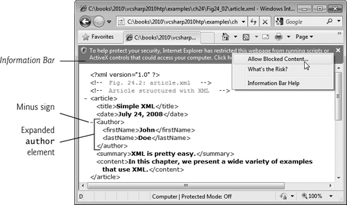
XAML View
There are differences, however. One is the new XAML view (Fig. 24.9) that appears when you open a XAML document. This view is linked to the Design view and the Properties window. When you edit content in the Design view, the XAML view automatically updates, and vice versa. Likewise, when you edit properties in the Properties window, the XAML view automatically updates, and vice versa.
Fig. 24.9. XAML view.
Generated Files
When you create a WPF application, four files are generated and can be viewed in the Solution Explorer. App.xaml defines the Application object and its settings. The most noteworthy setting is the StartupUri attribute, which defines the XAML document that executes first when the Application loads (MainWindow.xaml by default). App.xaml.cs is its code-behind class and handles application-level events. MainWindow.xaml defines the application window, and MainWindow.xaml.cs is its code-behind class, which handles the window’s events. The file name of the code-behind class is always the file name of the associated XAML document followed by the .cs file-name extension.
Setting XAML Indent Size and Displaying Line Numbers
We use three-space indents in our code. To ensure that your code appears the same as the book’s examples, change the tab spacing for XAML documents to three spaces (the default is four). Select Tools > Options and ensure that the Show all settings checkbox is checked. In Text Editor > XAML > Tabs change the Tab and indent size to 3. You should also configure the XAML editor to display line numbers by checking the Line numbers checkbox in Text Editor > XAML > General. You’re now ready to create your first WPF application.
GUI Design
Creating a WPF application in Visual C# Express is similar to creating a Windows Forms application. You can drag-and-drop controls onto the Design view of your WPF GUI. A control’s properties can be edited in the Properties window.
Because XAML is easy to understand and edit, it’s often less difficult to manually edit your GUI’s XAML markup than to do everything through the IDE. In some cases, you must manually write XAML markup in order to take full advantage of the features that are offered in WPF. Nevertheless, the visual programming tools in Visual Studio are often handy, and we’ll point out the situations in which they might be useful as they occur.
24.8 Laying Out Controls
In Windows Forms, a control’s size and location are specified explicitly. In WPF, a control’s size should be specified as a range of possible values rather than fixed values, and its location specified relative to those of other controls. This scheme, in which you specify how controls share the available space, is called flow-based layout. Its advantage is that it enables your GUIs, if designed properly, to be aesthetically pleasing, no matter how a user might resize the application. Likewise, it enables your GUIs to be resolution independent.
24.8.1 General Layout Principles
Layout refers to the size and positioning of controls. The WPF layout scheme addresses both of these in a flow-based fashion and can be summarized by two fundamental principles with regard to a control’s size and position.
Size of a Control
Unless necessary, a control’s size should not be defined explicitly. Doing so often creates a design that looks pleasing when it first loads, but deteriorates when the application is resized or the content updates. Thus, in addition to the Width and Height properties associated with every control, all WPF controls have the MinWidth, MinHeight, MaxHeight and MaxWidth properties. If the Width and Height properties are both Auto (which is the default when they are not specified in the XAML code), you can use these minimum and maximum properties to specify a range of acceptable sizes for a control. Its size will automatically adjust as the size of its container changes.
Position of a Control
A control’s position should not be defined in absolute terms. Instead, it should be specified based on its position relative to the layout container in which it’s included and the other controls in the same container. All controls have three properties for doing this—Margin, HorizontalAlignment and VerticalAlignment. Margin specifies how much space to put around a control’s edges. The value of Margin is a comma-separated list of four integers, representing the left, top, right and bottom margins. Additionally, you can specify two integers, which it interprets as the left–right and top–bottom margins. If you specify just one integer, it uses the same margin on all four sides.
HorizontalAlignment and VerticalAlignment specify how to align a control within its layout container. Valid options of HorizontalAlignment are Left, Center, Right and Stretch. Valid options of VerticalAlignment are Top, Center, Bottom and Stretch. Stretch means that the object will occupy as much space as possible.
Other Layout Properties
A control can have other layout properties specific to the layout container in which it’s contained. We’ll discuss these as we examine the specific layout containers. WPF provides many controls for laying out a GUI. Figure 24.10 lists several of them.
Fig. 24.10. Common controls used for layout.

24.8.2 Layout in Action
Figure 24.11 shows the XAML document and the GUI display of a painter application. Note the use of Margin, HorizontalAlignment and VerticalAlignment throughout the markup. This example introduces several WPF controls that are commonly used for layout, as well as a few other basic ones.
Fig. 24.11. XAML of a painter application.


The controls in this application look similar to Windows Forms controls. WPF RadioButtons function as mutually exclusive options, just like their Windows Forms counterparts. However, a WPF RadioButton does not have a Text property. Instead, it’s a ContentControl, meaning it can have exactly one child or text content. This makes the control more versatile, enabling it to be labeled by an image or other item. In this example, each RadioButton is labeled by plain text (for example, lines 33–34). A WPF Button behaves like a Windows Forms Button but is a ContentControl. As such, a WPF Button can display any single element as its content, not just text. Lines 59–63 define the two buttons seen in the Painter application. You can drag and drop controls onto the WPF designer and create their event handlers, just as you do in the Windows Forms designer.
GroupBox Control
A WPF GroupBox arranges controls and displays just as a Windows Forms GroupBox would, but using one is slightly different. The Header property replaces the Windows Forms version’s Text property. In addition, a GroupBox is a ContentControl, so to place multiple controls in it, you must place them in a layout container (for example, lines 27–43).
StackPanel Control
In the Painter application, we organized each GroupBox’s RadioButtons by placing them in StackPanels (for example, lines 29–42). A StackPanel is the simplest of layout containers. It arranges its content either vertically or horizontally, depending on its Orientation property’s setting. The default Orientation is Vertical, which is used by every StackPanel in the Painter example.
Grid Control
The Painter Window’s contents are contained within a Grid—a flexible, all-purpose layout container. A Grid organizes controls into a user-defined number of rows and columns (one row and one column by default). You can define a Grid’s rows and columns by setting its RowDefinitions and ColumnDefinitions properties, whose values are a collection of RowDefinition and ColumnDefinition objects, respectively. Because these properties do not take string values, they cannot be specified as attributes in the Grid tag. Another syntax is used instead. A class’s property can be defined in XAML as a nested element with the name ClassName.PropertyName. For example, the Grid.ColumnDefinitions element in lines 11–14 sets the Grid’s ColumnDefinitions property and defines two columns, which separate the options from the painting area, as shown in Fig. 24.11.
You can specify the Width of a ColumnDefinition and the Height of a RowDefinition with an explicit size, a relative size (using *) or Auto. Auto makes the row or column only as big as it needs to be to fit its contents. The setting * specifies the size of a row or column with respect to the Grid’s other rows and columns. For example, a column with a Height of 2* would be twice the size of a column that is 1* (or just *). A Grid first allocates its space to the rows and columns whose sizes are defined explicitly or determined automatically. The remaining space is divided among the other rows and columns. By default, all Widths and Heights are set to *, so every cell in the grid is of equal size. In the Painter application, the first column is just wide enough to fit the controls, and the rest of the space is allotted to the painting area (lines 12–13). If you resize the Painter window, you’ll notice that only the width of the paintable area increases or decreases.
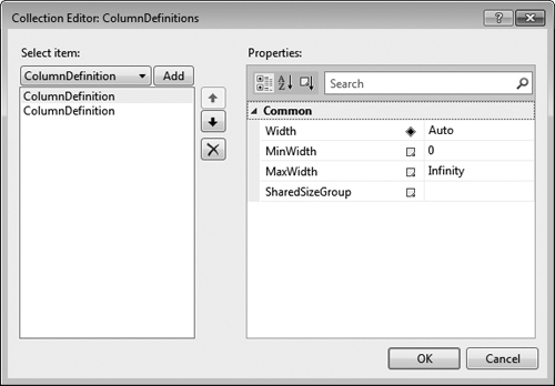
If you click the ellipsis button next to the RowDefinitions or ColumnDefinitions property in the Properties window, the Collection Editor window will appear. This tool can be used to add, remove, reorder, and edit the properties of rows and columns in a Grid. In fact, any property that takes a collection as a value can be edited in a version of the Collection Editor specific to that collection. For example, you could edit the Items property of a ComboBox (that is, drop-down list) in such a way. The ColumnDefinitions Collection Editor is shown in Fig. 24.12.
Fig. 24.12. Using the Collection Editor.
The control properties we’ve introduced so far look and function just like their Windows Forms counterparts. To indicate which cell of a Grid a control belongs in, however, you use the Grid.Row and Grid.Column properties. These are known as attached properties—they’re defined by a different control than that to which they’re applied. In this case, Row and Column are defined by the Grid itself but applied to the controls contained in the Grid (for example, line 17). To specify the number of rows or columns that a control spans, you can use the Grid.RowSpan or Grid.ColumnSpan attached properties, respectively (for example, line 27). By default, a control spans the entire Grid, unless the Grid.Row or Grid.Column property is set, in which case the control spans only the specified row or column by default.
Canvas Control
The painting area of the Painter application is a Canvas (lines 17–22), another layout container. A Canvas allows users to position controls by defining explicit coordinates. Controls in a Canvas have the attached properties, Canvas.Left and Canvas.Top, which specify the control’s coordinate position based on its distance from the Canvas’s left and top borders, respectively. If two controls overlap, the one with the greater Canvas.ZIndex displays in the foreground. If this property is not defined for the controls, then the last control added to the canvas displays in the foreground.
Layout in Design Mode
As you’re creating your GUI in Design mode, you’ll notice many helpful layout features. For example, as you resize a control, its width and height are displayed. In addition, snap-lines appear as necessary to help you align the edges of elements. These lines will also appear when you move controls around the design area.
When you select a control, margin lines that extend from the control to the edges of its container appear, as shown in Fig. 24.13. If a line extends to the edge of the container, then the distance between the control and that edge is fixed. If it displays as a small hollow circle, then the distance between the control and that edge is dynamic and changes as its surroundings change. You can toggle between the two by clicking on the circle.
Fig. 24.13. Margin lines and gridlines in Design view.
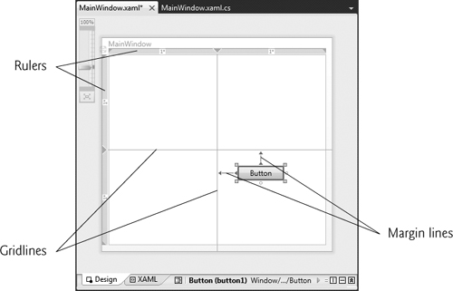
Furthermore, the Design view also helps you use a Grid. As shown in Fig. 24.13, when you select a control in a Grid, the Grid’s rulers appear to the left and on top of it. The widths and heights of each column and row, respectively, appear on the rulers. Gridlines that outline the Grid’s rows and columns also appear, helping you align and position the Grid’s elements. You can also create more rows and columns by clicking where you want to separate them on the ruler.
24.9 Event Handling
Basic event handling in WPF is almost identical to Windows Forms event handling, but there is a fundamental difference, which we’ll explain later in this section. We’ll use the Painter example to introduce WPF event handling. Figure 24.14 provides the code-behind class for the Painter Window. As in Windows Forms GUIs, when you double click a control, the IDE automatically generates an event handler for that control’s primary event. The IDE also adds an attribute to the control’s XAML element specifying the event name and the name of the event handler that responds to the event. For example, in line 34, the attribute
Checked="redRadioButton_Checked"
Fig. 24.14. Code-behind class for Painter.


specifies that the redRadioButton’s Checked event handler is redRadioButton_Checked.
The Painter application “draws” by placing colored circles on the Canvas at the mouse pointer’s position as you drag the mouse. The PaintCircle method (lines 32–45 in Fig. 24.14) creates the circle by defining an Ellipse object (lines 34–38), and positions it using the Canvas.SetTop and Canvas.SetLeft methods (lines 41–42), which change the circle’s Canvas.Left and Canvas.Top attached properties, respectively.
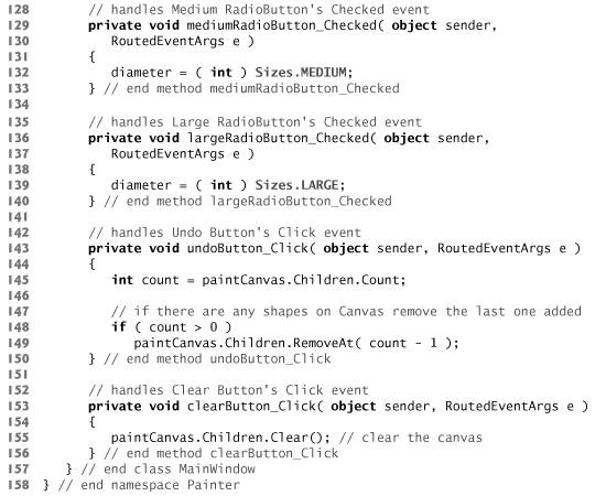
The Children property stores a list (of type UIElementCollection) of a layout container’s child elements. This allows you to edit the layout container’s child elements with C# code as you would any other implementation of the IEnumerable interface. You can add an element to the container by calling the Add method of the Children list (for example, line 44). The Undo and Clear buttons work by invoking the RemoveAt and Clear methods of the Children list (lines 149 and 155), respectively.
Just as with a Windows Forms RadioButton, a WPF RadioButton has a Checked event. Lines 94–140 handle the Checked event for each of the RadioButtons in this example, which change the color and the size of the circles painted on the Canvas. The Button control’s Click event also functions the same in WPF as it did in Windows Forms. Lines 143–156 handle the Undo and Clear Buttons. The event-handler declarations look almost identical to how they would look in a Windows Forms application, except that the event-arguments object (e) is a RoutedEventArgs object instead of an EventArgs object. We’ll explain why later in this section.
Mouse and Keyboard Events
WPF has built-in support for keyboard and mouse events that is nearly identical to the support in Windows Forms. Painter uses the MouseMove event of the paintable Canvas to paint and erase (lines 76–91). A control’s MouseMove event is triggered whenever the mouse moves while within the boundaries of the control. Information for the event is passed to the event handler using a MouseEventArgs object, which contains mouse-specific information. The GetPosition method of MouseEventArgs, for example, returns the current position of the mouse relative to the control that triggered the event (for example, lines 82 and 88). Mouse-Move works exactly the same as it does in Windows Forms. [Note: Much of the functionality in our sample Painter application is already provided by the WPF InkCanvas control. We chose not to use this control so we could demonstrate various other WPF features.]
WPF has additional mouse events. Painter also uses the MouseLeftButtonDown and MouseLeftButtonUp events to toggle painting on and off (lines 48–59), and the Mouse-RightButtonDown and MouseRightButtonUp events to toggle erasing on and off (lines 62–73). All of these events pass information to the event handler using the MouseButtonEventArgs object, which has properties specific to a mouse button (for example, ButtonState or ClickCount) in addition to mouse-specific ones. These events are new to WPF and are more specific versions of MouseUp and MouseDown (which are still available in WPF). A summary of commonly used mouse and keyboard events is provided in Fig. 24.15.
Fig. 24.15. Common mouse and keyboard events.

Routed Events
WPF events have a significant distinction from their Windows Forms counterparts—they can travel either up (from child to parent) or down (from parent to child) the containment hierarchy—the hierarchy of nested elements defined within a control. This is called event routing, and all WPF events are routed events.
The event-arguments object that is passed to the event handler of a WPF Button’s Click event or a RadioButton’s Check event is of the type RoutedEventArgs. All event-argument objects in WPF are of type RoutedEventArgs or one of its subclasses. As an event travels up or down the hierarchy, it may be useful to stop it before it reaches the end. When the Handled property of the RoutedEventArgs parameter is set to true, event handlers ignore the event. It may also be useful to know the source where the event was first triggered. The Source property stores this information. You can learn more about the benefits of routed events at bit.ly/RoutedEvents.
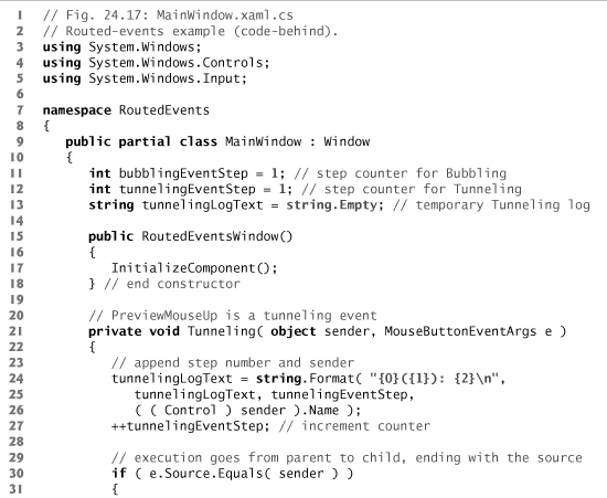
Figures 24.16 and 24.17 show the XAML and code-behind for a program that demonstrates event routing. The program contains two GroupBoxes, each with a Label inside (lines 15–28 in Fig. 24.16). One group handles a left-mouse-button press with Mouse-LeftButtonUp, and the other with PreviewMouseLeftButtonUp. As the event travels up or down the containment hierarchy, a log of where the event has traveled is displayed in a TextBox (line 30). The WPF TextBox functions just like its Windows Forms counterpart.
Fig. 24.16. Routed-events example (XAML).

Fig. 24.17. Routed-events example (code-behind).
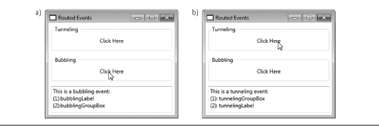
There are three types of routed events—direct events, bubbling events and tunneling events. Direct events are like ordinary Windows Forms events—they do not travel up or down the containment hierarchy. Bubbling events start at the Source and travel up the hierarchy ending at the root (Window) or until you set Handled to true. Tunneling events start at the top and travel down the hierarchy until they reach the Source or Handled is true. To help you distinguish tunneling events from bubbling events, WPF prefixes the names of tunneling events with Preview. For example, PreviewMouseLeftButtonDown is the tunneling version of MouseLeftButtonDown, which is a bubbling event.
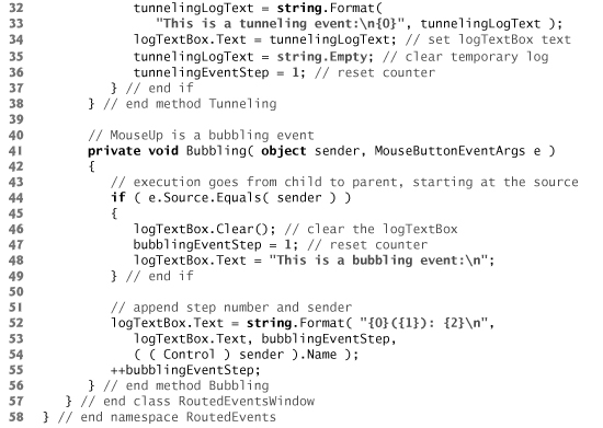
If you click the Click Here Label in the Tunneling GroupBox, the click is handled first by the GroupBox, then by the contained Label. The event handler that responds to the click handles the PreviewMouseLeftButtonUp event—a tunneling event. The Tunneling method (lines 21–38 in Fig. 24.17) handles the events of both the GroupBox and the Label. An event handler can handle events for many controls. Simply select each control then use the events tab in the Properties window to select the appropriate event handler for the corresponding event of each control. If you click the other Label, the click is handled first by the Label, then by the containing GroupBox. The Bubbling method (lines 41–56) handles the MouseLeftButtonUp events of both controls.
24.10 Commands and Common Application Tasks
In Windows Forms, event handling is the only way to respond to user actions. WPF provides an alternate technique called a command—an action or a task that may be triggered by many different user interactions. In Visual Studio, for example, you can cut, copy and paste code. You can execute these tasks through the Edit menu, a toolbar or keyboard shortcuts. To program this functionality in WPF, you can define a single command for each task, thus centralizing the handling of common tasks—this is not easily done in Windows Forms.
Commands also enable you to synchronize a task’s availability to the state of its corresponding controls. For example, users should be able to copy something only if they have content selected. When you define the copy command, you can specify this as a requirement. As a result, if the user has no content selected, then the menu item, toolbar item and keyboard shortcut for copying are all automatically disabled.
Commands are implementations of the ICommand interface. When a command is executed, the Execute method is called. However, the command’s execution logic (that is, how it should execute) is not defined in its Execute method. You must specify this logic when implementing the command. An ICommand’s CanExecute method works in the same way. The logic that specifies when a command is enabled and disabled is not determined by the CanExecute method and must instead be specified by responding to an appropriate event. Class RoutedCommand is the standard implementation of ICommand. Every Routed-Command has a Name and a collection of InputGestures (that is, keyboard shortcuts) associated with it. RoutedUICommand is an extension of RoutedCommand with a Text property, which specifies the default text to display on a GUI element that triggers the command.
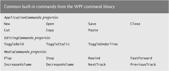
WPF provides a command library of built-in commands. These commands have their standard keyboard shortcuts already associated with them. For example, Copy is a built-in command and has Ctrl-C associated with it. Figure 24.18 provides a list of some common built-in commands, separated by the classes in which they’re defined.
Fig. 24.18. Common built-in commands from the WPF command library.
Figures 24.19 and 24.20 are the XAML markup and C# code for a simple text-editor application that allows users to format text into bold and italics, and also to cut, copy and paste text. The example uses the RichTextBox control (line 49), which allows users to enter, edit and format text. We use this application to demonstrate several built-in commands from the command library.
Fig. 24.19. Creating menus and toolbars, and using commands (XAML).
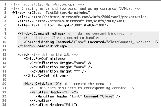

Fig. 24.20. Code-behind class for a simple text editor.

A command is executed when it’s triggered by a command source. For example, the Close command is triggered by a MenuItem (line 23 in Fig. 24.19). The Cut command has two sources, a MenuItem and a ToolBar Button (lines 26 and 39, respectively). A command can have many sources.
To make use of a command, you must create a command binding—a link between a command and the methods containing its application logic. You can declare a command binding by creating a CommandBinding object in XAML and setting its Command property to the name of the associated command (line 10). A command binding raises the Executed and PreviewExecuted events (bubbling and tunneling versions of the same event) when its associated command is executed. You program the command’s functionality into an event handler for one of these events. In line 10, we set the Executed attribute to a method name, telling the program that the specified method (closeCommand_Executed) handles the command binding’s Executed event.
In this example, we demonstrate the use of a command binding by implementing the Close command. When it executes, it shuts down the application. The method that executes this task is Application.Current.Shutdown, as shown in line 19 of Fig. 24.20.
You can also use a command binding to specify the application logic for determining when a command should be enabled or disabled. You can do so by handling either the CanExecute or PreviewCanExecute (bubbling and tunneling versions of the same events) events in the same way that you handle the Executed or PreviewExecuted events. Because we do not define such a handler for the Close command in its command binding, it’s always enabled. Command bindings should be defined within the Window.Command-Bindings element (for example, lines 8–11).
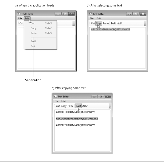
The only time a command binding is not necessary is when a control has built-in functionality for dealing with a command. A Button or MenuItem linked to the Cut, Copy, or Paste commands is an example (for example, lines 26–28 and lines 39–41). As Fig. 24.20(a) shows, all three commands are disabled when the application loads. If you select some text, the Cut and Copy commands are enabled, as shown in Fig. 24.20(b). Once you have copied some text, the Paste command is enabled, as evidenced by Fig. 24.20(c). We did not have to define any associated command bindings or event handlers to implement these commands. The ToggleBold and ToggleItalic commands are also implemented without any command bindings.
Menus and Toolbars
The text editor uses menus and toolbars. The Menu control creates a menu containing MenuItems. MenuItems can be top-level menus such as File or Edit (lines 22 and 25 in Fig. 24.19), submenus, or items in a menu, which function like Buttons (for example, lines 26–28). If a MenuItem has nested MenuItems, then it’s a top-level menu or a submenu. Otherwise, it’s an item that executes an action via either an event or a command. Menu-Items are content controls and thus can display any single GUI element as content.
A ToolBar is a single row or column (depending on the Orientation property) of options. A ToolBar’s Orientation is a read-only property that gets its value from the parent ToolBarTray, which can host multiple ToolBars. If a ToolBar has no parent ToolBarTray, as is the case in this example, its Orientation is Horizontal by default. Unlike elements in a Menu, a ToolBar’s child elements are not of a specific type. A ToolBar usually contains Buttons, CheckBoxes, ComboBoxes, RadioButtons and Separators, but any WPF control can be used. ToolBars overwrite the look-and-feel of their child elements with their own specifications, so that the controls look seamless together. You can override the default specifications to create your own look-and-feel. Lines 37–46 define the text editor’s ToolBar.
Menus and ToolBars can incorporate Separators (for example, lines 29 and 42) that differentiate groups of MenuItems or controls. In a Menu, a Separator displays as a horizontal bar—as shown between the Paste and Bold menu options in Fig. 24.20(a). In a horizontal ToolBar, it displays as a short vertical bar—as shown in Fig. 24.20(b). You can use Separators in any type of control that can contain multiple child elements, such as a StackPanel.
24.11 WPF GUI Customization
One advantage of WPF over Windows Forms is the ability to customize controls. WPF provides several techniques to customize the look and behavior of controls. The simplest takes full advantage of a control’s properties. The value of a control’s Background property, for example, is a brush (i.e, Brush object). This allows you to create a gradient or an image and use it as the background rather than a solid color. For more information about brushes, see Section 25.5. In addition, many controls that allowed only text content in Windows Forms are ContentControls in WPF, which can host any type of content—including other controls. The caption of a WPF Button, for example, could be an image or even a video.
In Section 24.12, we demonstrate how to use styles in WPF to achieve a uniform look-and-feel. In Windows Forms, if you want to make all your Buttons look the same, you have to manually set properties for every Button, or copy and paste. To achieve the same result in WPF, you can define the properties once as a style and apply the style to each Button. This is similar to the CSS/XHTML implementation of styles. XHTML specifies the content and structure of a website, and CSS defines styles that specify the presentation of elements in a website. For more information on CSS and XHTML, see Chapters 19 and 27, and visit our XHTML and CSS Resource Centers at www.deitel.com/xhtml/ and www.deitel.com/css21/, respectively.
Styles are limited to modifying a control’s look-and-feel through its properties. In Section 24.14, we introduce control templates, which offer you the freedom to define a control’s appearance by modifying its visual structure. With a custom control template, you can completely strip a control of all its visual settings and rebuild it to look exactly the way you like, while maintaining its existing functionality. A Button with a custom control template might look structurally different from a default Button, but it still functions the same as any other Button.
If you want to change only the appearance of an element, a style or control template should suffice. However, you can also create entirely new custom controls that have their own functionality, properties, methods and events. We demonstrate how to create a custom control in Section 29.4.3.
24.12 Using Styles to Change the Appearance of Controls
Once defined, a WPF style is a collection of property-value and event-handler definitions that can be reused. Styles enable you to eliminate repetitive code or markup. For example, if you want to change the look-and-feel of the standard Button throughout a section of your application, you can define a style and apply it to all the Buttons in that section. Without styles, you have to set the properties for each individual Button. Furthermore, if you later decided that you wanted to tweak the appearance of these Buttons, you would have to modify your markup or code several times. By using a style, you can make the change only once in the style and it’s automatically be applied to any control which uses that style.
Styles are WPF resources. A resource is an object that is defined for an entire section of your application and can be reused multiple times. A resource can be as simple as a property or as complex as a control template. Every WPF control can hold a collection of resources that can be accessed by any element down the containment hierarchy. In a way, this is similar in approach to the concept of variable scope that you learned about in Chapter 7. For example, if you define a style as a resource of a Window, then any element in the Window can use that style. If you define a style as a resource of a layout container, then only the elements of the layout container can use that style. You can also define application-level resources for an Application object in the App.xaml file. These resources can be accessed in any file in the application.
Figure 24.21 provides the XAML markup and Fig. 24.22 provides the C# code for a color-chooser application. This example demonstrates styles and introduces the Slider user input control.
Fig. 24.21. Color-chooser application showing the use of styles (XAML).
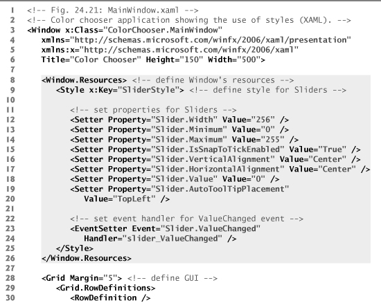
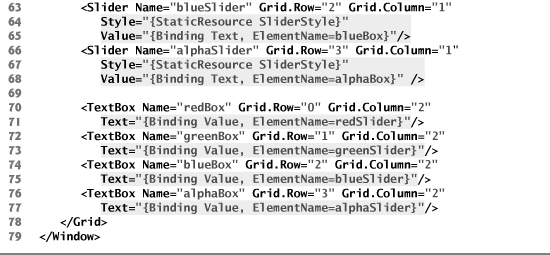
Fig. 24.22. Color-chooser application showing the use of styles (code-behind).
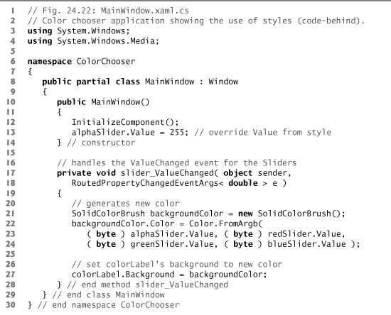

RGBA Colors
The color-chooser application uses the RGBA color system. Every color is represented by its red, green and blue color values, each ranging from 0 to 255, where 0 denotes no color and 255 full color. For example, a color with a red value of 0 would contain no red component. The alpha value (A)—which also ranges from 0 to 255—represents a color’s opacity, with 0 being completely transparent and 255 completely opaque. The two colors in Fig. 24.22’s sample outputs have the same RGB values, but the color displayed in Fig. 24.22(b) is semitransparent.
Slider Controls
The color-chooser GUI uses four Slider controls that change the RGBA values of a color displayed by a Label. Next to each Slider is a TextBox that displays the Slider’s current value. You can also type a number in a TextBox to update the value of the corresponding Slider. A Slider is a numeric user input control that allows users to drag a “thumb” along a track to select the value. Whenever the user moves a Slider, the application generates a new color, the corresponding TextBox is updated and the Label displays the new color as its background. The new color is generated by using class Color’s FromArgb method, which returns a color based on the four RGBA byte values you pass it (Fig. 24.22, lines 22–24). The color is then applied as the Background of the Label. Similarly, changing the value of a Text-Box updates the thumb of the corresponding Slider to reflect the change, which then updates the Label with the new color. We discuss the updates of the TextBoxes shortly.
Style for the Sliders
Styles can be defined as a resource of any control. In the color-chooser application, we defined the style as a resource of the entire Window. We also could have defined it as a resource of the Grid. To define resources for a control, you set a control’s Resources property. Thus, to define a resource for a Window, as we did in this example, you would use Window.Resources (lines 8–26 in Fig. 24.21). To define a resource for a Grid, you would use Grid.Resources.
Style objects can be defined in XAML using the Style element. The x:Key attribute (i.e., attribute Key from the standard XAML namespace) must be set in every style (or other resource) so that it can be referenced later by other controls (line 9). The children of a Style element set properties and define event handlers. A Setter sets a property to a specific value (e.g., line 12, which sets the styled Slider’s Width property to 256). An EventSetter specifies the method that responds to an event (e.g., lines 23–24, which specifies that method slider_ValueChanged handles the Slider’s ValueChanged event).
The Style in the color-chooser example (SliderStyle) primarily uses Setters. It lays out the color Sliders by specifying the Width, HorizontalAlignment and Vertical-Alignment properties (lines 12, 16 and 17). It also sets the Minimum and Maximum properties, which determine a Slider’s range of values (lines 13–14). In line 18, the default Value is set to 0. IsSnapToTickEnabled is set to True, meaning that only values that fall on a “tick” are allowed (line 15). By default, each tick is separated by a value of 1, so this setting makes the styled Slider accept only integer values. Lastly, the style also sets the AutoToolTip-Placement property, which specifies where a Slider’s tooltip should appear, if at all.
Although the Style defined in the color-chooser example is clearly meant for Sliders, it can be applied to any control. Styles are not control specific. You can make all controls of one type use the same default style by setting the style’s TargetType attribute to the control type. For example, if we wanted all of the Window’s Sliders to use a Style, we would add TargetType="Slider" to the Style’s start tag.
Using a Style
To apply a style to a control, you create a resource binding between a control’s Style property and the Style resource. You can create a resource binding in XAML by specifying the resource in a markup extension—an expression enclosed in curly braces ({}). The form of a markup extension calling a resource is {ResourceType ResourceKey} (for example, {StaticResource SliderStyle} in Fig. 24.21, line 58).
Static and Dynamic Resources
There are two types of resources. Static resources are applied at initialization time only. Dynamic resources are applied every time the resource is modified by the application. To use a style as a static resource, use StaticResource as the type in the markup extension. To use a style as a dynamic resource, use DynamicResource as the type. Because styles don’t normally change during runtime, they are usually used as static resources. However, using one as a dynamic resource is sometimes necessary, such as when you wish to enable users to customize a style at runtime.
In this application, we apply SliderStyle as a static resource to each Slider (lines 58, 61, 64 and 67). Once you apply a style to a control, the Design view and Properties window update to display the control’s new appearance settings. If you then modify the control through the Properties window, the control itself is updated, not the style.
Element-to-Element Bindings
In this application, we use a new feature of WPF called element-to-element binding in which a property of one element is always equal to a property of another element. This enables us to declare in XAML that each TextBox’s Text property should always have the value of the corresponding Slider’s Value property, and that each Slider’s Value property should always have the value of the corresponding TextBox’s Text property. Once these bindings are defined, changing a Slider updates the corresponding TextBox and vice versa. In Fig. 24.21, lines 59, 62, 65 and 68 each use a Binding markup extension to bind a Slider’s Value property to the Text property of the appropriate TextBox. Similary, lines 71, 73, 75 and 77 each use a Binding markup extension to bind a TextBox’s Text property to the Value property of the appropriate Slider.
Programmatically Changing the Alpha Slider’s Value
As shown in Fig. 24.23, the Slider that adjusts the alpha value in the color-chooser example starts with a value of 255, whereas the R, G and B Sliders’ values start at 0. The Value property is defined by a Setter in the style to be 0 (line 18 in Fig. 24.21). This is why the R, G and B values are 0. The Value property of the alpha Slider is programmatically defined to be 255 (line 13 in Fig. 24.22), but it could also be set locally in the XAML. Because a local declaration takes precedence over a style setter, the alpha Slider’s value would start at 255 when the application loads.
Fig. 24.23. GUI of the color-chooser application at initialization.

Dependency Properties
Most WPF properties, though they might look and behave exactly like ordinary ones, are in fact dependency properties. Such properties have built-in support for change notification—that is, an application knows and can respond to changes in property values. In addition, they support inheritance down the control-containment hierarchy. For example, when you specify FontSize in a Window, every control in the Window inherits it as the default FontSize. You can also specify a control’s property in one of its child elements. This is how attached properties work.
A control’s properties may be set at many different levels in WPF, so instead of holding a fixed value, a dependency property’s value is determined during execution by a value-determination system. If a property is defined at several levels at once, then the current value is the one defined at the level with the highest precedence. A style, for example, overwrites the default appearance of a control, because it takes higher precedence. A summary of the levels, in order from highest to lowest precedence, is shown in Fig. 24.24.
Fig. 24.24. Levels of value determination from highest to lowest precedence.

24.13 Customizing Windows
For over a decade, the standard design of an application window has remained practically the same—a framed rectangular box with a header in the top left and a set of buttons in the top right for minimizing, maximizing and closing the window. Cutting-edge applications, however, have begun to use custom windows that diverge from this standard to create a more interesting look.
WPF lets you do this more easily. To create a custom window, set the WindowStyle property to None. This removes the standard frame around your Window. To make your Window irregularly shaped, you set the AllowsTransparency property to True and the Background property to Transparent. If you then add controls, only the space within the boundaries of those controls behaves as part of the window. This works because a user cannot interact with any part of a Window that is transparent. You still define your Window as a rectangle with a width and a height, but when a user clicks in a transparent part of the Window, it behaves as if the user clicked outside the Window’s boundaries—that is, the window does not respond to the click.
Figure 24.25 is the XAML markup that defines a GUI for a circular digital clock. The Window’s WindowStyle is set to None and AllowsTransparency is set to True (line 7). In this example, we set the background to be an image using an ImageBrush (lines 10–12). The background image is a circle with a drop shadow surrounded by transparency. Thus, the Window appears circular.
Fig. 24.25. Creating custom windows and using timers (XAML).

The time is displayed in the center of the window in a TextBox (lines 15–18). Its Background is set to Transparent so that the text displays directly on the circular background (line 16). We configured the text to be size 16, bold, and white by setting the FontSize, FontWeight, and Foreground properties. The Cursor property is set to Arrow, so that the mouse cursor doesn’t change when it moves over the time (line 18). Setting Focusable to False disables the user’s ability to select the text (line 18).
When you create a custom window, there’s no built-in functionality for doing the simple tasks that normal windows do. For example, there is no way for the user to move, resize, minimize, maximize, or close a window unless you write the code to enable these features. You can move the clock around, because we implemented this functionality in the Window’s code-behind class (Fig. 24.26). Whenever the left mouse button is held down on the clock (handled by the MouseLeftButtonDown event), the Window is dragged around using the DragMove method (lines 27–31). Because we did not define how to close or minimize the Window, the only way to shut down the clock is to press Alt-F4—this is a feature built into Windows.
Fig. 24.26. Creating custom windows and using timers (code-behind).
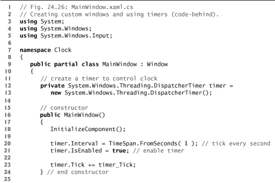
The clock works by getting the current time every second and displaying it in the TextBox. To do this, the clock uses a DispatcherTimer object (of the Windows.Threading namespace), which raises the Tick event repeatedly at a prespecified time interval. Since the DispatcherTimer is defined in the C# code rather than the XAML, we need to specify the method to handle the Tick event in the C# code. Line 23 assigns method timer_Tick to the Tick event’s delegate. This adds a new EventHandler—which takes a method name as an argument—to the specified event. After it is declared, you must specify the interval between Ticks by setting the Interval property, which takes a TimeSpan as its value. TimeSpan has several class methods for instantiating a TimeSpan object, including From-Seconds, which defines a TimeSpan lasting the number of seconds you pass to the method. Line 20 creates a one-second TimeSpan and sets it as the DispatcherTimer’s Interval. A DispatcherTimer is disabled by default. Until you enable it by setting the IsEnabled property to true (line 21), it will not Tick. In this example, the Tick event handler gets the current time and displays it in the TextBox.
You may recall that the Timer component provided the same capabilities in Windows Forms. A similar object that you can drag-and-drop onto your GUI doesn’t exist in WPF. Instead, you must create a DispatcherTimer object, as illustrated in this example.
24.14 Defining a Control’s Appearance with Control Templates
We now update the clock example to include buttons for minimizing and closing the application. We also introduce control templates—a powerful tool for customizing the look-and-feel of your GUIs. As previously mentioned, a custom control template can redefine the appearance of any control without changing its functionality. In Windows Forms, if you want to create a round button, you have to create a new control and simulate the functionality of a Button. With control templates, you can simply redefine the visual elements that compose the Button control and still use the preexisting functionality.
All WPF controls are lookless—that is, a control’s properties, methods and events are coded into the control’s class, but its appearance is not. Instead, the appearance of a control is determined by a control template, which is a hierarchy of visual elements. Every control has a built-in default control template. All of the GUIs discussed so far have used these default templates.
The hierarchy of visual elements defined by a control template can be represented as a tree, called a control’s visual tree. Figure 24.27(b) shows the visual tree of a default Button (Fig. 24.28). This is a more detailed version of the same Button’s logical tree, which is shown in Fig. 24.27(a). A logical tree depicts how a control is a defined, whereas a visual tree depicts how a control is graphically rendered.
Fig. 24.27. The logical and visual trees for a default Button.
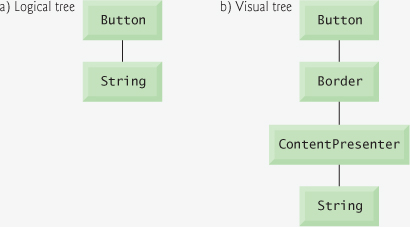
Fig. 24.28. The default Button.
A control’s logical tree always mirrors its definition in XAML. For example, you’ll notice that the Button’s logical tree, which comprises only the Button and its string caption, exactly represents the hierarchy outlined by its XAML definition, which is
<Button>
Click Me
</Button>
To actually render the Button, WPF displays a ContentPresenter with a Border around it. These elements are included in the Button’s visual tree. A ContentPresenter is an object used to display a single element of content on the screen. It’s often used in a template to specify where to display content.
In the updated clock example, we create a custom control template (named Button-Template) for rendering Buttons and apply it to the two Buttons in the application. The XAML markup is shown in Fig. 24.29. Like a style, a control template is usually defined as a resource, and applied by binding a control’s Template property to the control template using a resource binding (for example, lines 47 and 52). After you apply a control template to a control, the Design view will update to display the new appearance of the control. The Properties window remains unchanged, since a control template does not modify a control’s properties.
Fig. 24.29. Using control templates (XAML).


To define a control template in XAML, you create a ControlTemplate element. Just as with a style, you must specify the control template’s x:Key attribute so you can reference it later (line 12). You must also set the TargetType attribute to the type of control for which the template is designed (line 12). Inside the ControlTemplate element, you can build the control using any WPF visual element (lines 13–19). In this example, we replace the default Border and ContentPresenter with our own custom ones.
Sometimes, when defining a control template, it may be beneficial to use the value of one of the templated control’s properties. For example, if you want several controls of different sizes to use the same control template, you may need to use the values of their Width and Height properties in the template. WPF allows you to do this with a template binding, which can be created in XAML with the markup extension, {TemplateBinding PropertyName}. To bind a property of an element in a control template to one of the properties of the templated control (that is, the control that the template is applied to), you need to set the appropriate markup extension as the value of that property. In ButtonTemplate, we bind the Content property of a ContentPresenter to the Content property of the templated Button (line 18). The nested element of a ContentControl is the value of its Content property. Thus, the images defined in lines 49 and 54 are the Content of the Buttons and are displayed by the ContentPresenters in their respective control templates. You can also create template bindings to a control’s events.
Often you’ll use a combination of control templates, styles and local declarations to define the appearance of your application. Recall that a control template defines the default appearance of a control and thus has a lower precedence than a style in dependency property-value determination.
Triggers
The control template for Buttons used in the updated clock example defines a trigger, which changes a control’s appearance when that control enters a certain state. For example, when your mouse is over the clock’s minimize or close Buttons, the Button is highlighted with a light blue background, as shown in Fig. 24.29(b). This simple change in appearance is caused by a trigger that fires whenever the IsMouseOver property becomes True.
A trigger must be defined in the Style.Triggers or ControlTemplate.Triggers element of a style or a control template, respectively (for example, lines 21–28). You can create a trigger by defining a Trigger object. The Property and Value attributes define the state when a trigger is active. Setters nested in the Trigger element are carried out when the trigger is fired. When the trigger no longer applies, the changes are removed. A Setter’s TargetName property specifies the name of the element that the Setter applies to (for example, line 25).
Lines 23–27 define the IsMouseOver trigger for the minimize and close Buttons. When the mouse is over the Button, IsMouseOver becomes True, and the trigger becomes active. The trigger’s Setter makes the background of the Border in the control template temporarily light blue. When the mouse exits the boundaries of the Button, IsMouseOver becomes False. Thus, the Border’s background returns to its default setting, which in this case is transparent.
Functionality
Figure 24.30 shows the code-behind class for the clock application. Although the custom control template makes the Buttons in this application look different, it doesn’t change how they behave. Lines 3–40 remain unchanged from the code in the first clock example (Fig. 24.26). The functionality for the minimize and close Buttons is implemented in the same way as any other button—by handling the Click event (lines 43–47 and 50–53 of Fig. 24.30, respectively). To minimize the window, we set the WindowState of the Window to WindowState.Minimized (line 46).
Fig. 24.30. Using control templates (code-behind).
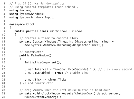

24.15 Data-Driven GUIs with Data Binding
Often, an application needs to edit and display data. WPF provides a comprehensive model for allowing GUIs to interact with data.
Bindings
A data binding is a pointer to data, represented by a Binding object. WPF allows you to create a binding to a broad range of data types. At the simplest level, you could create a binding to a single property. Often, however, it’s useful to create a binding to a data object—an object of a class with properties that describe the data. You can also create a binding to objects like arrays, collections and data in an XML document. The versatility of the WPF data model even allows you to bind to data represented by LINQ statements.
Like other binding types, a data binding can be created declaratively in XAML markup with a markup extension. To declare a data binding, you must specify the data’s source. If it’s another element in the XAML markup, use property ElementName. Otherwise, use Source. Then, if you’re binding to a specific data point of the source, such as a property of a control, you must specify the Path to that piece of information. Use a comma to separate the binding’s property declarations. For example, to create a binding to a control’s property, you would use {Binding ElementName=ControlName, Path=PropertyName}.
Figure 24.31 presents the XAML markup of a book-cover viewer that lets the user select from a list of books, and displays the cover of the currently selected book. The list of books is presented in a ListView control (lines 15–24), which displays a set of data as items in a selectable list. Its current selection can be retrieved from the SelectedItem property. A large image of the currently selected book’s cover is displayed in an Image control (lines 27–28), which automatically updates when the user makes a new selection. Each book is represented by a Book object, which has four string properties:
ThumbImage—the full path to the small cover image of the book.LargeImage—the full path to the large cover image of the book.Title—the title of the book.ISBN—the 10-digit ISBN of the book.
Fig. 24.31. Using data binding (XAML).

Class Book also contains a constructor that initializes a Book and sets each of its properties. The full source code of the Book class is not presented here but you can view it in the IDE by opening this example’s project.
To synchronize the book cover that’s being displayed with the currently selected book, we bind the Image’s Source property to the file location of the currently selected book’s large cover image (lines 27–28). The Binding’s ElementName property is the name of the selector control, booksListView. The Path property is SelectedItem.LargeImage. This indicates that the binding should be linked to the LargeImage property of the Book object that is currently booksListView’s SelectedItem.
Some controls have built-in support for data binding, and a separate Binding object doesn’t need to be created. A ListView, for example, has a built-in ItemsSource property that specifies the data source from which the items of the list are determined. There is no need to create a binding—instead, you can just set the ItemsSource property as you would any other property. When you set ItemsSource to a collection of data, the objects in the collection automatically become the items in the list. Figure 24.32 presents the code-behind class for the book-cover viewer. When the Window is created, a collection of six Book objects is initialized (lines 17–31) and set as the ItemsSource of the booksListView, meaning that each item displayed in the selector is one of the Books.
Fig. 24.32. Using data binding (code-behind).
Displaying Data in the ListView
For a ListView to display objects in a useful manner, you must specify how. For example, if you don’t specify how to display each Book, the ListView simply displays the result of the item’s ToString method, as shown in Fig. 24.33.
Fig. 24.33. ListView display with no data template.

There are many ways to format the display of a ListView. One such method is to display each item as a row in a tabular grid, as shown in Fig. 24.31. This can be achieved by setting a GridView as the View property of a ListView (lines 16–23). A GridView consists of many GridViewColumns, each representing a property. In this example, we define two columns, one for Title and one for ISBN (lines 18–19 and 20–21, respectively). A Grid-ViewColumn’s Header property specifies what to display as its header. The values displayed in each column are determined by its DisplayMemberBinding property. We set the Title column’s DisplayMemberBinding to a Binding object that points to the Title property (line 19), and the ISBN column’s to one that points to the ISBN property (line 21). Neither of the Bindings has a specified ElementName or Source. Because the ListView has already specified the data source (line 33 of Fig. 24.32), the two data bindings inherit this source, and we do not need specify it again.
Data Templates
A much more powerful technique for formatting a ListView is to specify a template for displaying each item in the list. This template defines how to display bound data and is called a data template. Figure 24.34 is the XAML markup that describes a modified version of the book-cover viewer GUI. Each book, instead of being displayed as a row in a table, is represented by a small thumbnail of its cover image with its title and ISBN. Lines 11–32 define the data template (that is, a DataTemplate object) that specifies how to display a Book object. Note the similarity between the structure of a data template and that of a control template. If you define a data template as a resource, you apply it by using a resource binding, just as you would a style or control template. To apply a data template to items in a ListView, use the ItemTemplate property (for example, line 43).
Fig. 24.34. Using data templates (XAML).
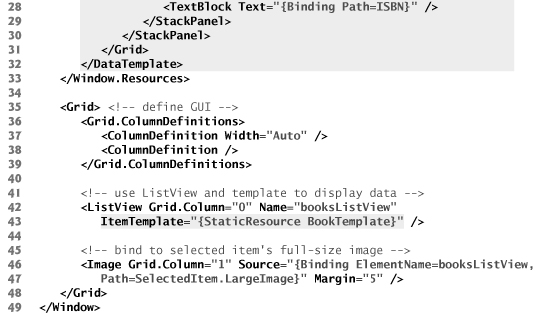
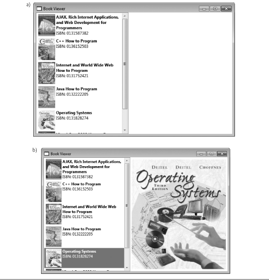
A data template uses data bindings to specify how to display data. Once again, we can omit the data binding’s ElementName and Source properties, because its source has already been specified by the ListView (line 33 of Fig. 24.32). The same principle can be applied in other scenarios as well. If you bind an element’s DataContext property to a data source, then its child elements can access data within that source without your having to specify it again. In other words, if a binding already has a context (i.e, a DataContext has already been defined by a parent), it automatically inherits the data source. For example, if you bind a data source to the DataContext property of a Grid, then any data binding created in the Grid uses that source by default. You can, however, override this source by explicitly defining a new one when you define a binding.
In the BookTemplate data template, lines 19–20 of Fig. 24.34 define an Image whose Source is bound to the Book’s ThumbImage property, which stores the relative file path to the thumbnail cover image. The Book’s Title and ISBN are displayed to the right of the book using TextBlocks—lightweight controls for displaying text. The TextBlock in lines 24–25 displays the Book’s Title because the Text property is bound to it. Because some of the books’ titles are long, we set the TextWrapping property to Wrap (line 25) so that, if the title is too long, it will wrap to multiple lines. We also set the FontWeight property to Bold. Lines 26–29 display two additional TextBlocks, one that displays ISBN:, and another that is bound to the Book’s ISBN property.
Figure 24.34(a) shows the book-viewer application when it first loads. Each item in the ListView is represented by a thumbnail of its cover image, its title and its ISBN, as specified in the data template. As illustrated by Fig. 24.34(b), when you select an item in the ListView, the large cover image on the right automatically updates, because it’s bound to the SelectedItem property of the list.
Data Views
A data view (of class type CollectionView) is a wrapper around a collection of data that can provide us with multiple “views” of the same data based on how we filter, sort and group the data. A default view is automatically created in the background every time a data binding is created. To retrieve the data view, use the CollectionViewSource.GetDefaultView method and pass it the source of your data binding. For example, to retrieve the default view of bookListView in the book-viewer application, you would use CollectionViewSource.GetDefaultView(bookListView.ItemsSource).
You can then modify the view to create the exact view of the data that you want to display. The methods of filtering, sorting and grouping data are beyond the scope of this book. For more information, see msdn.microsoft.com/en-us/library/ms752347.aspx#what_are_collection_views.
Asynchronous Data Binding
Sometimes you may wish to create asynchronous data bindings that don’t hold up your application while data is being transmitted. To do this, you set the IsAsync property of a data binding to True (it’s False by default). Often, however, it’s not the transmission but the instantiation of data that is the most expensive operation. An asynchronous data binding does not provide a solution for instantiating data asynchronously. To do so, you must use a data provider, a class that can create or retrieve data. There are two types of data providers, XmlDataProvider (for XML) and ObjectDataProvider (for data objects). Both can be declared as resources in XAML markup. If you set a data provider’s IsAsynchronous property to True, the provider will run in the background. Creating and using data providers is beyond the scope of this book. See msdn.microsoft.com/en-us/library/aa480224.aspx for more information.
24.16 Wrap-Up
In this chapter, we discussed some basic XML terminology and introduced the concepts of markup, XML vocabularies and XML parsers (validating and nonvalidating). We then demonstrated how to describe and structure data in XML, illustrating these points with examples marking up an article and a business letter. Next, we discussed XML namespaces and namespace prefixes. You learned that each namespace has a unique name that provides a means for document authors to refer unambiguously to elements with the same name (that is, prevent naming collisions) from different namespaces. We presented examples of defining two namespaces in the same document, as well as setting the default namespace for a document.
Many of today’s commercial applications provide GUIs that are easy to use and manipulate. The demand for sophisticated and user-friendly GUIs makes GUI design an essential programming skill. In Chapters 14–15, we showed you how to create GUIs with Windows Forms. In this chapter, we demonstrated how to create GUIs with WPF. You learned how to design a WPF GUI with XAML markup and how to give it functionality in a C# code-behind class. We presented WPF’s new flow-based layout scheme, in which a control’s size and position are both defined relatively. You learned not only to handle events just as you did in a Windows Forms application, but also to implement WPF commands when you want multiple user interactions to execute the same task. We demonstrated the flexibility WPF offers for customizing the look-and-feel of your GUIs. You learned how to use styles, control templates and triggers to define a control’s appearance. The chapter concluded with a demonstration of how to create data-driven GUIs with data bindings and data templates.
But WPF is not merely a GUI-building platform. Chapter 25 explores some of the many other capabilities of WPF, showing you how to incorporate 2D and 3D graphics, animation and multimedia into your WPF applications. Chapter 29 demonstrates how to create Internet applications using a subset of WPF’s features that are available in the Silverlight runtime, which executes as a plug-in for several popular browsers and platforms.
24.17 Web Resources
There is a tremendous amount of material on the web to help you learn more about WPF. Check out our Windows Presentation Foundation Resource Center
www.deitel.com/wpf/
for the latest WPF articles, books, sample chapters, tutorials, webcasts, blogs and more.