12
Data Modeling Considerations for Ask Data and Explain Data
Tableau Ask Data and Explain Data are powerful machine learning features that put analysis in the hands of casual users – those who would struggle to create their own analysis through the drag-and-drop features of Tableau Desktop and web authoring. For these casual users to get answers to their questions, the data models and available fields supporting them must be well thought-out; otherwise, the users may end up frustrated with answers that don’t make sense. This chapter explores these considerations.
In this chapter, we’re going to cover the following topics:
- Visual analytics through natural language search with Ask Data
- Creating a lens for Ask Data, including field exclusions, renaming, and creating aliases
- Uncovering outliers in your data with Explain Data
- Curating data sources for Explain Data by telling the model which columns to use and ignore
Technical requirements
To view the complete list of requirements needed to run the practical examples in this chapter, please see the Technical requirements section in Chapter 1.
In this chapter, we will be using the Tableau Desktop client software and the web interface of Tableau Server or Cloud. We are going to be working with the published data source we created in Chapter 6.
The screenshots and descriptions in this chapter are based on Tableau Cloud version 2022.3. They might be different in your version of Tableau Server or Cloud if you are working with a different version.
The published data source we will be using is based on the Superstore data, the sample data that Tableau uses in their products. This published data source contains sales from the US, Canada, Colombia, Chile, and Argentina, which we joined to a product database.
The name suggested for the published data source was Product Sales. If you did not publish the data source or no longer have access to it, you can rebuild the published data source from the following file in our GitHub repository:
- Product Sales.csv
The files used in the exercises in this chapter can be found at https://github.com/PacktPublishing/Data-Modeling-with-Tableau/.
Visual analytics through natural language search with Ask Data
Ask Data is a natural language search interface from Tableau Server and Cloud. It allows users to perform visual analysis without needing to have the technical skills that are associated with traditional business intelligence products. If a person can type out a business question in natural text, they can get an answer. This is true if the answer is in their data, of course!
Data modeling strategies are essential for a seamless experience with Ask Data.
First, Ask Data only works with published data sources. That is, data models that are embedded in workbooks are not available for Ask Data.
Second, at least one lens needs to be created on your published data source to use Ask Data. Lenses allow data modelers to further refine published data sources to hide fields, rename fields, add synonyms, and create view recommendations. All these options can be very valuable to the natural language question experience.
In the next section, we will look at building our first lens to enable Ask Data.
Creating a lens for Ask Data, including field exclusions, renaming, and creating aliases
To create our first lens, we are going to access the Product Sales published data source that we published to our Tableau Server or Cloud in Chapter 6. If you did not publish the data source at that step, or it is no longer on your Tableau Server or Cloud, download the Product Sales.csv file from GitHub, connect to it from Tableau Desktop or the Tableau web client, and publish it to your Tableau Server or Cloud. Take note of the project where you published the data source:
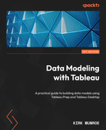
- Navigate to the project where you published the Product Sales data source. Click on the Product Sales data source to be taken to the data source page, as shown in Figure 12.1:
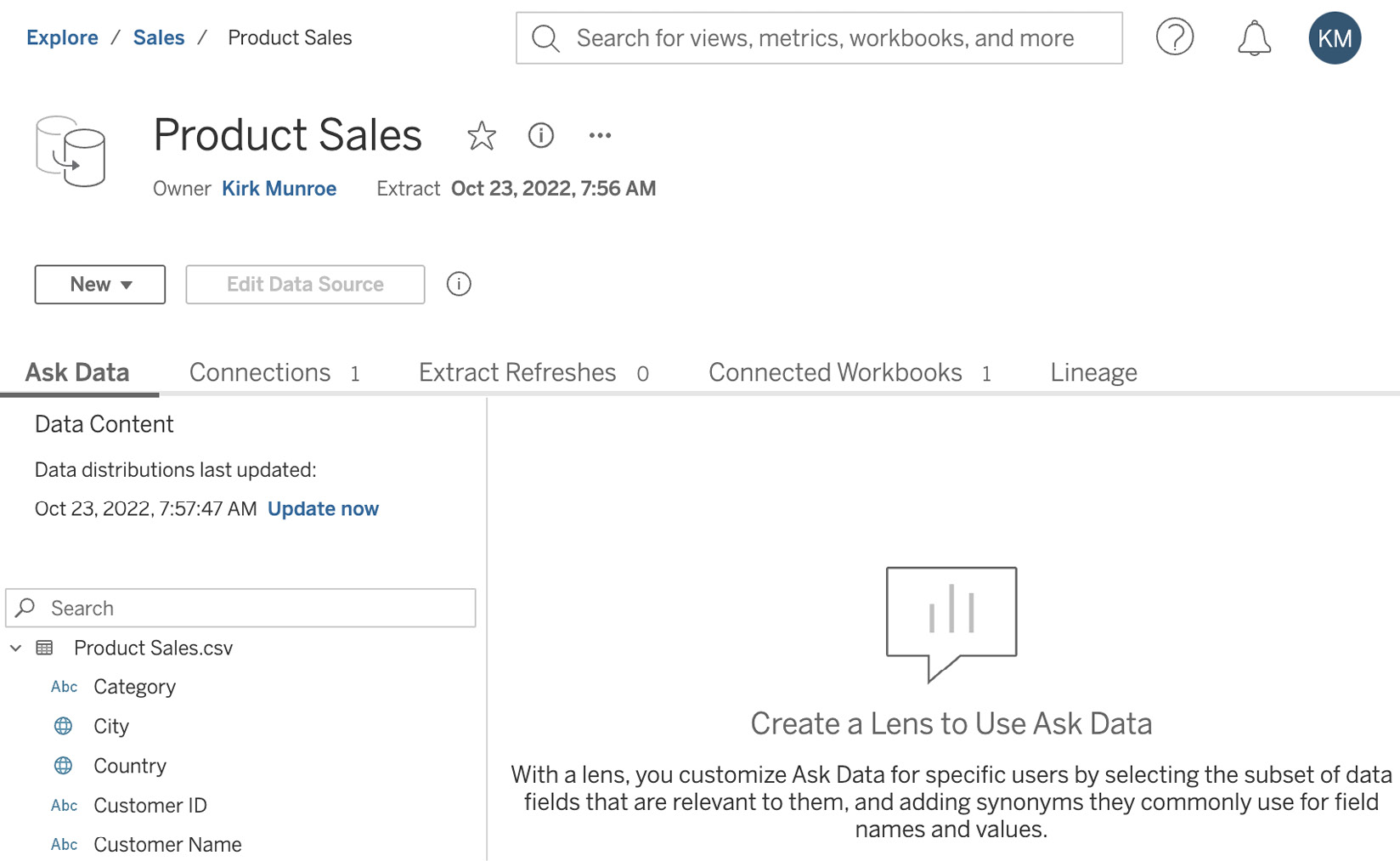
Figure 12.1 – Product Sales data source page
- You will notice that Tableau prompts you to create a lens before using Ask Data. Click on Create New Lens to begin. Tableau will prompt you to select the fields you want in your lens, as shown in Figure 12.2. This is an important first step as it makes sense to remove fields that can be searched through Ask Data, even though the fields might make sense to an analyst. For our example, de-select the following fields:
- Customer ID
- File Paths
- Order ID
- Product ID
- Product ID-1
- Row ID
- Table Names
- Table Names-1
After de-selecting these fields, click Submit:

Figure 12.2 – Selecting fields for the lens
- We now have a lens and can begin to test Ask Data. Before we begin, let’s look at some of the other features available in a lens. First, if we ever want to remove additional fields or add fields back into the lens, we can click on the pencil icon to the right of the Data label below the Ask Data tab, as shown in Figure 12.3:
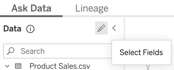
Figure 12.3 – Select Fields
- The next option available to us is creating synonyms. Synonyms are additional words or terms people might use in a search for field names or data elements within a field. To create a synonym, hover over a field until the pencil icon appears next to it. Hover over the Postal Code field until Edit Field Details appears, as shown in Figure 12.4. Left-click to bring up the Field Details dialog:
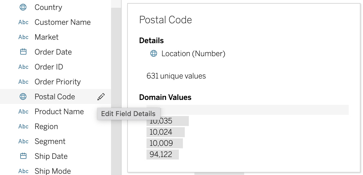
Figure 12.4 – Bringing up field details
- You will now be in the Field Details dialog. Type ZIP Code in the Synonyms field and enter The Postal/Zip Code for the customer in the Description field, as it appears in Figure 12.5. Click the x icon in the top-right corner of the dialog to dismiss the dialog box. This also saves our changes:

Figure 12.5 – Edit field dialog
- We can also create synonyms for data elements within a field. Click on the pencil icon next to the Sub-Category field to edit field details. At the bottom of the dialog, we can see 17 unique values. Click on this section of the dialog box to expand the dialog to see these 17 values. For our exercise, we know that people within our organization often refer to binders as folders. To make their questions easier to answer, click in the Synonyms column next to the Binders row and enter Folders, as shown in Figure 12.6. Click on the x icon in the top-right corner to save our changes and dismiss the dialog box:
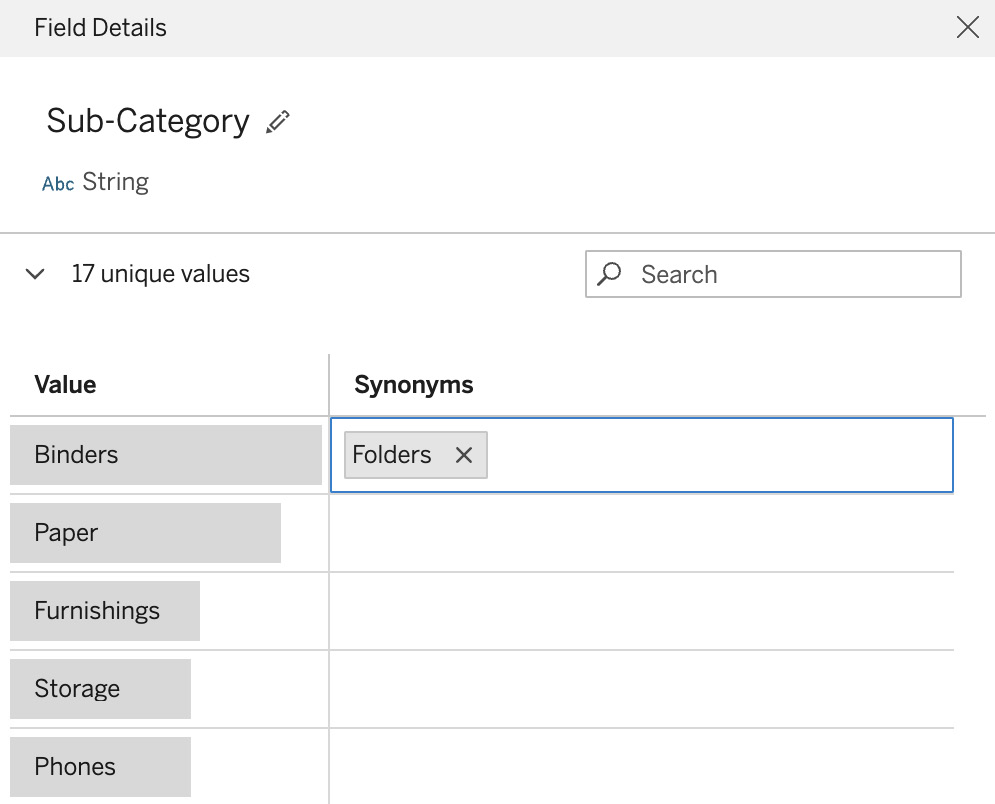
Figure 12.6 – Adding a synonym to a data element
- To test our synonyms, type Sales of folders by zip code in the Search fields or values to create a visualization box. Your screen should now look like Figure 12.7. Notice that Tableau mapped the fields and values to ones in our model in a manner that makes it clear to the person creating the search. Tableau also gives us information on the searches people are using in Ask Data. We can use that data to continually refine the synonyms in our lens:

Figure 12.7 – Mapping the synonyms in the search area
- We do not want to ask this question because there could be a lot of postal codes! Clear the text in the search box and type Sales by Ship Mode. Press Enter or click on the white arrow on the blue background (-->) to issue the search query. Tableau will now run the query and, using its proprietary VizQL language, will return the answer in a bar chart, as shown in Figure 12.8:

Figure 12.8 – Result of our search as a bar chart
- Tableau returns a bar chart as it is the best practice for comparing values. As lens authors, we can decide whether another chart type makes more sense by using a view recommendation. To the right of our chart, click on the drop-down that mentions Bar Chart. Select Treemap to get the visualization shown in Figure 12.9:

Figure 12.9 – Search results as a treemap
- As our final step, we can create recommendation visualizations that appear when people search to help direct them to visualizations that we think work best for specific types of searches. Click on the recommendations pin on the Ask Data menu, as shown in Figure 12.10. We can use Replace Recommendation… to update existing recommendations. Since we haven’t created a recommendation yet, let’s look at the first option – that is, to Pin to Recommended Visualizations…:
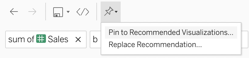
Figure 12.10 – Recommended visualizations
- We can give our recommendation a name and a section to appear, as shown in Figure 12.11. For now, click on Cancel as we will end finish modeling the lens for Ask Data here:
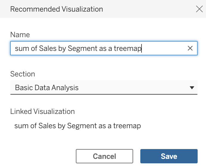
Figure 12.11 – Saving the recommended visualization
In this section, we learned about Tableau’s natural language query interface, Ask Data. We also learned that Ask Data needs a lens to be added to an existing published data source. A lens makes a published data source easier to query for casual users using natural language. A lens allows us to remove fields from our model, rename fields, add synonyms, and create recommendation visualizations without disrupting our data model for analysts using Tableau Desktop or web edit to create dashboards and other analyses.
Tableau also provides reports on how people are using Ask Data. These reports can be invaluable to us to refine our data model. If people are asking questions with different terms, we can update our synonyms; if they are asking for information that’s not in our data model, we can go back to our source data and add it to our published data source.
In the next section, we will look at Explain Data and the implications it has on data modeling.
Uncovering outliers in your data with Explain Data
Explain Data is a feature in Tableau that allows users to find outliers in their data through the automatic creation of potential explanations presented visually. When you use Explain Data on an individual mark in a Tableau visualization, Tableau builds these potential answers using statistical models that include data from the data source that isn’t in the current view.
Unless you instruct it otherwise, Explain Data will use all the columns in your data source to try to find explanations. Unlike Ask Data, the additional data modeling for Explain Data occurs in the workbook. This means Explain Data works with both published and embedded data sources.
In the next section, we will see Explain Data in action and control how it works by deciding which columns (fields) we want to exclude from the analysis.
Curating data sources for Explain Data by telling the model which columns to use and ignore
Let’s look at Explain Data in action. We will begin by connecting to our Product Sales published data source. We can do this in Tableau Desktop or by creating a workbook from the web client of Tableau Server or Cloud. As we have been using Tableau Desktop in Chapter 8, Chapter 9, and Chapter 10, the examples in this section will use the web client. If you prefer, you can follow along using Tableau Desktop:
- From the home page on Tableau Server or Cloud, click on New | Workbook, as shown in Figure 12.12:

Figure 12.12 – New workbook
- You will be presented with a Connect to Data dialog. On the On This Site tab, select our Product Sales data source and click Connect. We are now in the workbook. Double-click on Sales in the data pane and then double-click on the Ship Mode field. Your screen should now look like Figure 12.13:

Figure 12.13 – Sales by Ship Mode
- Click on the blue bar associated with Same Day sales. Wait for the tooltip to appear and notice the lightbulb icon. Hover on the lightbulb icon (
 ) until it shows Explain Data…, as shown in Figure 12.14, then click to activate the feature:

Figure 12.14 – Explain Data
- An Explain Data panel will appear to the right of the chart, as shown in Figure 12.15. Explain Data will make suggestions to best explain the mark you selected. In this case, it will explain why Same Day sales is 142,958. You will see that SUM(Sales) is Slightly lower than expected for this viz. Click on this card for further explanation:

Figure 12.15 – Explanation for SUM(Sales) of Same Day
- Tableau is now telling us that one potential explanation is that Number of Records is lower than expected but within normal limits, as shown in Figure 12.16. This makes sense. Since we have sold fewer items with Same Day delivery, the volume of sales in dollars is also lower than other Ship Mode types. If this finding was more insightful, we could click on the Open in worksheet (
 ) icon to explore it further. In our case, we are not likely to find true insights because our sample data is structured for easy demonstration and does not have the variance often seen in real-world data. For now, click on the < icon at the top left of the card to return to all explanations:
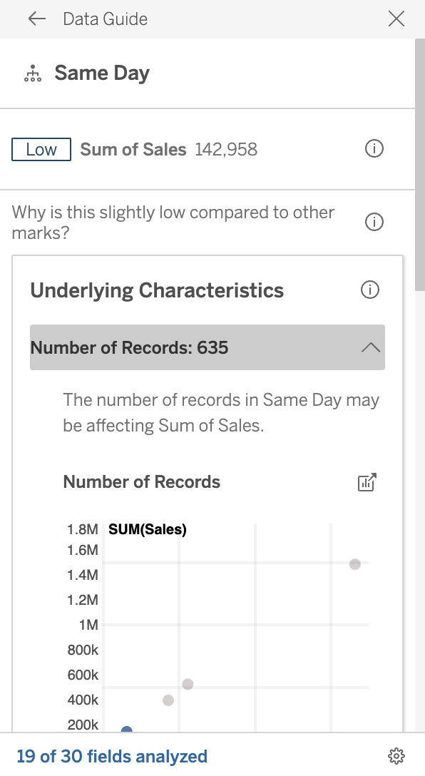
Figure 12.16 – Number of records explanation
- If we click on What is unique about Same Day?, we can see that Explain Data is suggesting that six dimensions might be having an impact on our selected mark, as shown in Figure 12.17. This is where our data modeling for Explain Data becomes important. The File Paths dimension contains the location where our source files came from. This cannot be related to why a sales number could be low:

Figure 12.17 – Potential dimensions
- Click on the settings icon in the bottom-right corner of the dialog, to the right of 11 of 23 fields, as shown in Figure 12.17. This will bring up the Explain Data Settings dialog, as per Figure 12.18. We see that we can decide which fields we want to exclude from the Explain Data algorithms by selecting Never Include next to the fields that we don’t want to be evaluated. Change File Paths to Never Include and then click on OK:

Figure 12.18 – The Explain Data Settings dialog
In this section, we learned about Explain Data, Tableau’s feature that uses statistical models to uncover the reason for outliers in our data. We also learned how to remove dimensions from consideration in the statistical models. It is key to remove these fields; otherwise, business users are unlikely to trust the suggestions from Explain Data.
Summary
In this chapter, we looked at Ask Data and Explain Data. These machine learning features put analysis in the hands of casual users if the data is modeled properly for each feature.
Ask Data requires us to first create a published data source. Next, we must create a lens on our published data source. A lens allows us to hide fields, rename fields, add synonyms, and create view recommendations. If we create a better lens, analysis by casual users through full-text search will provide much better answers.
By default, Explain Data runs statistical models that evaluate all the dimensions in our data model. We often know that some of these dimensions might appear in determining outliers but have no business value in the analysis. In these cases, we can remove dimensions from the analysis Tableau performs, increasing trust in the results of Explain Data.
In the next chapter, we will be looking at the role Tableau Prep Conductor plays in data modeling in the Tableau platform and exploring scheduling for extract refreshes.