1
Introducing Data Modeling in Tableau
Welcome to data modeling in Tableau. You might know Tableau as a great self-service analytics tool that provides both powerful analytics and is also easy to use. You might also think that Tableau is light on the key enterprise analytics requirement of data security, data model robustness, and data maintainability. In this book, you will learn that Tableau has all these key data requirements covered. You will learn how data is best structured for Tableau analysis and performance, and understand the functionality of Tableau Prep Builder and Tableau Desktop and the role each plays in building data models. You’ll then publish these data models to Tableau Server or Online and optimize them for performance, governance, and security.
By the end of this book, you will have all the strategies and techniques needed to enable individuals in your organization to answer their own questions with data, regardless of their level of expertise. You will also drastically reduce the calls you receive from these same individuals about confusing data and dashboards that are slow to load.
Tableau is very different from most other BI tools in that the model can be either implicit or explicit. For instance, many analysts open Tableau Desktop, connect to data, and immediately begin creating visuals. In this instance, Tableau implicitly created a data model (that is, made a connection, executed a query, and created metadata) without an analyst having to do anything to create the model.
This implicit data modeling works well when your data source has already been prepared for analysis and you are the person creating charts and dashboards. Often, our data is not structured this way. It comes from different sources and needs to be combined and defined in meaningful ways. In these instances, Tableau provides the tools for you to create data models that are scalable, secure, and targeted to the different skills of a broad class of developers and consumers.
Tableau uses a data model as the foundation for the creation of all analyses. A Tableau data model contains the following:
- Connection information to the underlying data source.
- The queries required to retrieve the data.
- Additional metadata, or data about the data, added to the underlying data. Metadata can include more readable field names, field types, the grouping of data into hierarchies, and calculations not in the underlying data.
Tableau works best when your data is in a traditional spreadsheet table format – that is, Tableau assumes that the first row of your data consists of column headers and each column header maps 1:1 to a field name, with additional rows of data each containing one record of data. If the underlying data is not formatted in this way, analysis within Tableau becomes very difficult and performance will suffer. To address this, you can model your data in a format that works best with Tableau. The best practices to model data properly are the primary content of this book.
This chapter demonstrates how Tableau automatically creates a data model when you connect to a data source, how it interprets rows and columns in your data, and how you can shape and combine additional data into your data model.
In this chapter, we’re going to cover the following main topics:
- What happens when you connect to data in Tableau Desktop
- The ideal data structure for Tableau
- Shaping data for Tableau
- Connecting multiple tables
Technical requirements
Tableau Desktop (and Tableau Prep Builder version 2022.2 or higher in future chapters) version 2022.2 or higher is needed to complete the exercises in this chapter.
If you don’t have a licensed version of Tableau Desktop, you can obtain a 14-day free trial from https://www.tableau.com/products/desktop.
Another alternative is Tableau Public. The free Tableau Public version of Desktop contains almost all the same features as the paid version, with the exception of a small number of data source connection options, and output can only be saved to the Tableau Public site. However, it often has enough features to perform visual analysis as long as the data isn’t confidential. The Tableau Public Desktop version can be found at https://public.tableau.com/s/.
The files used in the exercises in this chapter can be found at https://github.com/PacktPublishing/Data-Modeling-with-Tableau/. We recommend downloading all the files before getting started. The quickest way to do this is to click on the green <>Code button and then select Download ZIP. Expand the ZIP file and make note of the directory. We will be referencing it throughout the book.
Note
The aforementioned requirements are applicable to all chapters in this book.
What happens when you connect to data in Tableau Desktop?
When you connect to data in Tableau Desktop, Tableau will begin to interpret your data. First, it will create a field for each column of your data. Second, it will assign a data type to each of the fields. Tableau does this because it is powered by a proprietary query technology, called VizQL. VizQL is the technology that underpins Tableau, enabling a visual analytics experience by automatically creating visualizations for a user. This is very different than most business intelligence tools that rely on the user to tell the tool how they would like the data visualized through the picking of a chart type.
For VizQL to work, Tableau needs to know the type of each field. The two main field types in Tableau are discrete and continuous:
- Discrete fields: Colored blue in Tableau. By the Oxford Dictionary’s definition, discrete means independent of other things of the same type. When placed on a Tableau visualization, discrete fields usually create a header – similar to a column header in a spreadsheet.
- Continuous fields: Colored green in Tableau. Again, using the Oxford Dictionary, continuous is defined as happening or existing for a period of time without being interrupted. When placed on a Tableau visualization, continuous fields create an axis – that is, they create a visual display of data.
One way to think about the relationship between discrete and continuous fields is that continuous fields are recording measurements and discrete fields are describing those measurements. In a statement, this can usually be phrased as continuous by discrete – for example, sales (continuous) by region (discrete), as shown in Figure 1.1.
Figure 1.1 – Demonstrating discrete and continuous fields
Within these two main field types, there are additional field types that inform VizQL how to create a visual display when they are brought onto the Tableau canvas. These can be seen in Figure 1.2 and are as follows:
- Number (decimal): A number that allows fractions. Represented by a # symbol in the Tableau UI.
- Number (whole): An integer or a number with no decimals. Also represented by a # symbol.
- String: A field that contains alphanumeric characters. Represented by abc.
- Date: Tableau accepts several date formatting options. Represented by a calendar icon.
- Date & Time: A date field with granularity down to the second of a day. Represented by a calendar icon plus an analog clock.
- Geographical/Spatial: A field that can be plotted on a map. There are many subtypes of geographical fields, including country, state/province, city, postal/zip code, airport, congressional district, NUTS (Europe), and a latitude or longitude value. Represented by a globe icon.
- Binary/Boolean: A field that takes a true/false or yes/no condition. Represented by a T/F icon.

Figure 1.2 – Additional field types
Let’s open Tableau Desktop and connect to the Superstore sales 2022.csv file. This file contains the sample data that comes along with the Tableau installation. It is a sample (and fictional) retail dataset that is useful for demonstration and learning purposes. We will use this data throughout the book when we can. This will help you as you increase your Tableau learning journey, as most of Tableau’s training videos use the same data:
- Open Tableau Desktop.
- Click on the Connect to Data blue hyperlink near the top-left-hand side of the Tableau Desktop UI:

Figure 1.3 – Connect to Data in Tableau Desktop
- You are now presented with many different options for data sources. We will discuss some of these in upcoming chapters. For now, find the To a file section and click on the Text file option. Navigate to the Superstore sales 2022.csv file in the location you saved it on your computer. Click Open.
- Tableau will bring the data in and bring focus to the Data Source tab, as follows:

Figure 1.4 – The data pane in Tableau Desktop
The top part of the screen acts as a visual canvas where we can bring in additional data through relationships, joins, and unions. For now, we will look at the bottom part of the screen.
This part of the user interface is broken into two sections. The section on the left displays the metadata for the fields in the data source. The metadata list contains the type, field name, physical table from where the data is being queried, and remote field name.
Type is the Tableau field type, which allows VizQL to guide the analyst to the best visual display for the data. Field Name is Tableau’s attempt to take the remote field name and map it to a business-friendly name. In our dataset, the column names already translate easily to business-friendly names. Imagine if our source file had contained postal_code and not Postal Code in the first row. Tableau would automatically transform postal_code to Postal Code in the field name, making our data modeling job easier for us. We can always change the default name Tableau assigns to any field.
The section to the right contains a sample of data that will be queried, called the Table Details pane. By default, Tableau returns the first 100 rows as a sample. The sample size can be changed in terms of the number of rows to return.
Next up, we will look at what a table format looks like and why it is so important for Tableau.
The ideal data format for Tableau – table format
Tableau performs best and is easiest to use when every column in the source data corresponds to a single field and each row represents a record of data at the lowest level required for analysis. As you can see in the following screenshot (Figure 1.5), Tableau will put all the field names in columns, including the type of each field. This is the metadata in your data model. Every row below the row of field headers will contain data, with each row representing one record of data:

Figure 1.5 – The Tableau data format
When data is structured in this manner, it allows Tableau to perform optimally based on query performance, the ease of building analyses, and combining data from different sources.
Tableau will automatically assume your data is stored this way when you connect to a new data source. We saw this in the previous exercise. Tableau took the first row from the comma-separated values file and used it to create field names, restarting after the comma separator. Next, Tableau assumed after the first carriage return that the second row would be a row of values, neatly falling into the columns above it. For each additional carriage return, Tableau assumed another data record.
It turned out that Tableau was right in the assumptions it made. Data prepared for analysis is often already stored in this format, with each row being a unique record of data, separated into individual fields based on fields in database tables or headings in flat files and Excel.
What happens when it isn’t? This puts an analyst in the position of creating more complicated analyses (calculations, sheets, dashboards, and stories) and query performance almost always suffers.
In the next section, we will look at one of the most common ways where we see data structured in a manner that is not Tableau-friendly.
Shaping data for Tableau
In the previous section, we looked at the data format that works best in Tableau. We will now look at one of the two main examples where data is shaped ineffectively for Tableau and how we can easily change it to the correct format before beginning our data analysis.
Time-based data, especially financial data, is often stored in Excel with the dates in the column headers, the fields spread across columns in the first row, and values falling in the cells in the intersection. We can see this in Figure 1.6. This is a planning sheet for sales targets for the year 2022 for category sales of our SuperStore data:

Figure 1.6 – SuperStore sales targets format
If we connect this data to Tableau, it gives us the following metadata:
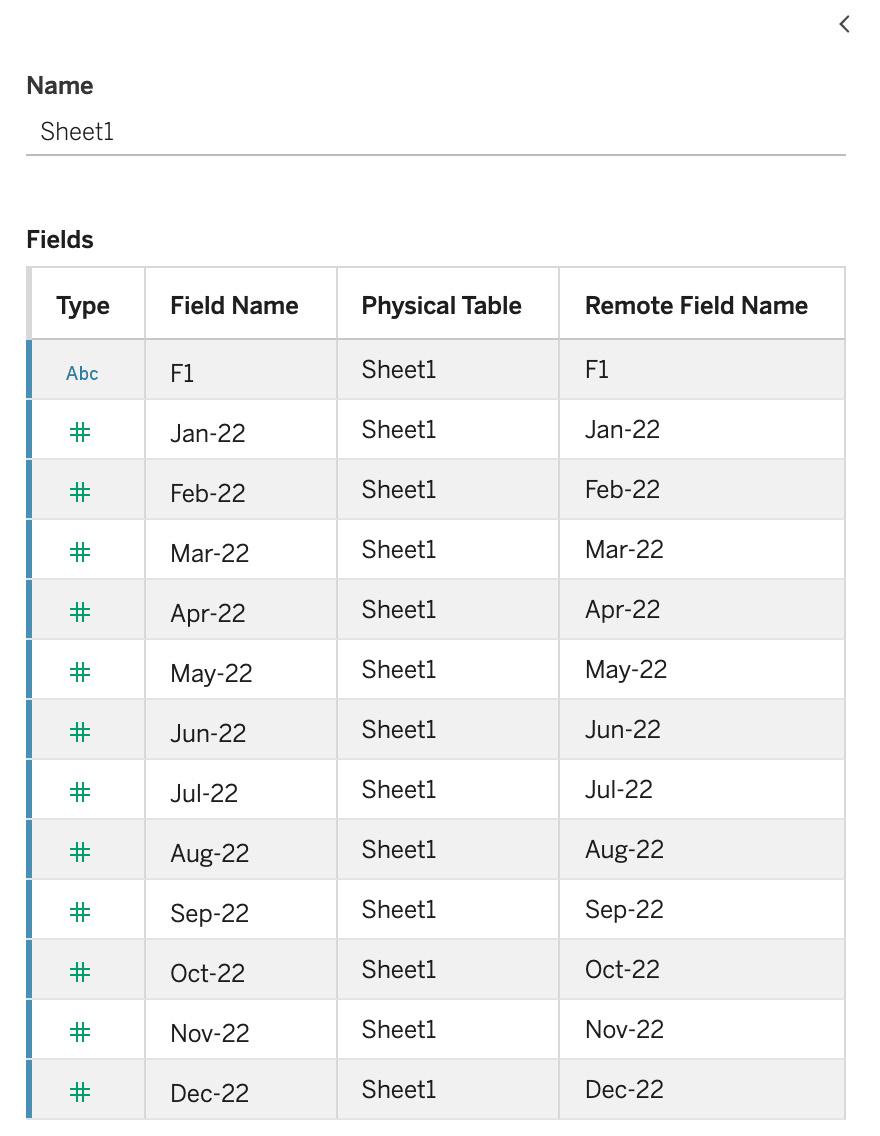
Figure 1.7 – SuperStore target default metadata
Thinking back to having fields in columns, a field type, and values in rows, we can see that this interpretation of the data is not helpful at all. What we want are three fields of the following types:
- Date: Type – date. There are 12 values, one for each month in 2022.
- Category: Type – string. There are three values: Furniture, Office Supplies, and Technology.
- Revenue target: Type – whole number
In order to get these fields into the right format, we need to pivot those date columns into rows and then rename two fields. Tableau makes this easy for us. Here are the steps:
- Open Tableau Desktop.
- Click on the Connect to Data blue hyperlink near the top left-hand side of the Tableau Desktop UI.
- Choose Microsoft Excel. Navigate to the SuperStore 2022 Budget.xlsx file in the location you saved it on your computer. Click Open.
- You will be presented with a screen similar to Figure 1.6.
- In the Table Details pane, click on the header of Jan-22, hold down the Shift key, and click on the Dec-22 header to select all the date columns. You might find this easier if you first collapse the metadata pane:

Figure 1.8 – Multiselecting columns in the Table Details pane
- Hold your cursor over the top-right-hand corner of the Dec-22 header to bring up the down arrow.
- Click on the down arrow to bring up the menu of options. Choose Pivot.

Figure 1.9 – Menu options from the Table Details pane

Figure 1.10 – Table Details after the pivot
- Our last step is to rename our three fields. We can do this by clicking on the field name and typing over the ones that are there, or by clicking on the same down arrow that we used in step 8 and using the Rename option.
- Let’s rename our fields as follows: F1 to Category, Pivot Field Names to Date, and Pivot Field Values to Sales Target:

Figure 1.11 – Table details after renaming
- Our last step is making sure our field types are correct. Category is a string field (alphanumeric) so it should show Abc, which it does. Similarly, Sales Target is a number and Tableau has it correct. Date is showing as a string. We would really like this as a date field because Tableau has special date-handling capabilities to make analysis much easier for us. To change the Date field to a type of date, click on Abc over Date and change the field type to Date:

Figure 1.12 – Table details – changing the data type
Don’t close this workbook; we will pick up from this point in the exercise in the next section, where we will combine data to our data model from other tables.
In this section, we looked at how we may need to reshape our data to make better data models in Tableau. In the next section, we will look at a use case where we need to add additional columns (fields) of data from other data sources to our model.
Connecting multiple tables to add new columns
Now that we understand the ideal format of data for Tableau, we can look at ways to expand the size of our data model by connecting to multiple tables. We have connected independently to two different tables in this chapter. We will now combine those tables, along with a third table.
There are two ways in which we can add multiple tables to a single data model. The first is by joining data. We join data when we want to add additional columns to our model for additional context. Think of our sales target data. We want to join that data to our SuperStore sales data to add the additional context of sales targets. That will allow analysts to create views to see how the different categories are performing against their targets.
The second way to add additional data to our model is by adding additional rows (with the same columns). The SuperStore data we used earlier in this chapter was for 2022. What if we wanted to add in sales from 2021? That is where a union would be the answer.
For our next exercise, it should be noted that we are creating a relationship to add the new column and not a join. Using a relationship allows Tableau to create the proper join at runtime based on the data being analyzed. You can think of a relationship as a dynamic, smarter join. We will explore the details and differences between relationships and joins in Chapter 7, Chapter 8, and Chapter 9.
To add the additional column of sales target, we will pick up from the end of the previous exercise:
- Click on the blue Add hyperlink to the right of Connections:

Figure 1.13 – Clicking the Add hyperlink
- Select To a file | Text file | Superstore Sales 2022.csv | Open.
- Under Files, drag Superstore Sales 2022.csv onto the canvas until the orange noodle shows, and then let go.
- At this point, Tableau tries to create a relationship between these tables. Sometimes, Tableau can figure out how to create this relationship. In this case, we can see Tableau was unable to do this from the exclamation mark in a red triangle:

Figure 1.14 – Creating a relationship between two tables
- We need to tell Tableau that the two relationships it should create are Date with Order Date and Category with Category. Let’s relate the two category fields first. We do this by selecting Category and Category1 and making sure the operator is set to equals (=):

Figure 1.15 – Creating a relationship by linking fields
- To complete the relationship, we will also need to link Date fields to ensure that the sales targets are aligned with the proper dates for analysis. In this specific case, the dates are not at the same grain (one is at the month level and one is at the day level). This will require us to create a relationship calculation, which we will explore in future chapters.
- Now that we have joined additional data sources (tables) to add additional columns for analysis, we will explore adding new rows of data through a union.
- Hover your cursor on the right side of the Superstore Sales 2022.csv file rectangle on the canvas, and click on the down arrow when it appears. Select Convert to Union…:

Figure 1.16 – Convert to Union…
- Drag the Superstore Sales 2021.csv file from the files section on the canvas into the union dialog box. After clicking OK, all the rows from both 2021 and 2022 will be available for analysis:

Figure 1.17 – Dragging files to the union dialog box
We have now covered the two core methods of expanding our data model through relationships and unions.
Summary
Congratulations! We are only one chapter in and you have already created a data model in Tableau. We now know how to structure the ideal data model for Tableau. We looked at connecting to data, exploring how Tableau interprets that data, reshaping data for analysis, and adding additional data. With this learning foundation, we are well-positioned for more advanced topics in the following chapters, where we will build security, maintainability, and robustness into our data models.
In the next chapter, we will look at Tableau licensing models and how licensing impacts data modeling. We will also explore the difference between embedded and published data models and the difference between data models that connect live to data and those that extract data for analysis.