
Job:03171 Title:Typography Referenced (Rockport)
Page: 232
206-233 03171.indd 232 9/23/11 5:26 PM
Text
Job:03171 Title:Typography Referenced (Rockport)
Page: 232
232
Typography, Referenced
P
airing typefaces should be more about contrast
() than similarity. For example, using Helvetica
() and Arial together in a composition does
little to no good for the average viewer who
won’t notice the diff erences between the letterforms.
So how exactly do designers decide which typefaces work
well together? Unfortunately, no prescription exists, no soft-
ware can decide, and clients rarely off er creative suggestions.
One of the most helpful tools is knowing of as many typefaces
as possible. No matter the pairing, make sure the selected
fonts honor the content, ensure readability (), and speak
to any conceptual undertones that need to come across.
TYPOGRAPHIC PRINCIPLES
Typeface Pairing
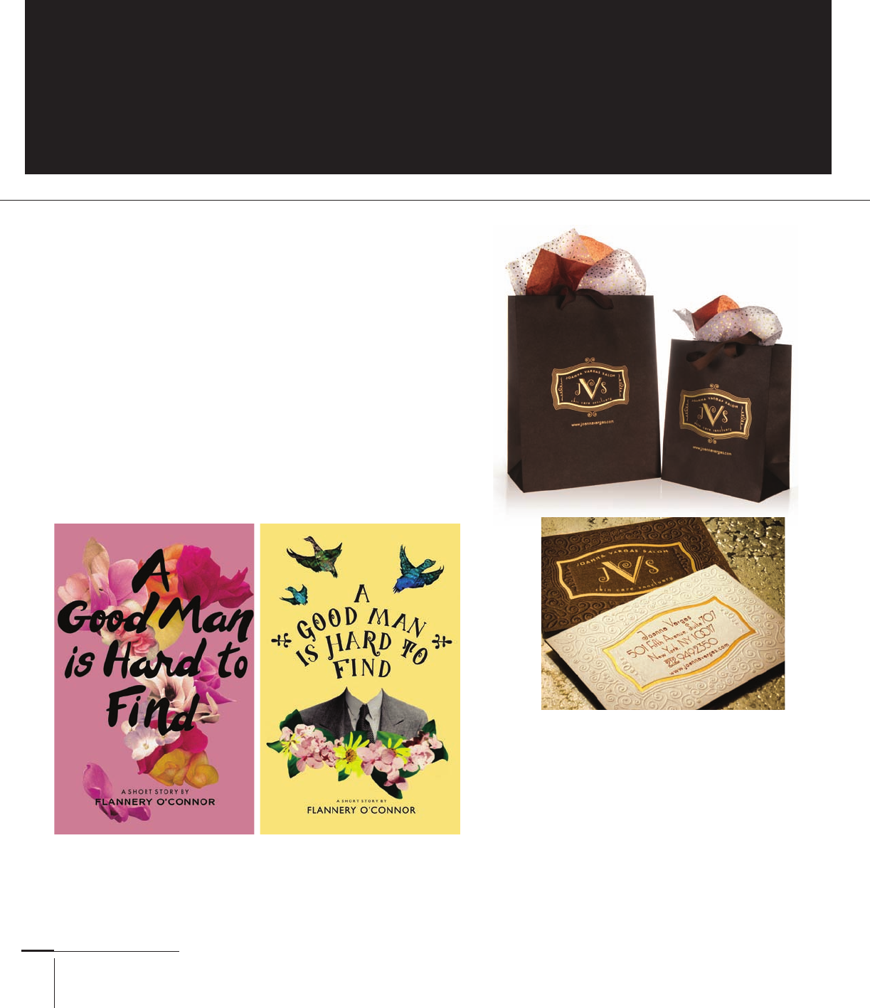
In each of Shelby Guergis’s book covers for A Good Man Is Hard to
Find, handwritten letterforms announce the title, with a calmer
sans serif face identifying the author. Custom lettering, Gotham,
Centaur York University Department of Design, Canada.
In these Joanna Vargas Salon identity
elements, the modifi ed and shadowed
Sympathetique V between the J and S in
the monogram elicits sophistication and
highlights the proprietor’s last name.
International, David Brier, United States.
206-233 03171.indd 232 9/23/11 5:26 PM
Job:03171 Title:Typography Referenced (Rockport)
Page: 233
206-233 03171.indd 233 9/23/11 5:26 PM
Text
Job:03171 Title:Typography Referenced (Rockport)
Page: 233
233
Typographic Principles
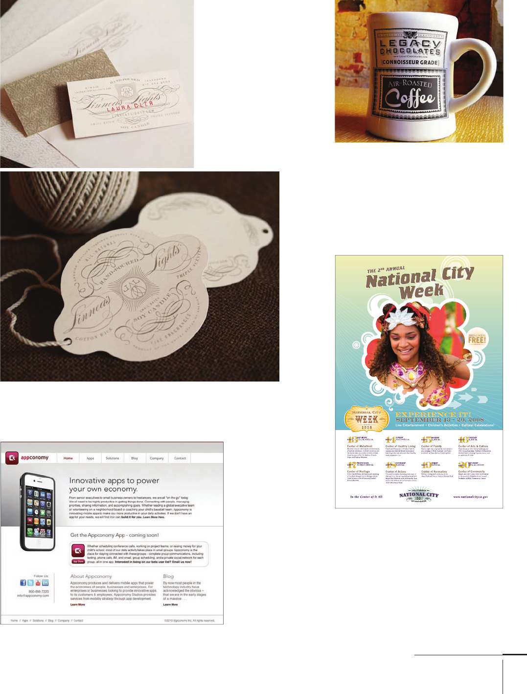
Why pair just two typefaces when you can
combine more than one fl avor to deliver an
array of looks and textures? Legacy Chocolate’s
identity sits at the mug’s top (hand lettered and
based on Bank Gothic), contrasted by a wealth
of typographic identifi ers such as “Connois-
seur Grade” in Modesto, “Air-Roasted” in
Serlio, and “Coff ee” in QuigleyWiggly.
International, David Brier, United States.
Designing this predominantly typographic
poster required a combination of a sans
serif (Trade Gothic), a serif (Engravers ),
and a wood typeface (Berkeley Oldstyle
Book). Each typeface denotes a particular
level of information, from the headline to
the subhead down to the dates and events at
the bottom. Tyler Blik (creative direction),
Kaori Toda (design), Yuki Hayashi (design),
Brian Pelayo (design), United States.
Thin, geometric
headlines
provide just
enough oomph
to headline
each area of the
Neo-Grosteque
sans serif body
text. Fangman
Design, United
States.
The Linneas Lights
wordmark (in Burgues
Script) looks delicate and
classy on this business
card, and the sans serif
typography (Engravers’
Gothic) calls out the
business cardholder’s
name. Subtle changes in
the serif typeface (Cordoba
and Bodoni) used for
the contact informa-
tion also create diff erent
information levels. Eric
Kass, United States.
206-233 03171.indd 233 9/23/11 5:26 PM
..................Content has been hidden....................
You can't read the all page of ebook, please click here login for view all page.