

Job:03171 Title:Typography Referenced (Rockport)
Page: 227
206-233 03171.indd 227 9/24/11 9:01 AM
Text
Job:03171 Title:Typography Referenced (Rockport)
Page: 227
227
Typographic Principles
Matt Fangman’s website for the University of Texas
at Austin’s library has distinct hierarchical levels
of information, where typographic information
and small photographs balance a large photo-
graph above. This asymmetrical composition
creates a sense of order and comfort for the viewer.
In its invitation for
Sutherland Models,
The White Room
breaks up the format
asymmetrically
with a large photo-
graph off set by a
vertical headline
that mirrors the
statuesque model.
By placing the business card’s
typography off -axis, designer Kevin
Finn not only creates a dynamic
layout, but also uses each side of
the divided card to separate contact
information from name and title.
206-233 03171.indd 227 9/24/11 9:01 AM
Job:03171 Title:Typography Referenced (Rockport)
Page: 228
206-233 03171.indd 228 9/23/11 5:25 PM
Text
Job:03171 Title:Typography Referenced (Rockport)
Page: 228
228
Typography, Referenced
D
esigners call compositional
areas that do not include
text, image, or graphic ele-
ments white space or negative
space. Some designers feel that using
white space lends a degree of sophisti-
cation to layouts, in contrast to layouts
with too many graphic elements.
Formally, white space allows the reader
an opportunity to focus on the element or
elements that demand the most attention.
Conceptually, white space can further an
underlying message the designer hopes to
communicate to the viewer. Despite these
issues, designers should use white space
sparingly and functionally, as too much
can make a composition look sterile.
TYPOGRAPHIC PRINCIPLES
White Space
The “Faces” annual report for the Adris Group (done in Gotham Bold and Minion Pro) personifi es the company
with the jacket photographs, while the inside text layout calmly positions the past year’s fi nancial summary
and future outlook amidst crisp areas of negative space. Bruketa&Žinić , Croatia.
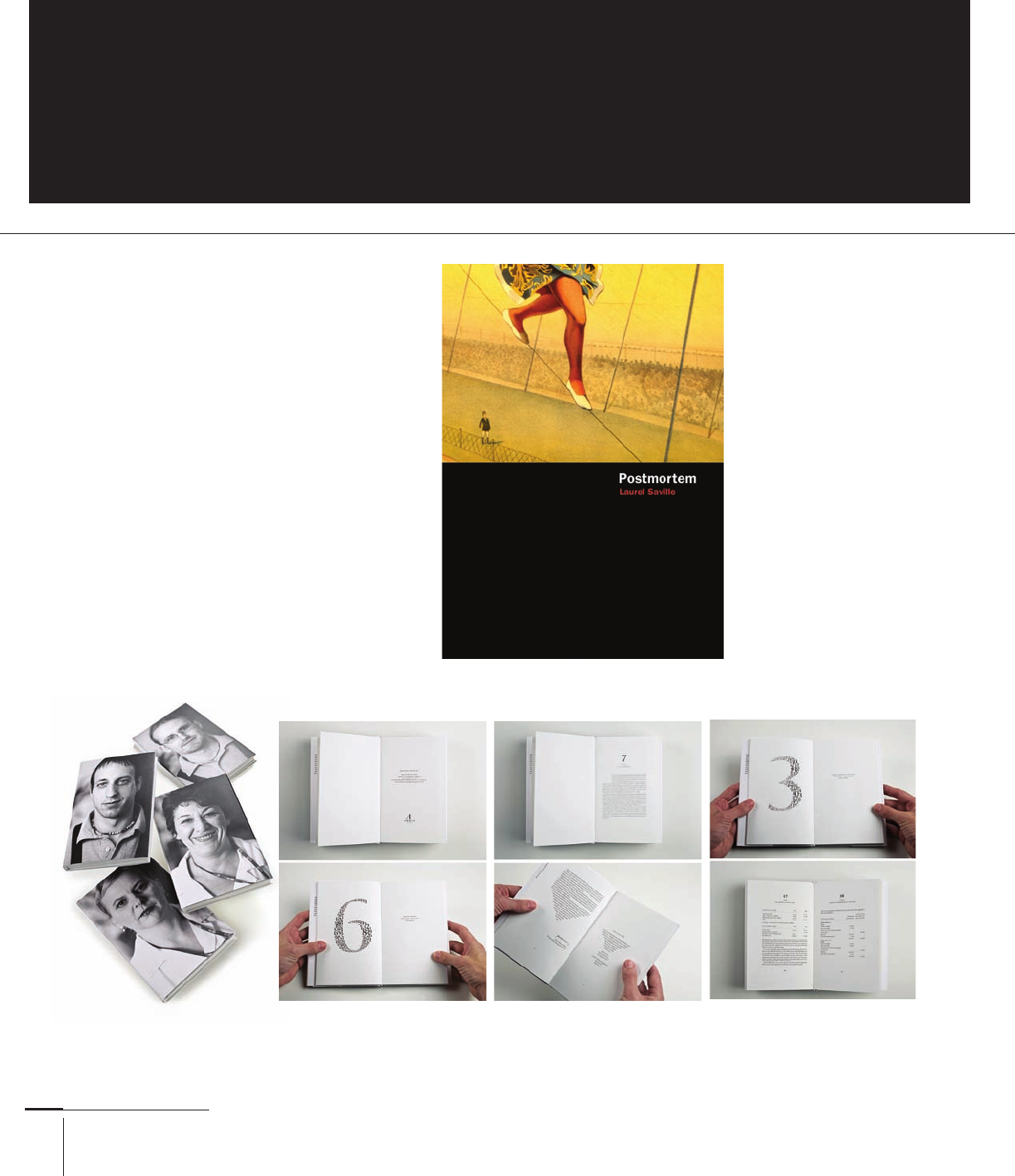
Although not technically
white space, the black lower
half of the Postmortem
book cover interferes with
the illustration to let fl at
typography (in Franklin
Gothic) leap to the surface
and identify both the title
and author. This juxtapo-
sition helps the reader zero
in on the text, and the dark
void doubles as a concep-
tual tool alluding to the
book’s content. AdamsMo-
rioka, Inc., United States.
206-233 03171.indd 228 9/23/11 5:25 PM
Job:03171 Title:Typography Referenced (Rockport)
Page: 229
206-233 03171.indd 229 9/24/11 9:27 AM
Text
Job:03171 Title:Typography Referenced (Rockport)
Page: 229
229
Typographic Principles
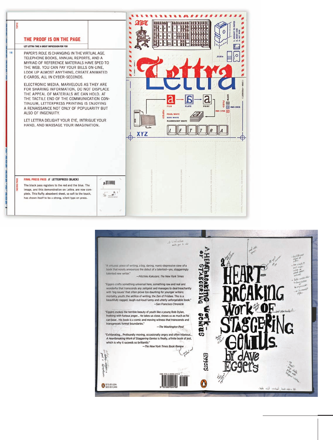
Federico Galindo’s
type-heavy book cover
for A Heartbreaking
Work of Staggering
Genius has areas of
repose, and these
negative spaces on the
cover, spine, and back
side balance out the
busy notes scrawled
across the format. York
University Department
of Design, Canada.
The almost-blank lower-
right side of this Crane
Lettra swatch book compo-
sitionally balances out the
more text-heavy left side
(done in Trade Gothic).
And the white strips of
paper act as pull-tabs for
designers and printers
to tear and use during
the specifi cation process.
/Michael Osborne
Design, United States.
206-233 03171.indd 229 9/24/11 9:27 AM
Job:03171 Title:Typography Referenced (Rockport)
Page: 230
206-233 03171.indd 230 9/23/11 5:25 PM
Text
Job:03171 Title:Typography Referenced (Rockport)
Page: 230
230
Typography, Referenced
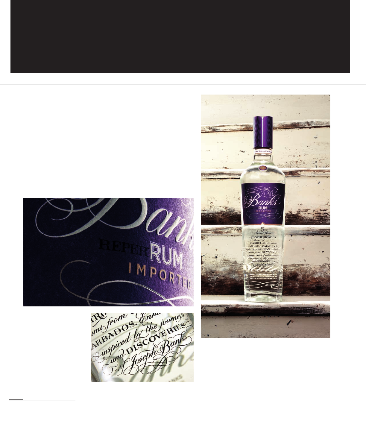
To create a new brand of premium rum for Banks Rum,
Design Bridge paired sophisticated script type by Frederick
Marns with the stability and stoicism of the typeface Gothic
for the word “rum.” The resulting typography works well
together because of the noticeable diff erences between
each letter treatment. Design Bridge, United Kingdom.
C
ontrast is one of the best ways to create diff erentiation
between graphic elements. With typography,
contrasts in size, weight, width, color, position, and
typeface are just some of the means to separate
information or catch a viewer’s glance. With typographic
contrast, readers immediately see what matters most instead
of being forced to read and make judgments on their own.
TYPOGRAPHIC PRINCIPLES
Contrast
206-233 03171.indd 230 9/23/11 5:25 PM
Job:03171 Title:Typography Referenced (Rockport)
Page: 231
206-233 03171 C2.indd 231 10/12/11 10:29 AM
Text
Job:03171 Title:Typography Referenced (Rockport)
Page: 231
231
Typographic Principles
Setting information in italic white type contrasted against the black subject
labels (in Franklin Gothic and Bauer Bodoni) allows readers to quickly
see which book is which when scanning the shelf. The White Room, Canada.
This wall at The One Club exhibition
has a high level of contrast between
the black typography on the white
background, as well as the reversed
typography on a black background. In
both cases, the reader can easily read each
line of copy. Design, United States.
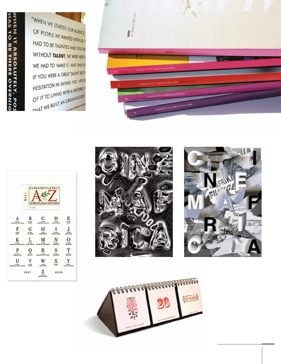
Size, typeface, and weight
all act as distinctly diff erent
pieces of typographic infor-
mation to help the viewer
discern between day of
week, date, and month in
this Mohawk Via paper
calendar. AdamsMo-
rioka, Inc., United States.
A promotional card for the “Alphabeti-
lately: An Alphabet of Philately” exhibition
at the Smithsonian National Postal Museum
positions a large and colorful typo-
graphic element at the composition’s
top in contrast with the black-and-
white array of letters beneath it. /
Michael Osborne Design, United States.
Despite the wealth of textures in each of Ralph Schraivogel’s Cinemafrica posters, the letter-
forms are legible because their textures diff er enough from the background elements.
206-233 03171.indd 231 9/24/11 11:19 AM
..................Content has been hidden....................
You can't read the all page of ebook, please click here login for view all page.