
Job:03171 Title:Typography Referenced (Rockport)
Page: 147
Job:03171 Title:Typography Referenced (Rockport)
Page: 147
142-165 03171.indd 147 9/23/11 11:42 AM
Text
Job:03171 Title:Typography Referenced (Rockport)
Page: 147
Text
Job:03171 Title:Typography Referenced (Rockport)
Page: 147
147
Typefaces and Specimens
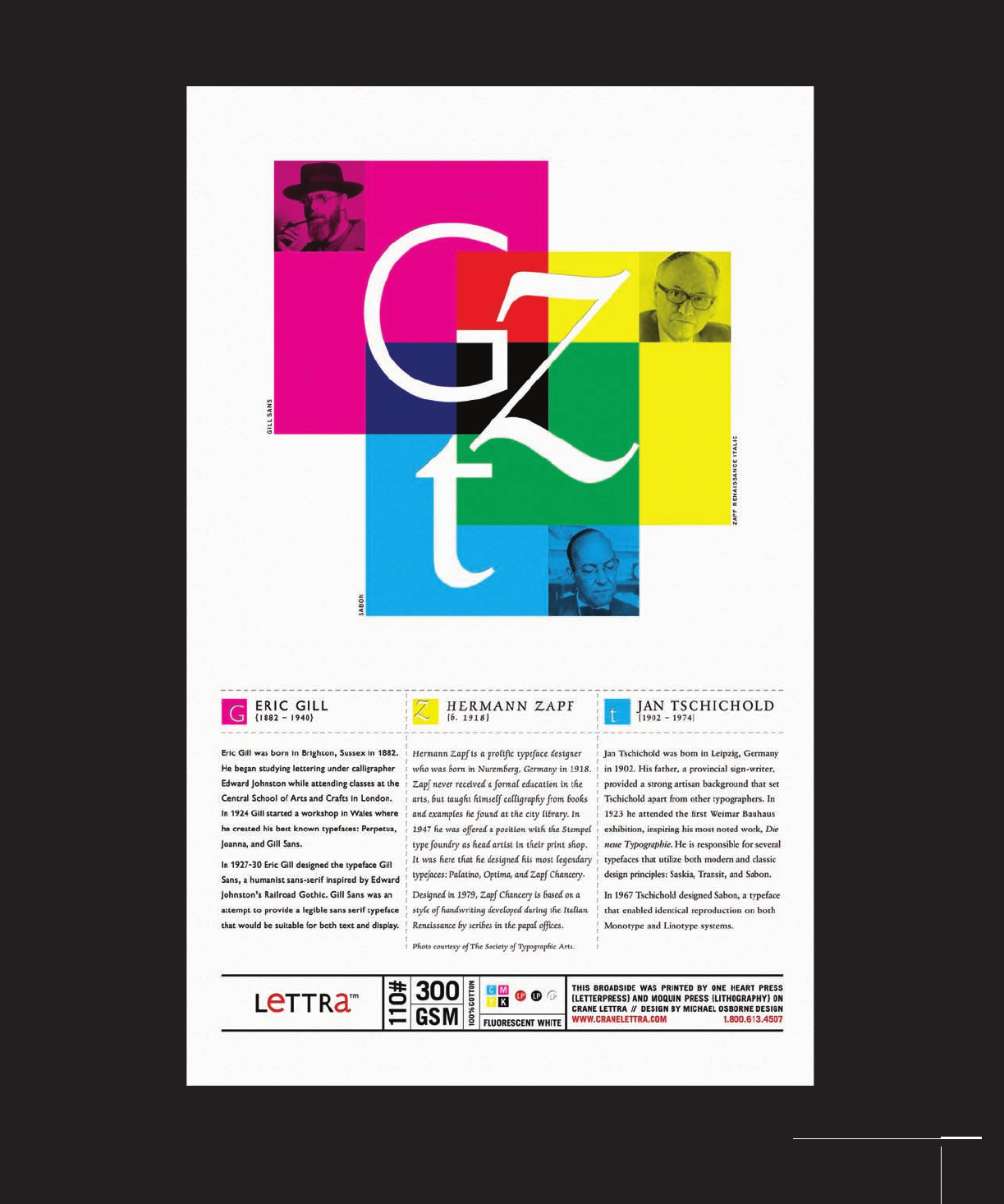
For its Crane Lettra poster, /Michael Osborne Design
paired Gill Sans, Sabon, and Zapf Chancery with great eff ect.
142-165 03171.indd 147 9/23/11 11:42 AM
Job:03171 Title:Typography Referenced (Rockport)
Page: 148
Job:03171 Title:Typography Referenced (Rockport)
Page: 148
142-165 03171.indd 148 9/23/11 11:42 AM
Text
Job:03171 Title:Typography Referenced (Rockport)
Page: 148
Text
Job:03171 Title:Typography Referenced (Rockport)
Page: 148
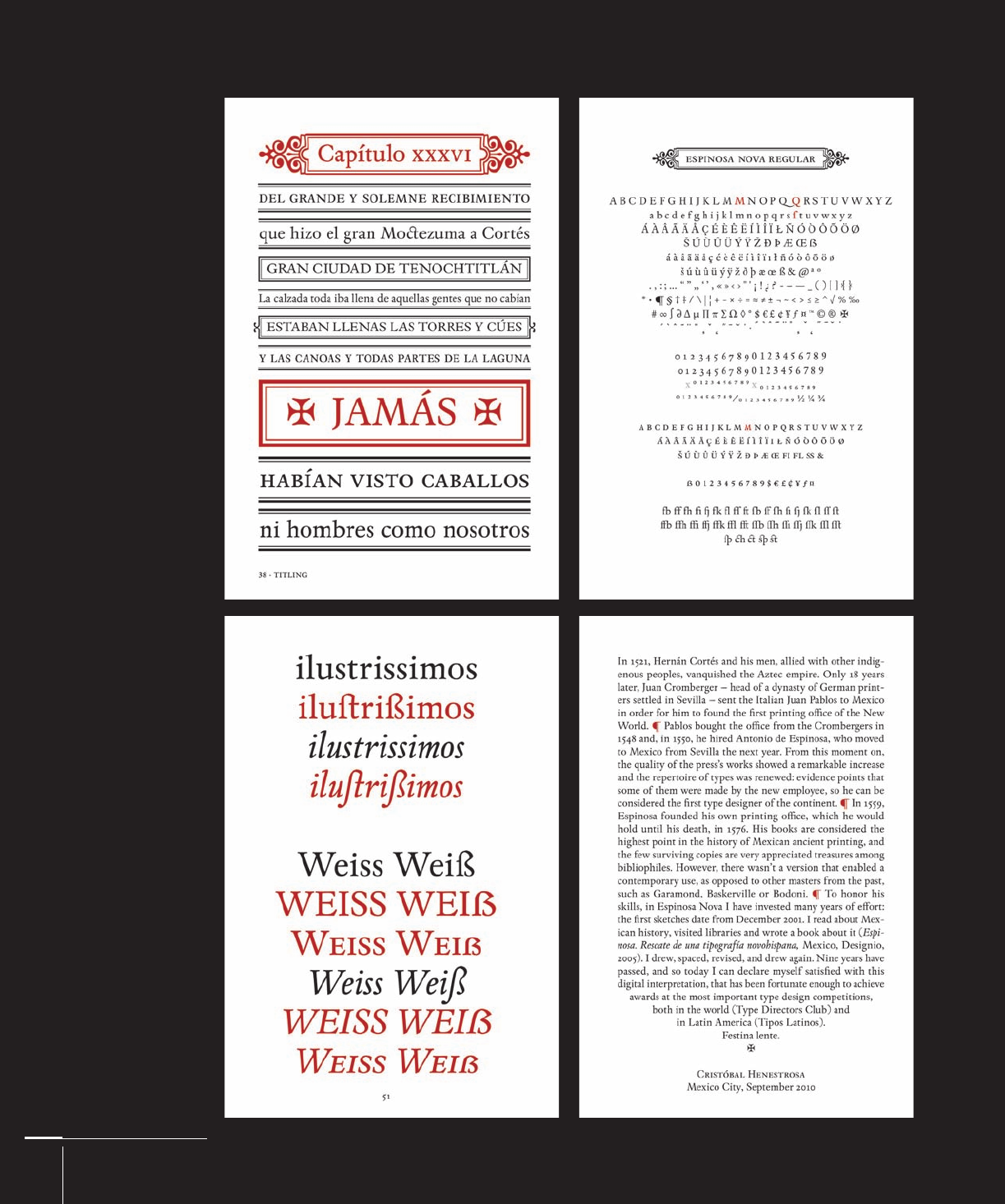
Sample pages from
a specimen book for
Espinosa Nova, an
extensive revival of a
typeface by Cristóbal
Henestrosa.
148
Typography, Referenced
142-165 03171.indd 148 9/23/11 11:42 AM

Job:03171 Title:Typography Referenced (Rockport)
Page: 149
Job:03171 Title:Typography Referenced (Rockport)
Page: 149
142-165 03171.indd 149 9/23/11 11:42 AM
Text
Job:03171 Title:Typography Referenced (Rockport)
Page: 149
Text
Job:03171 Title:Typography Referenced (Rockport)
Page: 149
Type specimens have
long enabled printers
and designers to see
an entire character set
in a range of sizes.
Typefaces and Specimens
149
142-165 03171.indd 149 9/23/11 11:42 AM

Job:03171 Title:Typography Referenced (Rockport)
Page: 150
Job:03171 Title:Typography Referenced (Rockport)
Page: 150
142-165 03171.indd 150 9/23/11 11:42 AM
Text
Job:03171 Title:Typography Referenced (Rockport)
Page: 150
150
Typography, Referenced
Text
Job:03171 Title:Typography Referenced (Rockport)
Page: 150
TYPEFACES AND SPECIMENS
Serif
S
ince the 1400s, serifs have
defi ned a generation of typefaces
that evolved into what became
known as Venetian, Garalde, and
Transitional (55) classifi cation. For sim-
plicity’s sake, contemporary historians and
typographers tend to lump them all into
one group. Classifi cations such as those
within the serif lineage are convenient
because they cluster fonts into schools,
styles, or historical movements. But the
job of classifying and subclassifying
grows ever more diffi cult with the release
of more and more typefaces, fragment-
ing each of the named classes into even
smaller permutations.
In terms of popularity, many typefaces
commonly used in print today are reviv-
als of classics created centuries ago such
as Bembo (155), Baskerville (154), and
Garamond (162). Calligraphy strongly
infl uenced Venetian typefaces such as
those from the fi fteenth (9) to sixteenth
century (10), most evident in their sloped
axis and low contrast (230). Old roman
faces from the seventeenth century (10)
share those traits, but are also low con-
trast, with more pronounced brackets
and bigger serifs that make them appear
heavier on close inspection. The Garalde
forms possess the most variety (224),
with both wide and narrow letterforms.
Transitional (55) fonts earned that title
because of where they sit in typographic
chronology: between Garalde and Didone
(56). Formally, Transitional typefaces
have medium contrast and less stress
than Old Style (54) faces.
Didone (56) (sometimes called Modern
or New Roman) arrived in the late eigh-
teenth century (10) and continued
through much of the nineteenth century
(12). Didone faces have vertical stress, but
abrupt contrast (230) between their thick
and thin strokes. Bodoni (156) was one
of the earliest examples of this formal
(64) trend that began in France and Italy.
Hybridizations of these and other clas-
sifi cations continue to permeate the
typographic landscape, with results that
can look exquisite, garish, or conservative.
But the specimens shown on the following
pages set a standard that has infl uenced
type designers for centuries, and their
endurance has been diffi cult to match.
PNCA3 by
Veronika Burian
142-165 03171 C2.indd 150 10/12/11 10:56 AM

Job:03171 Title:Typography Referenced (Rockport)
Page: 151
Job:03171 Title:Typography Referenced (Rockport)
Page: 151
142-165 03171.indd 151 9/23/11 11:42 AM
Text
Job:03171 Title:Typography Referenced (Rockport)
Page: 151
Text
Job:03171 Title:Typography Referenced (Rockport)
Page: 151
151
Typefaces and Specimens
An invitation by Jeff Matz of Lure design
couples Bembo’s graceful lines with subtle
curves found in an artist’s sculpture.
SERIF CHARACTERISTICS
Typography
Ty pography
Typography
Typography
Humanist (set in Monotype
Centaur): Calligraphic
traits, high ascenders with
low x-height, triangle-
shaped serifs, pronounced
stress of counters, small
counters, longer descenders
Garalde (set in Hoefl er Text):
Medium contrast, large
counters, medium x-height,
inclined stress, fl attened
serifs, shorter descenders
Transitional (set in
Times New Roman): High
contrast, vertical
serifs, downward-sloped
ears, nearly fl at serifs at stem
bottoms, shorter descenders
Didone (set in Didot): Extremely
high contrast between stroke
widths, vertical stress, hairline
serifs, some serifs with
brackets, others without
142-165 03171.indd 151 9/23/11 11:42 AM
..................Content has been hidden....................
You can't read the all page of ebook, please click here login for view all page.