
Job:03171 Title:Typography Referenced (Rockport)
Page: 41
030-051 03171.indd 41 9/22/11 11:52 AM
41
Type Design and Development
Text
Job:03171 Title:Typography Referenced (Rockport)
Page: 41
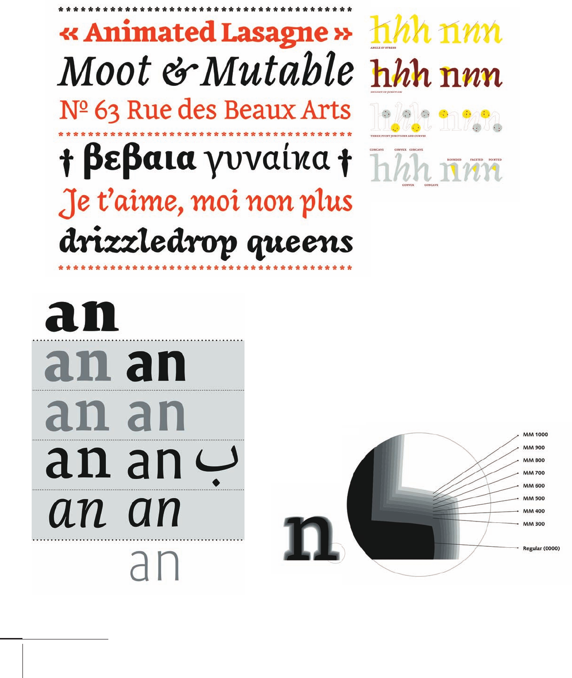
Another use of interpolation
involves the development of grades,
which allow the designer to fi ne-tune
the fi t of a typeface to specifi c presses.
Here the widths of the diff erent styles
remain identical to avoid the need to
refl ow text based on grade selection.
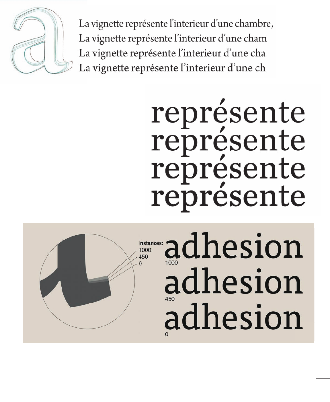
Typeface designers may use interpolation to produce
closely matched versions of typefaces optimized for
specifi c purposes, such as Adobe’s Arno Pro, which ships
with fi ve optical sizes (small text [for captions], regular,
subhead, and display). Four of these appear here as
green outlines; for comparison, the black outline is the
bold. Once the basic interpolation is done, the designer
often returns to the outlines to improve details for inter-
mediate styles. Setting the four variants at the same
size highlights the weight and spacing diff erences.
Trials during the development of Mitja Miklavčič’s Tisa show that the two
extremes share basic dimensions. Just the weight of the outstrokes changes.
The same approach was used to fi ne-tune many aspects of the typeface.
030-051 03171.indd 41 9/22/11 11:52 AM

Job:03171 Title:Typography Referenced (Rockport)
Page: 42
030-051 03171.indd 42 9/22/11 11:52 AM
42
Typography, Referenced
Text
Job:03171 Title:Typography Referenced (Rockport)
Page: 42
T
he rendering environment (the test design appli-
cation’s display of type) plays an important role in
the connection between the appearance of para-
graphs and specifi c design choices. Type design
applications may allow the designer to zoom in until a detail
fi lls the whole screen, but this precludes the display of a
whole paragraph. Zoom out to allow multiple lines of text
on the screen, and the low resolution renders the details
too fuzzy to judge. But printouts are also unreliable: Post-
script version, toner level, paper quality and orientation, and
many other factors infl uence the quality of laser output.
Instead, get printouts from diff erent printers. Some type
designers sneak lines of type on the margins of print jobs (or
even place small advertisements in their own typeface) to get an
idea of how the typeface performs in off set conditions. Here’s
a tip: Process black is generally lighter than laser toner, and a
typeface may look washed out on off set.
For many years, a limit of 256 characters per font hampered
digital typefaces, as did a need to ship in linked styles of four:
regular, italic, bold, and bold italic. Most foundries have now
expanded their character sets to include coverage for Latin
script and are extending into other scripts, driven mostly by
branding demand. But the most interesting developments are in
regard to thinking about typeface families.
The establishment of OpenType and the support of wide fam-
ilies by page-layout applications allowed designers to rethink
what constitutes a family. Traditional, individually bought
typefaces were often developed to meet specifi c user needs. For
example, a family like Monotype’s Grotesque had several widths
and weights for the upright styles, but only two inclined ones.
The diff erent styles have strong diff erences, and some weights
seem reworked from standalone typefaces, but the family
hangs together well because the individual styles work for their
intended purpose. Although the completeness of a Univers-like
() system is appealing, it irons out a designer’s interpretation
of a style for small sizes, display weights, and even alternate
styles within the text styles.
At the same time, a family based on small weight increments
can help publications such as magazines that need to combine
diff erent typefaces for headings, straplines, main text, captions,
pull quotes, etc. The ability to select something a little heavier
or lighter can make the diff erence between using a typeface or
not. The profusion of typeface families with many weights near
the middle of the range (regular, book, medium, semi-bold, etc.)
is a welcome development in the past decade.
TYPE DESIGN AND DEVELOPMENT
Rendering Environment
Three letters from -point Minion Pro, printed on a dpi laser printer, photographed under a
microscope. In comparison with the original outlines (left) the laser printer introduced inconsisten-
cies of width in the vertical strokes, as well as in serifs and terminals. Although the resolution of laser
printers is generally higher, this level of detail is comparable to many print-on-demand services.
030-051 03171.indd 42 9/22/11 11:52 AM

Job:03171 Title:Typography Referenced (Rockport)
Page: 43
030-051 03171.indd 43 9/22/11 11:52 AM
43
Type Design and Development
Text
Job:03171 Title:Typography Referenced (Rockport)
Page: 43
Testing the Design
The process of typeface design is, in
essence, a reductive refi nement of
details. First ideas are just sketches
that off er starting points followed by
a clear methodology of structured
changes, reviews, testing—and rep-
etition of the whole process. The
designer’s attention progresses in
ever-decreasing scales of focus:
• First, paragraph-level values
on the overall density of a design
• Next, fundamental interplay
of space and main strokes
• Third, elements within
a typeface that ensure
consistency and homogeneity
• Finally, elements that impart
individuality and character
At the heart of this process is a
question-fi lled dialogue: What are
the conditions of use for the new
design? How will the success of the
design be evaluated?
The wider the typeface family, the
deeper the need to test conclusively,
not only with documents that high-
light the typeface’s qualities, but
also with documents that approxi-
mate a wide range of possible uses.
Even very tight briefs (as in the case
of typefaces for corporate clients)
can generate an extremely broad
range of uses—scenarios that may
even change after typeface delivery.
But good designers also under-
stand the constraints of their
testing environment. Ironically,
the screen is gradually becoming
an area of better control than print.
Standardized tests to check the
quality of type rendering on screen
are increasingly published online
for developers and designers to use.
But the limitations of laser printers,
the range of quality in digital print-
ers, and the loss of wet proofs for
off set complicate testing.
Monotype Grotesque, a reference
historical sans family with an
incomplete family, works well
for a wide range of documents.
Emilie Rigaud’s Coline
combines a relatively
restrained regular
and bold, with an
informal upright style,
an upright italic with
an associated light
version, and an extra
bold that pushes the
style to its extreme.
030-051 03171.indd 43 9/22/11 11:52 AM
Job:03171 Title:Typography Referenced (Rockport)
Page: 44
030-051 03171.indd 44 9/22/11 11:52 AM
44
Typography, Referenced
Text
Job:03171 Title:Typography Referenced (Rockport)
Page: 44
Aoife Mooney’s Magnimo employs
both an upright italic and an
inclined one. There is a careful mix
of features across the three styles to
ensure that all combinations hang
together well. Depending on the text
to be set and the document’s tone,
the designer can choose a more
or less discreet secondary style or
employ all three instead of using
an extra weight for diff erentiation.
Mathieu Reguer’s plan for the
Cassius family demonstrates the
separation between text styles
and display weights: The text
variants are interpolated, but the
extra bold and light need to be
drawn separately to maximize
eff ect. Note also the beginning of
the extension into a second script,
starting at the main text weight.
A study of a typeface’s possible weight variants can be
extremely helpful for publications such as magazines
that need to combine diff erent typefaces for headings,
straplines, main text, captions, pull quotes, and so on.
030-051 03171.indd 44 9/22/11 11:52 AM

Job:03171 Title:Typography Referenced (Rockport)
Page: 45
030-051 03171.indd 45 9/22/11 11:52 AM
45
Type Design and Development
Text
Job:03171 Title:Typography Referenced (Rockport)
Page: 45
TYPE DESIGN AND DEVELOPMENT
Space Matters
Punchcutters and letter cutters know fi rsthand that the most important element in a typeface is the
space between letters. Readers are terrible at identifying specifi c widths along a line of text but extremely
adept at picking out inconsistencies. Within the space of a few words, a designer can establish the
typeface’s basic rhythm; with small variations of basic dimensions and spacing a typeface can appear
normal or impart the impression of a wider or narrower variant. This basic pattern greatly aff ects
readability (330) of the typeface, even more so than the details of the dark shapes themselves.
A detail from the Encyclopedie of shows composed foundry type. Even though
digital type is disembodied, the same basic measurements apply. Studying good quality
typesetting for hand-set type can help a designer discover how much is possible to
achieve with good spacing (before the application of kerning). The middle row italics
are off set on the body, an approach many digital typeface designers today use.
030-051 03171.indd 45 9/22/11 11:52 AM
..................Content has been hidden....................
You can't read the all page of ebook, please click here login for view all page.