
Job:03171 Title:Typography Referenced (Rockport)
Page: 36
030-051 03171.indd 36 9/22/11 11:51 AM
36
Typography, Referenced
Text
Job:03171 Title:Typography Referenced (Rockport)
Page: 36
T
ype design involves abstraction. A type designer
imagines an idealized shape captured with
type-making technology, then typeset and rendered
on material or screen. Part of a type designer’s skill
includes capitalizing on the potential of these technologies,
while at the same time understanding their limitations
and their eff ect on the fi nal forms. Producing the same
typeface for diff erent sizes and for a range of technologies
is impossible without separating the reference model for a
typeface, often designed fi rst with pencil and paper, and each
implementation with its specifi c properties (usually relating
to rendering limitations, character set restrictions, etc.).
Technologies for which the type designer works directly on
the fi nal rendering size (foundry type, hot-metal type, some
photo typefaces, and Bitmap typefaces, etc.) have a direct
connection between the designer’s specifi cation and the
outcome. Even there, however, the technology imposes a degree
of abstraction. Early foundry type often has pen-like strokes,
yet punchcutters would often employ counterpunches to form
consistent negative spaces, carving separately the outside of
TYPE DESIGN AND DEVELOPMENT
Tools and Concepts
Typeforms are inextricably linked to writing. Not calligraphy, the craft of exploring expression with hand-
rendered forms, but writing in the widest possible sense, from graffi ti to a hasty “back in fi ve minutes” sign
to the most elaborate piece of public lettering. These forms determine the fundamental relationships between
strokes and empty space at the heart of typeface design. On top of these, the designer adds a layer of interpretation
and elaboration, making unknown combinations of typeforms with consistent texture and adding stylistic
cues. Even the most constructed of typefaces hints at the underlying rhythm of manual mark-making.
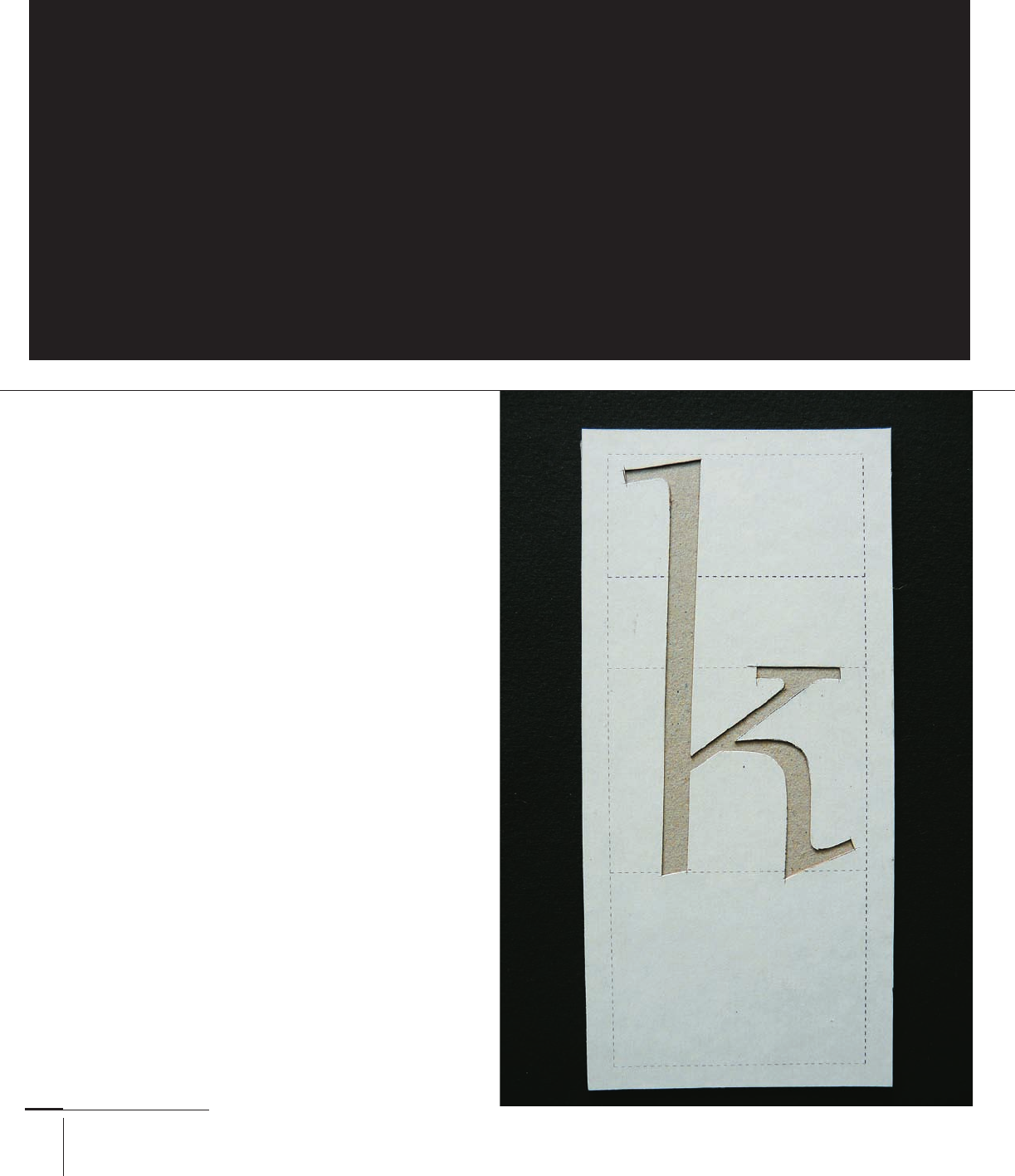
A card template cut by Jim Rimmer for his
typeface Stern. The gentle tapering of the
downstroke survived Rimmer’s use of a panto-
graph to reduce the shape onto a brass matrix.
Though Rimmer sketched the outline in pencil
before cutting the shape, the result echoes
a single stroke with a pen that modulates
width through rotation or pressure.
030-051 03171.indd 36 9/22/11 11:51 AM
Job:03171 Title:Typography Referenced (Rockport)
Page: 37
030-051 03171 C2.indd 37 10/12/11 9:14 AM
37
Type Design and Development
Text
Job:03171 Title:Typography Referenced (Rockport)
Page: 37
This series of nibs cut by Tim Holloway
appear in the angle required for Indian
penmanship, in which the stroke modula-
tion is the reverse of that for Latin. These
nibs were used to produce sketches that
formed the basis for a Devanagari typeface
from a major typeface foundry. The roots of
all scripts are infl uenced by the interface of
the writing tool, the pen-holding technique,
and the writing surface. Although smooth
paper is now ubiquitous, the charac-
teristics of palm leaves and other such
substrates still echo in typographic forms.
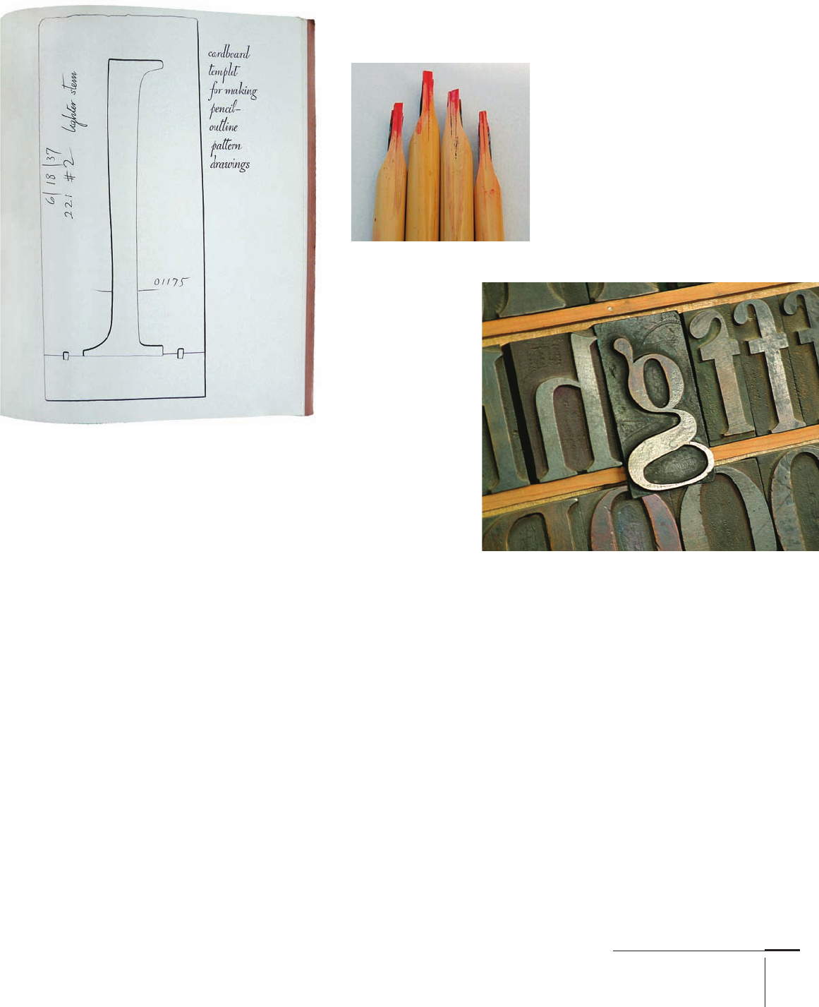
This sketch of a template cut in card by
William Addison Dwiggins in his 1940 monograph
WAD to RR showed a technique that allowed
Dwiggins to combine the fl uency of hand-rendered
curves with the facility to repeat the shape
in letters with similar strokes. The process
suggests an element of modularization,
but one reserved for main strokes only.
Wood letters, like other
carved or dug-out forms,
are largely agnostic as to
the style of letters on their
face. The letter-maker is
imagining a shape written,
designed, or constructed,
and transfers this onto
the face of the block. The
stylistic cues survive
longer than the original
tools and techniques for
letter making, perpetu-
ated through the longevity
of the format and the
demand for the style.
the stroke. Hot-metal type making operations would
use brass patterns, specially made French curves, and
other methods of storing shapes. Throughout the hot-
metal and phototypesetting eras, shapes were captured
as engineering drawings, each letter several inches
high, at scales that had little to do with the specifi c tool’s
movements. The arrival of platform-independent digital
type stored without reference to the rendering size pushed
further this separation between the model for a typeface
and the specifi c shape of its rendered forms.
When designing a script typeface, the designer can
reference written forms directly, modifying for output
size and rendering. Most typefaces, however, depart
from written form shapes. To ensure a typeface’s consis-
tency, the designer must develop a mental model of a tool.
This may imitate the behavior of a writing tool, but may
include mark-making and movement quite unlike any-
thing possible to render with a real tool. An invented tool
that, for example, makes incised vertical strokes and pen-
like bowls can become the basis for a wide range of styles,
ensuring consistency without the limitations of a spe-
cifi c tool. This approach is especially pertinent in scales
for which the limits of manual tools do not off er useful
guidelines, such as typefaces in very small sizes. In those
extremes a tool model might mark the counters and space
between elements as much as the strokes.
It also does not hinder the generation of large, con-
sistent families even without directly related elements.
A light condensed, for example, can belong to the same
family as a wide extra bold when the modulation, the
joins between vertical strokes and curves, and the shape
of instrokes and outstrokes are similar. Imagined tools are
particularly helpful when a design abandons the organic
shapes that reference pens, nibs, brushes, and other exist-
ing tools for entirely constructed shapes, treatments of the
strokes that hint at perspective, or surface eff ects.
030-051 03171.indd 37 9/22/11 11:51 AM
Job:03171 Title:Typography Referenced (Rockport)
Page: 38
030-051 03171.indd 38 9/22/11 11:52 AM
38
Typography, Referenced
Text
Job:03171 Title:Typography Referenced (Rockport)
Page: 38
This spread from Emigre , designed by
Laurie Haycock Makela, exemplifi es the
sea change in type making and typeset-
ting brought by platform-independent font
formats and object-based layout. Although
seen initially as a place for experimenta-
tion and new thinking on design, Emigre
also functioned as a mirror to precon-
ceptions. Barry Deck’s Template Gothic
is typical of an approach questioning
the means of type making with roots
all the way back to Wim Crouwel’s
proposal for a new style of typefaces.
This detail from a poster by Type-
Together on David Březina’s Skolar
shows a typical hybrid typeface.
The bowl of the a and the bottom
serifs have organic modula-
tion, but the top serifs are typical
of constructed elements. Some
of the details get lost in smaller
sizes and lower resolutions such as
footnote text, but the overall low
contrast helps maintain texture.
To understand the conventions for weight
distribution and modularization, hold two
pencils tied together and write slowly with
the pencil angle unchanged. The resulting
shapes will have, for the Latin script mainly,
the stress and modulation typical of the
traditional western style. Abstracted from
the specifi c “nib” dimensions, this method
can help answer questions such as where to
place the thick strokes in extreme widths.
In Eben Sorkin’s Arrotino, the baseline outstrokes of
the a and e are similar but not identical. The same
treatment in the top outstrokes of the c, f, and r ensures
a consistent typeface that retains a hint of written
irregularity and balanced terminals. This is partic-
ularly noticeable in the r, which has a shorter arm,
placing the terminal close to the strong top half-serif.
030-051 03171.indd 38 9/22/11 11:52 AM
Job:03171 Title:Typography Referenced (Rockport)
Page: 39
030-051 03171.indd 39 9/22/11 11:52 AM
39
Type Design and Development
Text
Job:03171 Title:Typography Referenced (Rockport)
Page: 39
TYPE DESIGN AND DEVELOPMENT
From a Letter to a Typeface
It is not too diffi cult to design one letter or even a few. But to design a full alphabet, a designer
must balance complementary and contrasting features across a large character set. Making sure
that range of shapes combines to form a unifi ed whole is the fi rst step toward a new typeface.
This underlying homogeneity distinguishes typefaces from lettering and allows integration of
unique features that impart personality and style while maintaining readability (330).
W
here to start? Many designers think of some
variation of “hamburgefons” (a typical
test word used by type foundries) when
starting a new typeface. But which of those
letters to attempt fi rst? Ideally, a designer works with a
small set of letters that allows for the rapid development
of ideas while embodying a wide range of strokes to give
an impression of the face’s more distinctive features.
The details here depend on a number of factors, not least
of which is the designer’s experience and skill and whether he
or she is making an entirely original design or one inspired
by an existing typeface. Sketching the n and the o alone is not
enough to give a good idea of where the typeface will end up.
Sequences such as a f g n p r s t, a b d e g h i n o y, and a g h m n o
p are well documented as starting sequences; they allow rapid
development of a new typeface. An experienced designer might
start with only a e h n t, or even b a n d.
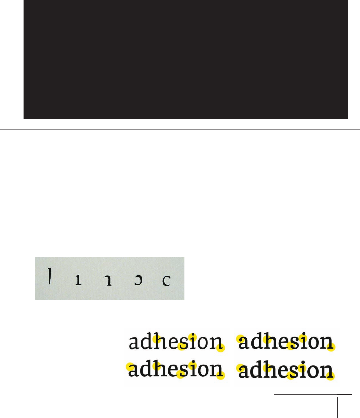
A new designer might try the letters a d e h i n o s (or the word
“adhesion” for ease) to get started. The letters off er a good com-
promise: It’s a small enough set for the designer to change
direction quickly, but it’s large enough to off er a good balance
of typeface-wide features and style in text settings. Letters
such as f g k, which are relatively unique, are omitted, as are
the diagonals (k v w x y z), which share strong features among
themselves, but not with the other letters.
These are four stages in the early develop-
ment of Neel Kshetrimayum’s Frijky. The
fi rst drawings show main strokes that are
too light, leading to light gray paragraphs.
In the next few versions the strokes
gain weight and the curves become less
pointed. The highlighted terminals start
as inconsistent outstrokes, but soon
change to relatively safe slab serif shapes.
The terminals of the fourth version
balance a range of shapes with enough
presence to emphasize the baseline.
Here is a sequence of basic strokes identifi ed by Dwiggins for his
typeface Falcon: long and short downstrokes, a top joining stroke, and
clockwise and counter-clockwise bowls. From these fi ve basic strokes,
the designer can easily develop twelve to fi fteen letters depending on
the design’s homogeneity. The remaining letters either have diagonal
strokes or unique features that allow the designer to refi ne the style.
030-051 03171.indd 39 9/22/11 11:52 AM
Job:03171 Title:Typography Referenced (Rockport)
Page: 40
030-051 03171.indd 40 9/22/11 4:27 PM
40
Typography, Referenced
Text
Job:03171 Title:Typography Referenced (Rockport)
Page: 40
TYPE DESIGN AND DEVELOPMENT
Design by Team
There has been a gradual return to typeface design as a team enterprise, drawing on the expertise of a group
rather than an individual. This concept is not new: Typeface design in the hot-metal and phototype eras
was very much a team product. But just as the digital, platform-independent formats enabled designers
to function outside of a heavy engineering world as sole traders, so it enabled the explosion of character
sets and families to unprecedented levels. The necessary skills and the sheer volume of work required for
text and branding typefaces have driven a growth of mid-size foundries where people with complementary
skills collaborate on a single product. The corollary is a rise in the need for documentation and explana-
tion to a community of fellows. The short-lived “creative hermit” model is giving way to new work modes.
M
ost of the typeface drawings that museums,
archives, and collections have show x-heights
at anything from a couple inches (or centi-
meters) to around ten inches (25 cm) high,
depending on their ultimate purpose. Designing on a com-
puter screen requires a similarly large zoom factor. In display
typefaces (213), this often refl ects the rendering scale to
allow the designer to grasp how the typeforms will look. But
typefaces rendered at text sizes demand that the designer
understands how design decisions translate across scales.
This is one of the trickiest challenges for new designers.
Understanding how to make shapes at one scale behave
a particular way in another scale is not straightforward.
Readers look at words, lines, or paragraphs of typeset text,
but a designer makes changes only to a single character.
Imagining how a small change in a single letter will aff ect
a whole paragraph is not an innate skill, but rather one
learned through experience.
Most designers use interpolation, for example, the Multiple
Master tools built in the widely used font-design application
Fontlab, to develop and fi ne-tune designs. This works for any-
thing from fairly basic proportions to fi ne details. Although
interpolation can be a powerful tool, its eff ectiveness depends
on the quality of the fonts at the extremes and the span the
interpolation covers for each parameter. (For example, it is
easier to obtain good results if interpolating within a relatively
narrow range, rather than between extreme weights or widths.)
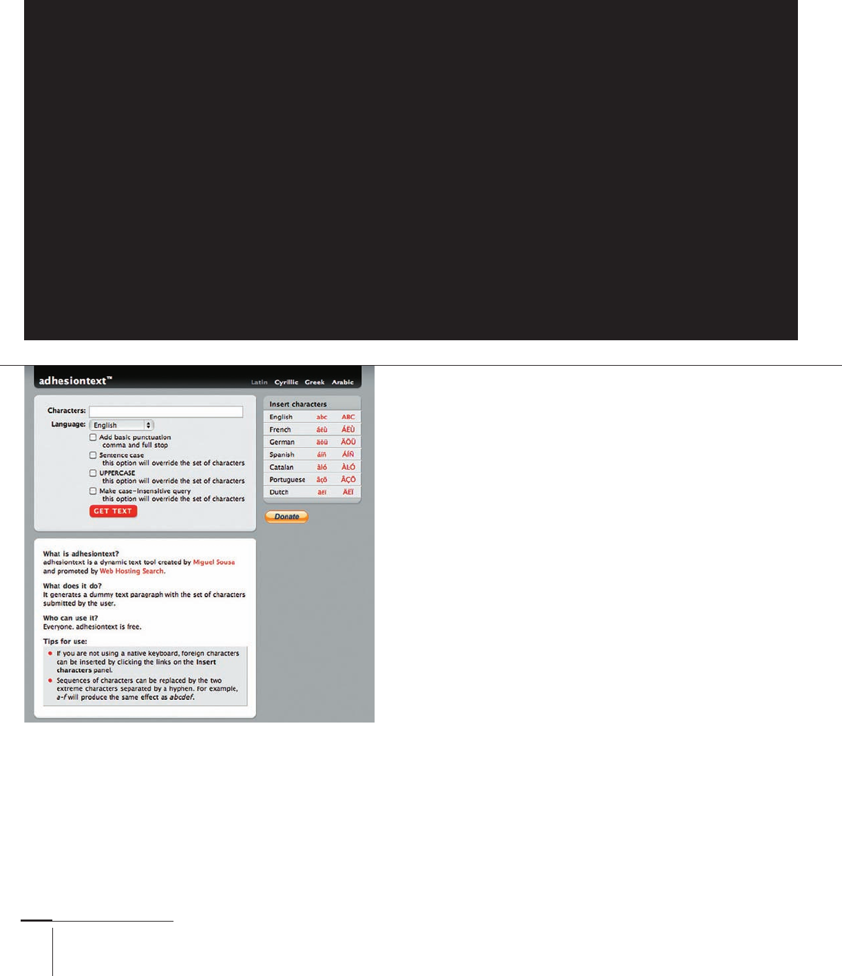
Miguel Sousa’s text generator grew out of the need to
source test texts for incomplete character sets. The tool
allows designers to test the feel of their typeface as it
develops across many languages, with texts that imitate
real context as closely as possible. Adhesiontext.com is
one of a growing range of online typeface design tools.
030-051 03171.indd 40 9/22/11 4:27 PM
..................Content has been hidden....................
You can't read the all page of ebook, please click here login for view all page.