

Job:03171 Title:Typography Referenced (Rockport)
Page: 31
030-051 03171.indd 31 9/22/11 4:27 PM
31
Text
Job:03171 Title:Typography Referenced (Rockport)
Page: 31
Type Design
and Development
By Gerry Leonidas
Y
ears ago we stopped trying
to count how many type-
faces are in circulation, but
the market is growing: Digital
type foundries are fl ourishing (as
evident in the foundries chapter on
page 122), specialist design courses are
thriving (for more information, turn to
the “Schools of Typography” chapter
on page 346), and ever more designers
want to publish their own typefaces.
The retail market is pushing the
envelope in many areas. Text typefaces
(212) are expanding to include many
weights and widths and are increasingly
refi ned in catering for detail typography.
Display typefaces (213) are extending
beyond simple forms to experiments
in typographic textures and alternate
glyphs. At the other end, corporate
branding now demands typefaces that
can be deployed across several markets
and in a wide range of environments.
The internationalization of publications
and brands for products and services is
redefi ning our ideas 0f what is a typeface
family, extending across scripts.
More visibly, the explosion of smart
phones, eBook readers, and tablets
bring typefaces to the foreground of the
design process. As less-than-forgiving
surfaces with constant dimensions
replace format, color fi delity, and
material properties, typefaces and
typography emerge as the dominant
ways to distinguish one publication from
the next. The recent maturity of Web
fonts not only enables this process but
hints at the next big thing: typefaces for
browser-based texts. Although it isn’t
yet widely understood, we are gradually
moving toward an environment
in which brands and publications
are primarily personal, local, and
portable. Well-designed, readable (330)
typefaces that convey strong identities
sit at the center of this process.
In many ways, the type market has
never been so healthy. New rendering
technologies and new scenarios for
using texts increase the demand for
new typefaces, and by implication, the
demand for designers, font engineers,
and the many professionals who manage
and develop the market. But the skills
to make a mark in this industry are also
becoming more refi ned and extensive.
It takes years of practice to reach an
international level of competence, but
a good grasp of the basic principles
makes the fi rst steps easier. That’s
what we’ll provide in this chapter.
030-051 03171.indd 31 9/22/11 4:27 PM
Job:03171 Title:Typography Referenced (Rockport)
Page: 32
030-051 03171 C2.indd 32 10/12/11 9:12 AM
32
Typography, Referenced
Text
Job:03171 Title:Typography Referenced (Rockport)
Page: 32
U
ntil recently, the divide between
display (213) and text typefaces
(212) was wide: Text typefaces
were often designed with clear
references to historical forms and quite sep-
arate from display types. They also had long
shelf lives. The few exceptions, usually sans
serif families such as Univers (181) or Futura
(174), targeted specifi c markets. Type histo-
ries tended to focus only on text typefaces for
books, often downplaying the contribution
of sans serifs to typographic design, ignoring
display type and non-Latin scripts. Not until
1970 did we begin to see narratives with wider
scope that considered the full range of print
production, from small ephemera to broad-
side posters, newspapers to lectern bibles.
Today we tell a richer story of typeface,
looking at the development of styles in response
to document types, the eff ect of technology,
market forces, and the interplay between
cultural movements and typeface design. Old
books and specimens enrich our understanding,
provide inspiration, and protect us from
reinventing the wheel.
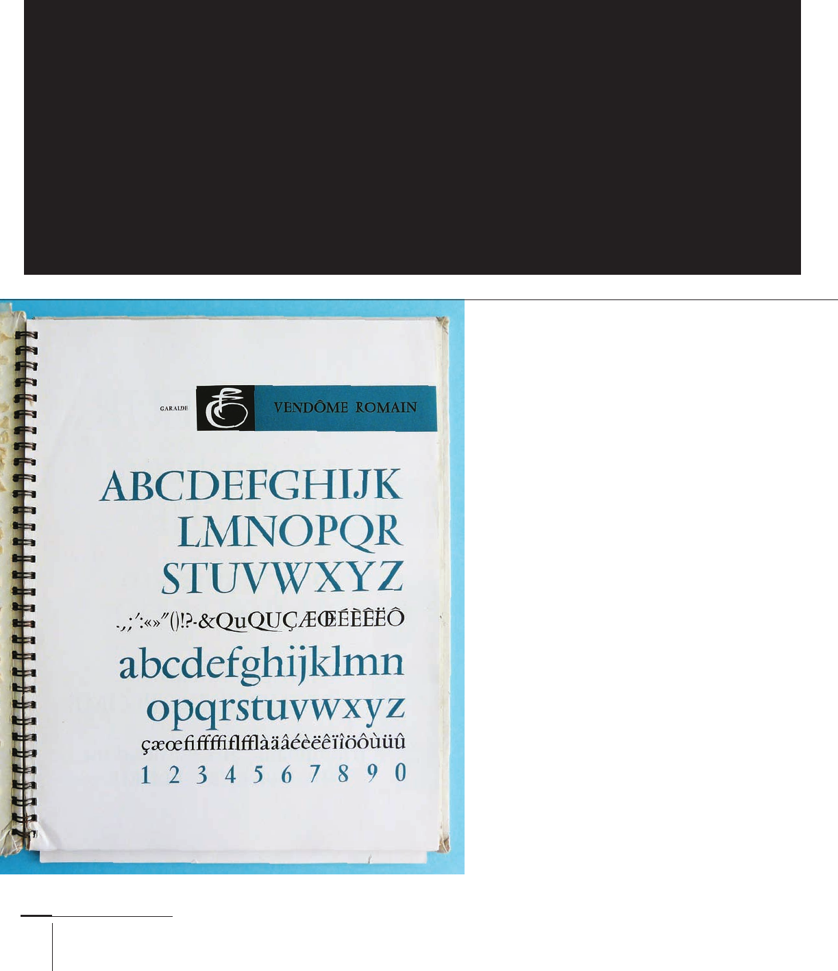
A page from a 1958 Fonderie Olive specimen
showing François Ganeau’s Vendome Romain, an
inspired interpretation of the Garamond style.
TYPE DESIGN AND DEVELOPMENT
The Past as Inspiration
Typeface design is personal and social at the same time. It sits at the intersection of a designer’s desire for identity
and originality, the demands of the moment, and the conventions shared by the intended audience. The designer
also needs to take into account the constraints of the type-making and typesetting technology, the characteris-
tics of the rendering process (whether printing or illuminating), and the past responses to similar conditions by
countless designers. A good visual history of past designs is an essential element of every designer’s toolkit.
030-051 03171.indd 32 9/22/11 11:50 AM

Job:03171 Title:Typography Referenced (Rockport)
Page: 33
030-051 03171.indd 33 9/22/11 11:50 AM
33
Type Design and Development
Text
Job:03171 Title:Typography Referenced (Rockport)
Page: 33
Letters, Lines, and Paragraphs
Although we can look at typefaces within
the framework of classifi cation systems, it
is better to examine them in the context
in which we see them on the page, so to
speak. Traditional systems categorize
typefaces by features such as angle of
contrast (230), rate of modulation, and
shape of serifs. (This partly explains why
sans serifs were not classifi ed with the
same degree of analysis.) But if we look at
typefaces in use, we see that many letter
features distort or become less impor-
tant to overall impression. The darkness
of a block of text, the visual reinforce-
ment of horizontal and vertical axes,
the distribution of space within and
between letters, the length of ascend-
ers and descenders, and the line spacing
(335) become the dominant features. The
typeface’s overall texture becomes less
important than the individual features.
The presence or absence of comple-
mentary styles and weights within the
paragraph and the editorial structure of
the text determine our reading strategy.
Typeface design never happens in
a vacuum. The designer acknowledges
the wider historical and cultural
environments in which a typeface
sits and must respect the users’
expectations. This does not mean
that a designer should not push the
envelope and surprise users, but to
do this well it’s important to know
what is considered conventional and
acceptable—conventions that change
over time and across geography,
demographics, and document types, and
according to the specifi cs of document
use. A good designer is at least a social
observer, decoding the culture of visual
communication. A great designer is a
social commentator, adding a layer of
interpretation and response.
In this detail from a 1570 book by Henri
Estienne, the overall consistency of
the typographic texture overcomes
the inconsistencies that result from
printing with metal type on damp,
unsized paper. The paragraph is
uniform in the distribution of black.
A typical Modern typeface
by Firmin Didot from an 1832
pamphlet. The high contrast
and strong features require
generous line spacing and
reward good presswork.
030-051 03171.indd 33 9/22/11 11:50 AM

Job:03171 Title:Typography Referenced (Rockport)
Page: 34
030-051 03171 C2.indd 34 10/12/11 9:13 AM
Text
Job:03171 Title:Typography Referenced (Rockport)
Page: 34
The Language of Letters
Typeface design, type design,
or font design? Letter or glyph?
Letterform, perhaps? Designers
often use terms interchangeably,
but it is helpful to have a good
grasp of the nuances, if only
because they reveal diff erent
aspects of the design process.
Think of a word. A sequence
of letters should spring to mind.
Write that sequence on a sheet of
paper and these letters assume
a concrete form made manually:
They have been translated into
letterforms. Any representations
of letters made manually, regard-
less of the tool and the scale, are
letterforms. Their maker con-
trols their sequence and size and
knows the dimensions and prop-
erties of the surface on which
they are rendered. A hasty shop-
ping list, Trajan’s column, John
Downer’s brush-made signs.
They’re all meaningful collec-
tions of letterforms.
On the other hand, any
representation of letters
intended for mechanical
reproduction is a collection
of typeforms. The sequence
in which a user places them
and the size he or she will use
remains unknown at the time of
their making. Their maker also
cannot predict the specifi cs of
their rendering environment.
Crucially, typeforms represent
formal relationships in two
dimensions rather than a
specifi c way of capturing and
rendering a shape. In other
words, a Univers (181) lowercase
(332) a is a Univers lowercase a
regardless of the type-making
and typesetting technology.
Although there are diff erences
in the visible forms produced
with handset, hot-metal, and
digital type, for example, the
diff erences refl ect the infl uence
of the encoding and rendering
technology. In other words, a
typeface is a snapshot of the
designer’s intentions for a
collection of typeforms.
To use these shapes in a spe-
cifi c typesetting environment,
the typeforms get converted
into glyphs (the term for digital
formats), precise encodings in
a machine-readable language
enriched with information
about the space surrounding the
shape, its relationship to other
glyphs, and its behavior. This
machine-specifi c implementa-
tion of a typeface is called a font.
To return to our Univers example,
the typeface can be represented
by a Linotype (129) matrix or
bits in an OpenType font, but
the essence of the design sur-
vives, hopefully with fi delity to
the designer’s intentions. Type-
face design and font making are
nominally sequential processes,
even if design today closely
interweaves typeface design and
font production. One person may
embody both roles, but often
the typeface designer and font
maker are separate members of
the same team.
This is a detail from
one of the many
sketches in the devel-
opment of Antonio
Cavedoni’s Enquire.
The typeface is
typical of contem-
porary designs
that question the
conventions of
stress angles for
modulated typefaces.
At the bottom is the
regular weight of a
near-fi nal design.
X
Michael Hochleitner’s
award-winning
typeface Ingeborg
revisits Modern
conventions with
originality and humor.
The typeface is refi ned
and discreetly playful
in the regular, but
extends beyond the
historical model in
its much more fl uid
italic. In addition,
the extreme weights
integrate infl uences
from later in the
nineteenth century.
34
Typography, Referenced
030-051 03171.indd 34 9/23/11 11:37 AM

Job:03171 Title:Typography Referenced (Rockport)
Page: 35
030-051 03171 C2.indd 35 10/12/11 9:13 AM
35
Type Design and Development
Text
Job:03171 Title:Typography Referenced (Rockport)
Page: 35
Joseph Champion’s 1794
writing manual demon-
strates the various styles
of writing with a steel
pen and the skill of the
engraver. The wide range
of alternate letterforms
in such examples is one
inspiration for contem-
porary typefaces.
A spread using Futura by Bauer for
the North American market, showing
sample designs—a typical way to
promote typefaces. The generous use
of white space around the heavier
forms emphasizes the texture and
reinforces the range of weights in the
family. These constructed styles off er
less room for experimentation and
have survived for decades as work-
horses of display typesetting.
030-051 03171.indd 35 9/22/11 11:51 AM
..................Content has been hidden....................
You can't read the all page of ebook, please click here login for view all page.